A Rhetorical Analysis of a Mediocre Website

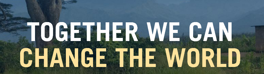
The purpose of a rhetorical analysis is to select a piece of work and determine if the piece properly conveys its’ purpose. For this particular rhetorical analysis I have chosen to examine the Maryland Immigrant Rights Coalition’s website. After carefully studying the website and its’ needs, the next step would be to visit the site establish a more in depth understanding of the organization and to create a digital publication based on my gained knowledge from the site visit as well as notes from the analysis. Based on my observations of the website alone the Maryland Immigrant Rights Coalition does a mediocre job of providing immigrants with resources, informing allies of how they can help, and soliciting donors.

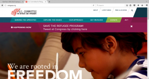
When first accessing the website, one sees the landing page. Above the fold the only noticeable features are the banner, navigation bar, search bar, page title, upcoming events, and the about title. From above the fold, it is evident the author of the page is the Maryland Immigrant Rights Coalition because there is huge emphasis on the banner and organization inside. The banner alone takes up majority of the space from above the fold leaving the audience to scroll down to see more information. If one were to find more information on who exactly is apart of the MIRC they would have to go to the navigation bar, select “Join MIRC” 
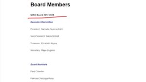
and then choose “Board Members”.  After browsing this particular page one finds all the potential authors. The problem with this is it only dates the 2017-2018 board so stating these members as the authors is not necessarily reliable.

Going back to the landing page when one scrolls below the fold they see what the organization aims to do. While reading the about section of this page it also allows the reader to note the purpose of the website; which is to providing immigrants with resources, informing allies of how they can help, and soliciting donors. Also, from the about section and the immigration news section one learns both the primary and secondary 
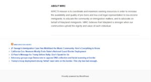
audience. Because one knows the organization wants to provide immigrants with resources from reading the about section the primary audience would be immigrants. Right below the about MIRC section is the immigrant news which can be a tool used to keep up with new updates regarding immigration.  This particular section is very close to the footer and beneath the main focus point of the page so one could identify that secondary audience are those who may support the cause.

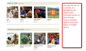
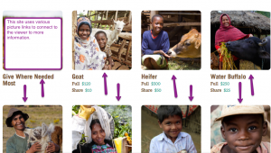
Unfortunately the bottom of the one column web page does not have navigation in the footer so one has 
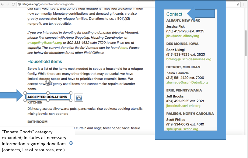
to scroll back to the top of the page if they would like to access the navigation bar. When accessing the navigation bar one has the option to visit the “Resources”, “Get Involved”, “Join MIRC”, “Donate”, and “Past Events”. By selecting the resources page those who have immigrant status can find extra information. However this page just provides a link toresources instead of listing the resources as soon as the page is accessed. This is another indicator that the primary audience is those of immigrant status because it is the first tab next to the homepage indicating the level of importance. Next on the navigation bar is the “Get Involved” page. Within this 
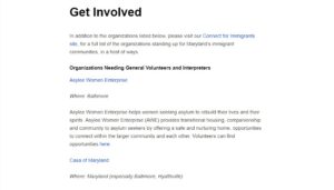
page there are just lists of other organizations that one may volunteer at if they would like to help immigrants this is also an indicator of their secondary audience. After the “Join MIRC” page on the navigation menu there is the “Donate” page. This page states once again the mission of MIRC. From knowing their mi
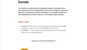
ssion and the nature of donation pages one can infer that the genre of this website is non-profit. The last page on the navigation bar is the “Past Events” page. Within this page the reader is able to see all the previous events MIRC has hosted in the 2017-2018 year. This 
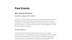
is the second time the website has mentioned this particular time frame meaning one can infer from the context the last time the whole website was updated was the 2017-2018 year.

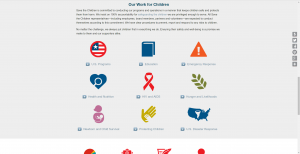
After analyzing the website there are many recommendations I would give the MIRC as to how they can significantly improve. First, the banner on all pages is entirely too big, it takes up most of the space above the fold. The space of above the fold is the most critical because it is what one wants the user to see. Since the website is information based the focus should be on the information not the banner. Secondly in the footer there should be a navigation bar. It is quite tedious after reading to the end of each page to have to scroll back up to the top of the page in order to access another web page within the site. Another option instead of putting a navigation bar in the bottom is to at least have a button that the reader can press that scrolls to the top of the page for them. Also within the website there should be more media, whether that be pictures, videos or audio. These visual forms of communication help to really drive the message the MIRC has home. Another recommendation that is important to implement is specifically for the Resources page. This page is the only page that does not have information listed but it only displays links to other resource pages within the site. The page needs to have both so the audience does not get confused on how to find information but to also have a way to access other resources without leaving the page. The last recommendation I would give is to provide an update to the website content. It is evident the last time the page has been updated was in the 2017-2018 year this is very out of date especially when immigration is such a hot topic and new developments within this topic are constantly appearing. In order to fully convey its purpose the MIRC needs to apply all of these changes but until then the website only does a bare minimum of informing its’ audience.

Rhetorical Analysis: refugees.org

refugees.org is the official website for the U.S Committee for Refugees and Immigrants. Their purpose is to provide information to the people of the United States about who the refugees are, where they are coming from, why they are trying to enter our country, and why we need to help. In recent months, this is very important as there are many misconceptions surrounding the refugee crisis in the Middle East and these people coming to the United States. The primary audience is those who don’t know information about refugees and immigrants but want to know more, or need to know more. They also provide information for people who want to get involved and help, but don’t know how. There is a bias to this site, however it is for immigrants and refugees and the good things they provide for our country, so it is not a bad bias as many other refugee sites these days are.


As a website, anyone with an internet connection can access it. This way, the information provided can reach almost anyone. It is a welcoming website that relies heavily on pictures to provide information. This helps it appeal to our sense of empathy. A visitor of this website sees pictures and videos of the men, women, and even children, as seen above, who are refugees. Actually seeing these pictures and learning more could make a person feel more inclined to donate to this foundation or do something in their own community. Besides pictures and videos, the pages also contain maps and other images to further show who these people are and why we should help them.


When looking at the interface of the website, many things stand out. The colors are pretty much the same throughout the site. Blue and white except for important pieces of information. On the navigation, all the buttons are blue except the two call to action choices, to Donate and Act, as seen in the first picture. On the map above, you can different colors have been used to pinpoint where these people come from and who they really are.


What makes the user experience so unique for this website compared the other sites we looked at, is that each page is different. Some pages you see images like the ones above, telling you different pieces of information about immigrants. You have maps, videos, pictures, success stories on other pages. You can find where these organizations are located. A donations page is set up, which is different then the rest of the site. Even the way the page scrolls is different for each page. This keeps the reader engaged and continuing to explore the site to find the other things that are hidden around each page.


To analyze this website, I used JING to provide screen-captures through this essay. These screen-captures allowed me to provide you with a visual for what I was discussing, instead of trying to describe every detail about the page I was looking at, which you as a reader wouldn’t have been able to see otherwise. Because this website was heavily image based, providing images was the best way to provide this information than trying to annotate or just talk about what is on the website. I not only learned about multimedia projects and what makes a good website, but also so much about immigrants and refugees. Exploring this website allowed to to gain knowledge I didn’t have before and alleviate any misconceptions I had toward refugees.


Rhetorical Analysis: Heifer ~ Chris Ollivett

Rhetorical Analysis


The website I chose to analyze was the Heifer project. The reason I chose to look at their website over the other two was because of their unusual way of giving. The Heifer project allows a person to donate money by buying an animal or supplies that can be directly donated. So, the audience of the website can feel directly connected to their gift and the effect it will have. The primary audience is any available donor who would be willing to give the project any amount of money. The site makes it effortless to donate with call to action buttons located at the bottom and top of most pages. The buttons to donate are well labels and normally a bright color. The secondary audience would be anyone looking for basic information on the organizations goals, priority’s, and work. While the donation buttons are all over the website, so is information telling about all the positives the Heifer project has done over the years. The website appeals to both audiences by easily displaying information that shows the Heifer project in a good light.

The purpose of the Heifer projects webpage is to gather donations and allow people to feel connected to the cause while donating. This is easily done by the donor’s ability to pick a specific animal that they want to give. An example would be the ability to give a donkey or goat to a person in need. In addition to this purpose, it is easily possible that the websites information is given to make it look like a worthwhile place to donate. While all the information is positive it makes, the visitor feel like they should donate. All the facts would make any person feel like they can help.

The context is displayed in the form of a website because the world has become digital. This means that the easiest way for the Heifer project to spread their message and to receive money is to be online. It allows the organization to reach a broad range of people cheaply. The website is very well connected to the social age having links for all current forms of media (Facebook, Instagram, Twitter, etc.) The organization also has a blog which allows people to be kept up to date on all things Heifer project related. The website would easily be read on a computer, tablet or phone. It would most likely be read by a person looking to donate so they would probably be in their own home.

The author would be the Heifer project which means there will be a constant bias to making themselves look good. I do trust them for the most part, but would investigate a little before donating money. The sites creditability is important because if no one trusts it then they will not get funding. They come off as being sincere and wanting the reader to understand what their purpose and goals are. The Heifer project has a reputation for helping people and seems to prove this as fact on their website. The site works very hard to make the project sound very trustworthy and reputable.

The genre would be informative due to its contents nature. All the information found on the site are facts or story that prove the organizations ability to help and farther people. It turns impoverished people into stainable ones by giving them tools.

Color: As the site is shown above its use of color is vibrantly expressed all throughout the web page. The color is used to draw the reader into the story of Heifer and connect them with the people that their donation will benefit.  On the lower picture, it also shows how they use color to present important information that highlights their accomplishments.


Font: The font changes to express what is meant to be highlighted on the page. Different blocks above use different fonts to make the page have differentiating blocks that don’t feel old after a few looks. The font is also used to highlight the donation links as that is the primary motive behind this website.

Information Architecture: The website flows together Allowing one piece of information to connect or pop up more information for the reader. The information is well laid out in its transition and interaction with the reader. In the first picture, big colorful buttons provide a pop out menu which can be clicked on to search even more information on the subject. The second picture right above provides an interactive experience that provides the donor with an interactive way of becoming informed and donating.

User Experience: The primary task of the site is to provide people with a way of donating so the Heifer project can continue its work. With that in mind they guild the user to multiple call to action buttons that allow them to donate from many different points. They incorporate two main task bars that can navigate through the website. They also incorporate social media links and at the very being ask if you’re a donor or not when you first log on

The Heifer organization does a great job in using their website to draw out possible donors and inform readers. The sites main application would be to possible donors, with a second audience being people looking for information on the organization and what it is about. Just like any other website that was designed for one of these fundraising and humanitarian organizations its purpose is to inform and collect donations to further their efforts. While the site has a natural bias in making their numbers look good. The overall feeling is one of trust due to the websites overall feeling and presentation of facts. I could not really see where the bias got in the way of the facts.

The authors ability to use a website to collect money and share information is far superior to say mailing out pamphlets and an envelope hoping for people to return with money. A website allows for a vast array of information to be presented and for interaction such as buying a share or a whole animal to donate. The author was ability to make the website informative but never made it seem redundant. The site uses Facebook, Twitter, blogs, and email to allow a person to communicate and share in any way they chose.

In closing I learned a great deal from my time on this project. From how to use JING to how website use different colors and fonts to draw a view to the information they want them to see. I used JING because it was recommended and I found it to be easy to use. The only caution I found with it was that once you saved the annotated picture that was the last time you could edit it. JING was easy to use and allowed me to make some nice points right onto the picture. I started by first looking at the website and then picking out what screenshots I wanted to use in the analysis. The website as a whole is one of my favorites due to its interactive use, colorful display, and unique way of fundraising. After I collected all my screenshots I wrote the paper portion around them to try and give it a seamless flow. I found this project really enlightened my understanding of webpages and has me look at them with a more detailed eye then before.

Work Cited

“Heifer International | Charity Ending Hunger And Poverty.” Heifer International | Charity Ending Hunger And Poverty. N.p., n.d. Web. 21 Feb. 2017.


Rhetorical Analysis Ryan Diepold-Heifer

Heifer International is a non-profit organization dedicated to supporting and bettering the lives of those who live in an ill-poverished and under-developed nations. The primary audience for this webpage would be those who are interested in donating either supplies or livestock to those under-privileged or under-developed towns, cities, or even areas. This organizations webpage, as soon as it loads, asks about how frequent of a donator you are to create a more customized experience. A secondary audience may be those who are suppliers of the donated livestock or items. They suppliers would want to know the statistics of the donations and how much, or how little, individuals are donating for a certain livestock or necessity in question. For example, if a water buffalo goes for $230 of donations and they raise enough to donate seven water buffalo but a goat goes for $50 but they only raise enough for three goats, the livestock donator would want to know why individuals are choosing one over the other and work with Heifer to determine better marketing or awareness for the necessity of individual livestock. A tertiary audience would include other donation website administrators, as well as individuals looking to find a cause to join but who are not looking to immediately donate or join. Other administrators may be looking for ways to better their sites and by looking at the website markets and at individual differences in-between sites, others can better their websites. Also, other administrators may also be looking for a partnership or a joint-action and may look the site over to see what each can bring to the partnership.

The overall intention for the creation of this text media is to not only show the reasons why donation is important, but to organize the text and graphic sources in such a way that it is appealing and welcoming to new users and keeps the attention of frequent users.  There is a mediated balance of text to accompany various graphics and it is created in such a way that invokes the user/viewer to look more into what the organization stands for, how their donations help, and gives current updates from the areas in which the donations go. A secondary intention for this site may also be to show how even though an area may be under-developed or lacking resources, that area is not miserable. A vast majority of the graphics used are of happy and smiling families and towns. Many donation or call to action sites show images of sad or damaged areas and children or family’s. Heifer goes against the norm and instead showcases how these areas manage to adapt and get by without the luxury’s or necessities that we oftentimes forget are not enjoyed by everyone else. The donations are meant to help improve the lives and standards of living that these individuals have, not meant to better them into a way of happiness.

(Heifer International.com)

The media for this given source is a website, as it is the best possible way to reach individuals around the globe. Using a website, the author allows a wider audience to view and observe their donation source. Using the web over print media also allows for on the spot donations and allows individuals to view and donate anywhere they feel comfortable. I found the text due to this course; however, If I found this site on my own I would still be interested. At this time, the best possible source to use is web media. It is the most up to date and modern type of media we have currently available.

(Heifer International.com)

The author is a collective of the group Heifer. I do trust the source as they not only cite and credit others, but they have up to date and modern source information. The authors are genuine and authentic and their message comes across as trying to spread the cause about their donations. Having a collective group of members develop and craft the website, I feel, creates a more dynamic site, as the more individuals who contribute the more aspects of the site can be modified and looked at from different perspectives.

The genre of this text would be informational organization. The source material wants to spread knowledge and information about their source. By using the .org option opposed to using .com, it is more genuine in its cause.

There is a wide variety of fonts within the subjects of the pages. The gift catalog text is a different from a majority of the other text styles on the page to draw attention. The explanation text starts off with a larger text size then it becomes slightly smaller as to allow the viewer get a grasp of the topics. Having a variety of fonts offered to the viewers helps to defeat the problem of the pages looking boring and the viewer potentially losing interest.

(Reference 1) (Heifer International.com)

(Heifer International.com)

The information of the site is organized in a way that it starts with a main topic (See Reference 1) and then breaks into sub topics; the information is simplified to the viewer by breaking the sub topics into pictures to allow the viewer to see what the next page of information would be. This style of organization allows a vast amount of information to be presented at once without over loading and deterring the viewer. The information is also very straight forward and leads the viewer to where they want to go.

(Heifer International.com)

As the viewer navigates the information on each page, the next page slowly becomes less and less clustered with more links. The pages become more information based as the viewer goes deeper through the site, narrowing down on what the page is meant to convey.

(Heifer International.com)

This style of information architecture and organization is very helpful and easy to navigate for viewers. By breaking the information up this way, a viewer can easily navigate through a lot of information without feeling over encumbered or even realizing the true breadth of information given to them. The viewer can take in the information at their leisure.

The colors of the website are simple; however, the few colors used can draw in and attract attention of the viewer. The main color scheme is composed of blue, white, and light/dark yellow. Using these three colors allows the viewer to recognize easily what color to look for when navigation the top ribbon. Making the gift catalog a different color, than the rest of the ribbon, on that is more dynamic and a different hue, draws the attention of the viewer and compels the viewer to click on it and donate.

(Heifer International.com)

(Heifer International.com)

The call to action button is a vibrant darkish red color. This color is the most predominant color on all the pages, as it wants to be remembered and imbedded in the viewer. The gift catalog and all to action button are dynamic and dark as to imbue the viewer with a sense to donate.

(Heifer International.com)

(Heifer International.com)

The user experience for the site is incredibly easy. The tabs and sidebars allow the user to viewer the page at their pace and reminding the viewer about the information presented on the page. The previous three sections all culminate to the user experience. The user, as the pages are navigated, is presented with diagrams, charts, figures, and more. The examples given to the viewer are presented in a simplified and colorful way as to not be over looked by the viewer. The overall navigation of the site is easy and able to be understood by viewers. There is no confusion of the pages. The pages are easily navigable and do not over-encumber the viewer.

(Heifer International.com)

(Heifer International.com)

(Heifer International.com)

(Heifer Intenrational.com)


This website is very well put together and is very easy to navigate. A first time user can go through the pages at their own leisure and not get too overwhelmed. The animations are an interesting touch as they are more of a “childish” style but fit the site nicely. The information itself is very well organized and put together and offers many various options to the viewer.

Using Jing to screen capture images was incredibly easy. Jing allows for annotations, arrows, highlighting and emphasis of text. This ease of access made relating my images back to the topic at hand relatively simple.

This project overall was very enjoyable and I learned a lot more about a website than I thought there was. The amount of thought, direction, and purpose for sites such as this to hone in on an audience is amazing.


Work Cited

“Heifer International | Charity Ending Hunger And Poverty.” Heifer International | Charity Ending Hunger And Poverty. N.p., n.d. Web. 10 Feb. 2017.

Taylor Barksdale Rhetorical Analysis

I chose to do Heifer International for my website analysis. Heifer International is a website that aims to end hunger and poverty in poor countries through donations from people around the world. Heifer provides these people with job skills as well as livestock in order to help them become more self-sustaining.

Audience

The primary audience for this site is would be possible donors that are going to donate to the site. These donors are being targeted because the main purpose of the site is to raise funds to help families become more self-sustaining in terms of giving them livestock and cooking supplies. The secondary audience for this site would be people who are themselves in poor countries and are trying to get access to help, whether that be getting funds for education for their children or to gain means of making a wage. Another secondary audience could be workers that are trying to get their clients (people in need of assistance) in contact with a third party who can help them get everything they need in order to live a successful life.

Purpose

The purpose of this site is to earn funds for underprivileged people. The site is trying to make sure that people will donate to the cause; it allows for people to make donations as well as purchase items that are made by the people Heifer helps such as rugs or ornaments. There is most definitely a bias on this website; Heifer wants people to donate to their foundation, so they showcase all of the good things that Heifer is doing for people through their foundation. There is nothing negative on the site; they want to keep the site positive and shed light to the work being done.

Context

The context that Heifer chose to use was in the form of a website. The layout of this website seems to work extremely well in order to help navigate places. On the main page there are several main tabs; these tabs include the following: “Ending Hunger and Poverty”, “What You Can Do”, and “Join the Conversation”. Providing these tabs at the forefront of the website allows for the site visitor to see the main components of the website at a glance.

The website makes really good use of color. The colors are not all the same; this keeps the reader engaged. The architecture of the menu seems to work well for this website as well; the menu options are rather brief and don’t crowd the page. This helps the user experience; things are easy to find.


Once a reader navigates to the “What You Can Do” page, and then picks an option from the tiles of options, they are brought to the page where that gives more detail to that particular image. The text content is organized in both paragraph form as well as bullet points; this variation helps to make sure the reader gets the content in the most effective format possible. The variation in font between titles, subtitles, and body information helps users follow the path of where they should be looking for information.


Author

The authors of this website are hired workers for the Heifer foundation. These authors have the job of establishing a positive public image for the Heifer Foundation so people will want to donate to the cause. There is an incredible amount of bias that these authors hold; they are trying to make Heifer appear in the best light possible. Heifer appears to be a credible source. The author makes an attempt at establishing a good amount of credibility by showcasing the families and individuals that have been helped by the organization as a whole. The author comes across as vested into helping people get back on their feet.

Genre

The genre of this website could be broadly defined as a foundation/donation solicitation website. More specifically, this text can be defined as a charity website. The key component of this website is how the website is campaigning to raise funds for poor countries. The website makes a call to action for people to donate. They sell items as well, but the proceeds are going to impoverished families.

Color

The color all throughout this site works well. The scheme of mixing warm tones of yellowish gold, pink, blues and purples really connects each page together nicely. The colors help set a tone of a warm. friendly and inviting environment; this may influence visitors to donate due to the site’s warmth.

Font

The fonts that are being used seem to fit each page. There are variations of fonts throughout the webpages, which will help keep the user engaged. Even the font colors help create a sense of structure for the user in a positive light.

Information Architecture

The structure of the information on the site makes finding information very easy. The menu bars at the top of the page provide just enough information about that page; there isn’t too much in the tab names to overcrowd, but not too little to leave the user wondering where to go. The information on the pages are formatted with whitespace in mind; there is no sense of overcrowding on the page, which helps.

User Experience

The user experience appears to have been a priority during the brainstorming and development of this website. From the tabs at the top of the page to the interactive widgets on the webpages, it is easy for a user to navigare the site efficiently.

Summary

As earlier stated, the primary audience for this site would be possible contributors to Heifer International to see exactly what they would be donating to. A secondary audience could include people seeking help in their country of origin. The purpose of this website is to earn money for Heifer to help families in the form of livestock and jobs/skill learning. There is a definite bias toward the site in efforts to persuade people to donate to their site.

The Heifer International foundation chose to make their medium a website. Heifer used a combination of media such as text, pictures/slideshows and videos in order to entice people to get involved with Heifer. These media helped to show the people that donations would in turn benefit; it helped possible donors see the faces of people in need, as well as people who have benefited from donations in the past. Creating a medium such as this website gives people a more personal experience, and may make people want to help out more by Heifer taking a more personal approach.

I selected Jing because it allowed for me to take pictures of only the parts of the screen that I wanted to capture, and cut out the parts that I didn’t really want to showcase as much. Jing seemed to really meet my expectations in allowing for me to annotate the picture to show what I liked about the website as well.


Rhetorical Analysis: savethechildren.org


Brian Casciero

2/12/2017

ENG 256-01

Rhetorical Analysis: Save the Children


Color Analysis

The colors red and white are present in many areas on the home page. Red and white invoke the concept of medical aid, as seen on hospitals and other medical facilities. It also gives a clinical, official feeling that harms the atmosphere of the site.

The red is present in the logo, the action buttons, and is a point of emphasis in this text box. This gives a sense of urgency. Being in the logo, it also gives the perception that Save the Children is committed to acting swiftly. The red coloring of the word “terrorized” makes a piercing call for sympathy and is somewhat manipulative.

Font

The “Latest News” section contains font that is slightly thicker and bolder than the rest. This is meant to attract attention. The smaller type font is reserved for the explanation paragraph below. If that were the same font size, users might be exhausted from reading that much large text. Finally, the pictures at the bottom contain thicker font. “120 Countries” and “185 Million” attract attention because the site wants us to remember those numbers.


Information Architecture

This is Save the Children’s About Us page. This section faces more towards corporations or investors; there is information about management, the board of trustees and corporate partners. This is clearly focused on creating a professional image. However, it is placed above this section on the About Us page:

The section of the page that most answers the “About Us” question is not placed on the forefront. Considering the main mission of the organization is in their work for children, this section should be above the previous, investor-heavy one. Instead, this creates the image of a company that cares more about business than it does its mission.


User Experience

The process for sponsoring a child is very streamlined. Right on the Sponsor a Child page, which is easily accessible from the home page, is a laid-out process for sponsoring. The four steps are visible and ready to be completed, giving the user a sense of control. This top portion is an easy way to find a child quickly; the site recommends a child for you, and you can select a new one from their choices. However, for a more advanced search, users can easily filter results.

These information/link columns are at the bottom of most of the site’s pages. It is basically a condensed version of the site without the flashy effects of the homepage. It is laid out very directly and logically. For users who have reached the bottom of a page and might be looking for more information, the info will be right there. This prevents the user from having to backtrack too much and gives a sense of streamlining to the site. It is large and clear.


Summary

The Save the Children website is very direct in its intentions. While websites for other foundations may be slightly veiled about their emotional pleas, this site does not shy away from being honest. The audience consists of people wishing to donate or provide other assistance to the cause of helping children in need. A secondary audience consists of those wishing to volunteer, fundraise, or partner with the organization. The genre appears to be charitable foundation platform/website (“Official USA Site” 1).

The main purpose of the site is to make an emotional grab at the audience while providing the platform to take advantage of convinced patrons. A gift shop is easily accessible, and it is simple to sponsor a child. The site makes the path clear (“Gifts of Joy” 1). In a sense, Save the Children’s website has a bias towards making emotional pleas rather than letting patrons feel in control. The main bias towards generating support is still present, as it is in all of these platforms, but it is much more obvious here.

The bias presents itself through multimedia and the form of the text. The medium allows for picture slideshows, videos, and other visual interactive tools that provide a more direct and compelling argument. There are many pictures; some pictures are photographs that demonstrate the emotional grab. Others are meant for displaying statistics or other hard facts. Pictures allow users to see in-need children with longing faces and in sad, pitying positions. Video allows users to see examples of the text stories already provided (“Official USA Site” 1).

In the context of the current political climate, this website takes advantage of the Trump administration’s threatening stance on immigration. Now that the children may not be able to come to America, the emotional plea becomes more effective. Now possible patrons may be more inspired to assist the organization.


Sources Cited


“Official USA Site.” Save the Children. N.p., n.d. Web. 17 Feb. 2017.

“Sponsor A Child.” Save the Children. N.p., n.d. Web. 17 Feb. 2017.

“Home – Gifts of Joy for Lasting Change.” Gifts of Joy for Lasting Change. N.p., n.d. Web. 17 Feb. 2017.

“About Us.” Save the Children. N.p., n.d. Web. 17 Feb. 2017.

Rhetorical Analysis: Heifer International

introduction

Heifer International is non-profit organization that serves to eradicate hunger and poverty globally by developing self-efficient communities and donating livestock to those agricultural communities. In order to succeed in their efforts, Heifer has created a website which has a number of features for donations as well as avenues to view their progress on the development of communities where they have a presence. I will be analyzing the site in order to establish how things function and if they succeed in generating interest in Heifer’s efforts.

Audience & Purpose

For starters, the audience for Heifer International are clearly individuals interested in entering the fight against hunger and poverty worldwide. The site is constructed in a way that invites a secondary audience in with a beautiful and engaging conglomeration of media and text that blend beautifully together. One of the primary purposes of Heifer International’s website is introducing an uneducated audience to the hunger and poverty plight around the world. It achieves this by having a large amount of carefully detailed graphs and statistics about the hunger epidemic around the world. Secondarily, the site also shows Heifer’s philosophy and business strategies throughout the world, including how the donations given to Heifer affect the communities and the various types of livestock that can be donated to struggling communities. There is an obvious bias, however since as a nonprofit, Heifer requires donations to function so it is of the utmost importance that they make their mission seem like it is both urgent and successful.

Medium

The choice of a website in the modern age instead of a magazine is very crucial as through the site’s meticulously planned layout, it’s much easier to get to the sections that you actually want to get to. As stated before, the site is filled with pictures and graphs, detailing the statistics of the hunger issue while giving a powerful and positive outlook due to their work. The beige, green and yellow tones of the site are nice choices. They’re good colors without being distracting but subtle without being boring.

Font-wise, the white and browns stand out against beige and green backgrounds. For further emphasis, Heifer’s designers have also included various reds and blues in their heading font selections that draw attention to whatever the site is addressing.

Information Architecture

The site is designed in a way where most of the most basic information is placed directly on the home page. By reading the home page, an interested can see what Heifer International is about and see what they believe. However, if more information is desired, Heifer has their information bar on the top that directs you to their views and their approach to eradicating hunger.

personal experience

Overall, I greatly enjoyed Heifer International’s website. I usually visit websites like this but I found myself lost in the rabbit hole, per se. There’s so much information to read and it’s presented in such an interesting and visually pleasing way that it’s extremely hard to back out once you’re fully invested in getting in.

The information is easy to access and every link seems to take you to a page that constantly reemphasizes the importance of Heifer’s mission and shows you just how widespread their reach is. It’s both inspiring and a bit daunting, knowing just how large their mission is. Because of this, it almost makes you want to donate because it isn’t an easy thing that they plan to do.

On a scale of 1 to 10, I’d definitely give heifer.org a 9.75, if only because when you first access the site, they try to hit you with a donate now sign up page that is a bit frustrating and annoying.

Howard McMillan, Jr.

Rhetorical Analysis of Heifer.org

Rhetorical Analysis Parts 1 and 2

Audience

The primary intended audience of Heifer.org seems to mainly be people looking to donate to the Heifer foundation. These possible donors are likely people looking to end world hunger. In addition to attracting potential funding, the website also aims to inform visitors about their mission and the issue of world hunger. A secondary audience of people trying to learn more about world hunger and its effects both locally and internationally is also reached. The website is only offered in the English language implying that its intended audience is English speakers. Based on their location here in the United States, one could further narrow down Heifer’s intended audience to being possible American donors or Americans researching Heifer and world hunger. There is a sub-menu allowing for donations to be placed that specifically go to empowering women. This adds another dimension to Heifer’s possible audience as well as their purpose. Both are broadened to support of women and ending hunger as well as donors interested in contributing to either cause.

Purpose

This website’s primary purpose is to raise money for the Heifer Foundation and the various projects and charitable actions they provide. As soon as a visitor logs on to the site they are presented with this pop-up screen that pushes them to identify as a donor. 

Due to the immense amount of information available on Heifer’s website, their secondary purpose seems to be bringing awareness to the issue of hunger on both international and local scales. The tertiary purpose seems to be informing the public with information regarding how they are working against world hunger. This is supported by Heifer dedicating a large portion of their website to describing the methods they use to provide their services to those in need.

Context

If you put heifer into your preferred search engine their website is usually among the top results and features a brief statement to provide some context to visitors before they click the lnk.

Heifer.org fully utilizes its online medium to present itself to readers. The text is laid out in an interactive format on the Heifer website. Readers navigate maps and other interactive graphics and menus to learn more about Heifer’s work, the issues surrounding hunger and nutrition worldwide as well as possible ways to contribute to Heifer in order to aid them in their mission.

These information graphics are easy to use and stand especially when compared to the information architecture on other sites. The designers of Heifer’s website spent a lot of time allowing a user to get lost in their information without becoming disoriented. No matter how deep into the charity projects or catalog you go, the top-navigation bar allows a user to keep their sense of direction within the site.

Heifer’s online context allows them to easily convey large amounts of info about themselves and allows for easy donations and purchases from their online store via credit or debit cards from visitors. Being an online publication/foundation with credit card processing capabilities allows for much easier access to customer/donor funds.

Notice how the donation slider comes preset to the most expensive standardized amount on their donation pages. Their online presence allows for them to draw donors in for larger sums than an in person, door-to-door charity campaign would simply by their ability to process credit cards.

Genre

The Heifer website most closely falls into the genre of online charity organizations. The amount of information on the site also adds an educational/informational aspect to it. Readers are constantly presented with facts about the issues of world hunger and different ways that Heifer is working to end it. In addition to a constant information screen, visitors are frequently and boldly prompted to donate via pop-ups and boldly placed call-to-action buttons. Small touches like calling the “cart” the “basket” and letting visitors choose who/where they donate to make the website feel more personal and less generic.

The careful, gentle wording and is an effective quality in a website that’s main purpose is to acquire donations. The warm colors featured by Heifer also aid in this feeling of comfort. Even the cooler colors like blues and greens used on their front page are soft and provide a gentle but effective contrast against their call-to-action buttons.

Font

Most of Heifers text is written in brief, easy to read blurbs in a font that does not use any serifs to possibly disorient dyslexic visitors. The writing is well spaced and formatted well enough that a reader’s eye naturally finds the next line or latches onto the next blurb down the screen.

The above font is easily readable , the layout is simple and the message is clear. The colors are all very muted but distinguishable against one another and allow for the plain white text to be easily read.

Author

No actual author is given credit or mentioned in any of the articles or parts of the website. The implied author is one that cares deeply about the work of Heifer and wants to inform the readers as heavily as possible about their work and the benefits that a donation will have on the work.

The author of the above image has a clear and persuasive voice. The benefits a donation would have are clearly listed for visitor’s through the use of persuasive language like “feeling of pride and joy” and “you’re making a lasting difference.” That firm but persuasive voice makes readers want to please that author and donate to Heifer.org.


Rhetorical Analysis Part 3

The primary audience for heifer.org is possible donor’s. These are visitors who come to the site to make a donation. Though the Heifer organization is a charity, it is run like a business and acquiring funding is still their primary goal, which makes potential donors their primary audience. Due to the immense amount of information also featured on the Heifer site, they reach a secondary audience of people who are looking to learn more about issues like world hunger and their effects on both a local and international scale. Countless pages of information on these topics are featured on the site and feature easy to read graphics like graphs, maps and photos to show readers what hunger looks like, how it affects people and what Heifer does to help. The primary purpose of Heifer’s site as mentioned above is to acquire funding, which does make them biased in their mission, though it is not necessarily negative bias. The side of the argument that Heifer presents and favors is their side. Heifer wants you to donate to them, rather than donate to a local food bank or other charity. It is an understandable bias to have considering that Heifer’s site functions to run a truly massive international charity.


The online medium utilized by heifer.org is what makes running their charity on such a massive scale possible. The website layout makes it super easy for donations to be taken by credit card processing software and allows for them to also run an online store to help fund their projects. Tons of pictures, graphics and interactive menus engage readers and all seem to somehow lead back to a donation button without Heifer seeming pushy or too assertive. These multi-modal elements make for a smooth and interesting user experience as readers are able to absorb cultural facts and statistics about hunger while they contemplate making their donations. Links and tags to other articles and pages on Heifer.org are abundant and a user can spend hours browsing the sites dense content.


When creating this rhetorical analysis I only used the screenshot key to capture images and the program MicrosoftPaint to crop and label the examples from Heifer’s website. I’m not a very tech savvy guy and I was pretty intimidated by the idea of recording myself using a computer, using unfamiliar programs or trying to narrate my technologically-challenged stumbling through Heifer’s website. The process I used to make this simply involved me copying and pasting the assignment requirements into a blank post, then answering the questions, then finding graphics to support my answers. This method was fairly simple and allowed me to stay organized. Though it may have been painful for you, thanks for sticking it out through all the 1376 words in this post.


Rhetorical Analysis


Heifer International

The Heifer International organization was founded by Dan West with the mission to provide relief for those in poverty. Dan West found a way to gift families with not just rations of food but whole, live animals that can sustain them for much longer than a simple ration of food. His organization empowers families to turn poverty and hunger into prosperity (heifer.org/about). The Heifer website is simple and easy to follow. By having a simple site, Heifer makes it easy to understand their message and their organization.

The intended audience for this website are people who are interested in helping end hunger and poverty around the world and people who want to learn more about the company and what they do. The secondary audience for this site could be sponsors/ partners or companies looking into sponsoring this organization. The intention of this website is to inform the audience of who the company is, how they conduct their work, and how the audience can help them. The company also wants to collect donations from their readers, in the form of money or gifts for families in poverty. They want to work with communities to end hunger and care for the earth. By allowing people to buy livestock, they are reassuring their audience that the money won’t be wasted, while providing a family in need with a valuable resource. The medium for this information is a website. I think the author chose this platform because it’s an easy way to get a lot of information across to a wide audience. This website can be read at a glance to get all the information or an be explored in great detail for a long period of time. We are now an online generation so having an interactive website is a great way to reach a very wide range of people. The author of this is the Heifer organization. The author of this website comes across as knowledgeable and trustworthy. They seem to know a lot about their topic and have a great understanding of their program. The author provides the information is a lot of detail and makes sure to explain everything in a way everyone can understand.

The general colors of the website are simple and not overwhelming. The colors are not overly vibrant. The main task bar is a simple blue color with a light grey bar at the top. The yellow box is a good way to highlight the area where the viewers of the site can donate money and other gifts.  As we get farther down the main page of the website, the background shifts to white, allowing the other links to pop out of the page, drawing your attention to them.

The bright colors in the pictures draw your attention, and make sure you can see more ways of helping/ giving. The white background helps highlight the light blue donation button along with the other donation ads.

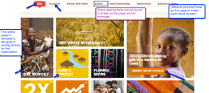
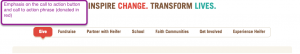
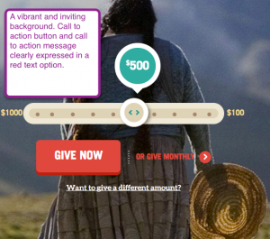
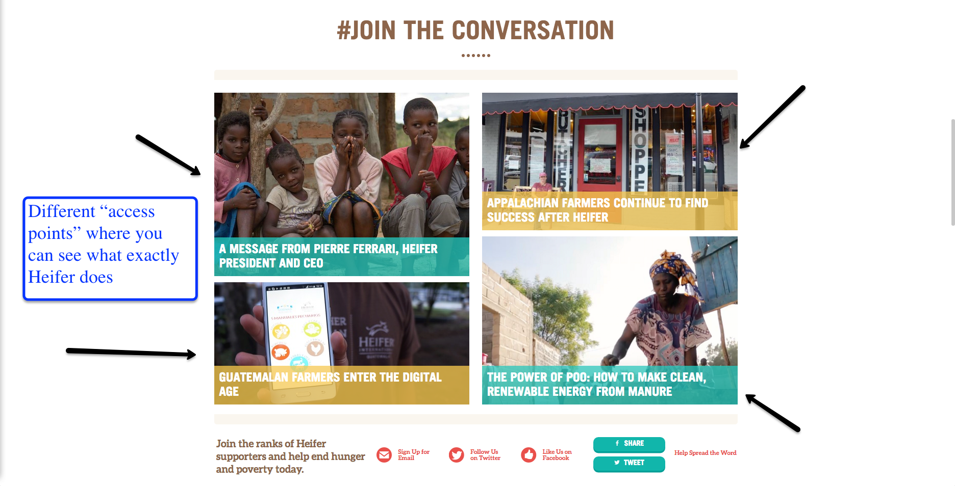
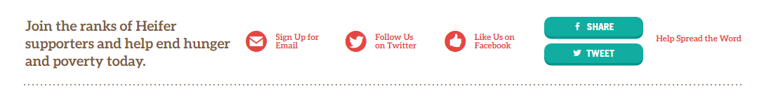
Below this area, we have a bar with bright red lettering, advertising the organizations social media accounts. Highlighting this section in red draws your attention and encourages you to follow their pages and help spread their message. The red text draws your eye, and encourages the audience to follow them on social media which would help them spread their message to people who might not know about their organization

The font is consistent throughout the whole site and isn’t constantly changing from page to page. It’s an easy to read font at a reasonable size. The size of the font changes depending on whether the text is a headline or a passage of information.  The headlines are big enough to be eye catching but not too big that they take up the whole page. The bigger text of the headline calls your attention to the article, while the smaller text makes reading the information easier.

Overall, this website is easy to interact with and full of positive information about the company and their mission. The authors make sure to get their information across in a very quick, easy to understand way. By having several bright pictures of families and kids on the first page, they encourage sympathy for their cause and make donating to them very easy and accessible. This website is full of interesting fats and information, overall I think it does a very good job of catching the readers eye and encouraging their help.

The tool I used to capture the above images was JING. I chose this tool because it was easy to download and easy to use. This tool allowed me to take screenshots of which ever section of the website I needed for my analysis. Having the images to go along with my description gives the reader a reference to go off of throughout the analysis. To create this analysis, I made sure to go through every page on the Heifer website before writing. I decided to focus mainly on the main page and the about page for my analysis because those are the two main pages that readers will see first. By focusing on only two pages, I know I limit my analysis but I thought it would be easier to analyze the main pages that the audience would see first.


Rhetorical Analysis

Dabrianna Green   

     I chose to analyze www.refugees.org. Though there is more than one audience, the intended audience is people who are interested in supporting this particular cause. The secondary audience is anyone who is interested in learning about the cause and the organization in general. This organization is dedicated to bringing awareness to the issues involved within the refugee crisis, which corresponds with the purpose of the website. The United States Committee for Refugees and Immigrants intend to provide a space that informs onlookers of their mission as a committee, while simultaneously providing the resources for the public to get involved.

     These core values, intentions, and motives appear throughout the entire layout of the site. The navigation bar reflects the gradual process the average person goes through before committing to a cause. First, they become informed by exploring the issues overall, which reflects the “explore the issues tab.” Next, they look into the approaches within different organizations, which reflects the “our approach tab.” Finally, they decide where and how they will get involved, which reflects the “get involved,” “donate,” and “act” tabs.

     The context of this site is a crisp, clean layout for the web that can easily be accessed from a number of electronic devices at any location. The organization presumably chose this particular medium because in today’s society, everything is online and viewers have less patience. This also seems to be the most efficient and effective way to combine all of their efforts such as informing and collecting donations simultaneously. They do not have to worry about running out of space and they can refer anyone with questions or concerns to their website to get all of the information they need. The navigation is simple enough for all age groups and facilitates almost anyone. This medium definitely is a reflection of understanding the target.

     The genre of this site is organizations. Instead of the “.com” websites generally have when their websites are for commercial use, organizations typically use “.org” at the end of their website. Many organizations have a similar setup when it comes to their websites; it often is reminiscent of a pamphlet they would give out. All of the key information about the organizations is displayed on their website ranging from their cause to their contact information. The great thing about having this website is that the organization is able to include video and have people donate directly from the site, which this site definitely makes     

     The interface is extremely user-friendly and everything that it should be. Though some websites tend to be carried away with all of the features they can include that results in a website saturated with widgets and unnecessary features, there is a function for everything in this website; everything included enhances the experience. The colors are vibrant enough to keep the reader interested and engaged, but not so vibrant that they assert playfulness. After all, the refugee crisis is a serious matter. However, many organizations have a tendency to come off so serious and stern (often not utilizing color, playing with font choices, & etc.) to make their website aesthetically pleasing) that their website doesn’t keep the viewer’s attention.

     The font choice is extremely readable. Throughout the entire website, the organization does not go under 12-point font. They also pay specific attention to the color choice in regards to font. Some colors do not overlap well when it comes to text and background. This organization realized that and made sure that the darker backgrounds had lighter fonts and the lighter backgrounds had darker fonts.

     The website’s information architecture is extremely straightforward and helpful. Every title reflects the exact link it is connected to. If the user wants to “get involved” with the cause, they can easily click “get involved” in the dashboard and they are brought to several options that show them how to get involved in the area of their choice. No matter what option they chose, they are provided with a list of all of the resources they will need and contact information should they have any questions. There are many aspects to this site. However, it is very hard to get lost or have navigation issues. This makes for an effective user experience, which is especially important considering the type of site this is.

     The purpose for this site is to spread awareness, gain support, and collect donations. The site definitely has bias because it is targeted towards a certain cause. There are little to no counterarguments towards this cause displayed on the site because it would take away from the organization’s purpose and mission; the organization is only going to showcase that supports their cause because they have a certain point they wish to make.

     After analyzing the site and making note of everything that stood out to me, I used the screenshot feature to make my arguments about what elements enhance or takes away from the site. Along with that, I used arrows to point out each feature I wanted to highlight. I then added text boxes directly under the arrows to explain the point I was trying to make about the features in detail. This allowed me to show exactly what I was referring to directly.