
Heifer International
The Heifer International organization was founded by Dan West with the mission to provide relief for those in poverty. Dan West found a way to gift families with not just rations of food but whole, live animals that can sustain them for much longer than a simple ration of food. His organization empowers families to turn poverty and hunger into prosperity (heifer.org/about). The Heifer website is simple and easy to follow. By having a simple site, Heifer makes it easy to understand their message and their organization.
The intended audience for this website are people who are interested in helping end hunger and poverty around the world and people who want to learn more about the company and what they do. The secondary audience for this site could be sponsors/ partners or companies looking into sponsoring this organization. The intention of this website is to inform the audience of who the company is, how they conduct their work, and how the audience can help them. The company also wants to collect donations from their readers, in the form of money or gifts for families in poverty. They want to work with communities to end hunger and care for the earth. By allowing people to buy livestock, they are reassuring their audience that the money won’t be wasted, while providing a family in need with a valuable resource. The medium for this information is a website. I think the author chose this platform because it’s an easy way to get a lot of information across to a wide audience. This website can be read at a glance to get all the information or an be explored in great detail for a long period of time. We are now an online generation so having an interactive website is a great way to reach a very wide range of people. The author of this is the Heifer organization. The author of this website comes across as knowledgeable and trustworthy. They seem to know a lot about their topic and have a great understanding of their program. The author provides the information is a lot of detail and makes sure to explain everything in a way everyone can understand.
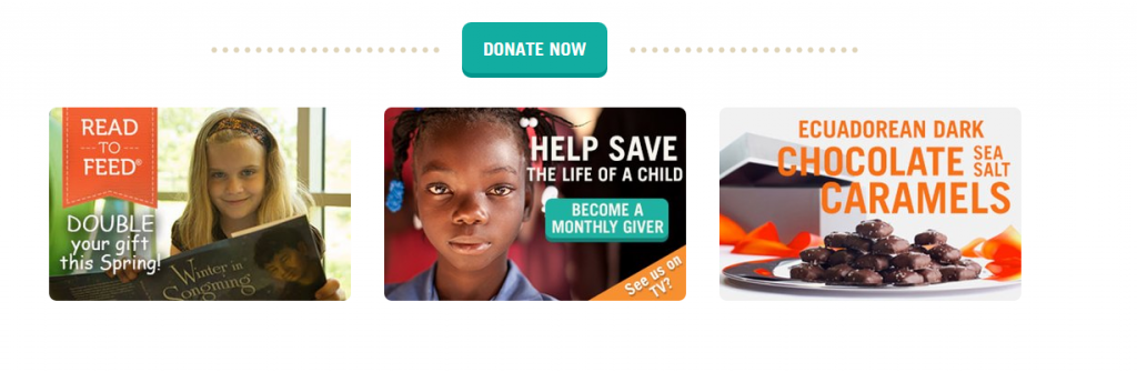
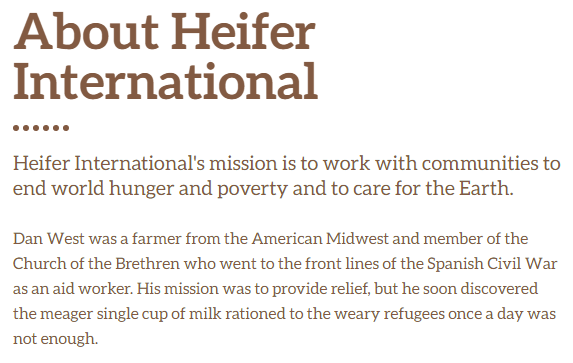
The general colors of the website are simple and not overwhelming. The colors are not overly vibrant. The main task bar is a simple blue color with a light grey bar at the top. The yellow box is a good way to highlight the area where the viewers of the site can donate money and other gifts. As we get farther down the main page of the website, the background shifts to white, allowing the other links to pop out of the page, drawing your attention to them.

The bright colors in the pictures draw your attention, and make sure you can see more ways of helping/ giving. The white background helps highlight the light blue donation button along with the other donation ads.
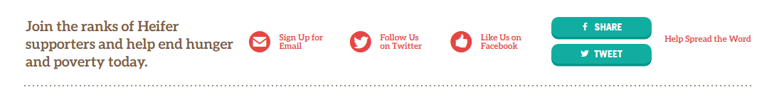
 Below this area, we have a bar with bright red lettering, advertising the organizations social media accounts. Highlighting this section in red draws your attention and encourages you to follow their pages and help spread their message. The red text draws your eye, and encourages the audience to follow them on social media which would help them spread their message to people who might not know about their organization
The font is consistent throughout the whole site and isn’t constantly changing from page to page. It’s an easy to read font at a reasonable size. The size of the font changes depending on whether the text is a headline or a passage of information. The headlines are big enough to be eye catching but not too big that they take up the whole page. The bigger text of the headline calls your attention to the article, while the smaller text makes reading the information easier.
Overall, this website is easy to interact with and full of positive information about the company and their mission. The authors make sure to get their information across in a very quick, easy to understand way. By having several bright pictures of families and kids on the first page, they encourage sympathy for their cause and make donating to them very easy and accessible. This website is full of interesting fats and information, overall I think it does a very good job of catching the readers eye and encouraging their help.
The tool I used to capture the above images was JING. I chose this tool because it was easy to download and easy to use. This tool allowed me to take screenshots of which ever section of the website I needed for my analysis. Having the images to go along with my description gives the reader a reference to go off of throughout the analysis. To create this analysis, I made sure to go through every page on the Heifer website before writing. I decided to focus mainly on the main page and the about page for my analysis because those are the two main pages that readers will see first. By focusing on only two pages, I know I limit my analysis but I thought it would be easier to analyze the main pages that the audience would see first.
I really liked the overall layout. It was easy to follow and direct with the information given. I also love how she incorporated the pictures so well into the paper.