Dabrianna Green
I chose to analyze www.refugees.org. Though there is more than one audience, the intended audience is people who are interested in supporting this particular cause. The secondary audience is anyone who is interested in learning about the cause and the organization in general. This organization is dedicated to bringing awareness to the issues involved within the refugee crisis, which corresponds with the purpose of the website. The United States Committee for Refugees and Immigrants intend to provide a space that informs onlookers of their mission as a committee, while simultaneously providing the resources for the public to get involved.
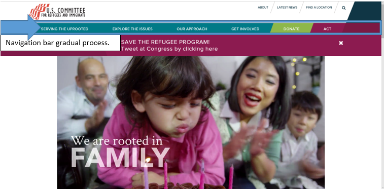
These core values, intentions, and motives appear throughout the entire layout of the site. The navigation bar reflects the gradual process the average person goes through before committing to a cause. First, they become informed by exploring the issues overall, which reflects the “explore the issues tab.” Next, they look into the approaches within different organizations, which reflects the “our approach tab.” Finally, they decide where and how they will get involved, which reflects the “get involved,” “donate,” and “act” tabs.
The context of this site is a crisp, clean layout for the web that can easily be accessed from a number of electronic devices at any location. The organization presumably chose this particular medium because in today’s society, everything is online and viewers have less patience. This also seems to be the most efficient and effective way to combine all of their efforts such as informing and collecting donations simultaneously. They do not have to worry about running out of space and they can refer anyone with questions or concerns to their website to get all of the information they need. The navigation is simple enough for all age groups and facilitates almost anyone. This medium definitely is a reflection of understanding the target.
The genre of this site is organizations. Instead of the “.com” websites generally have when their websites are for commercial use, organizations typically use “.org” at the end of their website. Many organizations have a similar setup when it comes to their websites; it often is reminiscent of a pamphlet they would give out. All of the key information about the organizations is displayed on their website ranging from their cause to their contact information. The great thing about having this website is that the organization is able to include video and have people donate directly from the site, which this site definitely makes
The interface is extremely user-friendly and everything that it should be. Though some websites tend to be carried away with all of the features they can include that results in a website saturated with widgets and unnecessary features, there is a function for everything in this website; everything included enhances the experience. The colors are vibrant enough to keep the reader interested and engaged, but not so vibrant that they assert playfulness. After all, the refugee crisis is a serious matter. However, many organizations have a tendency to come off so serious and stern (often not utilizing color, playing with font choices, & etc.) to make their website aesthetically pleasing) that their website doesn’t keep the viewer’s attention.
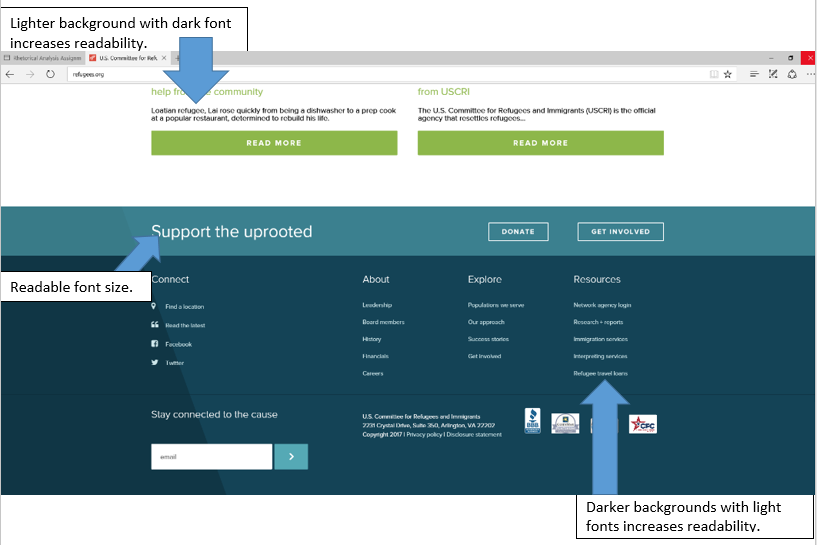
The font choice is extremely readable. Throughout the entire website, the organization does not go under 12-point font. They also pay specific attention to the color choice in regards to font. Some colors do not overlap well when it comes to text and background. This organization realized that and made sure that the darker backgrounds had lighter fonts and the lighter backgrounds had darker fonts.
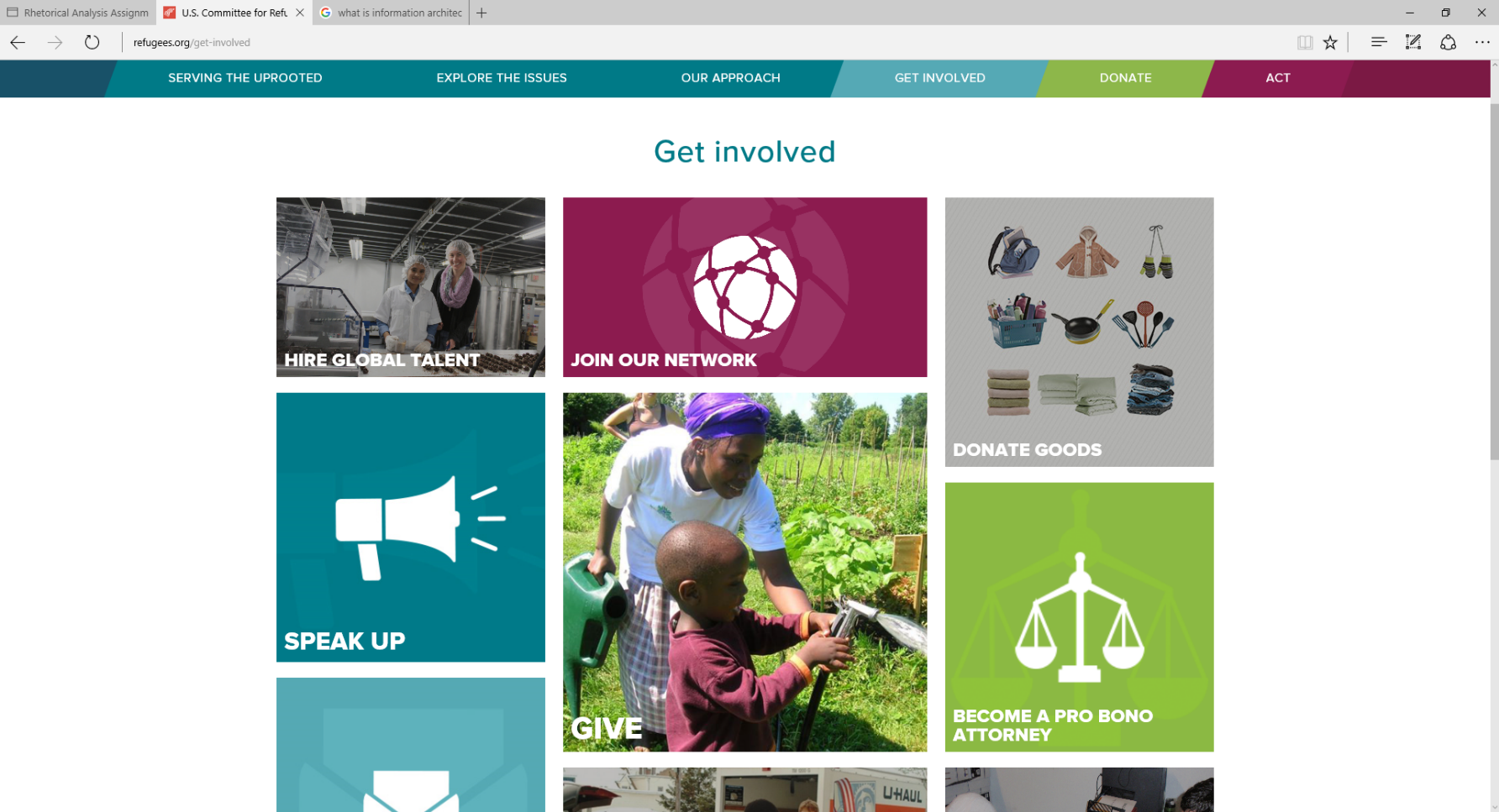
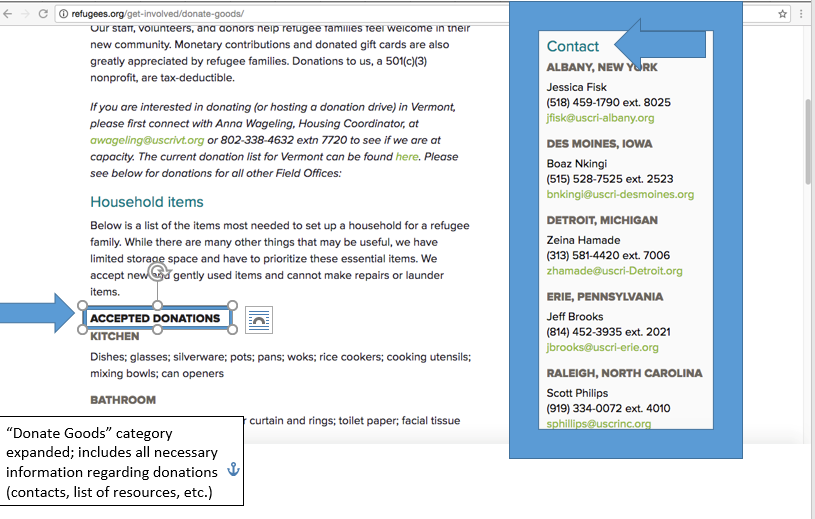
The website’s information architecture is extremely straightforward and helpful. Every title reflects the exact link it is connected to. If the user wants to “get involved” with the cause, they can easily click “get involved” in the dashboard and they are brought to several options that show them how to get involved in the area of their choice. No matter what option they chose, they are provided with a list of all of the resources they will need and contact information should they have any questions. There are many aspects to this site. However, it is very hard to get lost or have navigation issues. This makes for an effective user experience, which is especially important considering the type of site this is.
The purpose for this site is to spread awareness, gain support, and collect donations. The site definitely has bias because it is targeted towards a certain cause. There are little to no counterarguments towards this cause displayed on the site because it would take away from the organization’s purpose and mission; the organization is only going to showcase that supports their cause because they have a certain point they wish to make.
After analyzing the site and making note of everything that stood out to me, I used the screenshot feature to make my arguments about what elements enhance or takes away from the site. Along with that, I used arrows to point out each feature I wanted to highlight. I then added text boxes directly under the arrows to explain the point I was trying to make about the features in detail. This allowed me to show exactly what I was referring to directly.