
Heifer International is a non-profit organization dedicated to supporting and bettering the lives of those who live in an ill-poverished and under-developed nations. The primary audience for this webpage would be those who are interested in donating either supplies or livestock to those under-privileged or under-developed towns, cities, or even areas. This organizations webpage, as soon as it loads, asks about how frequent of a donator you are to create a more customized experience. A secondary audience may be those who are suppliers of the donated livestock or items. They suppliers would want to know the statistics of the donations and how much, or how little, individuals are donating for a certain livestock or necessity in question. For example, if a water buffalo goes for $230 of donations and they raise enough to donate seven water buffalo but a goat goes for $50 but they only raise enough for three goats, the livestock donator would want to know why individuals are choosing one over the other and work with Heifer to determine better marketing or awareness for the necessity of individual livestock. A tertiary audience would include other donation website administrators, as well as individuals looking to find a cause to join but who are not looking to immediately donate or join. Other administrators may be looking for ways to better their sites and by looking at the website markets and at individual differences in-between sites, others can better their websites. Also, other administrators may also be looking for a partnership or a joint-action and may look the site over to see what each can bring to the partnership.
The overall intention for the creation of this text media is to not only show the reasons why donation is important, but to organize the text and graphic sources in such a way that it is appealing and welcoming to new users and keeps the attention of frequent users. There is a mediated balance of text to accompany various graphics and it is created in such a way that invokes the user/viewer to look more into what the organization stands for, how their donations help, and gives current updates from the areas in which the donations go. A secondary intention for this site may also be to show how even though an area may be under-developed or lacking resources, that area is not miserable. A vast majority of the graphics used are of happy and smiling families and towns. Many donation or call to action sites show images of sad or damaged areas and children or family’s. Heifer goes against the norm and instead showcases how these areas manage to adapt and get by without the luxury’s or necessities that we oftentimes forget are not enjoyed by everyone else. The donations are meant to help improve the lives and standards of living that these individuals have, not meant to better them into a way of happiness.

(Heifer International.com)
The media for this given source is a website, as it is the best possible way to reach individuals around the globe. Using a website, the author allows a wider audience to view and observe their donation source. Using the web over print media also allows for on the spot donations and allows individuals to view and donate anywhere they feel comfortable. I found the text due to this course; however, If I found this site on my own I would still be interested. At this time, the best possible source to use is web media. It is the most up to date and modern type of media we have currently available.
(Heifer International.com)
The author is a collective of the group Heifer. I do trust the source as they not only cite and credit others, but they have up to date and modern source information. The authors are genuine and authentic and their message comes across as trying to spread the cause about their donations. Having a collective group of members develop and craft the website, I feel, creates a more dynamic site, as the more individuals who contribute the more aspects of the site can be modified and looked at from different perspectives.
The genre of this text would be informational organization. The source material wants to spread knowledge and information about their source. By using the .org option opposed to using .com, it is more genuine in its cause.
There is a wide variety of fonts within the subjects of the pages. The gift catalog text is a different from a majority of the other text styles on the page to draw attention. The explanation text starts off with a larger text size then it becomes slightly smaller as to allow the viewer get a grasp of the topics. Having a variety of fonts offered to the viewers helps to defeat the problem of the pages looking boring and the viewer potentially losing interest.
![]()
(Reference 1) (Heifer International.com)

(Heifer International.com)
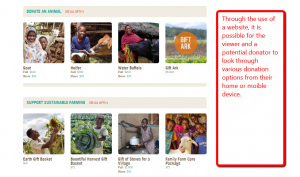
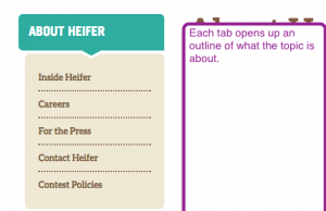
The information of the site is organized in a way that it starts with a main topic (See Reference 1) and then breaks into sub topics; the information is simplified to the viewer by breaking the sub topics into pictures to allow the viewer to see what the next page of information would be. This style of organization allows a vast amount of information to be presented at once without over loading and deterring the viewer. The information is also very straight forward and leads the viewer to where they want to go.
(Heifer International.com)
As the viewer navigates the information on each page, the next page slowly becomes less and less clustered with more links. The pages become more information based as the viewer goes deeper through the site, narrowing down on what the page is meant to convey.

(Heifer International.com)
This style of information architecture and organization is very helpful and easy to navigate for viewers. By breaking the information up this way, a viewer can easily navigate through a lot of information without feeling over encumbered or even realizing the true breadth of information given to them. The viewer can take in the information at their leisure.
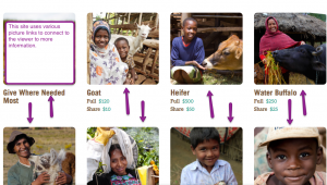
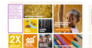
The colors of the website are simple; however, the few colors used can draw in and attract attention of the viewer. The main color scheme is composed of blue, white, and light/dark yellow. Using these three colors allows the viewer to recognize easily what color to look for when navigation the top ribbon. Making the gift catalog a different color, than the rest of the ribbon, on that is more dynamic and a different hue, draws the attention of the viewer and compels the viewer to click on it and donate.
![]()
(Heifer International.com)
(Heifer International.com)
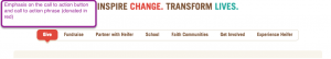
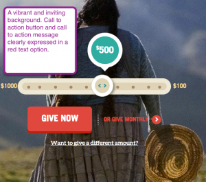
The call to action button is a vibrant darkish red color. This color is the most predominant color on all the pages, as it wants to be remembered and imbedded in the viewer. The gift catalog and all to action button are dynamic and dark as to imbue the viewer with a sense to donate.
![]()
(Heifer International.com)
(Heifer International.com)
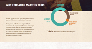
The user experience for the site is incredibly easy. The tabs and sidebars allow the user to viewer the page at their pace and reminding the viewer about the information presented on the page. The previous three sections all culminate to the user experience. The user, as the pages are navigated, is presented with diagrams, charts, figures, and more. The examples given to the viewer are presented in a simplified and colorful way as to not be over looked by the viewer. The overall navigation of the site is easy and able to be understood by viewers. There is no confusion of the pages. The pages are easily navigable and do not over-encumber the viewer.
(Heifer International.com)
(Heifer International.com)

(Heifer International.com)
(Heifer Intenrational.com)
This website is very well put together and is very easy to navigate. A first time user can go through the pages at their own leisure and not get too overwhelmed. The animations are an interesting touch as they are more of a “childish” style but fit the site nicely. The information itself is very well organized and put together and offers many various options to the viewer.
Using Jing to screen capture images was incredibly easy. Jing allows for annotations, arrows, highlighting and emphasis of text. This ease of access made relating my images back to the topic at hand relatively simple.
This project overall was very enjoyable and I learned a lot more about a website than I thought there was. The amount of thought, direction, and purpose for sites such as this to hone in on an audience is amazing.
Work Cited
“Heifer International | Charity Ending Hunger And Poverty.” Heifer International | Charity Ending Hunger And Poverty. N.p., n.d. Web. 10 Feb. 2017.
This analysis is clear and easy to understand. The use of pictures allows the reader to see an example of the category you are talking about.
The background information provided about Heifer’s background helps put the organization into perspective for readers.
I liked the use of so many pictures. I am sure all of them took a lot of time to take and use. I also love the depth of information and detail that you included in the paper.
I liked the way you use the pictures, but you should place them throughout the post more to make you analysis more smooth. It’s clear enough to understand, but there are some grammar errors that you need to fix (if you can).
You show a thorough understanding of the organization and website in your rhetorical analysis that can only be achieved by research and attention to detail.