
Rhetorical Analysis
The website I chose to analyze was the Heifer project. The reason I chose to look at their website over the other two was because of their unusual way of giving. The Heifer project allows a person to donate money by buying an animal or supplies that can be directly donated. So, the audience of the website can feel directly connected to their gift and the effect it will have. The primary audience is any available donor who would be willing to give the project any amount of money. The site makes it effortless to donate with call to action buttons located at the bottom and top of most pages. The buttons to donate are well labels and normally a bright color. The secondary audience would be anyone looking for basic information on the organizations goals, priority’s, and work. While the donation buttons are all over the website, so is information telling about all the positives the Heifer project has done over the years. The website appeals to both audiences by easily displaying information that shows the Heifer project in a good light.
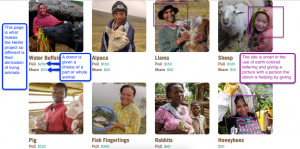
The purpose of the Heifer projects webpage is to gather donations and allow people to feel connected to the cause while donating. This is easily done by the donor’s ability to pick a specific animal that they want to give. An example would be the ability to give a donkey or goat to a person in need. In addition to this purpose, it is easily possible that the websites information is given to make it look like a worthwhile place to donate. While all the information is positive it makes, the visitor feel like they should donate. All the facts would make any person feel like they can help.
The context is displayed in the form of a website because the world has become digital. This means that the easiest way for the Heifer project to spread their message and to receive money is to be online. It allows the organization to reach a broad range of people cheaply. The website is very well connected to the social age having links for all current forms of media (Facebook, Instagram, Twitter, etc.) The organization also has a blog which allows people to be kept up to date on all things Heifer project related. The website would easily be read on a computer, tablet or phone. It would most likely be read by a person looking to donate so they would probably be in their own home.
The author would be the Heifer project which means there will be a constant bias to making themselves look good. I do trust them for the most part, but would investigate a little before donating money. The sites creditability is important because if no one trusts it then they will not get funding. They come off as being sincere and wanting the reader to understand what their purpose and goals are. The Heifer project has a reputation for helping people and seems to prove this as fact on their website. The site works very hard to make the project sound very trustworthy and reputable.
The genre would be informative due to its contents nature. All the information found on the site are facts or story that prove the organizations ability to help and farther people. It turns impoverished people into stainable ones by giving them tools.
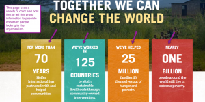
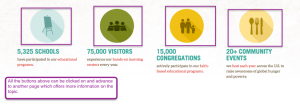
Color: As the site is shown above its use of color is vibrantly expressed all throughout the web page. The color is used to draw the reader into the story of Heifer and connect them with the people that their donation will benefit. On the lower picture, it also shows how they use color to present important information that highlights their accomplishments.
Font: The font changes to express what is meant to be highlighted on the page. Different blocks above use different fonts to make the page have differentiating blocks that don’t feel old after a few looks. The font is also used to highlight the donation links as that is the primary motive behind this website.
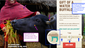
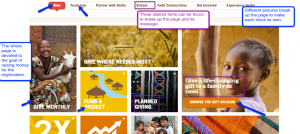
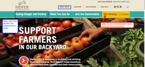
Information Architecture: The website flows together Allowing one piece of information to connect or pop up more information for the reader. The information is well laid out in its transition and interaction with the reader. In the first picture, big colorful buttons provide a pop out menu which can be clicked on to search even more information on the subject. The second picture right above provides an interactive experience that provides the donor with an interactive way of becoming informed and donating.
User Experience: The primary task of the site is to provide people with a way of donating so the Heifer project can continue its work. With that in mind they guild the user to multiple call to action buttons that allow them to donate from many different points. They incorporate two main task bars that can navigate through the website. They also incorporate social media links and at the very being ask if you’re a donor or not when you first log on
The Heifer organization does a great job in using their website to draw out possible donors and inform readers. The sites main application would be to possible donors, with a second audience being people looking for information on the organization and what it is about. Just like any other website that was designed for one of these fundraising and humanitarian organizations its purpose is to inform and collect donations to further their efforts. While the site has a natural bias in making their numbers look good. The overall feeling is one of trust due to the websites overall feeling and presentation of facts. I could not really see where the bias got in the way of the facts.
The authors ability to use a website to collect money and share information is far superior to say mailing out pamphlets and an envelope hoping for people to return with money. A website allows for a vast array of information to be presented and for interaction such as buying a share or a whole animal to donate. The author was ability to make the website informative but never made it seem redundant. The site uses Facebook, Twitter, blogs, and email to allow a person to communicate and share in any way they chose.
In closing I learned a great deal from my time on this project. From how to use JING to how website use different colors and fonts to draw a view to the information they want them to see. I used JING because it was recommended and I found it to be easy to use. The only caution I found with it was that once you saved the annotated picture that was the last time you could edit it. JING was easy to use and allowed me to make some nice points right onto the picture. I started by first looking at the website and then picking out what screenshots I wanted to use in the analysis. The website as a whole is one of my favorites due to its interactive use, colorful display, and unique way of fundraising. After I collected all my screenshots I wrote the paper portion around them to try and give it a seamless flow. I found this project really enlightened my understanding of webpages and has me look at them with a more detailed eye then before.
Work Cited
“Heifer International | Charity Ending Hunger And Poverty.” Heifer International | Charity Ending Hunger And Poverty. N.p., n.d. Web. 21 Feb. 2017.
Overall, I like the structure and the organization of the post. I like the analysis in terms of the fonts, color, user experience, and info. architecture. You have a very extensive break down of the categories and the type of components each possess. Your summary at the end really brought it all together.
I like the way that you notice how Heifer benefits those in need differently than other organizations. The integration of pictures into the post is smooth and clear as well, which adds to your argument.
The structure of the post is easy to follow and understand. The analysis itself was a great break down of the individual pieces of the website. The summary was well though out and clear.
You use great pictures to show what you mean. You separate each topic into clear, well-balanced topics so I can see what you mean. But there are a few grammar mistakes and you switch from a topic sentence to a topic word followed by a colon which doesn’t balance the essay.
From this, I can tell that the Heifer Project website is an interesting website, and not just because of it’s content. You analysis, using the JING screen captures really shows the color, font, and uses of this website and how it works.
Very organized analysis that display deep thought and observation. I didn’t know much about this website, but after reading this analysis I felt well-informed.