Lutheran Immigration and Refugee Service (LIRS)

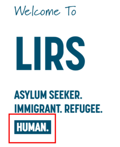
The Lutheran Immigration and Refugee Service (LIRS) is a nonprofit website that gives information about immigrants and refugees that are coming over and seeking assistance from LIRS. They also are trying to get people in the United States to help and give their time to help out and donate to help keep the organization running so they can help as many immigrants and refugees they can. This is a great website to a rhetorical analysis of. By doing a rhetorical analysis of this website, you get a better understanding of what the creator and authors wants the audience to understand and to take away from after visiting this site.

The primary audience that the author is trying to target is people that are looking or want to donate to help the LIRS, an audience that is looking to volunteer or help in any way that they can, and another primary audience that this website it trying to attract is people that are looking to adopt a child. A secondary audience that this website attracts is students that are doing research on refugees for projects. Some values and opinions that the primary audience holds are being compassionate and being kind hearted. These people want to make a difference is peoples lives and they can do so through this organization. The values and opinions of the secondary audience is that they are looking to achieve something. The author does appeal to these values and opinions because they are looking for money from the audience and they are also giving information to the audience.

This screenshot is of the navigation pane where you can find the donate button.

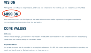
People go this website for a certain purpose. This website was created for a purpose and the way that the website looks and what the website says tells and shows the purpose that was in mind for the audience. When thinking about the overall intention of this text, the mission statement tells the audience what the intention is. “We stand with and advocate for migrants and refugees, transforming communities through ministries of service and justice.” (“Mission & Vision”). Mission statements are meant to show what the organization is trying to do. This mission statement says that they are standing with and being advocates for migrants and refugees. They are also saying that they are helping the community by transforming the community through their work. The secondary intention would to be to get money from people to help immigrants that are coming over here and to pay for the expenses that they have to run this organization. I say this because they have a donate section for people to donate any amount of money that they are able to donate.

This is the screenshot of the LIRS about us page. You can see that their mission is located here.

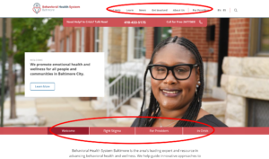
The medium of this is a website. The authors chose this because it is a super easy way to get all the information out to the public that they need to, and they can put any and all information that they want to. Also, with having technology being the way of the future, it just makes sense to put all of the information on the internet. Because this is a website that means that I was able to find this on the internet. The historical conventions for these types of text was over the phone calls, brochures, letters, and pamphlets. There are many ways for the reader to interact with this website. The reader will interact with this website over their phone, over a desktop computer, and over their laptop. This website is very easy to access, and it makes for easy use and it is very easy to move around in their website.

This is the Refugees page. This page explain all that they do to help the refugees. what is circles in red is a tab where you can find all the information on what they are trying to accomplish and what they do for the refugees, children, migrants and gives you the page to the travel loan portal.

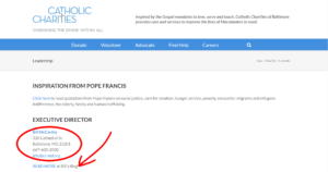
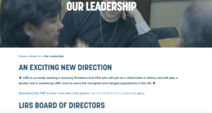
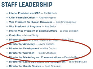
The way that the author writes the information really makes a difference in how the reader reads a text and it also helps get the reader to understand really what the author is trying to say. The authors establish personal creditability by showing the numbers of volunteers, how many people they have helped and how many partners they have working with them. The author wants to come across in a very accepting way. They do not want to force anything upon the reader. The author comes across as very informative. They just wanted you to know the information so you would donate or think about giving up some of your time to help them out and volunteer for them. I do not feel as if the author has a certain reputation to hold. I feel like that the authors really just wants to inform people about what is going on and I feel like they do a very good job at that. Since this website is a nonprofit organization, there are normally this many authors for the website. The authors include: Board Chair – The Rev. Michael Rinehart, Vice Chair – Mrs. Linda Stoterau, Board Treasurer – Mr. Dennis Wieckert, Board Secretary- Mr. Evan Moilan, Executive Member at Large – Ms. Judith Benke.

This is the Leadership page where you will find the executive members and the
At-Large members.

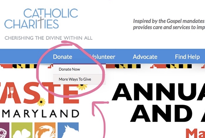
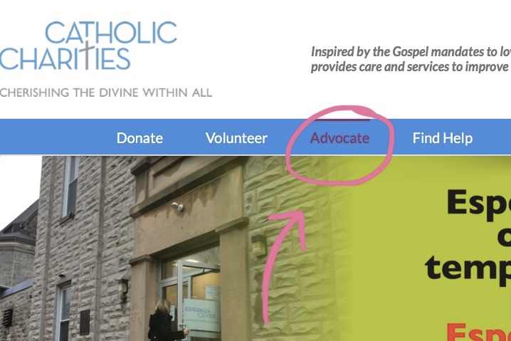
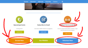
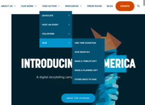
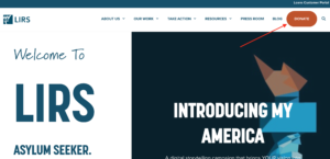
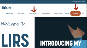
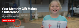
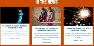
This website is a nonprofit website. Which makes this text a hortatory because the author is trying to encourage the audience to either help them by volunteering or help them out by donating money. This website is similar to other websites in this genre because they are asking for help, meaning your time. They are also asking for you to make a donation. They give you sad information about the immigrants and the refugees to play to your feelings and your emotions to make you want to help. There are some key features that make it a hortatory. One feature that makes it a hortatory is the donate button at the top right-hand side of the website. Another feature that shows it’s a hortatory is the take action section in the middle at the top of the page.

This is where you will find the “Take Action” in the navigation pane. Which allows the users the opportunity to give back and help out. 

Works Cited

“Lutheran Immigration and Refugee Service.” LIRS, https://www.lirs.org/. Accessed 11 Feb. 2019.

“Mission & Vision.” LIRS, https://www.lirs.org/mission-and-vision/. Accessed 11 Feb. 2019.

LIRS Rhetorical Analysis

The Lutheran Immigration and Refugees Services (LIRS) has been around for almost 80 years. Their mission statement is, “As a witness to God’s love for all people, we stand with and advocate for migrants and refugees, transforming communities through ministries of service and justice” (LIRS). LIRS’s webpage is effective because it is organized in a way that is easy for viewers to navigate and understand.

The first thing to understand about this webpage is that its’ intended Audience is for Donors and supporters. There is a button of the word Donate that stands out from the rest of the words and buttons on the screen (LIRS).

There is also a tab under “our work” that says, “become a foster parents” (LIRS). So, this is also intended for people looking to help asylum children and become their foster parents. Furthermore, this website could possibly be for people doing research on asylum seekers or want to help. This is shown through the button for “take action” that pulls down different options like, “Advocate”, “Host an event”, “Volunteer,” or “Give”(LIRS). The people interested in this web page most likely support asylum seekers and wish to help make a difference for families who are seeking safety.

Overall, the purpose of the website is to get people to donate to this cause. As mentioned above, there is a Donate button that stands out from the rest to get people to support their cause. In addition to the donate button, there is a “give” button under the “take action” tab. A few other purposes for this webpage is to raise awareness for asylum seekers and persuade readers the importance of protecting and helping refugees.

The author of this website is the organization Lutheran Immigration and Refugees services. LIRS was founded in 1993 by churches that saw the need to provide asylum services during World War II (LIRS). They continue to this day to provide support and shelter for refugees, children, and migrants. In today’s world, most organization need a website to be known about. The context of this medium is a website off the internet. The author most likely used a website because when people are searching for information on asylums, they are more likely to use the internet or “google” to get more information on that topic.

Keeping this topic in mind, the genre of this text can be considered a current social justice issue. A more specific genre is support for asylum seekers. This is shown through the organizations logo of the statue of liberty’s burning torch (LIRS). The statue of liberty usually represents light to freedom. In context to asylum seekers, the statue of liberty could represent them trying to find the light to freedom.

LIRS website is also effective because it has strong affordances. Meaning, it has strong visual, linguistic, and spacial representation that are easy to understand. Visually the website is user friendly because it looks similar to other popular nonprofit websites that we see. For example, the website shown below is of the U.S Committee for Refugees and Immigrants (USCRI). Both LIRS and USCRI pages look similar. They both have their logos at the top left corner, different drop down menus, and a “Donate” button on the right hand side that stands out from the rest of the buttons.

Linguistically, this website is effective because it is inviting. The first few words you see are, “welcome”, or “introducing” (LIRS). The use of language is powerful in getting its message across and gaining support from viewers.  In addition to its powerful language, the way the website is organized is powerful. Considering this webpage resembles others, it is easy to maneuver. The pull down tabs are easy to follow. The different pull down tabs say, “About Us”, “Our Work”, “Take Action”, “Resources”, “Press Room”, “Blog”, and “Donate”(LIRS). A cool thing about this website is that if you click on one of these tabs, you can click back on the logo in the top left corner to go back to the home page.

To close, the creators of LIRS effectively displayed their website because it was easy to comprehend for viewers. Thus, allowing them to fulfill their greater purpose in gaining support and donors for asylum seekers.

Works Cited:

“Lutheran Immigration and Refugee Service.” LIRS, 6 Feb. 2019, www.lirs.org/.

“U.S. Committee for Refugees and Immigrants”, 2017, refugees.org/.

Empowered Nonprofit Through Mode and Affordance

Erin Stephey

Dr. Licastro

ENG256

10 February 2019

Empowered Nonprofit Through Mode and Affordance

Lutheran Immigration and Refugee Service is a nonprofit organization that is working towards protecting and empowering migrants and refugees through their Lutheran faith. This organization has helped many migrants and refugees and will hopefully help hundreds of thousands more. Not only do you have the option to donate to help this organization, you can also volunteer or become a partner through your church, service, organization, etc. This nonprofit utilizes a website to reach their audience and clearly define their intended purpose.

When you first visit the Lutheran Immigration and Refugee Service website you see the navigation bar at the top, followed by a split hero image that takes up the majority of the homepage above the fold. Below you will see part of the hero image that is displayed on the homepage of the LIRS website.

screenshot from homepage

On the left side of the hero image there is text that says “Asylum seeker. Immigrant. Refugee. Human.” Viewers that read this side of the hero image can see that the word “Human” is emphasized because of the linguistic and visual changes that are apparent with the word, such as the background blue color as well as the white font color.  By looking at this text as well as the rest of the website above the fold, you understand that the genre of this website is a nonprofit website. If you look at the websites of other nonprofit organizations you will see that many of them have a hero image that either has a picture of people in need or state a short blurb of how they wish to help others. Other nonprofit organizations also have a more eye catching tab for donations to be made or a tab for people to volunteer to help the organization.

screenshot from IRC homepage

LIRS is one of those nonprofit organizations that has a navigation bar with one tab that catches the eye of those visiting the site because the font of the text saying “DONATE” is white instead of blue, like the other options in the menu, and it has a large orange colored bubble around the text.

screenshot from homepage

Because of this eye catching button, we can infer that the intended audience is towards donors as well as volunteers because of another tab labeled “TAKE ACTION”.

When taking a look at the “ABOUT US” tab it tells the viewers the background history of the nonprofit organization. This tab also has a dropdown menu that states the mission and vision statements, partners that work with and help LIRS, as well as the staff and leaders of the organization. The dropdown menu gestures improve the user experience by letting the viewers know when they hover over the tab, more options will fall underneath.

screenshot of Navigation Bar from homepage

From these pages we get a sense of who the authors of this website are. There are multiple names listed under the “OUR LEADERSHIP” tab so this means that there is a large group of people contributing around the United States from California to Maryland and from Texas to New York. When looking at each name individually, the Board Chair is titled “The Reverend Michael Rinehart.” Because of this title people believe that his credibility is legitimate as well as the information included within the LIRS website. Also looking at the partners that LIRS has, this is a potential secondary audience because in this tab there is a place to fill out information to become a partner. Whether the partner is a church, a service, or a foundation, these potential partners can view the existing partners of LIRS in the “OUR PARTNERS” tab as well as at the bottom of any page, there is a button that says “Partner Login” where you can access specific information regarding becoming a partner.

Because of the sections labeled “HISTORY” and “OUR WORK” that describe what the organization has done and will continue to do, this website is very informative. Viewers can access previous efforts that have helped many migrants and refugees along with future efforts that LIRS is hopefully going to continue to work towards. Not only is the website informative, but it is engaging, inviting, and involved because of the noticeable call to action with the “DONATE” button and the sans-serif fonts used throughout the website.

screenshot of My America page

Previously mentioned, this button is very eye catching so more people are inclined to visit that page and donate money to the nonprofit organization. The medium that the LIRS authors chose to use was web. I think the authors chose this particular medium over others because today more and more people access information through mobile devices since it is more convenient. People are able to look up information quickly, donate money easily, sign up for updates about situations occurring, become a partner with LIRS, share their own story, etc.

screenshot of My America page

This is much more convenient and accessible than looking at a flyer posted somewhere that tells people to go to a website or send money to a specific address or come into a nearby office to sign up, etc.

I think that the main intention of LIRS is to receive money from donors as well as help from volunteers that can help the nonprofit organization reach their mission and vision statements. I also think the authors of LIRS intended for more awareness of the nonprofit organization as well as more awareness about these current situations occurring today.

After analyzing the website entirely it is clear that the Lutheran Immigration and Refugee Service organization utilizes their website to effectively communicate their mission to their intended audience of donors and volunteers. Because of all of the modes and affordances within the website, this makes the website that much stronger and user friendly.

References

LIRS. “Lutheran Immigration and Refugee Service.” LIRS, 6 Feb. 2019, www.lirs.org/.

IRC. “International Rescue Committee (IRC).” International Rescue Committee (IRC), 2019, www.rescue.org/.

The Purpose of a Nonprofit Website

The Lutheran Immigration and Refugees Services is a non-profit working to improve immigration policies and help immigrants and refugees. This organization has been around for almost 80 years. They are “a champion for refugees and migrants from around the globe”(LIRS.org). This essay will be a rhetorical analysis of their online website www.LIRS.org. The design and intentions of the author of this website serves a specific purpose to make the audience take action in their goals.

The genre of this text effects how the site is organized and how that will reach the audience. A broader genre would be that it’s a website, but a more specific description would be that is non-profit.  The structure of the text looks like the template most non-profits use with the links at the top and images taking up the whole length of the screen.

The website aims for a specific audience that the organization wants to attract. The intended audience for this website is people willing to donate to LIRS or for people looking to become more involved with refugee relief. The secondary audience may be people who are looking to raise their awareness on immigration issues. The values that these audiences hold would be acceptance and community. Their opinions would reflect wanting refugees and immigrants to have a better life in America with the help to the organization. This audience would be more open minded to accepting immigrants in the U.S. The author appeals to these values and opinions because of the information and access on the website such as the donate button and the take action section of the site.

The donate and take action links also lead to the intentions of this text. The overall intention for the text is to take donations and volunteers in for the organization. At the top of the website there is a donate button that is orange while the rest of the site is blue and white. The attention to this button serves an important part of their purpose. A second purpose is to spread awareness about immigration issues and what LIRS does. This is seen through the parts of the website such as the about us tab and the link to their blog. Providing these links will draw the audience towards the sites purpose.

Allowing for a medium to support the sites purpose is important. The medium of this text is the Web. I think the author chose this particular medium because it can hold a lot of information and be very easy to navigate. I also think the author took into account how important the internet is in today’s society and the access many people have to the Web. You can find this text through searching for non-profit immigration and refugee organizations and that will send you to the website. This website is filled with visual, spatial, and linguistical aspects that make the website successful. LIRS “was founded in 1939 by Lutheran churches in the united states to serve uprooted people during world war 2.2” (LIRS.org). This organization has been supporting people in need for generations and they have adapted to the type of people who need help in today’s political climate and adapt to new ways to spread their mission such as with this website. Old forms of spreading their mission existed through public speeches at national council meetings. The social and cultural connotations in this text relate to the current immigration problems including improving immigration policies. This is a big controversy within our culture. The colors used on the site are different shades of blues and orange. The word welcome is used throughout the website. On the home page there is a picture of the statue of liberty hand and torch.

There are also images of refugee children and families.

Readers will react with this text through the links and opportunities to donate and volunteer. Readers would access this text while on their phone or laptop however it is a site they would use while sitting down in order to focus on the content. It is a text that could be used in private or public settings.

The author has to consider many aspects while using this medium. They establish credibility through a tab on the website that leads to a board of directors, executive committee, staff leadership and at-large members with their names and positions. The site also states the board of director consists of 17 members who “have knowledge of and commitment to refugees and immigrants” (LIRS.org). Looking at the staff leadership someone can make a guess that a more specific author could be the director for marketing and communications, director for outreach, director for development, or director for advocacy because all these positions play a role in this website.

I trust this source because it is run directly by the organization. It is important to trust the source because if someone donates money, they need to know it is legitimate. The author comes across as a group of individuals working together for a social justice issue, they believe is important. They also have links to their church, service, and foundation partners. These relationships show the authors involvement with partners who work for people. The organization itself does not have a great reputation with leadership according to reviews on glassdoor.com however this would be done through research past the site text. The text does not support this reputation.

This website uses calming colors and easy to read fonts so that the audience can quickly and easily understand the purpose of the website. The architecture of the site is easy to navigate like most nonprofit websites so users can effectively use the site. All of this enhances the users experience and allows LIRS to carry out their mission with the public to a full extent.

References

Arola, Kristin L., Ball, Cheryl E., Sheppard, Jennifer. Writer/Designer: A Guide to Making Multimodal Projects. Bedford/St. Martin’s. 2014.

“Lutheran Immigration and Refugee Service Reviews.” Glassdoor, www.glassdoor.com/Reviews/Lutheran-Immigration-and-Refugee-Service-Reviews-E915690.htm.

“Lutheran Immigration and Refugee Service.” LIRS, 6 Feb. 2019, www.lirs.org/.

Lutheran Immigration and Refugee Service

Rhetorical Analysis 

The Lutheran Immigration and Refugee Service (LIRS) provides a website that encourages the community to help advocate for the global refugee crisis that the world is currently facing (Lutheran Immigration and Refugee Service). LIRS was founded in 1939 in the United States by Lutheran churches (Lutheran Immigration and Refugee Service). The organization was first created to help those who were uprooted during World War II, and their mission has grown since (Lutheran Immigration and Refugee Service). LIRS helps refugees, asylum seekers, migrants in detention, unaccompanied migrant families and other vulnerable individuals (Lutheran Immigration and Refugee Service). The Lutheran Immigration and Refugee Service’s website is an accessible resource for information that helps users understand the confusing global refugee crisis in a way many people can understand (Lutheran Immigration and Refugee Service).

The authors of the Lutheran Immigration and Refugee Service are members of the organization (Lutheran Immigration and Refugee Service). While many various members of the organization may have created the website, the main contributors may include Danielle Bernard, the Director for Marketing and Communications (Lutheran Immigration and Refugee Service).

The intended audience of the Lutheran Immigration and Refugee Service’s website may include immigrants, refugees, vulnerable individuals, donors, political activists or other non-profits (Lutheran Immigration and Refugee Service). The website provides information on how to receive help from the organization, which helps reiterate that the main intended audience is refugees, immigrants, or vulnerable individuals (Lutheran Immigration and Refugee Service). The website allows for information on the overall crisis and provides information on how individuals can help advocate or volunteer for the organization or offers an option to donate to the organization which targets to their secondary audience: political activists and donors (Lutheran Immigration and Refugee Service).

The media’s context is a nonprofit’s online website that portrays a serious tone (Lutheran Immigration and Refugee Service). An online website is the easiest way to display information (Lutheran Immigration and Refugee Service). The genre of the content on the website is informative and persuasive (Lutheran Immigration and Refugee Service). The website provides information to website users about the refugee and immigrant crisis and uses their platform to persuade others to help by donating or volunteering (Lutheran Immigration and Refugee Service).

The purpose of the Lutheran Immigration and Refugee Service’s website is to inform readers of the global crisis and provide a resource for immigrants or refugees seeking help (Lutheran Immigration and Refugee Service). The second purpose of the website is to encourage people to advocate, take action or donate towards the cause (Lutheran Immigration and Refugee Service).

Mode Analysis 

Spatial:

The overall layout of the web page is user friendly, clear and accessible. The page has a menu on the top left, and provides menu options including “About Us,” “Our Work,” “Take Action,” etc. The top of the page has two columns of information, but changes into one column and the page ends with an address and menu options to visit their privacy policy, their financial information, their career site, etc. The page follows the same layout as most successful nonprofits. The layout may prove to draw people in, which is why it is used by many nonprofits.

An example of similar layouts used by non profits are shown in the picture above from LIRS and The Red Cross. Both websites have a menu across the top, a single column feature that includes picture icons and words underneath that either portray a message, or provides a link to the topic for more information.

Both The Red Cross and LIRS also have a specific column section on their page for donations. A section dedicated solely to donations may stand out and persuade viewers to donate to the organization.


Visual:

When first opening the web page, the dark theme colors stood out. The colors include: blue, white and dark orange. The dark orange is used for the “Donate” button for emphasis, which jumps out to the reader. Since the dark orange stands out and draws you in, the organization may hope that more people will recognize the donate option.

The website includes various of pictures including the hand of the Statue of Liberty, a sparkler and children. The picture that displays the hand from the Statue of Liberty may help remind viewers of our ancestors entrance into America or may reference American’s rights to freedom. The sparkler and children pictures are used to help draw viewers into the blog posts corresponding to the pictures.

White or blue font is used throughout the page. The font style differs throughout. For example, one section of the website includes thin, fancier lettering, while other sections of the website include thick lettering with a mixture of small and large font. The more critical information is bold faced. The difference in lettering may help reiterate the website’s call to action. The thick bold lettering may be more serious and informative, while the thin fancier lettering calls for individuals to use the hashtag on social media.


Aural:

The aural mode is silence, as there are no video or sounds played on the website.

Gestural:

There are no gestural modes displayed throughout the website

Linguistic:

The wording used throughout the website is formal, firm, yet simple. The website has both paragraphs and titles. The paragraphs are short enough to get the point across, which makes reading a lot of information easier for the viewer.


Works Cited:

Lutheran Immigration and Refugee Service. History. n.d. 11 February 2019.

Our Leadership. n.d. 11 February 2019.

Resources. n.d. 11 February 2019.

Take Action. n.d. 11 February 2019.

Different Doesn’t Mean Better

Different doesn’t always translate to better. Diverging from the standard can lead to the new content standing out, but it could also be an utter failure. There is a reason after all that a norm exists, it tends to work all the time. So, while the Non-profit website Lutheran Immigration and Refugee Services or LIRS has certainly changed the standard layout (however mildly), these changes did not necessarily lend themselves to a website that was intuitive to move around.  However, the website isn’t impossible to navigate, and after exploring it for a time it’s layout does begin to make sense. It is only the aspects of the traditional non-profit website that they changed which causes issues.

Starting with the most blatant issue, the design of this website is not what could be referred to as optimized or intuitive. But, they have at least deviated from the norms of the non-profit and changed the dark greens for a dark blue, not groundbreaking but certainly different.  Aside from this color change, most everything else that can be associated with a non-profit is present on this site (ie. Name/Logo in upper left hand corner, Donate button in bright color, drop down menus, etc.).

Image 1

However, this isn’t the main issue with the home page. The main issue is that after reaching this section of the homepage.

Image 2

There is no indication that there is any more content. An attentive web user may notice that there is still more space on the page due to the scroll bar, but the page has nothing to indicate this is the case. Considering the fact that the individuals using this page may not be as tech savvy as its creators, this seems like a rather grand oversight on LIRS’ part. Not ensuring that the audience is aware of the extra content on this page doesn’t score LIRS many points when it comes to maximizing the yield of their homepage.

As previously stated, this is a non-profit website, and if the orange “Donate” (image 1) button didn’t already make it clear, the goal of this website is get funding to continue their outreach projects. However, this site also seems to offer financial assistance for individuals seeking asylum in the US (Image 1 shows a portal to the loans section in the upper right corner). 

Image 3

This page has general overview of the intent of this program and its goals for those individuals who would enroll in it.  While no precise details are provided, the content of this page seems to suggest that loans are not intended for making money, but as a tool to assist displaced people become familiar with new/different economic system.  There are a few more portals to news stories, as well as the history of the organization (see the “About Us” portal); information does not seem to be the primary interest for this site. Rather, they seem to focus on Donations and the Loan program.

On the note of the loan program, the intended audience for this site does change ever so slightly. Obviously, the site is meant as tool for those individuals who have used are in the process of using the loan program, so one of the primary audiences is asylum seekers who are enrolled in the loan program. Additionally, this website is meant for Lutherans who are refugee activists or those individuals who believe in Lutheran ideals and are looking to engage with a religious outreach program. While this site does seem to have some opportunities for volunteer work, it is again obvious that they are more interested in financial backing than.

This page was produced by the LIRS group, and more specifically Danielle Bernard the director of marketing and communication (the exact designers of this page are not listed on this site). It’s layout mostly follows the designs that are common to non-profit sites, with some non-standard services such as travel loans. While it does serve as informational site, including the history of the organization and their current projects, it’s primary goals are donations and the loan program (likely funded by donations).  Beyond that, it doesn’t make many pressing arguments. While images are used on this site, they aren’t meant to be striking or pitch a strong message. This site seems to use its media to accent the articles instead of support them. What images that are used are often hidden behind walls of text, or cropped to make for space for paragraphs and empty space. Too much of this website is empty space that could have been filled with striking photographs and/or video’s about their organization. (3/10 to much empty space)

Works Cited

“LIRS.” LIRS, Lutheran Immigration and Refugee Service, www.lirs.org/. Accessed 11 Feb. 2019.


An Analysis: The Lutheran Immigration and Refugee Service (LIRS)

A Rhetorical Analysis: The Lutheran Immigration and Refugee Service

Introduction

Nowadays, various forms of texts will usually have subliminal messages within them that require further thought in order to unbox the true purpose and intention of an author. A rhetorical analysis of a piece of text is a beneficial and effective method in identifying the ideas an author wants to communicate. Writer/Designer: A Guide to Making Multimodal Projects describes five areas that help determine the author’s purpose which is: author, audience, genre, context, and purpose; and five modes that aid in communicating the message such as: visual, linguistic, aural, spatial, and gestural (Arola, Sheppard, Ball 22). I will be analyzing each of the five areas as well as the various modes and how they contribute to the success of the Lutheran Immigration and Refugee Service (LIRS) website.

Author

Who is LIRS? It’s easy to determine the mission and purpose of non-profit organizations just by clicking their “About Us” page, but what makes the organization credible? Deeper into the “About Us” page lists the leaders of the organization. While the Chief Executive Officer, Pat Nichols, is currently the person leading the organization towards accomplishing its mission. The LIRS website posted a short article about his past experience which makes the website visitor more inclined to donate if they knew the person is trustworthy.

The other important contributor to the success and reputation of LIRS is Danielle Bernard, the Director of Marketing and Communications. Although Ms. Bernard isn’t directly involved in the creation of the website, she is responsible for maintaining the organization’s public image, which includes how they are represented on their website. The website is multimodal, with a greater concentration on the visual, linguistic, and spatial modes. Visually, the layout of the website is minimalistic. 
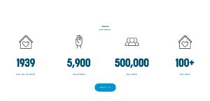
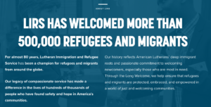
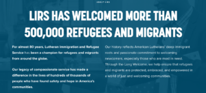
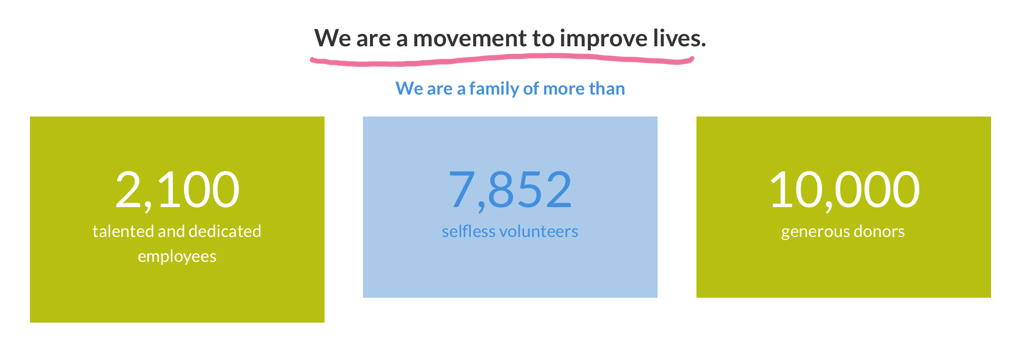
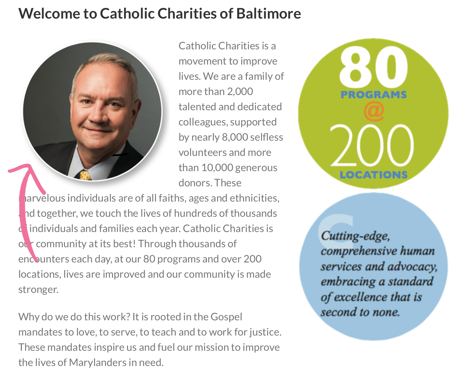
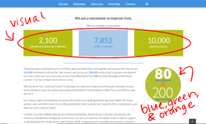
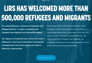
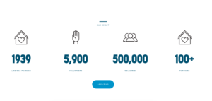
It is easy to conclude which information provided are important based on the sizes of the fonts and which information they want to emphasize. Instead of writing out “Since 1939, over 5,900 volunteers and over 100 partners, we have helped welcome 500,000 immigrants, asylum seekers, and refugees,” simple figures and large numbers were more effective and visually appealing to the viewer. 
Spatially, the website is designed very well. Starting from the homepage, the facts, texts, and images blend well together and doesn’t strain the visitor’s eyes when scrolling. All of the information in the website are organized accordingly based on their topic. The menu tab is listed on the top of the page. The gestural mode found in the website is mainly from the arrows pointing down from the menu tabs, which also coincides with the spatial mode because of the organizational pattern of the website. There was a video on the website found within the “Take Action” tab under the “Volunteer” and “Detention Visitation” which aligns with the aural mode, however, most of the website is text and visual therefore the audience will be navigating in silence. Linguistically, the text throughout the website is short, concise, formal, yet coherent. The texts doesn’t require a high level of vocabulary and doesn’t take too much time to read. The author is very clear with their intentions and purpose.

Audience

The first step in determining an author’s true purpose is to analyze the intended
audience. It is evident that the primary audience of the Lutheran Immigration and Refugee Service (LIRS) website are donors. The website designer intended the entire website to be a simple color scheme, with mostly white and blue text, but the designer purposefully created the “DONATE” button to be in contrast with the rest of the homepage with a bright red bubble around it.The secondary audience of the LIRS website are Lutheran church members and political activists whose focus is on immigration. The entire organization was founded by the Lutheran Churches throughout the United States and the focus of the entire organization is to aid in the transitions of migrants fleeing their homes which has been a political issue many countries face to this day.

Genre

The LIRS website is classified as a non-profit organization. According to the article What is a Nonprofit? nonprofit organizations serves public interests and generate profit to further their cause, not to harvest income (Brownsword, et al What is a Nonprofit). With that being said, nonprofit organizations have to be transparent and open to share where the money generated goes. For LIRS, it can be implied that donations are one of their sources to financially support the organization and the people they help. It is imperative for the intended audience, the donors, where the money goes. LIRS offers a PDF file for their annual financial statements which dates back to as far as 2013. The author of the website provided a pie chart to visually show how much money is directed to the programs they offer, management, and fundraising. This amount of transparency between the donor and the organization builds trust between two parties and improves the credibility of the organization and the mission LIRS is trying to achieve. 

Context

As society become more connected through technological advancements, creating a website is the most efficient way to reach a broader audience. According to the International Telecommunication Union, approximately 3.9 billion people around the world have access to the internet (ITU, Statistics). With that many people with the ability to access LIRS, they are able to successfully advocate for their cause, raise the necessary funds, and evangelize and spread their religious beliefs everywhere in the world. The organization isn’t limited to members of the Lutheran church. The website is accessible through various mediums including mobile phones, laptops, computers, and tablets. This fluidity in accessibility allows anyone at any time of day to visit the website, learn more about the organization, and possibly donate to the cause.

Purpose

So, what is the author’s purpose for the LIRS website? The first thought that came into my mind was to assist immigrants, asylum seekers, and refugees resettle in the United States. As soon as you visit the website, the website designer
strategically provided a visual and linguistic mode that captivates the visitor and encourages them to continue to learn more about the website, hoping that the information provided will accrue donations. Starting from the homepage, large bolded words quickly draws eyes to the word “HUMAN” as a singular description for the words “Asylum seeker. Immigrant. Refugee.” After further analysis of the website and the content provided, the overall intention was to gather donations to fund the resettlement of the migrants as well as the programs offered by LIRS.

Conclusion

The Lutheran Immigration and Refugee Service is an excellent example of a well-designed website the hasn’t lost its integrity on their path to achieving their mission and purpose. The website itself is great in integrating the user and welcoming them to the organization. The contents of the website answers questions that the visitor has yet to ask in a short and clear way. It’s easy and efficient to navigate around. The organization appears more credible and reliable due to its appearance on a computer and the information isn’t overwhelming to the audience. However, the more I navigate around the website, I’m left asking myself “where’s the rest of the information?” While minimalistic appearance and information can be more inviting, the website lacks specificity. The small links within the texts could be placed on a separate tab on the menu bar. For a random visitor to come across the site, they won’t be able to fully into the website unless they spend time clicking through every link. Overall, the website does a great job at presenting itself and its values through the website and applying the various modes of communication.

References

Arola, Sheppard, & Ball. Writer/Designer: A Guide to Making Multimodal Projects. Boston, Bedford/St. Martin’s, 2014.

Brownsword, Tracey, et al. “What Is a Nonprofit Organization?” Fit Small Business, Fit Small Business, 1 Feb. 2019, fitsmallbusiness.com/nonprofit-organization/.

ITU Contributors. Statistics. Accessed 2018. Retrieved from www.itu.int/en/ITU-D/Statistics/Pages/stat/default.aspx

The Rhetorical Analysis of the Esperanza Center of Baltimore

screenshot of Catholic Charities logo

The rhetorical analysis is everywhere andis a method of describing the context in which an author wants to communicate their purpose or call for action to the intended audience in a genre (Arola, Sheppard, Ball 22). We use it to analyze text that you read or media you listen to or watch. According to Writer/Designer, “the five areas to address -audience, purpose, context, author, and genre…” I analyzed the website catholiccharities-md.orgthat provides a strong sense of audience, purpose, context, author, and genre by using organization and persuasion to help their users learn more information about their organization.

AUDIENCE

The audience, according to Writer/ Designer “is the intended readership for a text.”The Esperanza Center is a non-profit organization who’s intended audience would be people who want to donate to this organization since they have that option on their main page. The author tries to get the intended audience’s attention by using the donate button and explaining their mission. I believe the secondary audience are religious members (Catholic) because they want to help their Catholic community or political advocates. The Catholic people are drawn in mainly because it’s an organization created by the Catholic Church. They provide more information about the catholic charity under “our History” tab. There is also a page for users to go to that says “Advocate” to show the user their intended purpose for this organization. I feel they achieved this area because looking at their mission and stories about how they’ve impacted the community draws a bigger picture that they are determined to help their community and I would want to donate since it’s easy to get to that donate button and everything is right there on the landing page (home page).

screenshot of Catholic Charities homepage

PURPOSE

Purpose is the overall intention of the author in their text (Arola, Sheppard, Ball 22). Esperanza Center of Baltimore’s purpose is to help serve the families within Baltimore and to who help like the “people living in poverty, individuals with intellectual disabilities, immigrants and seniors.” Their mission is noticed on their homepage which allows users to understand their mission which brings the community together to help those in need within the Baltimore area. They add how many people are involved in this process to thank them which sounds genuine. I think they did good in serving the purpose of trying to get people to donate and pushing their mission statement with testimonies on the website. The idea is to get new people to donate and with their testimonies and commitments show new people they are a dedicated organization built on helping the Baltimore community.

screenshot of Catholic Charities impact page

CONTEXT

Based on Writer/ Designer, the context is the what, where, and how of the source. Inthis source, you would it online since it’s a website which allows users to be interactive between the pages rather than a magazine. I feel the author chose to use a website to be able to reach everyone on the online community and spread the word rather than our own community. Where can they see this? They can read and look at content while sitting at a desk on their computer or on the go using their phones or tablets. This source would be found under non-profit or religious websites that surrounds the idea to help others in the Baltimore, Maryland. I think this was good because the author needs to think ahead of our time and do things that would be used later on. The use of flyers and advertisements are great but to be able to reach the greater mass, the use of the internet is the ideal way to go. The author achieved that by creating the website for public consumption. Below, you can see there is the mobile device version and desktop version which shows that they are both accessible not matter which medium you decide to view it on. That helps the user because they can access it anywhere and there are multiple ways to view it.

screenshot of Catholic Charities homepage on mobile device


screenshot of Catholic Charities homepage on desktop

AUTHOR

To find out who the author is of the Esperanza Center was a little difficult to know whether he is behind this whole website. The believe the intended author is William J. McCarthy Jr. who is the executive director of the Esperanza Center. You can locate a picture of him and the organization’s contact information on the “about us” page. The addition of a letter format on the “about us” page signed by Mr. McCarthy adds a personal and authentic touch to the site. Mr. McCarthy also has more information about him on one of the links below his letter and also has a blog where he posts many things as to their mission and what the catholic church does to help others. However, I cannot tell if he is a credible source since he is the executive director, he does have a bias towards his organization. Since, they are trying to reach out to their audience to get more attraction, it’s safe to say that bias would be a great choice to make an organization better than it probably is. The purpose for the Esperanza Center is to get the attention of the primary and secondary audience which they succeeded in with the number of donators and contributors they have within their organization.

screenshot of Catholic Charities about us page


GENRE

The genre “helps us recognize how to group similar texts and understand their communicative purpose” (Arola, Sheppard, Ball 22).  The Esperanza Center is projected as a non-profit and religious genre. Based on the business dictionary website, non-profit organizations are “association, charities, cooperatives, and other voluntary organizations formed to further cultural, educational, religious, professional, or public service objectives.” I feel that this was accomplished because the website follows what other non-profit organizations use as their template for their websites.

screenshot of Stevenson University homepage

As you can see, Stevenson University is also a non-profit organization that has a similar format the Esperanza Center Website. They both have their logos in the upper left-hand corner and search button on the upper left corner. The pages to find more information are located in the middle and has a pretty consistent color scheme going on for each website. Below you can see the similarities on the Esperanza Center website.

screenshot of Catholic Charities homepage

This source uses multiple modes used to grasp the attention of their readers which was were linguistic, visual, spatial and gestural.

screenshot of Catholic Charities volunteer page

The linguistic mode explains the author’s thoughts in written text but is helped by visual mode to represent what the organization does. For example, on their volunteer page, users will find information on ways you can volunteer at their facility then shows a photo of volunteers helping serve food.

screenshot of Catholic Charities events page

The spatial mode serves as a visual alignment where the user can focus on the information needed in a organized way that makes it interesting. For example, in the events page, there are small calendars on the right hand side that for a overall visual of the month but on the left there are specific dates for the user to focus on which makes it interesting.

The Gestural Mode serves as an interactive tool on a website. This is represented through clicking of links or through a gallery. For example, on the website the user is able to click on different pages or on different posts to get more information or is able to donate using the donate button. By swiping up and down is also an example of gestural since the user has to move the page up and down by touching the screen.

CONCLUSION

This source has everything a religious, non-profit would have based on their colors and layout of the website. It is easily noticed who they are trying to reach and what their purpose is. The use of visuals and linguistics allows the user to grasp a better understanding of what they are trying to accomplish. After analyzing the Esperanza Center, I feel the author executed their strong sense of author, purpose, context, author, and genre by using organization and persuasion to help their users learn more information about their organization. I would say that they should add more colors to help brighten their landing page since it seems light. Another suggestion would be to add testimonies on the landing page instead of news so that the new people on the website can see what their organization has done. I feel those testimonies could be more from donators and volunteers since they are the ones persuading others to join this organization and support the Esperanza Center.

REFERENCES

Arola, Kristin L., et al. Writer-Designer: a Guide to Making Multimodal Projects. Bedford/St. Martin’s, 2014.

“What is a Non Profit Organization (NPO)? Definition and Meaning.” BusinessDictionary.com, www.businessdictionary.com/definition/non-profit-organization-NPO.html.


A Comprehensive Rhetorical Analysis of the Esperanza Center

Lauren Aversa

Dr. Licastro

ENG 256

2/10/2019

A Comprehensive Rhetorical Analysis of the Esperanza Center

Introduction

The Esperanza Center is an extension of the Catholic Charities of Baltimore. Their mission is to uphold the visions of humility, dignity, compassion, and integrity in collaboration with the city of Baltimore. The Esperanza Center is a resource center for immigrants trying to navigate life in a new country. This paper will analyze the components of the Esperanza Center’s website and how they work together.

Audience

In a rhetorical analysis, you have to pay attention to who the text will be received by (Arola, Sheppard, Ball 23). The intended audience of the Esperanza Center is volunteers, donors, and immigrants. Volunteers and donors are the primary target for the website because they are the main supporters of the charity. There are many opportunities for these people to get involved, including donate and volunteer now buttons. Immigrants are the people who can most benefits from their services. There are many outlets for immigrants to reach out to the center including contact us buttons, addresses, and phone numbers. The secondary audience is Catholics. As the Esperanza Center is a function under the Catholic Charities of Baltimore, it is suiting that this would be a secondary audience. The values each audience holds are humanitarianism, well-being of others, dignity of others, treat people with compassion, act with integrity. The website appeals to these values by providing an opportunity for people to reach out in collaboration and serve the community.

Screenshot of the Esperanza Center’s website
Purpose

A purpose can be communicated in many ways; one of the most commonly used methods is a call to action (Arola, Sheppard, Ball 22). The Esperanza Center’s website utilizes this call to action method with opportunities to get involved. This center considers their purpose to be bringing the community together by offering “English as a second language and other classes, primary medical and dental care, immigration legal services, and general assistance with resources and referrals, family reunification and support immigrant victims of human trafficking.” Their mission is easily accessible through their homepage and throughout their written text. The Esperanza Center shows the amount of people who are and are involved in this organization. They make sure their resources are available for the people who need it. The website serves as an outlet for people to get involved with this organization through donations, volunteer work, and testimonials.

Screenshot of the Esperanza Center’s website
Context

There are many things to consider when analyzing the context of text. The main things you need to consider are the where, how, what of the text, and the social, cultural, and historical connotations within the text (Arola, Sheppard, Ball 24). In this particular case, the Esperanza Center’s website is being analyzed. So, the medium would be the web and this would be chosen because it reaches the broadest audience. By having this information available on the Internet, more people will be reached whether they be the volunteers, donors, or immigrants in need. This site is also mobile-friendly; ultimately, this means that the audience is not restricted to one form or usage of the Internet and it can be accessed at the user’s discretion. This website also reflects on the sociocultural influences in Baltimore. There are more immigrants and people in need in our streets and this websites serves as a service for them and their families. The websites utilizes pictures, colors, and phrases to represent this.

Screenshot of the Esperanza Center’s website
Author

In some rhetorical analyses, finding the author of a piece of text is simple. In this case of the Esperanza Center, the answer is not so clear. A general author of this text would be the Catholic Charities of Baltimore. The Esperanza Center is an extension of this larger organization, the Catholic Charities of Baltimore would be an implied author of the text. If specifics had to be made, Bill McCarthy would be a credible choice. According to the about us section of the Esperanza Center’s website, Bill McCarthy is the executive director. He may not be in charge of writing all the copy for the website, but he is an overseer and would at least have a say in what is used. He is also listed as having his own blog. Under this link there are many articles that he publishes based on current events and personal editorials. His pieces and that of the Esperanza Center are reliable and trust worthy. The reader gets a sense of the reputation the center holds after its many years of service.

Screenshot of the Esperanza Center’s website
Genre

A genre can help people “recognize how to group similar texts and understand their communicative purposes” (Arola, Sheppard, Ball 27).  Genres can be broad but they can also be specific. They can also be influenced by the culture, history, and audience surrounding the text. When analyzing the Esperanza Center’s website, the reader can easily identify that it is a non-profit, charity organization. It is also known that religion plays a factor in the organization. However, what makes this a universal non-profit website is the design and layout of the page. Most non-profits use the same template for website creation. For example, compare the homepage of the Catholic Charities of Baltimore to that of the Behavioral Health System Baltimore. These two non-profits have very similar homepages.

Screenshot of the Esperanza Center’s homepage


Screenshot of the Behavioral Health System Baltimore’s homepage


As seen above, the Esperanza Center’s homepage features an about us and learn more option just as the Behavioral Health System Baltimore’s page has done. There are a few differences, but both websites utilize the varying featured photo and content with tabs above and below for more access to the page.

Modes

The Esperanza Center’s website is multimodal. This means it includes visual, spatial, and linguistic modes of communication. Each mode plays a role in the overall message, but the multimodality is what creates the full piece of communication (Arola, Sheppard, Ball 4).

The visual mode looks at the color, layout, and style of the text. The Esperanza Center uses a green, blue, and orange color theme with a sans serif font. This style choice reflects a lot about the personality of the organization. Each of these choices reflect on the culture within the center. They also include pictures of people volunteering and the immigrants utilizing their services. This gives a unique outlook of the charity.

Screenshot of the Esperanza Center’s website


Spatial mode is a unique mode. It focuses on the placement, arrangement, and organization of the text. The proximity of the text and the placement of the visuals all take place in this mode. For example, on the Esperanza Center’s website, is organized so that the reader knows where to direct their eye to obtain vital information.

Screenshot of Esperanza Center’s website


The linguistic mode serves to analyze the word choice and delivery of the text. Essentially, the way the text is written. The Esperanza Center’s website uses this mode to communicate simply and effectively to it’s audience. They even include text written in Spanish for their audience.

Screenshot of the Esperanza Center’s website


Conclusion

The Esperanza Center’s website features multiple modes of communication including color, organization, and linguistics that adequately reflect that of a non-profit, Catholic, charity. This rhetorical analysis reviews how the site executed it call to action with audience, purpose, context, author, and genre. The site could be made more efficient with better visuals and organization. What the site has is a good start that needs to be refined. The sit could benefit from updating their Esperanza Center landing page. The Catholic Charities of Baltimore has a more refined design and layout whereas the Esperanza Center feels more like a blog post. This Center is a major organization and should be represented as such. Overall the message the Center is trying to convey is received, it could just be done more effectively with these tips.

References

Arola, Kristin L., et al. Writer-Designer: a Guide to Making Multimodal Projects. Bedford/St. Martin’s, 2014.


Catholic Charities of Baltimore

Jessica Merrick

2/10/18

Intro to Digital publishing

The Catholic Charities of Baltimore

The Catholic Charities of Baltimore is an organization that uses religion and faith as well as service as a way to give back to the Baltimore, Maryland community. This organization has a website that informs and persuades many individuals to donate, volunteer, and give love and support the immigrants and others living in poverty. With many programs, religion and the community, this organization supports the people in need and those who are or wish to be religious. Catholic Charities uses a website to spread the word in which sheds a light on the situation as well as gives an overall aesthetically pleasing design to the Web.

The authors of Catholic Charities have a great way of expressing their way of persuading and informing others of the site as well as drawing their audience closer. Although the author is not obvious to the viewer, it’s pretty clear that the creators of this idea play a big role in the making of the website. The primary author is the Catholic Charities of Baltimore. According to the website Catholic Charities, they were “Inspired by the Gospel mandates to love, serve, and teach…” This is why the Gospel mandates would be the secondary author since, of course, they inspired the people of Baltimore to make Catholic Charities become a thing. Another secondary author would be religious members, specifically those who are Catholic. Although it’s all implied, I believe that the website does support the authors’ reputation in helping those in need and, for those who may not realize the first time, to draw closer to God. The audience is intended for immigrants, specifically, who are in need. According to Catholic Charities, the secondary audience are those in which the community “serves and supports children and families in crisis, people living in poverty, individuals with intellectual disabilities, our new neighbors in the immigrant community and older Marylanders”.

The genre of Catholic Charities has a creative way of informing the purpose of their website. A website, one of the best ways for individuals to find out more information about something. Now that we are in an era where technology has evolved so much, many things nowadays are on the Internet. And as long as the website has easy access, many people can go online and find out about Catholic Charities. The genre is of a website created by a non-profit organization made up of volunteers who support those who are in need and are looking to better their relationship with God, which brings us to the purpose of Catholic Charities. There are obvious reasons as to what the purpose of the organization is and then there are less obvious signs. The basis, to support and aid immigrants who are in need, to spread the word about the way of Catholic living, and to give back to the community. The organization includes 80 programs for those who are interested in developing hobbies in the community. The secondary purpose includes those who are interested in volunteering, for those who wish to become religious or have a stronger bond with Him and those who wish to make a change in the Baltimore, Maryland community.

The Catholic Charities website uses context to help gain easy access that gives people the chance to donate, sign up to volunteer, and read about the purpose of Catholic Charities. It can be used for those who have internet access and a phone, tablet, laptop, or desktop. The website uses linguistic,visual, gestural, aural, and spatial modes. It also uses good forms of color, font, informational architecture and media. These are called affordances.

As you can see from the image above, the Home Page uses linguistic, visual, and spatial modes as well as the affordances listed. We see linguistic from the words. The three small sentences at the bottom are used to describe what the purpose that each colorful button symbolizes. Now let’s focus on the buttons at the bottom for a moment. They are three different colors, the left green “Missions”, themiddle blue “Impact”, and the right orange ”Programs”. They are all different colors to bring attention to the viewer’s eyes. Each button also has an image in the center. This shows the visual mode because they are using an icon to represent what the category is about. The font and color of the text are simple but effective. The black text is just a small overview of what the mission, impact, and programs are. The spatial mode comes from how each category is aligned. It has plenty of space in between and if you were to have a grid present, you would be able to see that the alignment is the same as well. This is effective because it gives the viewer a sense of organization when going through each category. In other words, they won’t have trouble finding the next category. Now, the sentence in the box at the top of the page that says “Hope is Just the Start”, they change the font and color of the text. The font is bigger and white for it to pop outat the reader, especially if the background of the box is darker. Again, simple, but effective. Now, the box at the top with the woman on it has dots at the bottom of the box. This is to show that there are different events going on in slideshow form. This is a great example of informational architecture because it informs the viewer of what’s going on as you swipe left or right.    

Another part of the Home Page on the website uses media such as Latest News and social media. These outlets are good for exposure to the community and website. The page above shows the Latest News, what’s happening in the community, and so on. The second image shows social media outlets that viewers can further do research on about Catholic Charities. YouTube especially is good for looking at videos of members of the community who are a part of the organization. Just simply click on the YouTube icon shown in the image. Social media is a way to spread the word and bring notice to something, good or bad.

The Catholic Charities of Baltimore is a non-profit organization that helps immigrants and other individuals in need of aid, love, and support in the Maryland community. They use social media and have a website in order to spread the word about making a difference in Maryland and to help those discover and draw closer to God. Their website uses different modes and affordances in order to draw the viewers’ attention to the aesthetic appearance as well as inform and persuade many people to be a part of this amazing way to give back to the community and make Maryland a better place.

Works Cited

Arola, L. Kirstin, Sheppard, Jennifer, Ball, Cheryl, E. Writer/Designer, A Guide to Making Multimodal Projects, 2014.

Catholic Charities,

https://www.catholiccharities-md.org. Accessed 2018.

“Home Page”. Catholic Charities,

https://www.catholiccharities-md.org. Accessed 2018.