Amanda Israel
Professor Licastro
English 256
9 February 2019
Rhetorical Analysis Assignment
No matter what form of text we read, speech we listen to, or show we watch; there is always an underlying message. In a rhetorical analysis, it focuses on how the author communicates their message to their audience (Arola, Sheppard, Ball, 22). There are five different types of modes to communicate an author’s message, such as: spatial, visual, gestural, aurol, and linguistic mode. The non profit website, “Lutheran Immigration and Refugee Service”, shows their true message with these modes, as I examined the audience, purpose, context, genre and author of this website.
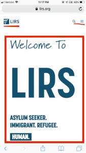
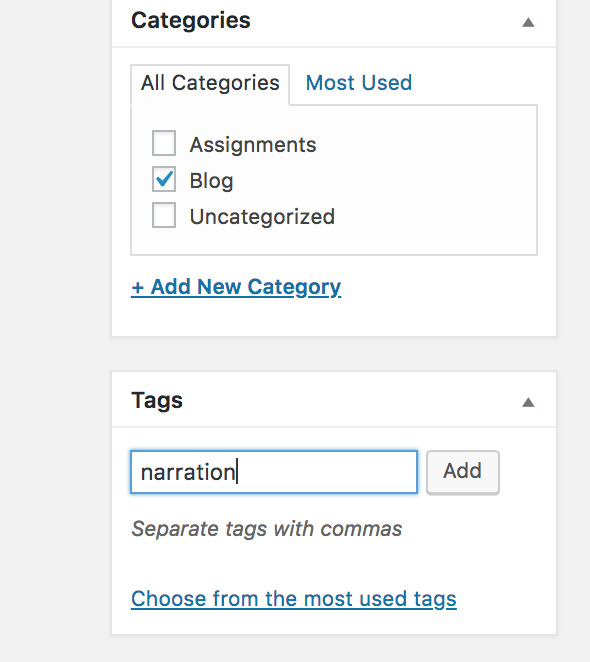
In order to really discover even the purpose of the LIRS website, one must examine the type of audience this content is for. The LIRS website clearly demonstrates that their intended audience is for donors and volunteers. The author of this website uses visual modes to make the color of the donate button in a rusty red, catching the audience’s eyes; while being contrasted to the blue color pallet. (screenshot of https://www.lirs.org)
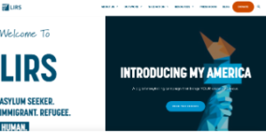 When examining a secondary audience, it can be intended for political activists who are powerful enough to make the change, and even religious Lutheran adults. One can see that it might lean towards religious Lutheran adults, due to tabs that give information on how religion helps. It even just flat out states on one of the tabs, an option to become a foster parent for these children, which follows that idea of it being more directed towards adults as whole. To persuade the audience even more so, the website has videos on the foster child’s perspective, and how they have been forever grateful cause of foster care. The author uses gestural and aural modes, by having the person that was in foster care looking sad, shaking their head explaining their past on how it was like for them to first come to America. Then, the mood changes, as they nod their head up and down with a smile on their face, explaining how living in foster care helped them live a better life. (Screenshot of LIRS video on Quicktime).
 (https://www.lirs.org/be-prepared-to-cry-these-videos-capture-the-real-relationship-between-foster-children-and-foster-parents/ )
The author wants to make sure that this audience plays into their ideal purpose.
A clear, self explanatory purpose of this website when examining it, is to educate people enough about Lutheran immigrants and refugees, so it can persuade them to want to be more involved; keeping these refugees protected. A purpose of this website that might not be so obvious, would be shedding light to Lutheran work. This website uses the linguistic mode by using the words like “God” a lot, and having a section under the resources button called “Faith on the Move”; insinuating that the audience has a belief system. Within this tab, they have the words, “Bible, First and Foremost”, in the boldest,and biggest font across the page, to visually capture the audience. The author wanted to make sure it catches the reader’s eye spatially as well. When reading further, the author breaks up the information in small sections so it’s not overwhelming to reader, and has links on the bottom that direct you to certain Bible passages. 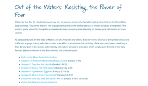
(screenshot of https://www.lirs.org/faith-on-the-move/ )
This website not only wants their audience to participate in helping these refugees and immigrants; yet wants people to join their religious beliefs.
Context of the website is key, when deciphering why the author used this certain platform to communicate with the audience. The main reason the author probably used an online website as their way of communicating, simply because it’s the easiest access. No matter where you are, anyone can go on their mobile device and access the website. Websites are also a go to, when it comes to easily being able to share on the lower bottom page, to the Instagram, Twitter and Linked-in icons. With websites, it’s also easy to link to different tabs and create a format that manipulates the audience to feel, or look a certain way. For example, the author already creates a certain mood from the moment you click on the page; by having the distinct color pallete blue. Ever hear the phrase, “I’ve got the blues.”? The color blue is a color that directly correlates to the feeling of sadness. The author of this website wants the audience feeling emotionally sad for these refugees, making them more than willing to donate to their cause. Websites also allow the author to display huge imagery behind their text. With this picture below, the author really wanted to use imagery to get the point across that their website provides liberty, as the statue of liberty shows major symbolism, having that image be behind the words “about us” .
(screenshot of https://www.lirs.org/about/)
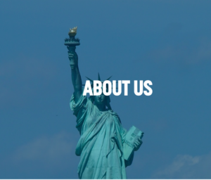
The context of this message being displayed through a website is most ideal for a non profit website.
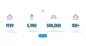
This website would be categorized as a non- profit genre, just because it reports facts and information around their cause, in hopes of gaining profit. The author wants everyone to make sure of their goal, by stating the fact of 22.5 million refugees, underneath the “our work” tab. The author uses large imagery of people huddled close together, over the information about refugees, in hopes more people come together.
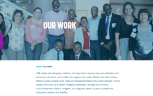
(screenshot from https://www.lirs.org/our-work/)
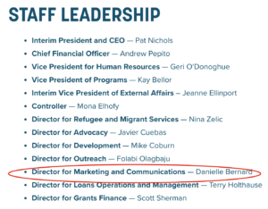
Lastly, the author behind this website finally gives us definitive confirmation on all this information, as it agrees to our argument on why the layout is the way it is. Danielle Bernard is the so called marketing and communications director, when clicking staff leadership. Since there aren’t enough facts on the author itself, I wanted to learn more about the contributors as a whole to get more of an idea. While scrolling through the “about us” tab, you can see that the majority of members are religious Lutherans, as some of the member’s names has the name of the church their affiliated with next to it. This organization is also run by powerful people, such as doctors, judging by their prefix on their name as well.
(screenshot of https://www.lirs.org/our-leadership/)
What all these authors have in common is a general bias, in which they all believe heavily in the Lutheran religion, and general persuasion for the saving of all of these immigrants and refugees.
Modes, such as linguistic, aural, gestural, visual and spatial, all help deliver the author’s main purpose. The non-profit website, “Lutheran Immigrant and Refugee Service”, clearly demonstrates the author’s main point through a series of different modes to try and forever change the audience’s point of view.
References
Arola, Sheppard, & Ball. Writer/Designer: A Guide to Making Multimodal Projects. Boston,
Bedford/St. Martin’s, 2014.
Bernard, Danielle. (2019). Lutheran Immigration and Refugee Service. Retrieved from
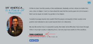
 If I learn more, I’m more likely to donate. This also supports the values that the audiences might have. If I was a donor, I would like to know my money is going to actually help and support the mission. By clicking “read more stories,” I now have access to read about people who have actually received the service of LIRS.