Rhetorical Analysis: Catholic Charities

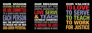
Upon analyzing Catholic Charities website (www.catholiccharities-md.org), Catholic Charities is a non-profit organization that provides care and services to people living in Maryland. Their values include “to love, to serve, to teach, and to work for justice.” In addition to their mission statement, the purpose of Catholic Charities is to persuade people into donating or volunteering for the organization. The authors of the Catholic Charities website have credibility with this kind of work. The author includes links to news articles and current events and includes images to capture the audience’s attention. The author of the website uses rhetoric to be able to have the website stand out to their audiences, inform the audience of the organization’s purpose, and help convey the genre and context to reach relevance in today’s society.

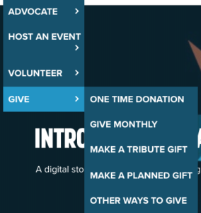
The primary audience that Catholic Charities strives to appeal to would be the donors and volunteers. When you first come to the website, the first thing you will see is their mission statement on the right side of the screen and a blue bar that goes across the page. The first two words that are read on the blue bar are “Donate” and “Volunteer.” Underneath of the blue bar is a graphic with a button that says, “Stand With Us.” Pressing the button leads you to a page that says, “Turn compassion into action” and on the right side of the screen there and three buttons with three different colors. The first button is green and has the word “GIVE.” Green could be associated with money and in this case, it is a good choice for the author to use the color to receive donations. The second button is blue and has the word “VOLUNTEER” which is another important aspect for Catholic Charities. Lastly, the third button is orange and has the words, “LEARN MORE” which takes you back to the homepage. This was a purposeful choice that the author made because when on the “Stand With Us” page, the navigation bar is not accessible, which means that the only options that a person could do is to either give or volunteer.

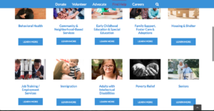
The secondary audience that Catholic Charities could appeal to would be advocates, immigrants/refuges, senior citizens, people with disabilities, and people who would need poverty relief or housing and shelter. The website’s secondary audience is a wide range because of the amount of services that they do offer. “Advocate” is the third word on the blue navigation bar on the homepage. The tab takes you to a page that informs the audience on Catholic Charities advocacy and public policy. The page also includes advocacy alerts, workshops, and information on how to contact the organization. Next to the “Advocate” button on the navigation bar is the word, “Find Help.” The tab leads you to a page that has a list of services that Catholic Charities has to offer. On the top of the page, it has a tagline that reads, “Find The Help You Need From One of Our 80 Programs.” The author purposely choose to put the tagline on the top and bottom of the page to show audiences that the organization does offer a wide range of services to appeal to anyone who needs help.

Catholic Charities’ medium is a website. The author most likely chose a website platform because it would be easily accessible to anyone who could access a phone or a computer. The primary reason for why the author chose a website would be to easily collect donations and to have volunteers contact the organization without having to find a location to go to. A secondary reason for the website is to provide people with resources. These resources include help with immigration, poverty relief, housing and shelter, community and neighborhood based services, and 80 other services. The historical convention for this website is that with the ongoing issues on immigration and refuges within the United States, people need to be able to find resources without fear of “being caught.” They want to be discreet with their actions for providing themselves with a better life.

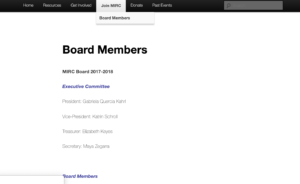
Overall, Catholic Charities website is easy to navigate through. The tabs are straight forward and takes you to where you need to go. The website can be word heavy, however, it compensates with images and color. The website sticks to the same color scheme, most likely to ensure people that they are still on the same website. This would also help with people who have disabilities. The website also has credibility because it provides information and updates on government actions. The website is also well organized and keeps everything condensed into six tabs. The website could improve on adding auditory aids or add an option for different languages. This would satisfy a bigger range of audience and possibly bring more traffic to the website.

An Analysis of the Esperanza Center Website By Meg Biemesderfer

The following paper is a rhetorical analysis of the Catholic Charities’ Esperanza Center Webpage. To begin, some context is needed. The Esperanza Center is a charitable organization that aids immigrants, who need to learn English, find homes, jobs, and adjust to the US, as well as get legal help. There is an increasing prejudice against and fear of immigrants today and it has become even more important as can be seen by the population Esperanza serves and how it has grown over the years. This page of the Catholic Charities website is meant to gain volunteers and workers to provide these services for low cost or for free. It also directs those in need of the services to the center in Spanish. It was originally created in the early 1960s by a determined community activist, Nancy Conrad, who had returned to Baltimore from Latin America where she was serving with the Young Christian Workers with newfound inspiration to help immigrants and Spanish speakers in the U.S. Her endeavor was supported by the Catholic Church, and later adopted in 1980s by Catholic Charities the Esperanza Center has been through several names and locations as it grew to accommodate the growing need for it.


The Esperanza Center’s page portion of the Catholic Charities Website puts emphasis on the Catholic Charities Logo, being nearly as big as the images placed in close proximity to the topmost part of the screen. It draws the eye and ensure the reader knows who runs the site, and instantly defines a possible bias in favor of Catholics. This logo gives legitimacy to the website, and in turn to the Esperanza Center, with Catholic Charities being a well known and well established charitabl     e Non-Profit organization that has operated for decades. It is clear from this logo, the company’s reputation, and from the layout of the navigation bar that the site targets religious people with money as it’s primary audience. The logo includes below it the words “Inspired by the Gospel Mandates” and “Cherishing the Divine Within All” (“Esperanza Center.”), which respectively is the tagline of the Baltimore Catholic Charities Branch and the Catholic Charities overall. The Navigation bar gives further insight, with Donate coming first, followed by Volunteer and Advocate. It is clear that those with time and/or funds to spend on Catholic Charities, in this case the Esperanza Center in particular, are the Primary Audience the webpage is created for. All over the website there are Volunteer and Donate Buttons, practically on every section of the website. Its purpose is clearly to gain the resources needed to run the Center and better help immigrants. The name of the Center is also highly emphasized, the words Esperanza Center appear all over the website, in various colors and sizes, as well as in images to ensure the name is prominent and easily remembered. The most important information, such as name, location, and contact options of the represented Esperanza Center are all placed above the fold and in close proximity to each other, in text that draws emphasis to them in English and Spanish.  This use of both languages points to the secondary audience, though the site seems to be shifting them more towards a primary audience role: immigrants. It is clear that they are currently secondary as the bulk of the website is geared towards recruiting volunteers and donors and is in English. However, there are videos and important text in Spanish and intent stated that more will be offered in Spanish. There are also various links that lead services and their contact information that Esperanza offers and options to get the information in Spanish.


As you continue past the Navigation bar it is notable that important text is emphasized by color, bolding, capitalization, or a combination of the three. Urgent messages are in red, important parts that aren’t as vital as well as text links in blue, and addresses and bolded. Other important information or things that the site wants attention drawn to are caps locked and written in black as y
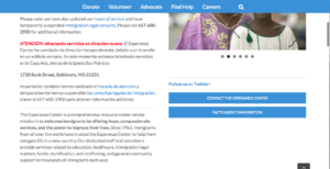
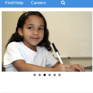
ou continue down below the fold. Back above the fold, on the right side, a rotating box of images showing various immigrants utilizing the offered services as well as the building that houses Esperanza center is shown prominently. The dots under the rotating picture box indicates the option to shift the images, and hovering over them produces arrows on either side of the images that also indicate an option for lateral movement. And past this on the far right is a scroll bar, notifying users that there is more to the website than the initial view. As the consumer scrolls down through the site, they will notice that the linguistics were carefully planned with clear and simple language with text of a fair size and non-seriffed font, lending to easier reading. There are also prominent translations in Spanish for more vital or useful information being provided. Though it is not yet in place, there is intent stated to translate more of the website into Spanish in the near future, which makes it more accessible to the large Spanish speaking immigrant population. There doesn’t seem to be any option for text to voice on this site, and there isn’t much Spanish. The midsection of the page contains button in green for upcoming events, and below it are tabs with more in depth information about the Esperanza Center and its’ history, its’ goals, and its’ services. Each has a plus sign next to them in black and white signifying that more information can be accessed by clicking it and less can be seen by clicking the minus sign that appears once you’ve clicked the plus sign. Most 
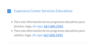
of the options are written in English; though one is in Spanish and provides a phone number to call for information on education for both adults and children, presumably also given in Spanish. For the most part this list of services are meant to garner pro-bono workers and volunteers to provide the services, rather than to explain them to immigrants.


Under the services and about us tabs, there is a video in Spanish with an option for subtitles in dozens of languages in the middle row of the page. This video explains some basic rights and legal tips for immigrants, various services that the center offers, and how to access them. There isn’t much sound on the site beyond the video. The video is an affordance for those who speak other languages or are hearing impaired in some way. This allows for another means o
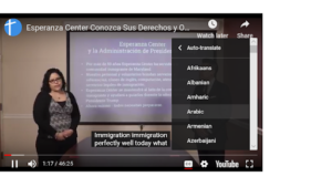
f communication, but it should have an option for translation on site or for text to speech. There is a lot of gesturing, facial expression, and body language in the video, as well as friendly interaction and explanation from both a male and a female. There is a scroll bar on the site’s right side to indicate the option to scroll down.  The images above the options directly below the video are gestural and are not the most common but common enough to help signify what the buttons do. The checked box for example is something seen on various sites to denote mail or email. Both the text and buttons use contrast to stand out from the colors of the buttons against the plain white background. The brightly colored and emphasized text contrast is used 
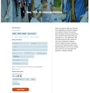
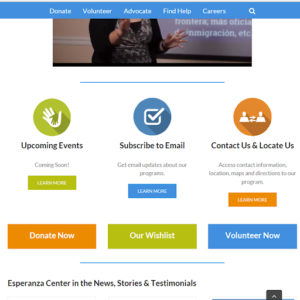
to great effect to pull the eye to the most relevant, beneficial, and important information or points for the company’s goals. Just below this, it is again made clear the website’s main goal of gaining donors and volunteers with far larger size than the buttons above them and opposite color patterning with buttons “Donate Now”, “Our Wishlist”, and “Volunteer Now” (“Esperanza Center.”). Finally at the bottom of the page, there are testimonials and more links to get involved in Catholic charities.


The Esperanza Center site is online, and thus is easy to access for anyone, be it via personal devices or free ones that can be utilized at libraries and other public spaces. This platform provides a direct route through which to donate or t
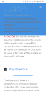
o sign up to volunteer. It is on Catholic Charities’ site, as one of their many projects, giving it a better chance of being noticed than it would have on its’ own. It has a mobile version as well, which contains more Spanish text on the homepage than the desktop site does. I am not entirely sure why. However, it is possible that it could be because people are likely to have a phone, or access to one, than a laptop or other personal computer, and so more people will be able to use it and find information on the Esperanza Center in an easy to consume manner. Note that the mobile site has a major flaw, in that the mission statement and logo of Catholic Charities covers about a third of the page once you scroll below the fold. This is annoying and unhelpful at best, and detrimental to user’s ability to read the text at worst. It is distracting and a poor design choice that limits the site’s usefulness.


The Esperanza Center has a good web page with a clear focus on Donors and Volunteers and a strong secondary focus on immigrants. It provides a streamlined way to research the Center and donate and volunteer for it. It also provides useful information and routes to information for Spanish speaking immigrants. It’s mobile site is useful, but has issues in regards to set up, with a large portion of the site being covered by the Catholic Charities’ Logo and mission statements rather than displaying the relevant information for which the site exists. The desktop site has its own issues, in the lack of text to voice capability and the fact that it does not apply a translation option. Overall, it is a focused and useful website in any form so long as you can get around the minor inconveniences.


Works Cited

“Esperanza Center.” Catholic Charities of Baltimore, www.catholiccharities-md.org/services/esperanza-center/.


I pledge on my honor that I have neither given nor received

unauthorized assistance on this assignment/exam.”

-Megan Biemesderfer


80 Years in the Making: Refugee Website Analysis

“Our World is facing a refugee crisis of a magnitude not seen since the second World War. This presents us with great challenges and many hard decisions.” ~Pope Francis~

Non-Profit organizations have been established since nearly 80 years ago and are still prominent in today’s world. Refugee organizations such as the Lutheran Immigration and Refugee Service located in Baltimore, Maryland is constantly updating their website to target towards those who have a passion of giving back. The LIRS contains features that provide rhetorical messages including audience, purpose, context, author and genre to create a multimodal website.

The home page of the site begins with a view of the navigation bar which includes links to pages like “about us, our work, take action, resources, press room, blog and DONATE.” The donate button is bolded in bright orange (unlike the blue theme) on the top right corne
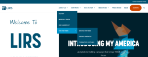
r. This indicates that the intended audience are people with money who can afford to donate. The website also provides a link that is called “our partners.” Our partners include the church partners that are affiliated with certain activities that the LIRS may provide. The donate button also serves a purpose for possible members of a church that works collaboratively with the LIRS. Members of the EvangelicalLutheran Church in America (ELCA), the Lutheran Church—Missouri Synod LCMS, and the Latvian Evangelical Lutheran Church in America (LELCA) could have a higher chance of donating because they are partnered with the LIRS.

Since the LIRS is a religious focused non-profit, it is important to recognize that refugees who are seeking help may want to work with a lutheran-influenced asylum. The website tailors their focus on those who are religious by inserting a “history” page (underneath the “about us” category,) explaining that the LIRS

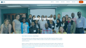
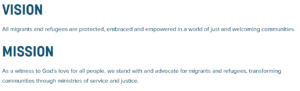
has a religious “tone” to the organization as a whole. Refugees and Immigrants who follow a specific religion may favor the fact that it is a Lutheran non profit, for they understand how churches give back to the community and would prefer to be affiliated with this influence. The purpose is to target a group of refugees and with appropriate resources, use them to provide a religious influence on their daily lives.

The overall intention of the Lutheran Immigration and Refugee Service is to create a religious focused home for refugees and for those who would like to work for a religious focused refugee organization. The LIRS provides a link called “steps to host a refugee Sunday” which shows how your Lutheran church can get involved in service. With programs such as “Refugee Sunday, Faith on the Move, Be not afraid, No Temas, and ELCA Youth Gatherings,” lutheran churches are encouraged to get involved with helping immigrants through the LIRS. 


To target every time of demographic, the LIRS uses the internet web overall to capture their audience. They also use images on their website of the statue of liberty as their main theme and the flame in the statue of liberty as their logo to provide a feeling of full acceptance for the potential refugees. Like many non profit websites, the Lutheran Immigrant and Refugee Service website targets everybody. In this day of age, mostly everybody in the world ha
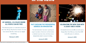
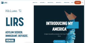
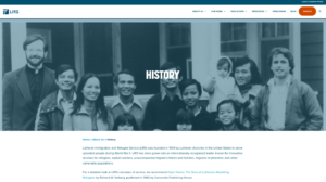
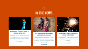
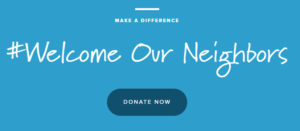
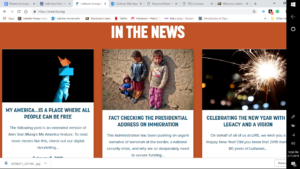
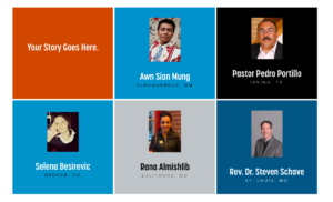
s internet and technology, so for the LIRS to be using the web as their main source of interaction shows they are trying to reach a mass audience. In order to further reach a mass audience of all demographics, the website provides a tiled mosaic structure of a “digital storytelling campaign” to welcome fellow immigrants. The campaign consists of refugees who have previously gone through the LIRS proving the credibility and to shed a positive light on the program.


The LIRS does a good job with site exploration. Since there is no sound on the page or any type of video’s generalizing the LIRS, this forces viewers to explore their website a bit more and view other criteria other than the home page to get a feel for the site.  Unlike other refugee sites such as the HIAS, the LIRS does not have a video testimony or audio media. Since viewers are forced to actually read the site a bit more, the LIRS provides postings to get viewers updated with recent news about refugees occurring in the United States. This further emphasizes how important refugee asylums are. The news postings include current events regarding the President of the United States, and LIRS updates. 

Since viewers are forced to explore the page to get more details, people who view this website would most likely access this on their computer, or their phones. The overall layout of the website creates an aesthetically pleasing appearance where viewers read from left to right. 
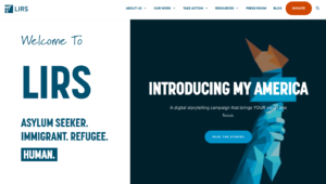
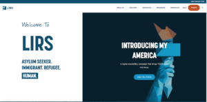
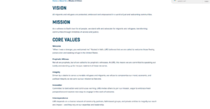
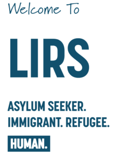
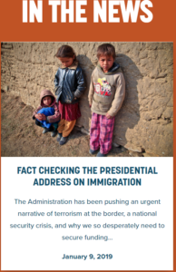
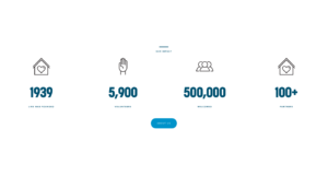
The overall facts that readers need to know are dead center, in large text, with no other distractions or information surrounding it. This is done purposefully so people can scroll and analyze the page with ease. 
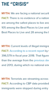
The previous author of the LIRS (who was president Linda Hartke, 2017) established the site’s credibility by saying that the non profit has been around for 80 plus years. This allows the readers to gain a sense of comfort since it has been established for a long time. With a quick google search, people who view the website could also see awards that the LIRS have received. The site provides an announcement that president, Linda Hartke has won the Maryland International Business Leadership award back in 2017. However, what the site does not mention is that in 2018, Hartke was soon fired as the LIRS CEO due to her “financial irregularities” and “harassment” during her time. This has caused her reputation to soon backfire. 


Overall, the site establishes it’s credibility by providing viewers a history page which states that the non-profit has been around since 1939. The LIRS also establishes their credibility by providing a “Loans Customer Portal” button at the top right corner, indicating that the organization has money to give out loans for potential refugees. The LIRS site categorizes as a non-profit refugee website that protects and helps refugees while being welcomed to the community. It is also categorized as a refugee site due to it’s options for asylum seekers as well as the common theme of “donations, ways to get involved, and our work” found on the main header navigation bars of each site. For example, a website called “Refugees International” looks almost identical to the LIRS website with its header options. Refugeesinternational.org creates news postings in a centered alignment as well, just like the Lutheran Immigrant and Refugee Services site however the only difference is that Refugee International categorizes their news as “The Latest from RI.” 

       vs. 

Overall, the Lutheran Immigrant and Refugee Services website is a well organized, aesthetically pleasing site with an abundance of information.  The site provides positive multimodal tactics to grab viewers into providing or receiving help in many ways. The dark blue and light blue color scheme approach of the site comes off as a non-threatening way to getting involved with the LIRS. The overall alignment makes it easy to read and perfect for people with a slim vocabulary. Although the site is easy to navigate and skim, the creator of the site could have provided some auditory and more visual modes to then grab an even larger demographic. People who are blind could use the audio and people who have reading disabilities need the videos to grasp as much information as they can.


References: 

“Lutheran Immigration and Refugee Service.” LIRS, 6 Feb. 2019, www.lirs.org/.

“Refugees International.” Refugees International, www.refugeesinternational.org/.

Corcoran, Ann. “Lutherans Announce Departure of CEO Hartke amid Claims of Financial Irregularities, Poor Management.” Refugee Resettlement Watch, 14 Feb. 2018, refugeeresettlementwatch.wordpress.com/2018/02/14/lutherans-announce-departure-of-ceo-hartke-amid-claims-of-financial-irregularities-poor-management/.


Lutheran Immigration and Refugee Service Rhetorical Analysis

The website I chose was the Lutheran Immigration and Refugee Service. The website’s audience is primarily for those who can donate, volunteers, activists, and many more that fall in that line of work. When you first enter the website, there is a button that leads you to the inspirational stories from various refugees. Adding this element in, helps when trying to convince others to donate to a good cause. The button also happens to be under the horizontal menu where the word “donate” is much bigger than the other words and is in its own orange bubble. The secondary audience are refugees and possibly even students and teachers. The reason I say students and teachers is because it can be used as an instructional method like how we are currently using it now. Considering the fact that the audience is most likely people who donate and activists, I believe the author of this website appeals to the audience’s values and opinions.

The purpose of this website is primarily to get people to support the cause. LIRS wants people to be well informed about the political climate surrounding this issue of immigration and they want people to know that they stand with the refugees and want to help them out in any way that they can. When you enter the site, there is a saying that states, “Welcome to LIRS. Asylum Seeker. Immigrant. Refugee. HUMAN.” The word “human” is in an all blue bubble and it stands out to the person reading this quote. The author clearly wants us to remember that these are people’s lives and that they shouldn’t be treated any less than others because at the end of the day, they are human just like us. The website kind of has two purposes. Like mentioned before, the first is to get people to support mainly through donations but the second purpose for those who cannot donate, is for them to learn about the cause and spread the word. The more who hear about the cause, the better.

When it comes to the context, the medium that all this information is found on is on the Web. We can find almost anything on the web because of how easily accessible it is to us. The author chose this medium because it is easy but also because the people who they are targeting to donate and support most likely have access to the internet and it just makes the process of donating much easier. Word travels fast on the internet so there is no better way to get the word across than through the internet. The context of one particular story on this page also fits in perfectly with the political climate we are in today and the “crisis” at the border. LIRS does a great job on focusing on the current stance of Trump and his supporters and debunking what they believe to be “facts”. When you scroll down and click the section that reads “Fact Checking the Presidential Address on Immigration”, there they have a bunch of myths stated by Trump and his party and then they have the actual facts. In this day and age, we are in, because word travels fast especially on the internet, it is important that what we are spreading around is the truth. The format of this particular piece makes it easy to read on a phone, tablet, laptop, etc.

The author of this website is Lutheran Immigration and Refugee Service. Amongst the leadership, there are many respected leaders. They come of ass very credible and they know what they are talking about and you can see that hey are very passionate about their work. There are any people on the list of their leadership, and you can see that LIRS takes time in working with everyone to accomplish their goals with getting information out about the “crisis’ and what they do to help those who find themselves seeking asylum. Along with their work, the overall genre of the LIRS is informational. The whole goal of this website is to let others know all about the work they do and what it is they can do moving forward to continue to help those in need.


The interface of this website is very easy to navigate through and the colors they chose seem to come through well. It is well known that blue is a calming color and the websites overall theme most places where you see color is blue. Even the font on the different titles and the links are blue. On the home page there are seven sections that are separated by color blocks and it all seems to flow as you continue to scroll down. Like mentioned before, it starts out with the quote on the left-hand side and then there is the button for the stories of the refugees on the right-hand side. When you continue to scroll there is a little bit of a background on what exactly the LIRS is and then there is a button to learn more about their work (which also takes you to the same page if you click on “About Us” on the menu bar at the top). Just under the background info is some stats about what the organization has done so far.

Overall, I feel that they did a great job with making the website easy to use and they get straight to the point. If anyone was ever confused about what exactly it is that the organization does, there is no doubt once you enter the site. There are multiple buttons that will lead you to the various pages about what they do, what they provide, and even where to donate. The only thing that I would say the could maybe do is add a little background info on the people who are in charge but besides that, the LIRS website is a good one.

How the LIRS uses Rhetoric to Induce Change as a Nonprofit with their Website

The Lutheran Immigration and Refugee Service (LIRS) is a nonprofit organization dedicated to providing service for immigrants and refugees facing persecution. Motivated by their faith, they have developed service programs, organizations, and influenced public policy (Lutheran Immigration and Refugee Service, 2019); all of which can be found on their website, www.lirs.org. While the organization’s goal is to serve, the website’s authors communicate using rhetoric to reach their intended audiences, inform them of the organization’s purpose, the genre of the organization, and the context in terms of how it is relevant today. Using rhetoric successfully will allow the LIRS to effectively induce change from their website.

The audience LIRS is trying to reach varies, as it provides multiple opportunities to engage with the organization for different types of people. Donors and volunteers are the primary audiences of the website. This is shown through the buttons on the navigation bar, as the last but brightest button is “DONATE.”

The color and style the button is presented with deviates from the format of the navigation bar. Along the navigation bar, the buttons link to different pages on the website that give insight as to what the organization’s mission and purpose is, how someone can help, donate, and “take action” (Lutheran Immigration and Refugee Service, 2019). The secondary audiences are the refugees and immigrants that have been helped or are seeking help. The reason they are secondary and not primary is because there are more opportunities provided on the website to donate and volunteer than there are to help the refugees and immigrants directly from online. This could be because LIRS assumes that most do not have access to the internet. When the home page is opened, there is a large graphic that reads “Read the stories” and “Share your story,” and provides inspirational accounts of refugee experiences from those they are aiding.

The overall intention of trying to reach these audiences is to persuade viewers to give to their organization whether it be in the form of time and energy, personal accounts, or money. An additional purpose is to inform the public of the power of their faith, as they are a religious-affiliated organization. A portion of the website is dedicated to religious writing, in the form of downloadable prayers or readable sessions about the Lutheran faith. While the site does not directly educate on what the religion is by definition, it provides perspectives and online sessions to read religious texts written by the authors of the website.

Broadly defined, the LIRS website is a nonprofit service organization. Beneath a more specific lens, it is a religious-affiliated organization that focuses on aiding immigrants, refugees, and other asylum-seekers. Key features that tell the audience it belongs to the nonprofit genre of websites are its spatial, linguistic, and visual modes. This multimodal text uses a spatial organization with a one-column style of text and linguistics in English and the option to read in Spanish.

It is not meant to be complicated or require deep analysis to find its purpose and resources, and is made easy-to-read to pertain to both English and non-english speakers based on the context of its website is a nonprofit service to immigrants and refugees from other countries. The spacing and format of the website also reflect other nonprofit websites, with features such as large, contrasting colors and letters as well as large graphics that requires one to scroll throughout the page to read more (but not dense) content. The options on the navigation bar are listed left-to-right for simplicity, and the use of calm, cool colors against a vast amount of whitespace provides a more calm and friendly tone set by the site, despite the context of the topic to be more demanding.

In a heating political climate in which “immigration” is now a household and sensitive topic, this website exists within the context that it is relevant to today’s current issues of immigration to the U.S. It even includes a newsletter that details these issues. 

Several years ago, when the internet was recently invented, this website would not have existed because online media was incredibly new as well as an untouched frontier. In this present context, one can simply use a search engine to find a site like LIRS’s to learn more about the issue. The medium is online to provide this convenience, ease, and efficiency for both the LIRS and their audience. The social and cultural connotations of the text are that while immigration is a hot topic that demands attention in the media, it is also often seen as a threat to inhabitants of the U.S., depending on how the information is presented.

Beneath the “ABOUT US” tab of the navigation bar, there is a link to a page titled “OUR LEADERSHIP.” This page of the LIRS website gives the names of the Executive Committee of LIRS, At-Large Members, and Staff Leaders (Lutheran Immigration and Refugee Service, 2019).

There are no direct names of the author(s) or creator(s) of the website, therefore one can assume that the names that comprise the lists of LIRS’ leadership page played key roles in the development of the website. In essence, the website is a portfolio of the work done by the LIRS, which is compiled by the different experiences and works accomplished by all members. Therefore, the author of the website is the organization as a whole.

The Lutheran Immigration and Refugee Service organization has successfully applied rhetoric to their multimodal website, www.lirs.org. They were able to communicate the need and desire for change to the public, and reach their audience based on the accounts of experiences from refugees, volunteers, and donors. They have made known their purpose of persuading the audience to give through the literal written text asking to give, as well as giving clear options to do so throughout the website. They have made known to their audience that they are of a nonprofit genre through the formatting of the website as well as the content of the text communicated. The context of the website also communicates the relevance of their message, motivating the audience as well as permitting them to take the required action now. While there was no clear name given, the author of the website can be concluded as the organization itself, glorifying its purpose rather than the faces behind it. These are all factors that have allowed LIRS to induce change through their website.

VIDEO ANALYSIS: https://drive.google.com/open?id=1aAoW1iJK3V3iBWZ2ylANBD41IxSo28ZU

Citation

“Lutheran Immigration and Refugee Service.” LIRS, 9 Feb. 2019, www.lirs.org/.

LIRS- Analysis in Depth

The Lutheran Immigration and Refugee Service (LIRS), was founded by Lutheran churches in 1939 in service to uprooted people during World War II. LIRS is a non-profit organization which outlines their goals in its mission statement: “As a witness to God’s love for all people, we stand with and advocate for migrants and refugees, transforming communities through ministries of service and justice.” Their sole objective is to help protect and save all migrants and refugees from dangerous situations in their home countries. In order to determine if this website is effective or ineffective on promoting LIRS and what they believe in, a complete analysis on the audience, purpose, context, author and genre was performed. This website is ineffective in promoting what LIRS is since it seems they have a heavier focus on donations.

The initial or the primary audience for this website is their donors and volunteers. When you look at the navigation bar, the “DONATE” tab pops out since it is a completely different color than all the other tabs which are blue. The donate tab is a burnt orange color. This guides the donors and volunteers eye directly to this button. When you scroll down, looking through the rest of the front webpage, there is another section where you can click and be redirected to the donation page. When taking a look at the “TAKE ACTION”, there are various ways that they offer to be a part of the organization. Under this tab, there is information about being an advocate, hosting an event, becoming a volunteer, and ways on how to give. Under the tab, for how to give, there are various pages dedicated for donors on they can donate.

Give tab under “Take Action”

The secondary audience is immigrants and refugees. For this audience, there are two areas where this audience is thought about and which it is supposed to be directed for. They are both on the navigation bar, but the first place that they could look would be “OUR WORK” tab on the navigation bar where there is information on what the organization does and how refugees and immigrants benefit from them. The other area is through the “RESOURCES” tab, also on the navigation bar. On this tab are different pages on just general resources that LIRS offers, including “REFUGEE SUNDAY”, an event that any church, school, or community can hold with former refugees and can pray for refugees’ safety, care and dignity. 
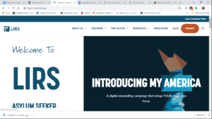
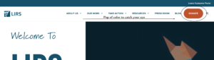
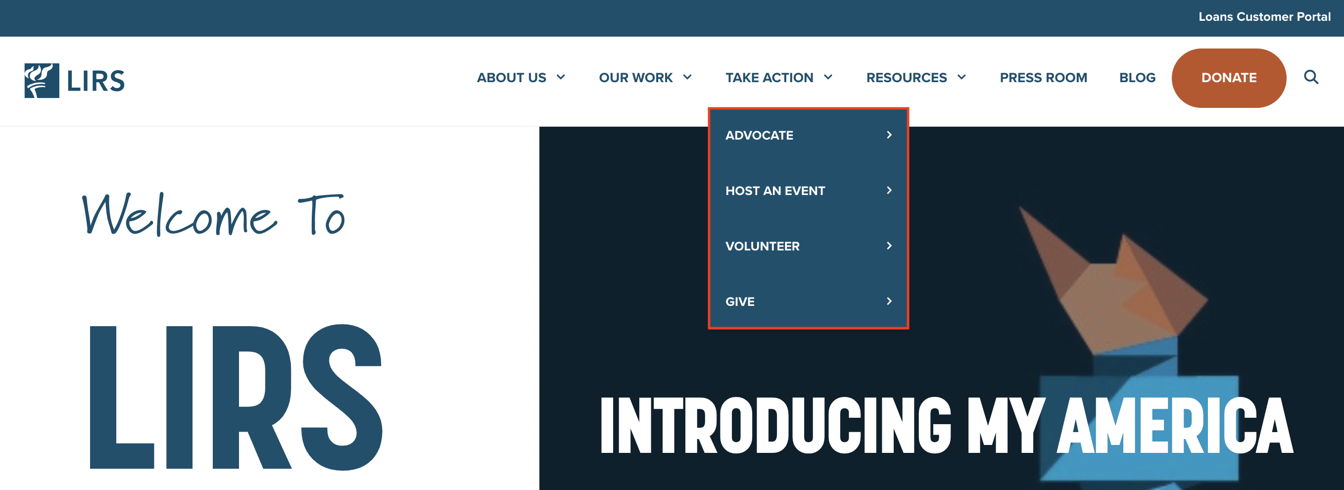
In addition, at the top right corner above the navigation bar is a link for “Loans Customer Portal”, where a refugee can receive a loan, another great resource. It is known that the donors and volunteers are the primary audience because there is a bigger focus in the website to donate and how to do that as well as the ways available to volunteer. If the primary audience was the refugees then there would be a bigger focus on the resources and what the organization can offer, which the website does not do.

The websites’ overall purpose and motive is to show and explain what Lutheran Immigration and Refugee Services is and what they do as an organization. By doing this it is their hope to receive donations and get people wanting to volunteer. Again, there are lots of pages where you can be directed to the donation page, as well as when you scroll down, there is a section which is a little pow wow to give, which is essentially just another way of saying “please donate”. In a more personal way, this website also utilizes using blog posts, which discuss news or interesting facts about what is happening to immigrants and refugees in their home countries. This gives a visual aspect to better understand what these people are going through and why it is so important to help them. Some of these blog posts are even about what life is like after they are able to come to the America. As an example, one of the posts which is on the main page is called, “My America… Is a Place Where All People Can be Free”. This pulls on the need to be a part of this organization, as well as giving faith and trust into the refugees.

The context of LIRS website is the internet. Lutheran Immigration and Refugee Service has decided that the internet is a good outlet to display their organization because nearly everyone is on it and it is especially easy to access for donors and volunteers. Their website can be accessed through a laptop, phone, tablet, and other devices that have access to the internet. Since donations are available online it also makes it easy to do so, which makes donors lives more easy if they are considering donating their money or time for those who can’t offer money. When looking through the entire website, there is a focus of using white and navy blue. There is also a gradience throughout the website of using different shades of blue as well, and the use of burnt orange for the donate tab on top for the navigation bar. There are a few pictures of immigrants and refugees but not many unless they are the cover images for the page that you have clicked on. This can be an issue when you are trying to show what these people are going through, and is hard to know exactly you are donating your money for, if there is no images of it.

The author of this website is yet to be determined but the website is produced by Lutheran Immigration and Refugee Service. This organization is made up of many board members, which includes an executive committee, at-large members, and staff leadership. The entire board is composed of 17 members who have an in depth knowledge for immigrants and refugees. Due to the authors part, this website does feel like it is searching more for money and donations, than trying to convince people to become a part of helping and solving this issue of refugees. There needs to be a bigger focus on helping these endangered human beings who are scared to live in the countries that they do. However, LIRS has a reputation for helping these people, which is dwindling due to how the author is representing the website. To better show their concern for the immigrants and refugees, the author should  show more images and videos of them, and volunteers assisting them in any of the ways that the website says that you can help. It gives a visual call of action.

The genre of this website and the text on it would be non- profit. It is non-profit because they are assisting refugees and immigrants to escape from their dangerous home countries. It is also non-profit from the way that the entire website is formatted, and a heavy concentration on donors and volunteers, which is one of the tiers for a non profit website. Non profit websites are also easy to navigate and have simple layouts. Each of the pages has a photo on top of a refugee, immigrant, volunteer, or leader to give visual of what that page is about. The fonts on this website mostly consist of san serif, due to the fact that if there are people with disabilities, like dyslexia, they will have an easier time reading and comprehending the website.

In this rhetorical analysis, the audience, purpose, author, context, and genre were closely looked at and discussed in relation to the LIRS website. also represented was visuals to the website to show what is being discussed for a better understanding. the Lutheran Refugee and Immigration Services has created a well formulated website where information is easy to find, but the meaning has been lost in the creation of it all.

Citation:

“Lutheran Immigration and Refugee Service.” LIRS, 6 Feb. 2019, www.lirs.org/.

Appealing to Those with Money

When viewing the LIRS website, the first thing that sticks out are the two graphics under the menu. The large text and strong contrast causes you to be drawn into their claim that all people are human and the stories they want to share. Ultimately the main purpose of this site is to raise money. There is a donate button that sits right in the main menu at the top of every page. Not only is it in the menu at the top of the page, but it is the one link that has a bright orange button which makes it stick out drastically from all of the other links in the menu. It is very clear that this is a nonprofit website because of the big donate button at the top of every page. They do deserve credit though, they did go with design more unique that some of the nonprofit websites we viewed in class.

By choosing a website the organization has created a central hub for their online presence. So much of our lives are spent online that it makes sense that the organization would want to be where their audience is and once the website is established, they can point all of their other online presence to their website. All social media, emails, and just about anything else can direct people to their website for a more complete picture of the organization and ways the audience can participate. While the use of websites is on the newer side compared to other means of publication such as print materials, they have become standard and expected for every organization. People rely on them to learn about the organization, instead of searching for brochures or people who are part of the organization they turn right to the website. Since the website is their first place to turn, people expect the website to be good. If the site navigation is not easy to use, or if they can not find the information they are looking for, the viewer will just turn away and look into a different organization with a better website.

Full Page of Text lirs.com

Viewers could look at this site from their phones, but I would think that most of the views comes from either laptop or desktop computers. This site had a lot of text to read and most people don’t want to read as much on their phone as they would on their computer. Viewers who are visiting the site for the first might look around the site on their phone but I would guess that they would try to find an actual computer if they wanted to spend time reading the contents.

Right from the front page it is apparent that this website is aimed an audience that values viewing people as people. The site is appealing to these values right from the homepage where the one of the first thing you read is “Asylum Seeker. Immigrant. Refugee. Human.” The organization is saying how people are people and we need to help each other out. They also use images that have a lot of meaning behind them such as the image of the Statue of Liberty used in header on Missions and Vision page. Using an image like this not only is familiar to people, but the Statue of Liberty is associated with feelings of freedom, empowerment, and unity of the country. This helps the author appeal to the audience because when the viewer if reading through the website and then sees that image it is going to lead the viewer to think about the mission of the organization associated with all of those good feelings evoked by the Statue of Liberty.

Home Page: lirs.com

The site also brings attention to what the organization is doing, through the traditional pages like About Us and Our Work, but it also included press releases and a blog. The blog can give a more personal connection to the organization or making the website feel like it is active and not just a stationary text. This site also wants to reach asylum seekers, immigrants, and refugees and provide them with assistance. Specifically through the site, they want to help provide loans to these people. In the upper right corner of every page as well as part of the normal menu is a link to the loan portal for people applying for loans and managing the loans they have received.

Blog Page lirs.org

Nowhere on the site does it really seem to talk about the author of the site. It can be assumed that the organization would be the ones behind the website because it is a site about them, and then in the footer of the site it indicated that LIRS holds the copyright privileges.  In navigation to the page titled “Our Leadership” under the About menu, a list of the leadership team is related. It it broken down into the representation members and the staff leadership. Currently they are seeking a new President and CEO, so at the current moment they are being led by interim President and CEO Pat Nichols. Even though they are being let by Pat Nichols, I wouldn’t consider him the author of the site. I believe that the site is a representation of the organization as a whole and was comprised by a few representatives of the organization to make sure that it accurately represented the entire organization.

Footer lirs.com

Overall I thought the site did a really good job at presenting information and trying to get people to take action. I do think that they could have benefited from using some video or at least something moving. Additionally something with sound. I was not able to easily find any spots where the website used any sound. One question that was raised for myself was the name of the organization. The URL, the logo, and many places on the site it refers to it as LIRS, in the footer it shows that it stands for Lutheran Immigrant and Refugee Services. LIRS seemed a little odd to be, like I wanted to know what it stood for the entire time I was looking around until I found it in the footer.

Lutheran Immigration and Refugee Services website: A Rhetorical Analysis

For this rhetorical analysis, the Lutheran Immigration and Refugee Services (LIRS) website will be the focus. LIRS is an organization that assists refugees and immigrants in the United States. For the website, the author, purpose, context, audience, and genre will be reviewed from the information gathered on the website. The structure and organization of the website will be analyzed also within these categories. LIRS is an easy to navigate webpage that is chalk full of valuable information about refugees and immigration, while it also fundraises and gathers volunteers, all in one website.

When the LIRS home page is accessed, it presents the most educational information about their organization, the work they do, as well as their volunteers and how one can donate.

The website is set-up in a user friendly manner. The navigation bar is located at the top and is organized logically for the user, as can be seen below.

The navigation bar is the source of all the different main pages, subpages, and information. The website is comprised of several authors and contributors, which are those from their leadership group and their organization. Some of these individuals are outlined in the below picture, which can be found on their website.

The organization establishes credibility through their background and history, as well as the stories they share about the people they have assisted. This information is presented on LIRS homepage, which can be seen below. First, the stories of the people LIRS have assisted are presented.

Then, the “About LIRS” page provides their mission statement and more information about their work.

While the website does present a bias, it is a trustworthy source. The reputation is that of non-profit work and the website helps to support that reputation. The home page presents the stories of immigrants, the about portion of LIRS, stating their mission statement, which is ““For almost 80 years, Lutheran Immigration and Refugee Service has been a champion for refugees and migrants from around the globe.  Our history reflects American Lutherans’ deep immigrant roots and passionate commitment to welcoming newcomers, especially those who are most in need. Through the Long Welcome, we help ensure that refugees and migrants are protected, embraced, and empowered in a world of just and welcoming communities,” (Lutheran Immigration and Refugee Service, 2019).

The purpose of this website is to gain donations, educate the general population about their organization, as well as provide information and resources for those that are in need. The above image can be found on the main page of LIRS, while a separate donation page can also be found on the navigation bar at the top of the website. That donation page can be seen below.

The website also helps to connect people, whether it is volunteers to refugees or those who wish to donate. The reader can conclude this information from their “About LIRS” page, their impact page, their page asking individuals to sign up for their newsletter, and their donation page. Their impact can be seen in the below image, which is a continuation of their about page.

The medium of this resource is a website and it is used to reach the maximum amount of people, both with purpose of finding the website and general browsing. The website uses video within its site which is another mode that is utilized. A website is free to access and is accessible by anyone who has access to an electronic device. It provides the most information to the maximum amount of people. Although, a downside is that some refugees or immigrants may not access to technology. This organization is shown through a website, but it does have physical locations in Baltimore, as well as an office in D.C. The internet did not exist when the organization was created in 1939 so this outlet is relatively new and constantly changing (Lutheran Immigration and Refugee Service, 2019).

At the beginning of LIRS, it was operated out of Lutheran Churches (Lutheran Immigration and Refugee Service, 2019). At that time, newsprint, pamphlets, and word of mouth were important in connecting people. The website uses videos, pictures, and links to other resources within the site. Readers can watch videos, click links, read the information presented, and browse the entire website. One of those videos can be seen below, which is on the website’s volunteer page.

The intended audience would be those who are willing to donate to the organization, hence the large and orange donate button on the right hand side of the website, which distinguishes it from the rest of the navigation bar. The primary audience is also those who are immigrants and refugees that are looking for assistance. The secondary audience would be people that are looking to get involved and help, such as our class. The secondary audience also are those who just come across the website as they browse the internet. The people who want to donate to this type of organization and help volunteer are human rights activists that support non-profit organizations. The author and website appeal to these values and opinions by outlining the humanitarian work the organization does everyday. These values are outlined in the “About Us” page.


The genre of this website is a non-profit informational website. It is used as a resource for people to be involved in the organization, whether that is through volunteering or donating, as well as those who need information that are refugees or immigrants. In comparison to the other two websites provided (Maryland Immigrant Rights Coalition and Catholic Charities), the texts are very similar in set-up, context, genre, and audience. They all hope to achieve the same goal. The image below invites everyone who visits the site to join their newsletter to stay connected and involved with LIRS.

The website is uses mostly blue tones and white as its color scheme. Pictures of refugees, immigrants, asylum seekers, as well as people who work in the organization are presented on the site. People can access the website on their tablet, phone, computer, or laptop at any time they chose. The main page is organized in an interesting fashion because even though there are several things on the home page, they take up the entire screen to help the viewer distinguish the different categories.

Regardless of what sub page you visit, the footer is always there as well as the navigation bar for easy access. This is the footer of the website, which has their address, as well as the “fine print” details of the website and organization.

In this rhetorical analysis, the author, context, genre, purpose, and audience were reviewed and identified in detail in regards to the LIRS website. As these items were identified linguistically, a visual guide to the website was also presented for an enhanced understanding. This spatial organization allowed for the material to connect with the reader on a deeper level. The website is easy to navigate and is pleasing to the eye. The Lutheran Refugee and Immigration Services has created a powerful website to garner attention for their work, educate the masses, and call for fundraising and donations.

Works Cited:


“Lutheran Immigration and Refugee Service.” LIRS, 6 Feb. 2019, www.lirs.org/.


Analyzing Writing and Designing

There are many non-profit organizations out there looking to help refugees and immigrants seek asylum. Below is a rhetorical analysis of the non-profit website www.lirs.org. The Lutheran Immigration and Refugee Service was designed to help refugees escape life threatening situations and get the attention of volunteers/donors to help. By taking the time to analyze the audience, purpose, context, author and genre of this website will determine if the site is truly effective or not. LIRS has many positive design choices along with a very persuasive intention and delivery to make a change, making LIRS an effective website to gain donors and inform refugees on the steps they need to take to gain safety.

These smart design choices begin right on the landing page of the site in the navigation bar. Without having to scroll you immediately see an orange button that stands out and grabs your attention through a linguistic and gestural mode of communication. The capital letters make it known that it is important and the button makes it interactive for the donors.  This shows that LIRS primary audience is donors/volunteers and their main goal is to get donors to help make a change. The secondary audience is the refugees who are seeking asylum and looking to learn more. We know this due to the different tabs that are in the navigation bar, by providing different resources and how to take action will help the refugees get a better understanding of the non-profit.

Navigation Bar
Navigation Bar on LIRS website with DONATE button that stands out indicating their primary audience.

The overall intention of the LIRS website is to persuade people to donate and volunteer their money and time to help spread the word and support the refugees. It is very clear that this is the main purpose due to the linguistics and visuals all over the website. Between the TAKE ACTION tab and the large DONATE button it is very clear that they are looking for donations and volunteers. Not only is the purpose indicated through the drop down menu but the site also states its mission and its values under the ABOUT US tab. When reading through the author of the site truly persuades you to want to help the refugees, even if it is only a little it make a change in someone else’s world.

Purpose
This image shows the dropdown menu indicating the purpose of this website.

When analyzing this non-profit it is clear to tell that the medium is the web. This medium is used for many reasons including it is easy to access and it has the ability to reach many people, especially in todays society where everyone is constantly on their phones, tablets, or computers. This was a very smart move on the authors end because it gives the donors the ability to donate from the click of their mouse or fingers and it also allows for many people to easy learn more information just by searching the web. Through this medium the site has the ability to touch on many of the modes of communication including linguistic, visual, spatial, and gestural. These can all be reached through different text, fonts, images, white spacing, and buttons throughout the site. The different categories of the site are organized in the navigation bar at the top of the homepage and the site uses a very attention grabbing color scheme that includes white, navy, and a pop of orange to really gain emphasis. It makes use of different heading sizes, along with incorporating images at the top of every page to bring in the emotion.  If the person viewing the site sees these emotional picture of children and families in need, they are more likely to donate money or time to supporting the refugees.

Child
This is one of the images on the LIRS website that could trigger a person viewing the site to become a donor.

The implied author behind the scenes of this website is the The Lutheran Immigration and Refugee Services but the actual authors are the people behind the scenes. Some of these name include board chair, Michael Rinehart, vice chair, Linda Stoterau, interim president and CEO, Pat Nichols, director for marketing and communications, Danielle Bernard, and director of outreach, Folabi Olagbaju. All of these people have made it possible for there to be content on this website. This is a trustworthy source due to the fact that all of these people involved have had past experience and knowledge of refugees and three people on the board are actually former refugees who are now trying to help others. A lot of people come together to make this site possible so the author comes across as very knowledgeable and gives a lot of insight because everyone on the team has experienced different encounters. This author is looking to raise awareness and gain support of the refugees and immigrants and the website they have produced definitely back up that reputation. The author of the site also gives off a very organized vibe due to the clean cut colors and layout of the site overall.

news postings
This is a screenshot of some of the news articles and blog posts that have been put on the website to show that the author continues to do research and gain information to help.

The LIRS website is put under the genre of nonprofit. You can clearly tell this because of the layout of the site and the content it shows. Many nonprofits have rows and top navigation, it is the standard layout for a site that is made for a nonprofit. Not only that but the large images that are placed throughout the site allow for emotion and that is one of the main factors in drawing people in to donate. The sites linguistics are mainly geared toward the helping and the wellbeing of refugees and immigrants and there are many call to actions which all people to interact and donate. You could also say that LIRS is an educational site as well due to the fact that it gives a lot of information for the refugees or people learning about refugees to gain information.

layout
This screenshot shows the clean alignment and layout of the content they display. Shows organization and the use of white space to make a point.

After analyzing the entire LIRS site it is clear that they have a motive and want to help. But there are also some things that could be changed to help gain them more donors and attention. Some of these things include incorporating more videos to really get empathy from the users.  As a social media user I would also recommend that they use their social media platforms to their advantage and incorporate hashtags and more links to their social platforms since social media is currently the way of the world. They make use of many different fonts and heading sizes which is a great way to gain attention and make a point. But I do not think that everything has to be in capitals because it starts to take away the point of emphasis. You only want to capitalize the words you want to take a lot of meaning and to make a point with. Overall, I feel that this site was made in an effective manner and does its goal of persuading people to donate and want to make a change through its linguistics, visuals, gestures, and spatial layout.

Works Cited:

 Lutheran Immigration and Refugees Service. 2019. www.lirs.org/. Accessed February 11 2019.

A Well Made Website Goes a Long Way for Non-Profits

When a company wants someone to donate money to them, there needs to appear like there is legitimacy to the organization. Otherwise, it feels like a scam and people don’t want to donate. With donating online, the legitimacy comes from the website design. If the layout and aesthetics of the website don’t come together effectively, the website loses its credibility. I am going to digest the nonprofit organization, the Maryland Immigration Rights Coalition (MIRC), by rhetorically analyzing their website on whether or not it is effective at getting its purpose across: having people donate money or time towards helping immigrants in America.


From the first click onto the website, it’s hard to see what the true target audience is. The text appears under the “About MIRC” section, with nothing else there to catch the eye. Even the donate button is bland like all the others. The layout for the site has lots of empty space in left and right columns making the website seem as if it wasn’t formatted correctly for web pages.


After looking on a cellphone of the same site, everything fit perfectly, as if that was the reason for the layout decisions.


Cellphones are used on 47 times per day (Wolfe 2018). The amount of people in the United States that use the internet as of 2011 is 245 million, 78.2% of the population (CNN 2011). Today, internet users are growing at a rate of  about 200% worldwide (Popular Mechanics 2019). After looking at MIRC’s multiple times, it’s hard to view the website as a good fit for cellphones. It ‘s hard to imagine someone walking down the street or killing time by reading about the website. It appears more fit for a computer or laptop if the audience was in the mindset of learning more about the organization or getting involved, maybe if they went to a library.  The author had the right mindset with appealing to the most popular medium for viewing content, but when people are mostly on social media apps or games on cellphones, and app should’ve been made to truly make the organization cellphone friendlier.


The website is non-profit, educational and political. The tabs under the “Resources” button are all materials for education to the audience.


The conflict in general transcends political barriers, and the organization itself is non-profit. A good way to describe MIRC is: a small organization wanting people to donate money and their time to help immigrants in need in America. Even though the web design is not extremely similar to other non-profit organizations, its text is similar: giving information regarding the organization’s mission to help a certain group of people, the people they are helping, and how to help.


This non-profit organization does not follow the typical web design setup that other organizations have when it comes to how their web pages are structured. It looks old fashioned with the general setup of: title of organization at the top of the webpage (but centered), a picture/looped video representing the organization, and a donate button.


But nothing pops out showing its targeted audience. The assumption is that being an organization that requires donors, the primary audience is probably donors or volunteers. Now, this conclusion only comes from prior knowledge of other non-profit organization website structures. With MIRC’s, there’s nothing making donations stand out. No colored button, no size difference, nothing. But being non-profit, all outside money is important. I can guess that the donor/volunteer audience is specified highly towards Democrats or Anti-Trump people. This is due to many articles or hyperlinks leading to text that speaks out against the Trump administration.


The second purpose to reach audiences and secondary audience type are people who want to be educated on the topic at hand. Lots of tabs under “Resources” talk about immigration and issues present such as Immigration 101.


The hope with these targeted audiences is that they are humanitarian, hard-working, and/or sympathetic so they donate money and/or time towards helping immigrants.


MIRC gives lots of information pertaining immigrants living in America and the challenges they face. The author tries to pull at contemporary issues to encourage the audience to donate money and/or time talking about topics such as Trump’s administration and ICE Raids (articles found under the “Resources” button).


This point can be seen through a video found under the “Immigration 101” button within the “Resources” button…


…through any number of “Resource” button tabs, or by clicking on hyperlinks found at the bottom of any page.


However, there are minimal unique ways of interacting with the web browser, or eye popping ways to gain the attention of the reader.  Little is done with the use of photos, gifs, or anything that is popular now-a-days. Things appear out of date. This can also be seen with multiple articles dates being nearly 2 years old.


The purpose for this organization is to encourage its audience to give money or help out immigrants and to educate them on current issues. This can be seen through all information on the home screen: the “About MIRC” for the organization, the “Donate” button, the “Resources” button, and “Past Events” button seeing what the organization has done before.


A lot of the site is speculation. This is a combination of everything that has been looked at: author, audience, context, and genre. The author is a non-profit organization meaning the want donations from people. The targeted audience are people who would be willing to help immigrants. The most prominent genre present educational and non-profit, and the context is about immigrant’s issues today. It’s not easy to find quick answers to questions on this website. By searching through the site taking many steps, answers are there.


Though looking through the website, it’s hard to come away with an author for the site other than MIRC. No descriptions are given for the board members (found under Join MIRC).


There is no reputation for the work the organization does. It makes it really hard to rely on this organization and trust them if there’s nothing credible to their work. The only thing credible is looking up board members and understanding they are actual people with solid background checks but even then it’s not clear whether they are credible enough for donations.


The website is not a good representation for an organization wanting to help immigrants. MIRC needs to update its website like other non-profit organizations to first give it more credibility from first impressions. Then, add more information to its board members so the audience is aware of their personal background and understand who runs the organization. Adding some more photos, videos, or other ways for the audience to interact with the site make its more attracting. For this organization to thrive, it needs to stay up to date with the norms for its website: creating different layouts when viewing the website on cellphones and laptops, updating website layouts so they are not out of date and appear sketchy, and add more aesthetically pleasing colors instead of faded ones that aren’t eye catching. First impressions are everything and MIRC needs to adjust there’s.


References

“The Death of the Internet.” Popular Mechanics, 7 Feb. 2019, https://www.pop-               ularmechanics.com/technology/infrastructure/a26016334/death-of-the-                     internet/. Accessed 9 Feb. 2019.

MIRC – Maryland Immigrant Rights Coalition. Maryland Immigrant Rights                       Coalition, 2017, http://marylandimmigrantrightscoalition.org/. Accessed 9               Feb. 2019.

“Where is the Internet most popular?” CNN, 19 Aug. 2011, http://www.cnn.c-                  om/2011/WORLD/africa/08/18/country.comparisons.internet.use/index.html.          Accessed 9, Feb. 2019.

Wolfe, Anselee. “Guess how often you use your phone everyday.” Journal of                    Accountancy, 2 Apr. 2018https://www.journalofaccountancy.com/newslet-              ters/2018/apr/how-often-use-phone-every-day.html. Accessed 9 Feb. 2019.