When a company wants someone to donate money to them, there needs to appear like there is legitimacy to the organization. Otherwise, it feels like a scam and people don’t want to donate. With donating online, the legitimacy comes from the website design. If the layout and aesthetics of the website don’t come together effectively, the website loses its credibility. I am going to digest the nonprofit organization, the Maryland Immigration Rights Coalition (MIRC), by rhetorically analyzing their website on whether or not it is effective at getting its purpose across: having people donate money or time towards helping immigrants in America.
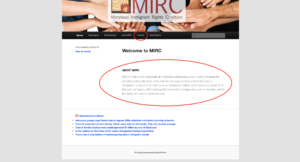
From the first click onto the website, it’s hard to see what the true target audience is. The text appears under the “About MIRC” section, with nothing else there to catch the eye. Even the donate button is bland like all the others. The layout for the site has lots of empty space in left and right columns making the website seem as if it wasn’t formatted correctly for web pages.
After looking on a cellphone of the same site, everything fit perfectly, as if that was the reason for the layout decisions.

Cellphones are used on 47 times per day (Wolfe 2018). The amount of people in the United States that use the internet as of 2011 is 245 million, 78.2% of the population (CNN 2011). Today, internet users are growing at a rate of about 200% worldwide (Popular Mechanics 2019). After looking at MIRC’s multiple times, it’s hard to view the website as a good fit for cellphones. It ‘s hard to imagine someone walking down the street or killing time by reading about the website. It appears more fit for a computer or laptop if the audience was in the mindset of learning more about the organization or getting involved, maybe if they went to a library. The author had the right mindset with appealing to the most popular medium for viewing content, but when people are mostly on social media apps or games on cellphones, and app should’ve been made to truly make the organization cellphone friendlier.
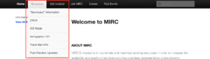
The website is non-profit, educational and political. The tabs under the “Resources” button are all materials for education to the audience.
The conflict in general transcends political barriers, and the organization itself is non-profit. A good way to describe MIRC is: a small organization wanting people to donate money and their time to help immigrants in need in America. Even though the web design is not extremely similar to other non-profit organizations, its text is similar: giving information regarding the organization’s mission to help a certain group of people, the people they are helping, and how to help.
This non-profit organization does not follow the typical web design setup that other organizations have when it comes to how their web pages are structured. It looks old fashioned with the general setup of: title of organization at the top of the webpage (but centered), a picture/looped video representing the organization, and a donate button.

But nothing pops out showing its targeted audience. The assumption is that being an organization that requires donors, the primary audience is probably donors or volunteers. Now, this conclusion only comes from prior knowledge of other non-profit organization website structures. With MIRC’s, there’s nothing making donations stand out. No colored button, no size difference, nothing. But being non-profit, all outside money is important. I can guess that the donor/volunteer audience is specified highly towards Democrats or Anti-Trump people. This is due to many articles or hyperlinks leading to text that speaks out against the Trump administration.


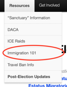
The second purpose to reach audiences and secondary audience type are people who want to be educated on the topic at hand. Lots of tabs under “Resources” talk about immigration and issues present such as Immigration 101.
The hope with these targeted audiences is that they are humanitarian, hard-working, and/or sympathetic so they donate money and/or time towards helping immigrants.
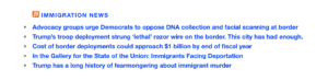
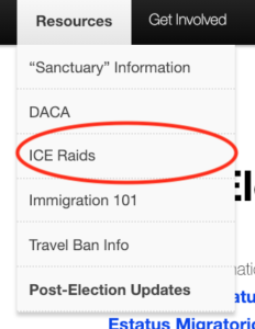
MIRC gives lots of information pertaining immigrants living in America and the challenges they face. The author tries to pull at contemporary issues to encourage the audience to donate money and/or time talking about topics such as Trump’s administration and ICE Raids (articles found under the “Resources” button).
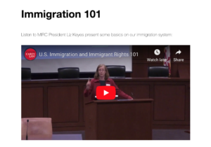
This point can be seen through a video found under the “Immigration 101” button within the “Resources” button…
…through any number of “Resource” button tabs, or by clicking on hyperlinks found at the bottom of any page.
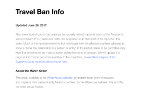
However, there are minimal unique ways of interacting with the web browser, or eye popping ways to gain the attention of the reader. Little is done with the use of photos, gifs, or anything that is popular now-a-days. Things appear out of date. This can also be seen with multiple articles dates being nearly 2 years old.


The purpose for this organization is to encourage its audience to give money or help out immigrants and to educate them on current issues. This can be seen through all information on the home screen: the “About MIRC” for the organization, the “Donate” button, the “Resources” button, and “Past Events” button seeing what the organization has done before.

A lot of the site is speculation. This is a combination of everything that has been looked at: author, audience, context, and genre. The author is a non-profit organization meaning the want donations from people. The targeted audience are people who would be willing to help immigrants. The most prominent genre present educational and non-profit, and the context is about immigrant’s issues today. It’s not easy to find quick answers to questions on this website. By searching through the site taking many steps, answers are there.
Though looking through the website, it’s hard to come away with an author for the site other than MIRC. No descriptions are given for the board members (found under Join MIRC).
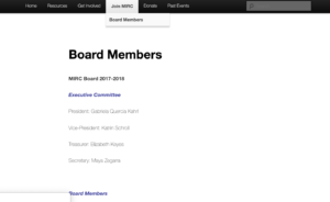
There is no reputation for the work the organization does. It makes it really hard to rely on this organization and trust them if there’s nothing credible to their work. The only thing credible is looking up board members and understanding they are actual people with solid background checks but even then it’s not clear whether they are credible enough for donations.
The website is not a good representation for an organization wanting to help immigrants. MIRC needs to update its website like other non-profit organizations to first give it more credibility from first impressions. Then, add more information to its board members so the audience is aware of their personal background and understand who runs the organization. Adding some more photos, videos, or other ways for the audience to interact with the site make its more attracting. For this organization to thrive, it needs to stay up to date with the norms for its website: creating different layouts when viewing the website on cellphones and laptops, updating website layouts so they are not out of date and appear sketchy, and add more aesthetically pleasing colors instead of faded ones that aren’t eye catching. First impressions are everything and MIRC needs to adjust there’s.
References
“The Death of the Internet.” Popular Mechanics, 7 Feb. 2019, https://www.pop- ularmechanics.com/technology/infrastructure/a26016334/death-of-the- internet/. Accessed 9 Feb. 2019.
MIRC – Maryland Immigrant Rights Coalition. Maryland Immigrant Rights Coalition, 2017, http://marylandimmigrantrightscoalition.org/. Accessed 9 Feb. 2019.
“Where is the Internet most popular?” CNN, 19 Aug. 2011, http://www.cnn.c- om/2011/WORLD/africa/08/18/country.comparisons.internet.use/index.html. Accessed 9, Feb. 2019.
Wolfe, Anselee. “Guess how often you use your phone everyday.” Journal of Accountancy, 2 Apr. 2018, https://www.journalofaccountancy.com/newslet- ters/2018/apr/how-often-use-phone-every-day.html. Accessed 9 Feb. 2019.