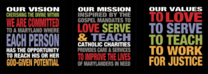
Upon analyzing Catholic Charities website (www.catholiccharities-md.org), Catholic Charities is a non-profit organization that provides care and services to people living in Maryland. Their values include “to love, to serve, to teach, and to work for justice.” In addition to their mission statement, the purpose of Catholic Charities is to persuade people into donating or volunteering for the organization. The authors of the Catholic Charities website have credibility with this kind of work. The author includes links to news articles and current events and includes images to capture the audience’s attention. The author of the website uses rhetoric to be able to have the website stand out to their audiences, inform the audience of the organization’s purpose, and help convey the genre and context to reach relevance in today’s society.
The primary audience that Catholic Charities strives to appeal to would be the donors and volunteers. When you first come to the website, the first thing you will see is their mission statement on the right side of the screen and a blue bar that goes across the page. The first two words that are read on the blue bar are “Donate” and “Volunteer.” Underneath of the blue bar is a graphic with a button that says, “Stand With Us.” Pressing the button leads you to a page that says, “Turn compassion into action” and on the right side of the screen there and three buttons with three different colors. The first button is green and has the word “GIVE.” Green could be associated with money and in this case, it is a good choice for the author to use the color to receive donations. The second button is blue and has the word “VOLUNTEER” which is another important aspect for Catholic Charities. Lastly, the third button is orange and has the words, “LEARN MORE” which takes you back to the homepage. This was a purposeful choice that the author made because when on the “Stand With Us” page, the navigation bar is not accessible, which means that the only options that a person could do is to either give or volunteer.

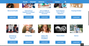
The secondary audience that Catholic Charities could appeal to would be advocates, immigrants/refuges, senior citizens, people with disabilities, and people who would need poverty relief or housing and shelter. The website’s secondary audience is a wide range because of the amount of services that they do offer. “Advocate” is the third word on the blue navigation bar on the homepage. The tab takes you to a page that informs the audience on Catholic Charities advocacy and public policy. The page also includes advocacy alerts, workshops, and information on how to contact the organization. Next to the “Advocate” button on the navigation bar is the word, “Find Help.” The tab leads you to a page that has a list of services that Catholic Charities has to offer. On the top of the page, it has a tagline that reads, “Find The Help You Need From One of Our 80 Programs.” The author purposely choose to put the tagline on the top and bottom of the page to show audiences that the organization does offer a wide range of services to appeal to anyone who needs help.
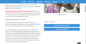
Catholic Charities’ medium is a website. The author most likely chose a website platform because it would be easily accessible to anyone who could access a phone or a computer. The primary reason for why the author chose a website would be to easily collect donations and to have volunteers contact the organization without having to find a location to go to. A secondary reason for the website is to provide people with resources. These resources include help with immigration, poverty relief, housing and shelter, community and neighborhood based services, and 80 other services. The historical convention for this website is that with the ongoing issues on immigration and refuges within the United States, people need to be able to find resources without fear of “being caught.” They want to be discreet with their actions for providing themselves with a better life.
Overall, Catholic Charities website is easy to navigate through. The tabs are straight forward and takes you to where you need to go. The website can be word heavy, however, it compensates with images and color. The website sticks to the same color scheme, most likely to ensure people that they are still on the same website. This would also help with people who have disabilities. The website also has credibility because it provides information and updates on government actions. The website is also well organized and keeps everything condensed into six tabs. The website could improve on adding auditory aids or add an option for different languages. This would satisfy a bigger range of audience and possibly bring more traffic to the website.