The following paper is a rhetorical analysis of the Catholic Charities’ Esperanza Center Webpage. To begin, some context is needed. The Esperanza Center is a charitable organization that aids immigrants, who need to learn English, find homes, jobs, and adjust to the US, as well as get legal help. There is an increasing prejudice against and fear of immigrants today and it has become even more important as can be seen by the population Esperanza serves and how it has grown over the years. This page of the Catholic Charities website is meant to gain volunteers and workers to provide these services for low cost or for free. It also directs those in need of the services to the center in Spanish. It was originally created in the early 1960s by a determined community activist, Nancy Conrad, who had returned to Baltimore from Latin America where she was serving with the Young Christian Workers with newfound inspiration to help immigrants and Spanish speakers in the U.S. Her endeavor was supported by the Catholic Church, and later adopted in 1980s by Catholic Charities the Esperanza Center has been through several names and locations as it grew to accommodate the growing need for it.
The Esperanza Center’s page portion of the Catholic Charities Website puts emphasis on the Catholic Charities Logo, being nearly as big as the images placed in close proximity to the topmost part of the screen. It draws the eye and ensure the reader knows who runs the site, and instantly defines a possib![]() le bias in favor of Catholics. This logo gives legitimacy to the website, and in turn to the Esperanza Center, with Catholic Charities being a well known and well established charitabl e Non-Profit organization that has operated for decades. It is clear from this logo, the company’s reputation, and from the layout of the navigation bar that the site targets religious people with money as it’s primary audience. The logo includes below it the words “Inspired by the Gospel Mandates” and “Cherishing the Divine Within All” (“Esperanza Center.”), which respectively is the tagline of the Baltimore Catholic Charities Branch and the Catholic Charities overall. The Navigation bar gives further insight, with Donate coming first, followed by Volunteer and Advocate. It is clear that those with time and/or funds to spend on Catholic Charities, in this case the Esperanza Center in particular, are the Primary Audience the webpage is created for. All over the website there are Volunteer and Donate Buttons, practically on every section of the website. Its purpose is clearly to gain the resources needed to run the Center and better help immigrants. The name of the Center is also highly emphasized, the words Esperanza Center appear all over the website, in various colors and sizes, as well as in images to ensure the name is prominent and easily remembered. The most important information, such as name, location, and contact options of the represented Esperanza Center are all placed above the fold and in close proximity to each other, in text that draws emphasis to them in English and Spanish. This use of both languages points to the secondary audience, though the site seems to be shifting them more towards a primary audience role: immigrants. It is clear that they are currently secondary as the bulk of the website is geared towards recruiting volunteers and donors and is in English. However, there are videos and important text in Spanish and intent stated that more will be offered in Spanish. There are also various links that lead services and their contact information that Esperanza offers and options to get the information in Spanish.
le bias in favor of Catholics. This logo gives legitimacy to the website, and in turn to the Esperanza Center, with Catholic Charities being a well known and well established charitabl e Non-Profit organization that has operated for decades. It is clear from this logo, the company’s reputation, and from the layout of the navigation bar that the site targets religious people with money as it’s primary audience. The logo includes below it the words “Inspired by the Gospel Mandates” and “Cherishing the Divine Within All” (“Esperanza Center.”), which respectively is the tagline of the Baltimore Catholic Charities Branch and the Catholic Charities overall. The Navigation bar gives further insight, with Donate coming first, followed by Volunteer and Advocate. It is clear that those with time and/or funds to spend on Catholic Charities, in this case the Esperanza Center in particular, are the Primary Audience the webpage is created for. All over the website there are Volunteer and Donate Buttons, practically on every section of the website. Its purpose is clearly to gain the resources needed to run the Center and better help immigrants. The name of the Center is also highly emphasized, the words Esperanza Center appear all over the website, in various colors and sizes, as well as in images to ensure the name is prominent and easily remembered. The most important information, such as name, location, and contact options of the represented Esperanza Center are all placed above the fold and in close proximity to each other, in text that draws emphasis to them in English and Spanish. This use of both languages points to the secondary audience, though the site seems to be shifting them more towards a primary audience role: immigrants. It is clear that they are currently secondary as the bulk of the website is geared towards recruiting volunteers and donors and is in English. However, there are videos and important text in Spanish and intent stated that more will be offered in Spanish. There are also various links that lead services and their contact information that Esperanza offers and options to get the information in Spanish.
As you continue past the Navigation bar it is notable that important text is emphasized by color, bolding, capitalization, or a combination of the three. Urgent messages are in red, important parts that aren’t as vital as well as text links in blue, and addresses and bolded. Other important information or things that the site wants attention drawn to are caps locked and written in black as y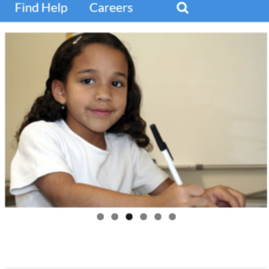 ou continue down below the fold. Back above the fold, on the right side, a rotating box of images showing various immigrants utilizing the offered services as well as the building that houses Esperanza center is shown prominently. The dots under the rotating picture box indicates the option to shift the images, and hovering over them produces arrows on either side of the images that also indicate an option for lateral movement. And past this on the far right is a scroll bar, notifying users that there is more to the website than the initial view. As the consumer
 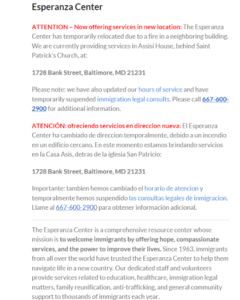 scrolls down through the site, they will notice that the linguistics were carefully planned with clear and simple language with text of a fair size and non-seriffed font, lending to easier reading. There are also prominent translations in Spanish for more vital or useful information being provided. Though it is not yet in place, there is intent stated to translate more of the website into Spanish in the near future, which makes it more accessible to the large Spanish speaking immigrant population. There doesn’t seem to be any option for text to voice on this site, and there isn’t much Spanish. The midsection of the page contains button in green for upcoming events, and below it are tabs with more in depth information about the Esperanza Center and its’ history, its’ goals, and its’ services. Each has a plus sign next to them in black and white signifying that more information can be accessed by clicking it and less can be seen by clicking the minus sign that appears once you’ve clicked the plus sign. Most
 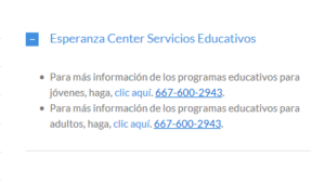 of the options are written in English; though one is in Spanish and provides a phone number to call for information on education for both adults and children, presumably also given in Spanish. For the most part this list of services are meant to garner pro-bono workers and volunteers to provide the services, rather than to explain them to immigrants.
Under the services and about us tabs, there is a video in Spanish with an option for subtitles in dozens of languages in the middle row of the page. This video explains some basic rights and legal tips for immigrants, various services that the center offers, and how to access them. There isn’t much sound on the site beyond the video. The video is an affordance for those who speak other languages or are hearing impaired in some way. This allows for another means o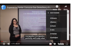 f communication, but it should have an option for translation on site or for text to speech. There is a lot of gesturing, facial expression, and body language in the video, as well as friendly interaction and explanation from both a male and a female. There is a scroll bar on the site’s right side to indicate the option to scroll down. The images above the options directly
  below the video are gestural and are not the most common but common enough to help signify what the buttons do. The checked box for example is something seen on various sites to denote mail or email. Both the text and buttons use contrast to stand out from the colors of the buttons against the plain white background. The brightly colored and emphasized text contrast is used
 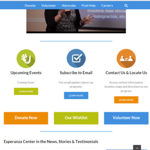 to great effect to pull the eye to the most relevant, beneficial, and important information or points for the company’s goals. Just below this, it is again made clear the website’s main goal of gaining donors and volunteers with far larger size than the buttons above them and opposite color patterning with buttons “Donate Now”, “Our Wishlist”, and “Volunteer Now” (“Esperanza Center.”). Finally at the bottom of the page, there are testimonials and more links to get involved in Catholic charities.
The Esperanza Center site is online, and thus is easy to access for anyone, be it via personal devices or free ones that can be utilized at libraries and other public spaces. This platform provides a direct route through which to donate or t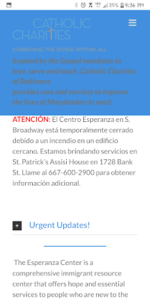 o sign up to volunteer. It is on Catholic Charities’ site, as one of their many projects, giving it a better chance of being noticed than it would have on its’ own. It has a mobile version as well, which contains more Spanish text on the homepage than the desktop site does. I am not entirely sure why. However, it is possible that it could be because people are likely to have a phone, or access to one, than a laptop or other personal computer, and so more people will be able to use it and find information on the Esperanza Center in an easy to consume manner. Note that the mobile site has a major flaw, in that the mission statement and logo of Catholic Charities covers about a third of the page once you scroll below the fold. This is annoying and unhelpful at best, and detrimental to user’s ability to read the text at worst. It is distracting and a poor design choice that limits the site’s usefulness.
The Esperanza Center has a good web page with a clear focus on Donors and Volunteers and a strong secondary focus on immigrants. It provides a streamlined way to research the Center and donate and volunteer for it. It also provides useful information and routes to information for Spanish speaking immigrants. It’s mobile site is useful, but has issues in regards to set up, with a large portion of the site being covered by the Catholic Charities’ Logo and mission statements rather than displaying the relevant information for which the site exists. The desktop site has its own issues, in the lack of text to voice capability and the fact that it does not apply a translation option. Overall, it is a focused and useful website in any form so long as you can get around the minor inconveniences.
Works Cited
“Esperanza Center.” Catholic Charities of Baltimore, www.catholiccharities-md.org/services/esperanza-center/.
“I pledge on my honor that I have neither given nor received
unauthorized assistance on this assignment/exam.”
-Megan Biemesderfer