Rhetorical Analysis: Heifer International

introduction

Heifer International is non-profit organization that serves to eradicate hunger and poverty globally by developing self-efficient communities and donating livestock to those agricultural communities. In order to succeed in their efforts, Heifer has created a website which has a number of features for donations as well as avenues to view their progress on the development of communities where they have a presence. I will be analyzing the site in order to establish how things function and if they succeed in generating interest in Heifer’s efforts.

Audience & Purpose

For starters, the audience for Heifer International are clearly individuals interested in entering the fight against hunger and poverty worldwide. The site is constructed in a way that invites a secondary audience in with a beautiful and engaging conglomeration of media and text that blend beautifully together. One of the primary purposes of Heifer International’s website is introducing an uneducated audience to the hunger and poverty plight around the world. It achieves this by having a large amount of carefully detailed graphs and statistics about the hunger epidemic around the world. Secondarily, the site also shows Heifer’s philosophy and business strategies throughout the world, including how the donations given to Heifer affect the communities and the various types of livestock that can be donated to struggling communities. There is an obvious bias, however since as a nonprofit, Heifer requires donations to function so it is of the utmost importance that they make their mission seem like it is both urgent and successful.

Medium

The choice of a website in the modern age instead of a magazine is very crucial as through the site’s meticulously planned layout, it’s much easier to get to the sections that you actually want to get to. As stated before, the site is filled with pictures and graphs, detailing the statistics of the hunger issue while giving a powerful and positive outlook due to their work. The beige, green and yellow tones of the site are nice choices. They’re good colors without being distracting but subtle without being boring.

Font-wise, the white and browns stand out against beige and green backgrounds. For further emphasis, Heifer’s designers have also included various reds and blues in their heading font selections that draw attention to whatever the site is addressing.

Information Architecture

The site is designed in a way where most of the most basic information is placed directly on the home page. By reading the home page, an interested can see what Heifer International is about and see what they believe. However, if more information is desired, Heifer has their information bar on the top that directs you to their views and their approach to eradicating hunger.

personal experience

Overall, I greatly enjoyed Heifer International’s website. I usually visit websites like this but I found myself lost in the rabbit hole, per se. There’s so much information to read and it’s presented in such an interesting and visually pleasing way that it’s extremely hard to back out once you’re fully invested in getting in.

The information is easy to access and every link seems to take you to a page that constantly reemphasizes the importance of Heifer’s mission and shows you just how widespread their reach is. It’s both inspiring and a bit daunting, knowing just how large their mission is. Because of this, it almost makes you want to donate because it isn’t an easy thing that they plan to do.

On a scale of 1 to 10, I’d definitely give heifer.org a 9.75, if only because when you first access the site, they try to hit you with a donate now sign up page that is a bit frustrating and annoying.

Howard McMillan, Jr.

Rhetorical Analysis of Heifer.org

Rhetorical Analysis Parts 1 and 2

Audience

The primary intended audience of Heifer.org seems to mainly be people looking to donate to the Heifer foundation. These possible donors are likely people looking to end world hunger. In addition to attracting potential funding, the website also aims to inform visitors about their mission and the issue of world hunger. A secondary audience of people trying to learn more about world hunger and its effects both locally and internationally is also reached. The website is only offered in the English language implying that its intended audience is English speakers. Based on their location here in the United States, one could further narrow down Heifer’s intended audience to being possible American donors or Americans researching Heifer and world hunger. There is a sub-menu allowing for donations to be placed that specifically go to empowering women. This adds another dimension to Heifer’s possible audience as well as their purpose. Both are broadened to support of women and ending hunger as well as donors interested in contributing to either cause.

Purpose

This website’s primary purpose is to raise money for the Heifer Foundation and the various projects and charitable actions they provide. As soon as a visitor logs on to the site they are presented with this pop-up screen that pushes them to identify as a donor. 

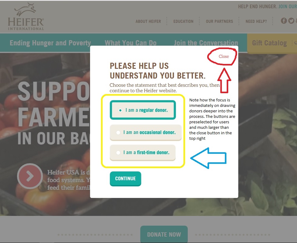
Due to the immense amount of information available on Heifer’s website, their secondary purpose seems to be bringing awareness to the issue of hunger on both international and local scales. The tertiary purpose seems to be informing the public with information regarding how they are working against world hunger. This is supported by Heifer dedicating a large portion of their website to describing the methods they use to provide their services to those in need.

Context

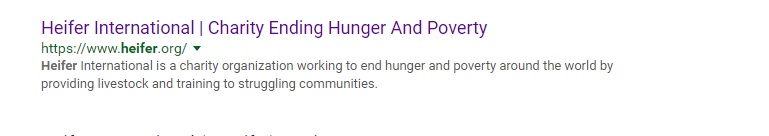
If you put heifer into your preferred search engine their website is usually among the top results and features a brief statement to provide some context to visitors before they click the lnk.

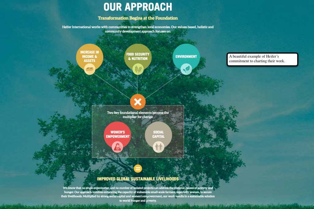
Heifer.org fully utilizes its online medium to present itself to readers. The text is laid out in an interactive format on the Heifer website. Readers navigate maps and other interactive graphics and menus to learn more about Heifer’s work, the issues surrounding hunger and nutrition worldwide as well as possible ways to contribute to Heifer in order to aid them in their mission.

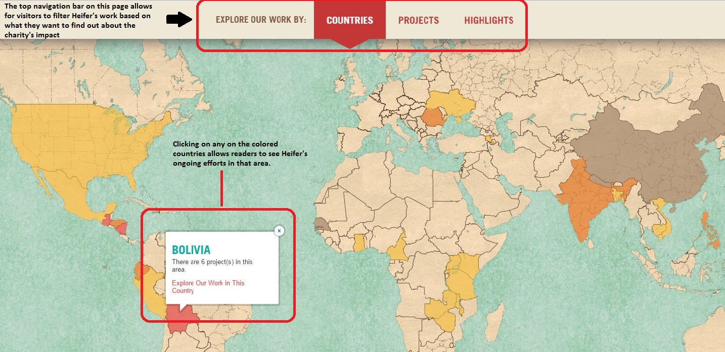
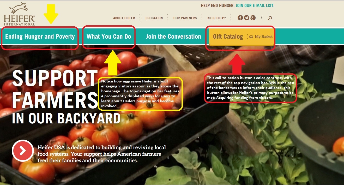
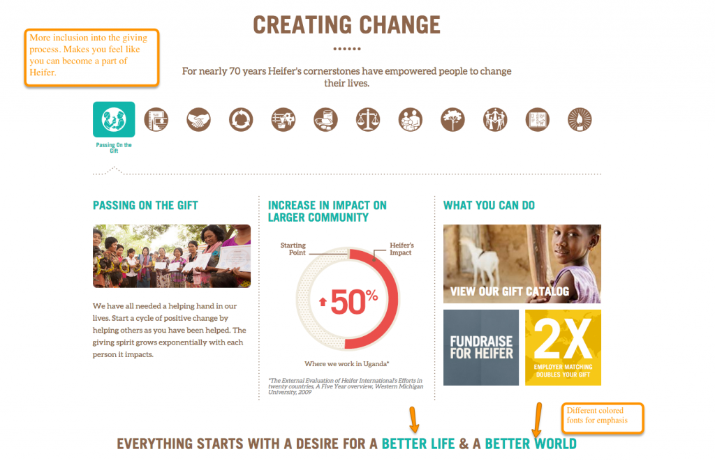
These information graphics are easy to use and stand especially when compared to the information architecture on other sites. The designers of Heifer’s website spent a lot of time allowing a user to get lost in their information without becoming disoriented. No matter how deep into the charity projects or catalog you go, the top-navigation bar allows a user to keep their sense of direction within the site.

Heifer’s online context allows them to easily convey large amounts of info about themselves and allows for easy donations and purchases from their online store via credit or debit cards from visitors. Being an online publication/foundation with credit card processing capabilities allows for much easier access to customer/donor funds.

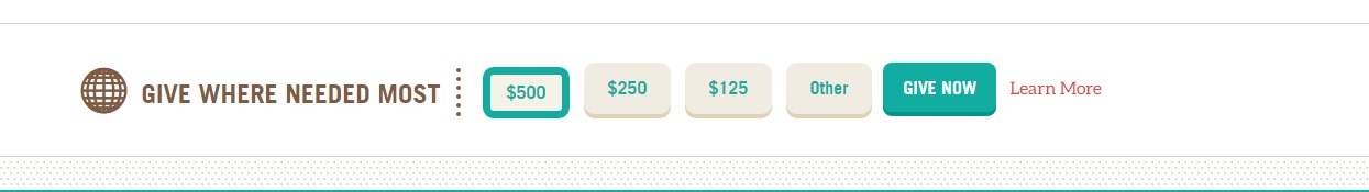
Notice how the donation slider comes preset to the most expensive standardized amount on their donation pages. Their online presence allows for them to draw donors in for larger sums than an in person, door-to-door charity campaign would simply by their ability to process credit cards.

Genre

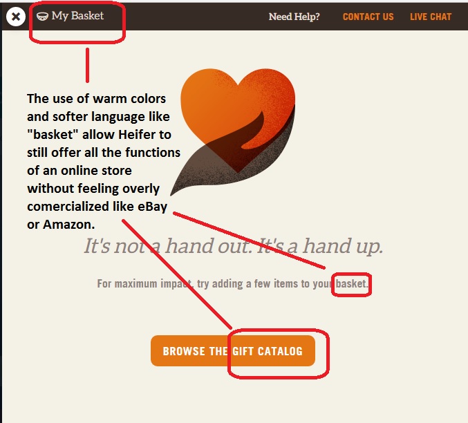
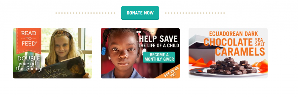
The Heifer website most closely falls into the genre of online charity organizations. The amount of information on the site also adds an educational/informational aspect to it. Readers are constantly presented with facts about the issues of world hunger and different ways that Heifer is working to end it. In addition to a constant information screen, visitors are frequently and boldly prompted to donate via pop-ups and boldly placed call-to-action buttons. Small touches like calling the “cart” the “basket” and letting visitors choose who/where they donate to make the website feel more personal and less generic.

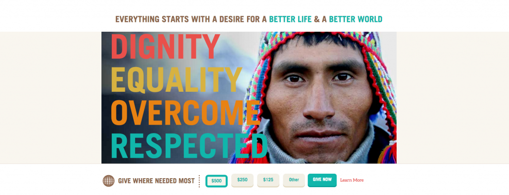
The careful, gentle wording and is an effective quality in a website that’s main purpose is to acquire donations. The warm colors featured by Heifer also aid in this feeling of comfort. Even the cooler colors like blues and greens used on their front page are soft and provide a gentle but effective contrast against their call-to-action buttons.

Font

Most of Heifers text is written in brief, easy to read blurbs in a font that does not use any serifs to possibly disorient dyslexic visitors. The writing is well spaced and formatted well enough that a reader’s eye naturally finds the next line or latches onto the next blurb down the screen.

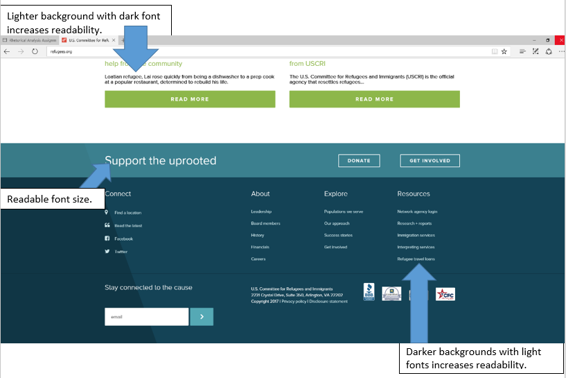
The above font is easily readable , the layout is simple and the message is clear. The colors are all very muted but distinguishable against one another and allow for the plain white text to be easily read.

Author

No actual author is given credit or mentioned in any of the articles or parts of the website. The implied author is one that cares deeply about the work of Heifer and wants to inform the readers as heavily as possible about their work and the benefits that a donation will have on the work.

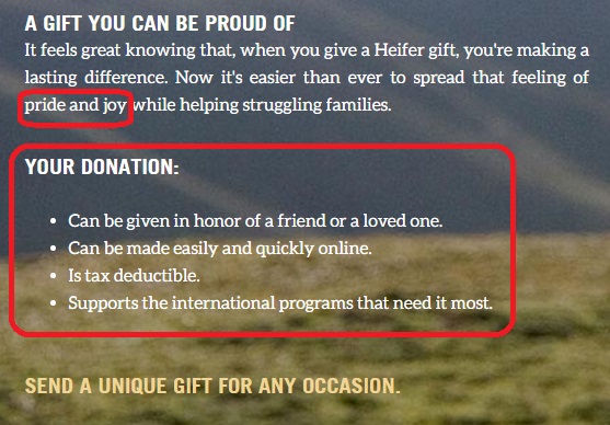
The author of the above image has a clear and persuasive voice. The benefits a donation would have are clearly listed for visitor’s through the use of persuasive language like “feeling of pride and joy” and “you’re making a lasting difference.” That firm but persuasive voice makes readers want to please that author and donate to Heifer.org.


Rhetorical Analysis Part 3

The primary audience for heifer.org is possible donor’s. These are visitors who come to the site to make a donation. Though the Heifer organization is a charity, it is run like a business and acquiring funding is still their primary goal, which makes potential donors their primary audience. Due to the immense amount of information also featured on the Heifer site, they reach a secondary audience of people who are looking to learn more about issues like world hunger and their effects on both a local and international scale. Countless pages of information on these topics are featured on the site and feature easy to read graphics like graphs, maps and photos to show readers what hunger looks like, how it affects people and what Heifer does to help. The primary purpose of Heifer’s site as mentioned above is to acquire funding, which does make them biased in their mission, though it is not necessarily negative bias. The side of the argument that Heifer presents and favors is their side. Heifer wants you to donate to them, rather than donate to a local food bank or other charity. It is an understandable bias to have considering that Heifer’s site functions to run a truly massive international charity.


The online medium utilized by heifer.org is what makes running their charity on such a massive scale possible. The website layout makes it super easy for donations to be taken by credit card processing software and allows for them to also run an online store to help fund their projects. Tons of pictures, graphics and interactive menus engage readers and all seem to somehow lead back to a donation button without Heifer seeming pushy or too assertive. These multi-modal elements make for a smooth and interesting user experience as readers are able to absorb cultural facts and statistics about hunger while they contemplate making their donations. Links and tags to other articles and pages on Heifer.org are abundant and a user can spend hours browsing the sites dense content.


When creating this rhetorical analysis I only used the screenshot key to capture images and the program MicrosoftPaint to crop and label the examples from Heifer’s website. I’m not a very tech savvy guy and I was pretty intimidated by the idea of recording myself using a computer, using unfamiliar programs or trying to narrate my technologically-challenged stumbling through Heifer’s website. The process I used to make this simply involved me copying and pasting the assignment requirements into a blank post, then answering the questions, then finding graphics to support my answers. This method was fairly simple and allowed me to stay organized. Though it may have been painful for you, thanks for sticking it out through all the 1376 words in this post.


Rhetorical Analysis


Heifer International

The Heifer International organization was founded by Dan West with the mission to provide relief for those in poverty. Dan West found a way to gift families with not just rations of food but whole, live animals that can sustain them for much longer than a simple ration of food. His organization empowers families to turn poverty and hunger into prosperity (heifer.org/about). The Heifer website is simple and easy to follow. By having a simple site, Heifer makes it easy to understand their message and their organization.

The intended audience for this website are people who are interested in helping end hunger and poverty around the world and people who want to learn more about the company and what they do. The secondary audience for this site could be sponsors/ partners or companies looking into sponsoring this organization. The intention of this website is to inform the audience of who the company is, how they conduct their work, and how the audience can help them. The company also wants to collect donations from their readers, in the form of money or gifts for families in poverty. They want to work with communities to end hunger and care for the earth. By allowing people to buy livestock, they are reassuring their audience that the money won’t be wasted, while providing a family in need with a valuable resource. The medium for this information is a website. I think the author chose this platform because it’s an easy way to get a lot of information across to a wide audience. This website can be read at a glance to get all the information or an be explored in great detail for a long period of time. We are now an online generation so having an interactive website is a great way to reach a very wide range of people. The author of this is the Heifer organization. The author of this website comes across as knowledgeable and trustworthy. They seem to know a lot about their topic and have a great understanding of their program. The author provides the information is a lot of detail and makes sure to explain everything in a way everyone can understand.

The general colors of the website are simple and not overwhelming. The colors are not overly vibrant. The main task bar is a simple blue color with a light grey bar at the top. The yellow box is a good way to highlight the area where the viewers of the site can donate money and other gifts.  As we get farther down the main page of the website, the background shifts to white, allowing the other links to pop out of the page, drawing your attention to them.

The bright colors in the pictures draw your attention, and make sure you can see more ways of helping/ giving. The white background helps highlight the light blue donation button along with the other donation ads.

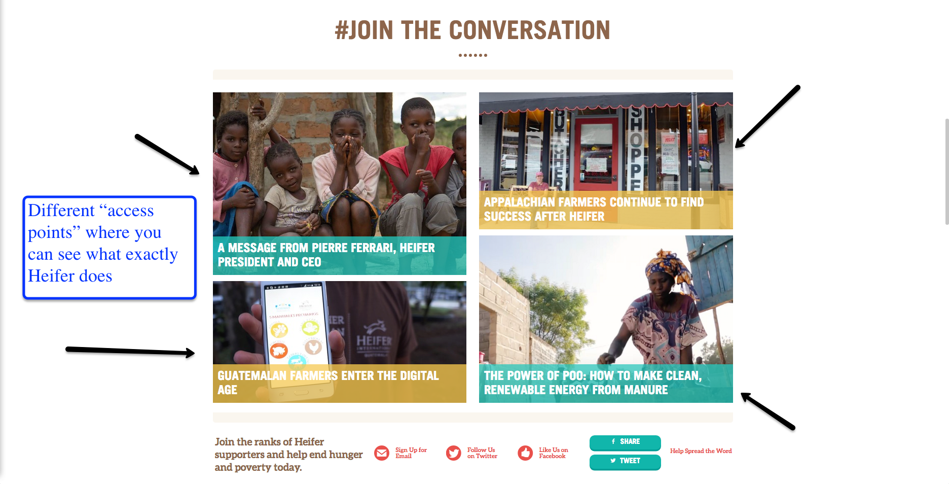
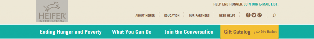
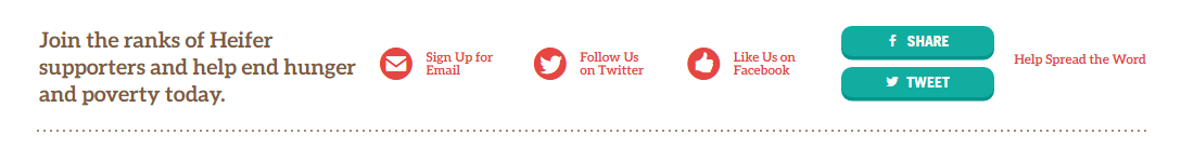
Below this area, we have a bar with bright red lettering, advertising the organizations social media accounts. Highlighting this section in red draws your attention and encourages you to follow their pages and help spread their message. The red text draws your eye, and encourages the audience to follow them on social media which would help them spread their message to people who might not know about their organization

The font is consistent throughout the whole site and isn’t constantly changing from page to page. It’s an easy to read font at a reasonable size. The size of the font changes depending on whether the text is a headline or a passage of information.  The headlines are big enough to be eye catching but not too big that they take up the whole page. The bigger text of the headline calls your attention to the article, while the smaller text makes reading the information easier.

Overall, this website is easy to interact with and full of positive information about the company and their mission. The authors make sure to get their information across in a very quick, easy to understand way. By having several bright pictures of families and kids on the first page, they encourage sympathy for their cause and make donating to them very easy and accessible. This website is full of interesting fats and information, overall I think it does a very good job of catching the readers eye and encouraging their help.

The tool I used to capture the above images was JING. I chose this tool because it was easy to download and easy to use. This tool allowed me to take screenshots of which ever section of the website I needed for my analysis. Having the images to go along with my description gives the reader a reference to go off of throughout the analysis. To create this analysis, I made sure to go through every page on the Heifer website before writing. I decided to focus mainly on the main page and the about page for my analysis because those are the two main pages that readers will see first. By focusing on only two pages, I know I limit my analysis but I thought it would be easier to analyze the main pages that the audience would see first.


Rhetorical Analysis

Dabrianna Green   

     I chose to analyze www.refugees.org. Though there is more than one audience, the intended audience is people who are interested in supporting this particular cause. The secondary audience is anyone who is interested in learning about the cause and the organization in general. This organization is dedicated to bringing awareness to the issues involved within the refugee crisis, which corresponds with the purpose of the website. The United States Committee for Refugees and Immigrants intend to provide a space that informs onlookers of their mission as a committee, while simultaneously providing the resources for the public to get involved.

     These core values, intentions, and motives appear throughout the entire layout of the site. The navigation bar reflects the gradual process the average person goes through before committing to a cause. First, they become informed by exploring the issues overall, which reflects the “explore the issues tab.” Next, they look into the approaches within different organizations, which reflects the “our approach tab.” Finally, they decide where and how they will get involved, which reflects the “get involved,” “donate,” and “act” tabs.

     The context of this site is a crisp, clean layout for the web that can easily be accessed from a number of electronic devices at any location. The organization presumably chose this particular medium because in today’s society, everything is online and viewers have less patience. This also seems to be the most efficient and effective way to combine all of their efforts such as informing and collecting donations simultaneously. They do not have to worry about running out of space and they can refer anyone with questions or concerns to their website to get all of the information they need. The navigation is simple enough for all age groups and facilitates almost anyone. This medium definitely is a reflection of understanding the target.

     The genre of this site is organizations. Instead of the “.com” websites generally have when their websites are for commercial use, organizations typically use “.org” at the end of their website. Many organizations have a similar setup when it comes to their websites; it often is reminiscent of a pamphlet they would give out. All of the key information about the organizations is displayed on their website ranging from their cause to their contact information. The great thing about having this website is that the organization is able to include video and have people donate directly from the site, which this site definitely makes     

     The interface is extremely user-friendly and everything that it should be. Though some websites tend to be carried away with all of the features they can include that results in a website saturated with widgets and unnecessary features, there is a function for everything in this website; everything included enhances the experience. The colors are vibrant enough to keep the reader interested and engaged, but not so vibrant that they assert playfulness. After all, the refugee crisis is a serious matter. However, many organizations have a tendency to come off so serious and stern (often not utilizing color, playing with font choices, & etc.) to make their website aesthetically pleasing) that their website doesn’t keep the viewer’s attention.

     The font choice is extremely readable. Throughout the entire website, the organization does not go under 12-point font. They also pay specific attention to the color choice in regards to font. Some colors do not overlap well when it comes to text and background. This organization realized that and made sure that the darker backgrounds had lighter fonts and the lighter backgrounds had darker fonts.

     The website’s information architecture is extremely straightforward and helpful. Every title reflects the exact link it is connected to. If the user wants to “get involved” with the cause, they can easily click “get involved” in the dashboard and they are brought to several options that show them how to get involved in the area of their choice. No matter what option they chose, they are provided with a list of all of the resources they will need and contact information should they have any questions. There are many aspects to this site. However, it is very hard to get lost or have navigation issues. This makes for an effective user experience, which is especially important considering the type of site this is.

     The purpose for this site is to spread awareness, gain support, and collect donations. The site definitely has bias because it is targeted towards a certain cause. There are little to no counterarguments towards this cause displayed on the site because it would take away from the organization’s purpose and mission; the organization is only going to showcase that supports their cause because they have a certain point they wish to make.

     After analyzing the site and making note of everything that stood out to me, I used the screenshot feature to make my arguments about what elements enhance or takes away from the site. Along with that, I used arrows to point out each feature I wanted to highlight. I then added text boxes directly under the arrows to explain the point I was trying to make about the features in detail. This allowed me to show exactly what I was referring to directly.