The site that I chose to analyze is www.refugees.org, the website of the U.S. Committee for Refugees and Immigrants
Audience
The primary audience of refugees.org is people who want to learn how they can help refugees who are trying to get into the United States for better opportunities. The secondary audience is people who care about the issue of refugees and want to learn more about the issue.
Purpose
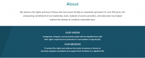
The purpose of this site is to inform and to educate web viewers about both the issue of refugees, what the committee does and how it handles doing it.
It could be argued, though, that it has a bias since the opposing argument would be the fear that terrorists would take advantage and sneak through our borders to carry out more terrorist attacks. While the website does not counter this argument, presumably since it does not want to get involved in a political loophole, it simply states the facts and only tells the audience how they can help refugees instead of advice on how to win an argument with someone who wants to bar refugees from coming into our country.
Context
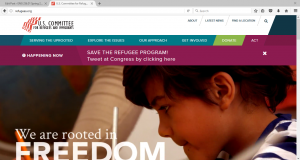
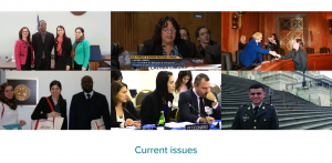
The context of refugees.org is rooted in its color scheme of light colors to give the viewer a feel that the committee is dedicated to what it feels is right in helping refugees. From the picture of the homepage, the white outline makes the site seem educated on the refugee issue and the text is in black since other colors would be distracting. Whenever there’s an alert, a tab appears in dark red at the top of the web-page to catch the viewer’s eye, showing that action has to be taken in order to ensure that the viewer can immediately help out even if the viewer hasn’t navigated the entire site. The other navigation sections are colored in light blue, which makes the website seem positive about its message. Several pictures of committee members meeting with politicians and congressional hearings as well as refugees sitting around are also displayed to show that the committee is dedicated to helping refugees since it sees the issue as very serious and wants the viewer to think so too.
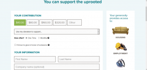
In fact, the website relies more on images than actual text to make the site feel more welcome rather than being overloaded with information that can make it seem too tiring to read. The donation and the act tabs are designed in bright green and dark red to make them stand out from the other tabs so that the audience can tell what is action and what is information. The donation slider is set at the cheapest amount at $40.00. Viewers can also select whether to do this once or monthly. With a website, the committee now has the opportunity to draw donors in for larger sums of money than if a committee tried to receive donations via door-to-door or fundraiser activities.
Genre
The genre of the website can be categorized as an online charity. There’s a lot of information on the website both about the committee and how a viewer can help that makes the website seem educated and resourceful. The facts about refugees are constant and always present. The viewer isn’t told constantly, however, to donate as he or she keeps reading. Instead, the home-page has quick little videos that make viewers feel welcome and that they have come to a place where they can help contribute to helping refugees find a safe and comfortable home.
Author
While no credit is given to who authored the site, the implied author is the United States Committee for Refugees. The actual author, or authors, is someone that strongly supported the committee’s cause and wanted to reach out to internet surfers to get widespread attention.
Font
While their isn’t much text written on the website, since it prefers to use pictures, the text that is provided is written in short and concise sentences that quickly summarize the problem and the committee’s solution. This was probably done to stop the site from boring the reader, but the layout is straight-forward and the message is clear because the text is spaced and formatted in a way that the viewer can follow without becoming disorienting.
Interface
The interface enhances the experience with all the features that are designed to attract the viewer’s attention. The colors are vivid at the right tone to keep the viewer engaged.
Information Architecture
The information architecture is simple as the short text sentences. If the viewer is convinced and wants to contribute, they can go to the bottom of the site in a blue column headed “Support the uprooted” and select either “Donate” or “Get Involved”. If viewers want to know more, they can go further down where there’s a darker blue column with four rows, each headed “Connect”, “About”, “Explore” and “Resources”. As a result, the site is easy to navigate to the point where it’s almost impossible to become lost.
The tool that I used in creating my analysis was JING since it was the easiest to capture screen shots and implement them with my rhetorical analysis. I’m not good when it comes to internet design hence the reason the pictures may be blurry. But having the photos with my analysis helps the reader understand what I am describing as I analyze refugees.org. I didn’t want to overload my analysis with photos, though. I only used images that seemed necessary in order to understand what I was talking about.