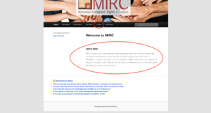
There are many non-profit organizations out there looking to help refugees and immigrants seek asylum. Below is a rhetorical analysis of the non-profit website www.lirs.org. The Lutheran Immigration and Refugee Service was designed to help refugees escape life threatening situations and get the attention of volunteers/donors to help. By taking the time to analyze the audience, purpose, context, author and genre of this website will determine if the site is truly effective or not. LIRS has many positive design choices along with a very persuasive intention and delivery to make a change, making LIRS an effective website to gain donors and inform refugees on the steps they need to take to gain safety.
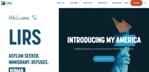
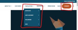
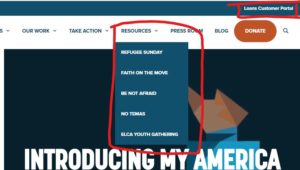
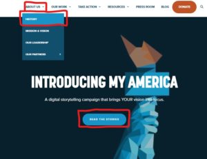
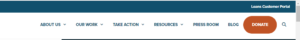
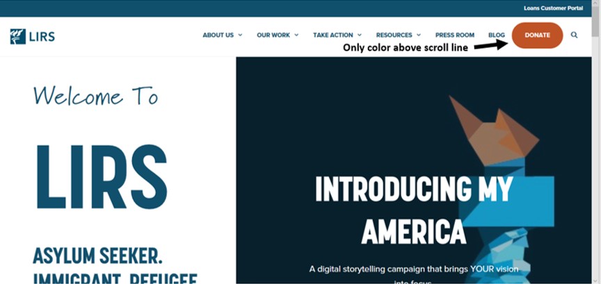
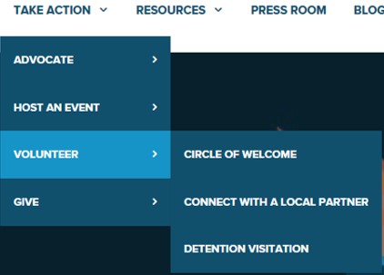
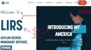
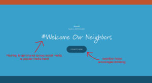
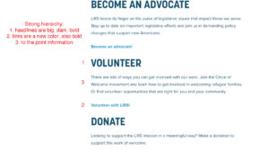
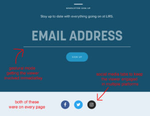
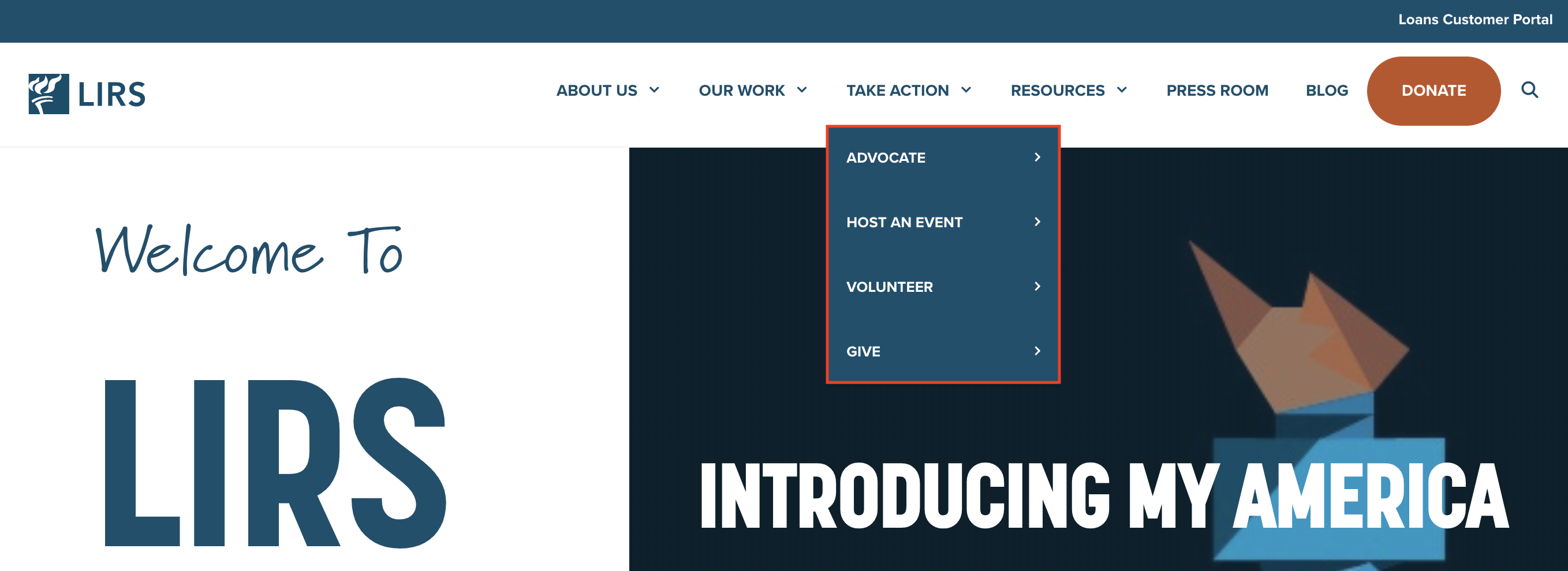
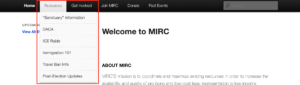
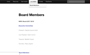
These smart design choices begin right on the landing page of the site in the navigation bar. Without having to scroll you immediately see an orange button that stands out and grabs your attention through a linguistic and gestural mode of communication. The capital letters make it known that it is important and the button makes it interactive for the donors. This shows that LIRS primary audience is donors/volunteers and their main goal is to get donors to help make a change. The secondary audience is the refugees who are seeking asylum and looking to learn more. We know this due to the different tabs that are in the navigation bar, by providing different resources and how to take action will help the refugees get a better understanding of the non-profit.

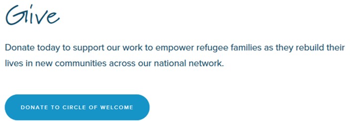
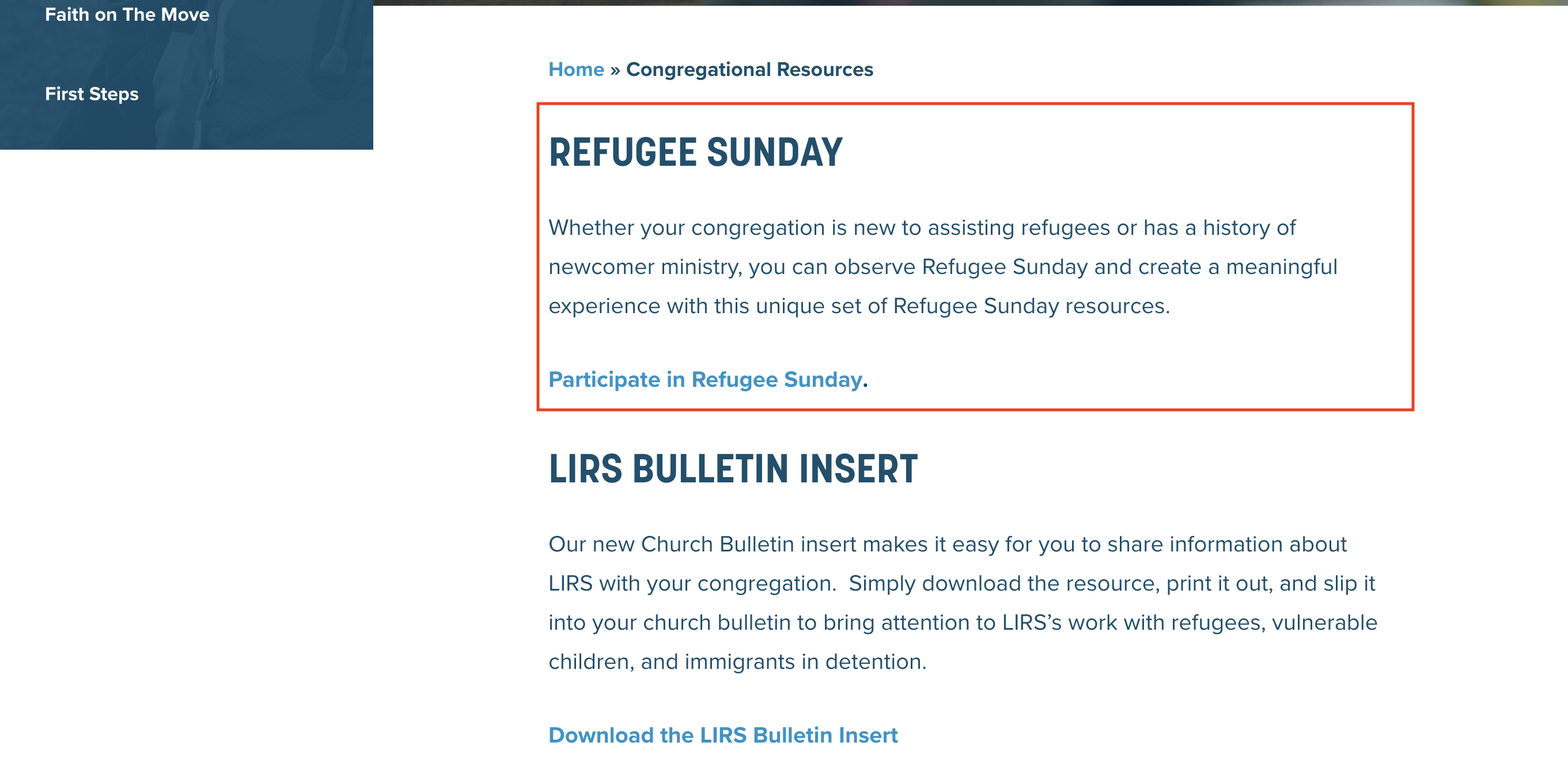
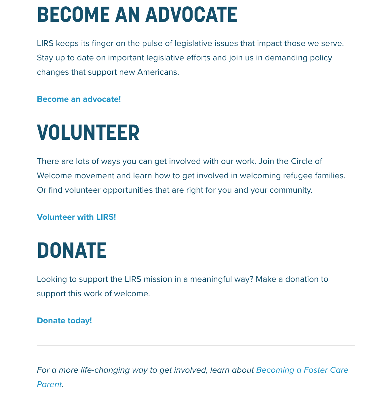
The overall intention of the LIRS website is to persuade people to donate and volunteer their money and time to help spread the word and support the refugees. It is very clear that this is the main purpose due to the linguistics and visuals all over the website. Between the TAKE ACTION tab and the large DONATE button it is very clear that they are looking for donations and volunteers. Not only is the purpose indicated through the drop down menu but the site also states its mission and its values under the ABOUT US tab. When reading through the author of the site truly persuades you to want to help the refugees, even if it is only a little it make a change in someone else’s world.
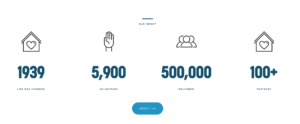
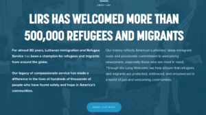
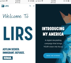
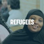
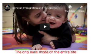
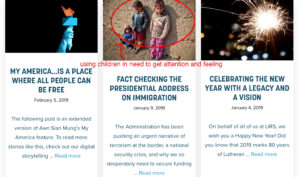
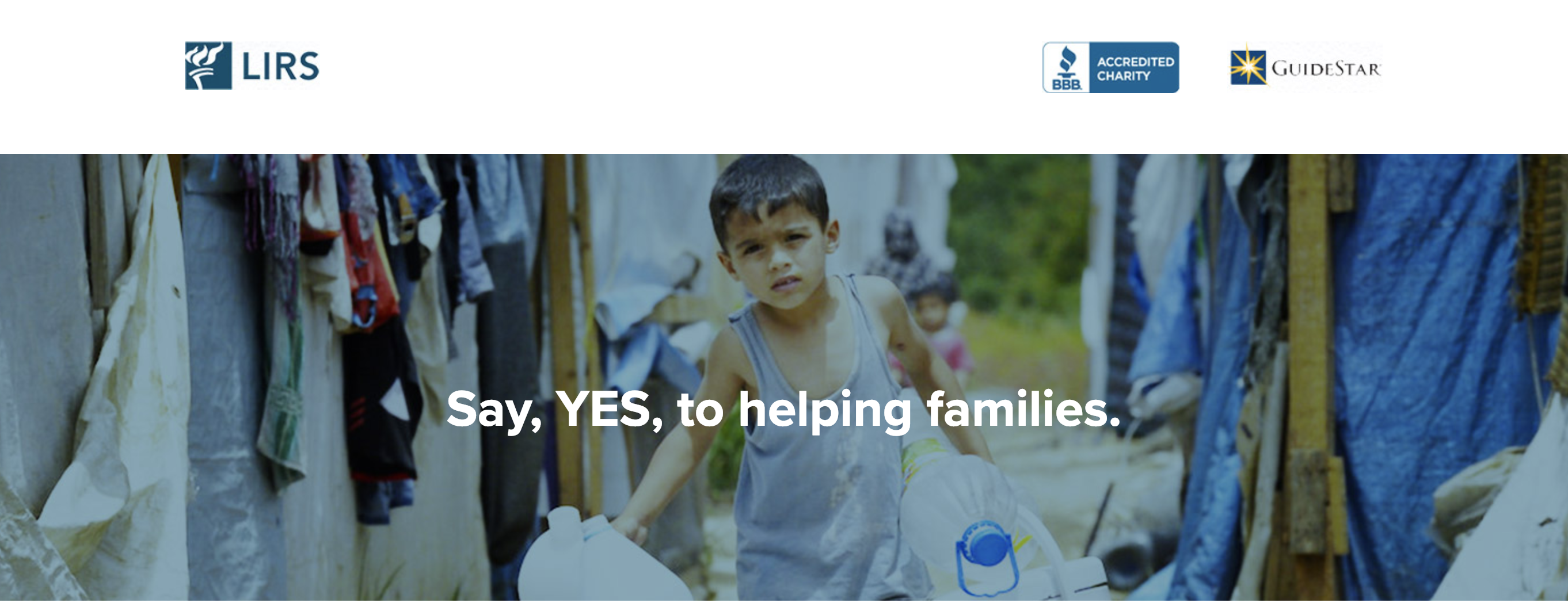
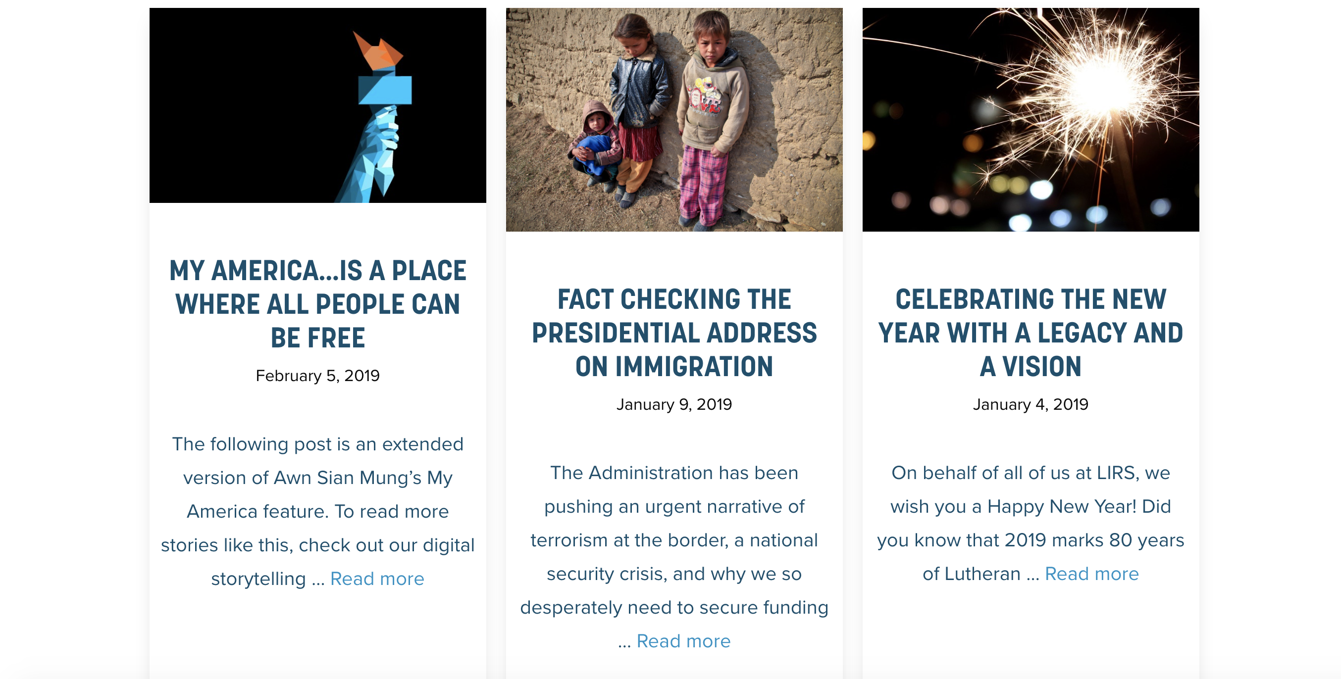
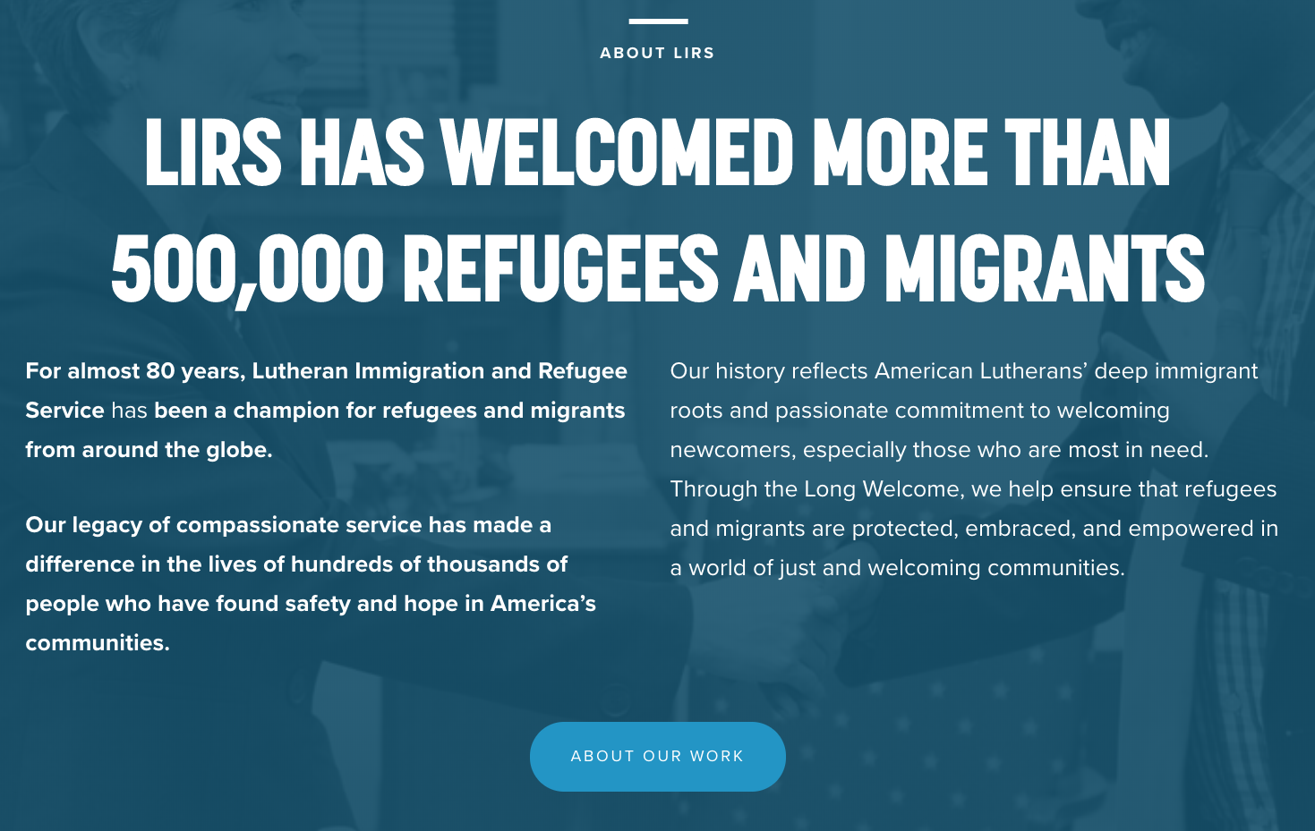
When analyzing this non-profit it is clear to tell that the medium is the web. This medium is used for many reasons including it is easy to access and it has the ability to reach many people, especially in todays society where everyone is constantly on their phones, tablets, or computers. This was a very smart move on the authors end because it gives the donors the ability to donate from the click of their mouse or fingers and it also allows for many people to easy learn more information just by searching the web. Through this medium the site has the ability to touch on many of the modes of communication including linguistic, visual, spatial, and gestural. These can all be reached through different text, fonts, images, white spacing, and buttons throughout the site. The different categories of the site are organized in the navigation bar at the top of the homepage and the site uses a very attention grabbing color scheme that includes white, navy, and a pop of orange to really gain emphasis. It makes use of different heading sizes, along with incorporating images at the top of every page to bring in the emotion. If the person viewing the site sees these emotional picture of children and families in need, they are more likely to donate money or time to supporting the refugees.
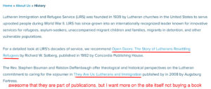
The implied author behind the scenes of this website is the The Lutheran Immigration and Refugee Services but the actual authors are the people behind the scenes. Some of these name include board chair, Michael Rinehart, vice chair, Linda Stoterau, interim president and CEO, Pat Nichols, director for marketing and communications, Danielle Bernard, and director of outreach, Folabi Olagbaju. All of these people have made it possible for there to be content on this website. This is a trustworthy source due to the fact that all of these people involved have had past experience and knowledge of refugees and three people on the board are actually former refugees who are now trying to help others. A lot of people come together to make this site possible so the author comes across as very knowledgeable and gives a lot of insight because everyone on the team has experienced different encounters. This author is looking to raise awareness and gain support of the refugees and immigrants and the website they have produced definitely back up that reputation. The author of the site also gives off a very organized vibe due to the clean cut colors and layout of the site overall.
The LIRS website is put under the genre of nonprofit. You can clearly tell this because of the layout of the site and the content it shows. Many nonprofits have rows and top navigation, it is the standard layout for a site that is made for a nonprofit. Not only that but the large images that are placed throughout the site allow for emotion and that is one of the main factors in drawing people in to donate. The sites linguistics are mainly geared toward the helping and the wellbeing of refugees and immigrants and there are many call to actions which all people to interact and donate. You could also say that LIRS is an educational site as well due to the fact that it gives a lot of information for the refugees or people learning about refugees to gain information.
After analyzing the entire LIRS site it is clear that they have a motive and want to help. But there are also some things that could be changed to help gain them more donors and attention. Some of these things include incorporating more videos to really get empathy from the users. As a social media user I would also recommend that they use their social media platforms to their advantage and incorporate hashtags and more links to their social platforms since social media is currently the way of the world. They make use of many different fonts and heading sizes which is a great way to gain attention and make a point. But I do not think that everything has to be in capitals because it starts to take away the point of emphasis. You only want to capitalize the words you want to take a lot of meaning and to make a point with. Overall, I feel that this site was made in an effective manner and does its goal of persuading people to donate and want to make a change through its linguistics, visuals, gestures, and spatial layout.
Works Cited:
Lutheran Immigration and Refugees Service. 2019. www.lirs.org/. Accessed February 11 2019.


 screenshot from
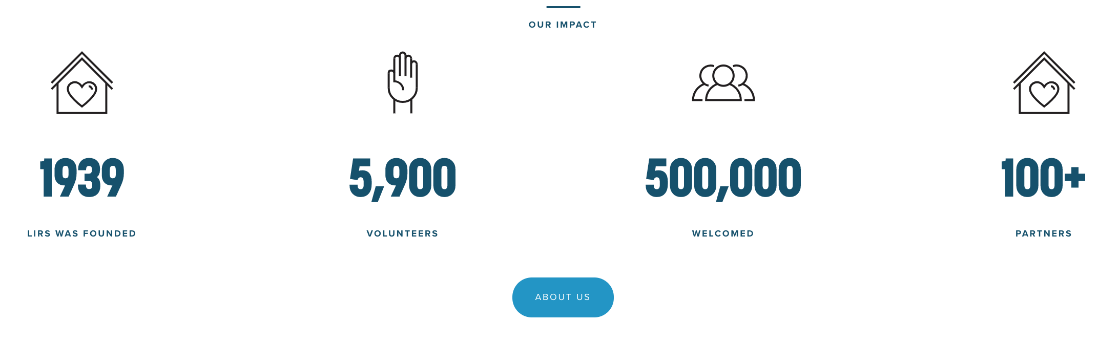
 ..
.. screenshot from
 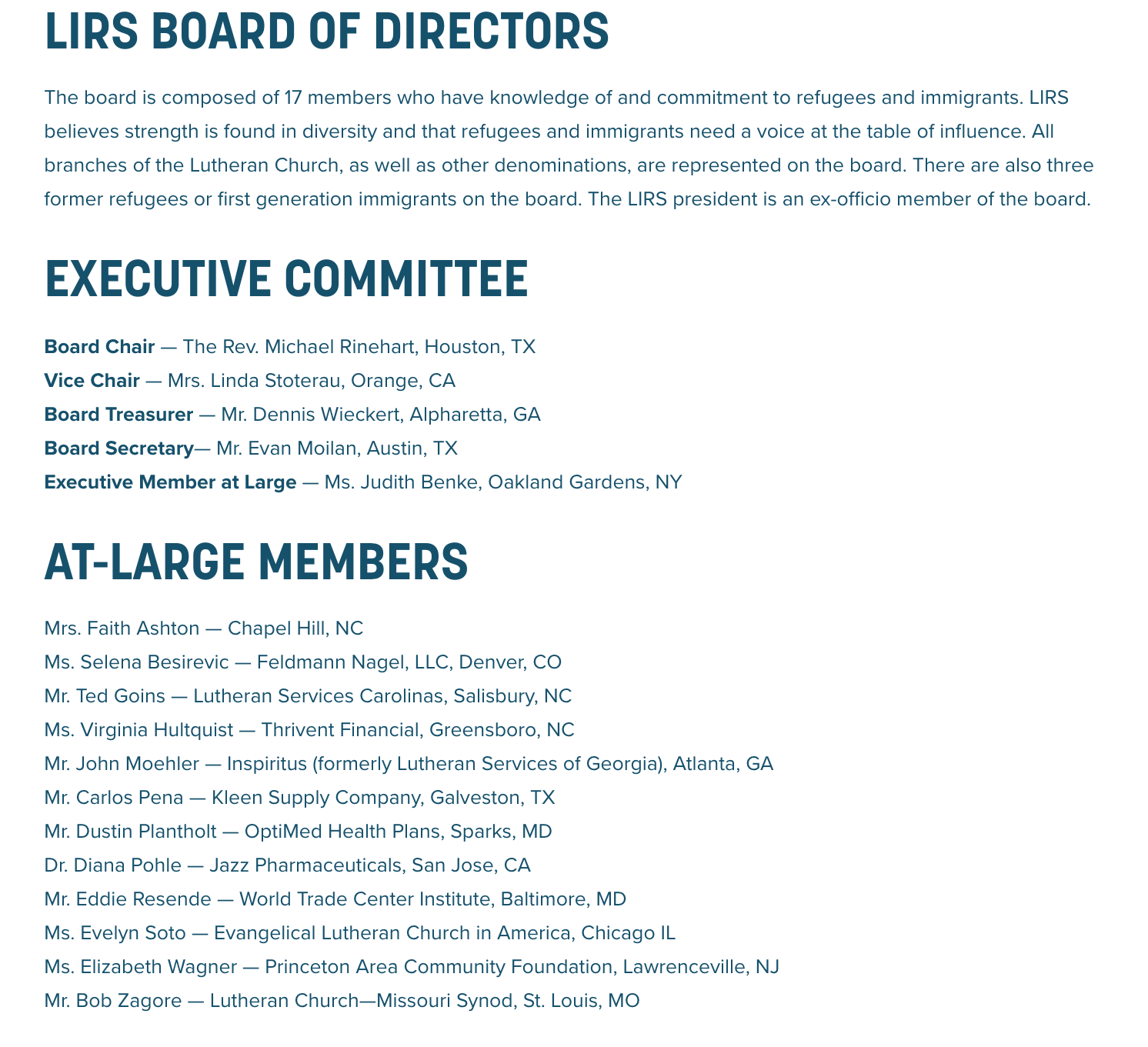 screenshot from