The analysis of the Lutheran Immigration and Refugee Service

Jordan Turner
Professor Licastro
English 256
11 February 2019

The “Lutheran Immigration and Refugee Service”, LIRS for short, is an non-profit organization in support of refugees and immigrants entering the states. In my analysis of the LIRS’ website, we’ll be going over the five different areas of a rhetorical analysis, “a method of describing the context in which an author wants to communicate his or her purpose or call for action to the intended audience in a genre” (Arola, Sheppard, Ball 22). The different areas we’ll be analyzing are the audience, purpose, context, author, and genre of the website, along with an analysis of the media included.

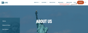
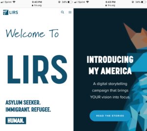
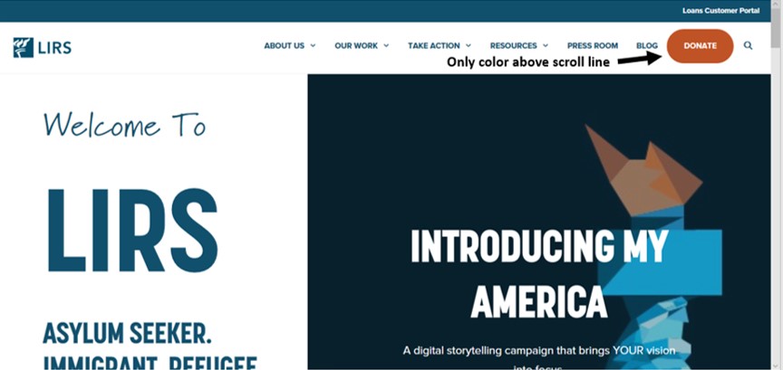
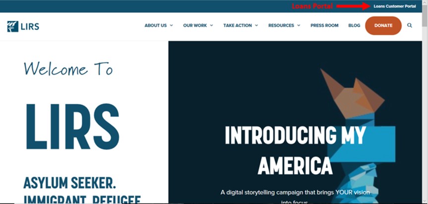
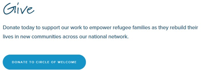
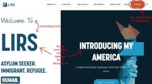
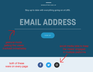
When understanding the intent, it’s good to start with who the content is intended for, I.e the audience. By taking a look at their navigation bar, the first thing that draws the reader’s eyes, is their orange DONATE button, located on the far right of the navigation bar. This is their primary audience, those who want to help their cause, AKA donators.

Screenshot from https://www.lirs.org

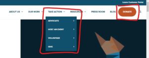
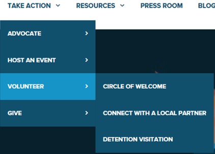
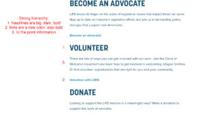
While the audience is who the text is intended for, there may be more than one intended/actual audience (Arola, Sheppard, Ball 22). Their second intended audience are advocates to help stay up-to-date with the legislative issues, while their third intended audience are volunteers. Detailed on the “take action” tab, LIRS goes into depth about how their readers/audience can help.

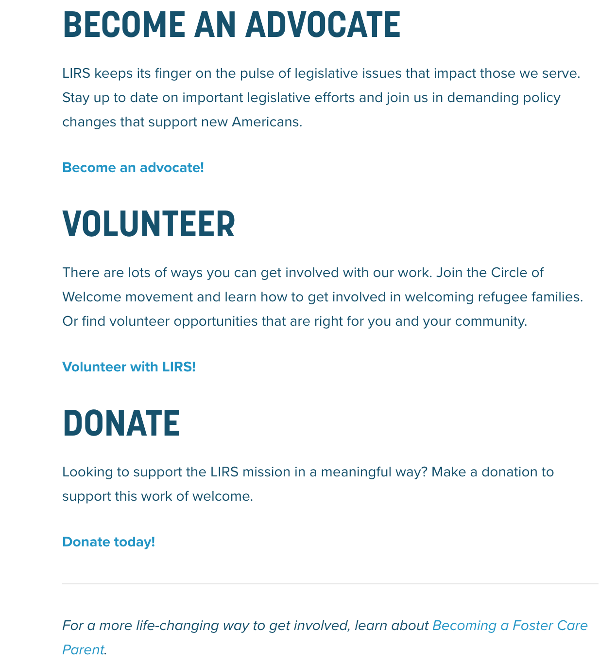
screenshot from https://www.lirs.org/take-action/


By placing the option to learn more under each, it influences the audience to support and aid LIRS in their mission by doing research and participating in any of these options.

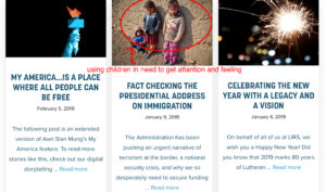
After understanding the intended audience, “it’s important to also consider the range of intentions”(Arola, Sheppard, Ball 23) or their purpose for showing us this information. Considering the information given to us, it’s safe to say that their overall intention for the text is to spread the word about their work and inform the public of their cause. This is further supported by the navigation bar, displayed on each separate page, holding multiple opportunities for the audience to either donate, volunteer, or read more information about their mission and purpose. In a sense, their website is essentially a huge advertisement for their history and what they do

 ..

Screenshots from https://www.lirs.org

and communicates multiple ways that others can help through becoming a volunteer and/or an advocate to help battle legislative issues through their medium/context.

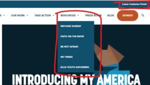
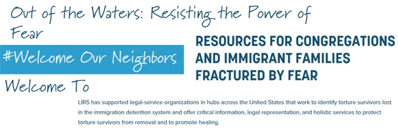
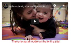
It’s time to now consider the context, “which generally refers to where the text is located, how it is meant to be read, what surrounds it” (Arola, Sheppard, Ball 24). It’s important to think about why the author chose this medium, a website, in comparison to other ones available. After we we’ve gather about the audience and the purpose, the reason why the author chose this medium could’ve been in order to get their intention/purpose across as visually possible without having to bore the audience with multiple paragraphs, running the risk of losing their attention; this is supported by how on each page, there is an image or video.

screenshot from https://www.lirs.org/about/

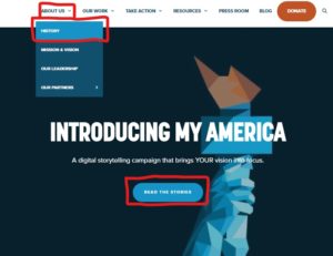
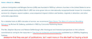
Before considering the genre of the context, the way the author (implied or actual) establishes credibility, is also something to note when conducting a rhetorical analysis. By including a sub-section within the “about us” tab, the author(s), or the people who run LIRS, establish credibility; Even though it does not go in depth about who they are or their backgrounds, it does include their beliefs.

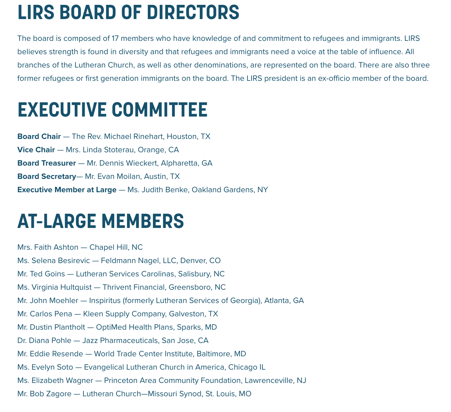
screenshot from https://www.lirs.org/our-leadership/

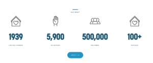
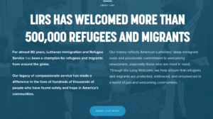
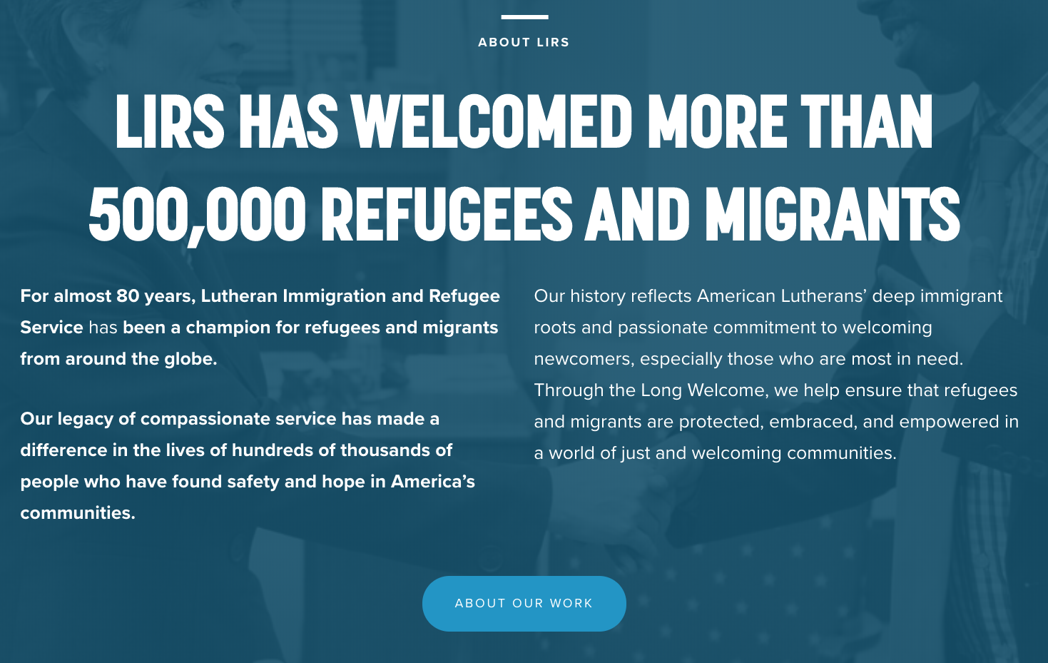
It’s important to note that the author(s) established a big reputation as “a champion for refugees and migrants from around the globe” (“Lutheran Immigration and Refugee Service.”). for almost 80 years. They go into depth about this by saying that they’ve helped over 500,000 refugees and immigrants.

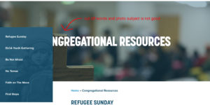
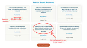
The final part of the rhetorical analysis, is the genre of the context. The text can be defined as a newspaper as a broad definition, but in more specific terms, it can be defined as either journalism, realistic fiction, or as a documentary. It’s defined as a journalism/documentary in the sense that the context details LIRS’ work, mission, and the inclusion of credible news articles to support their information.

Screenshot from https://www.lirs.org/press/

While it’s defined as realistic fiction in the sense that everything that is happening is true to life, from the struggle of being a refugee/immigrant to their work and vision of helping them. The key features that support the genre’s I’ve identified are their inclusion of a blog, press room, and their history.

After finishing the analysis of the website, it’s time to analyze its media and the interface. The most important thing when analyzing the media is to consider the modes and affordances, including: color, font, information architecture, and user experience.

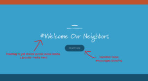
The color of the media presented to us follows a small range throughout (Light blue, Dark blue, orange, and white). the most noticeable is that their navigation bar highlights the DONATE button, drawing their reader’s attention instantly to that. Meanwhile, their font is consistent throughout the website, using only two fonts to keep the reader from getting confused or lost among a possible wide variety of fonts.

Screenshots from https://www.lirs.org

The information architecture is what keeps everything organized and neat in the media. LIRS keeps their information organized in a neat manner, everything is organized until the reader enters different section, each section holding information similar to each other in order to keep the same generally topic of the section consistent. This makes the User experience simple, creating a website that is fairly easy to navigate through, making it simple for reader’s of all ages to use.

Screenshots from https://www.lirs.org

In conclusion, The website of the non-profit organization, “Lutheran Immigration and Refugee Service”, gets the author’s point across is a smooth, organized manner. Each section has enough media and information to keep their audience intrigued and influences them to help or provide their services to the cause. By analyzing their website, a reader can effectively understand the purpose and context that the author(s) is educating them about.

Works cited

Arola, Kristin L.; Ball, Cheryl E.; Sheppard, Jennifer. Writer/Designer (Page 22). Bedford/St. Martin’s. Kindle Edition.

“Lutheran Immigration and Refugee Service.” LIRS, 6 Feb. 2019, www.lirs.org/.

Rhetorical Analysis of The Lutheran Immigration and Refugee Service

The Lutheran Immigration and Refugee Service is a non-profit organization that specializes in helping incoming refugees get asylum within the United States. In this essay, I will be giving a rhetorical analysis of Lirs.org, which is the home website for the Lutheran Immigration and Refugee Service. In this rhetorical analysis I will be analyzing the website’s author, audience, purpose, context, and genre. I will give support to this analysis with my own words and visual captures from the website to help give a better understanding.

The author of this website is technically not defined, but we can say that the website is a representative of the Lutheran Immigration and Refugee Service (LIRS). I inferred that the author of this website may be the board of directors for LIRS. The board of directors for LIRS consists of 17 members who are experienced with immigration and refugees. These 17 members are also located throughout the United States.

Who is the intended audience? The primary intended audience for the Lutheran Immigration and Refugee Service is potential donors and/or volunteers. I know this because on the main navigation bar of the website, the only navigation option that is a different color is the donate button. This tells me that they want this specific button to pop out and grab the users attention.

As you can see with the provided screenshot above, all of the other navigation options are the same color/size. But the “donate” option is not only a different color, but also bigger than the rest. This shows that they are trying to grab the attention of potential donors.

The second intended audience for LIRS are the potential refugees that are seeking asylum within the United States. I know this because of the “resources” section on the LIRS website. This section contains a ton of information about how someone could seek LIRS services if they are in need. How do I know this is secondary audience and not a primary? Well, the resources sections is the same color as the rest of the navigation options. Unlike the “donate” button which is designed to stand out to the user.

The purpose of the Lutheran Immigration and Refugee Service website LIRS is to be able to efficiently collect donations and volunteer support. I find this conclusion because as stated above,  in the navigation bar the main section that clearly stands out is the “donate” button. This is them clearly wanting to drive the users attention to the donate button. Another reason why I came to this conclusion is that the entire main homepage is that of a sales pitch. Everything they’re talking about on the home page is essentially giving the user a reason to donate.

The following images above are the examples of them trying to sell themselves to donators. These two information graphics are on the landing page of LIRS’ site. These info graphics clearly are stating their accomplishments and their upside. Each graphic then links to their “about us” section which describes better in detail these accomplishments and what exactly they do at LIRS. In my opinion, these feel like a sales tactic in order for them to gather donations and support.

The medium for the LIRS is the web. I believe the organization chose the web because it offers the largest reach over all the other potential mediums. The web is also completely free and is accessible to anyone who can access a device that can access the internet. You do not have to pay anything to be able to access this site and it’s information. Unlike other mediums like print, newspapers, CDs, etc. where you actually have to buy the service just to get exposed to the information it contains. The site follows a relatively strict color code of blue and white. This gives the sense that it was professionally built, which is also a means of recruiting donations and support. A donator isn’t going to donate to an organization with what seems like a poorly made and designed website. There are a ton of images on this site. Most of them are images of the people that help or have helped in the past, other photos are of immigrants or refugees or are in need of help. This is a play on emotions. It makes the user emotional which then would help them donate or support the cause.

The genre for this website is a non-profit charitable organization. This is a non-profit because it does not use its earnings as profit. I would classify this as a charitable organization because it accepts donations in cash form and uses those donations to help the immigrants and refugees. This website is very similar to other non-profit organizations’ websites because they all follow the same format. They have a professional theme and color scheme. Followed by an image with their navigation bar on top of that image. They also all share the same mentality of making the “donate” buttons or section stand out. The images they use capture emotion and makes the user feel like they need to help so they can make a difference.

I genuinely believe that this website is great. It properly appeals to its primary and secondary audiences respectively, its purpose to clear and simple, and it utilizes the web to the best of its capabilities. I do believe that there are a few changes that I would make to the site to better improve it. One would be to add more images and even a video.

I think they should replace these images on the landing page with a short video that loops and has no sound. This video should consist of some of the organizations day-to-day operations, their accomplishments, and compelling images that appeals to the readers emotion. I think that would greatly improve the ability for the homepage to grab the readers attention. Another change I would make that would improve this site is to offer more “resources”. Although these resources within the “resources” section are good, some of them are vague and do little for the reader. I think if they added some more content that is actually useful to the user, it would greatly improve this section of the site.


Citation:

“Lutheran Immigration and Refugee Service.” LIRS, 6 Feb. 2019, www.lirs.org/.

An Analysis of Online Humanitarian Efforts

When a struggle comes of the improper treatment of human beings, assistance and care is a sought after tool in the process of rebuilding the lives of those hurt. Hundreds of nonprofits organizations exist to help immigrants and migrants in a time when being of assistance to these peoples is necessary to the care of humanity. This essay will analyze the ability and design of a nonprofit’s website and their efforts to use an cyber platform to spread their message of humanitarian assistance. The website lirs.org for the Lutheran Immigration and Refugee Service is an online center that utilizes bold imagery and sophisticated text organization to call the people of America to serve and aid those in situations of need through volunteerism, donations, and direct action. 

American Statue of Liberty Torch Logo

The intended audience of this web-page is possible donors and volunteers for the Lutheran Immigration and Refugee Service. The homepage of this website is geared towards American English speakers as it explains everything about the organization in English and uses the American iconic image of the Statue of Liberty’s torch. The top bar of web-page, which remains on the site regardless of the page you enter, contains a large orange squared off button that says “DONATE” in all capital letters as well as a section titled “TAKE ACTION” with a pull-down bar that contains linked pages titled “Advocate”, “Host an Event”, “Volunteer”, and “Give” (“Lutheran Immigration and Refugee Service”). The push for these actions and the fact that they are made to be found easily illustrates that these actions are what the author wishes the intended audience to notice. As for a secondary audience, this website also provides specific posts and links that give resources to refugees. Examples of these resources include the direct link in the very top right corner of the page that allows those in need of financial assistance to sign-up or sign in to an account for travel loans as well as a top bar “Resources” pull-down. The secondary audience of this web-page also could be those brought into being involved in the website through the social media or social gathering aspects of the organization’s promotions like the speaker events which people can volunteer to host.

“Take Action” and “Donate” Buttons made to grab the attention of volunteers and donors
“Resources” and “Customer Loan Portal” options available for refugees with access to this website

The author of this page, the Lutheran Immigration and Refugee Service (LIRS) organization, does an excellent job at pushing the services and pages they want seen by their audience in a simple and easily accessible way. For example, along with the top bar that provides straightforward navigation of the site’s tools, the home page includes a large section focused on something called “My America”, which includes a button allowing you to read stories of those that have moved to America as refugees. They wish to persuade the reader into joining the cause by assisting in some fashion as recommended on the website. This gives the audience an immediate idea of the importance refugees have to this organization. The webpage includes a section devoted to the organization’s history under the “About Us” profile. LIRS was established in 1939 by Lutheran churches to help and serve people in need during WWII (“Lutheran Immigration and Refugee Service”). There is even a book written on LIRS, which highlights their many years of service. They have a vast history in this line of work and have proved themselves to be a truly important asset to asylum-seekers and migrants (“Lutheran Immigration and Refugee Service”).

“My America” and “About Us” and “History” Buttons
Payment information input section
Charity accreditation symbol

This website allows for a large audience as it is publicly and widely accessible. The use of a common payment input and charity accreditation when you click the “Donate” button allows for simple and safe donations for potential donors. This is an example of how a website is an advantageous context for an organization seeking funds from contributors. As the refugee crisis has been an extensively spoken about topic in recent years, and is only continuing to become more relevant, websites and organizations like LIRS are gaining visitation and possibly support, making of these groups very socially relevant. This web-page is designed well enough to be used properly and efficiently on any device. Someone could pull up the web-page on their phone and see the same information and nearly the same layout as someone searching the site on their desktop computer. This aspect of the design allows for people to research and access by any means necessary in any environmental context. The use of large imagery across the homepage and many other pages is meant to draw the user’s attention to pertinent sections or stories. The use of big and simple text allows for easy reading, making it more accessible to those with vision and reading difficulties.

LIRS website mobile layout example

The Lutheran Immigration and Refugee Service has many intentions for their web-page. Most importantly, they are seeking assistance from outsiders to broaden their abilities for assisting and serving refugees in need. This is exemplified again in the way the site is setup to have simple access to tools that allow the user to donate their time or efforts to the cause within the top bar of the website. 

Top bar navigation tools

LIRS is also looking to help refugees directly. The site’s straightforward navigation of tools to assist refugees gives those with this need who do have possible access to the internet a place to go to figure out what they can do and what help they can receive. Another purpose behind LIRS’s web-page is to educate. This site gives information about their work and about the situations that migrants and asylum seekers are coming from, as listed under their “Our Work” section. This provided information teaches those who are unaware of the issue and the need there is for assistance why helping is necessary (“Lutheran Immigration and Refugee Service”). 

The genre of  the LIRS website is humanitarian and nonprofit. Firstly, you can tell the website is a nonprofit simple because it is a charity organization that is categorized as a nonprofit. Though, upon further inspection and comparison, it is easy to see that LIRS is quite similar to that of many other charity organizations, as it implements a simply organized web-page using large images that catch attention, bold, large, and easy to read text, donor and volunteer options, and information about their beginning and mission. We can also tell that LIRS is humanitarian because their work is solely based in assisting with the welfare of immigrants and migrants. There is no other apparent line of work for this organization, it was founded and continues to work for the lives of those who have been misplaced and need help.

Examples of large images with easy to understand, bold headings

Building a online environment to draw attention to a need or purpose can be a challenge to creators. Using proper imagery and text layout to make an online text appealing and generally understandable is an important feat in the world of cyber communications. The people behind LIRS have done a wonderful job of persuading their audience in assisting refugees and migrants of the world through the use of their conveniently and well designed website.

Works Cited:

“Lutheran Immigration and Refugee Service.” LIRS, 6 Feb. 2019, www.lirs.org/.

Money or Patron?

The website lirs.org for the non-profit organization, Lutheran Immigration and Refugee Services (LIRS) was analyzed in depth. The non-profit organization was designed to help refugees and immigrants escape the life-threatening conditions of their home country. For a full analysis, the audience, purpose, context, author and genre were analyzed to determine if the website effectively or ineffectively promotes LIRS and their mission. The website for LIRS is ineffective because of the lack of videos, pictures, color and more resources for the people they developed this service for, refugees and immigrants.

The primary intended audience for the LIRS website is donors and volunteers. In the top white navigation bar, all the tabs are written in blue, excluding the last tab which says “DONATE” and is an orange button. The orange button is the only color above the scroll line on the landing page.

On the landing page, the “DONATE” button is the only color.

This directs your attention straight to the donate button which show it is geared towards donors. There are also various pages which directly transfer you to the donation page also.

The volunteer tab under “Take Action”

Also, under the “TAKE ACTION” tab, there are different pages dedicated to volunteers and how you can become a volunteer. The second intended audience is refugees and immigrants. There is a resource tab on the top navigation bar geared toward refugees. In the top right-hand corner, there is also a link for “Loans Customer Portal” which is a source where refugees to get loans. If refugees were the primary audience, the site would not be in English or they would include translation options. The primary audience consists of donors and volunteers so values they hold include helping others and donating time and money to make a difference in immigrant and refugee’s lives. The author is able to appeal to these values by showing sparsely how volunteers and donors can and have helped the immigrants. The secondary audience includes refugees who Lutheran Immigration and Refugee Service are trying to help since they value America and want to escape from the conditions of their home country. The author appeals to them by showing they give out loans to help get refugees and immigrants inaugurated in America and also manifest ways that they are able to succor refugees and immigrants throughout the website.

The overall intention for the LIRS website is to show what Lutheran Immigration and Refugee Service is and what they do, as well as accumulate donations and get volunteers. The website itself lead me to this conclusion because the website has a lot of “Take Action” and “Volunteer” categories, as well as a donation page. In addition to the orange donation button on the top navigation bar, under the “Take Action” tab there is an option to “give,” which includes donations, and under the “volunteer” tab there is another big button blue button that asks for donations also. There is a secondary intention of persuading immigrants and refugees to use this service instead of some of the other non-profits designed to help them. This is due to the “Loans Customer Portal” button in the top right-hand corner. Some of the other non-profits designed to assist them don’t include loans on their website, so this is unique to Lutheran Immigration and Refugee Services.

The Loans Customer Portal is located in the upper right-hand corner.
The big blue donation button under one of the volunteer tabs.

The medium of the LRIS website is the web. Lutheran Immigration and Refugee Service chose this medium because it is easily accessible, especially to donors or volunteers that have access to a computer, phone, tablet, etc. Being published on the web makes it easy for volunteers or donors to donate money or time no matter where they are. The main colors used on the website are blue and white. There are some pictures throughout the site, mainly of immigrants and refugees or a picture of the statue of liberty. Each page of the website has one picture at the top of the page. There should be more pictures and videos to display what these refugees and immigrants are going through, as well as the impact the volunteers and donors have on them. Readers can interact with this text however they like, but most common will be with a computer, laptop or tablet at work or in their house.

The author of the website is unknown but is produced by Lutheran Immigration and Refugee Service. Lutheran Immigration and Refugee Service is made up of a board of directors, an executive committee, at-large members from all over the nation, and staff leaders. This source is trustworthy because the company made the website, providing accurate information, links and pictures. The author of the website comes across as asking for money and volunteers rather than showing how they help refugees and immigrants. LIRS has a reputation of helping refugees and immigrants that are in danger if they go back home. This text works to alter the reputation because their website is aimed to make donations and acquiring volunteers. If their main goal is to help immigrants and refugees, they should make that more prominent when looking at the website. They could also include visual representations like videos of real volunteers helping, refugees and immigrants receiving items and care purchased from donations or even a translated video telling refugees and immigrants how they can use this program to seek asylum.

The genre of this text would be non-profit or humanitarian. It is a non-profit because they are ameliorating refugees and immigrants to escape the dangers of their own country and do so with the support of volunteers and donations. It is also humanitarian because LIRS is concerned with and working to improve the security, safety and health of refugees and immigrants. The website is like other non-profits because it is geared toward donors and volunteers. The website is designed to easily navigate to a donation page or a page where you can volunteer. On each page of the website there is one picture of a refugee, immigrant, leader or volunteer to give a visual representation of what this service does. It is also similar to humanitarian sites because the purpose of their organization is to promote the welfare of refugees and immigrants, which is the definition of a humanitarian organization. They include some visuals of the refugees and immigrants as well as some testimonies from previous refugees and immigrants they have helped to show how they have promoted their welfare and overall well-being.

To make the website more effective they need to appeal to all their audiences and viewers. Since the organization was developed to assist immigrants and refugees, it should be accessible to them also and not aimed unanimously toward donors and volunteers. Lutheran Immigration and Refugee Service could offer a translated version of their website that would be more accessible to them. The

Example of one of the few pictures found on the website, faded out.

website also needs more colors, different fonts and visuals. A plethora of colors other than blue and white would be more appealing to donors and volunteers, as well as an average lay-person who comes across the website. Most of the pictures already portrayed on the website are faded, so there is not much color present.

Also, majority of the fonts need to be changed to a san-serif font for people with reading disabilities, like dyslexia, are able to read and navigate through the website easier.

Collage of the fonts found on the website.

Lastly, there should be more pictures throughout the entire website, as well as videos. If people are donating their time or money, they want to see where their money or time is going. If refugees and immigrants are deciding between taking a loan from Lutheran Immigration and Refugee Services or a different organization to help with their transition to the United States, they want to see what this service offers in comparison to the other ones. With these suggestions, the website could become more effective in reaching people with disabilities, refugees and immigrants, as well as attracting more donors and volunteers.

Citation:

“Lutheran Immigration and Refugee Service.” LIRS, 6 Feb. 2019, www.lirs.org/.

The Power of a Great Website

Can a website make you feel? Can it make you spend money? Can it make you do something better for the world? You may be thinking of social media, shopping, or researching, but what about a nonprofit site, what would it take for them to reach their and potentially get you to do all three of those things. I am in a course that has given me access to looking into the work of nonprofit organizations and open my eyes to how texts of all types and mediums can impact us without us knowing. We are focusing on refugees and immigrants in America and analyzing Lutheran Immigration and Refugees Service’s (LIRS) website can help show if a website can inspire us to join the movement or if it will be another website forgotten. The LIRS website is successful in encouraging people to donate and volunteer through visuals and gestural modes to spread their goal to a specific audience.

First we begin on the homepage of the LIRS website, what immediately loads without scrolling a few things catch the eye first: big contrasting words, darker colors, and a big donate button. Right away this allows us to think a few things. It leads us to our first clue of the audience, the large donate button in the bold red-orange color shows us that one of their big goals is to make money toward helping refugees, so their audience is people who will donate the money to help or will put in the time and effort to volunteer and help. This also gives us the first glimpse of their purpose, to persuade, the design choices they made to make the donate button visually stand out shows us their commitment to reach their goal through the assistance from their audience. The contrast in this above the fold view is very powerful. The dark navy blue against the bright white allows for emphasis as well as the chosen font, they begun with a thin, almost handwritten font, into a bold, thick, sans serif font. These two big contrast starts a hierarchy, the bigger text in the navy on the left and white on the right is noticed immediately, it gives you a quick glimpse on the company and their mission. The hierarchy also helps us travel the entire entire page, as we begin scrolling through we get more blues, whites, and red-orange, more bold headings, and some repetition. The organization gets into introducing themselves, their mission, and other information before repeating a donate button with a hashtag, this hashtag will connect to the social media side of today’s society. Almost everyone uses social media, and most people are addicted to it, so this will help their organization expand by getting shared to new people with something as simple as a hashtag.


After scrolling through the entire home page we can connect that this is a nonprofit website specifically, because it follows the technique and template, a lot of large imagery, big bolded text, saturated colors, and a one column design with a grid like structure. Now that we know general idea of the site that we are on we can continue clicking through the tabs of the top navigation. The first tab is information on the organization, it goes into a mini overview and we get our first, and only, aural mode, a video of the company, their mission, and imagery to entice the viewers emotions for compassion. They also have a side menu with more tabs to get deeper into the history, mission, and the people behind the story. The history is extremely short because they lead you to two different books that help tell their story, I believe it appeals to their credibility, if they have been published in something it helps give you a sense that they have been around, they have made an impact, and others can see that and trust them. Finally, it goes into the leadership and partners where there are a lot of people listed which shows that there was a lot of people who went into this website. The Lutheran Immigration and Refugees Service is our big author, they are the organization held accountable and the focus of the entire website, but a lot of people are a part of this organization to get it where it is. A few names that seemed most important to the website specifically is the board chair, Michael Rinehart, vice chair, Linda Stoterau, interim president and CEO, Pat Nichols, director for marketing and communications, Danielle Bernard, and director of outreach, Folabi Olagbaju. A lot of people and a lot of Lutheran churches have been involved in this organization and it shows even more into their credibility and history.

The next tab is more information about their mission, goal, and the job they do in details. This is part of the persuasion in the purpose of the website. If they show you the people they are helping with images, the details on the people they help, and they even have an entire sub tab devoted to the children to really push the viewer to feel empathy for those they are trying to help. It also shows a part of another purpose they have, to educate. They are trying to give you as much information as possible about the issue they are battling and their solutions to build into the persuasive purpose. The more informed the viewer is the more willing they usually are to help. Another tab is to inform the viewer on how they can help, donation, advocating, volunteering, and holding events. The purpose of this website is on every single tab, they again are trying to convince you to join their cause, and it is very obvious with the big, navy headings separating the page, and it repeated as sub tabs and links.

The tab with resources also has the purpose twined into it well specifically for the churches and how they can put their organization and goal into the churches congregation. I spotted a minor tweak, every tab has a header with an image, overlaid with the title of the tab, and the sub tabs as a menu on the left. For this tab it didn’t quite work out with the left menu. Putting a navigation menu on the left is important for viewers looking on a phone or tablet, which does help us know they want readers to be able to view this on any device anywhere, but for this longer title and the subject of the image being left aligned the menu covers up part of both making the three elements not work as well together. The tab also helps us analyze the audience again, this shows more into the secondary audience, the lutheran churches. The entire tab is dedicated to how they specifically can help with refugees and spreading the word allowing us to believe it is a focus for them to branch to more. They are hoping for an audience that is religious and faithful and this tab alone represents that hope. The final two tabs are articles and blogs on more information about refugees and current updates on the issue in America. This and the copyright at the bottom of the site gives us the information that LIRS keeps their information up to date which allows us to look more into their credibility in a positive way and the context of this website in the fact that it is constantly revolving to stay with the times.

The website is very cohesive and has repetitive pieces to help with that. The navigation and footer does not change with the contrasting donate button, LIRS logo, social media buttons, and other links. They also repeat the email newsletter at the bottom of every page which helps show they are reaching out to their audience and allowing the audience to engage and feel a part of the community quickly. This is a strong gestural quality that other sites do not have. They also use the thin, handwritten text every now and then which makes it feel a bit more personable and helps those texts to stand out compared to all the bold, geometric text. They did well in a lot, but they do have some things to work on. I believe pulling in more of an aural mode with video could help push more of trying to encourage empathy from the viewers. This will also boost their gestural and visual modes allowing the website to develop more in multiple areas. Another element I would suggest would be to add more into the information on their history and the people involved. That tab seemed short and dry, instead of putting details in their history they put a publication that cost money. It looks good to be a part of a publication, but adding more history on their own site would allow people to trust them more. Also adding more of the people working for the organization, images, quotes, who they are, would make it more personable and allow the readers to gain more of a connection with the people inside then just stating names and jobs.

Looking through the entire Lutheran Immigration and Refugees Service website, their purpose is strongly shown and that was the goal in the website to persuade more people at a wider range to join in the movement. They had some weakness, for example while other refugees nonprofit sites have a tab specifically to those they are trying to help, LIRS does not have resources for them, but they had a lot of strength in their cohesiveness, visuals of contrast and imagery that pulls at the audiences emotions, and filling the site with information to educate. I believe those strengths were stronger than the weaknesses and could potentially hook the audiences into donating and volunteering to the cause. With the images of the children in need it can make you feel, with the bold donate button on every page it could persuade you to want to donate your money, and with its informative and convincing qualities maybe they can get you to join and in the end help someone in need.

Citations:

Lutheran Immigration and Refugees Service. 2019. www.lirs.org/. Accessed February 10 2019. 

WordPress Tips

Here are a few basics you can refer to if you need to know the basics of our WordPress site.
  • To sign in, click “Log In” on left side under “Meta”

  • Username = Stevenson username (email)
  • After the first time you use the password your professor provided, you should change it immediately to protect your privacy.
  • To change your password, click on your profile in the top right corner, then click on “Edit My Profile,” and then scroll down to change your password.
  • To add your own blog posts, click on the Dashboard, and then go to “Posts” – “Add New.”
  • To add media, you can use the box on the top of your post.
    Don’t forget to use Advanced Google Image search for “free to use or share” or upload your own original images. Every image needs a citation.
  • Always add the categories and tags your professor provided to each post.
  • To “turn in” your work, click publish. Otherwise, you can save it as a draft until you are ready.
Ask me if you have any questions!