The Rhetorical Analysis of The Villager

The Villager is the student-run online newspaper at Stevenson University. The paper is run by a class of journalism students. This paper does a wonderful job of creating an easy to navigate the website but does not have the most eye-catching material.

Mode and Affordances:

The Villager uses many different modes for its publication creating a wonderful multimodal website. They include pictures, videos, text, and hyperlinks. By creating a multimodal website it will attract the eye.

The Linguistic Mode: Looking at the linguistic mode some titles are not as clear as others and there is the occasional grammatical error.

The Visual Mode: The site contains pictures, videos, colors, and font choices. The Villager is generally inconsistent when it comes to photography on the site. I see many photographs and some are nicely photographed, most likely stock photos and others are grainy photos of sports games or events around campus. This photo was one of the four photos that scrolled on the front page of the site.

Whitley, Brittany, et al. “Stevenson Villager: A News Publication by the Students of Stevenson University.” Stevenson Villager – A News Publication by the Students of Stevenson University, 5 Dec. 2019, stevensonvillager.com/.

As you can see this photo is not the most eye-catching photo, the photo is blurry and unclear. By using professional-looking photographs on the front page of the site it would grab more attention to the articles. Another Visual mode is the font used on the site. The font is uniform and always consistent which makes the site look clean and put together. The only downside to this font is that the titles are in all capital letters so when one a title stated “Wellness Offers SAD and Daylight Savings Help” it looked like the wellness center was offering sad help instead of Seasonal Affective Disorder help. The awesome thing about this being an online paper is that it offers the chance to watch videos from games or events that you may have missed. The color choices for this site are green and black which fits perfectly with the audience of Stevenson students.

The Aural Mode: The Villager only has an occasional video with audio that would fit into this mode, which is very suitable for an online paper.

The Spatial Mode: The Villager has a top navigation and side navigation. This fits perfectly with the site. The layout is clear and easily navigated.

The Gestural Mode: this site is easily navigated. You have the option to use a search bar or scroll down through the articles posted.

LaCourte, Ryan. “Ryan LaCourte.” Stevenson Villager – A News Publication by the Students of Stevenson University, 5 Dec. 2019, stevensonvillager.com/affordable-holiday-gift-ideas/.

The site has hyperlinks to other sources leading to easily find things referenced in the article. You can see in this screenshot this article has a hyperlink directly to a mug that you can purchase from the target.

The Villager has its share of affordances. The multimodal site is easy to access and easy to navigate but the site could be improved by adding better photographs and changing up the font.

Visual Rhetorical Analysis of The Villager

The Stevenson Villager is an excellent source for information needed on the livelihood of a Stevenson student. From the articles, to the news, to information on Stevenson sports, The Villager creates an environment that is easily accessible for not just current students, but prospective students as well. Although the content of The Villager is well written and displayed, it does not however depict everything that might go on in within a typical students time here at Stevenson.

Modes:

The linguistic mode for The Villager is somewhat of a professional manner, while also being something that is easy to read and understand. Since it is a news publication, the professionalism aspect of the linguistic mode is important. You see this in the various articles throughout the site while you also see text that is more casual in aspects such as the “categories” or “recent posts” section. The content creators for the site have done a good job of keeping it professional, but also making sure that it is something that will keep the reader engaged and wanting to read more.

Visual mode can be seen everywhere on The Villager as with most texts, there is either a diagram, or picture relating to the post it is with. This is an important aspect of the modes used on the site because it can help bring in the reader if the visuals are done correctly. Aside from pictures being used, the visual mode used for the fonts and styles of much of the text being different. As seen in the example below you can notice just from one news article that multiple fonts are being used, as well as different sizing and choice of bold text on headings.

The aural mode of The Villager is lacking in most cases. Throughout, there is no music, sound effects, or any type of volume being used. On occasion, there are articles that have been attached with a video as also seen above when discussing the visual mode. Adding more content where aural mode is being used could be something that adds that missing factor to The Villager that could put it over the top. Sometimes as a reader it is nice to be able to take a break from an article and be able to see a visual effect of what they are reading.

The spatial mode is something I see as a strong suit for the publishing. On the various pages throughout, each section of content is clearly labeled for whatever you trying to read, as well as the use of bold and italics. There is also a use of underline which helps the creator of that content stick out while adding the dates to the bottom of the picture helps organize the entire site not only for the creators, but also the readers. There is a good amount of space left between each article which also helps the visual effect making it easier to navigate and find your preferred article.


The gestural mode of the publishing is not as existent as it would be in a physical setting, or in a setting of face to face interaction. However, The Villager is able to communicate what they do because of the tone and choice of words that they decide to use on a piece, or a news story regarding the University. The gestural mode is then up to the creator of the content to be able to attach some sort of gestural mode. In all, gestural mode is something that is not as obvious in this instance.

Affordances seen in the content of The Villager consist of several videos, pictures, and writing. All around, there is a good mix of all three where it is seen as the best way to capture the audience for that particular piece. In some instances, video is used in order to showcase a certain player or person within the university while some things require only writing or are only able to be explained through the writing that is done. Affordances are the make up of the entire Villager website so making sure that these are something checked off is important to the success of the site.

The color of The Villager is very simple throughout the headings and different sections of the website. Although making it more colorful would add some eye appealing content, keeping the simple colors of black, white, and green make it feel more professional. Simple colors for the site also helps to not make it too busy and really helps the reader focus on the content of the website as opposed to the flare and appeal it may bring.

Font choice for The Villager differentiates depending on whether or not it is the heading of an article, or if it is the content to go along with it. More capital letters and bold are used throughout when it is the heading or title of a section of piece where much of the content is done in smaller font. Making sure the font sticks out for the titles and headings is a great way to draw attention to a piece that someone may want someone else to see.

The layout of the publishing is done simply just as much of it is. It is well organized throughout making it easy on the eyes as well as making it much easier to navigate and find the content that you are looking for. There is no clutter especially on the front page which makes it easier for someone to want to read through all the headings and articles. Seeing a clean front page and a good layout is the first thing that someone is going to notice when first visiting a publishing. Since this is something affiliated with the university as a whole, it makes it all the more important.


Visual Rhetorical Analysis

Introduction:

The Villager is a student-ran, online newspaper at Stevenson University.  The weekly publication consists of news, sports, and other happenings around the university.  Staff consists of students enrolled in journalism as well as other members within the Stevenson community.  Although the publication reports well-written articles, it lacks showing the negative sides of the university.

Linguistic:

Articles within the villager are written and edited by students who understand the style of newspaper writing (AP), due to their journalism class as well as previous English classes.  The word choice within these articles is simple enough for the average person to comprehend.

Visual:

The layout of the site is straightforward and simple.  There is a white background with black text as well as a green logo.  The front page holds images with scrolling content with the titles paced int the middle of them.  Font remains consistent throughout the entire site including body, titles, and links.

Aural:

There is no use of music or other audio when opening the page.  Videos that consist of interviews and sports clips are the only use of the aural mode.  There are not many of these videos and can take a long time to find.

Spatial:

The physical arrangement of The Villager is quite appealing.  The top of the page hosts tabs that can be selected to sort information within that category.  There is also a search bar which allows information to be found efficiently.  On the article pages there is a good use of white space and includes a side column that the ten most recent posts can be found.

Gestural:

The Villager is does not convey an interactive experience.  There is no place where readers can comment and connect to other readers and the writers.

Conclusion:

The student-ran online newspaper provides readers an opportunity to find out about events and happenings around the Stevenson community.  However, the publication lacks showing all sides of the university, while just focusing on the positives.

Visual rhetorical analysis

The Villager is a user-friendly newspaper that caters mostly to students who want to quickly access concise and brief information while staying up to date with Stevenson related news. The Villager accomplishes this by creating a fast and easy to use layout and publishing relatively short length articles.

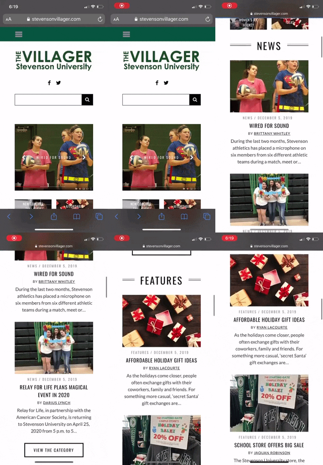
The Villager’s front page is heavily populated with images. Clicking on any of these images will then take you to the article. Although the reader can sort their news by category, the user can also easily access the featured articles since these occupy the largest area of the front page and rotate every few seconds.

The colors and font choices are standard for any newspaper apart from the header. The title heading indicates that the newspaper reports on Stevenson related news by using the University’s colors and a large, bold font. The body text is in black in an easy to read font against a white background.

The article thumbnails are well-spaced out and do not feel cluttered. All articles appear to be accompanied by an image and occasionally a video. Although The Villager occasionally uses videos to complement the articles, these do not automatically play. As such, The Villager makes very little use of sound.

The university newspaper has a very minimalistic feel to it. Articles are organized into a grid-like front page making it easy for anyone to find their way in the website.  The left and right side of the page are usually left blank, which helps frame the articles into a position where the user typically expects them to be.  Another great use of space is the simple pop-up that appears at the bottom right of the page when the user is about done with an article. The pop-up is not invasive, it does not occupy a large section of the screen and does a great job of guiding the user to the next article prolonging the time the reader spends on the website.

The desktop website offers very little gestural interaction. The most a user will do on this website will be point, click, and scroll. However, The Villager does offer a mobile version of the newspaper in which the gestural interactions will resemble the typically interactions with mobile apps such as Instagram and reddit. The user simply swipes down to scroll through the various articles and then taps on the article they which to read. This facilitates navigating the newspaper by offering a familiar layout to the reader.


This online newspaper makes use of various modes to deliver an effective but simple experience. The major benefit of The Villager is that it is fully online. This affords the user the opportunity of accessing previous issues of the newspaper through the archive tab, searching for a particular topic by using the search bar or the tag feature and watching videos related to Stevenson. It also offers a subscription feature which lets the reader receive the newspaper in their email inbox. The downside of The Villager is the lack of sound, and the lack of interaction that it provides for the user.


In conclusion, The Villager does a great job of captivating its primary audience through an effective use of the spatial and visual modes which provide a simplified but effective experience for the user.


Visual Rhetorical Analysis

The Stevenson Villager is a student and professor run publication that reports on things happening on and around campus. Most of the articles on the site are composed and edited by students giving them a professional experience and the opportunity to write articles for a publication. Thus giving them the tools to succeed if they choose to follow a journalistic career path. However, this being a publication with primarily student writers, there are mistakes and instances where The Villager lacks as an overall publication.

Modes and Affordances

Linguistic… The use of language on the Stevenson Villager is simple to understand and read. The word choice for titles is often simple however the font choice does not always work since the publication has a white interface. There are also some grammatical errors within some of the articles on the site, these errors aren’t all that bad but for being a professional esque publication it’s important for The Villager to attend to these.

Visual… The layout of the site is simple and straightforward, there aren’t many crazy or unique visuals; just the logo and articles. With this lack of visuals there is also a lack of general color on the site. The logo is green and each article has a color photo and that’s it. If the site utilized more appealing colors and visuals it would be much more popular and attractive, especially for younger audiences. However, the use of the photos within articles is simple and doesn’t interfere with the reading, painting a useful image in your head.

Aural… There is a lack of any type of music or sound on the website. However, there’s some videos and interviews on the site. But being an online student publication it isn’t entirely necessary to include videos as the site focuses primarily on the writing aspect of journalism.

Spatial… The front page of the publication is simple and provides access to all parts of the site at the top. This allows you to navigate with ease along with a search bar you can easily type a name or keyword to find a specific article. However, many of the stories are presented in a weird manner that makes the site hard to use and hard to follow and keep yourself up to date.

Gestural… The Villager lack’s gestures on their site. The only gestures on the site is the interactive slide on the menu where users can choose and slide between different articles.

Conclusion… Overall, for a student run publication Stevenson’s Villager is a site that provides students, staff, and prospective students the opportunity to read about events and articles pertaining to the University. However, being a non professional publication the site is lacking in many areas and has room to improve interactivity and its overall appearance. If Stevenson were to improve The Villagers weaknesses the site and publication would be much better and have more readers.


Visual Rhetorical Analysis

A Rhetorical analysis can be performed on The Villager. The villager is an online newspaper that is operated by students who attend Stevenson University. It is used to post articles that are related to Stevenson university, regarding sports, events, or anything that is going around in the Stevenson community. These articles are meant to be read by current Stevenson university students, parents, faulty members, and those who live around the Stevenson community.

Modes & Affordances

Visual- Logging on The villager you will notice the clean white negative spaces in between every image. The first text that pops out is the Title, written in big bold letters with that recognizable Stevenson green. The front page has a menu going across the top of the page in a horizontal matter. Below it there is previews of some of the articles that are found in the menu items, for easy access. When you navigate to one of the menu items such as “Sports” or “Reviews”, you will notice the articles are going in a staggered form.

Aural- When clicking on any link or title on the website, there is no feedback. When browsing through mobile, there is no vibration neither.

Spatial- The menu is too repetitive. The sections are first seen on the top menu. Then when scrolling down you will see the menu on the right side of the screen. As it shows again with two previewed articles from each section. Under the side menu on the right side, there is another menu that provides a list of the 10 most recent articles. Which is a nice touch but should be placed higher than it is.

Gestural- The website lacks in gestures. The only thing that the reader can see that is interactive is on the main page. There is a slideshow of four articles.

Linguistic- The goal throughout the articles is to keep a professional writing style due to it still being a “newspaper”. Nothing but facts about the school and community is written in these articles. The only time you see change in writing styles is in the OP/ED section, as students give their stories and opinions.

Conclusion- The Villager does a good job at providing articles for the reader. But it does not do it in a way where it seems interesting enough to keep a ready on the website, the website is kept very monotone. There are very little aural elements. It would be nice to see videos on news going around the campus or even highlights of some of the games rather just reading about them. However, if a student wants to focus on reading articles, The Villager makes it easy for them to navigate to their article of choice.


The Villager Rhetorical Analysis

The Villager, created by journalism students and staff of Stevenson University, is a website in which articles and reviews about current and past campus events are written and published to inform multiple audiences related to the school. These audiences include current and past students, parents of those students and faculty of the university. The content that the website provides utilizes a multimodal organization that offers a variety of affordances to its readers for simple navigation and comprehension.

Visual Mode

The use of pictures placed on top of a white background draws the audience’s attention to them, which give a visual representation of what the review would describe if clicked on. The font chosen for the website remains uniform for most of the links, including variations with color and size in the titles and the top and side navigation bars. The layout of these pictures and titles either lie within the picture itself or is displayed as a caption below, both areas providing links to the article. This affords multiple ways to reach reviews on different topics while not being too harsh on the eyes of the audience to read through titles and information.

Spatial Mode

The layout of these pictures and titles either lie within the picture itself or is displayed as a caption below, both areas providing links to the article. The white space between each topic of writing separates the text and prevents captions and pictures from overlapping and causing any visual confusion. The affordance to this style of layout allows the audience to read and navigate the site easily, especially when looking for a specific topic. However, the amount of links and articles that can be viewed at one time on a screen can be slightly overwhelming, mostly evident on the front page.

Gestural Mode

The chosen pictures contributes facial expressions and body language that can seem inviting and prompt the reader to click on the link. Also, the portraits of the writers, editors and subjects gives the site a more personal touch, and combined with text makes the articles feel more like a conversation than a news report.

Linguistic Mode

The language used in the articles and the titles of the site is very simplistic and easy to comprehend. Although slang and complex academic-style words are not used in this form of informal writing, the affordance of this is that the language allows the audience to passively read through the articles without having to constantly pause and search the meaning of a word.

Aural Mode

The Villager uses video clips of interviews and sport events that incorporates a more vocal way of reporting news in contrast to utilizing only words in other articles. However, there are very few and require some searching to locate.

The layout of Stevenson University’s The Villager includes a multitude of ways to connect and stay in contact with on-campus news. The use of the visual, gestural, linguistic, aural, and spatial modes combined together allows the site to be easily navigable with the use of pictures, captions and navigation bars to ensure the audience is able to find what they would like to read. Although this website has positive and some negative affordances, overall it effectively provides useful information catered to anyone in affiliation with the university.

Visual Rhetorical Analysis of The Villager Website

The Villager is a student-run online weekly news publication. The publication reports university news, sports updates, and other student activities.

Linguistic

The word choice for each article is simple enough for the average reader to understand. This makes The Villager an easy read although there are spelling errors on some articles. The titles of the articles summarize what the article is about, but are not worded in a way that captivates the viewer into wanting to click to read more. However, all articles are written in a way that all audiences can read and understand them. The Villager provides a variety of news articles from sports, clubs, and other campus events.

Visual

While the website does include images with each article, it lacks an interesting layout. The layout of content is very basic like a typical news article or blog post. It does not capture the reader’s attention. Only three main colors are used throughout the website: green, white, and black. The black text on a white background is not visually appealing for the user. Green is only used as a subtle accent color for the website’s title and when some images are hovered over. Hierarchy is used with the text on the pages, but no attractive typography is used. Block paragraph text is used with a sans serif font. The images included with each article do help break up the text and add some visual appeal.

Aural

Videos are the only aural element featured on The Villager. The videos consist of interviews or sports clips that add value to the articles.

Spacial

The Home page displays featured articles from each section of the website. Top and side navigation bars allow users access to different pages on the website. A sticky top navigation may be useful for when a user is scrolling down a page and passes even the side navigation bar. This would improve user experience. The articles are laid out in a block paragraph format with images placed in the middle of paragraphs causing text to become aligned strangely. While the images help to aid the reader’s understanding of the article and break up the amount of text, it disrupts the viewer’s eye when following the line of text.

Gestural

The images and videos are important for assisting the written text and increasing user’s engagement with the articles. Some articles feature images of students interacting helping to attract the reader through the energy felt through the static image. Some images, while they relate to the article, feature people with unenthusiastic body language that could throw off the reader from wanting to view that article.

Visual Rhetorical Analysis Practice

On the Villager site, students at Stevenson University are provided with a plethora of information regarding events and news at their institution by using various modes, yet lack in other modes that include interaction between site and the student.

Modes:

When looking at linguistics, the title heading sticks out because the font style remains the same, yet the font size and direction of the text do not. They chose to have the word “Villager” in a larger font than “Stevenson university” and the word “The” is turned vertical alongside the two.

When exploring the visual modes within the site, the color schemes of green and white are very noticeable and keeps the purpose focused on Stevenson University-related news and information. The green and white space allow the arrangements of the site to not feel so cluttered. This leads to the spacial modes within The Villager site. The pages are organized by static headings of “News”, “Features”, “Sports”, Reviews”, and “OP/Ed”. Regardless of the different stories fluctuating under the headings, the headings themselves remain the same to keep a constant level of organization within the site. Another example of spacial modes within the site is located on the side navigation bar, under the heading “Recent post”. The site organizes the stories based on recency and goes a step further to even number the stories 1-10 to stay focused on the organization for the audience to better follow stories that are more up to date.

Affordances:

While the Villager affords the Stevenson Student with a vast amount of information and news regarding the school, the site is not heavy in gestural modes. The main interaction piece of the site is the top navigation bar, including the search bar and social media link icons. When searching through the site, these are the only way to interact and be a part of the site. This takes a little bit of the nostalgic feel away from the genre of a newspaper. There are no interactive games or fun side comics much like a printed newspaper.

Conclusion:

The Villager allows students the opportunity to gain information regarding their news within the university. Although not as interactive, the site gives a new insight to all the events and features going on at the school.

Visual Rhetorical Analysis

A visual rhetorical analysis can be performed on Stevenson University’s online magazine, The Villager. The Villager is an online publication, which consists of articles posted by journalism students from Stevenson University. These articles are usually related to university news, such as sports, events happening on campus, and reviews of things in the community that might interest students. This online magazine is effective for capturing the attention of Stevenson University students by accommodating and writing to their interests.

The primary audience of The Villager is current Stevenson University students, faculty, and staff. One of the ways it captures the attention of the audience is by the color scheme. For example, the header states, “The Villager Stevenson University” in large green text. Knowing that Stevenson’s colors are green and white, they designed their website with mostly green text and white background to promote their school colors. Additionally, the writers know that college students are generally not interested in reading long articles. Therefore, most of their articles are short, so they can be read fairly quickly. At the same time, there is a lot of white space, so the readers do not feel overwhelmed by the website. The articles also include pictures, which is another thing that will catch the eye of college students. College students would rather read an article with pictures than an article with just text. Another thing The Villager does well to connect to their audience is by posting hyperlink icons to Facebook and Twitter in their heading. They are aware that most students will not check their website on a daily basis. However, many college students check their social media sites regularly, so they want to encourage readers to follow their social media accounts to stay up to date on the latest articles. The Villager does a great job with their colors, spacing, pictures, and icons to capture the attention of their intended audience, which is Stevenson University students and employees.

The Villager is published weekly to inform and motivate students. First, it is published to inform students of campus news, such as sport scores or events happening on campus. For example, on December 5, 2019, Cassandra Harris published an article about Winter Commencement. This was done to inform Stevenson students and employees about the ceremonies, so they are aware of the event. Furthermore, this also motivates students and employees to come out and support the Stevenson graduates. They did a good job using a picture of a creative graduation cap to accommodate the story, which once again will catch the eyes of college students. In addition, they underlined important information to make it stand out from the rest of the text. For instance, the writer underlined the link to a website to watch the ceremonies online since some people may want to watch the graduation, but will not be able to attend in person. It is also hyperlinked, so they can click the link and it will take them directly to the streaming website.

Since this is an online magazine, it is only published online at https://stevensonvillager.com/. Other contexts include their Facebook and Twitter accounts. It is also published weekly throughout the spring and fall semesters every year. With it being a website, there are many visual elements that make it an effective magazine. The layout is very basic and easy to understand. There are categories in the top navigation and the side navigation, which can be clicked on to take you to the page. This makes it very easy to find articles related to what the reader is looking for. Also, there is a search bar, so the reader can search anything to find it on the website. This is located in the header, which makes it easy to locate and use. In addition, the home page is separated into each of the sections with the two most recent points in each category. This is effective because it gives the reader a quick glance at the recent posts in each category without having to go to each page individually.

There are many affordances to using an online magazine. First, there is a search feature, which allows you to search for anything that was ever published on the website. The reader can even search the names of authors to find all the articles written by that student. Secondly, writers can hyperlink websites to allow readers to navigate to a new website quickly. This saves the reader time because they do not have to copy and paste the text since they can just click on the text. Additionally, there are no space constraints when writing for an online magazine because the page can be infinitely long, unlike a newspaper which is a consistent size. Lastly, all the information that was ever posted will always be in one place, which is on the website. If they published hard copy magazines or newspapers, then the readers would be expected to keep all the editions if they did not want to lose anything. However, with a website magazine, everything will always be there, but it may just be further down on the page.

Clearly, The Villager is a great online magazine to inform and motivate students about events on or around Stevenson University. They use many visual elements to meet the needs of the audience, which is Stevenson students and employees. They do this by keeping the layout simple and easy to navigate, text color that matches the school colors, lots of white space to not overwhelm the readers, social media icons, and interesting pictures. Also, by using an online magazine rather than a paper copy, it allows for many benefits. For example, a search bar, hyperlinks, no text length constraints, and articles that will remain viewable forever. Stevenson University’s journalism department should continue accommodating to the interests of college students to make their website effective and enjoyable to read.