The Villager Rhetorical Analysis

The villager is a Stevenson University student run online news source that reflects professional news journals such as Delaware Online. The site offers weekly articles on sports, events, bookstore sales, etc all written by students.  The Villager is very impressive for being run by students, especially when comparing it side by side to professional online journal such as Delaware Online. 

Both websites have a very sleek look that allows for easy navigation through out the site. When it comes to text, both chose to have the title of the article written in bold black lettering while a preview of the body of the article can be found below in a gray color. This contrast increases legibility and makes it easier for readers to find the article they were looking for. The simplicity of the fonts and colors makes both websites very legible along with maintaining a sleek aesthetic.

When it comes to images and layout, Both the Villager and Delaware online have a home page that consists of one large picture and then two smaller pictures to the right representing articles.

Although both lay outs are similar, Stevenson was able to make their website look more organized and technologically advanced. Unlike Delaware online, the large picture used in The Villager’s home page is constantly changing, bringing up a new article. This is a good attention grabber for readers and makes the website look more technologically advanced. Another simple, yet drastic   difference that puts The Villager over Delaware Online is the placement of the title over the pictures instead of under. This creates more symmetry through out the site and all around made it look more neat and organized. 

Students at Stevenson University have worked really well to create a news journal that is well organized, neat, easy to navigate, and interesting. When comparing a student run news journal to a professional news journal,  ran by “The News Journal,”  one can find that Stevenson’s “The Villager” is just as good, if not better based on functionality and look.

Visual Rhetorical Analysis

The Stevenson Villager is an informative online magazine that is managed by Stevenson students. The Villager’s audience consists of current students, faculty, parents of Stevenson students, and alumni. The online magazine can easily be found on the SUnow portal or on a Stevenson University social media platform.  The Villager’s purpose is to inform its audience on current events around the university.

There are various modes that are used within The Villager.

Linguistic – The word choice is direct. The content manages to capture the important details of the news being discussed. There is a sort of formality with each article, which is impressive since there are various writers. The writing has a consistent style.

Visual – The layout of The Villager is simple. It’s easy to use. There is the consistent use of a picture alongside an article. This draws the eyes of the reader to that article. The color is similar to other online magazines with a white background and black text. The color doesn’t distract the viewers from the article’s content.

Aural – There were a couple of videos attached to some articles. Some videos provide a visual demonstration. There were no sound effects or music within The Villager.

Spatial – The arrangement of the online magazine was placed in an orderly manner.  The tabs on the top of the page makes the website more organized. The search bar is small, and it would be hard to find at first glance, since it’s not at the top.  The articles are placed in chronological order from the most recent article to the least recent article.

Gestural – As previously stated, there are pictures associated with the articles. Some of these pictures consist of various people posing or engaging in the activity that is mentioned within the article. The body language of the people in the pictures suggests to the audience a sort of investment in the event they are partaking in.

The color of the site is mainly black and white. The white background with black text provides a sophisticated and professional look. The words, The Villager, are in green, which creates a nice association to Stevenson.

The font is easy to read and doesn’t distract the audience from the content of the passage. The font’s simple style also brings out a certain formality that is often associated with news articles.  The headings are darker and larger, making it stand out and catch the readers’ attention. The date of the article is in a lighter font, which might be hard to see for some people.

As mentioned before, the layout of The Villager is simplistic, making it easy to navigate through the website. In the home page, it has a section that shows recent posts, which provides options to look at for someone who is reading The Villager for the first time.

In conclusion, The Villager does a nice job with its organization. The tabs at the top give readers different options on what to look at and makes it easier to navigate through the website. They could add more videos for articles about sports or past events. For some people, this might make the articles more appealing, since they might prefer having a video over just reading.  The search bar is hard to find, which might make it difficult to find anything for someone who is reading The Villager for the first time. Despite this, The Villager still manages to have a professional and concise organizational style, which makes it enjoyable to read.

Villager Rhetorical Analysis

The Stevenson Villager online newspaper utilizes several different stylistic choices to ensure it is an easy to read and navigate site. Using a combination of clean and simple text, enough photo and video to make the point without over-saturation, and a layout that makes sense and is easily navigable, the website is effective at being easy to read, although it does not make itself stand out particularly well.


The front page shares a color and layout with the rest of the website. The logo of the newspaper is at the top, simple, in green letters to represent the school. Underneath it are the subcategories of different areas listed in plain black, and separated by very pale slashes. The use of the simple black and white contrast overall not only calls to mind print newspapers, but continues the format of text on a plain background that is a staple of internet news sources. On the right side of the page is a box which offers links to other articles. On the front page and the head page of the different sections, this sidebar has pictures as links to the articles, however those photos are removed in an article itself, and instead category information about the article, along with links to similar articles, appears in its place. This keeps the relevant text and images primarily on the left side of the screen, and allows the reader to focus just on the article as opposed to the details about it.


However, this style does not come without drawbacks. The first is that the logo, color and font choices are not particularly daring or bold. The article text is fine in simple font, but the logo and headings are only slightly stylized, making it seem like an effort in crafting a conservative design, but ends up resulting in something that is not particularly memorable. Having such a prominent information box taking up the right side of the screen is a tad distracting, as it pushes the main contents of the article to the left. There’s little white space around, leaving little to focus the reader on the text of the article. Once the mental separation is established, then reading the article is fairly easy, but the large info box taking up almost half of the page at a vertical perspective is somewhat distracting.


Overall, the site is effective at making its point. The pictures add flair and context to articles, and the site is easy to navigate. It’s simple and clean, but without much risk taking, thus, leaving an unmemorable experience. The large info box, which changes based on the page, is a bit distracting, but not cripplingly so.

Villager Analysis

We can use a Rhetorical Analysis to assess The Villager. The Villager is Stevenson’s user-friendly website that guides students, parents, alums, professors, and prospects to name a few through the ins and outs of what goes in the Stevenson community.  The site allows users to find the content they are looking for easily and efficiently. Although The Villager is a solid site in its make-up and contents, there are still some modes that the site could use to take it to the next level.

Visual

Black, Green, and White, though they are great school colors, (Go
Stangs!)can be very bland and boring if consistently used and not used correctly. That is one of our main visual issues. The use of these colors is simple and effective, however, they get old if we don’t add some flair. The use of colors on the website goes from cute school spirit to bland. After a while, it tends to look like a professional website that has not gone through a media change. Along with the colors, the fonts of the headlines and categories/subcategories also scream makeup change. They don’t really grab the attention of the user unless you are genuinely on the website to look for headlines and not just looking at the site miscellaneously(like most people do). Even though these aspects could use some sprucing up, it is also the characteristics that make The Villager easy to navigate.

Linguistic

The overall language and word choices that the site uses to expand on how I related the website to a professional website. This could be a good and bad thing. It can be positive because it gives the website a lot of respect and things that look professional attract people, however, that being said that professional wording and language are only attractive to s specific audience within our specific audience. The only time you see the language and wording change a little bit is when we have the student-written articles, which is cool of course because we want to hear from the students.

Aural

This mode is the one section that the site is really missing. The only audio we have is through videos and there aren’t that many videos on the site as a whole. However, along with the lack of videos, there aren’t many audio files either.

Spatial

The organization of The Villager is probably one of the best aspects of the website. The tabs and headlines are easy to follow and navigate. They guide you to exactly what you’re looking for without going through a maze of clicks. If you would like to restart your search you can easily go back to the home page where you can begin your search and navigation again. The way it is organized you can also easily stiff through old, new, and relatable posts easily.

Gestural

Along with aural, this is another mode that is kind of absent from The Villager. The only gestures we have on the site are videos and they don’t necessarily count as gestures because the gesture comes with the video, it is not its own entity. The lack of gestures makes the website less interactive than other websites.

The Villager has a lot of attractions that are positive for the site including its easy accessibility and user-friendly organization. It has all the aspects that can attract their audience and slightly intrigue them to want more. However, if the Villager can expand on some of the other modes that they lack in that is what can take them from a boring, cookie-cutter professional site to a fun college website that people want to go on every day.


Rhetorical Analysis of Villager site

The Villager site offers a wide variety of news related to the Stevenson Community. It provides news on events, games, and opportunities to get involved around Stevenson. The site is updated every week with stories written by journalism students.  As a student newspaper, the Villager maintains a professional feel like many well-known newspapers but is more welcoming to an individual.

People looking to find information about what is happening on campus are not going to spend 20 minutes trying to navigate a confusing site. The Villager does a great job of using a simplistic layout to help its visitors find the information they want and focus on it.  The front page of the website features a rotating content portion where a few of the new stories take their turn being presented. It draws your attention and brings the newest or more influential stories. The search bar is small enough to be seen while not drawing attention away from the stories at first glance. The section dividers as you scroll down the page not only effectively separate different types of news but allow the visitor to see what the next section is about. The news reported on the Villager is never breaking news and the simplistic font helps further the point that the article is a more in-depth look at a specific event or game. It is not bolded or italicized and helps the reader maintain a calm pace of leisure reading. The titles, however, are larger font and bolded to grab attention and explain what the story is about in brief detail to the reader. The color scheme is very desaturated which helps focus the attention to the stories and does not distract the visitor. The spacing of the site helps everything flow together and helps the reader’s eyes navigate the information on the page. The navigation bar has a wide variety of options but not too many that it becomes confusing. It covers what people could be coming to the site for into the smallest amount of categories possible.

Overall, the Villager does a good job of relaying recent information to the Stevenson community in a timely and organized fashion. The site has a plethora of stories to read and they all have quality information that can create action for the viewers. Its multi-modal use creates a site pleasing to the eye. The site’s layout is friendly to all users and makes specific stories or topics easy to find for current or prospective students, alumni, faculty, parents, or anyone interested in learning about the university.

Visual Rhetorical Analysis: Villager

Intro:

I am performing a rhetorical analysis on the Stevenson Villager. The Villager aims to keep students and readers informed about what is going on at Stevenson, through various modes with different types of articles.The Villager is a website that is updated weekly by journalism students that attend Stevenson. The website features the latest news on the school, and highlights certain occurrences on campus. Some examples of articles include Relay for Life, how the science majors prepared for the showcase, as well as highlighting the athletes of the week. Furthermore, the website contains various modes, such as pictures and videos in order to gain the attention of it’s readers and communicate individual writers point across. Diving deeper, the purpose of the website is to provide students with a medium they can access to stay in touch with what is occurring on campus. The intended audience for this website is for students, including perspective ones, parents, alumni, teachers, and anyone else who is interested in keeping up with what is happening at Stevenson. 

Visual:

Looking at this website visually, it is thought out nicely and is easily accessible. Tuning into the font, it is readable and it seems to go well with the color scheme. The splash of green in the title emphasizes the name of the website effectively. By making the font white and grey, it blends in nicely but is not “bold” to readers to an extent where they feel as though it is almost “screaming” at them. In terms of the layout, the way it is designed makes it easy for its readers to navigate the website, and encourage them to explore it. The variety of categories provides readers with a range of topics they could be interested in, such as sports, reviews, and features. By including the search bar at the top, it allows the audience a sense of freedom and control as to what they want to look for and what exactly they choose to look at. Spatially, the website is thought to be well spaced out, having a bar on the right side, and various articles going down the middle, all with having different categories at the top.

Aural Mode:

Despite the inclusion of various modes, there is little to say when it comes to aural. There is only sound when it comes to the videos that are present. Having sound present in the videos is extremely important to peak the viewer’s interest and add a different element. The volume and tone in each video is at an appropriate setting.

Spatial Mode:

Referring to visual again, the way the website is spacially organized makes sense. The search bar at the top allows viewers that have a specific targed article to get there, instantly, which is not an option when it comes to non online resources. By having articles in the middle, it draws attention to them and gains viewers. It does not feel too crowded, yet it does not feel like there is a lot of empty space either. The combination of filling the page and not filling it at the same time makes for an appropriate layout.

Gestural Mode:

By looking at the people on the website, it seems evident some were camera ready, and some didn’t even know a camera was there. In videos, some of the people involved act like there isn’t a camera, and some do. There are no gestures that feel out of place, and everything is fitting for the website and its contents.

Linguistic:

The language on this website is easy, simple, and informative. By making the language easily understandable, it gives the potential to broaden the audience and have readers focused on the articles, since they can understand them.

Conclusion:

In conclusion, The Villager’s usage of various modes and affordances play a vital role in captivating it’s readers. All the modes come together to create a website that provides students and other viewers with accurate and real time information as to what is happening at Stevenson. If the website lacked any of the modes, it would be missing something that has been a key contributor for it’s success. 

Visual Rhetoric of the Villager

The Villager is a student digital publication that is updated on a weekly basis. The Villager covers topics such as campus news, reviews, events, sports, etc. It is designed for the Stevenson community to become more informed of what is happening on the campus around them. I will be doing a rhetorical analysis on the Villager website to evaluate if it is effective in reaching and appealing to its audience.

Modes:

Linguistic- Because this is a publication there is a lot of the linguistic mode used here. The language used is clear, concise, and helpful/informative. Every article is set up relatively the same considering they have to follow the AP style of writing. Even though stories are written by different students, meaning different writing voices, there is still a coherent style and method here. This is probably the most used mode on the Villager website, however it cannot work alone, as nothing but words would be rather uninteresting.

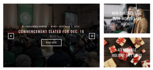
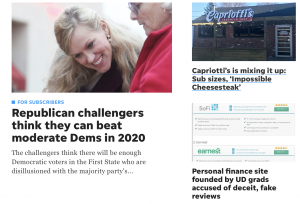
Visual- I feel the layout and style is very simple and clean. To me this makes the cite easy to use and find what you’re looking for. The layout is also similar on every page even when you click the different headers on the navigation bar. Each page has photos or an article on the left and a side bar on the right that leads the audience to other stories and articles. Because of the photos it frames the viewers eyes directly to that area. This brings the audience’s attention to the articles and depending on the picture it can intrigue them before they even read a word. The layout even looks like that of a real newspaper or other digital publications I have seen.

Aural- There is not much use of the aural mode on the website besides a few videos that are attached to some articles.

Spatial- I think the spatial use here is very well done. It is not cluttered so the information is not overwhelming. There is a lot of information that can be found on this website and the way it is spaced out and organized is very well done and effective. There are different categories of articles so that students can focus on finding articles with topics they are interested in. The arrangement of information is the same throughout, again making it easy to use and navigate.

Gestural- Most of the gestural mode here comes from the visuals of the pictures. In some pictures we see students having fun whether participating in a school event, in a workout class, studying abroad, etc. In others we see clear interacting between students. Some students working together to orchestrate events, others playing a sport with their team members. By seeing their facial expressions, body language, and interaction with others we get a sense that students enjoy their time at Stevenson and that is a community based school. This is beneficial consider the audience are people who go to Stevenson. It could encourage them to do more with the school, or just have a sense of pride for where they go.

Affordances:

I would say the strongest affordances are linguistic, visual, and spatial. These three modes really have to work together in order to produce a cohesive and effective publication. The visuals enhance the words and meanings of the linguistics, while the spatial makes the whole process easy and user friendly. Gestural is also effective here, but because it is mostly scene in the photos posted I feel visual still has a stronger use. Aural is probably the weakest affordance, and could actually use some improvement. It might be nice if they had an audio reading of the articles so that people with visual constraints can also enjoy the articles, making the publication more inclusive to their audience. Besides that I don’t see much use for aural here. The videos are a nice touch, and gives the audience a break from just pictures and texts, but because it is a publication, photos and words are what is most expected.

Color:

The colors of the publication are a white background with mostly black text besides the green text for the Villager logo. Having a white background and black texts creates a great contrast. It makes the words pop and brings the viewer’s eyes to the information at hand. It also helps create a clean and sophisticated look. This shows its audience that although this publication is ran by students they take their jobs as journalist seriously. And finally, the Villager logo being the only hint of green is very effective. It is always in the left hand corner in big bold letters using the “Stevenson Green” we see all over campus, the website, clothing, etc. By using this green it is still connecting to the Stevenson community it is a part of, making it very cohesive and identifiable to its audience.

Font:

The font reminds me of something I would see in an actual newspaper or magazine. The use of all caps in the headers are very effective, everything looks even, clean, and brings the viewers’ eyes to those all capped words. It also helps differentiate between topics and actual stories. And the having the logo in big thick letters clearly brings attention to it, and again is very similar and cohesive with other Stevenson logos.

Layout:

The layout is very effective here. It is easy to navigate and is visually appealing. The layout is probably one of my favorite things about this publication. It makes it easy for the audience to read the mass amount of information and makes it more enjoyable for them.

Overall, I think the students who run this publication have done a good job of making this website user friendly for their audience. Whether a faculty member, student, parent, or alumni is reading this I think they will all clearly see the connection to their school and find useful information that they can use here at their time in Stevenson and in the future. It was designed so that any of these audience members can look at it, easily navigate it, and enjoy whichever article they choose. And on top of that, the information provided on their website is strictly devoted to their desired/actual audience members as well.

The Stevenson Villager

The Stevenson Villager is a University weekly newspaper run by students, for faculty, students, alumni, and those interested in knowing more about the school. The Villager features content on school sports, on and off campus activities, and more. This website uses a multimodal way of communication by including both word and image to convey a message to its readers. This way of organization can be analyzed through different modes and affordances to help readers better understand the content they are reading.

Linguistic: Each article is written in a specific format known as AP Style (Associated Press). This style is commonly used by journalists and on newspapers. Using this format ensures that there is uniform between all posts because there are many different writers for the paper. The journalists must not show too much difference in writing styles, though they are allowed to use their personal judgment on a piece, there is a chance it could be edited before publishing.

Visual: The home page for the Villager website displays a title which is in the Stevenson colors, and every font used on the Villager website is a sans serif font. This allows for clear visuals, and all other text on the website is black against a white background.

Aural: The website features no sound on the page, except when adding a link a sports video- or the occasional SUTV or SU Radio article. This website rarely features videos, though they do use a lot of images, usually two per article.

Spatial: There are clear categories on the paper which separate the types of articles which are along the top and as a sidebar on the website. These categories can help readers stay in articles they care most about. On the homepage there is a feature section that rotates through images of the new weekly articles. Each article is also laid out the same way, two pictures flushed to the left with a caption. This keeps a sense of symmetry through the articles and writers.

Gestural: There is not much to interact with on the page other than the category buttons. This page is very informational and there is not anything to interact with other than the content itself.

Overall, the Stevenson Villager is an online publication that features a multimodal way of communication. Through this analysis we can see that there is a lot of uniformity through the entire website. The images used throughout the page are the only real visual aspects for the website.


Stevenson Villager

The Stevenson Villager is a newsletter that is run by students and professors at Stevenson University. All the articles that are featured in the publication come from Stevenson students or faculty. The purpose of this publication is to allow students to develop their writing skills by producing original material.


Visual

Visually, the webpage’s design gives in a more professional look. In large green letter in the top left, it says “The Villager: Stevenson University” with the rest of the lettering on the page in plain black text. The background of the page is white and does not offer the reader any other things to look at and engage with outside of the page links and videos. The page layout consists of and horizontal top link bar with and additional options on the right-hand side vertically.


Aural

There are no aural elements to the villager’s website. Even though there are links to videos present on the main page, it does not have any actual aural elements.


Linguistic

Since it is a webpage that is dedicated to writing publications. The language used is professional and well written. The choice of words used in the brief captions is basic enough for the reader to understand and get an introduction into what the article is about.


Gestural

As far as gestural elements go, the reader is only able to see the body language of the individuals who are pictured in the articles. The facial expressions of the subjects vary do to the type of photograph that was taken. In some cases the photos are candid and in others they are portrait photos.


Spatial

The spatial elements of the webpage are relatively neat and organized. There are multiple sections that have links to direct the reader to other material available on the page. There is uniform spacing in between each of the photographs featuring articles.


Rhetorical Analysis of The Villager

The Villager is one of many Stevenson University’s websites. This website is more article based where students majoring in Journalism control of it. Articles are published every week stemming from topics about school athletics, reviews and news about the institution or the community around it.

Modes and Affordances

Linguistic Mode

The language used in this website is informative in every article. Whether the article is a review or highlights on a past sports game, the language is consistent.

Visual Mode

The Villager incorporates a lot of visuals throughout the articles. All of the articles have the same layout when it comes to the visuals. The picture is always on the left side of the article at the start of it. On the posts, all of the articles have their headlining picture above the date of publication, title of the article, author and a brief introduction. The color scheme of the website corresponds to the color scheme of the school.

Aural Mode

There are no sounds or sound effects that aid in the communication of the information provided in the website. However, under the category “Students Are Talking…” there are links to short YouTube videos of past or current Stevenson University students that responded to topic questions about what was going in that point in time.

Spatial Mode

All of the pages and categories on the website are consistent in the layout. As stated above, the pictures on the pages and in the articles are identical in layout. There is a side navigation bar on the right of the websites on all pages and posts. There also is a top navigation bar that is consistent on all pages and posts.

Gestural Mode

The way the website is constructed leads to the user to have an easy time navigating through it if you are on a desktop or computer. The top navigation bar is easy to access and see on every page. The YouTube videos and the products addressed in some of the articles that are linked throughout the website are easily accessible and work. One aspect of the layout that may hinder navigation is the side navigation bar on the right. If this website is being looked at on a smart phone, having the side navigation on the right side can hinder scrolling through the website as majority of users are right handed.

The Villager is a simple website that is user friendly and easy to navigate through for all ages. The content and information provided is feasible to those who have or are attending Stevenson University and their families, faculty of the institution, the community of Baltimore and people that are interested in attending the university.