Do’s and Don’ts for Greenspring Review

  • The audience
    • The audience of my poster is to the population at Stevenson University that deals with dyslexia, specifically letters. The population includes, but is not limited to, Stevenson students, faculty, staff, and the rest of the surrounding community.
  • The purpose
    • The purpose of this poster is to, not only bring awareness to dyslexia, but to bring specific key elements of the difficulties of dyslexia to the eye of The Greenspring Review. The poster that I created points out five (there are more) points that The Greenspring Review should and should not do when creating their cite, to accommodate to the needs of those with dyslexia.
    • I kept my post very simple, still keeping the Stevenson color scheme, I made sure that my text was easy to read, not using a san serif font. I also made sure use colors that did not complement each other, I did this so that words don’t get lost when reading the poster.  Another main thing that I did was to keep the text concise and straight to the point, trying to eliminate the idea of getting lost or sie tracked when reading.
  • Citations:
    • Ball, Cheryl E., et al. Writer/Designer: a Guide to Making Multimodal Projects. Bedford/St. Martins, 2018.
    • Pun, Karwai. “Dos and Don’ts on Designing for Accessibility.” Accessibility in Government, 2 Sept. 2016, accessibility.blog.gov.uk/2016/09/02/dos-and-donts-on-designing-for-accessibility/.dyslexia finaldyslexia final

dyslexia final

Do’s and Dont’s Poster

Website Do's and Don't for people with social anxiety

The audience that I focused on for my poster was people who have social anxiety. Anxiety is a common mental health disorder that “comprise[s] a range of mental illnesses that are characterised by excessive feelings of fear, apprehension, and dread” (Swallow). Social anxiety is “an intense fear of being embarrassed, humiliated, or judged negatively by others in a social or work setting” (Swallow). Personally, I have some degree of social anxiety, especially when sharing my creative work or presenting. Just from talking with other people, most students, and people in general, tend to have a form of social anxiety in some degree. This is why it is important for The Greenspring Review to follow some accessibility guidelines so that those with social anxiety can interact with the site and participate in events the organization holds.

The first Do and Don’t I have listed is all about creating a comfortable, positive enviornment. In the definition of social anxiety provided by David Swallow, one of the intense fears stems from being judged negatively. The comments on the site must be moderated to eliminate the possibility of somebody’s work being judged negatively. To reassure the user, there could be a disclaimer or warning message stating that negative comments will not be tolerated. The second item I list deals with unpredictability of the site. All buttons need to be clearly labeled so that users know exactly what will happen if they click on the button. For someone with social anxiety, unpredictability can increase levels of anxiety (Cambron). The next item deals with the submission of works and contacting others. Contact with others, even if it is just over email, can be very difficult for those with social anxiety. Users should be able to submit directly to the site as opposed to having to email someone. People with anxiety should not be rushed, which brings me to my fourth item. Deadlines needs to be established far out in advance so the user has an adequate amount of time to prepare. Deadlines should be flexible as well, so that the user does not feel uncomfortable submitting a piece of work a little late. My last item deals more with the events The Greenspring Review holds. They are wonderful events, but for people with social anxiety, it can be hard to participate and enjoy themselves. For example, the open mic event is very anxiety provoking for those who have to read their own work in front of others. The GSR needs to have more relaxed events that don’t require any sort of forced participation.

While I did not have many aesthtic-related items listed on my poster, I tried to create the poster so that it would not provoke any anxiety. According to Writer/Designer, “Cool colors are usually read as calming” (Ball et al. 46). I went with blue as my primary color choice becuase it is a cooler color and evokes a sense of calming for those who may be feeling anxious. The font I chose was so that the poster was as welcoming as it could be to try and eliminate any fears related to anxiety. According to Jakob Nielsen’s “10 Usability Heuristics for User Interface Design,” “Dialogues should not contain information which is irrelevant or rarely needed. Every extra unit of information in a dialogue competes with the relevant units of information and diminishes their relative visibility” (Nielsen). With this in mind, I tried to keep the wording on my poster to a minimum. I kept a neat, simple layout that was simple and easy to follow so that those with anxiety did not feel overwhelmed.

Ball, Cheryl, et al. Writer/Designer: A Guide to Making Multimodal Projects, 2nd ed., Bedford/St. Martin’s, Boston, 2018, pp. 46.

Cambron, Thaddeus. “Designing Better Experiences for People Facing Anxiety.” Model View Culture, no. 37, Feminist Technology Collective, Inc., 24 May 2016, modelviewculture.com/pieces/designing-better-experiences-for-people-facing-anxiety. Accessed 4 March 2020.

Nielsen, Jakob. “10 Usability Heuristics for User Interface Design.” Nielsen Norman Group, 24 April 1994, www.nngroup.com/articles/ten-usability-heuristics/. Accessed 4 March 2020.

Swallow, David. “A web of anxiety: accessibility for people with anxiety and panic disorders [Part 1].” The Paciello Group, Vispero, 14 Aug. 2018, developer.paciellogroup.com/blog/2018/08/a-web-of-anxiety-accessibility-for-people-with-anxiety-and-panic-disorders-part-1/. Accessed 4 March 2020.


Do’s and Don’ts Poster

The audience that I am gearing this poster toward is for the student, specifically a student in a STEM related field. Stevenson has driven its university focus toward one that is career-oriented, leaving me to have my suggestions pertaining to neatness and structural order of a particular work. The STEM field tends to lead away from abstract designs or ideas, thus, making the need for the Greenspring Review to be visually pleasing and organized. Many students attend Stevenson for this reason, leaving me to believe the audience to be more willing to adhere to logic and order rather than abstract and artistic. As reflected in my poster, there is a systemic theme occurring throughout, leaving an importance to theme and least effort usability principles all with the goal of catering toward Stevenson students.

For the poster itself, my focus was on alleviating the user experience as much as possible. Having a consistent layout allows the user to be able to use the website faster as it most likely relates to other websites that the user is already familiar with, reinforcing a well known Gesalt psychology found in Jakob’s Law. In terms of the colors and font use, I used red font on key words in the “Do” poster to draw more impact on the specific word. Cool colors are usually read as calming and are used to create less emphasis than warm colors (Ball). Presenting the information in a step-by-step infographic allows for the user to consume the information with more efficiency and less effort, reinforcing Hick’s Law where less is more. These are among many of the items that I feel should be necessary in catering the Greenspring Review to the audience of Stevenson students. (Livesession)

The choices aesthetically for this poster were used to provide information in a way that is appealing to students of this background. We as humans naturally view the colors green and red as stop and go (or good and bad), so by having posters with certain colors provide the reader with a better visual aid for understanding and making certain information “pop.” Having the information in a sequential order (1, 2, 3, 4, 5) provides a clear and concise way of providing ways to improve user experience and things to be cautious of. In the “Do” poster, I maintained a consistent format with a headline and a brief description using some color font to make key aspect hit home. In the “dont” poster however, I made the boxes slightly uneven and used random colors. What this does is create disorganization and if a website’s information is hard to read or doesn’t answer users’ key questions, then users will leave (Usability 101)

7 Psychological Principles for Better UX.” LiveSession, https://livesession.io/blog/7-psychological-principles-for-better-ux. Accessed 18 Feb. 2020.

Ball, Cheryl E., et al. Writer/Designer: A Guide to Making Multimodal Projects. “Chapter 1: What Are Multimodal Projects?” Second Edition. Bedford/St. Martin’s, 2018. Print.

World Leaders in Research-Based User Experience. “Usability 101: Introduction to Usability.” Nielsen Norman Group, www.nngroup.com/articles/usability-101-introduction-to-usability/.

Poster

The audience I chose for my poster is the student – athlete population. My reasoning for choosing this group is because it is something easily relatable for me being a student – athlete myself. Student – athletes are a large portion of any university’s population but sometimes get overlooked when it comes to being accommodated. This poster is just one example of information of how even the smallest things such as a website can make things less, or more difficult on a student – athletes academics. Student – athletes are a unique group of people with a tight schedule with minimal room for error. This can be preventable by keeping things simple, straight forward, and informative. 

For my “do’s” and “don’ts”, they are things that are all about making things easy on the user. Meaning a simple layout, easily accessible information, and something that can be used on the go for the student – athletes busy schedule. Making sure that there is balance is a key factor in a successful website. Balance occurs when there is an equally distributed (but not necessarily symmetrical) amount of visual signal on both sides of an imaginary axis going through the middle of the screen. (5 Principles of Visual-Design in UX) Without balance in a website, there is not much opportunity for success. With my do’s and don’ts, they are all factors that can contribute to the balancing of the Greenspring Review. 

My aesthetic choices were inspired by wanting to create something that was not too busy, but still had a touch of color to help it stand out. By using smaller art as I have done, it lets the content be front and center, while the art is a nice touch to put the content into picture. The organization was something that I wanted to keep simple and clean to provide the user ample opportunity to see all the information without being overwhelmed with a busy page. If a website’s information is hard to read or doesn’t answer users’ key questions, they leave. (Usability 101: Introduction to Usability) An easy website is a successful website, which can also be said for the poster. Making something easy to read and giving the user something aesthetically pleasing gives them more than enough reason to want to read.


Works Cited 

World Leaders in Research-Based User Experience. “Usability 101: Introduction to Usability.” Nielsen Norman Group, www.nngroup.com/articles/usability-101-introduction-to-usability/.

World Leaders in Research-Based User Experience. “5 Principles of Visual-Design in UX.” Nielsen Norman Group, www.nngroup.com/articles/principles-visual-design/.

Rubin, Lisa M., and Ron A. Moses. “Athletic Subculture Within Student-Athlete Academic Centers.” Sociology of Sport Journal, vol. 34, no. 4, 2017, pp. 317–328., doi:10.1123/ssj.2016-0138.


Poster

I chose my primary audience to be victims of sexual assault.  I did not want to specify any age, demographic or sex because it is a tragedy that anyone can be subject to.  Nearly one in six women experience sexual assault in their lifetime, and one out of every ten rape victims are male (“Victims”).  These are astounding numbers.  Because of the prevalence in society, it is paramount to be conscious of how survivors can continue to be affected in their everyday life.  I wanted to have some of the major “do’s” and “don’ts” for The Greenspring Review to be weary of.

Providing trigger warnings and disclaimers is important for survivors of sexual assault because survivors are constantly working to be able to identify their triggers to avoid anxiety and PTSD episodes (Smith).  Survivors are also advised to stay off social media for some time (Smith) because of the triggers that can come from it.  For this reason, I said a major “don’t” is the advertisement of sexualized bodies.  A part of recovering after a sexual assault is to engage in rhythmic movements because is allows the survivor to “relax and regain a sense of control” (Smith), which is why I advise a flowy layout opposed to blocks of text or an overwhelming amount of media. It is also important for survivors of sexual assault to open up at their own pace (Smith), which is why I said that information should be easily accessible and not have vague options.  They need to have clear options because their experience most likely put them in a blur of self-doubt and hatred (Smith).  Clear options also involve precise language and word choice.  It is important to consider the linguistics based on the audience (Ball 13-14).  Because it is important for survivors to feel comfortable when disclosing information, it is also important to provide opportunities to engage.  They should not feel pressured to reveal any information (Smith).  I also said that bright colors should be avoided and simple, inviting colors should be used.  Survivors are often advised to practice mindfulness and/or meditation (Smith), which are commonly associated with simple and relaxing colors.

This poster uses solid lines because of the impact and presence they have for the viewer.  However, the horizontal lines in the body of the poster have little arrows attached to them, so the solid lines do not have such an imposing force, and it allows for some fluidity (Vasile).  I did not want the viewer to be intimidated by the solid lines, so that is why I used lines with some flare, but not dotted lines because these “do’s” and “don’ts” are not interchangeable.  I also organized the poster into a type of T-chart with all “do’s” and “don’ts” are clearly distinguished.  The spatial mode is an essential aspect in allowing users and viewers to engage with the media (Ball 18).  I used a fair amount of white space to create an open and inviting feeling (Vasile).  I did provide some images to coordinate with the “do’s” and “don’ts,” but I chose not to do images for every item on the list because I did not want it to be overwhelming or have a sense of being trapped (Vasile).  I chose to use greys and blacks for all lines and words on the poster because it is neutral.  I wanted the poster to be inclusive to all because any person, no matter their race, religion, sex, etc. could be a victim of sexual assault.


Works Cited

Ball, Cheryl, Jennifer Sheppard, and Kristin Arola.  “Writer/Designer: A Guide to Making Multimodal Projects.” Massachusetts: Macmillan Learning, 2014. Print.

Smith, Melinda, and Jeanna Segal. “Recovering from Rape and Sexual Trauma.” HelpGuide.org, 17 Feb. 2020, www.helpguide.org/articles/ptsd-trauma/recovering-from-rape-and-sexual-trauma.htm.

Vasile, Christian. “Learning the Basic Elements and Principles of Graphic Design.” 1stWebDesigner, 4 Mar. 2019, 1stwebdesigner.com/graphic-design-basics-elements/.

“Victims of Sexual Violence: Statistics.” RAINN, www.rainn.org/statistics/victims-sexual-violence.


Accessibility Poster


As my audience for creating this poster, I knew I had wanted an anxiety-based disorder because I struggle with social anxiety myself, and after researching different disorders I decided on post-traumatic stress disorder (PTSD). This is not limited to people who have served in any of the military branches, as the definition of trauma is any shocking event that one sees or has happen to them. Traumatic situations include robberies, assault, sexual assault, witness of death, etc. PTSD is also not limited to a specific age or gender, as 60% of men and 50% of women have at least one traumatic experience in their lives that could lead to the development of this disorder. More specifically, 10% of women and 4% of men will experience PTSD in their lives (U.S. Department of Veterans Affairs, 2018). Since this is so common among the general public, I decided to create a poster geared towards people with PTSD because of the students and faculty that may have/will experience this at some point in their lives.

Accommodating for this anxiety disorder proves difficult as it varies for each person, since different things such as sounds and visuals are triggering for different individuals. Providing trigger warnings for sensitive content included in videos or very graphic images would be beneficial. In a study conducted in a university located in Australia, it was found that the prevalence of mental illnesses such as depression, anxiety, and PTSD were the most prominent (Kent, 2015). Since trauma is variable with each individual, I decided to use more general Do’s and Don’ts catered to the content that the Greenspring Review would inhabit. In specific pieces such as videos, images, or written work inspired by PTSD, offering contact information or resources would be beneficial to this audience as this would encourage users to seek help if they need it, rather than promoting content that inadvertently discourages them. Also, to reduce anxiety from using the site, implementing an easy to use navigation system and eliminating ambiguity by utilizing clear language would render the website more useful.

For the visual aspect of my poster, I tried to create a simple design that would not be too overwhelming to users with anxiety disorders, specifically PTSD. To serve the idea to be clear and concise, I used bold lines to separate parts of the poster for the Do’s and Don’ts, as well as using a white background to make the text and pictures stand out more and to create contrast. I included the picture at the top of the poster as a way of expressing that PTSD is not limited to certain ages or genders. I also kept the colors relative to this picture so that they would coordinate well with the “color scheme.” To not overwhelm the reader with walls of text. I spaced the words out at much as possible so that the space would not be too cluttered. Overall, I tried to balance the pictures and the text as much as possible so that and off-centered pictures or text would not be noticeable. (Vasile, 2018)


Kent, Mike. “Disability, Mental Illness, and ELearning: Invisible Behind the Screen?” The Journal of Interactive Technology and Pedagogy, Cuny Academic Commons, 17 Dec. 2015, jitp.commons.gc.cuny.edu/disability-mental-illness-and-elearning-invisible-behind-the-screen/.

U.S. Department of Veterans Affairs. “How Common Is PTSD in Adults?” National Center for PTSD, 13 Sept. 2018, www.ptsd.va.gov/understand/common/common_adults.asp.

Vasile, Christian. “Learning the Basic Elements and Principles of Graphic Design.” 1stWebDesigner, 27 May. 2018, 1stwebdesigner.com/graphic-design-basics-elements/.

Accessibility Poster


Audience

Up to 24 million people of all ages and genders suffer from an eating disorder in the U.S. (MEDA). Currently, there are 20 million students enrolled college (Statista). Of course, not every college student has an eating disorder, but they do account for part of the population. Things such as “Freshman 15” are commonly mentioned when referring to some of the many experiences college students have. Also, things such as weight requirements for athletes, self-perception, and depression increase the risk of a college student developing an eating disorder. Because of this prevalence, it is important to consider these students when designing a website or posting content that can affect their online experiences.

 Do’s/Don’ts

With eating disorders being less apparent or obvious than other physical or mental disorders/disabilities, the needs of those with eating disorders are often overlooked. In general, the do’s are listed to support healthy behavior and open communication while the don’ts are listed to prevent the enabling of unhealthy behavior. It is also important to not project ideals or create an environment in which the user feels judged, pressured, or inadequate. Many of these things can be subconsciously reinforced by the authors of various works in their content. Things such as limited representation of various body types, stereotypical characters, or toxic story lines can subliminally perpetuate one’s negative self-perception.

 Aesthetic Choices

Most suggestions regarding engagement with those who may have an eating disorder refer to content/context rather than design. Because of this, I chose to keep the poster organized and somewhat minimal while keeping it visually appealing. The blue background was chosen to simply provide contrast while avoiding harshness. 5 Principles of Visual-Design in UX, briefly explained the importance of using balance when designing to support a positive user experience. Using balance while designing, prevents drawing the user’s attention from one part of the content to another due to a lack of symmetry. Ultimately, avoiding asymmetry allows for the content to be consumed in its entirety.

Works Cited

Experience, World Leaders in Research-Based User. “5 Principles of Visual-Design in UX.” Nielsen Norman Group, https://www.nngroup.com/articles/principles-visual-design/.

“U.S. College Enrollment Statistics 1965-2028.” Statista, https://www.statista.com/statistics/183995/us-college-enrollment-and-projections-in-public-and-private-institutions/.

“Eating Disorders & College Students” Multi-Service Eating Disorders Association, https://www.medainc.org/wp-content/uploads/2015/09/MEDA-College-Guide.pdf

Do’s and Don’ts Poster


The audience I chose for my poster is students with anxiety. I chose this audience because I feel like many students deal with some level of anxiety, I myself included. Another reason I chose this disability is because it is often associated with a stigma, or at risk of being ignored. Because anxiety is not a visible disability it tends to be out of sight, therefore out of mind, resulting in designers not creating a more inclusive interface for students (Kent, 2011).  For students who have anxiety and want their work on the Greenspring review, it can be very intimidating to put yourself and your work out there. The idea itself can cause students anxiety, so it is important to find more ways to create a calming and welcoming environment where they feel they can be a part of it.

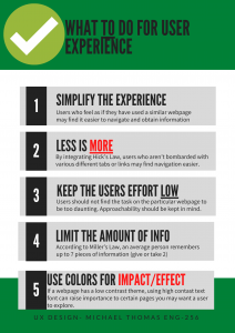
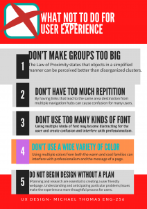
When coming up with my list of do’s and don’ts I considered what I myself find overwhelming in website designs that cause me anxiety. I realized that I typically like websites that use warm and inviting colors, with a simple layout, and a mix of words and images. Whenever the information isn’t easy to find, is overwhelming, or complicated to understand I tend to become tense and frustrated. I eventually feel overwhelmed and don’t even know where to begin with processing everything, leading me to give up and leave the website. I also know that if I were to submit something to the Greenspring Review that didn’t get accepted I would not only want a response, but some positive feedback that I can use to improve for next time. If my work did get approved and was submitted I also know I would be terrified of seeing negative comments for everyone to see, or seeing any type of negative content in general. I also read what students with anxiety found encouraging about online learning and adapted it to better fit my do’s and don’ts poster. Many of them like how easy blackboard is to use and that it is a place that encourages open and accepting discussions. They also like the easy access to feedback and tutoring, and enjoyed some of the video tutorials on the website (Kent, 2015). What I gathered from this is that students felt better when they could easily navigate the page, had access to positive feedback, had a positive forum encouraging participation, and liked having visuals to look at besides just reading texts. This, along with my own experiences, helped me create my five do’s and don’ts.

The aesthetics of the poster, and the interface in general, are important to consider. Good aesthetics have been known to not only increase the attractiveness of the interface, but also the usability. When users have a positive response with the aesthetics, they are more likely to enjoy the usability more, or ignore minor discrepancies (Morgan, 2017). This can be especially important for users with anxiety as they will feel more calm and open minded while navigating the website. While aesthetics are important, the interface still needs to be usability friendly for their user. Aesthetics and usability must work together to create a cohesive and effective interface, something I kept in mind when creating my poster. Because I am doing a poster for students with anxiety, I wanted the aesthetics of my poster to resemble the do’s and don’ts of my poster. After looking at many different sources I discovered that muted, pale, or dusty shades of blues and greens are popular colors for relieving stress, therefore my background colors are muted shades of blues and green. Using muted greens is also something for the Greenspring Review to utilize in their design, that way it can relate back to Stevenson, but also provide a calming background for these users as well. To help my audience understand the information better I used a mix of words and images in each of my do’s and don’ts, and also made the information as clear and concise as possible without overcrowding each section. While the Greenspring Review already shares images students have taken, they can still utilize visuals in their homepage, or other informative page, maybe even use videos in some way. It can be helpful to provide different ways for students to absorb information. For my poster, the layout of each box is the same, and the overall poster is clean, simple, and cohesive. And finally, I utilized thin blue lines to separate each do and don’t from each other. This helps declutter the information and create clear designated sections, allowing the user to easily follow along. The Greenspring Review should keep in mind how they use their spacing. Pages should not be cluttered with information, and they can utilize white space between images and words to make it visually easier to follow. While each page will vary with content, the layout should be generally the same to avoid an overwhelming presence. By considering these aesthetics, and the do’s and don’ts, the Greenspring Review can design a more user friendly interface for users with anxiety.

Works Cited:

Kent, Mike. “Disability, Mental Illness, and ELearning: Invisible Behind the Screen?” The Journal of Interactive Technology and Pedagogy, 17 Dec. 2015, jitp.commons.gc.cuny.edu/disability-mental-illness-and-elearning-invisible-behind-the-screen/.

Morgan, Kate. “The Aesthetic-Usability Effect.” Nielson Norman Group, 29 Jan. 2017, www.nngroup.com/articles/aesthetic-usability-effect/.


Designing for Users with Anxiety Poster

For this assignment, I chose to focus on the dos and don’ts for designing for users with anxiety. I chose the audience of college students with anxiety because anxiety is very common in college students. According to the American Psychological Association, 41.6% of college students have anxiety (American Psychological Association). Therefore, it is important to design your website accordingly because it is likely that people with anxiety will be visiting your website.

When designing for users with anxiety, it is important to keep the website easy to navigate. In Dr. Kent’s study of college students with disabilities in Australia, he found many students enjoyed sites that were easy to navigate (Kent). For example, “Blackboard has been great. It’s generally easy to understand and use (Kent). Like any website, the user wants it to be easy to use. You do not want to clutter the pages because this will discourage the user, which will cause them to leave the website. When there is a simple layout, the users will be able to find information easily, which will make them feel good. One of the pieces of the “usability honeycomb” is that information is easily found (UserTesting). In addition to using a simple layout, bold text is a good way to make information easily to find. Writers are able to use bold text to make the important information stand out, so readers do not have to read the entire article. People with anxiety do not want to read long paragraphs of text because that will make them stress out, so writers can make articles less intimidating by using bold text and shorter paragraphs. Furthermore, the use of visuals, like pictures or videos, can also be used effectively to provide alternatives to reading lengthy articles. However, you should never have pop-ups or videos that play automatically because that will cause people with anxiety to panic, which will turn them away from using your website in the future. Lastly, people with anxiety can sometimes require more support than others. Therefore, it is a good idea to make a live chat option or at least make it easy to contact someone to get help when needed.

I used the dos and don’ts strategies listed in my poster and applied them to creating the poster. I made the poster very simple with two clear sides that distinguished the do’s and the don’ts to make it easy to follow. The text is also simple, which makes it easy to read. Additionally, I left a lot of blank space, so I did not overwhelm the viewer with a lot of text. To supplement each box of text, I used an image to display what the text says in a visual way. Therefore, people do not have to read the text to understand the poster. Although this is not mentioned in my poster, I felt like it was important to use a blue color scheme because the color blue is usually associated with tranquility. It is important to make people with anxiety feel calm, so the color scheme you choose is very important.

“College Students’ Mental Health Is a Growing Concern, Survey Finds.” Https://Www.Apa.Org, https://www.apa.org/monitor/2013/06/college-students. Accessed 3 Mar. 2020.
Kane, Laura. “Disability, Mental Illness, and ELearning: Invisible Behind the Screen?” The Journal of Interactive Technology and Pedagogy, 17 Dec. 2015, https://jitp.commons.gc.cuny.edu/disability-mental-illness-and-elearning-invisible-behind-the-screen/.
“UI vs. UX: What’s the Difference between User Interface and User Experience?” UserTesting, https://www.usertesting.com/blog/ui-vs-ux. Accessed 3 Mar. 2020.


Designing for Students with Depression


Poster link: https://bit.ly/2vr4vNJ (bit.ly is a url shortener)

Justification:

I chose to represent do’s/don’ts for students that have depression, and though it is not a physical disability it is a mental one that can sometimes affect users physically by simply being uninterested. In an article i’ve read, “Attempting to Make an App for Depressed People and Failing,” Amit Shukla attempted to make an app for depressed people and details  his failings. In a poll he asks users  if they were interested in an App that would help them fight depression. Only 10% answer yes in their depressive state while 60% answer yes in a happy state. So this small poll shows us how difficult this audience can be to design for.

I have chosen some do’s and don’ts that may help when designing and I will go through each one to explain my reasoning. Starting with Do’s, the avoidance of grey and loud colors Is something I know from experience as anyone would that grey colors can be dreary and give off a tired and sad vibe. The loud colors I mention have the opposite effect. Really bright colors can be annoying  and unpleasing to the eye, So I decided to go with something in the middle and made my poster out of light and cool colors that have a synergy with each other. Keeping the website simple and organized is something that a designer designing for any audience should follow, but especially for someone with depression because it can help encourage the user to stay on the website and not get lost.  Creating a sense of community is important because it can help eliminate feelings of loneliness and isolation. Building trust and familiarity can increase the benefits users gain from your design even if a forum or chat group isn’t part of your digital product(How to Design for Users Struggling with Mental Health | Clutch.Co). Next is choosing your words wisely. It is important that designers watch out for trigger words that map be on their website and give warnings for them. An empathy map can help with this process. Using the empathy map to work with users will help designers understand the language they use to describe their experiences and be able to integrate it into their design.

The last thing I mentioned under ‘ Do’ is Display realistic images of the users that are neutral and non-exaggerated. This is better explained when knowing the reason of not displaying realistic or neutral images. Images that represent sadness or exaggerated happiness can be stress inducing or, in the case of an exaggerated happy photo, can be seen as fake to users. The next point, ‘Don’t make navigation too complex,’ is a direct comment to the navigation bar on the Greenspring Review that has a long drop down menu for the Issues tab that branches off into 3 other categories.  By eliminating some of the redundancy designers can avoid cognitive overload (John Sweller and Howard Soloman). Excluding mobile design is something I thought designers should not do, and though Greenspring review doesn’t do that, their mobile design is lacking compared to the webpage. I believe both designs should be up to date to maximize the possible encounters and keep users coming back. The information on both mobile and the webpage tend to have walls of text and that can push users away. Finding walls to space information out and use some white space can help the page look less condensed and more inviting to read. Lastly, similar to the first ‘don’t’ the constant reminder of positive/get help messages or hotline numbers can also either annoy or hurt some users with depression. 7/10 people that commented on Amit’s poll when asked about how they felt about seeing National Suicide Prevention Lifeline at the top of the homepage said,  it
“made them feel like a loser”(Shukla).

Aesthetically I chose to have the poster look soft and light. The shapes I chose are used to give off a natural handmade and artsy look. Art therapy is a great way to express emotions without words, process complex feelings and find relief (Cohen). I tried not to include too many pictures to clutter the poster because it is already full. I also did not want to include images that broke the rule I was describing like showing sad images or over exaggerated happy images.

  • Shukla, Amit. “Attempting to Make an App for Depressed People and Failing.” Medium, 6 Dec. 2018, https://uxplanet.org/attempting-to-make-an-app-for-depressed-people-and-failing-cbad3ea9263.
  • Experience, World Leaders in Research-Based User. “Empathy Mapping: The First Step in Design Thinking.” Nielsen Norman Group, https://www.nngroup.com/articles/empathy-mapping/. Accessed 28 Feb. 2020.
  • How to Design for Users Struggling with Mental Health | Clutch.Co. https://clutch.co/web-designers/resources/how-to-design-for-users-struggling-with-mental-health. Accessed 28 Feb. 2020.
  • November 30th, Last Updated, and 2018 06:56 Pm. “Cognitive Load Theory (John Sweller).” InstructionalDesign.Org, https://www.instructionaldesign.org/theories/cognitive-load/. Accessed 28 Feb. 2020.
  • Cohen, Mary Ann. Creativity and Recovery: The Mental Health Benefits of Art Therapy. 10 July 2018, https://www.rtor.org/2018/07/10/benefits-of-art-therapy/.