Do’s and Don’t’s Posters

For the Greenspring Review, I have come up with do’s and don’t’s for the athletes as the target audience. Athletes are a large portion of the university’s population and ultimately they have connections that may reach outside of a literary level. I believe athletes would be a good audience to expand the magazine and help spread the content throughout.

When talking bout the don’t’s, I came up with five to capture the essence of what shouldn’t be done or added if this was their target audience. The first don’t is to not create and publish extra long content; athletes unfortunately do not have tons of time in between lifts, games, practices, classes, film and homework and reading a shorter piece would capture more of their attention because they would have time to read in its entirety. My next two don’t’s are to not schedule meetings during games and not to only focus on “star” players. Games are important for athletes and ultimately are their purpose for playing the sport they play, making athletes have to make a decision on which event to attend; a game will mostly likely come over a meeting. When it comes to sport’s features in the magazine, focusing on the same “star” player every week is a factor in the external collaboration of the team. Gonzalez writes “The author cites coaches that ‘focused on favorites instead of the good of the entire team,'” is bad for team chemistry and causes athletes to lose passion for sport. Although the Greenspring review is focused on content of great literary work from student, I believe this is something for them to consider if the opportunity comes along. In Writer Designer, we also learn about the balance of modes. Visual modes are a huge factor in a design and can turn audiences to or against the site. By not using too many designs

With don’t’s, there are also do’s and some of those include, writing and publishing interesting sports poems and short stories. This will make athletes feel as though they are included and that someone was thinking of them during this process. In addition to this, the Greenspring Review could feature more published work from athletes. Sending out interest for “poetry needed” around the gym and the stadium for athletes to see because that is where you will find most of them outside of class. Again, this goes to the idea of inclusion for all student and not making athlete feel like literary art and sports don’t mix because they can mix. Another do would be to include short computer game onto the site. This give the site a competitive and fun edge that will attach not just athletes but other students. Creating that sense of interaction is good for the overall culture and feel for the site. The games can be minimal and art related with a competitive component. A smaller and less invasive change would be to continue to make all meeting be on campus.

These do’s and don’t’s allow for more participation from student athletes on campus and ultimately expands the audience base amongst the school. The modes used to create the Greenspring review can always be changed to attract and expand to new audience members and I feel as though these do’d and don’t’s will help with that based on my research.
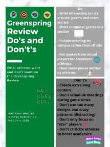


Work Cited:

Ball, Cheryl E.; Sheppard, Jennifer; & Arola, Kristin L. (2017). Writer/designer: A guide to making multimodal projects, 2nd ed. Boston, MA: Bedford/St. Martin’s Press.

Gonzalez, Peter. “A Response to ‘The Coach That Killed My Passion.’” Athletes in Action, athletesinaction.org/underreview/a-response-to-the-coach-that-killed-my-passion?gclid=Cj0KCQiAwP3yBRCkARIsAABGiPpYYSY_Wo9zGnUhBXGeeRmjrJPpzBUoG7N7pydZXMwjR-2muYOE5jkaAl2fEALw_wcB#?cid=da-adwords-cru-mktgfol-us-aiasearch2-456789061.

Poster Assignment


Audience:


 It is important to note that colorblind people can still see color. The colors just blend making it harder to differentiate them. Some cases are more severe than others but the majority of people are red/green colorblind. People who are red/green colorblind “generally have difficulty distinguishing between reds, greens, browns and oranges. They also commonly confuse different types of blue and purple hues” (“Types of Colour Blindness”) according to Colourblindawarness.org. This can make things problematic as websites try to be creative with the color scheme and layout but it can cause major problems for colorblind people. UX Collective states that “Statistically speaking most people with a moderate form of red/green color blindness will only be able to identify accurately 5 or so colored pencils from a standard box of 24 pencil crayons” (Tuchkov). Colorblind people can struggle navigating sites because of the wide range of colors and the failure of sites to differentiate links, error messages, and titles from normal information. The lack of accommodation for their condition can cause lots of frustration when trying to find information on a site efficiently. 


Do’s:


Some things to help colorblind people navigate a specific website include using text labels for things with color. If a picture features a girl in a yellow dress then the label could explain that to help the viewer understand and not feel left out. Another thing to do is to use thicker lines. This allows the site to be separated into sections for the viewer. The use of colors and symbols together will allow colorblind people to understand what they mean. Red usually means something is wrong in a box or with the site but adding an exclamation point or the word “stop” will help colorblind users to know that something is wrong. Patterns and textures are also an effective method for accommodating colorblind users. Graphs, charts, and backgrounds with different patterns and textures are easy to differentiate from one another. Lastly, a tip is to underline links to other articles so these viewers can find it instead of scrolling over every word to see if it leads them to another page. It saves time and keeps mindless scrolling down.  


Don’t:


Some things that should be avoided include colors that are problematic like red/green and blue/purple. Another thing that should be avoided is the use of thin lines. It is hard to distinguish and might not be effective in separating sections from one another. Do not use optional fields when asking for information as colorblind people can’t distinguish the color of the required vs. optional fields. Just have boxes for the required information so they know what is needed without any confusion. Another aspect to avoid color-wise is low contrast colors like red/orange and green/yellow. Close color combinations make it especially hard to decipher what color the background of words are in. Lastly, don’t link articles or the next page without adding a symbol or line to it. Viewers will lose their patience if they are looking for a specific link or next page button and can’t find it because it blends in with the rest of the site.


Aesthetic:

The aesthetic-usability effect is a component of designing a site to accommodate colorblind users. This effect refers to the user’s tendencies to perceive attractive products as more useable. One site described that “Users are more likely to want to try a visually appealing site, and they’re more patient with minor issues” (The Aesthetic-Usability Effect). For colorblind people, the use of symbols, thick lines, and quality color combinations help them perceive the site better because they can use it and it makes sense to them. If they instantly can navigate and understand the site they are more likely to put up with some issues since it is aesthetically pleasing to them. Another component of the aesthetic when designing for colorblind people is to make clickable links recognizable. An article that focused on this stated that designers need to “test [their] color choice for hyperlinks to make sure that people who have colorblindness can spot them easily” (Beyond Blue Links). The site also explains how the site needs to make clickable text universal throughout the site so colorblind viewers can easily recognize it. Whether it be the design around it, underline, or symbol next to it, it needs to be consistent around the site so people know where to click when they want more information or want to change pages.


References


Tuchkov, Ivan. “Color Blindness: How to Design an Accessible User Interface.” Medium, UX Collective, 1 Mar. 2019, uxdesign.cc/color-blindness-in-user-interfaces-66c27331b858.


“Types of Colour Blindness.” Colour Blind Awarenesswww.colourblindawareness.org/colour-blindness/types-of-colour-blindness/.


World Leaders in Research-Based User Experience. “The Aesthetic-Usability Effect.” Nielsen Norman Groupwww.nngroup.com/articles/aesthetic-usability-effect/.


World Leaders in Research-Based User Experience. “Beyond Blue Links: Making Clickable Elements Recognizable.” Nielsen Norman Group, www.nngroup.com/articles/clickable-elements/.


Designing for the Autism Spectrum

The audience that I choose was members on the Autism spectrum. I choose to use the spectrum because I did not want to specify the severity. The website is mainly for grade school-aged children, but gender does not matter. Although, because of the website coloring it may attract more males, however, the color was chosen in lew of April 2nd which is world autism awareness day where people wear blue. It is important to design websites with this audience in mind because according to the Center for Disease Control (CDC) 1 in 59 kids are identified with Autism Spectrum Disorder (ASD).

The do’s/don’ts of my poster were chosen with the purpose of not overwhelming my audience with too much clutter and dynamic, functions as I did not want them to feel trapped (Vasile). The first do/don’t is to use simple navigations over complex navigations. This is because websites that take a lot of work to figure out how to move around can cause extreme stress and frustration. My second do/don’t is to use plain English and simple sentences instead of puns, figures of speech, or idioms. This is because if you try and explain something important to a person on the spectrum they may have a harder time understanding exactly what you are trying to say. This can lead to a miscommunication of important information. It is always important to consider what the linguistic needs of your audience are (Ball 13-14). The third do/don’t is to use soft colors over bold colors. This is because people with autism can suffer from sensory overload a lot easier and faster than those who are not. Therefore, to help them have a comfortable experience on the website you need to avoid colors that can overstimulate like bright yellows, oranges, pinks, and greens. My fourth do/don’t is to use consistent layouts instead of dynamic ones. This is also because of sensory overload and frustration. A website that is constantly rotating a slide show of pictures or images may make it harder for a person on the spectrum to focus. Lastly, I said to use the principles of scale to indicate what is more important than other things instead of making every button the size. This is because it makes it easier to navigate the site if you can visually see what is most important without even reading.

Aesthetically, I made several choices to show my audience that I listened to my own do’s and don’ts. First, I kept the background a solid color and design. This is because I did not want the design to be too busy that my audience gets frustrated trying to read the poster. Secondly, I choose all straight lines so that they would not clutter the poster and take away from the words. However, I chose thinner horizontal lines because the thicker ones made the poster really hard to look at and I did not want too much sensory information. I used large and bold lettering instead of thinner font because it is easier to read and quicker which will cut down on frustrations of reading. My decision to choose white lines over black lines was based on the fact that the black lettering and black lines made all of the words and lines appear to blend, but white lettering and black lines were too hard to read. So, in order to create a balance, I used black, white, and navy blues to keep the poster consistent but easy to read. Lastly, I did not give every line an image because I did not want the center of the poster to be off-balance with the sides.


Works Cited

Ball, Cheryl, Jennifer Sheppard, and Kristin Arola.  “Writer/Designer: A Guide to Making Multimodal Projects.” Massachusetts: Macmillan Learning, 2014. Print.

Data & Statistics on Autism Spectrum Disorder. (2019, September 3). Retrieved from https://www.cdc.gov/ncbddd/autism/data.html

Vasile, Christian. “Learning the Basic Elements and Principles of Graphic Design.” 1stWebDesigner, 4 Mar. 2019, 1stwebdesigner.com/graphic-design-basics-elements/.

Accessibility Poster

I designed a poster portraying concerns of an online publication environment as it relates to those with movement disorders, specifically Tourette’s Syndrome. To evaluate this, I listed both do’s and don’ts that the target audience can use to improve online publication. For this project, the target audience is both Stevenson students, faculty, staff, and alumni. This target audience was chosen in particular to refine the Stevenson literary magazine, the Greenspring Review. To relate to the target audience, I used words, images, and information that would be useful for each of these individuals. In order to improve the online publication, it is essential to think about all possible viewers. Therefore, disability accommodations are necessary for the success of the literary magazine. 

The accessibility poster includes both five do’s and don’ts to be considered when designing an online publication. Each is accompanied by an image to further explain the point that is stated. The do’s included are: use a simple background and font, have easy accessibility to articles, use organized text, consistent sizing of both text and images, and use clear heading. Proceeding are the don’ts that read don’t: use distracting colors, use links that are broken, use overwhelming information, use images of multiple sizes, and use multiple links to direct site. The Journal of Interactive Technology & Pedagogy states that eLearning has proven successful for those with disabilities (jitp.commons.gc.cuny.edu). However, in order to ensure this, the article titled “Disability, Mental Illness, and eLearning: Invisible Behind the Screen?” says that publishers need to pay close attention to specific areas of accessibility, flexibility, and disclosure (jitp.commons.gc.cuny.edu). Therefore, these three aspects are what I focused on when designing this poster. 

In terms of aesthetics, I chose to focus on one specific color scheme. It was important to do this because of the the information stated in the poster. It is particularly important to keep information displayed both simple and neat for those with Tourette’s Syndrome. Therefore, the poster does just that and is an example of how to design when considering movement disorders. This color scheme is light blue which is said to be calming and advantageous to the mind and body. The guide for this poster was an article titled “Do’s and Don’ts on designing for accessibility”. The article states that it is imperative for us to not solely design or build for our own “immediate needs” (accessibility.blog.gov.uk). Karwai Pun also mentions that when creating an accessibility poster, it should not be too much based on perspective but be a general guide (accessibility.blog.gov.uk). Therefore, as stated, I used both images and color scheme to portray this. I chose a white background for the text to further my point of organized information. Letting the images explain the point simply is one of the key tools for accessibility. 

References

Kent, Dr. Mike. “Disability, Mental Illness, And Elearning: Invisible Behind The Screen? /”. Jitp.Commons.Gc.Cuny.Edu, 2015, https://jitp.commons.gc.cuny.edu/disability-mental-illness-and-elearning-invisible-behind-the-screen/.

Pun, Karwai. “Dos And Don’ts On Designing For Accessibility – Accessibility In Government”. Accessibility.Blog.Gov.Uk, 2016, https://accessibility.blog.gov.uk/2016/09/02/dos-and-donts-on-designing-for-accessibility/.

Designing for Students with Migraines

The audience for this poster are students from Stevenson University that suffer from migraines. I am a student from this institution who suffers from migraines so it was easy for me to come up with things that benefit me when I am on the computer. The Dos and Don’ts that I have listed will be beneficial to the changes made to the Greenspring Review as migraines and headaches are common in my age group. Students are under a lot of stress and tend to get lack of sleep due to the large amount of coursework during the semester. Stress and other factors can result in a migraine that can hinder a student’s learning and work ethic.


Migraines can affect you in different ways. In general, they can cause you to be more sensitive to light, sound and smells. Sometimes they can cause nausea, vomiting, and blurred or hindered vision. Staring at a computer screen already strains the eyes but staring at one with a migraine is even worse. The Dos and Don’ts listed are to make it easier for someone who is migraine-prone to browse the Greenspring Review. Using low contrasting colors is preferred as it decreases eyestrain which can make they symptoms worse. Blue and green spectrum colors are known to be catalysts for migraines so it is recommended not to incorporate them in digital works (Bullock). Moving around too quickly tends to stress out the brain and stomach (if you are nauseated) during a migraine and the same applies to fast moving objects on a screen. Slow moving objects stimulates the brain less than fast moving objects which leads to less straining. Using large and easy to read fonts has the same effect as using low contrasting colors. It strains the eyes less with does not provoke a migraine. Using a more spaced out design/layout is an example of Jakob’s Law and the Principle of Least Effort according to Kalina Tykiel in her article “7 Psychological Principles for better UX”. Having a layout that is almost universal to other website and provides minimal effort to navigate through leads to better user experience. Incorporating a spaced out layout helps students with migraines navigate through the Greenspring Review easier with little to no effort on the brain. Making sure to have low sounding videos is crucial to migraine users. Loud and alarming noises and provoke a migraine which leads to pain and throbbing. Low sound will ensure that the migraine user will have no problems scrolling through the website.


I chose to use a grey background and lavender font because it is easy on the eyes. Lavender is also a calming color and it is not on the blue and green spectrum. I didn’t want the colors to be alarming or bright to correspond to the Dos and Don’ts about color. I wanted the poster to be calming, smooth to look at and read. The font I used is relatively large and easy to read. The layout of the poster is simple along with the wording. Separating the Dos and Don’ts on each side spaces them out. The icons used are uniform in color and are simple. I used a faint line as a divider to provide structure.


Works Cited

Bullock, Greg. “Computer Screens: The Effect on Headaches, Migraines and Concussions.” TheraSpecs, https://www.theraspecs.com/blog/computer-screens-headaches-migraines-and-concussions/. Accessed 4 Mar. 2020.

Doherty, Colleen. “How Your Computer May Cause a Headache.” Verywell Health, https://www.verywellhealth.com/is-working-at-my-computer-causing-my-headaches-1719432. Accessed 4 Mar. 2020.

Tyrkiel, Kalina. “7 Psychological Principles for better UX.” Livesession, https://livesession.io/blog/7-psychological-principles-for-better-ux/. Accessed 19 February 2020.

“UI vs. UX: What’s the Difference between User Interface and User Experience?” UserTesting, https://www.usertesting.com/blog/ui-vs-ux. Accessed 3 Mar. 2020.

“designing for users with anxiety” accessibility poster

Many students, especially college students, suffer from anxiety. “Anxiety is your body’s natural response to stress” (Holland and Legg) and college is definitely stressful. Students’ apprehensiveness and worry are triggered with project due dates and exams and balancing your social life and health and a lot more factors that can trigger your anxiety. Staying active and talking to someone can help remedy people’s anxiety (National Institute of Mental Health) . . . and the arts can help with that as it challenges your mind with insightful work and the opportunity for discourse. Product Designer at Envoy Jon Rundle said “[d]on’t allow technical limitations to get in the way of thinking outside the box” so designing the Greenspring Review website should strive to accommodate as many needs as possible, as if there is no box.

My “designing for users with anxiety” accessibility poster has a very simple design and relaxing color scheme. Dizziness, distress, irritability, and headaches are some symptoms of anxiety (Holland and Legg), so to combat that, I opted for a simple design and spacious layout. Negative space “offers light and an open feeling . . . [and] lack of white space will turn your design into an old-fashioned, cluttered one” (Vasile), so a spacious layout is necessary as to not distress users with anxiety. Anger is another symptom, so using cooler, calming colors like the seafoam-blue and soft pink relaxes the user. I initially thought pink was a warm color, but “soft pastel pink can definitely bring an element of peace and calm to a space” (Robinson). The bolded font is also more rounded and playful, instead of a hard-edged font that felt too aggressive.

GSR should definitely provide comment sections, but also remove negative comments. The National Institute of Mental Health state that some people might benefit from support groups as it provides a space for people to share “their problems and achievements with others”. This community can be cultivated in comment sections as well so providing a place for students to interact with others over art and literature could be a way to help alleviate their anxiety. GSR has an editorial staff and they often have meetings to discuss submission guidelines and plan events, but they should also offer the option to allow remote editorial work as social anxiety may prevent some people from attending meetings or events. When there is an event, don’t have such a tight and busy itinerary as anxious people may feel jittery.


Works Cited

“Anxiety Disorders.” National Institute of Mental Health, 2020, https://www.nimh.nih.gov/health/topics/anxiety-disorders/index.shtml. Accessed 4 Mar. 2020.

Holland, Kimberly and Timothy J. Legg, PhD, PsyD, “Everything You Need to Know About Anxiety.” Healthline, 19 Sep. 2018, https://www.healthline.com/health/anxiety#in-teens. Accessed 4 Mar. 2020.

Robinson, Sarah. “9 Peaceful Paint Colors to Help You Relax.” Wow 1 Day Painting, https://www.wow1day.com/blog/paint-colors/9-peaceful-paint-colors-help-you-relax/. Accessed 4 Mar. 2020.

Rundle, Jon. “Designing your digital product like a concept car.” Medium, Transform, 15 Jan. 2020, https://medium.com/snapdocs-design/designing-your-digital-product-like-a-concept-car-26e382eb56e. Accessed 17 Feb. 2020.

Vasile, Christian. “Learning the Basic Elements and Principles of Graphic Design.” 1stWebDesigner. 27 May 2018, https://1stwebdesigner.com/graphic-design-basics-elements/. Accessed 4 Mar. 2020.

Poster: Autism Spectrum Do’s & Don’ts

The audience I chose to represent are students who are on the autism spectrum. Autism is very prevalent in a lot of college students, and people are not usually aware of that. When people initially think of autism, they automatically gravitate towards the lower functioning side of the spectrum. Usually, college students that are on the spectrum are on the higher functioning side, so they tend to be forgotten about because no one thinks about their needs. I have a  little sister and friends on this campus that are on the spectrum which is why I wanted to bring this the GSR’s attention.  The list of Do’s and Don’ts are very concrete.

The Do’s and Don’ts of students of the autism spectrum are very broad in the sense that they usually take pieces of concepts from people that suffer from ADHD or anxiety to name a few. Students on the spectrum vary because the spectrum is so extensive certain parts get triggered. One aspect we need to focus on is to use plain English and not use complex words or phrases. We must also refrain from use bright and loud colors and stick to the softer and warmer colors. Color and word use used the wrong way could trigger anxiety in the students. The last few Do’s and Don’ts focus on the simplicity of the site. We must have a simple layout of the content where everything is laid out bulleted or structured because clutter can also trigger panic, uneasiness, and even anxiety. To keep on the simplicity the navigation must be kept simple as well,  nothing tricky to get you from point A to point B.

This poster is plain and simple. I used the soft and plain colors on top of a white background to create an open and inviting feeling (Vasile). The use of the boxes and circles kept the layout appeal yet simple and easy for the eye.  I did not do images for on the list because I did not want it to be overwhelming or have a sense of being trapped Id.  As far as the text goes, I chose to use whites and blacks for words on the poster because it is neutral and remained consistent with the simplicity of the poster.


Kent, Mike. “Disability, Mental Illness, and ELearning: Invisible Behind the Screen?” The Journal of Interactive Technology and Pedagogy, 17 Dec. 2015, jitp.commons.gc.cuny.edu/disability-mental-illness-and-elearning-invisible-behind-the-screen/.

Vasile, Christian. “Learning the Basic Elements and Principles of Graphic Design.” 1stWebDesigner, 4 Mar. 2019, 1stwebdesigner.com/graphic-design-basics-elements/.


Usability Poster

dyslexic poster 3

For my usability poster, I chose to focus on those who live with dyslexia and overcome those every day challenges. For dyslexic people, they struggle with being able to properly process what their eyes are trying to send to the brain. This can manifest in different ways, some are simply just reading the words, others can be through sound and sometimes it is even the struggle know left from right. In this piece, the focus will be on dyslexia that causes the reader to see letters and words move around and become a jumbled mess. Following this will be ways in which websites can effectively design websites to help those individuals out a little. 

When looking at the Greenspring Review(GSR) website, initially it does a good job of being dyslexic friendly. The single big image in the middle of the screen along with the title in the left hand corner and the navigation bar in the right corner, clean and simple. And the navigation bar continues that idea, it is short and sweet in regards to the amount of text used, which is important for dyslexic users in particular. This applies to Hick’s Law, which states, “When the users are overwhelmed with options, they may as well not choose anything at all” (2019). This is certainly applicable to dyslexic users as if they can’t read the options, they will move on.  The site also uses the basic design of using black text against a white background, which is the easiest for dyslexic users as this provides great contrast for the text. They also do a good job of making the titles for the pieces bold, all capitalized, and in a bigger sized font. Allowing the dyslexic users to easily identify what is supposed to be the titles and know what else is supposed to be the description. Another very helpful aspect to the site that often gets overlooked is the amount of spacing between the lines of text. In the GSR they use good spacing between lines that allows the reader to easily track which line of text they are on, and especially for those with dyslexia, it is important for them to be distinguishably separated. The last positive of the poster concerning the GSR is the fact that they used a consistent two column layout throughout the site. Like stated in the do’s and don’ts article particularly for dyslexia, “keep a consistent layout” (2016). Having a set format makes it easy for dyslexic users to navigate the site when everything is constant and aren’t being inundated with style changes. But at the same time, the GSR does have some flaws that wouldn’t be too favorable for those with dyslexia. First one being the fact that their font color for the description of pieces is way too faint. The site uses a light gray font color against a white background and in a smaller sized font too. This is difficult for the average user as it doesn’t stand out against the background very much, but is especially troublesome for those with dyslexia as those letters begin to blend together since they’re so light. And to piggyback off this, the smaller font of the descriptions and tags are also a challenge for dyslexic users to efficiently browse through and read about pieces of work the site has to offer. Next, depending on the screen being used to view the GSR, there are way too many words for one screen at a time. When visiting the site on the Macs, there are six pieces of work visible at a time when scrolling down the section. Even for me, someone without dyslexia, I feel like I can’t decide where to start reading first, meaning the sea of words is even worse for those that are afflicted. And lastly, the about section on the site is helter skelter and the text wrapping around the poorly placed images creates a difficult reading layout. By the bottom of the page, the spacing between lines is not consistent and the breaks in descriptions are hard to decipher between a break in someone’s own  bio opposed to moving on to a whole other person.

As I started to come up with my approach for the poster, I wanted to try and make it as though the poster was split in half and each side represents the good and bad. So for that reason that is how I chose the layout for doing two columns. And then in the title I wanted to reflect the sides by making parts of the title on the right side reflect bad designs for those with dyslexia as the bright colors would be difficult for them to read. The same reasoning is applied as to why I chose to make the word “bad” red, to be indicative of how the changing colors is unappealing to those with dyslexia. I also added an image of one of those tests that are used to indicate that a real user is not a computer bot. The text has a wavy effect on it and has a line through it, which really makes it a struggle for someone with that impairment to decipher. Outside of that, I wanted the poster to be telling of what dyslexic people appreciate, which is why it is a fairly bland poster, not to pull their attention away from what’s important. 


Work Cited

Pun, K. (2016, September 2). Dos and don’ts on designing for accessibility. Retrieved from https://accessibility.blog.gov.uk/2016/09/02/dos-and-donts-on-designing-for-accessibility/

Tyrkiel, K. (2019). 7 Psychological Principles for Better UX. Retrieved from https://livesession.io/blog/7-psychological-principles-for-better-ux/

Poster Assignment

The audience that I focused my poster on is those who struggle with ADHD.  According to Robert Weis, “approximately 5% of postsecondary students have ADHD and experience academic and/or social-emotional problems because of it.  Although I chose to focus on students with ADHD; this poser could also be applied to parents, staff, faculty or perspective students who struggle with ADHD and view the Greenspring Review.

The do’s and don’ts of this poster are things that make it easier for the user(s).  Keeping a minimalistic, consistent layout as well as bolding or drawing attention to important information reduces confusion and helps users find information quickly.  By using bullet points or simple sentences, the designers are keeping the attention of the audience for much longer rather than distracting them with other information.  Using calm, simple colors rather than bright, distracting colors avoids unnecessary attention-grabbing features.  Finally, minimizing surprises avoids distractions from the main information on the page.  Loran McKnight noted, “a designer who is sensitive to usability issues should be capable for designing a product that is suitable for both ADHD and non-ADHD children”.  While following these do’s and don’ts, users with ADHD will have more success viewing the Greenspring Review, they also apply to the everyday user that may not suffer with ADHD.

I tried to create my poster so that it followed the do’s and don’ts presented in the poster.  I used simple colors and short, simple sentences to keep the viewer from getting distracted around the page.  By keeping the layout minimalistic and consistent, any viewer can retrieve any information that they wish.  Overall, creating a simply designed poster, a user with or without ADHD could successful look at the information that could be applied to the redesign of the Greenspring Review.

Works Cited:

Ball, Cheryl E., et al. Writer/Designer: a Guide to Making Multimodal Projects. Bedford/St. Martins, 2018.

McKnight, Loran. “Designing
 for Children
 with ADHD: The Search for Guidelines for Non-Experts User Experience Magazine.” User Experience Magazine, Mar. 2011, uxpamagazine.org/designing_children_adhd/.

Weis, Robert1, et al. “Assessing and Overcoming the Functional Impact of ADHD in College Students: Evidence-Based Disability Determination and Accommodation Decision-Making.” Journal of Postsecondary Education & Disability, vol. 32, no. 3, Fall 2019, pp. 279–295. EBSCOhost, search.ebscohost.com/login.aspx?direct=true&db=eue&AN=140391290&site=eds-live&scope=site.

Do’s and Don’ts for Designing for Commuter Students.

The audience for this poster is commuter students at Stevenson University. My sister and I are both commuter students attending two different schools. We have both realized throughout the years that universities do not cater to commuter students. Commuter students are often expected to have open availability and be able to get to the university at any time. With my personal experience, I have had trouble when planning meetings with teachers or other students because they do not understand that I do not live on campus and assume I have the ability to meet all the time. I have also noticed in my time of being a commuter that I often feel left out, I want to be included within the student body. I wanted to do my poster on this group of people because it has been huge in my life and I think commuter students should be recognized when designing the Greenspring Review.

I started y list of do’s and don’ts with the simple things that should help when designing for commuter students. first on my list would be to include online submissions for the Greenspring Review, by having an online submission commuter students can easily submit work from home. Secondly, I would add any events to the cite in advance, by doing this it would make it easier for commuter students to schedule for events and be able to attend them. My third suggestion would be to make the site mobile friendly. If commuter students are on the go then they may not have the time to get out a laptop or find a desktop to submit work or adjust the cite, by making it mobile-friendly anyone can access it at any time. forth on my list would be to have an option to phone in or video chat into an editorial meeting. If you had this option it would make scheduling easier and students could still attend the meeting without having to drive back to the school. My fifth item on my do list would be to have links to social media updates, this will help commuter students get updates on other news and things happening n campus when they are not there. Don’t only hold meetings in person, this makes commuter students miss meetings if they cant get back to the school in time. Secondly don’t exclusively write about Stevenson events, when we have journalism entries if we pick movies or theatre productions that have multiple viewing times it will be more likely that all students will be able to see this and then can read the article. Third on my list would be don’t hold meetings at different times, by sticking to a schedule it will be easier for people to plan around. My fourth suggestion would be to not hold too many events. If you hold too many events commuter students will have to pick and chose what event they want to go to. Finally don’t hold any mandatory events or meetings this will discourage students from getting involved if they know that the organization will not be flexible.

I chose to arrange my post symmetrically (Vasile). I chose to do this so that my information would be clearly understood. As I mentioned in my do’s and don’ts commuter students want to feel included in Stevenson University so I made sure to incorporate the colors of Stevenson. The colors will clearly shout Stevenson and will attract the eye of Stevenson Students (Arola et al, 15). I also chose to add simple pictures that keep the design to the point and will not take away from the topic of my poster.

Arola, Kristin L., et al. Writer/Designer: A Guide to Making Multimodal Projects. 2014.

Vasile, Christian. “Learning the Basic Elements and Principles of Graphic Design.” 1stWebDesigner, 27 May 2018, https://1stwebdesigner.com/graphic-design-basics-elements/.