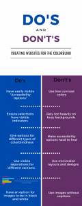
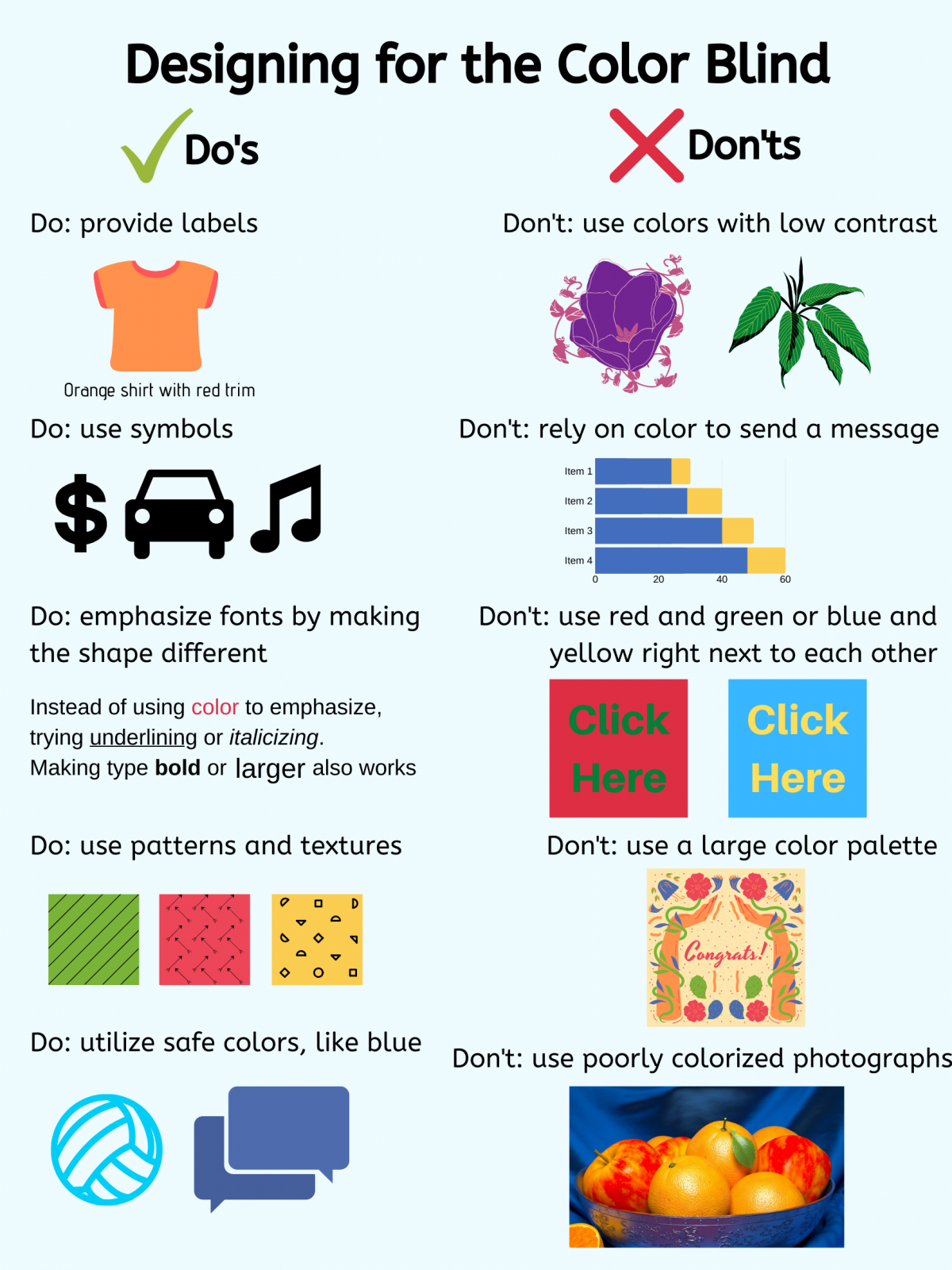
The audience I wanted to work for is the colorblind audiences. Since being colorblind is more common than people think, then websites can be made more accessible by taking some simple affordances into account while retaining stylistic independence. Video games often have colorblind options to make things easier for players, and they’re treated as standard features now. If websites adopted simple colorblind options as standard, then a commonly missed audience would be accounted for in web design, and present a more universally user-friendly experience.


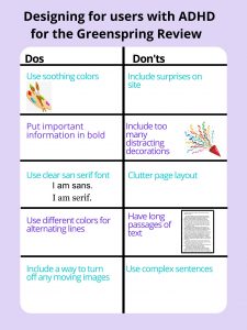
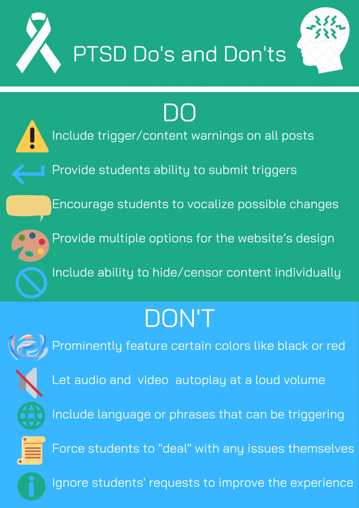
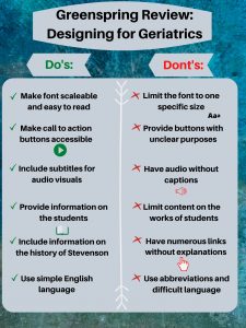
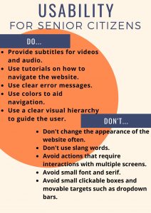
In “Disability, Mental Illness, and eLearning: Invisible Behind the Screen?” By Dr. Mike Kent, he says that “Online information can be made available in a variety of formats to best suit the person accessing it” (Kent). The do’s and don’ts on the list were crafted to reflect some basics of web design. The use of colors, when used, was chosen to highlight the contrast between different sections while having visible text on it, while the idea of Accessibility Options including colorblindness were taken directly from video games because they are simple features designed to make things accessible. Without color, busy backgrounds tend to be difficult to read, so eliminating them makes sense for accessibility options.


According to “The Aesthetic-Usability Effect” by Kate Moran, “a positive emotional response to your visual design, and that makes them more tolerant of minor usability issues…users are strongly influence by the aesthetics of any given interface, even when they try to evaluate the underlying functionality” (Moran). However, in this instance, the aesthetics are directly related to the usability. Every aesthetic choice is directly tied to accommodating the colorblind, and therefore is directly related to the user experience.


Kent, Dr. Mike. “Disability, Mental Illness, and eLearning: Invisible Behind the Screen?” The Journal of Interactive Technology & Pedagogy. 17 December 2015. Web. Accessed 13 March 2020.


Moran, Kate. “The Aesthetic-Usability Effect.” Nielsen Norman Group. 29 January 2017. Web. Accessed 13 March 2020.

Depression Poster- Dorothy Baker

The audience for the poster is people suffering from depression. The idea of the poster is to provide a pleasing, easy, readable site and set of guidelines for developers hoping to appeal to those suffering with depression. As someone who suffers daily with depression, I chose the suggestions both from research and from my own personal experience. When someone suffers from depression, they can experience symptoms such as “persistent sad, anxious, or empty mood; difficulty concentrating, remembering, or making decisions, and feeling restless or having trouble staying still” among many others. With these symptoms in mind the design had to include features that someone with depression could utilize and find that they made using the site easier when their condition was flaring up and not simply when they were feeling okay and happy.
My do’s and don’ts include making things on the poster and the site colorful. I chose this because the idea was to create a positive user experience (User Testing ) for those with depression and if the site were to feature colors that were associated with happiness and joy then this would be a great thing for someone with depression to interact with when feeling low. I also encourage choosing positive images for the site. This means that rather than choosing images that are dark and foreboding, a suggestion that made it on the don’ts side of the list, the designer should choose images with happy and encouraging connotations to them to dissuade negative thoughts or feelings of hopelessness. For if one has too much exposure to negative material when feeling low this may cause the feelings to stay longer or increase. If dark, negative, or sensitive items must be included on the site, which I strongly suggest avoiding, then a disclaimer should be provided so that if the depressed individual is viewing the site then they can prepare to view said images. This may include waiting and coming back to the images when they are in a better state of mind. I also encourage the designer to avoid displaying large chunks of information on the site. A person suffering from depression may experience an inability to focus (Lyness) and if this is the case then the large portions of information may be overwhelming to them and cause them to shy away from the site. If the site requires portions of information to come in large quantities then I suggest that the User Interface be such that the user can save their progress on the site and come back to it without difficulty (Zaraysky). I also chose to discourage from a tiny, dark, or disorganized them. If the depressed person is taking the time to visit the site when they are not feeling their best then the hope is that the information searched for will be clean, precise, and direct. Lastly, I suggest that the site be encouraging for the user. After all, out of millions of other websites that could have been visited to search the information the user chose this one. That is cause for praise but then to have a depressed individual visit, operate, and get something of the site when they are not feeling well is truly cause for kindness and graciousness.
For my poster I chose a salmon and pink background. These colors were chosen because I found that bright red can cause a person to feel alert and energized while colors such as salmon can cause a person to feel happy (Gremillion). I chose font colors of yellow and white because they were not the norm. Yellow was also found to be a happy color, and since black is seen as a depressing color, I went with white which is considered a calming color. These are all feelings that a depressed person lacks when they are in the middle of an episode/bout of feelings and so if they were to visit the website at that time the hope is that the color choice would soothe them. The decision to put the information in different blocks was to break up the information in hopes that it does not overwhelm the user. The emoji stickers were placed to create some joy, positivity and/or happiness for the user. Instead of using regular mundane bullet points to share my points the emojis do the job while including a design element. Examples were given on the poster when possible, however if I were to include examples of all bullet points it would go against my don’ts list which is something I wanted to avoid. Therefore, on an actual website the design would include these features and the other stylistic elements featured on the poster.

References
Gremillion, Allison. “Colors and emotions: how colors make you feel.” n.d. 99 Designs . Document . 9 March 2020.
Lyness, D’arcy. “Depression .” August 2016. Kids Health from Nemours . Document . 9 March 2020.
User Testing . “UI vs. UX: What’s the difference between user interface and user experience?” 15 October 2018. User Testing. Document. 9 March 2020.
Zaraysky, Sara. “The Obvious UI is Sometimes the Best UI.” 2 October 2019. Google Design . Document . 9 March 2020.

Poster

I chose to direct my poster towards people who experience anxiety and how the Green Spring Review can make their website in a way that prevents users from feeling anxious. Anxiety is something that can affect anyone and everyone who may be reading the Greenspring Review. This includes teachers, students, alumni, parents etc. As a designer of the website it is important to ask who the possible users are, and what a designer can do to make their website accessible (Kent 2015).  


There are many things that can trigger someone’s anxiety and it is important to know the things you can do to prevent it, and what not to do so you don’t provoke it. The website should have images and videos that are calming and underwhelming along with using colors with good depth and contrast. It is also important to be very descriptive about things such as events in order for the audience to be well prepared. This includes the date, time, location, etc. never leave room for surprises. Always make sure to use trigger warnings for sensitive content such as violence, stress, drugs, loss, etc. And lastly reduce the steps needed to get to another page of the website make navigating through very easy and fluent. A few key things the Green Spring Review should not include in their website are flashy gifs or buttons and do not use things like “Next video will play in 5 seconds” because these could make people feel anxious and antsy. Don’t be unpredictable and make sure the titles of the articles are not misleading or too shocking because this is an easy way to trigger anxiety. And lastly do not make the users feel powerless, or that they are not in control while navigating through the site. This means limiting the amount of popups and ads throughout the website. 


I wanted the aesthetic for my poster to be calm and neat so it would reflect something that would be good for someone with anxiety. Pun in 2016 suggests for posters to have good color contrasts, legible font sizes, and linear layouts. This is why I chose the bright colors and kept it as minimalistic as possible. I wanted to make sure it was easy to read so I used the same black font throughout the poster. The pictures I used served as good examples for each point and tied the poster in well together. My end goal was to create something simple that got the message across as easy as possible. 


Kent , Mike. “Disability, Mental Illness, and ELearning: Invisible Behind the Screen?” The Journal of Interactive Technology and Pedagogy, 17 Dec. 2015, jitp.commons.gc.cuny.edu/disability-mental-illness-and-elearning-invisible-behind-the-screen/.

Pun, Karwai. “Dos and Don’ts on Designing for Accessibility.” Accessibility in Government, 2 Sept. 2016, accessibility.blog.gov.uk/2016/09/02/dos-and-donts-on-designing-for-accessibility/.

Posting for Mental Illnesses

To create webpage content while being mindful for those who suffer mental illness or depression there are a number of things you should and should not do.

Since there are many factors of college life that contribute to the risk of getting depression, it is important for a school sponsored webpage to be mindful of the content they are posting. Suicide is the second leading cause of death to young adults aged 18-25 years old, so they should not post content that promotes suicide or other toxic behaviors. Toxic behaviors include isolation, negativity, or drug and alcohol abuse, posting content that includes or promotes toxic behaviors, could give readers the idea that these behaviors are ok.

According to Unity Rehab, “nearly one-third of people with depression also have a co-existing substance abuse disorder”


Since there are so many different types of depression it is also important to be mindful of the content that is frequently posted to the Greenspring Review. Many college students experience stress due to financial standing, academics, work, and relationships; posting about this could contribute to a common type of depression known as situational depression. There are also more common types of depression such as major depression, or Seasonal Affective Disorder (SAD) which is contributed to during the winter months due to the lack of sunlight.


In todays culture people tend to throw around words without realizing their true meaning. There are many mental illnesses that people claim to have, using phrases such as “I am so OCD” when they are just trying to over exaggerate their neatness. Making false claims like this can be upsetting to those who may truly be suffering from these issues.

Dos and Don’ts Poster

Creating a website for users with vision impairment


The audience for my poster is users with visual impairments. The goal of this poster was to demonstrate and highlight serval things that you should and shouldn’t do when building a website lie the Greenspring Review so that you can make it more accessible. I decided to choose users with visual impairments because it can span a large audience from young people with actual visual disabilities, too older people who simply just have a harder time seeing things.


In the poster, I list in two different columns things that you should do for a website as well as things you shouldn’t do for a website with users who are visually impaired. In the first column, it lists all the things you should do for your website. The first item I list under the “Do” category is to use contrast colors. Having a starkly different background color as the color of your text and material will help someone with visual impairments easily identify elements on the page. Next, it is important to use large font. This will enable the user to clearly discern what the word is instead of having to struggle with smaller fonts that may be hard to read. After this, having voiceover accessibility is important because it allows the reader to listen rather than struggle to see what is on the page. Fourth, Best that you are able to space out the material on your page. If it is all cluttered together then the user will have a hard time discern different elements. Lastly, using keyboard shortcuts for your websites ensures that the user is able to more efficiently navigate through the webpage rather than having to look for certain elements.


Equally as important as the list of things you should do with a website for visually impaired people, there is a list of things you should not do. Cluttering material together is a good way to confuse and complicate the understanding of your website from somebody who is visually impaired. Keeping good distance between elements will help them be able to read what is on the website. Second, do not use similar font colors as the background color. When you do this, it is hard to distinguish the difference between the background in the actual words that are on the page. Next, avoid using bubbly text fonts. When the font is more abstract, the visually impaired user will have a harder time distinguishing words as opposed to if the font was straightforward and clean. After this, avoid using small sized font. When the font is too small the impaired user is unable to read the elements on your website does reducing your websites impact. Lastly, avoid using very detailed pictures. When you do so, it makes it nearly impossible for someone with a visual impairment to understand the importance for detail of the photo.

Dos and Don’ts Poster

The audience for this poster would be students, faculty, and staff members at Stevenson with ADHD. The dos and don’ts are meant to be utilized by the Greenspring Review website in order to accommodate viewers with ADHD. I chose to address this audience because I believe that there is a vast amount of people who have ADHD within Stevenson, and I wanted to make it easier for them to view the literary magazine.

For my poster, I had included 5 dos and 5 don’ts. My first do addresses the need for soothing colors. Soothing colors helps create a calm environment for people with ADHD (Harris). My second do is to put important information in bold. For people with ADHD, this helps them distinguish that the information presented before them is actually important (Harris). My third do is putting the text in sans serif font. This makes it easier for people with ADHD to read the text, since it will be clearer for them (Harris). My fourth do is to use different colors for alternating lines, since it helps people with ADHD follow the text (Harris). My fifth do is to include a way to turn off any moving images on the website (“Diverse Abilities and Barriers”). This is important because people with ADHD have a  hard time  concentrating, and moving images may be a hindrance to their experience as a viewer of the website. My first don’t is to avoid surprises. People with ADHD have a harder time focusing on the content of the website, especially if the website displays a sudden surprise, which may be a displeasing experience for the viewer. My second don’t is to avoid too many distracting decorations, since this will make it difficult to view the literary magazine (Harris). This reason is also applicable to my third don’t, which refers to avoiding clutter on the page. My fourth don’t is to avoid having long passages and my fifth don’t is to avoid complex sentences. Reading the website should be enjoyable. My fourth and fifth don’ts are to ensure that people with ADHD have an easier time reading the text and taking the time to actually enjoy the reading instead of struggling with the text.

In his article, Nielson mentions that it is important to pay attention to what users do. I know that users focus on pictures and colors, but for my poster, I had made sure to accommodate users with ADHD. For my poster, I had used a light purple, since it is a soothing color. I only used a few pictures, since I didn’t want it to be distracting for someone with ADHD. I had also used different colors for alternating lines to make it easier for people with ADHD to follow the text. I tried to keep the text simplistic, so people with ADHD would have an easier time reading the content of the poster. According to one of the articles we read in class, it is important to take the time to learn about different disabilities and how we can address these disabilities (“Disability as Insight”). This is something I hoped to establish in my poster.


Works Cited

“Disability as Insight into Social Justice Pedagogy in Technical Communication.” The Journal of Interactive Technology and Pedagogy, jitp.commons.gc.cuny.edu/disability-as-insight-into-social-justice-pedagogy-in-technical-communication/.
Harris, Mike. “An Introduction to Inclusive Design.” Humanising Technology Blog, Nomensa, 11 Oct. 2018, www.nomensa.com/blog/2011/introduction-inclusive-design.
Nielson, Jakob. “First Rule of Usability? Don’t Listen to Users.” Nielsen Norman Group, 4 Aug. 2001, www.nngroup.com/articles/first-rule-of-usability-dont-listen-to-users/.
w3c_wai. “Diverse Abilities and Barriers.” Web Accessibility Initiative (WAI), 3 Mar. 2020, www.w3.org/WAI/people-use-web/abilities-barriers/#cognitive.

Do’s and Don’ts Poster: PTSD

For my poster, I decided to target students who are affected by PTSD or PTSD-like symptoms. These students may have had traumatic experiences in their past, and likely still have pain associated with those events. Students with triggers and sensitivities to certain stimuli will also benefit from this website design. In addition, regardless of mental health status, many people have fears and phobias that may cause a negative reaction upon experiencing.  According to Lisbeth Thorlacius’s article on web design, “there is always visual communication on a Web site, whether the use of visual effects is deliberate or not” (2007, p. 63). As such, this website design will give students a variety of options to make their experience as comfortable as possible.

For my do’s, I decided to focus on the ability to make the user’s experience customizable. I want the students to be able to encourage change, as well as provide multiple design options. The ability to hide content will also be very beneficial. Allowing students to submit triggers, that will then be featured as content warnings before posts, will prevent students from reliving any possible trauma. For my don’ts, I outline key mistakes that many website designers make. Certain colors, such as black or red, are common triggers for folks with PTSD. They should be avoided, as such videos that play at a loud volume. Certain language and phrases can be triggering, so posts should be reviewed before they are greenlit. The designers should not force students to accept the negative consequences of their posts, as that directly alienates this group of students. Ignoring these same students’ requests would also cause unnecessary tension. According to Karwai Pun’s post on gov.uk, “it’s always worth testing your designs with users to find the right balance, making compromises that best suit the users’ needs” (2016). While all students cannot have their needs met, our goal should be to reach the most students possible.

The visual design of my poster is quite simple, and this is purposeful. The top header is the color of the PTSD awareness ribbon, with a white ribbon to represent it. The symbol on the right is another PTSD awareness symbol. The line below it is meant to separate the header from the first title. Including “bullet” points could be triggering, so I decided to use symbols to represent each statement instead. The green and blue are meant to be calming colors. The colors of the information, enter, censor and world symbols were originally black, but I decided to switch the colors to fit the design motif (and prevent any possible triggers). The unique and simple design of the poster should not invoke any past trauma, but if it did such I would edit it accordingly.

Sources:

Pun, Karwai. “Dos and Don’ts on Designing for Accessibility.” Accessibility in Government, 2 Sept. 2016, accessibility.blog.gov.uk/2016/09/02/dos-and-donts-on-designing-for-accessibility/.
Thorlacius, Lisbeth. “The Role of Aesthetics in Web Design.” Nordicom Review, vol. 28, no. 1, Jan. 2007, pp. 63–76., doi:10.1515/nor-2017-0201.


Designing for the Color Blind

This poster contains the basic Do’s and Don’ts for designing with a color blind audience in mind. The most important Don’t is to never use colors to tell a message. Using other elements like symbols, patterns, or manipulating text are easy ways to emphasize and highlight specific areas. Choosing the correct images is also important. Do not choose an image with poor saturation or colorization, which could make it difficult to understand. Try to find graphics with simple color schemes without green and red or blue and yellow taking the majority of the picture. Providing labels and captions is also important, so the audience can tell what the graphic depicts. Utilizing safe colors is also a good idea. Blue often appears in color blind-friendly color palettes. The reason why Facebook is blue is because its founder, Mark Zuckerberg, is red-green color blind (Widrich, 2016).

I chose to spotlight colorblindness because it is often forgotten about when talking about disabilities. Color Blindness is a condition where a person’s eyes cannot read colors as they present. The types of color blindness include red-green, blue-yellow, and complete color blindness. Color blindness occurs when specific rods in a person’s eye are either absent or not working properly. The result is having trouble distinguishing red and green or blue and yellow. On rare occasions, most or all of the rods are absent or defected, and the person cannot differentiate red, green, yellow, and blue (Tubert, 2019).

I chose color blindness because it is often forgotten about. Color blindness has always intrigued me, and it makes me think about animals with multiple rods in their eyes who can see more colors than humans can. As somebody who isn’t color blind, I know that there are colors I cannot distinguish because humans only have 3 sets of rods in their retinas.


Turbert, David. What Is Color Blindness? American Academy of Ophthalmology, 6 Sept. 2019, www.aao.org/eye-health/diseases/what-is-color-blindness.
Widrich, Leo. “Why Facebook Is Blue: The Science of Colors in Marketing.” Resources, Buffer, 18 Sept. 2017, buffer.com/resources/the-science-of-colors-in-marketing-why-is-facebook-blue.


Do’s & Dont’s Poster

  • The audience I chose for my poster is the Geriatric population. Meaning viewers over the age of 60. This is an important audience to think about because if there aren’t certain features on the website, it can make the experience for them unbearable. By adding additional features to the website, it can make their user experience positive and actually enjoyable. I thought about my grandma looking at the Greenspring Review, and let that guide my thinking and my decisions.


  • My first do is one of the most important. It is crucial to make the font scalable for the Geriatric population to be able to read and review the website in the first place. That’s why my don’t is right next to it, to ensure that the font can be scalable and easily read. My second do is to ensure that the buttons are clear and easily accessible. One of the points on Accessabilityblog is to make the buttons “clear and clickable” when considering people with low vision. Referring to my second don’t, there is no need to incorporate buttons without a clear purpose or not to be easily seen. The third do on my list is vital for comprehension. It is absolutely essential to provide subtitles for audio visuals to make sure people understand the video. My third don’t goes along with it as well, where as providing a video without captions would hinder their experience with the website.  My fourth and fifth do relate to the content of the Greenspring Review. It is important to keep in mind what this population would be interested in reading about to keep their interest. Leading to my fifth don’t, having a bunch of links everywhere can be confusing for anyone. From Boomertechtalk.com, they state to “underline links and change color” when you click on it so they know they have already visited that part of the site. My last do is important as well so the Geriatric population can understand the content that is in front of them. My last don’t going along with it, makes sense because the older generation may not use the same lingo as we do and not understand exactly what we are trying to say exactly.


  • The majority of my decisions for this poster came from my general knowledge, and ‘The do’s and don’ts on designing for accessibility” article reviewed in class. I started off with a blue/green background because it is subtle and adds a calming mood to my poster. I put the grey over it so that way the text was easily readable. I made sure the font was an appropriate size, and picked black so it would stand out. I decided to label ‘Do’s” green and put green checks next to it because green represents good. And for the don’ts, I used red and kept it consistent throughout that side to symbolize what not to do. I put a white line down the middle to show that there is separation, and to make the reading easier.

Sherman, Linda, and Linda ShermanBoomer. “Website Design for Seniors Accessibility Guidelines.” Boomer Tech Talk, 19 Dec. 2018, boomertechtalk.com/website-design-for-seniors/.

“UI vs. UX: What’s the Difference between User Interface and User Experience?” UserTesting, www.usertesting.com/blog/ui-vs-ux.

Pun, Karwai. “Dos and Don’ts on Designing for Accessibility.” Accessibility in Government, 2 Sept. 2016, accessibility.blog.gov.uk/2016/09/02/dos-and-donts-on-designing-for-accessibility/.


Do’s and Don’ts Poster for Senior audience

Senior citizens use the internet almost as much as everyone else. In our case, we will find that past alumni, or relatives of current students who publish in our literary magazine may want to access and read the Greenspring review. With that in mind, it is important that these people find it easy to navigate the website and will not have difficulties reading the publications. Moreover, it is important every age group feel included in our community and not left out due to slang or other forms of communication that aren’t common across all age groups or audiences. For this poster, I focused specifically on the geriatric audience, or those over 65 years of age.

When considering a UX design for older people, it is important to maintain a streamlined, easy to read, easy to navigate environment. The main challenges this age group face in most websites are readability issues, and small targets such as clickable boxes or dropdown bars. (Kane) Fonts are usually too small, on a computer or mobile device, and often the color choice also impacts readability. Using jargon or wordplay can pose a challenge for this age group and “sabotage the experience [the website is] trying to generate.” (Adiseshiah) Senior may also face issues with sound. Those who are hard of hearing or suffer from any degree of blindness or eye impairment may find websites without subtitles or text-to-speech features too hard to enjoy and simply give up. Finally, it is important that websites don’t change their appearance too often because with age, “short-term, episodic memory tends to suffer” (Adiseshiah). Having to relearn how to navigate a website may prove to taxing for a senior citizen and they may just give up or not enjoy their experience as much.

Aesthetically, I chose a relatively  standard poster. Do’s on one side, Don’ts on the other. I used a pastel background and very little color. I used orange to give some color to the poster but tried to keep the poster neutral without bright colors to not impact readability or create eyestrain. For the body text, I used a large sanserif font. I also used bold for the body text so that users find it easier to read. I created a visual hierarchy and separated elements, the Do’s are not too close to the Don’ts and are not parallel so that the user intuitively knows they either reading the Do’s or the Don’ts reducing the chances of mixing them up. Overall, the aim of the poster was to be very simple and straightforward, without too many elements as too not create a confusing or difficult experience.


Kane, Lexis. “Usability for Seniors: Challenges and Changes.” Nielsen Norman Group, https://www.nngroup.com/articles/usability-for-senior-citizens/. Accessed 4 Mar. 2020.

Adiseshiah, Emily. “UX Design Thinking From A Senior Citizen’s Perspective.” UsabilityGeek, https://usabilitygeek.com/ux-design-thinking-senior-citizen-user/. Accessed 4 Mar. 2020.