HTML Reflection

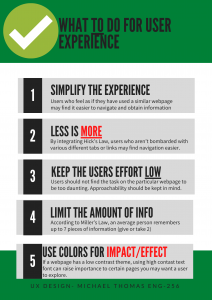
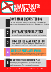
https://drive.google.com/file/d/1QxLp8Y4bDssRq7Bu4QgUy5x7VWbLq8RT/view?usp=sharing

The lessons in this website were at first confusing to me given that this is entirely a new area for me. Some students that I noticed said that they were familiar with the idea of coding through various cyber security courses or with specifically Python with some math courses. The experience was similar to that of learning a new language with understanding the grammar and formatting of the language, intertwined with some terms of which I am familiar with but not from an HTML perspective. That being said, at first, I did feel overwhelmed with the language and formatting of the coding. Once I began to actually read the lessons and practice through the examples, I was able to slowly catch on. In addition, I may have taken the harder route by typing my reflections up within the code. One of the pages on the site said that the “Notepad” application is a great way to write these codes in an editor and that I could test them via web browser to see the final product; and that is exactly what I did.Though this took more time in the process, this helped me significantly as any errors in the coding that I made reflected in the final outcome via web browser after I saved the note as an .htm file.

I believe this furthered my understanding of this as I was able to start from a blank canvas and type the codes in myself, taking note of obvious commands like <h1> for headers of the sections that I was working on and typing my reflections using the tag <p> with emphasis (<i>, <b>) on various aspects of the code. Though the final product ended up being a different font size toward the end, I took this opportunity to essentially treat notepad like a sketch book and record my observations and reflections within the code itself. One aspect that I made a point to learn myself was tackling the issue of inputting multiple source codes on a specific section of text (like to have a header be centered in blue font at a bigger font than other headers). This allowed me to observe the importance of the spacing within the codes as well as the importance of “;” and the quotes as well to encapsulate the specific area that I wanted to target.  Though I acheived my goal in doing this with one specific area, I noticed that when I began the CSS section, my colors and background color began to become a bit hidden, so I opted to leave the code out of the actual Google doc, however it is in my reflection.

I have learned a great deal of HTML from absolutely no prior knowledge, however, I humbly say that I am not ready to put HTML on my resume just yet. I feel having practice on this and getting certain tags memorized for efficiency purposes must be mastered first prior to me somewhat entering a mode of comfort with the practice of HTML rather than experience. 

Do’s and Don’ts Poster

The audience that I am gearing this poster toward is for the student, specifically a student in a STEM related field. Stevenson has driven its university focus toward one that is career-oriented, leaving me to have my suggestions pertaining to neatness and structural order of a particular work. The STEM field tends to lead away from abstract designs or ideas, thus, making the need for the Greenspring Review to be visually pleasing and organized. Many students attend Stevenson for this reason, leaving me to believe the audience to be more willing to adhere to logic and order rather than abstract and artistic. As reflected in my poster, there is a systemic theme occurring throughout, leaving an importance to theme and least effort usability principles all with the goal of catering toward Stevenson students.

For the poster itself, my focus was on alleviating the user experience as much as possible. Having a consistent layout allows the user to be able to use the website faster as it most likely relates to other websites that the user is already familiar with, reinforcing a well known Gesalt psychology found in Jakob’s Law. In terms of the colors and font use, I used red font on key words in the “Do” poster to draw more impact on the specific word. Cool colors are usually read as calming and are used to create less emphasis than warm colors (Ball). Presenting the information in a step-by-step infographic allows for the user to consume the information with more efficiency and less effort, reinforcing Hick’s Law where less is more. These are among many of the items that I feel should be necessary in catering the Greenspring Review to the audience of Stevenson students. (Livesession)

The choices aesthetically for this poster were used to provide information in a way that is appealing to students of this background. We as humans naturally view the colors green and red as stop and go (or good and bad), so by having posters with certain colors provide the reader with a better visual aid for understanding and making certain information “pop.” Having the information in a sequential order (1, 2, 3, 4, 5) provides a clear and concise way of providing ways to improve user experience and things to be cautious of. In the “Do” poster, I maintained a consistent format with a headline and a brief description using some color font to make key aspect hit home. In the “dont” poster however, I made the boxes slightly uneven and used random colors. What this does is create disorganization and if a website’s information is hard to read or doesn’t answer users’ key questions, then users will leave (Usability 101)

7 Psychological Principles for Better UX.” LiveSession, https://livesession.io/blog/7-psychological-principles-for-better-ux. Accessed 18 Feb. 2020.

Ball, Cheryl E., et al. Writer/Designer: A Guide to Making Multimodal Projects. “Chapter 1: What Are Multimodal Projects?” Second Edition. Bedford/St. Martin’s, 2018. Print.

World Leaders in Research-Based User Experience. “Usability 101: Introduction to Usability.” Nielsen Norman Group, www.nngroup.com/articles/usability-101-introduction-to-usability/.

UX Research Cheat Sheet Summary

Experience, World Leaders in Research-Based User. “UX Research Cheat Sheet.” Nielsen Norman Group, https://www.nngroup.com/articles/ux-research-cheat-sheet/. Accessed 28 Feb. 2020.

This article promotes the importance of research at any point of design process. This article breaks down the design process into four parts: Discover, Explore, Test, and Listen. At each of these parts, there are methods of research to better the user experience at each of these levels of design. During the discover stage, one is attempting to better understand what people need. Here, you could conduct interviews with stakeholders and find strengths and weaknesses of the product. Exploration methods include understanding the problem space and design scope and addressing user needs appropriately. With testing, methods are used for checking designs during development and beyond, to make sure systems work well for the people who use them. Lastly, by listening to our research and design,  we can better understand existing problems and to look for new issues. Each of these parts have a variety of activities to incorporate to better user experience. These methods and activities can improve the user experience of one’s design, ultimately improving the final product.

Disability, Mental Illness, and eLearning Summary

Kane, Laura. “Disability, Mental Illness, and ELearning: Invisible Behind
the Screen?” The Journal of Interactive Technology and Pedagogy, 17 Dec. 2015, https://jitp.commons.gc.cuny.edu/disability-mental-illness-and-elearning-invisible-behind-the-screen/.
The potential for eLearning can pose very interesting outcomes, of which can be positive and negative. This article talks about the support that students with disabilities receive with online classes at universities in Australia. Many students are hesitant to disclose their disabilities which often leads to issues later on in their education. The Open Universities Australia (OUA) conducted a study that had students select 1 of 8 categories that their disability fit in. The study found that students with a disability of mental illness, struggled more in the courses than other disability categories. The study found that online learning was easier for students with disabilities due to the fact that they can chose their learning environment. These disabilities must be taken into account when designing curriculum, especially for these institutions. In addition, the article recognizes that online courses can make it easier for students to finish the course of study. Despite this, however, there is still more things that can be done to improve students ability to finish courses.

7 Psychological Principles for Better UX Annotated Summary

“7 Psychological Principles for Better UX.” LiveSession, https://livesession.io/blog/7-psychological-principles-for-better-ux. Accessed 18 Feb. 2020.


Cognitive psychology takes other mental processes into account and researches attention, perception and problem solving. For example, Miller’s Law states that the average person is limited to about 7 pieces of information. This is one of the many important aspects of improving user experience. UX designers may keep that in mind with tab amounts, page links, etc. In addition, Gestalt states that the whole is more than the sum of the parts. This field of psychology explores how people perceive objects, as well as how they simplify complex images, such as the law of proximity. Almost all Gestalt laws can be applied to UX design. With Jakob’s Law, your users already know how to interact with other websites. Why would you ask them to change their habits? If your site works like other sites they know, they won’t need to learn how to use it – they’ll know right away. The principal of least interest is self-explanatory, but requires the users to work with the interfaces with as little effort as possible. Other factors such as the law of similarity, Hick’s Law (less is more) and serial position effect are key in creating an engaging webpage for users to explore. This is all applicable characteristics that I hope to incorporate in our process of redesigning the Greenspring Review.

Rhetorical Analysis- Guernica

https://drive.google.com/open?id=1bVLDF05DScwHxKipK-VRl5NKM4T63S7q

Guernica Rhetorical Analysis

            Guernica is an online literary magazine of ideas, art, poetry, and fiction with content published twice monthly. In addition, Guernica has a blog (Guernica Daily) that is updated every weekday. Specifically, the footnote provides information about the magazine itself that describes the website’s audience, staff, contact information and contributors, which can be seen here at the footer of the page(Guernica). Guernica is a literary magazine that pushes ones thinking with exciting and complex writings, photographs, and even videos catered to the interests of creative and educated people alike.

At first glance, there is an artistic, as well as literary element within the information throughout the site. The color scheme is dark throughout the website. Cooler colors are seen throughout the website with warm red accents complimenting the content. Cool colors are usually read as calming and are used to create less emphasis than warm colors. (Ball 2018, pg 46). The front-end has a headline story paired with an image that takes up a good portion of the page. This indicates importance of the story to the website, most likely incorporating the websites values and themes.

The navigation of the site is simple and easy to use due to its arrangement of pages and structure of the pages. The top navigation bar indicates clear categorical differences of which the user of the site could explore throughout various topics on the website. The “more” page indicates additional pages of which a user could explore more topics catered to specific categories, which I will be touching on a bit more coming up. The site contains both fictional and informational texts as well, of which could become cluttered and make the separation between fact and fiction a bit blurred, however, the organization creates an easy way of navigating through the topics on Guernica.

Looking at one of the many tabs in the navigation bar, you can find a number of different articles to choose from based on their category. For example, under the politics tab, you can find various types of writings such as the report called “The Boarder Merchant.” This is a report from Aliyeh Ataei in regard to the behind the scenes look at the boarders of Afghanistan and Iran. In this report,  a man named Mohammad Osman regularly sells people across the boarder to either access a better life or find transportation into turkey. From Turkey, people then find their way into Europe to escape the hardships in much of the Middle East.

Looking onward, creativity is expressed through the elegant linguistic forms of poetry. One poem called “The Empty City” seeks to push one’s thinking and express one’s creativity through making a metaphorical connection with an empty city to a lost heart..

For those who seek a different form of content, there is even a video option under here in “more” of which users can search for things such a this video where college students debate with inmates together on gun control.

Guernica is a well-themed literary magazine that pushes ones thinking with exciting and complex writings, poems, videos, and beyond. I think that the magazine is well organized and has topics that are quite interesting to get lost in; leaving something someone like me could relate to all while learning from the content.

Works Cited

Abdoh, Salar. “The Border Merchant.” Guernica, 6 Nov. 2019, https://www.guernicamag.com/the-border-merchant/.

“Advertise.” Guernica, https://www.guernicamag.com/about/advertise/. Accessed 10 Feb. 2020.

Ball, Cheryl E., et al. Writer/Designer: A Guide to Making Multimodal Projects. “Chapter 1: What Are Multimodal Projects?” Second Edition. Bedford/St. Martin’s, 2018. Print.


Bazzett, Michael. “The Empty City.” Guernica, 10 Jan. 2020, https://www.guernicamag.com/the-empty-city/.

“Guernica – A Magazine of Global Arts & Politics.” Guernica, https://www.guernicamag.com/. Accessed 10 Feb. 2020

“Video on Guernica.” Guernica, https://www.guernicamag.com/format/video/. Accessed 10 Feb. 2020.