In this part of the article, it focuses on the first rule of usability. It says that the first and most important is to not listen to the users. At first thought, it seems odd, people that create websites want to have it appealing to their users, therefore their input is important. However, instead of listening to what they say, and might do. Focus on what they actually do on the website when navigating, this would include the idea of business intelligence.
To go along with the idea of not listening to the users, there are three sub-points to it. The first one is watch what the people actually do. Second, do not believe what people SAY they do, and lastly do not believe what people predict they may do in the future. In conclusion this basically means, do not react to what the users says, react to what they actually do.
World Leaders in Research-Based User Experience. “First Rule of Usability? Don’t Listen to Users.” Nielsen Norman Group, www.nngroup.com/articles/first-rule-of-usability-dont-listen-to-users/.
After reading “Disability, Mental Illness, and eLearning: Invisible Behind the Screen?” by Mike Kent, discusses how many students that attend online Universities also have mental illnesses or disabilities. Since online courses have become so popular in recent years it is important to understand as to why students may choose online versus in person courses, so studying what type of disabilities or illnesses people have that prevent them from attending school can lead to possible accommodations to make it easier for those who do want to attend in person classes. Through this study it is said that studying online rather than in person helps overcome many issues and allows for students to complete their coursework, although some do come into contact with troublesome websites, they are overall able to complete their courses.
Kent, Mike. “Disability, Mental Illness, and ELearning: Invisible Behind the Screen?” The Journal of Interactive Technology and Pedagogy, 17 Dec. 2015, jitp.commons.gc.cuny.edu/disability-mental-illness-and-elearning-invisible-behind-the-screen/.
Boag, Paul. “Software as a Service (SaaS): How to Be Sure of Success.” Boagworld, Boagworld – User Experience Advice, 14 Jan. 2020, boagworld.com/digital-strategy/software-as-a-service/.
This article acts as a guide for those looking to develop a software as a service. The author of this article has experience in his failed attempt at creating such. The first tip he suggests is to test the market before becoming too invested in the software idea. This saves lots of time and money from being wasted on something that the public is not interested in and/or willing to pay for. The market can be tested by creating a “fake marketing campaign.” The first step in this campaign is the construction of a “landing page,” which should include things like pricing, videos, and what the author considers to be most important, a “call to action.” This is what will invite users to purchase the actual product. The next campaign step is to compile emails to the users who expressed interest in the software. The author explains a five day email list that should draw users into the product. The third step is to create a set of surveys to distribute to those who failed to engage with the call to action, those who signed up for the emailing list, and those who actually preordered the product. The last step is to “drive traffic to the landing page.” Once people reached the page, it is then most important to understand their interaction with it.
From this article, I learned the importance of advertisement prior to the actual release of a product or service. I obviously know that marketing is a key role in any product’s success, but I thought it was an interesting idea to make a “fake” campaign for it in order to really get a feel for what the products’ receptions would be like. I also have never come across surveys in this context. This could be because I don’t subscribe to many things (mainly due to a lack of money), but I cannot recall being asked to complete a survey for a product I have never used. I think this is a good idea in principle, but it heavily relies on customer response. The likelihood of hearing back from even half of the surveys sent out is low. Because there is a tendency to lack responses, the analysis of the product/service may not be entirely accurate.
The idea of sending out designs of The Greenspring Review to students and faculty is great because it will allow the creators and editors to hone in on what the public audiences find appealing in a literary magazine. I also think that getting students to engage with the magazine is important because most students don’t realize the extent of creativity in it or that it even exists. Once again, it is not likely that a large amount of responses will be received, but it can aid in the process of rebuilding, which is very important in success.
Rundle, Jon. “Designing Your Digital Product like a Concept Car.” Medium, 15 Jan. 2020. Retrieved from https://medium.com/snapdocs-design/designing-your-digital-product-like-a-concept-car-26e382eb56e.
This article talks about concept cars, and how car manufacturers spend millions of dollars, and thousands of hours on creating a concept car that will never actually roll off the production line. What does happen is that certain features in these concept cars do end up trickling down to current day cars. Like the 1938 concept car Buick Y-job with its electric windows and flush door handles which are now common in modern cars.
The article makes a connection between these concept cars and UI/UX design. Concept designs can have an influence on tomorrow’s car or website. By designing with the future in mind, instead of the typical normal restraints, a designer may be able to influence design and “help unlock ideas that … may have never realized or explore[d].” If used as a tool, this design mindset can help designers picture their future designs and set out goals or steps on how to achieve them.
At the author’s company, this mindset helped develop a future workplace platform, because with zero engineering the company managed to evaluate what would be great design ideas that could work with the rest of their products.
In summary, the author of the article explains that just like concept cars help push the automotive industry forward, concept UX designs, even if not implemented, serve as learning experiences for the designers and helps push their work forward.
This article can greatly help redesigning the Greenspring Review website. If we are to compete with other schools, we cannot have a redesign that is plain and standard. A design that pushes towards the future and is unique, would help the Greenspring Review standout when compared to other school literary magazines.
Braga, C. (2020, January 16). Rendering intentionality. Retrieved from https://uxdesign.cc/rendering-intentionality-1a57df40b585
The article begins with the process of how products begin. They start small and focused and are successful at what they do. As time goes on though, developers began to make the app more sophisticated by adding more features. This happens for a number of reasons, one of them being that users ask for updates and features and the developers and designers comply. However, a lot of times it is because businesses get ahold of the designers and they began to push for more features because they evaluate their performance based on the number of features and not their function or relevance. What businesses don’t realize is that with added features comes a decrease in the user’s experience on the app. Newer apps, like Tonic, have created a news app that does not even require a sign in, which makes it extremely…simple and user-friendly. Being intentional about ones’ design is knowing that the job is to solve the needs and wants of the user and not to keep the developers happy. This means that the designers need to care about the wants and needs of the user, therefore, caring about the impact of the work over the work itself.
This articles information was very informative and brier, which kept in line with the subject matter. Less is more, and for this article delivering the information was more important than trying to be fancy and use unnecessary wording.
The information in this article was very useful. Something that I learned from this article is that less is more. Adding features doesn’t make the website or app cooler or fancier, it actually makes it harder for the user to use. The simpler the application the better, as we do not want to decrease the user experience. I will apply this to the redesign of the Greenspring review by making sure that every application and feature is necessary. We do not want to turn users away because of the business of the website.
Guernica is a literary magazine where art and politics intersect. The site is comprised of poetry, essays, photographs, and podcasts to name a few, with each continent being well represented. This literary magazine attracts a wide range of individuals from young adults to middle-aged adults who all express interests in global and multi-cultural perspectives and stories. The site’s purpose is to teach, inform, and provide insight into what is going on in the world through the artistic and creative lens.Guernica is an unconventional literary magazine website because at first glance its layout and design are one that resembles a news website.Since it throws in art, news, politics, and entertainment it stands out compared to its other literary counterparts giving it an artistic reality feel like a genre. The site’s use of colors, shapes, and fonts creates more of that rough hard news aesthetic, whereas most literary magazines have more of a softer approach to their sites.
As you see when we get to the site’s Homepage and click around, you can jump around to the different themes of the site. Like we’ll see here “Politics” is a major theme or this site.The layout of these posts is that of a major news site, but if you actually look at the thumbnails you’ll see:poetry, commentary, fiction, essays, and interviews. They are all related to politics, but politics have shown through an artistic lens.
The next theme we’re going to explore is the “Lives” tab. Notice how the colors on this site are only black and white with a dash of red. The red is only used to highlight where you are on the site and also highlight certain tabs that the creators want you to focus on throughout your navigation. So, as you see I clicked the “Lives” tab and now it’s highlighted in red. Even looking at the font on this site, the font is plane professional and very easy to read. What makes using this type of font in a literary magazine different from most is that for this type of site, it works. They don’t need the soft pretty font, or big bold font to make it artistic, the art lies within the posts and the whole site’s aesthetic.
To my surprise, a popular and effective literary magazine does not have to be the “pretty in pink” with cursive writing splashed everywhere to be considered a literary magazine. They can be just as great without having to actually look like one. This is the case with Guernica. That is probably why it also attracts a wide range of people because they share that same common ground of world news but make it artistic.
Introduction: The Paris Review is a literary magazine that was created in 1953, with the express purpose of emphasizing creative works without the main point being to criticize it. The content that the Paris Review publishes is very intellectual in nature and minimalistic in design. This leads me to believe that the primary audience is upper-middle to upper class highly educated white women between the ages of 30-60.
First, the use of the color pink as being the only defining color gives the website a very feminine vibe.
The slightly cursive font of the “the” in The Paris Review, followed by a serif font type also further reinforces the dainty and minimalistic feel of the website.
The lack of color and the use of minimalism shows that the website is mainly interested in attracting older viewers as younger generations would more than likely find this website boring.
The ease of the site’s user experience also points to an older audience. With the majority of websites tending to move away from drop-down menus, the Paris Reviews entire site is navigated using dropdown menus, and scrolling.
TO NEXT PAGE
The context the Paris Review comes in, which is not only an online subscription but a physical magazine also points to older audiences.
Members of younger generations tend to move away from paper materials in favor of digital copies.
The reasoning behind the audiences being upper-middle to the middle class are because of the subscription process and price.
In order to fully view the majority of their creative content, you have to subscribe to the Paris Review. However, one subscription cost $49 a year and your average middle-class family will not be paying close to $50 for a literary magazine when there are numerous free literary websites available.
TO NEXT PAGE
The Paris Review’s primary audience is assumed to be white also because there is not a large emphasis on writers of color.
Even during Black history month, there is no article or mention of celebrating Black writers. Also, among their featured writers, almost all of them are white.
TO NEXT PAGE
Building on that, the type of content published in the Paris Review is not for the everyday person who is looking for entertainment.
TO NEXT PAGE
There are numerous academic interviews, such as the interview with Helen Vendler. In fact, the first article that you see is a work by Chantel Tattoli which is essentially about antique postcards.
Conclusion: The Paris reviews content is definitely aimed at older affluent white women primarily as the use of color creates a feminine feeling, navigation is easy, the website still offers physical subscriptions that cost at a minimum $49, there are no featured authors of color even during Black history month and the subject matter is often very dull.
Works Cited
About. (n.d.). Retrieved from https://www.theparisreview.org/about/
Cole, H. (2017, June 12). Helen Vendler, The Art of Criticism No. 3. Retrieved from https://theparisreview.org/interviews/1324/helen-vendler-the-art-of-criticism-no-3-helen-vendler
Homepage. (n.d.). Retrieved from https://www.theparisreview.org/
Subscriptions. (n.d.). Retrieved from https://ssl.drgnetwork.com/ecom/TPR/app/live/subscriptions?org=TPR&publ=PR&key_code=ENAPRFX&type=S&gift_key=TESTFXG
Tattoli, C. (2020, February 13). How to Leave Your Lover with Lemons. Retrieved from https://www.theparisreview.org/blog/2020/02/13/how-to-leave-your-lover-with-lemons/
The Paris review publishes fiction, poetry, photography and other art mediums with the purpose of emphasizing “creative work as long as its good”. It also publishes podcasts and video interviews. It is geared towards literary enthusiasts and aspiring writers who can submit their work to the magazine. Although rich in content, it provides a mediocre user experience.
The website uses a white background with dark grey font for titles and light gray for author names and the body text. The title pops out due to its large font size. The font chosen by the Paris review is professional and adequate to the content of the magazine. Notice how the only color that pops out at the reader is pink. This is effective in drawing the user’s attention to certain elements of the website such as the subscribe button, the current issue, and the title of the featured articles.
The front-page layout is easy and intuitive with one big area for featured articles followed by three columns with other articles to choose from.
Other tabs such as the daily, follow a similar pattern, with one single literary work taking most of the screen with its image and some of the body text. To see more articles simply scroll down.
All tabs make great use of the spatial mode. The stick header at the top follows the user, eliminating the need of scrolling back to the top to change tabs, and also by spacing out articles or pictures into columns, such as in the podcast or video tabs it reduces the clutter on the screen, making it for a clean and simple to navigate UI for the most part.
Once a article has been selected, the text and images will take up the left and central area of the screen while the right side is left for showcasing other articles.
The layout changes drastically in the about page, with a grey background and pictures being side by side with no space between them. This about page is unique in the sense that it tells the story of the magazine with emphasis in pictures rather than words. This makes it hard for the user to find pertinent information fast.
The aural mode is standard for any website, sound only plays when the user wants it to play, however exiting a video without clicking the x bottom on the top left corner will close the video but audio will keep playing. Certainly, making it for a rather mediocre experience in that regard.
The gestural mode of the website is also lacking with the same gesture having different functions in different tabs. In the video tab, clicking on the side of the video will close it, but clicking on the side of a picture in the about page wont. Clicking away from the search bar at the top will prevent you from writing but the search bar won’t disappear.
Navigation isn’t the easiest in this website, there are more categories besides the ones at the header however, because the Paris review does not make use of the tags features even though it is available, it makes it hard to search for a particular topic the only way to do so is to click here.
Overall, the website satisfies its purpose of providing the user with literary content, but it is not easiest website to look through, with some aspects of the website being empty such as tags or videos playing even though you’re no longer watching them. Along with some categories being hard to find it makes for a frustrating user experience.
The Paris Review. https://www.theparisreview.org/. Accessed 13 Feb. 2020.
“Paris Review – Writers, Quotes, Biography, Interviews, Artists.” The Paris Review, https://www.theparisreview.org/about/. Accessed 13 Feb. 2020.
“Paris Review – Writers, Quotes, Biography, Interviews, Artists.” The Paris Review, https://www.theparisreview.org/about/submissions. Accessed 13 Feb. 2020.
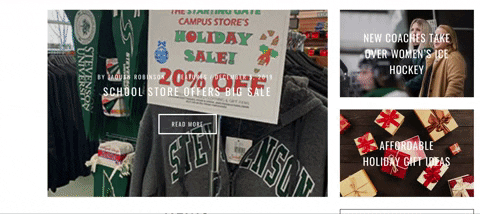
The Villager is a user-friendly newspaper that caters mostly to students who want to quickly access concise and brief information while staying up to date with Stevenson related news. The Villager accomplishes this by creating a fast and easy to use layout and publishing relatively short length articles.
The Villager’s front page is heavily populated with images. Clicking on any of these images will then take you to the article. Although the reader can sort their news by category, the user can also easily access the featured articles since these occupy the largest area of the front page and rotate every few seconds.
The colors and font choices are standard for any newspaper apart from the header. The title heading indicates that the newspaper reports on Stevenson related news by using the University’s colors and a large, bold font. The body text is in black in an easy to read font against a white background.
The article thumbnails are well-spaced out and do not feel cluttered. All articles appear to be accompanied by an image and occasionally a video. Although The Villager occasionally uses videos to complement the articles, these do not automatically play. As such, The Villager makes very little use of sound.
The university newspaper has a very minimalistic feel to it. Articles are organized into a grid-like front page making it easy for anyone to find their way in the website. The left and right side of the page are usually left blank, which helps frame the articles into a position where the user typically expects them to be. Another great use of space is the simple pop-up that appears at the bottom right of the page when the user is about done with an article. The pop-up is not invasive, it does not occupy a large section of the screen and does a great job of guiding the user to the next article prolonging the time the reader spends on the website.
The desktop website offers very little gestural interaction. The most a user will do on this website will be point, click, and scroll. However, The Villager does offer a mobile version of the newspaper in which the gestural interactions will resemble the typically interactions with mobile apps such as Instagram and reddit. The user simply swipes down to scroll through the various articles and then taps on the article they which to read. This facilitates navigating the newspaper by offering a familiar layout to the reader.
This online newspaper makes use of various modes to deliver an effective but simple experience. The major benefit of The Villager is that it is fully online. This affords the user the opportunity of accessing previous issues of the newspaper through the archive tab, searching for a particular topic by using the search bar or the tag feature and watching videos related to Stevenson. It also offers a subscription feature which lets the reader receive the newspaper in their email inbox. The downside of The Villager is the lack of sound, and the lack of interaction that it provides for the user.
In conclusion, The Villager does a great job of captivating its primary audience through an effective use of the spatial and visual modes which provide a simplified but effective experience for the user.
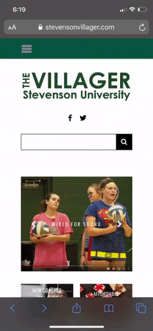
The Stevenson Villager is a student and professor run publication that reports on things happening on and around campus. Most of the articles on the site are composed and edited by students giving them a professional experience and the opportunity to write articles for a publication. Thus giving them the tools to succeed if they choose to follow a journalistic career path. However, this being a publication with primarily student writers, there are mistakes and instances where The Villager lacks as an overall publication.
Modes and Affordances
Linguistic… The use of language on the Stevenson Villager is simple to understand and read. The word choice for titles is often simple however the font choice does not always work since the publication has a white interface. There are also some grammatical errors within some of the articles on the site, these errors aren’t all that bad but for being a professional esque publication it’s important for The Villager to attend to these.
Visual… The layout of the site is simple and straightforward, there aren’t many crazy or unique visuals; just the logo and articles. With this lack of visuals there is also a lack of general color on the site. The logo is green and each article has a color photo and that’s it. If the site utilized more appealing colors and visuals it would be much more popular and attractive, especially for younger audiences. However, the use of the photos within articles is simple and doesn’t interfere with the reading, painting a useful image in your head.
Aural… There is a lack of any type of music or sound on the website. However, there’s some videos and interviews on the site. But being an online student publication it isn’t entirely necessary to include videos as the site focuses primarily on the writing aspect of journalism.
Spatial… The front page of the publication is simple and provides access to all parts of the site at the top. This allows you to navigate with ease along with a search bar you can easily type a name or keyword to find a specific article. However, many of the stories are presented in a weird manner that makes the site hard to use and hard to follow and keep yourself up to date.
Gestural… The Villager lack’s gestures on their site. The only gestures on the site is the interactive slide on the menu where users can choose and slide between different articles.
Conclusion… Overall, for a student run publication Stevenson’s Villager is a site that provides students, staff, and prospective students the opportunity to read about events and articles pertaining to the University. However, being a non professional publication the site is lacking in many areas and has room to improve interactivity and its overall appearance. If Stevenson were to improve The Villagers weaknesses the site and publication would be much better and have more readers.