GSR Submission

Covid-19: A personal Timeline

January 11th, 2020,

I have seen on the news something about a virus in China. I don’t care. It’s probably sensational journalism to get more “clicks.” One or two people have died but these people had underlying health issues I am sure. In a few days, it will all be forgotten.


January 30th, 2020,

I read today on Reddit that the WHO declared the virus a global health emergency. An exaggeration. They’re just trying to be safe. Some are saying this is going to be really bad, but I don’t believe it. They just want to be fearmongers. Bad things only happen to other people, not me.


February 26th, 2020,

They quarantined a ship in Japan. Again, my naïve mind believes this is just another fad. Little did I know more than 700 people on that ship would test positive for the virus.

My school sent me an email about the virus, and that they’re following the situation closely. Is it really that bad? I’m just keeping calm and carrying on with my routine. People are just scared. Wash your hands, don’t cough into your hand and don’t touch other people and you will be fine.

February 29th, 2020,

It is Saturday and I have to go to work.  Working at a busy restaurant is very nice on Saturdays because I’ll leave with a lot of cash in my pocket.

It is 6:30pm and I eagerly await my first table. It has been two hours. Where is everyone? I leave my job at 7:00pm with $30 in my pockets. All in a day’s worth.

I open my car door, I sit down, close it and take a deep breath. For the first time it hit me, this is not fine. I shrug it off again because I’m young and bad things only happen to other people.


March 1st, 2020,

My trip to California has officially been cancelled. I am still optimistic that everything will go back to normal soon. We know it won’t last. People are nervous but it will all go away like everything else.

Death tolls in China are going through the roof. Health care in china isn’t the best from what I’ve read so I believe all this death is due to negligence rather than a deadly virus.


March 5th, 2020,

I have been laid-off from my job. I have worked since I was 18 and never have I ever been laid-off. I have enough money for one last tuition payment, but I won’t be able to pay my car or insurance. I’ll go back to work in a few days, and I’ll pay it all off.


March 8th, 2020,


My state is in lockdown. I can no longer leave my house unless I’m doing something essential like grocery shopping or going for a run. This is historical, I think to myself.


Today I went grocery shopping and I was afraid. Afraid of touching the cart, afraid of touching doorknobs, I’m afraid of everything because we have lost control. Everyone has face coverings and I feel like I’m in the middle of a “biological fallout.” I keep scolding my dad because he touches everything he sees. “-Stop doing it. We don’t know if we are asymptomatic” I don’t want to be responsible for someone’s death.


March 9th, 2020,

I called my Mom today. She offered to buy me a plane ticket so I can go back home and “wait it out.” “-Mom, I can’t travel right now” “-Yes, mom I’m good on money, don’t worry.” I can’t possibly make my mom give me any money after everything they spent on those leukemia treatments. Everyone is struggling. I have been washing windows and managed to make a couple hundred bucks. Should be good for another couple of weeks.

March 10th, 2020,

My stepmom and dad’s boss has requested that our family move into her house to minimize risk of infection. Selfish. We have no choice. We either do it or risk losing our only two sources of income. I pack very little clothes, and my laptop. We won’t be there for long.

This virus is slowly taking away all good things from my life. I am away from my girlfriend, my bed, my home.

Most of the time, I don’t know what day it is. Feeling like Kurt Ville;

“But it was a Monday, no, a Tuesday
No, a Wednesday, Thursday, Friday
Then Saturday came around, and I said
“Who’s this stupid clown blocking the bathroom sink?”

https://www.youtube.com/watch?v=659pppwniXA

March 11th, 2020,

I wake up and chuckle. I find it amusing that I am now in lockdown in a multimillion-dollar mansion, but I only have about 53 cents in my bank account. At least I can cry about in the sauna. These hard times are marked by irony. I am a prisoner of the virus I once called dramatic.

March 25th, 2020,

The first dreaded email comes in,

“Dear Renato,

            I have not received your assignment. Hope you are doing well. Please submit soon.”

I don’t know what’s going on with me. I am having trouble developing a routine in this house. I’m working weird hours. I am afraid of opening blackboard because I know how much I have neglected my student life.  I just can’t do it.

March 28th,2020,

My mom calls me. She always waits for me to call her. Something is wrong.


I cannot believe this is happening. Bad things do happen to me. He died from the virus. I wasn’t even close to him so am I so hysterical? I cannot even fly home to the funeral. Is there even a funeral?


I could feel the optimism I have so proudly carried with me throughout the years seep away.

April 10th, 2020,

I have moved again, and I am back home. I couldn’t handle it over there anymore. I am isolated but I am okay.


I just want good things to happen to me again. 


https://www.youtube.com/watch?v=659pppwniXA – Ville, Kurt. “Pretty Pimpin” “b’lieve i’m goin down..”
 

Style Sheet Assignment

https://docs.google.com/document/d/1hofRQJWJwY4O3o982SoAGsNIxCTMsJQC0IYYt8OXh4E/edit?usp=sharing

This style sheet editing was a lot more difficult to understand and comprehend because there were so many different rules that had to be followed. Having to read and reread over and over was a lot to handle at some points and sometimes I felt like I wasn’t finding anything. I think the practice definitely helped me better understand Chicago-Style. But overall it was very difficult and I still don’t think I fully understand what I did, to be honest. But the experience was good practice and I think with more practice, maybe I would become more fluent with known the mistakes to edit right away. The footnote citations were a bit hard and made it a struggle to flow through the editing process. Overall, unfortunately, I don’t think this is an editing style I will try to keep using in my career unless I have to and if I do have to, I am glad I had a little practice.

Style Sheet Exercise

https://docs.google.com/document/d/1paBdFMSFjJW6eL4IWOrRj9AQH1g41xy73Fq66meIooY/edit?usp=sharing

This exercise was somewhat challenging and at first slightly overwhelming. I began by reading the article once without making any changes. Then I started by going over punctuation and grammar. There were a few sentences that were confusing and I was unsure whether i should change them or whether i didn’t understand the sentence simply because i wasn’t too familiar with the subject. After punctuation I tested every link and  made sure every citation was correct.

Overall, the style sheet can be a very useful tool once one becomes familiar with them  and I’m sure having access to  one when editing an article makes the process a lot easier and straightforward.


Coding Reflection

https://docs.google.com/document/d/1xiWVgKw69eiES43KDsnAzAwbXrRme0a4fIz5dJA7bL0/edit?usp=sharing

I completed the work kinda all out of order. I first went through and did the try it now sections after reading each one, and then posted them all in the google doc. After that, I went back and summarized each section in my document. I did the exercises last because they took some time for me, and I wanted to just simply go ahead and complete the try it now sections. One fo the main obstacles I overcame (sort of) was frustration and confusion. I was confused first of all because this was basically a different language for me, so it took some time to understand it. I was frustrated for part of it because some of them were short, and some required lots of steps and if you messed up a little step or forgot a letter, the whole code would be messed up and I couldn’t find exactly where I would mess up and would have to start over. One of the problems I also overcame was time management.. I didn’t realize the coding was supposed to be done over break so it was hard jamming it all out in a session to try to get it done on time, especially when I have never done anything like this before.

Like I said before, this coding work was completely new for me. It was stressful, overwhelming, and I did not really enjoy it overall. Although, I did enjoy seeing the end result when it actually worked. I definitely do not feel confident applying these skills to a website in the future and hopefully won’t need to since I am a psychology major who wants to have a private practice and teach to kids. I definitely couldn’t put this on my resume because if you asked me to do the same thing a week later but without giving any instruction, I definitely would not have been able to do it. It was so out of my element and honestly I was really surprised we had an assignment like this at first. But when I thought about it, I understand how it is necessary. I understand we really had no control with this, but I think it would have been a lot easier and a lot more manageable if we were able to maybe do it in class so we could walk through it together and break it down to be more manageable and be there to support each other.

HTML Reflection

https://docs.google.com/document/d/1UqN9yjsBiaIRnpDYTBmFTLSiknkwEdiLbPpnSGmc2sk/edit

I was a little apprehensive at first because i had never coded before but knew just how difficult it is. I had seen the “99 little bugs in the code, 99 little bugs,  Take one down, patch it around. 127 little bugs in the code!” meme float around Reddit a lot and knew how complex it can be. I took my time with each lesson but the learning process is slow and  there is, in my opinion, a huge learning curve when it comes to learning how to code.

Like others have said before, learning how to code is very similar to learning a new language. The first lesson was relatively easy but it I did have to refer back to the tutorial a few times because simply forgetting one sign is enough for the whole code to break.  After the first couple of lessons I felt a little more comfortable and felt like was finally understanding how HTML works. I became a little faster at understanding new concepts and putting them in practice.

It felt extremely rewarding when i did the “try it yourself” sections and my code actually worked. Every once in a while I’d click “Run it” and it would be a complete mess and I occasionally had a hard time understanding what was wrong and how to fix it. This is when i understood the importance of comments when it comes to coding. Write code slowly and document everything so that it is easy to come back to a certain part of the code and fix whatever is wrong.

One thing that I enjoyed about coding is that if felt a lot like writing legal citations. When citing a court case for example, there are rules such as whether the volume comes first, or the court’s name or even the year of the case. Everything is well-structured. Once you know how to cite a court case, you stop seeing random letters and numbers and instead immediately know where and when it happened and where to find the case. Coding was a lot like that. Once you master the rules of coding, things become a lot easier because you just follow the structure of the code using specific rules.

I would not  feel confident putting HTML in my resume because I’m very much a novice and still cant really grasp how in-depth coding is.  Overall this was a very interesting experience and was not surprised with the difficulties i encountered throughout the assignment.

Do’s & Dont’s Poster

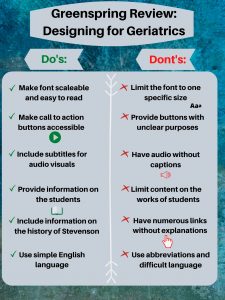
  • The audience I chose for my poster is the Geriatric population. Meaning viewers over the age of 60. This is an important audience to think about because if there aren’t certain features on the website, it can make the experience for them unbearable. By adding additional features to the website, it can make their user experience positive and actually enjoyable. I thought about my grandma looking at the Greenspring Review, and let that guide my thinking and my decisions.


  • My first do is one of the most important. It is crucial to make the font scalable for the Geriatric population to be able to read and review the website in the first place. That’s why my don’t is right next to it, to ensure that the font can be scalable and easily read. My second do is to ensure that the buttons are clear and easily accessible. One of the points on Accessabilityblog is to make the buttons “clear and clickable” when considering people with low vision. Referring to my second don’t, there is no need to incorporate buttons without a clear purpose or not to be easily seen. The third do on my list is vital for comprehension. It is absolutely essential to provide subtitles for audio visuals to make sure people understand the video. My third don’t goes along with it as well, where as providing a video without captions would hinder their experience with the website.  My fourth and fifth do relate to the content of the Greenspring Review. It is important to keep in mind what this population would be interested in reading about to keep their interest. Leading to my fifth don’t, having a bunch of links everywhere can be confusing for anyone. From Boomertechtalk.com, they state to “underline links and change color” when you click on it so they know they have already visited that part of the site. My last do is important as well so the Geriatric population can understand the content that is in front of them. My last don’t going along with it, makes sense because the older generation may not use the same lingo as we do and not understand exactly what we are trying to say exactly.


  • The majority of my decisions for this poster came from my general knowledge, and ‘The do’s and don’ts on designing for accessibility” article reviewed in class. I started off with a blue/green background because it is subtle and adds a calming mood to my poster. I put the grey over it so that way the text was easily readable. I made sure the font was an appropriate size, and picked black so it would stand out. I decided to label ‘Do’s” green and put green checks next to it because green represents good. And for the don’ts, I used red and kept it consistent throughout that side to symbolize what not to do. I put a white line down the middle to show that there is separation, and to make the reading easier.

Sherman, Linda, and Linda ShermanBoomer. “Website Design for Seniors Accessibility Guidelines.” Boomer Tech Talk, 19 Dec. 2018, boomertechtalk.com/website-design-for-seniors/.

“UI vs. UX: What’s the Difference between User Interface and User Experience?” UserTesting, www.usertesting.com/blog/ui-vs-ux.

Pun, Karwai. “Dos and Don’ts on Designing for Accessibility.” Accessibility in Government, 2 Sept. 2016, accessibility.blog.gov.uk/2016/09/02/dos-and-donts-on-designing-for-accessibility/.


Do’s and Don’ts Poster for Senior audience

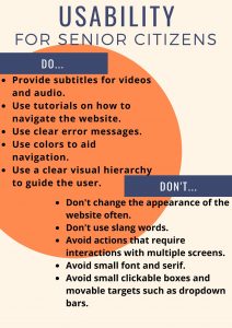
Senior citizens use the internet almost as much as everyone else. In our case, we will find that past alumni, or relatives of current students who publish in our literary magazine may want to access and read the Greenspring review. With that in mind, it is important that these people find it easy to navigate the website and will not have difficulties reading the publications. Moreover, it is important every age group feel included in our community and not left out due to slang or other forms of communication that aren’t common across all age groups or audiences. For this poster, I focused specifically on the geriatric audience, or those over 65 years of age.

When considering a UX design for older people, it is important to maintain a streamlined, easy to read, easy to navigate environment. The main challenges this age group face in most websites are readability issues, and small targets such as clickable boxes or dropdown bars. (Kane) Fonts are usually too small, on a computer or mobile device, and often the color choice also impacts readability. Using jargon or wordplay can pose a challenge for this age group and “sabotage the experience [the website is] trying to generate.” (Adiseshiah) Senior may also face issues with sound. Those who are hard of hearing or suffer from any degree of blindness or eye impairment may find websites without subtitles or text-to-speech features too hard to enjoy and simply give up. Finally, it is important that websites don’t change their appearance too often because with age, “short-term, episodic memory tends to suffer” (Adiseshiah). Having to relearn how to navigate a website may prove to taxing for a senior citizen and they may just give up or not enjoy their experience as much.

Aesthetically, I chose a relatively  standard poster. Do’s on one side, Don’ts on the other. I used a pastel background and very little color. I used orange to give some color to the poster but tried to keep the poster neutral without bright colors to not impact readability or create eyestrain. For the body text, I used a large sanserif font. I also used bold for the body text so that users find it easier to read. I created a visual hierarchy and separated elements, the Do’s are not too close to the Don’ts and are not parallel so that the user intuitively knows they either reading the Do’s or the Don’ts reducing the chances of mixing them up. Overall, the aim of the poster was to be very simple and straightforward, without too many elements as too not create a confusing or difficult experience.


Kane, Lexis. “Usability for Seniors: Challenges and Changes.” Nielsen Norman Group, https://www.nngroup.com/articles/usability-for-senior-citizens/. Accessed 4 Mar. 2020.

Adiseshiah, Emily. “UX Design Thinking From A Senior Citizen’s Perspective.” UsabilityGeek, https://usabilitygeek.com/ux-design-thinking-senior-citizen-user/. Accessed 4 Mar. 2020.

Accessibility Summary

Dr. Mike Kent from Curtin University wrote the article, “Disability, Mental Illness, and eLearning: Invisible Behind the Screen?” In which he discusses the study about online students who registered for disability support for higher education and how they were surveyed and interviewed about their mental disabilities. The survey explored how accessible different online platforms for learning were and the reason for what motivated students to disclose their disability or not. Some students felt that they didn’t want to share that they had a disability due to feeling ashamed, having a hard time admitting it to others, and having to accept their limitations. The article then moves into talking about disability and eLearning and how online classes can work as an advantage for people with disabilities by creating a way of learning that improves accessibility, flexibility, and disclosure. Students say they like being able to complete their assignment at their own pace and to have the freedom to work ahead if they wanted to. Although online learning has its negatives such as not being designed to reach its maximum affordances, the study showed that online higher education provides more flexible options for students with disabilities. Finally the article touches base on how eLEarning is beneficial to not only people with disabilities, but also mental illnesses. All together, the article discusses how online learning for higher education is beneficial and has many affordances that help people with disabilities and mental illnesses recieve an education that works best for them.

Kent , Mike. “Disability, Mental Illness, and ELearning: Invisible Behind the Screen?” The Journal of Interactive Technology and Pedagogy, 17 Dec. 2015, jitp.commons.gc.cuny.edu/disability-mental-illness-and-elearning-invisible-behind-the-screen/.

Usability Summary

This article focuses on the five principles of visual design in UX. Principles of visual design refer to how “design elements go together to create well-rounded and thoughtful visuals.” It starts by stating that for the most part, at a glance, a user can immediately tell whether a visual is appealing or not. Kelly Gordon then states and defines those five principles.

  • Scale – This principle uses size to draw attention to certain visual elements. Something that is bigger is more likely to be noticed. A visual appealing design should not use more than three different sizes. The biggest size should emphasize the most important part of the website. Using different sized visuals also establishes a visual hierarchy.
  • Visual Hierarchy – The second principle in the article refers to how our eyes are guided in a website. Usually, the user knows where to look in a website when a visual hierarchy is well-established. “Scale, value, color, spacing, placement” can all be used to establish a hierarchy. Using a bright color to signal something more important and a muted color for something less important is an example of a visual hierarchy
  • Balance- Balance occurs when there is an even and satisfying arrangement or proportion of design elements in a website. Visual signals must equally distribute between both sides of an imaginary axis that either runs vertically or horizontally. The balance may be symmetrical, asymmetrical or radial, but balance must be achieved so that no one area draws “your eyes so much that you can’t see the other areas.”
  • Contrast – This principle refers to “the juxtaposition of visually dissimilar elements in order to convey the fact that these elements are different”. Contrast also helps empathize differences between two objects in order to highlight that they are distinct.
  • Gestalt Principles – Gestalt principles explain how humans tend to analyze images as a whole rather than as individual elements. Proximity, one of the principles of Gestalt is particularly important to UX design because humans tend to perceive images that are close together as part of the same group.

The author finishes  the article by stating that these principles help increase usability, provoke emotion and delight, and strengthen brand perception.


Experience, World Leaders in Research-Based User. “5 Principles of Visual-Design in UX.” Nielsen Norman Group, https://www.nngroup.com/articles/principles-visual-design/. Accessed 2 Mar. 2020.

Usability Summary

In the article, “First Rule of Usability? Don’t Listen to Users” by Jakob Nielson it overall states that web designers should not listen to what users say that they want, but listen to the actions they do. Previously websites used to focus on how flashy they looked, now they focus on the simplicity. Typically when customers think they will like an idea, is it not actually functional or something that is easy to use. The article mentions that even when users have taken surveys about what they want to see on a website, they will choose things because it ‘sounds cool’ not because they actually want it.

The proper way to collect data from users is by seeing their actions on a webpage. It is also not recommended for designers to try and predict what is the next move that users will make, it is best to just focus on their current needs.

Nielson, Jakob. “First Rule of Usability? Don’t Listen to Users.” Nielsen Norman Group, 4 Aug. 2001, www.nngroup.com/articles/first-rule-of-usability-dont-listen-to-users/