The Paris Review rhetorical analysis


Script:

The Paris review publishes fiction, poetry, photography and other art mediums with the purpose of emphasizing “creative work as long as its good”. It also publishes podcasts and video interviews. It is geared towards literary enthusiasts and aspiring writers who can submit their work to the magazine. Although rich in content, it provides a mediocre user experience.

The website uses a white background with dark grey font for titles and light gray for author names and the body text. The title pops out due to its large font size. The font chosen by the Paris review is professional and adequate to the content of the magazine. Notice how the only color that pops out at the reader is pink. This is effective in drawing the user’s attention to certain elements of the website such as the subscribe button, the current issue, and the title of the featured articles.

The front-page layout is easy and intuitive with one big area for featured articles followed by three columns with other articles to choose from.

Other tabs such as the daily, follow a similar pattern, with one single literary work taking most of the screen with its image and some of the body text. To see more articles simply scroll down.

All tabs make great use of the spatial mode. The stick header at the top follows the user, eliminating the need of scrolling back to the top to change tabs, and also by spacing out articles or pictures into columns, such as in the podcast or video tabs it reduces the clutter on the screen, making it for a clean and simple to navigate UI for the most part.

Once a article has been selected, the text and images will take up the left and central area of the screen while the right side is left for showcasing other articles.

The layout changes drastically in the about page, with a grey background and pictures being side by side with no space between them. This about page is unique in the sense that it tells the story of the magazine with emphasis in pictures rather than words. This makes it hard for the user to find pertinent information fast.

The aural mode is standard for any website, sound only plays when the user wants it to play, however exiting a video without clicking the x bottom on the top left corner will close the video but audio will keep playing. Certainly, making it for a rather mediocre experience in that regard.

The gestural mode of the website is also lacking with the same gesture having different functions in different tabs. In the video tab, clicking on the side of the video will close it, but clicking on the side of a picture in the about page wont. Clicking away from the search bar at the top will prevent you from writing but the search bar won’t disappear.

Navigation isn’t the easiest in this website, there are more categories besides the ones at the header however, because the Paris review does not make use of the tags features even though it is available, it makes it hard to search for a particular topic the only way to do so is to click here.

Overall, the website satisfies its purpose of providing the user with literary content, but it is not easiest website to look through, with some aspects of the website being empty such as tags or videos playing even though you’re no longer watching them. Along with some categories being hard to find it makes for a frustrating user experience.


The Paris Review. https://www.theparisreview.org/. Accessed 13 Feb. 2020.

“Paris Review – Writers, Quotes, Biography, Interviews, Artists.” The Paris Review, https://www.theparisreview.org/about/. Accessed 13 Feb. 2020.

“Paris Review – Writers, Quotes, Biography, Interviews, Artists.” The Paris Review, https://www.theparisreview.org/about/submissions. Accessed 13 Feb. 2020.



Rhetorical Analysis of Guernica Magazine

https://youtu.be/Fsf28dQOzJc

Script for Rhetorical Analysis

Start off on home page of screen

Hello everyone and welcome to Guernica’s home page. Guernica is a well-organized website that incorporates all of the modes of communication to provide a user-friendly experience for an audience interested in politics and global affairs.

The purpose of the website is to combine arts and politics on a global scale to feature different perspectives on the issues we come across in our world today. You are able to find different authors speaking on different issues across the world. These issues are incorporated in the many different literary works on the site. Scroll down on homepage to show the different article topics.

Following the purpose, the primary audience of the site would be those interested in global affairs and/or politics. This is because the main ideas of the magazine focus more on global issues and politics. The secondary audience would be fans of literature, as there is an abundance of literary works on the site that combine these more intense topics.

The context of the site is an online literary magazine. The magazine was founded 15 years ago, but has done a nice job of updating their materials and site so that it is more user-friendly. The site functions well on a computer, tablet, or phone and is easy to navigate through each device with no big changes to the formatting.

Therefore, the genre would be an online literary magazine with a twist. The magazine is taking a radical approach by focusing more specifically on the politic and global affairs subjects.

The colors of the site are black, white, and shades of grey with hints of red. The black/white/grey are standard colors for professional websites and it makes the text easier to read. It gives the feeling of more of a news blog than a literary magazine, but it works with the magazine’s purpose. This contrasts the color scheme of The Paris Review greatly, where instead you have a lot of pink and white, attracting a more feminine audience.  The pop of red color that appears when you click on something click on a category header highlights what section of the website you are in. This allows the user to easily see exactly what page they are on.

The font is pretty standard as well, which is what you would expect on a literary website. The size and type of font makes the articles easy to read. The big, bold block letters of the title also back up the idea of more of a professional news site than a literary magazine. Switch to an article The titles of the articles are larger than the articles themselves with the tagline in italics. It is easy to separate the title from the rest of the article because of the font size.

Switch to more tab There are lots of different kinds of media on the site. Articles, videos, audio clips of some content, photographs, and videos can all be found. This provides the user with an abundance of content to interact with. The audio clips can be found on a lot of poetry entries switch to a poetry entry for audio This allows the poet to read their work exactly as they want it to sound, which provides a more enriching experience for the audience. This is much like The Paris Review website, which also has many different forms of media.

Back to home screen The information architecture of the site is split into categories for easy navigation by the user. There is a search bar to find exactly what you are looking for. The categories across the top include arts & culture, politic, bodies & nature, lives, fiction, poetry, social, more. Switch to more tab Under the more category, they are broken down even further into types of media, topics, and specials. Compared to the Tin House literary magazine site where there are very few categories to choose from, the Guernica site has a way for their audience to find what they are looking for in an easier manner.

For the user experience, it is easy to find what you need or are looking for with the categories and break downs. A lot of the poetry entries can be listened to. Back to home The tags on all of the articles tell you exactly what category it is in.

In conclusion, Guernica is a well-designed and organized site that allows a user-friendly experience for those interested on literary works mainly focusing on politics, arts, or global affairs.

MLA Citations

Bazzet, Michael. “The Empty City.” Guernica, 10 Jan. 2020, https://www.guernicamag.com/the-empty-city/.

“Guernica – A Magazine of Global Arts & Politics.” Guernica, https://www.guernicamag.com/. Accessed 12 Feb. 2020.

“Paris Review – Writers, Quotes, Biography, Interviews, Artists.” The Paris Review, https://www.theparisreview.org/video. Accessed 12 Feb. 2020.

“Home.” Tin House, https://tinhouse.com/. Accessed 12 Feb. 2020.

Yi-seol, Kim. “Thirteen.” Guernica, 30 Jan. 2020, https://www.guernicamag.com/thirteen/.


Villager Analysis

We can use a Rhetorical Analysis to assess The Villager. The Villager is Stevenson’s user-friendly website that guides students, parents, alums, professors, and prospects to name a few through the ins and outs of what goes in the Stevenson community.  The site allows users to find the content they are looking for easily and efficiently. Although The Villager is a solid site in its make-up and contents, there are still some modes that the site could use to take it to the next level.

Visual

Black, Green, and White, though they are great school colors, (Go
Stangs!)can be very bland and boring if consistently used and not used correctly. That is one of our main visual issues. The use of these colors is simple and effective, however, they get old if we don’t add some flair. The use of colors on the website goes from cute school spirit to bland. After a while, it tends to look like a professional website that has not gone through a media change. Along with the colors, the fonts of the headlines and categories/subcategories also scream makeup change. They don’t really grab the attention of the user unless you are genuinely on the website to look for headlines and not just looking at the site miscellaneously(like most people do). Even though these aspects could use some sprucing up, it is also the characteristics that make The Villager easy to navigate.

Linguistic

The overall language and word choices that the site uses to expand on how I related the website to a professional website. This could be a good and bad thing. It can be positive because it gives the website a lot of respect and things that look professional attract people, however, that being said that professional wording and language are only attractive to s specific audience within our specific audience. The only time you see the language and wording change a little bit is when we have the student-written articles, which is cool of course because we want to hear from the students.

Aural

This mode is the one section that the site is really missing. The only audio we have is through videos and there aren’t that many videos on the site as a whole. However, along with the lack of videos, there aren’t many audio files either.

Spatial

The organization of The Villager is probably one of the best aspects of the website. The tabs and headlines are easy to follow and navigate. They guide you to exactly what you’re looking for without going through a maze of clicks. If you would like to restart your search you can easily go back to the home page where you can begin your search and navigation again. The way it is organized you can also easily stiff through old, new, and relatable posts easily.

Gestural

Along with aural, this is another mode that is kind of absent from The Villager. The only gestures we have on the site are videos and they don’t necessarily count as gestures because the gesture comes with the video, it is not its own entity. The lack of gestures makes the website less interactive than other websites.

The Villager has a lot of attractions that are positive for the site including its easy accessibility and user-friendly organization. It has all the aspects that can attract their audience and slightly intrigue them to want more. However, if the Villager can expand on some of the other modes that they lack in that is what can take them from a boring, cookie-cutter professional site to a fun college website that people want to go on every day.


Visual Rhetoric of the Villager

The Villager is a student digital publication that is updated on a weekly basis. The Villager covers topics such as campus news, reviews, events, sports, etc. It is designed for the Stevenson community to become more informed of what is happening on the campus around them. I will be doing a rhetorical analysis on the Villager website to evaluate if it is effective in reaching and appealing to its audience.

Modes:

Linguistic- Because this is a publication there is a lot of the linguistic mode used here. The language used is clear, concise, and helpful/informative. Every article is set up relatively the same considering they have to follow the AP style of writing. Even though stories are written by different students, meaning different writing voices, there is still a coherent style and method here. This is probably the most used mode on the Villager website, however it cannot work alone, as nothing but words would be rather uninteresting.

Visual- I feel the layout and style is very simple and clean. To me this makes the cite easy to use and find what you’re looking for. The layout is also similar on every page even when you click the different headers on the navigation bar. Each page has photos or an article on the left and a side bar on the right that leads the audience to other stories and articles. Because of the photos it frames the viewers eyes directly to that area. This brings the audience’s attention to the articles and depending on the picture it can intrigue them before they even read a word. The layout even looks like that of a real newspaper or other digital publications I have seen.

Aural- There is not much use of the aural mode on the website besides a few videos that are attached to some articles.

Spatial- I think the spatial use here is very well done. It is not cluttered so the information is not overwhelming. There is a lot of information that can be found on this website and the way it is spaced out and organized is very well done and effective. There are different categories of articles so that students can focus on finding articles with topics they are interested in. The arrangement of information is the same throughout, again making it easy to use and navigate.

Gestural- Most of the gestural mode here comes from the visuals of the pictures. In some pictures we see students having fun whether participating in a school event, in a workout class, studying abroad, etc. In others we see clear interacting between students. Some students working together to orchestrate events, others playing a sport with their team members. By seeing their facial expressions, body language, and interaction with others we get a sense that students enjoy their time at Stevenson and that is a community based school. This is beneficial consider the audience are people who go to Stevenson. It could encourage them to do more with the school, or just have a sense of pride for where they go.

Affordances:

I would say the strongest affordances are linguistic, visual, and spatial. These three modes really have to work together in order to produce a cohesive and effective publication. The visuals enhance the words and meanings of the linguistics, while the spatial makes the whole process easy and user friendly. Gestural is also effective here, but because it is mostly scene in the photos posted I feel visual still has a stronger use. Aural is probably the weakest affordance, and could actually use some improvement. It might be nice if they had an audio reading of the articles so that people with visual constraints can also enjoy the articles, making the publication more inclusive to their audience. Besides that I don’t see much use for aural here. The videos are a nice touch, and gives the audience a break from just pictures and texts, but because it is a publication, photos and words are what is most expected.

Color:

The colors of the publication are a white background with mostly black text besides the green text for the Villager logo. Having a white background and black texts creates a great contrast. It makes the words pop and brings the viewer’s eyes to the information at hand. It also helps create a clean and sophisticated look. This shows its audience that although this publication is ran by students they take their jobs as journalist seriously. And finally, the Villager logo being the only hint of green is very effective. It is always in the left hand corner in big bold letters using the “Stevenson Green” we see all over campus, the website, clothing, etc. By using this green it is still connecting to the Stevenson community it is a part of, making it very cohesive and identifiable to its audience.

Font:

The font reminds me of something I would see in an actual newspaper or magazine. The use of all caps in the headers are very effective, everything looks even, clean, and brings the viewers’ eyes to those all capped words. It also helps differentiate between topics and actual stories. And the having the logo in big thick letters clearly brings attention to it, and again is very similar and cohesive with other Stevenson logos.

Layout:

The layout is very effective here. It is easy to navigate and is visually appealing. The layout is probably one of my favorite things about this publication. It makes it easy for the audience to read the mass amount of information and makes it more enjoyable for them.

Overall, I think the students who run this publication have done a good job of making this website user friendly for their audience. Whether a faculty member, student, parent, or alumni is reading this I think they will all clearly see the connection to their school and find useful information that they can use here at their time in Stevenson and in the future. It was designed so that any of these audience members can look at it, easily navigate it, and enjoy whichever article they choose. And on top of that, the information provided on their website is strictly devoted to their desired/actual audience members as well.

Visual rhetorical analysis

The Villager is a user-friendly newspaper that caters mostly to students who want to quickly access concise and brief information while staying up to date with Stevenson related news. The Villager accomplishes this by creating a fast and easy to use layout and publishing relatively short length articles.

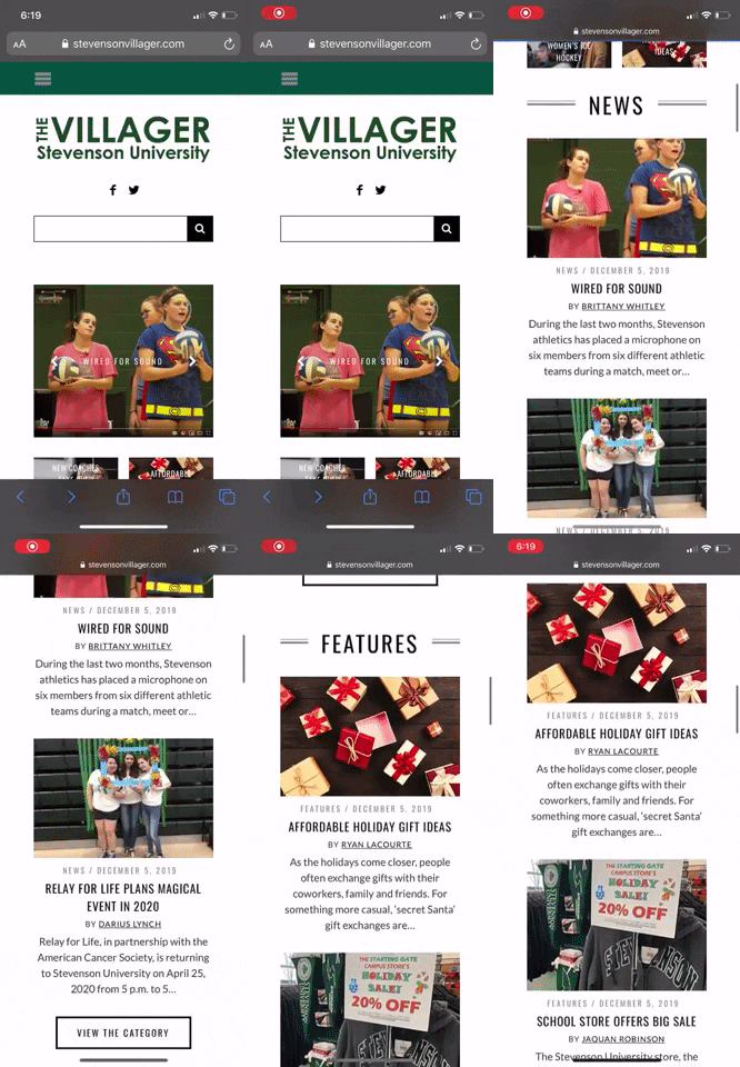
The Villager’s front page is heavily populated with images. Clicking on any of these images will then take you to the article. Although the reader can sort their news by category, the user can also easily access the featured articles since these occupy the largest area of the front page and rotate every few seconds.

The colors and font choices are standard for any newspaper apart from the header. The title heading indicates that the newspaper reports on Stevenson related news by using the University’s colors and a large, bold font. The body text is in black in an easy to read font against a white background.

The article thumbnails are well-spaced out and do not feel cluttered. All articles appear to be accompanied by an image and occasionally a video. Although The Villager occasionally uses videos to complement the articles, these do not automatically play. As such, The Villager makes very little use of sound.

The university newspaper has a very minimalistic feel to it. Articles are organized into a grid-like front page making it easy for anyone to find their way in the website.  The left and right side of the page are usually left blank, which helps frame the articles into a position where the user typically expects them to be.  Another great use of space is the simple pop-up that appears at the bottom right of the page when the user is about done with an article. The pop-up is not invasive, it does not occupy a large section of the screen and does a great job of guiding the user to the next article prolonging the time the reader spends on the website.

The desktop website offers very little gestural interaction. The most a user will do on this website will be point, click, and scroll. However, The Villager does offer a mobile version of the newspaper in which the gestural interactions will resemble the typically interactions with mobile apps such as Instagram and reddit. The user simply swipes down to scroll through the various articles and then taps on the article they which to read. This facilitates navigating the newspaper by offering a familiar layout to the reader.


This online newspaper makes use of various modes to deliver an effective but simple experience. The major benefit of The Villager is that it is fully online. This affords the user the opportunity of accessing previous issues of the newspaper through the archive tab, searching for a particular topic by using the search bar or the tag feature and watching videos related to Stevenson. It also offers a subscription feature which lets the reader receive the newspaper in their email inbox. The downside of The Villager is the lack of sound, and the lack of interaction that it provides for the user.


In conclusion, The Villager does a great job of captivating its primary audience through an effective use of the spatial and visual modes which provide a simplified but effective experience for the user.


College Meme

This meme depicts my journey throughout college pretty well. Growing up when i was first looking for colleges, I was greatly worried about how I had to go take out loans and accrue debt to get an education. Though I personally did well in school, this is the approach I often took when addressing admissions counselors. Currently in college, I find myself still doing the same approach as I gear up for a career in education as I explore potential graduate schools and programs to prepare for another financial burden to increase my education. As my GPA grows each year, I basically finding myself relating to this meme portraying me with similarities to this meme.

Michelle, Kara. “I Am Once Again Asking For Your Financial Support.” Twitter, Twitter, 27 Jan. 2020, twitter.com/_karmadillo/status/1221930994560831489.