Social Media Remix Assignment

I chose Twitter as an effective platform to promote my poem submission and The Greenspring Review because I think it is the easiest platform for content to be shared with the retweet function being available.  From my experience it is easier for a post to catch fire and be exposed to more people because when someone retweets something that interests them, their followers automatically see the post and it is easier for a post to begin trending.  People who would be interested in reading my piece are writing and reading enthusiasts that enjoy a reading or poem with a deeper meaning that can have multiple meanings.  

Twitter has and will always be one of the largest social media platforms where one can make many impressions on their posts in a short period of time.  Even though Twitter allows for a maximum of 140 characters per post, the use of hashtags is yet another tool that can be used to promote a post and increase the number of impressions.  To make the post more enticing one can use pictures and emojis to gain attention and catch a reader’s eye. 

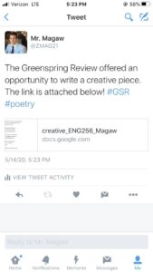
When crafting the pitch I used text as an overlay due to the text restraint to give a bit of a background to the link of my poem that I shared.  A GIF would work best to grab attention but I did not have enough room with the character restraint so a short intro and link will do with how the platform works.

I think that it would work best to get exposure if I posted a few times a day and retweeted the tweets as well to bring them back to the top of the timeline for people to see.  Retweets are key to getting more likes because when someone else retweets your post, all of their followers see it as well and so forth.  An easy way to increase views is by putting the genre of the tweet in the hashtag because you can search for hashtags and if someone is interested in poetry they can search #poetry and my poem will show up along with others.  Overall, Twitter is a wonderful platform to gain exposure and get your creative piece out to the public to read.

DOG YEARS

By: Zach Magaw


Bringing home a newborn is like no other feeling,

A chubby bundle of joy has entered one’s life,

With a personality like no other.


The development process has begun,

Hardship in the near future looming,

The beginning can seem unbearable.


The smell of fecal matter overwhelming,

The disobedience, naughty incidences,

Potty training is like pulling teeth.


No two developing at the same rate,

The learning process continues, 

As slow as molasses.


One year of growth may seem like seven,

But don’t blink,

Time flies like a fighter jet in the sky.


The challenge proves to be rewarding,

A good boy will emerge,

Bringing light and joy to the world.


Formed from guidance,

Making their own footprint,

What seemed like forever.


Really hasn’t been that long,

A final product has surfaced,

Ready to meet the world.


Don’t forget to smell the roses,

What was once a newborn in your arms,

Has gradually become mighty and mature.


Ready to leave those loving arms,

To start a new chapter,

Reminiscence helps move forward, 

To the unknown that the future has in store for us.


HTML Reflection

I found this assignment particularly difficult in the beginning because I am not a tech savvy individual at all and it took a bit of time to get started and figure out exactly what to do.  I did four sections a day to complete the assignment over time, but once I got through the first few sections I started to get the hang of the tedious process.   

The HTML headings are by far the easiest to understand but I learned that each HTML heading has a default size unless changed using CSS font-size property to specified size.  Also, there is even an element being <hr> that defines the thematic break in an HTML page, which highlights the extent of detail that goes into creating the code for a website.  In addition I learned HTML headings are defined by <h1> to <h6> tags, <h1> being the most important heading to <h6> being the least important heading. The following exercises were fairly simple, outlining the major elements in the layout of a website.  I found it interesting that every little detail that goes into a website has its own tags that make up the coding of a website. I found the HTML formatting section to be difficult due to the immense detail that goes into the formatting process. I learned that there is an element being <del> that defines even deleted or removed text, which is quite interesting and I wonder how often it is used when coding a website.

This was the first time I had ever been exposed to coding and I feel confident in being able to understand what goes into coding but when it comes to actually coding on my own, I think that would be extremely difficult for me because of all of the nuances and rules there are to create certain code for a web page. I would not put it on my resume because I am not skilled at coding and I feel that if you put something on your resume it means you are proficient in that skill and I feel that it would be misleading to an employer.  Overall, I think the project was interesting and I would like to learn more about coding because I understand that this assignment only scratched the surface.

https://docs.google.com/document/d/1YLcY6ONRzxU22hpchSVqDuAyJNmzeSsFW-oVB14Blz4/edit?usp=sharing

Dyslexia Accessibility Poster & Paper


The audience for my poster is the portion of the Stevenson community that deal with or are negatively impacted by Dyslexia, in regards to accessibility of the Green Spring Review website.  The Stevenson community involves students, faculty, parents, as well as art and reading enthusiasts interested in checking out student work.

The Do’s and Don’ts for this poster are guidelines as to how one can be the most effective in organizing and displaying information for users of the Greenspring Review that struggle with Dyslexia.  To start off, using prompts, notifications and arrows will help direct the user where they are supposed to go in order to access desired information nestled in the website. A tool to help navigate the website more efficiently is the search box where the use of auto-correct and suggestions will appear to guide the reader through the site, the reader may not know what they are exactly looking for and this tool makes for easier accessibility of all the work published on the Greenspring Review site, rather than skimming through everything.  A huge factor in displaying content for individuals with dyslexia is contrast; allowing users to change contrast between background and texts to whatever fits their personal needs has shown to have a positive impact. It is essential to “provide the eye with a noticeable difference between two objects in order to emphasize that they are distinct” according to the 5 Principles of Visual-Design in UX.  In addition to contrast, using at least 1.5 line spacing between text is imperative so the text is separated to help with clarity and make it easier for the reader to not get lost in a sea of text.  Like I outlined in the poster, the use of bullet points and numeral are also great site guides to efficiently organize information so readers can swiftly move through a clumps of information and be able to take the main points away.  In order to successfully display information websites should not be rigid and one size fits all, that makes it quite hard to distinguish text lines as well as makes the site hard to navigate. In addition, for those who don’t know, using cursive, italic and San serif fonts make it twice as hard for someone with dyslexia to read because the words get jumbled together due to there not being a break between letters.  This causes the blur effect in individuals, where “dyslexic readers see the text blurring or swirling”, making reading quite tiring due to the strain on one’s eyes (Typetisdale).  Furthermore, the slightest thing like double spacing after periods also hinders reading ability due to the river effect, this happens “when large gaps occur within consecutive lines of text” hindering the ability to read fluently and accurately (Typetisdale).

  The aesthetic choices I used in my poster were simple and fun to make it easy to navigate the information thoroughly.  I put a main emphasis on organization being that it is absolutely imperative for my audience of dyslexic readers. I organized each Do and Don’t in boxes that are numbered and have bullets to make the information clear and concise with some visual appeal.  In addition, the font choice was a big deal to make sure that my audience would be able to fluently read the information, in other words don’t use San serif or nautical fonts. Last but not least, each section is specifically concise and to the point with a visual to add more meaning to the text. 

Experience, World Leaders in Research-Based User. “5 Principles of Visual-Design in UX.” Nielsen Norman Group, https://www.nngroup.com/articles/principles-visual-design/.

Typetisdale. “Fontasia: 6 Bad Practises That Affect Dyslexic Reading.” Fontasia, 10 Nov. 2012, https://fontasiastudies.blogspot.com/2012/11/6-bad-practises-that-affect-dyslexic.html.

Pun, K. (2016, September 2). Dos and don’ts on designing for accessibility. Retrieved from https://accessibility.blog.gov.uk/2016/09/02/dos-and-donts-on-designing-for-accessibility/

World Leaders in Research-Based User Experience. “Usability 101: Introduction to Usability.” Nielsen Norman Group, www.nngroup.com/articles/usability-101-introduction-to-usability/.

Rhetorical Analysis of The Paris Review Literary Magazine

https://drive.google.com/file/d/158euAowEGHFiiISJnkczq4BMEPruX8gg/view?usp=sharing

The Paris Review is a literary magazine featuring original writing, art, and in-depth interviews with famous writers and artists. The main goal of The Paris Review is to present quality works of art for a well to do audience that has a vast knowledge and interest in reading and discussing art from the nineteenth century to present day. The Paris Review website employs the rhetorical appeals of pathos and ethos in an effective manner with their high end reputation for publishing and displaying high grade content, as well as harnessing the development of creativity within writers and artists. The Paris Review takes pride in promoting appreciation for excellence in the art world by publishing great content for the public to see. The purpose of this website is to provide a platform for writing and art pieces to be published and displayed in order to grow the specific literary and artistic categories.
Overall the visual representation of The Paris Review is elegant with a minimalist design, putting a major emphasis on the work created by the authors and artists. The home page gives us an idea that the Paris Review has been around for some time with the classical font adding a sense of trustworthiness . The Paris Review even advertises the pieces they publish and display on the home page, which in turn helps one comb through the website, giving you a sense of direction in what genres the website offers. The website is presented in a professional manner, organized by tabs that house creations from different categories of work being fiction, poetry, art, etc. Interesting enough the Paris Review is rich in culture dating back to the mid nineteen fifties with creative pieces, but better yet the website under each genre organizes the pieces by decade making it simple and easy to explore or find what you are looking for. The easy to navigate and well organized format is a great representation of spatial mode and strengthens the ethos appeals that the website has to offer for its users. The Paris Review became famous for its interviews of notable writers and artists, one of many was with Ernest Hemingway under the fifties collection of interviews. Hemingway is a household name writer, along with a plethora of others are featured in the collections. The lack in color of the background of the websites is an example of the pathos appeal the website has, drawing the bulk of the attention to pieces they publish and display. A visualization for each writing piece is offered to create interest with an imaginative impact on the reader before reading anything about the particular piece of writing.
Apart from the writing, the Paris Review has such a great following in the art world that they even have a store tab where they sell a series of expensive limited edition prints created by contemporary artists. They are involved in the niche market of displaying high end art for buyers, sellers and enthusiasts to enjoy, adding a different element to the content that they offer separating them from others.
Through analysis of the Paris Review website, one can concur that when effectively employing the rhetorical appeals of pathos and ethos with the content and layout, that there is a reason why the Paris Review has been around for some time and is successful in what they do.


Ball, Cheryl E., et al. Writer/Designer: A Guide to Making Multimodal Projects. “Chapter 1: What Are Multimodal Projects?” Second Edition. Bedford/St. Martin’s, 2018. Print.

The Paris Review | American Literary Magazine.” Encyclopedia Britannica, https://www.britannica.com/topic/The-Paris-Review. Accessed 14 Feb. 2020.

The Paris Review. https://www.theparisreview.org/. Accessed 13 Feb. 2020.

College Meme

Description: The meme I chose depicts the “appearance” of a college student when they first come in as a freshman and when they are goin into their senior year using Leonardo DiCaprio.  The first picture on the left shows a young Leo with zero facial hair at all looking like a teenager that just received his license.  The second picture shows him with a full beard and long hair looking twice as old as the other picture.  The difference between the pictures shows how even though four years may not seem that long, you grow up and mature at a rapid rate when your college career is coming to an end and your ready for the real world.

I chose this particular meme because not only do I like Leo as an actor but this before and after looks pretty similar to what I looked like coming into freshman year with little to no facial hair.  It also gives an accurate depiction as to how I feel coming to the end of my college career.  The drastic change gives us an idea as to how grueling college can be as well as how much change can occur in that short time.