Social Media Remix

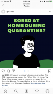
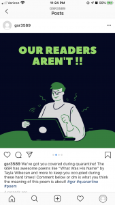
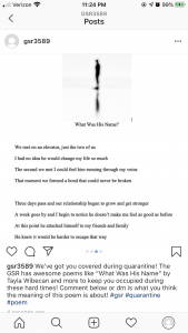
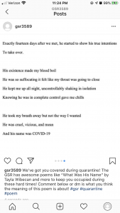
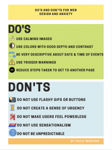
I thought instagram would be the best platform to promote my submission to the GSR because of its high number of readers who are Stevenson students. Being a student myself, I know that instagram is the most used form of social media across campus. My submission was a creative poem about COVID-19 that could strike some interest in students who are effected by it too. Instagram has multiple ways of reaching an audience from videos, pictures, stories, or lives. Stories and lives disappear after 24 hours and I wanted to make sure to not put a time limit on the promotion of my submission. Videos are a great tool but I felt making a normal post would work best. I chose to use multiple pictures that causes viewers to “swipe for more” with the hopes to grab their attention. Instagram allows you to change the font, color, and size as well as draw on posts that are part of the story feature. This however is not available for changing the caption of a regular post. I didn’t mind this limitation so much because I put a lot of work into creating the pictures and wanted that the be the main focus.  The plus side of captions is they can include many emojis and have no space limit. It’s always important to make sure to keep the account active in order to gain and keep followers. Posts should be made around 3 times a week and stories once a day to keep followers engaged and updated. For my post I decided to ask the viewers to comment what they thought the poem was about in order to increase comments. Likes can also be increased by using hashtags like the ones used that put the post into groups so that it can be seen with others and reach more people. The best time to post on instagram is between 9 and 12 a.m. early in the workweek (Shannon, Michael, & Hootsuite 2020).


Sources

Shannon, et al. “The Best Time to Post on Facebook, Instagram, Twitter, and LinkedIn.” Hootsuite Social Media Management, 25 Feb. 2020, blog.hootsuite.com/best-time-to-post-on-facebook-twitter-instagram/.

GSR Poem

Pickard, Martin. “Shadow of Man.” Flickr. April, 2009. https://www.flickr.com/photos/ropemonkey/3418110715

What Was His Name?


We met on an elevator, just the two of us

I had no idea he would change my life so much

The second we met I could feel him running through my veins

We were completely inseparable


Three days passed and our relationship began to grow and become stronger

A week went by and I begin to notice he doesn’t make me feel as good as before

At this point he attached himself to my friends and family

He knew it would be harder to escape that way


After two weeks, his existence made my blood boil

He was so suffocating it felt like my throat was going to close

I spent night after night uncontrollably shaking because of his poison

He was a monster I couldn’t get rid of


Knowing he was in full control gave me chills

The more I was with him the worse the headaches got

I became weaker and weaker day by day


He took my breath away, but not the way I wanted

He was cruel, vicious, and mean

And his name was COVID-19


Copy Edits

https://docs.google.com/document/d/1LDDC6yj4oqP-89IWshTaK8r2nEUAGgDFgVflxz17ZfE/edit?usp=sharing

This assignment seemed really challenging at first but once I went through each step one at a time I found out it wasn’t as overwhelming as I thought. The main things I learned were how to add alt text to a picture which I thought would be really useful in the future. One thing I could not find out how to do was change the footnote to be a bracket, after googling how to it seemed like all the answers were “google doc doesn’t have the ability to do that” which was upsetting. As far as grammar, the article had a couple run on sentences that I wasn’t sure how to fix because I didn’t want to change the meaning. I feel like I missed out on a few incorrect citations because I’m still learning that style myself however I did make one change for the “et al” citation.  I checked to make sure all of the heading were correct and that each picture was labeled as Figure 1 and so on. From my understanding there were any issues with spelling variants and the lists used looked good. In general I feel like this assignment was good practice to learn how to edit and proofread an article however I’m not sure if I caught on to everything since it was my first time.

Poster

I chose to direct my poster towards people who experience anxiety and how the Green Spring Review can make their website in a way that prevents users from feeling anxious. Anxiety is something that can affect anyone and everyone who may be reading the Greenspring Review. This includes teachers, students, alumni, parents etc. As a designer of the website it is important to ask who the possible users are, and what a designer can do to make their website accessible (Kent 2015).  


There are many things that can trigger someone’s anxiety and it is important to know the things you can do to prevent it, and what not to do so you don’t provoke it. The website should have images and videos that are calming and underwhelming along with using colors with good depth and contrast. It is also important to be very descriptive about things such as events in order for the audience to be well prepared. This includes the date, time, location, etc. never leave room for surprises. Always make sure to use trigger warnings for sensitive content such as violence, stress, drugs, loss, etc. And lastly reduce the steps needed to get to another page of the website make navigating through very easy and fluent. A few key things the Green Spring Review should not include in their website are flashy gifs or buttons and do not use things like “Next video will play in 5 seconds” because these could make people feel anxious and antsy. Don’t be unpredictable and make sure the titles of the articles are not misleading or too shocking because this is an easy way to trigger anxiety. And lastly do not make the users feel powerless, or that they are not in control while navigating through the site. This means limiting the amount of popups and ads throughout the website. 


I wanted the aesthetic for my poster to be calm and neat so it would reflect something that would be good for someone with anxiety. Pun in 2016 suggests for posters to have good color contrasts, legible font sizes, and linear layouts. This is why I chose the bright colors and kept it as minimalistic as possible. I wanted to make sure it was easy to read so I used the same black font throughout the poster. The pictures I used served as good examples for each point and tied the poster in well together. My end goal was to create something simple that got the message across as easy as possible. 


Kent , Mike. “Disability, Mental Illness, and ELearning: Invisible Behind the Screen?” The Journal of Interactive Technology and Pedagogy, 17 Dec. 2015, jitp.commons.gc.cuny.edu/disability-mental-illness-and-elearning-invisible-behind-the-screen/.

Pun, Karwai. “Dos and Don’ts on Designing for Accessibility.” Accessibility in Government, 2 Sept. 2016, accessibility.blog.gov.uk/2016/09/02/dos-and-donts-on-designing-for-accessibility/.

Accessibility Summary

Dr. Mike Kent from Curtin University wrote the article, “Disability, Mental Illness, and eLearning: Invisible Behind the Screen?” In which he discusses the study about online students who registered for disability support for higher education and how they were surveyed and interviewed about their mental disabilities. The survey explored how accessible different online platforms for learning were and the reason for what motivated students to disclose their disability or not. Some students felt that they didn’t want to share that they had a disability due to feeling ashamed, having a hard time admitting it to others, and having to accept their limitations. The article then moves into talking about disability and eLearning and how online classes can work as an advantage for people with disabilities by creating a way of learning that improves accessibility, flexibility, and disclosure. Students say they like being able to complete their assignment at their own pace and to have the freedom to work ahead if they wanted to. Although online learning has its negatives such as not being designed to reach its maximum affordances, the study showed that online higher education provides more flexible options for students with disabilities. Finally the article touches base on how eLEarning is beneficial to not only people with disabilities, but also mental illnesses. All together, the article discusses how online learning for higher education is beneficial and has many affordances that help people with disabilities and mental illnesses recieve an education that works best for them.

Kent , Mike. “Disability, Mental Illness, and ELearning: Invisible Behind the Screen?” The Journal of Interactive Technology and Pedagogy, 17 Dec. 2015, jitp.commons.gc.cuny.edu/disability-mental-illness-and-elearning-invisible-behind-the-screen/.

Proposal Recommendations

Tayla Wibecan 

Amanda Reandeau

Akira Merchant

  1. We would change the background to be less busy, more modern, and link more to the content of the Greenspring Review. We feel that the books make it feel outdated and there’s more to the website than just books or writing. 
  2. We like how team two and three had a direct link to upload a submission. 
  3. We like the organization of team two’s issues area. Where it started with the categories (Creative writing, journalistic writing, and visual art) and then went into the date/time.
  4. The issues and writing submissions should have pictures along with the title. If you look at most literature review websites such as the Guernica Literary Magazine, each writing piece has a picture to grab the reader’s attention. 
  5. We liked a mix of team two and team three’s about me section, with the circle head shots of each editor along with a quote by them. They should also include a short paragraph of what the green spring review is and its history under the about page. 

“3 Practical Tips for Product Builders When Designing in an Era of Digital Exhaustion.” Summary

Li, Jacky. “3 Practical Tips for Product Builders When Designing in an Era of Digital Exhaustion.” Medium, UX Collective, 11 Jan. 2020, uxdesign.cc/3-practical-tips-for-product-builders-when-designing-in-an-era-of-digital-exhaustion-47131d933baa.

This article begins with a graph that shows the number one reason why people uninstall mobile apps is because of annoying notifications. It then goes into saying how as a product builder, a successful product is able to stand out from all the noise, and shares three tips about designing for digital wellbeing. The first tip mentioned is “Knowing the current landscape of our mental capacity.” Meaning it is important to think about your target audience’s cognitive capacity in order to make a product that people will continue to use that can blend well  into their daily routine. Tip number two is behavioural design. One way of making an impactful product is using the “Maintain/shift/inspire” framework. This can be done by maintaining a user’s behavior and updating something that will influence users to shift their behavior into doing something else and lasty to inspire users to sustain this way. The last tip the article provides is “The emotional piggy bank.” This serves as a way to empathize with users in a deeper way than interviews and field research. The piggy bank is a way for the builder and user to gain empathy for each other through meaningful conversations that build a deep relationship. The article then ends with two quotes: 

“Each year more than 30,000 new consumer products are launched and 80% of them fail.” — Clayton Christensen

“And out of the $4 trillion global technology spend that does successfully make it to production, “at least 67% of those efforts are either scrapped, or end up being under whelming with low-to-negative ROI.” — Gianni Giacomelli

The three tips, and more from this article helped me understand a few ways to create a better user experience for digital media. 


Rhetorical Analysis on The Paris Review

https://vimeo.com/user105115695/review/392005884/2d9ffb566b

Script:

My name is Tayla Wibecan and today I will be doing a rhetorical analysis on the website the Paris review. This is a professional literature website where authors and writers can submit their work to be reviewed. As you can see, they do reviews on issues, interviews, fiction, poetry, letters and essays, art and photography. They also have a podcast and YouTube videos.

After doing a rhetorical analysis on the professional website The Paris Review, I think the website needs to reconstruct the page, so it is more symmetrical along with changing some things to make the website not look as bland.

Visual

Color-The title along with paragraphs of the page are written black. There are pops of hot pink as you can see the subscribe button and some of the titles. As you move your mouse over an article the color of the title changes to hot pink.

Font -The font for the website is serif that makes it look very professional and sophisticated.

Media– There are a lot of pictures and videos that can be found on the site. They all are very different

Purpose of images/visuals- For readers to see what the article is about

Information architecture– menu bar and dropdown menu bar

User experience- Overall the website was easy to navigate through however after a while of the lack of color and symmetry it got kind of old and boring.

Aural– There’s no sounds when you press a button or anything like that and the video options do not play automatically unlike some other websites might do.

Gestural– you can enter your email address to be part of their newsletter.  They also have an advertisement at the top that you can look and exit out of.

Spatial– There is a lot of white space on the sides, too much for my liking.  Everything is left centered.

Linguistic– This is a very sophisticated website that is used by very educated people and because of this you won’t see, and slang used or incomplete sentences. Instead you will find proper grammar and spelling throughout the whole site with full and complete sentences.

The audience is geared towards those who are interesting in literature. Specifically, those who want to publish/upload their own work onto the website or read and learn more about work that is published already.

Purpose– to provide a space where authors and readers can submit their work of fiction, nonfiction, or poetry.

Context– As you move along to the about page under history you can see that the Paris Review was founded in Paris in 1953.

And genre– literature, English,

The Villager Rhetorical Analysis

The villager is a Stevenson University student run online news source that reflects professional news journals such as Delaware Online. The site offers weekly articles on sports, events, bookstore sales, etc all written by students.  The Villager is very impressive for being run by students, especially when comparing it side by side to professional online journal such as Delaware Online. 

Both websites have a very sleek look that allows for easy navigation through out the site. When it comes to text, both chose to have the title of the article written in bold black lettering while a preview of the body of the article can be found below in a gray color. This contrast increases legibility and makes it easier for readers to find the article they were looking for. The simplicity of the fonts and colors makes both websites very legible along with maintaining a sleek aesthetic.

When it comes to images and layout, Both the Villager and Delaware online have a home page that consists of one large picture and then two smaller pictures to the right representing articles.

Although both lay outs are similar, Stevenson was able to make their website look more organized and technologically advanced. Unlike Delaware online, the large picture used in The Villager’s home page is constantly changing, bringing up a new article. This is a good attention grabber for readers and makes the website look more technologically advanced. Another simple, yet drastic   difference that puts The Villager over Delaware Online is the placement of the title over the pictures instead of under. This creates more symmetry through out the site and all around made it look more neat and organized. 

Students at Stevenson University have worked really well to create a news journal that is well organized, neat, easy to navigate, and interesting. When comparing a student run news journal to a professional news journal,  ran by “The News Journal,”  one can find that Stevenson’s “The Villager” is just as good, if not better based on functionality and look.

College Meme

Elmo College Meme
“It’s Coming.” Cheezburger, https://cheezburger.com/9024460032/its-coming. Accessed 28 Jan. 2020.

I chose this meme because I really related to it. One night I pulled an all-nighter that consisted of leaving the reading room at 1 am and then finishing the paper at 5am in the common area of my dorm room. When I went to class the next day the teacher said she would push the due date back a week for everyone that was in class that day. I didn’t know if I should have felt relieved that I could spend more time on it or frustrated that I stayed up all night for basically no reason. All in all I got an A on the paper and hopefully never have to pull another all nighter!