Social Media Remix


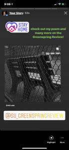
I chose Instagram because this is one of the social media platforms that I use the most. With Snapchat, your story can only been seen up to 24 hours. It is the same with Instagram but you can make your InstaStory more interactive. You can add links to websites, link your own or someone else’s Instagram post, music and more. You can @ and use any hashtag to further the engagement of who’s following you or watching your story. Another reason I chose Instagram is because I have a lot of followers that go to Stevenson or are college students. Since my poem is about my COVID experience, many of my followers will be able to relate to it and want to look at other works on the Greenspring Review.

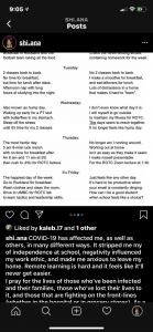
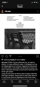
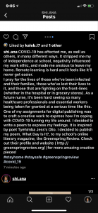
I posted a series of InstaStories as a “teaser” to my Instagram post. This will lead the viewers to my original post that promotes the Greenspring Review and my work. In my post, one of the pictures is the photograph that I attached to my poem. The next pictures are of my poem itself. In the Caption, I explain how COVID altered my way of life which directly relates to my poem. Then, I add on how many others from Stevenson, along with others from different colleges, are experiencing the same feelings and that we put them into art. I tell them to check out the Greenspring Review for more works from students like us. I added the hashtags #stayhome, #staysafe, #covid_19, and #greenspringreview to gain more traction to my post. I also tagged our school’s and the GreenSpring Review’s Instagram profile.

I was a little late in when I originally wanted to post. I wanted to post on my InstaStory and feed at 8 pm but I ended up doing it later for outside reason s other than schoolwork. I’ve noticed that I get the most engagement on my Instagram (story and posts) around 8 pm from my followers.

What Day Is It?

Allen, Shiana. Isolation. September 17, 2019. Stevenson University.

What Day Is It? By Shiana Allen

Sunday,

it’s the start of the week.

The last “peaceful” day

before the storm hits.

Make sure to complete

last minute assignments.


Monday,

only one class today.                                           do I technically have a class today?

Early morning PT sessions                                       No early mornings anymore.

with fellow Stevenson’s cadets.                             No PT with the Stang Gang.

Breakfast in Rockland with the                            Check the long list of emails for

football team taking all the food.                             homework for the week.


Tuesday,

2 classes back to back.                                                   no 2 classes back to back.

No time for breakfast,                                               Make a smoothie for breakfast,

but time for lunch after class.                                   and eat leftovers for lunch.

Afternoon nap with long                                            Lots of distractions in a home

hours of studying into the night.                            that makes it hard to “learn”.


Wednesday,

also known as hump day.                                        no longer feels like hump day.

Waking up early for a PT test                                     I will myself to go outside

with butterflies in my stomach.                        to maintain my fitness for ROTC.

Sleep off the stress                                                  The days seem to mesh together.

until it’s time for my 2 classes.                           I don’t even know what day it is.


Thursday,

the most hectic day.                                                   no longer am I running round.

5 am 6 mile ruck march                                                     At home workouts

with no time for breakfast after.                  aren’t as easy as they make it seem.

An 8 am and 11 am at SU                                          Make yourself presentable

then rush to JHU for ROTC lecture.               for the ROTC Zoom lecture at 1:30.


It’s Friday,

the happiest day of the week.                                    just feels like any other day.

Go to Rockland for breakfast.                                 It’s hard to be productive when

Wash clothes and clean the room.                    your email is constantly dinging.

Drive to UMBC for ROTC lab                                     How can I be a good student

to learn tactics and leadership skills.                 when school feels like a choice?


Saturday,

finally able to sleep in.                                                all I do is sleep in.

Do I want to stay in                                                     I can’t play the Sims because

and play the Sims?                                                     I can’t afford to slack off.

Or do I want to go out and have fun?                 We longer can leave the house.

The possibilities are endless.                            We have to keep social distancing.


Sunday,

once again,

it’s the start of the week.

The last “peaceful” day

before the storm hits.

The cycle continues.


Immersive Pedagogy Style Sheet

https://docs.google.com/document/d/1JQSG9G4hLG7DpYVL-5GBQN0e4tysBCzNA0e-VW-69zM/edit#heading=h.gjdgxs


This assignment was super challenging for me. I have never used or wrote in Chicago style or a style sheet. It was hard for me to grasp how to edit my section (second half) because I don’t have any knowledge on the topic they are addressing. Although, the further I got to the end the more I kinda understood what wad going on. Editing the citations wasn’t as bad, but it was just the content itself that was challenging to edit. I wasn’t sure how to reconstruct or alter some sentences because I didn’t have a good understanding on the information. When I write, I refuse to write in long sentences because they tend to confuse me when I’m reading. This article did have a lot of long sentences that was a little hard to understand, let alone alter or edit. I know I missed some things I should’ve caught and may have messed up on, but thats the beauty of learning a new technique. Using a style sheet is very beneficial in writing a piece of work or editing one.

Coding Experience

https://docs.google.com/document/d/1NoMq_0r-FE0gBXOk1mK-hKaZdv_cDwAdQJNVrUk7Jl0/edit#

This assignment was supper difficult for me to do. I am a person that hates doing things on the computer. I am more of a hands-on person so typing is something that I loathe. With that being said, this was not easy for me.

It was difficult for me to remember what symbols and letters to use for specific elements. Making sure to type in width, length, color, size, font, etc. on my own was tedious to me. I would often forget or use the wrong <> or forget to include / to end the element. The comment section of the lesson was confusing because I couldn’t see what was going on when I practiced it. This happened with bidirectional, borders and values when I tried to do it on my own.

What was pretty easy was doing headings, lists, what color I wanted, images and links. The hiccup I had with images was putting the correct link in for the picture. You have to insert the direct link of the picture to successfully add it. Once I realized that you basically state what you want to add or alter before you include it it got a little easier. It was interesting to see how you can change and create things using certain codings.

It took me around 15-30 minuets per lesson to have a small sense of what I was doing or supposed to do. I was relying on the Try it Yourself function to see what I was doing and what it was supposed to look like. I had the template on the screen at all times when I tried it on my own and it was still very challenging. I would be elated and ecstatic if I never had to do this ever again. I would personally use a template for making a website than use HTML. I don’t really have the patience to do it since I hate computer work. I give props to those that enjoy and are good at using it and creating

Designing for Students with Migraines

The audience for this poster are students from Stevenson University that suffer from migraines. I am a student from this institution who suffers from migraines so it was easy for me to come up with things that benefit me when I am on the computer. The Dos and Don’ts that I have listed will be beneficial to the changes made to the Greenspring Review as migraines and headaches are common in my age group. Students are under a lot of stress and tend to get lack of sleep due to the large amount of coursework during the semester. Stress and other factors can result in a migraine that can hinder a student’s learning and work ethic.


Migraines can affect you in different ways. In general, they can cause you to be more sensitive to light, sound and smells. Sometimes they can cause nausea, vomiting, and blurred or hindered vision. Staring at a computer screen already strains the eyes but staring at one with a migraine is even worse. The Dos and Don’ts listed are to make it easier for someone who is migraine-prone to browse the Greenspring Review. Using low contrasting colors is preferred as it decreases eyestrain which can make they symptoms worse. Blue and green spectrum colors are known to be catalysts for migraines so it is recommended not to incorporate them in digital works (Bullock). Moving around too quickly tends to stress out the brain and stomach (if you are nauseated) during a migraine and the same applies to fast moving objects on a screen. Slow moving objects stimulates the brain less than fast moving objects which leads to less straining. Using large and easy to read fonts has the same effect as using low contrasting colors. It strains the eyes less with does not provoke a migraine. Using a more spaced out design/layout is an example of Jakob’s Law and the Principle of Least Effort according to Kalina Tykiel in her article “7 Psychological Principles for better UX”. Having a layout that is almost universal to other website and provides minimal effort to navigate through leads to better user experience. Incorporating a spaced out layout helps students with migraines navigate through the Greenspring Review easier with little to no effort on the brain. Making sure to have low sounding videos is crucial to migraine users. Loud and alarming noises and provoke a migraine which leads to pain and throbbing. Low sound will ensure that the migraine user will have no problems scrolling through the website.


I chose to use a grey background and lavender font because it is easy on the eyes. Lavender is also a calming color and it is not on the blue and green spectrum. I didn’t want the colors to be alarming or bright to correspond to the Dos and Don’ts about color. I wanted the poster to be calming, smooth to look at and read. The font I used is relatively large and easy to read. The layout of the poster is simple along with the wording. Separating the Dos and Don’ts on each side spaces them out. The icons used are uniform in color and are simple. I used a faint line as a divider to provide structure.


Works Cited

Bullock, Greg. “Computer Screens: The Effect on Headaches, Migraines and Concussions.” TheraSpecs, https://www.theraspecs.com/blog/computer-screens-headaches-migraines-and-concussions/. Accessed 4 Mar. 2020.

Doherty, Colleen. “How Your Computer May Cause a Headache.” Verywell Health, https://www.verywellhealth.com/is-working-at-my-computer-causing-my-headaches-1719432. Accessed 4 Mar. 2020.

Tyrkiel, Kalina. “7 Psychological Principles for better UX.” Livesession, https://livesession.io/blog/7-psychological-principles-for-better-ux/. Accessed 19 February 2020.

“UI vs. UX: What’s the Difference between User Interface and User Experience?” UserTesting, https://www.usertesting.com/blog/ui-vs-ux. Accessed 3 Mar. 2020.

Journey Map 101 Summary

Gibbons, Sarah. “Journey Mapping 101.” Nielsen Norman Group, 9 Dec. 2018, https://www.nngroup.com/articles/journey-mapping-101/.

In simpler terms, a Journey Map is an outline, visualization or a plan that highlights the steps you need to get to your end goal. Sarah Gibbons’s article explains what journey mapping is and how it is a vital tool in UX. In the process of creating one, user actions are put together in a timeline which leads to highlighting user thoughts and emotions to create a narrative. After going over it, it is then a full journey map. Gibbons then explains the 5 typical components are the actor which is the point of view of who the map is about/for, scenario and expectations which is the situation that’s addressed and the goals, journey phases are the stages, opportunities are the insights that were gained, and action, mindsets and emotions embodies how the actor feels during the journey. She then address the different variations of journey maps, such as Experience Map, Service Blueprint, and User Story Map, and how they are not interchangeable. Sarah emphasizes that journey maps can be crucial in the enhancement of UX. This technique leads to collaborative conversation within organizations and promotes a universal goal and vision to improve UX. Companies that use this technique tend to be more in-tune with their customers qualms and appreciation so that they can better user experience.

#OpenAPS, Nightscout & Type 1 Diabetes

Kane, Laura. “#OpenAPS, Nightscout, and User-Driven Design for Type 1 Diabetes Technology.” The Journal of Interactive Technology and Pedagogy, 17 Dec. 2015, https://jitp.commons.gc.cuny.edu/openaps-nightscout-and-user-driven-design-for-type-1-diabetes-technology/.


In this article, Krista A. Murchison analyzes and discusses the benefits of 2 innovations, #OpenAPS and the Nightscout, in medical research and education. Murchison addresses the negative perspective of the impaired and disabled in the medical and government field. The medical field and government only focus on limiting impairment and not how the user feels or interacts with their technology.  In this era, more engineers are creating technology that benefits the disabled and impaired in a new way.

These 2 innovations specifically aid in maintaining Type 1 Diabetes. The Open Artificial Pancreas System (#OpenAPS) was created to create an artificial pancreas that incorporates CGMs and insulin pumps. The Nightscout project was derived from #OpenAPS to help those with type 1 diabetes to send their glucose levels on the internet. Within this project, parents and guardians can monitor a dependent’s glucose levels. Murchison concludes that both innovations are more beneficial than the preexisting ones  because it gives a sense of independency while using and is multivalent. Both innovations take in considerations of the user’s needs and interests.

7 Psychological Principles for better UX

Tyrkiel, Kalina. “7 Psychological Principles for better UX.” Livesession, https://livesession.io/blog/7-psychological-principles-for-better-ux/. Accessed 19 February 2020.

This article is about how you can use psychology as a tool to bettering or perfecting your website to engage and lead to a positive experience for the user. The information that I didn’t know prior to reading this article where the different laws of psychology such as Jakob’s Law, Principle of Least Effort, Law of figure/ground, Hick’s Law, and Serial Position Effect. Kalina Tyrkiel explains some of the basic areas of psychology, the laws within them and how using/practicing them can benefit your website. What I definitely want to take with me to apply to the redesign of the Greenspring Review is Jakob’s Law which is “don’t fix anything that isn’t broken”. There is a unofficial “standard” for websites that many use, changing it to something completely different will lead to confusion the user.

Rhetorical Analysis on Tin House


https://drive.google.com/open?id=1T3OXAh6uwwUUYErSgohHqip44eHHYIt2

Welcome to my Rhetorical Analysis on the website, Tin House. I will be analyzing the mode and affordances of this website and ultimately discussing my views on how it stands out from other literary magazines.

The Tin House website is unlike any of the other 3 websites included in the assignment prompt. What makes this company and their website stand out is that they encourage and cater to everyday people. You are freely able to send in your poem for them to publish and it will be a part of their collection. The simplicity of the website allows for the creative work featured on the website to stand out.

First, I am going to give you some background information about this website.

From the looks of it, this website is for the publication office of Tin House Literary Magazine.

The genre of this literary magazine is focused on works, whether books or poems, that are either nonfiction, fiction or poetry.

To give you some context about this publication -> starting this year, Tin House no longer was an in-print magazine. They have made the decision to only produce and publish digital-only online magazines on this website.

The books they include are available in stores or online, which links are provided.

Some poems that they directly published are fully on this website under “Tin House Online” page.

I would say that the audience of this website are young adults and adults. There is no specific gender targeted. I think that the economic status targeted is the middle class, only because the books they provide range from $15 to roughly around $30 and you need to have a decent amount of spending money to purchase books leisurely.

All in all, I would say that the primary audience would be any young adult or adult looking for new and good reads for their free time. The secondary audience would be young adults or adults looking to either publish their work or desire to work in publication. On this website there are pages that are specific to how someone can send in their work for publication and how to apply for a job or internship.

There are many purposes that this Tin House’s website wants to accomplish. One, is to showcase and support authors in their new released or already released works whether if Tin House themselves publish it or not.

Another purpose is to promote diversity as they encourage others that seek to publish their work or have a career in this field to work with them (Tin House).

Now that you know a little about Tin House, let’s get into the modes and affordances of their website.

Let’s get into the great things this website has to offer. Within the linguistic mode, every article and book review on this website is easy to read. As for the font, it is in the style Georgia in 13.5 size which is easy on the eyes and allows for fluid reading. The tone of each article is informal as they get straight to the point and provide enough information about the book or poem and it’s author.

This leads to enjoyment when reading through because the user will be able to get all the valid and reliable information about works Tin House promotes.

The visual mode of this website is also straight to the point. The background color of all of the pages is white with black font. The hyperlinks, top navigation bar, emails and address are in red which makes it easy for the user to notice and navigate them when needed.

Although the background of the page is bland, the pictures and book covers make up for it. All of the visuals are vibrant in color and stand out. This draws the user’s eyes to the works that Tin House wants you to recognize because they support and are in association with them. The size of the visuals are large which also makes it easy for the user to see and read.

The spatial mode is one that is consistent throughout most, if not all, of the webpages. The top navigation bar is consistent on the choices, which are magazine, books and workshop.

On the front end, there is a large dynamic visual of some of the most recent publications they have included on their website. Below that, there is a dynamic page of the most recent articles and poems they have published.

There is one widget where all of the pages on the website are located so it is easy access for the user.

The “Books”, “Magazine”, “Shop”, and “Tour Dates” pages are all the same regarding the layout. At the top of the page is a navigation bar with the different genres of the books and poems. Then there are rows of the book covers and under them are the title of the book along with the name of the author.

On each book and magazine page, the left side has the book cover with the book title, author name and the genre categories it falls under. The right side of the page consists of the book synopsis, reviews and links to where you can purchase it. The bottom of the page is information about the author and other books they’ve written.

The resources and internship page are in paragraph form will all the necessary information and no pictures. It also has the emails and address in red for hyperlinks.

The Tin House Online page is similar to the front-end page but without the dynamic visuals. This page is dynamic in which the latest articles they’ve put out are on the top.

As you can see from the Tin House website, their goal is to let the creative work speak for itself. They want to endorse everyday people who are creative and encourage those who want to work in publication. The website is very user friendly and promotes enjoyment for all who wants to access its. This is what sets Tin House from all of the other literary magazine website.

Thanks for listening to my Rhetorical Analysis!

Works Cited

“Internships.” Tin House, https://tinhouse.com/internships/. Accessed 12 Feb. 2020.

“Resources.” Tin House, https://tinhouse.com/internships/. Accessed 12 Feb. 2020.

“Tin House Live: Craft Talk: Jericho Brown on Suicide & Joy.” Between the Covers Podcast, 2016. https://tinhouse.com/podcast/tin-house-live-craft-talk-jericho-brown-on-suicidejoy/

Tin House Staff. “Gallery Club: The Magical Language of Others.” Tin House, 27 Jan. 2020. https://tinhouse.com/galley-club-the-magical-language-of-others/. Accessed on 12 Feb.2020.

Tin House Staff. “The Last Summer of Ada Bloom.” Tin House, https://tinhouse.com/product/the-last-summer-of-ada-bloom/. Accessed 12 Feb. 2020.

Tin House Staff. “Tin House Online.” Tin House, 5 Feb. 2020. https://tinhouse.com/tin-house      online/. Accessed 12 Feb. 2020.

Smith, Patricia, et al. Tin House, 5 Feb. 2020, tinhouse.com/. Accessed 12 Feb. 2020.

Rhetorical Analysis of The Villager

The Villager is one of many Stevenson University’s websites. This website is more article based where students majoring in Journalism control of it. Articles are published every week stemming from topics about school athletics, reviews and news about the institution or the community around it.

Modes and Affordances

Linguistic Mode

The language used in this website is informative in every article. Whether the article is a review or highlights on a past sports game, the language is consistent.

Visual Mode

The Villager incorporates a lot of visuals throughout the articles. All of the articles have the same layout when it comes to the visuals. The picture is always on the left side of the article at the start of it. On the posts, all of the articles have their headlining picture above the date of publication, title of the article, author and a brief introduction. The color scheme of the website corresponds to the color scheme of the school.

Aural Mode

There are no sounds or sound effects that aid in the communication of the information provided in the website. However, under the category “Students Are Talking…” there are links to short YouTube videos of past or current Stevenson University students that responded to topic questions about what was going in that point in time.

Spatial Mode

All of the pages and categories on the website are consistent in the layout. As stated above, the pictures on the pages and in the articles are identical in layout. There is a side navigation bar on the right of the websites on all pages and posts. There also is a top navigation bar that is consistent on all pages and posts.

Gestural Mode

The way the website is constructed leads to the user to have an easy time navigating through it if you are on a desktop or computer. The top navigation bar is easy to access and see on every page. The YouTube videos and the products addressed in some of the articles that are linked throughout the website are easily accessible and work. One aspect of the layout that may hinder navigation is the side navigation bar on the right. If this website is being looked at on a smart phone, having the side navigation on the right side can hinder scrolling through the website as majority of users are right handed.

The Villager is a simple website that is user friendly and easy to navigate through for all ages. The content and information provided is feasible to those who have or are attending Stevenson University and their families, faculty of the institution, the community of Baltimore and people that are interested in attending the university.