GSR Social Media Remix

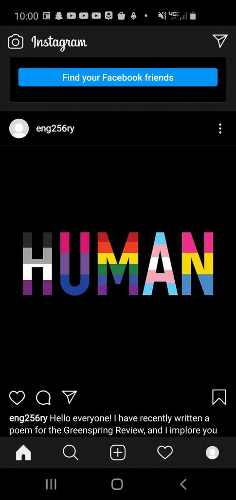
To advertise my story in the Greenspring Review, I chose to make the social media post on Instagram. I am quite familiar with Instagram, and the types of posts that are often made on the site. If you follow people who  are involved on campus, they often post event flyers on their Instagram pages. This is usually done through Instagram stories, but since the purpose of the account is for this assignment, I will be doing so in post form. In addition, this post will allow me to create a caption for the photo. While Instagram stories contain overlay text, posts are usually accompanied with captions.

Since I decided to use my caption as my text, I was not able to manipulate the text color or font. However, I do not believe this would have added to the post significantly. At the end of the post, I added a playful emoji, along with a Pride flag. Despite the serious nature of the piece, I enjoyed writing it greatly, which I hoped to reflect in the post itself. I did use punctuation throughout, although I decided to forgo the final period where the emojis are.

Pictures are far more popular on Instagram than videos are, which is why I decided to use a slightly modified version of the photo featured in my piece. Instagram uses square photos, which made it difficult to use the banner included in my piece. As such, I grabbed a different image, which also features the asexual/aromantic pride flag in place of the lesbian pride flag. This may be inconsistent, but it broadens the amount of represented identities, and may now include people who were not included before.

I made this post at around 10 P.M., which is just about the best time to post on Instagram (although a little bit earlier may have been better). To increase traffic, I could make this same post on my main account. I could also advertise my piece on social media. In addition, I could make an Instagram story post that says “link in bio” and also advertises the main post itself. I could get more views by encouraging others to like and share the post as well.


GSR Poem

Why am I

Flags from left to right: Lesbian, Pride, Bisexual, Transgender, Pansexual. VLAW759, 2020.

I sit upon this bed
In this room that I call mine
I dwell inside this house
But it’s not home, and I’m not fine

I found a sense of purpose
Beyond inhabiting this world
It began with the acceptance
That I’m not quite boy or girl

At first it brought such happiness
I found my desired energy
The friends I’ve made are lifelong
And continue to inspire me

But unfortunately acceptance
Is more than just my pronouns
It’s internal, and it’s external
And leaves me hopeless; unbounded

But these feelings are tempoary
And my future is uncertain
However, with Coronavirus
I’m afraid that things will worsen

Just months ago I was thriving
Growing with each passing day
I started therapy, once again
And opportunties came my way

For once, I wasn’t a failure
At least from my own perspective
But as this pandemic continues
It reveals things this world has neglected

The systems that were created
To serve this Earth’s people
Are quite faulty in nature
Corrupted men create this evil

Unfortunately for anyone
Who is not Caucasian
Will receive quite unfair treatment
In this supposedly great nation

Unfortunately for anyone
Who is not heterosexual
Will go through great pains
To embrace who they truly love

Unfortunately for anyone
Who happens to be transgender
Has gotten their protections removed
In the name of “family standards”

To some, it’s an overstated story
They say we have equality
To me, it’s my everyday
I have no other reality

As COVID-19 continues
Those most vulnerable will suffer
I’ll try to help the most I can
But conditions will get rougher

This won’t just end tomorrow
Though Trump makes it out to be
How about for once in life
We deal with this disease

No, not Coronavirus
(Some of us) are doing all we can
It’s capitalism I’m talking about
That’s truly killing Man

Is it really worth any amount
To sacrifice human life
For the sake of the economy
Think about that more than twice

The systems put in place
Are only there to serve the rich
Without corporations, there’s community
Please, just picture this

We seem to have forgotten
How we dealt with those who wronged us
No, we didn’t need police
We looked to those around us

We gave our all to our families
Our friends, and our communities
We can still do that in this world
But that doesn’t help society

This world is not accepting
Of its peoples’ different natures
Bodies, skin colors, even genders
These things still separate us

You can try to make some changes
Help some people out
But at the end of every single day
The Patriarchy tears us down

I suppose I should say “It tries to tear”
For some of us rise above
We live our truths, no matter the cost
True bravery comes from love

Style Sheet

https://drive.google.com/file/d/18RuAzJQtsRQAs1ZIwoNID-0J5GWX81Xz/view?usp=sharing

The process for editing this article was quite the roller coaster. It was initially very overwhelming, as the style sheet included a lot of information. However, I found it was quite easy to simply go through and check-off the requirements after I read my section (which started on page 8). I used the resources provided to learn about Chicago author-date style, which helped with making sure the citations were correct. It was not particularly difficult to find grammatical problems with the article, as I found information contained in it to be very engaging. Not only was it engaging, but it was somewhat challenging to fully comprehend the material as well. As such, I often re-read paragraphs multiple times, which provided ample opportunities for finding new issues.

HTML Essay

https://drive.google.com/drive/u/0/folders/1oQUwtVCowys47xazq1BvLrSQXdUTOKQT

When working with HTML, I immediately began to recall my prior experience with coding. Although it was many years ago in high school, many basic concepts did stay the same. Each code has a beginning and end, with elements inside that can be tweaked to various levels of depth. Size, colors, shape, styles, comments, tests, links, etc. were all concepts that I had dealt with in depth before. Although the specific formats and names of HTML functions were entirely new, they did seem quite familiar. I completed the work by first copying the source code into the initial “Try it for me” code. Then, I edited the elements to my own liking, using this process to understand how the code is assembled. Many of these sections required minimal work, especially the initial sections. I did not struggle with this code until the CSS section. While I understand CSS conceptually, different uses of CSS are often formatted very differently from others. I find these different uses difficult to remember from one another. CSS is also very important, and allows the coder to control many important elements at their whim. In a way, I feel pressure to implement these elements properly, which makes coding intuitively difficult. I also struggled in the images section, as it had a lot more depth than I initially thought it would. The section with background and repeating images was particularly difficult for me, as it wanted the coder to implement many elements that seemed to work against one another. Perhaps I misunderstood how it wanted us to implement it.

While I would feel confident creating my own web page in HTML, I would not yet put it on my resume. My skills are still very new, and it will take time to fully understand the quirks and intricacies of HTML. By the end of this semester, I hope to be able to put it on my resume.

Do’s and Don’ts Poster: PTSD

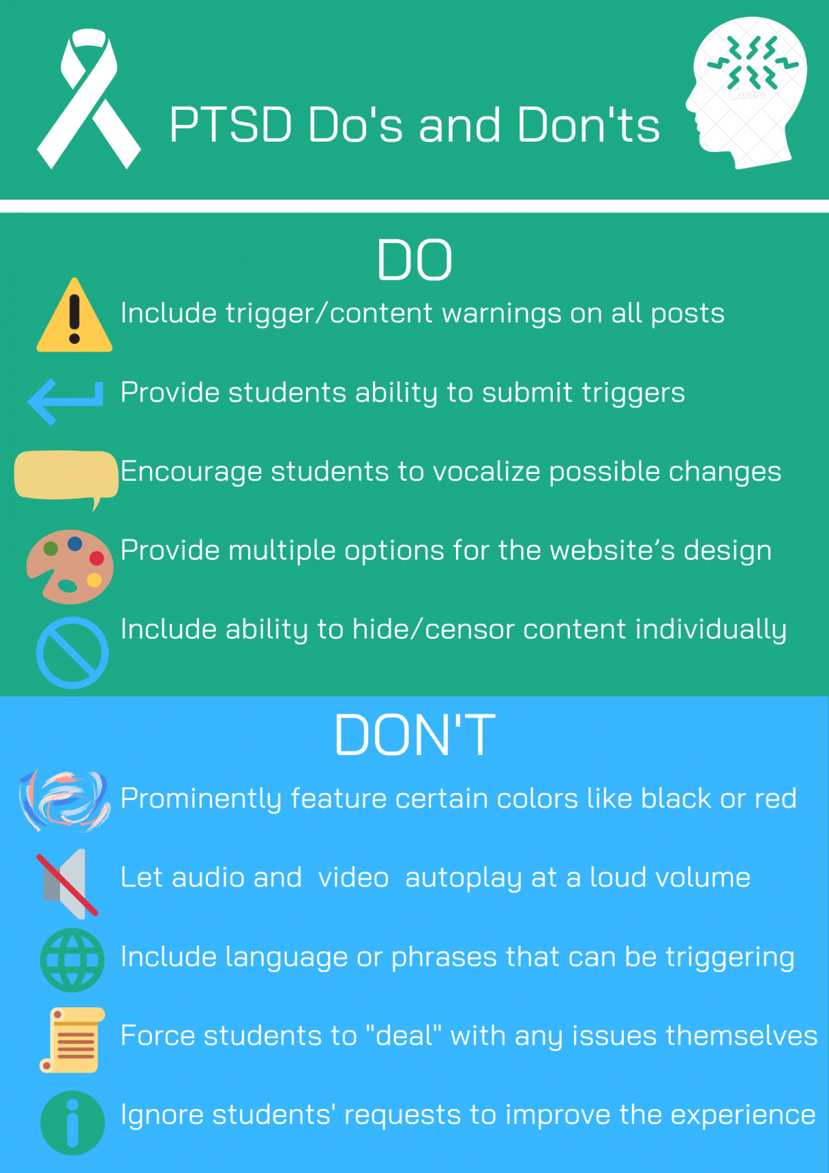
For my poster, I decided to target students who are affected by PTSD or PTSD-like symptoms. These students may have had traumatic experiences in their past, and likely still have pain associated with those events. Students with triggers and sensitivities to certain stimuli will also benefit from this website design. In addition, regardless of mental health status, many people have fears and phobias that may cause a negative reaction upon experiencing.  According to Lisbeth Thorlacius’s article on web design, “there is always visual communication on a Web site, whether the use of visual effects is deliberate or not” (2007, p. 63). As such, this website design will give students a variety of options to make their experience as comfortable as possible.

For my do’s, I decided to focus on the ability to make the user’s experience customizable. I want the students to be able to encourage change, as well as provide multiple design options. The ability to hide content will also be very beneficial. Allowing students to submit triggers, that will then be featured as content warnings before posts, will prevent students from reliving any possible trauma. For my don’ts, I outline key mistakes that many website designers make. Certain colors, such as black or red, are common triggers for folks with PTSD. They should be avoided, as such videos that play at a loud volume. Certain language and phrases can be triggering, so posts should be reviewed before they are greenlit. The designers should not force students to accept the negative consequences of their posts, as that directly alienates this group of students. Ignoring these same students’ requests would also cause unnecessary tension. According to Karwai Pun’s post on gov.uk, “it’s always worth testing your designs with users to find the right balance, making compromises that best suit the users’ needs” (2016). While all students cannot have their needs met, our goal should be to reach the most students possible.

The visual design of my poster is quite simple, and this is purposeful. The top header is the color of the PTSD awareness ribbon, with a white ribbon to represent it. The symbol on the right is another PTSD awareness symbol. The line below it is meant to separate the header from the first title. Including “bullet” points could be triggering, so I decided to use symbols to represent each statement instead. The green and blue are meant to be calming colors. The colors of the information, enter, censor and world symbols were originally black, but I decided to switch the colors to fit the design motif (and prevent any possible triggers). The unique and simple design of the poster should not invoke any past trauma, but if it did such I would edit it accordingly.

Sources:

Pun, Karwai. “Dos and Don’ts on Designing for Accessibility.” Accessibility in Government, 2 Sept. 2016, accessibility.blog.gov.uk/2016/09/02/dos-and-donts-on-designing-for-accessibility/.
Thorlacius, Lisbeth. “The Role of Aesthetics in Web Design.” Nordicom Review, vol. 28, no. 1, Jan. 2007, pp. 63–76., doi:10.1515/nor-2017-0201.


Empathy Mapping: First Step Summary

UX designers have a tough task at hand, as they must understand both their users and their colleagues. To more easily understand these groups of people, empathy maps are used. Empathy maps are divided into four different sections: says, thinks, does, feels. While traditionally it is only applied to a user, we can also include designers for these empathy maps. Empathy maps visualize each of their respective sections. Says includes the words spoken by the user. Thinks includes aspects that users are definitely aware of, but too polite to speak out about. Does includes actions performed by the user, and feels include the user’s emotions. While these categories may seem to occasionally blend together, they aren’t meant to be perfect.

Empathy maps can be about one specific user, or a group of users. These group maps are formed from surveys and other types of data. Empathy maps, if implemented early on, can provide crucial data for the design process. By keeping the words, thoughts, actions and emotions of the user in mind when making choices, there will no doubt be some sense of consistency with your design. Not only that, but these descriptors create a goal and image to keep in mind when making important design decisions.


Source:

Gibbons, Sarah. “Empathy Mapping: The First Step in Design Thinking.” Nielsen Norman Group, 14 Jan. 2018, www.nngroup.com/articles/empathy-mapping/.

JITP Nonverbal Learning in the Classroom

This article detailed the experiences of Leeann Hunter, a professor at Washington State University. She studied the role that nonverbal learning can play in a classroom, and how students have been conditioned to not engage in class because of a variety of societal factors. In modern day, many students stare at their laptop screens instead of focusing on the professor during class. At the same time, other students stare blankly at the professor, and do not engage with the lesson. Hunter goes into depth at her own experience with a nonverbal lesson.
To be more specific, this nonverbal communication is purely with our bodies. ASL would fall under this type of communication, but not signed letters. You would be surprised how intuitively people can use gestures and familiar situations to convey an idea. Hunter incorporated many nonverbal lessons into her curriculum. Students would exchange gifts and photographs in one lesson.
Her students also adapted nonverbal practices into their projects. For one advertisement, a student incorporated facial expressions in place of text. This helped with the natural flow of the advertisement’s comedy. In another lesson, Hunter compared a computer to our lives as people. While computers are limited to the expression of the 1’s and 0’s, people are not limited to this same plane. Instead, we exist between the 1’s 0’s. Students learn how to appreciate human difference when we engage with each other in the same classroom.
Hunter, Leeann. “The Embodied Classroom: Deaf Gain in Multimodal Composition and Digital Studies.” The Journal of Interactive Technology and Pedagogy, Washington State University, 17 Dec. 2015, jitp.commons.gc.cuny.edu/the-embodied-classroom-deaf-gain-in-multimodal-composition-and-digital-studies/.

Task Analysis in the Greenspring Review (UI/UX Article)

UI defines anything that a user may interact with on a digital screen. UI has been around since the 1980’s, and has since become more complex in nature. Actions that previously required manual inputs can now be done at the click of a button. UI evolved to fit many different types of technologies: phones, watches, tablets and more. UX, which stands for user experience, encompasses all aspects of a product. According to Peter Moreville, your product should be usable, useful, findable, credible, desirable, accessible and valuable.

With this in mind, The Greenspring Review should consider Task Analysis in their structure. Task analysis helps teams discover how they arrived at a certain conclusion. This is extremely useful, as it can make other aspects a lot more clear. It can also allow alternatives to get more room to shine, as this sort of basic questioning is often forgone. There are many different ways to perform Task Analysis, but they accomplish the same goals. Task Analyses cover every option available to you, discover how events occur, sees if desired outcome is more easily achievable and look at alternative goals.

There are two parts of Task Analysis that The Greenspring Review should look: desired and expected outcome. Expected outcome describes what the user thinks is the likely path, while the desired is the path that they want to use. The Greenspring Review needs to keep this in mind for ease of use. By creating UI and designs that are both desired and expected, The Greenspring Review could create something that is truly intuitive. However, it is important to recognize that a perfect design is usually not possible or feasible. Instead, pick the path that is most functional and fits the site’s design philosophy.

Task Analysis also makes something else clear: what angles/designs/questions will NOT work. While Task Analysis can break down the layers of dilemmas that seem simple on the surface, it can also open doors that have no business being open. Some issues, like figuring out why certain people would prefer certain page orders (alphabetical, by popularity, etc.), are best left unsolved. Not only is the work required significant for such a small issue, but these wants are always subject to change. The relevance of the change is also noteworthy, as functions that are essentially useless would act as a waste of space. However, useful user research, like a well put together student survey, would help lead The Greenspring Review in the right direction.

Sources:

Tarik, and Rick Dzekman. “Why Most UX Projects Could Use Task Analysis.” Medium, UX Collective, 16 Dec. 2019, uxdesign.cc/most-ux-projects-could-use-task-analysis-7244e8cf9916.

“UI vs. UX: What’s the Difference?” UserTesting Blog, 19 Nov. 2018, www.usertesting.com/blog/ui-vs-ux/.

Paris Review Visual Rhetorical Analysis

https://drive.google.com/file/d/19ji38K0pEGFpB_1gZse65m-GUqwF4Eux/view

For this assignment, I will be analyzing the Paris Review, a literary magazine and website for lovers of fiction, photography and more across the world. In this assignment I will analyzing the Paris Review spatially, gesturally, aurally, visually and linguistically. The Paris Review’s combined efforts as a multi-modal publication, as well as their long history, has allowed them to cultivate an incredible resource for writers and readers alike. However, the website itself is not the greatest user experience.

The Paris Review literary magazine got their start in 1953. The literary magazine is still published to this day, and shares content with the website. The website began in 1996 and has been publishing poetry and interviews since. These articles are not short news articles: they are developed stories and reviews that will take time to read. As such, most readers are likely on their laptops instead of their phones. The Paris Review appeals to people who appreciate many different types of literary pieces. Book reviews, poetry and author interviews can be found all over the site.

Anyone who loves reading and writing has a place on this website. The demographic age appears to be in the 18-40 range, as literary magazines are popular with younger people. Rather than favor any specific gender, the website could be appealing to anybody. The website describes itself as a place for writers to publish and read good writing (no matter how varied that definition of ‘good’ is, as in all different types of writing) Articles written by the publication itself & other writers are found on the site. There is also a podcast. The website creates a sort of hub for creative writing ventures.

The Paris Review has a very limited, but appealing, use of colors. It’s mainly black and white, with a very interesting pink motif. Things that are pink include the current issue number, the subscribe button, newsletter sign-up, events, store and the highlighted article on the front page. The only issue is the prominence of white space on the website. It doesn’t take away from the design, but it is very plain overall. After some research, I found that the Paris Review’s font is Garamond Premier Pro. This is a professional font, which fits the “regal” theme that the publication gives off. It is not distracting and is also very visually pleasing.

The Paris Review includes all sorts of media. Photography, videos and audio clips can be found on the site’s articles. However, each of these forms of media are also given their own special treatment. Photographers are often given their own articles to display their pieces. Book authors, play writers and the website’s founder, George Plimpton, have their own videos under the “Video” section. Multiple podcasts also exist on the website! A series of interviews titled “92Y Interviews”, and 2 seasons of a podcast on all sorts of important literary information and discussion.

While the website itself is functional, there are a few key issues with it. For one, as you can see on the podcast page, the sidebar seems to not work properly when scrolling. On the front page the suggested articles disappear quite quickly, leaving white space for about 90% of the page. However, other areas of the site are well designed, such as the search function for the sites large collection of fiction. Interviews, poetry, letters, essays, art and photography are also featured and fully searchable. The website spans nearly any genre, as it includes most creative writing formats. Most pieces of writing featured by themselves on the website are fiction. The nonfiction pieces are usually interviews and articles about writers.

While many aspects of the site are appealing, it has one fatal flaw: it is not free! To read articles in full, a subscription is required. Other websites with subscriptions at least allow for one or two free articles. While the videos and podcast are free to consume, all pieces of writing are only partially readable. The only exception to this I could find were published essasys. A subscription is required to read any full article, poem or fictional piece. Considering the literary magazine and the website do not share the same exact content, I find this decision to be problematic. I don’t fault the people at the Paris Review, but other websites are able to provide a ton more information for free.

While the Paris Review is a solid website, it certainly has its flaws. I can appreciate the large collection of literary and photographical content that the site provides. However, the actual design of the site itself is far too simplistic. Also, a lot more could have been done to improve the user experience. The lack of features and available content without a subscription turns a great site into a lackluster one.


Sources:

Ball, Cheryl E., et al. Writer/Designer: A Guide to Making Multimodal Projects. Second Edition. Bedford/St. Martin’s, 2018. Print.

The Paris Review. https://www.theparisreview.org/. Accessed 14 Feb. 2020.

Quora. https://www.quora.com/What-font-does-the-Paris-Review-use. Accessed 14 Feb. 2020.
Stevenson Villager Rhetorical Analysis

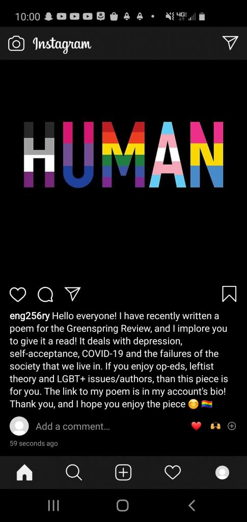
Thesis: The Villager is Stevenson University’s student-run paper, with articles from journalism students and people in the Stevenson community. Articles are published on Stevenson’s staff, sports and on-campus events. Feature articles are also written on a wide range of people involved with Stevenson University. While the website hosts well-written content, it lacks the features and visual design that many online student papers have.

Visual: Although the website is faithful to the Stevenson colors, it’s blandness cannot be understated. A green logo, black text and white background is about as plain as you can get. They could have opted for a green background with complimentary colors instead. The large header images also look jarring on the white background. While the design is by no means poor, it does not fully represent what the villager is about. The professional design would better suit a hard news outlet, or a blog on a more sensitive topic. The Villager can have a colorful design while maintaining it’s reputation of quality journalism. However, the current design is not obstructive in any way. It gets the job done, and is easy to read.

Linguistic: The articles on The Villager are written and edited by students who are proficient in AP Style. Many of these students have taken a multitude of writing classes, including previous Journalism classes. These students work for weeks on single articles, and have met with multiple sources. The topics are also chosen by the editors, who have experience writing for The Villager. I bring up all this information to show that the content for The Villager is excellent in multiple ways. It is well-researched, edited heavily and coherent with what Stevens0n represents: integrity. While articles on student events and athletic performances are mostly hard news, feature articles allow Stevenson students to express their writing skills.

Aural: The Villager lacks embedded videos, and as such has no sound. Although articles may redirect you to pages/videos with sound (with many of them being Stevenson affiliated websites), the site itself does not include any sound.

Spatial: The arrangement of The Villager is another very competent area of the site. The search and tagging functions on the website are very accurate. Everyone who has written for The Villager has a writer page, which is made easier to navigate thanks to the search and tagging functions. While the site may not be the prettiest, it is a very pleasant navigating it. However, it does include a lot of unnecessary space. Many of the heading links (home, about, etc.) could be included under one central link, instead of many individual ones. These categories are then repeated on the side of the page. There are multiple search bars on the home page, and the social media sharing function is limited to Twitter and Facebook. Being able to sort pages by category is a useful feature, as well as the ‘Recent Posts’ section.

Gestural: The Villager website is not a very interactive experience. The lack of embedded videos and audio has an impact on this. However, even more apparent is the total lack of a comment section! A curated comment section for Stevenson students and staff could be a hub for good discussion. Additionally, the ability to change the website’s design yourself with preset designs would allow the site to appeal to more people. Another useful feature would be the ability to share with other social media websites.

Conclusion: The Villager is a well-organized paper with a great group of Journalism students. The website’s design is simple, which is not inherently a bad thing. However, it would certainly benefit from a splash of color. Additional features that are included on other online news sites would greatly enhance the quality of the user experience.