GSR Social Media

The platform that I chose to use was Instagram.  Instagram is a great option because it combines both images and text which can get the interest of different people.  Personally, I am on the platform a lot and know that is very popular for college students.  With the target audience of the Green Spring Review being current students, prospective students, and parents, I think that Instagram is the best way to reach the current and prospective students.  Not only can the pieces be viewed on the GSR Instagram, people can link it to their Instagram stories of the piece which can get more people to view it.

GSR

Dear self,

This sucks.  Everything you knew as normal got taken away in second.  But, maybe it was for the better.  

As much has you hate school, you miss sitting in class and hearing a professor go on and on for 75 minutes.  As much as you love going to lacrosse, you miss the run test.  

Take this time to work on you.  Find new things that make you happy.  Read a book, finish a puzzle, play board games with family, write in a journal, do a face mask, or take a bath.

Enjoy the little things in life, because in the end, you could have it much worse.

Think of the people who are fighting for their lives.  Think of the people who are fighting for other people’s lives.  Thank the people who are working tireless, around the clock to slow this down.  

Because in the end, you wake up every morning in a bed, with a roof over your head, and are healthy.

So yes, it sucks.  But maybe, just maybe, it is for the better. 

Style Sheet Reflection

I do not have any previous experience making edits from a style sheet or with Chicago style, so this exercise was fairly hard and quite overwhelming.  I began the exercise by reading over the article and making any changes that stood out as obvious.  I then went through and made sure that headers and in-text citations looked correct.  Overall, i thought that it was difficult to read through the pages and not be able to stylistically edit.  For example, there were so many run on sentences that could not be changed and made it really, really, really difficult to get through.  Also, while I know that the editor can not pick what article they want to look over, this was very hard to get through reading as it is not something that has much interest to me.

I think that the style sheet is a very useful tool to be applied when the person making corrections is familiar and fully nows that is to be done.  Over time it seems that it would get easier and shows that every piece of writing needs editing.

Immersive Pedagogy_Frye

HTML Lessons

https://docs.google.com/document/d/1Apyq_ozR0hI4nBBLu8xziTzBFaWb-f5aIuqc-T87n8U/edit?usp=sharing

Previously, I have only coded once for a sample project in another class.   Being able to use this site was greatly helpful because it showed you how to complete certain tasks, and then allowed you room to practice it and see how the code actually worked.  Overall, it was not that difficult to get the hang of, and with more practice it seems to get much easier.

Poster Assignment

The audience that I focused my poster on is those who struggle with ADHD.  According to Robert Weis, “approximately 5% of postsecondary students have ADHD and experience academic and/or social-emotional problems because of it.  Although I chose to focus on students with ADHD; this poser could also be applied to parents, staff, faculty or perspective students who struggle with ADHD and view the Greenspring Review.

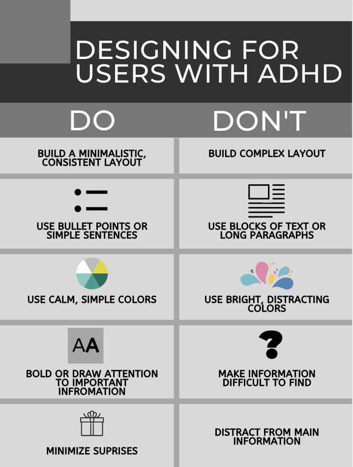
The do’s and don’ts of this poster are things that make it easier for the user(s).  Keeping a minimalistic, consistent layout as well as bolding or drawing attention to important information reduces confusion and helps users find information quickly.  By using bullet points or simple sentences, the designers are keeping the attention of the audience for much longer rather than distracting them with other information.  Using calm, simple colors rather than bright, distracting colors avoids unnecessary attention-grabbing features.  Finally, minimizing surprises avoids distractions from the main information on the page.  Loran McKnight noted, “a designer who is sensitive to usability issues should be capable for designing a product that is suitable for both ADHD and non-ADHD children”.  While following these do’s and don’ts, users with ADHD will have more success viewing the Greenspring Review, they also apply to the everyday user that may not suffer with ADHD.

I tried to create my poster so that it followed the do’s and don’ts presented in the poster.  I used simple colors and short, simple sentences to keep the viewer from getting distracted around the page.  By keeping the layout minimalistic and consistent, any viewer can retrieve any information that they wish.  Overall, creating a simply designed poster, a user with or without ADHD could successful look at the information that could be applied to the redesign of the Greenspring Review.

Works Cited:

Ball, Cheryl E., et al. Writer/Designer: a Guide to Making Multimodal Projects. Bedford/St. Martins, 2018.

McKnight, Loran. “Designing
 for Children
 with ADHD: The Search for Guidelines for Non-Experts User Experience Magazine.” User Experience Magazine, Mar. 2011, uxpamagazine.org/designing_children_adhd/.

Weis, Robert1, et al. “Assessing and Overcoming the Functional Impact of ADHD in College Students: Evidence-Based Disability Determination and Accommodation Decision-Making.” Journal of Postsecondary Education & Disability, vol. 32, no. 3, Fall 2019, pp. 279–295. EBSCOhost, search.ebscohost.com/login.aspx?direct=true&db=eue&AN=140391290&site=eds-live&scope=site.

Usability Article Summary

In this article, Jakob Nielson describes how developers should pay attention do what users do on their site, rather than what they say.  In the past, most projects were unsuccessful due to the complexity of a website when all people wanted was simplicity.  Now, public websites are focusing on making it easy for customers to do business; and intranets are focusing on improving employee productivity.  Now, the new problem is getting usability right.  Nielson says to discover which design works best, watch users as they engage with the interface.  Watch what the users actually do, rather than what they say they do or what they may do in the future.  Only after people have engaged with a design should one collect data from users.  Nielson and Jonathan Levy found that there was a 0.44 correlation between the user’s measured performance and their stated preference.  In collecting this data, the group typically bend the truth to be what they think the designer wants to hear.  This is why it is so important to pay attention to what they are actually engaging with in the design rather than simply collecting data.


Nielson, Jakob. “First Rule of Usability? Don’t Listen to Users.” Nielsen Norman Group, 4 Aug. 2001, www.nngroup.com/articles/first-rule-of-usability-dont-listen-to-users/.

Accessibility Article Summary

This article explains how online students with disabilities can have issues of accessibility in higher education.  Open University Australia is an organization of seven universities and fifteen institutions teaching higher education to students fully online across undergraduate and postgraduate programs.  Students are given the opportunity to disclose any disabilities to OUA during enrollment; however due to privacy legislation, OUA does not pass the information on to the institution where the student is studying.  At OUA, an emailed survey was conducted with students who had registered for support.  The survey examined two areas; how accessible the online platforms used for teaching were, and what motivated the students to disclose their disability or not.  The study found that 46.3% of OUA students responded as to having a mental illness.

The article then examines the advantages of eLearning and those with a disability.  Kent states that the biggest advantage is that online information can be made available in a variety of formats that best suit the person trying to access it.  Information can be formatted visually through images or text, audio as spoken words or sound, or touch through wearable technology.  Kent mentions that design can make or break student accessibility with eLearning.

Mike, Kent. “Disability, Mental Illness, and ELearning: Invisible Behind the Screen?” The Journal of Interactive Technology and Pedagogy, 17 Dec. 2015, jitp.commons.gc.cuny.edu/disability-mental-illness-and-elearning-invisible-behind-the-screen/.

Suggestions for GSR

Morgan Bateman, Jacob Tatum

  1. Take away the books as the background.  It is very distracting and hurts the eyes.
  2. Event countdown widget needs to stand out more.
  3. Needs to be a line under the navigation bar to have its own section.
  4. On the issues page, they need to add pictures for the spring and fall pictures.
  5. On the submission and guidelines page, they need to add an easy submission section like team 2’s (box’s to add information).
  6. Contact info should be at the bottom of the page.
  7. Screen navigation from team 2 into this page.

Greenspring Redesign

Team 1: https://thegreenspringreview.art.blog/

Effective elements:

  • Logo is fresh and welcoming

o   Simple but still shows the information that it needs to

  • Search bar where it is easy to find
  • The event countdown is unique but still creates an interactive element
  • The issues covers (short stories) is really unique with the background being an image and the link to that section open up
  • I like how you can sign up for email updates

 Improvements:

  •  In the submission section, wish that there was a way to actually submit online rather than through email
  • Add picture to the issues section (spring 2020, fall 2020) like how the short stories section is
  • The background with the bookshelves is distracting
  • The light gray “welcome” section is a little hard to read (may just be my eyes)
  • Homepage could use a link to social media


Team 2: https://jennaaye.wordpress.com/

Effective elements:

  • I do like the way that the header takes up most of the homepage when you open it
  •  Really enjoy the way the about page has quotes with the editors
  • The issues section has a dropdown to go directly to the poem/creative writing/etc. Page
    •  Creates ease to find what one is looking for
  • The font is different yet creates an professional feel
  • The bar does not disappear as you scroll down so you can still easily navigate is you move around on the page

Improvements:

  • Be able to link directly to the article/poem whatever is featured on the homepage
  • When you go to another page (ex. About) the header gets cropped and all one can see is “review” so find a way to have the full header be shown
  • Wish that there was a search bar somewhere on near the top of each page
  • Not sure of the connection of the flower to school
  • Use a little more color overall bland and boring


Team 3:https://greenspringreview.art.blog/

Effective elements:

  •     Search bar is easy to find and use
  •     Link to social media where it is easy to see the latest post without actually having to go to the separate site
  •     Easier submission area
  •     Overall the site simple and easy to navigate
  •     Audience has the ability to share certain things to their own social media 

Improvements:

  • Header/Logo is not eye catching or really show/tell anything about Stevenson
  • Remove the smiley faces on the about page
  • Have the jobs and the names align on the about page
  • The background is taking away from the content

UX/UI article summary

Tyrkiel, Kalina. “7 Psychological Principles for Better UX.” LiveSession, 11 Dec. 2019,livesession.io/blog/7-psychological-principles-for-better-ux/.


Tyrkiel states that “UX and psychology go hand in hand”.  Throughout the article she explains how seven psychological principles relate to UX.  These seven principles include: Jakob’s law, the principle of least effort, law of proximity, law of figure/ground, law of similarity, hick’s law and serial position effect.  Jakob’s law, explains that if a site is laid out in similar ways to other sites users know, they won’t need to learn how to use it. The second principle, the principle of least effort, states that people want to do as little work as possible to find something on a website.  Making sure that customers can achieve their goal as soon as possible is important for creating a good UX. The law of proximity explains that elements located close to each other are perceived as one group. The law of figure/ground states that an element can be perceived as a figure or as a background.  This UX principle is applicable through contrast, brightness, or colors. The law of similarity states that if multiple elements are similar, they are often seen as parts of the same group. Hick’s Law simple demonstrates that less is more. Grouping things into categories makes it easier for the user to make a choice as to what they want to find.  Finally, the serial position effect illustrates how people tent to remember the first and last items in a series. This is important for UX because you need to grab the user’s attention at both the beginning and end of the page. Overall, these seven psychological principles can be applied to the greenspring redesign, so that the user experience improves.  I believe that the most important of these seven principles to apply to Greenspring is Jakob’s Law and principle of least effort. Most if not all college students, the most important audience of the Greenspring review, want to find information quickly and with as little effort as possible.