Social Media Remix Assignment

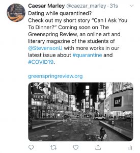
Above is my Tweet that I decided to go with. Here, you can see my line of interest followed by a brief description of what you, as a viewer, can expect to view prior to clicking on it, without giving too much away.

1. Choose your platform, and explain why you think this platform would be effective for the GSR and your submission. Consider choosing the platform that you are familiar with, but that will also address a specific audience of the Greenspring Review. Who might be interested in reading your piece, and what platforms do they interact with most?

For this assignment, I have chosen twitter. I am familiar with Twitter and find it to be much easier to post than Twitter. I feel that Twitter can spread information better than other outlets such as instagram as followers can “retweet” information to allow for their followers on their accounts to see the post. Students from Stevenson who are impacted by COVID-19 can view this story as a romantic tale that exists in the darkness of a dreary world.

2. Craft a pitch that fits the constraints of the platform. Consider the common conventions for that site. Will you use text as a caption or an overlay? Do you have a character or space limit? Can you manipulate the font or color of the text? Should you include emojis and punctuation?

Twitter has a character limit on their posts, but they have a multitude of options to choose from to accessorize your posts such as images, GIFs, links, emojis, and hashtags. This allows for more people to see your tweets and find a relatable subject to the tweet. I intended on using a tweet as a headline with a brief description of what the post will entail and leave the link present for students to view the selected works directly and then can view more content should they choose to do so.

3. Craft media for your post. Should you use an image? A video? A screenshot? A GIF? What works best for this platform?

For my media post, I would use an image of NYC during quarantine as it relates to the theme of the story. Providing a visual element to go along with the headline can let the viewer’s mind wander in wondering what the selected work may be about. All this gives the viewer least effort to maximize the chances of them selecting the story.

4. Consider when and how often to post. What time of day does your audience use this platform? How can you increase likes and comments? How can you get more views?

Twitter is active in the morning and in the evening hours as most people check their phone for social media either before or after work early in the morning or late at night. That being said, incorporating hashtags as well as tweeting when most people are on will generate interaction with the most through likes and retweets, bringing more traffic to the post. As a page as well, the GSR can use Twitter features such as “pinning” the tweet to the profile page to keep a potential “featured post” option available for headline stories or works.

Can I Ask You For Dinner?

Ring! Ring! Ring! Slap

I still try to maintain a daily routine, even during these hard times of this new coronavirus ordeal. Things have been awfully quiet around the neighborhood, especially here in Brooklyn as many people have fallen ill due to how fast this virus spreads. Hospitals are overcrowded and schools have closed to prevent the spread of this contagion. Even my job has closed down and asked us to start working from home, allowing me to care for my younger brother Terrance, though he’s been driving me crazy as well.


“Why do you still have that loud ass alarm clock going off this early? It’s been two weeks since you stopped working, learn to chill a little bro,” said Terrence as he barges through the door.


“Routines are important to stay in touch with the world,” I replied. “There’s always something to do, can’t just sit around on your ass all day, let’s see what school work you got going on today-”


“N-O-T-H-I-N-G, I’m trying to get my team more wins in this game and-”


“Did you finish your math from yesterday?” I said cutting him off. 


“Yo, you’re not mom or dad Allen,” says Terrence with a little sass in his voice while walking away. “so just chill stop being annoying. You are barely here and just because mom and dad aren’t here doesn’t make you have to ‘step up.’” 


Getting Terrence to buckle down and do his work has been like pulling teeth. Our parents travel often between mission work and business trips, leaving our parents quarantined over in Africa until cases begin to die down enough to allow air travel in their country. We still talk to them, recently just celebrating my 21st birthday over FaceTime while learning about what things needed to be done at our home here in the states. Though schools have been out, I have been trying to express to him how this is a good time to get ahead of everyone else and give yourself an advantage in school. But what 14 year old wants to hear this now, especially in times like these? I have to ease into the routine with him and hope he follows.


I begin getting ready for the day while saying to Terrence, “Alright, first of all, watch your tone. Second, let’s do our morning workout, eat breakfast, and then finish whatever schoolwork you gotta do and I’ll do whatever work that I have to do. Then we can chill the rest of the day. Sound good?”


“I mean, I guess,” says Terrence begrudgingly.


We begin tackling our day with our newfound ‘quarantine exercise regimen’ that we compiled with all the workouts we learned throughout the years, beginning with our legs. Normally, our neighbors wouldn’t fare well with the noticeable banging from our movements on the floor, but given the circumstances, I think they have begun to take a liking to our noise to feel less alone.


Following the workout, we have breakfast while watching Netflix. We have a running tradition of exchanging who gets to select the show to watch. This time, Terrence put on The Office, a show that pretty much anyone can get on board with. As we watch a few episodes, I began to realize that Terrence is starting to get into some of his “work-time” thinking that I’d forget, but I stop the show and get him into his work. 


Though I have work on my own that I have to do, I sneaked outside for a quick smoke on our balcony before I got started, trying to not let Terrence notice my sudden disappearance. While on the balcony, I noticed a woman on a rooftop across the street doing morning stretches. They weren’t ordinary stretches from a power lifter, or athlete, but looked like stretches of a dancer of some sorts. She was bundled up to start, but throughout the routine took off layer after layer until she seems to be doing her routine at full speed, doing angelic jumps and high leg kicks all on a rooftop. She noticed me observing, and gave me a wave. I decided not to stick around much any longer as I felt that I might have been creeping a little bit., I responded with a wave and headed back inside. 


Later throughout the day, I began helping Terrence with his math work. Pre-calculus is an area that I barely remember myself, but luckily Terrence is smart enough where I just am a means for him to make sense of what he is learning. While Terrence is working, I notice that the same woman is outside still, now on a blanket while reading a book. It’s unusual that I have been in this apartment for so long, yet I am just now noticing people being on a rooftop. Terrence notices me giving him a half-ass ear toward his work and says, “Why are you eyeing that lady down?”


“What you mean?” I replied. “Tell me about this matrix-”


“Nah nah, we gonna be locked up in this house for the next few months, so you might as well shoot your shot with her.” 


“How?’ I asked in pure confusion. “We supposed to be social distancing, not knocking on each other’s doors.” 


“You give her your number-”


“T, how?” 


“I can put your number on my drone, fly it over, and you guys can figure it out from there.” Terrence doesn’t have a bad idea quite frankly, and honestly, I have nothing better to do… the worst that can happen is rejection.


Terrence got his drone and I got a sheet of paper to put my phone number and a little message on and tape to the drone. Luckily, she was still on the rooftop and I eagerly ran out hoping she still was at least looking out for me. While all this is being done, Terrence fires up the drone and gets it in the air. 


“Hurry up, I forgot that it is kind of illegal to be flying drones in Brooklyn without a permit, but maybe cops aren’t out trying to arrest us for this right now,” I said with calming humor. 


“I am the pilot, shush,” said Terrence. 


The drone slowly approached her and landed peacefully on her rooftop. She approached the drone and took the paper, looked at it, and gathered her things and went back inside. 


“Well that was embarrassing,” I said. 


“Just wait,” said Terrence. 


I give him the benefit of the doubt as he’s retrieving his drone. Moments later, I get a FaceTime from a random ‘917’ number, a New York number. 


“Hello?’


On the other end answers the woman. “Hey, um, I’m Sandra- from the rooftop,” said Sandra timidly Are you the one to send me this cute little message asking me for a quarantine dinner?”


“Quarantine dinner? Really,” said Terrence in a disgusted tone while eavesdropping. “Smooth.”


“Yo go finish your work, let me handle this,” I barked back. Realizing my tone, I caught him on the way out to thank him for the push to do this. 


After somewhat formally introducing myself, Sandra and I began to talk over our in-house lunches and placed our phones across from each other as we learned more about each other. Even though we were communicating through a phone, we tried to still act as if we were face to face, asking each other about our meals and laughing and making jokes. Sandra and I talk nightly and eat all our meals together now, imagining a life after quarantine together. 


In the darkest of times, a light was able to shine, making this a moment of hope in this time of uncertainty, at least for me…
Style Sheets

https://docs.google.com/document/d/1InZj19lW_6aQzWW05bjOQVUtotMADH0BiusP5yW-tbk/edit?usp=sharing

At first the idea of stylesheets seemed confusing, but as time went on I got used to the idea of what I have to do in terms of this assignment. As middle school education major, I constantly have to grade papers throughout my placements. Being in a Baltimore County public school, I have the opportunity and luxury to work specifically through technology not just with my students and school teacher, but planning with my school mentor. Although I may not have closely analyze this reading as closely as an educator should have in terms of assessment, this exercise allows for me to closely analyze my students writings and to make comments at certain aspects to improve the overall development in their writing structure. This allows for students to be more open in terms of their own assessment of their own writing and for more honest feedback for peer review, allowing for more growth in terms of overall writing skills, as well as another avenue for educators to connect with their students to pinpoint where their writing maybe lacking in structure and development versus where they excel.

HTML Reflection

https://drive.google.com/file/d/1QxLp8Y4bDssRq7Bu4QgUy5x7VWbLq8RT/view?usp=sharing

The lessons in this website were at first confusing to me given that this is entirely a new area for me. Some students that I noticed said that they were familiar with the idea of coding through various cyber security courses or with specifically Python with some math courses. The experience was similar to that of learning a new language with understanding the grammar and formatting of the language, intertwined with some terms of which I am familiar with but not from an HTML perspective. That being said, at first, I did feel overwhelmed with the language and formatting of the coding. Once I began to actually read the lessons and practice through the examples, I was able to slowly catch on. In addition, I may have taken the harder route by typing my reflections up within the code. One of the pages on the site said that the “Notepad” application is a great way to write these codes in an editor and that I could test them via web browser to see the final product; and that is exactly what I did.Though this took more time in the process, this helped me significantly as any errors in the coding that I made reflected in the final outcome via web browser after I saved the note as an .htm file.

I believe this furthered my understanding of this as I was able to start from a blank canvas and type the codes in myself, taking note of obvious commands like <h1> for headers of the sections that I was working on and typing my reflections using the tag <p> with emphasis (<i>, <b>) on various aspects of the code. Though the final product ended up being a different font size toward the end, I took this opportunity to essentially treat notepad like a sketch book and record my observations and reflections within the code itself. One aspect that I made a point to learn myself was tackling the issue of inputting multiple source codes on a specific section of text (like to have a header be centered in blue font at a bigger font than other headers). This allowed me to observe the importance of the spacing within the codes as well as the importance of “;” and the quotes as well to encapsulate the specific area that I wanted to target.  Though I acheived my goal in doing this with one specific area, I noticed that when I began the CSS section, my colors and background color began to become a bit hidden, so I opted to leave the code out of the actual Google doc, however it is in my reflection.

I have learned a great deal of HTML from absolutely no prior knowledge, however, I humbly say that I am not ready to put HTML on my resume just yet. I feel having practice on this and getting certain tags memorized for efficiency purposes must be mastered first prior to me somewhat entering a mode of comfort with the practice of HTML rather than experience. 

Do’s and Don’ts Poster

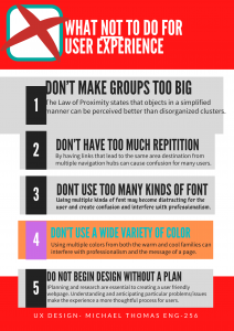
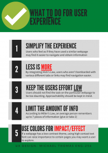
The audience that I am gearing this poster toward is for the student, specifically a student in a STEM related field. Stevenson has driven its university focus toward one that is career-oriented, leaving me to have my suggestions pertaining to neatness and structural order of a particular work. The STEM field tends to lead away from abstract designs or ideas, thus, making the need for the Greenspring Review to be visually pleasing and organized. Many students attend Stevenson for this reason, leaving me to believe the audience to be more willing to adhere to logic and order rather than abstract and artistic. As reflected in my poster, there is a systemic theme occurring throughout, leaving an importance to theme and least effort usability principles all with the goal of catering toward Stevenson students.

For the poster itself, my focus was on alleviating the user experience as much as possible. Having a consistent layout allows the user to be able to use the website faster as it most likely relates to other websites that the user is already familiar with, reinforcing a well known Gesalt psychology found in Jakob’s Law. In terms of the colors and font use, I used red font on key words in the “Do” poster to draw more impact on the specific word. Cool colors are usually read as calming and are used to create less emphasis than warm colors (Ball). Presenting the information in a step-by-step infographic allows for the user to consume the information with more efficiency and less effort, reinforcing Hick’s Law where less is more. These are among many of the items that I feel should be necessary in catering the Greenspring Review to the audience of Stevenson students. (Livesession)

The choices aesthetically for this poster were used to provide information in a way that is appealing to students of this background. We as humans naturally view the colors green and red as stop and go (or good and bad), so by having posters with certain colors provide the reader with a better visual aid for understanding and making certain information “pop.” Having the information in a sequential order (1, 2, 3, 4, 5) provides a clear and concise way of providing ways to improve user experience and things to be cautious of. In the “Do” poster, I maintained a consistent format with a headline and a brief description using some color font to make key aspect hit home. In the “dont” poster however, I made the boxes slightly uneven and used random colors. What this does is create disorganization and if a website’s information is hard to read or doesn’t answer users’ key questions, then users will leave (Usability 101)

7 Psychological Principles for Better UX.” LiveSession, https://livesession.io/blog/7-psychological-principles-for-better-ux. Accessed 18 Feb. 2020.

Ball, Cheryl E., et al. Writer/Designer: A Guide to Making Multimodal Projects. “Chapter 1: What Are Multimodal Projects?” Second Edition. Bedford/St. Martin’s, 2018. Print.

World Leaders in Research-Based User Experience. “Usability 101: Introduction to Usability.” Nielsen Norman Group, www.nngroup.com/articles/usability-101-introduction-to-usability/.

Drag–and–Drop: How to Design for Ease of Use Summary

Laubheimer, Page. “Drag–and–Drop: How to Design for Ease of Use.” Nielsen Norman Group, Nielson Norman Group, 23 Feb. 2020, www.nngroup.com/articles/drag-drop/.

Drag-and-drop is a type manipulation that is used for grouping together, moving around, or resizing objects on a page. Some benefits of this manipulation that it user gestural interaction by making the actions visible, improving the overall usability. A downside to drag-and-drop is that at times, precision and efficiency can be lacking at times. For example, a user can drag and drop an item in the wrong space or lose the item that was dragged due to the distance on the page, making the user have to repeat the action potentially multiple times. In terms of the accessibility of the drag and drop, there are two types of visual icons that show an item’s specific action: grab-handle icons, which provide a target to click then drag and drop, and hover-state cursor changes which shows that clicking an item will allow the user to grab then drag and drop/release the said item. Feedback is an indicator to show that an object was grabbed and/or preview what it will look like once the user drops it, all to minimize mistakes. Features in drag and drop such as magnetism exist by making the drop area of the drag and drop feature a bit bigger, allowing users to “snap” objects into place (Laubheimer).

UX Research Cheat Sheet Summary

Experience, World Leaders in Research-Based User. “UX Research Cheat Sheet.” Nielsen Norman Group, https://www.nngroup.com/articles/ux-research-cheat-sheet/. Accessed 28 Feb. 2020.

This article promotes the importance of research at any point of design process. This article breaks down the design process into four parts: Discover, Explore, Test, and Listen. At each of these parts, there are methods of research to better the user experience at each of these levels of design. During the discover stage, one is attempting to better understand what people need. Here, you could conduct interviews with stakeholders and find strengths and weaknesses of the product. Exploration methods include understanding the problem space and design scope and addressing user needs appropriately. With testing, methods are used for checking designs during development and beyond, to make sure systems work well for the people who use them. Lastly, by listening to our research and design,  we can better understand existing problems and to look for new issues. Each of these parts have a variety of activities to incorporate to better user experience. These methods and activities can improve the user experience of one’s design, ultimately improving the final product.

Disability, Mental Illness, and eLearning Summary

Kane, Laura. “Disability, Mental Illness, and ELearning: Invisible Behind
the Screen?” The Journal of Interactive Technology and Pedagogy, 17 Dec. 2015, https://jitp.commons.gc.cuny.edu/disability-mental-illness-and-elearning-invisible-behind-the-screen/.
The potential for eLearning can pose very interesting outcomes, of which can be positive and negative. This article talks about the support that students with disabilities receive with online classes at universities in Australia. Many students are hesitant to disclose their disabilities which often leads to issues later on in their education. The Open Universities Australia (OUA) conducted a study that had students select 1 of 8 categories that their disability fit in. The study found that students with a disability of mental illness, struggled more in the courses than other disability categories. The study found that online learning was easier for students with disabilities due to the fact that they can chose their learning environment. These disabilities must be taken into account when designing curriculum, especially for these institutions. In addition, the article recognizes that online courses can make it easier for students to finish the course of study. Despite this, however, there is still more things that can be done to improve students ability to finish courses.

UX/UI Experience List Ranking of The Greenspring Review Proposals

Team 1: https://thegreenspringreview.art.blog/

Effective:

  1. The logo with the oak leaf is very creative. It creates a sophisticated professional look but welcoming page for the homepage.
  2. I like the idea of a “featured piece” from the latest issue of the magazine. It creates a constant viewer due the sheer similarity to other websites/magazines.
  3.  The search bar in the right middle of the front end allows for users to quick-search specific topics of which may be to their interest.
  4. The event planner widget that is within the website lets users stay in touch with Stevenson events.
  5. The submission page is concise and informs the user of what goods can and cannot be submitted for posting. It may be a little lengthy, however its purpose is well served.

Needs Improvement:

  1. The book background limits the users understanding of what the Greenspring Review has in terms of its content. Traditional books should be looked away in looking on an online page with content that may entail more than just reading such as videos, art, photography, music, etc.
  2. The logo is excellent, especially the font, but the placement and the window of which the logo is within is a bit small and misplaced. Though expressed in another potential version of the websites, I think that the idea of using this logo in scrollax form would serve the websites best interest in whatever version ends up to be taken.
  3. In terms of the “Issues” tab on the navigation bar, I believe that the semester and year of each issue should be in a drop-down menu of which would make the “issues” page that the drop-down is attached to much more organized.
  4. I think that the social media links are among the most important resources for the website for users to constantly connected to the information in the magazine. I think reconsidering the placement of the social media widget to even making it have its own section in the navigation bar could prove beneficial for users to constantly be reminded about the social media aspect of the blog.
  5. I believe Hick’s Law (essentially the phrase “less is more”) should be applied here with the detail to the featured piece. The additional text other than the potential title could create unwanted clutter of which the user may not find as visually pleasing.

Team 2: https://jennaaye.wordpress.com

Effective:

  1. I love the visuals on the home page. The homepage with the header that covers the front image, or the implementation of scrollax is a great means to possibly position featured stories on The Greenspring Review.
  2. Though the header moves from the middle of the page to the top, the fact that the bar doesn’t disappear entirely lets users not have to scroll to the very top of the page.
  3. I like how there is an archives option within the “Issues” tab of which allows the user to access older information.
  4. The approach of the website is logistic. The whole site is the literary magazine and there is no option for Spring 2019 or Fall 2018 and so on. I believe this allows the user easier accessibility to access the contents of the website.
  5. The simple colored background is appealing to the eye, however, it does not distract the user from the contents of the websites. In addition, the submission page is ideal and should be modeled for future sites.

Needs Improvement:

  1. The font is unbearable and inconsistent. The font in the image behind the navigation bar is different from the subtitles of the genres, which is also different from the font in the navigation bar. It takes away from the professionalism of the website.
  2. Though for mobile devices makes the gestural mode of operating this site fairly organized, the single column use of space for the website makes the website feel incomplete in terms of the arrangement for desktop users.
  3. I understand the logo was meant to be ambiguous, however, I think the logo should be reexamined.
  4. There’s not much of a homepage which makes the “issues” tab a bit redundant. By having the categories of the literary site view-able from the homepage, there seems to be no point in redirecting the user through numerous pages. Consider having a featured story followed by other headlines viewed horizontally rather than vertically with other related stories or other important events, postings, media, or Stevenson related news.
  5. Adopt more Stevenson colors. Though the goal is to not feel like a Stevenson website, at the end of the day, this is a Stevenson literary magazine. This should incorporate more darker greens and black coloring (explore using black/white font with the green backing) or maybe even some Maryland colors to give the site a geographic anchor.

Team 3: https://greenspringreview.art.blog/

Effective:

  1. This site does a great job at turning a great deal of information into simple-easy-to-read sections which breaks the information into organized parts on the home page.
  2. The header and the title/logo of the site is centered, instilling a professional look from the start. The dual column view looks good for desktop users and the view for mobile devices is nice as well.
  3. The side navigation bar with the search bar on each page is simple and effective. It provides more options with less effort for the user to search things to search for specific content.
  4. Having the submission box at the top of the submission page is bold but understandable. If The Greenspring Review wants to generate more content off of student work, it would behoove their interests to do this.
  5. I like the idea of the wide image at the header of the page. Though perhaps a different photo, but the reinforcement of the magazine is a nice feature.

Need Improvement:

  1. The font of “The Greenspring Review” looks like little attention was focused on it. Either a traditional-style or modern-style bold font with accents of Stevenson colors (or Stevenson literary magazine colors) would look a bit better.
  2. Having the classic “share this” section for the Facebook, Twitter, and Instagram accounts seems slightly dated and not with the times anymore. Most websites incorporate that information either at the very top of the page in the corner as a simple hyperlink. This may be a beneficial option for the Greenspring Review to get more student exposure of the content within the site by making it easier to share information.
  3. The website is a little bland in terms of the color and background. The pattern is simple, however there are no accented colors to make essential information pop out for users to be more drawn to the site.
  4. There are limited options in terms of the places to put additional forms of information such as short stories.
  5. The accessibility to older editions is fairly limited as only two semesters are able to be seen.

7 Psychological Principles for Better UX Annotated Summary

“7 Psychological Principles for Better UX.” LiveSession, https://livesession.io/blog/7-psychological-principles-for-better-ux. Accessed 18 Feb. 2020.


Cognitive psychology takes other mental processes into account and researches attention, perception and problem solving. For example, Miller’s Law states that the average person is limited to about 7 pieces of information. This is one of the many important aspects of improving user experience. UX designers may keep that in mind with tab amounts, page links, etc. In addition, Gestalt states that the whole is more than the sum of the parts. This field of psychology explores how people perceive objects, as well as how they simplify complex images, such as the law of proximity. Almost all Gestalt laws can be applied to UX design. With Jakob’s Law, your users already know how to interact with other websites. Why would you ask them to change their habits? If your site works like other sites they know, they won’t need to learn how to use it – they’ll know right away. The principal of least interest is self-explanatory, but requires the users to work with the interfaces with as little effort as possible. Other factors such as the law of similarity, Hick’s Law (less is more) and serial position effect are key in creating an engaging webpage for users to explore. This is all applicable characteristics that I hope to incorporate in our process of redesigning the Greenspring Review.