I chose Instagram because it is a pretty popular platform among Stevenson University students, who represent a majority of the target audience. I believe that students who are dealing with issues during the COVID-19 crisis may enjoy my writing piece, since it is cheerful and includes a lot of adorable moments between a father and his daughter. I think Instagram is the best way to reach these students due to the platform’s popularity. For my pitch, I used text. Although Instagram has a character limit of 2,200 characters, it is still a pretty long. I took advantage of this and included a small part of the intro of my piece in order to entice the readers into reading more. I created an image that was simple but also appealing to the eyes. The colors can be seen as aesthetically pleasing. The bright pink goes hand in hand with the title of my piece. I believe the color also suits the main character, Elizabeth and her personality because she is a young adorable diva. I kept the image simple because I didn’t want to to spoil anything from the piece. I also kept the image simple because I didn’t want to overwhelm anyone with an image that has too many details that may be hard to mentally process. I thought using an image would be a good idea for this platform, since Instagram focuses so much on visuals. I think the best time of the day to post would be around 3pm to 6pm on a weekday. I know those times can be relaxing, especially at 3 pm since there are students who have completed most if not all their classes by that time. I also know that on a Saturday, it would be best to post at 11:00 am because more people are likely to see it during that time. I think the a way to get more likes, comments, and views is to use hashtags. I think you could get your friends and classmates from SU to spread the post. Another way to get more likes, comments, and views is by sharing the post on other networks.
Elizabeth ran around her house, or as she liked to call it, her castle. Weaving in between the different rooms and exploring for hidden treasure, Elizabeth, with an ever-present smile on her face, was set on having a good day. Her laugh echoed through her kingdom as she marched through the halls. Her head tilted proudly upwards like she’d seen all the kings do in her cartoons. She was dressed in her royal attire with her ruby cape and a luxurious golden crown on her head. When she walked into her father’s office, she greeted him as any 6-year-old royal would.
“Bow peasant.” She folded her arms and looked at her father with an unwavering gaze. Her lips pressed together into a thin line as she attempted to stop herself from smiling. Her father turned slightly in his office chair to look at her. He merely raised an eyebrow at her as he paused in his work. His fingers still hovering over the keyboard. His eyes, a similar shade of brown as her own, held a hint of amusement as he noticed the long red blanket and burger king crown she wore.
“Gasp. My own daughter dares speak to her king that way.” He placed a hand on his chest as if she had somehow wounded him, which was ridiculous. If she was going to attack him, she would have gone for the legs.
“You are not the king. I am, and as king, I need a throne.” Her finger pointed towards the office chair as if to provide a clarification for the simple peasant. The office chair was the perfect throne. She loved to spin in it, and even though whenever she sat in it, her feet never touched the ground, she still managed to feel mature and powerful.
“Well,” he said slowly as he rose from her soon to be throne, “then where am I going to sit?”
She shrugged her shoulders as she looked up at him. “The floor.” She walked towards the chair and stopped in front of her father, waiting patiently for him to move.
“There is just one thing though,” he looked thoughtful with one hand stroking his beard like she had seen all those old wizards on TV do before they said something wise, so she paid close attention to what her father had to say next. “In order to gain the throne, you must defeat the tickle monster.” She paled at his words. The dreaded tickle monster was one of her greatest foes. She looked up at her once father and knew what she had to do. She discarded her long ruby cape and made a run for it. Unfortunately for her, her legs were short, and in a few seconds, the tickle monster caught her in its grasp. It was merciless.
She couldn’t stop laughing and there were tears in her eyes. The tickle monster tickled her sides, and she felt like she couldn’t breathe. She heard the demonic laugh of the tickle monster as she was tortured.
“Alright! I have been defeated.” She managed to wheeze out and look up at the tickle monster, her father. Despite her defeat, there was a smile on her face. She took off her crown and placed it on top of her father’s head. His smile was warm and gentle as he bent his head down so she could place the crown on him.
“As king, my first decree,” he picked her up and slowly walked back to his office, “is to share my throne with the princess of this kingdom.” He placed her on the office chair as she beamed at him. He placed the crown she had just given him back on her head and handed back her discarded cape. “Your highness.” He said with a small bow and a smile on his lips. Elizabeth smiled at him from her throne. It was good to be the princess.
I found this assignment to be overwhelming because I have never done anything like it before. I wasn’t used to the guidelines, which caused me to be unsure of myself as I was editing. I was trying not to miss anything. It took some time, but by the end of the article, I got the hang of it.
It took a while to figure some stuff out on the website, but I got the hang of it eventually. For instance, I had a hard time understanding some of the tags, but the practice helped. I also had a hard time memorizing everything such as how to apply certain tags and attributes. It was difficult structuring my time with this project at first, since it was a little overwhelming at first, but I think I was able to handle it pretty well in the end.
I have never had any prior coding experience, so I’m not that confident in my abilities. Although, I know with more time and practice, I will feel more confident in applying these skills to a real website. I wouldn’t put HTML in my resume just yet, since as I said before, I want more practice. Hopefully, I will feel comfortable enough to add HTML to my resume in the near future. I plan to gain more coding experience, since I actually did enjoy learning these skills. Despite the challenges, I found it to be an interesting process.
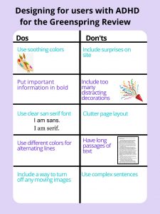
The audience for this poster would be students, faculty, and staff members at Stevenson with ADHD. The dos and don’ts are meant to be utilized by the Greenspring Review website in order to accommodate viewers with ADHD. I chose to address this audience because I believe that there is a vast amount of people who have ADHD within Stevenson, and I wanted to make it easier for them to view the literary magazine.
For my poster, I had included 5 dos and 5 don’ts. My first do addresses the need for soothing colors. Soothing colors helps create a calm environment for people with ADHD (Harris). My second do is to put important information in bold. For people with ADHD, this helps them distinguish that the information presented before them is actually important (Harris). My third do is putting the text in sans serif font. This makes it easier for people with ADHD to read the text, since it will be clearer for them (Harris). My fourth do is to use different colors for alternating lines, since it helps people with ADHD follow the text (Harris). My fifth do is to include a way to turn off any moving images on the website (“Diverse Abilities and Barriers”). This is important because people with ADHD have a hard time concentrating, and moving images may be a hindrance to their experience as a viewer of the website. My first don’t is to avoid surprises. People with ADHD have a harder time focusing on the content of the website, especially if the website displays a sudden surprise, which may be a displeasing experience for the viewer. My second don’t is to avoid too many distracting decorations, since this will make it difficult to view the literary magazine (Harris). This reason is also applicable to my third don’t, which refers to avoiding clutter on the page. My fourth don’t is to avoid having long passages and my fifth don’t is to avoid complex sentences. Reading the website should be enjoyable. My fourth and fifth don’ts are to ensure that people with ADHD have an easier time reading the text and taking the time to actually enjoy the reading instead of struggling with the text.
In his article, Nielson mentions that it is important to pay attention to what users do. I know that users focus on pictures and colors, but for my poster, I had made sure to accommodate users with ADHD. For my poster, I had used a light purple, since it is a soothing color. I only used a few pictures, since I didn’t want it to be distracting for someone with ADHD. I had also used different colors for alternating lines to make it easier for people with ADHD to follow the text. I tried to keep the text simplistic, so people with ADHD would have an easier time reading the content of the poster. According to one of the articles we read in class, it is important to take the time to learn about different disabilities and how we can address these disabilities (“Disability as Insight”). This is something I hoped to establish in my poster.
Works Cited
“Disability as Insight into Social Justice Pedagogy in Technical Communication.” The Journal of Interactive Technology and Pedagogy, jitp.commons.gc.cuny.edu/disability-as-insight-into-social-justice-pedagogy-in-technical-communication/.
Nielson, Jakob. “First Rule of Usability? Don’t Listen to Users.” Nielsen Norman Group, 4 Aug. 2001, www.nngroup.com/articles/first-rule-of-usability-dont-listen-to-users/.
w3c_wai. “Diverse Abilities and Barriers.” Web Accessibility Initiative (WAI), 3 Mar. 2020, www.w3.org/WAI/people-use-web/abilities-barriers/#cognitive.
The article, “Talking with Participants during a Usability Test” by Kara Pernice starts off by mentioning echo, boomerang and Columbo. These words are meant to remind usability-test facilitators of three productive methods for responding to users during usability tests. The echo approach is when facilitators echoes the users’ last phrase or words in an interrogatory tone. The boomerang method allows the facilitator to create a question that turns the users’ previous question back at them. This method doesn’t answer the users’ previous question, but it allows them to think for themselves. The Columbo method causes facilitators to establish tasks and questions in a way that lures users into answering. In other words, the facilitators use state part of a comment or question and allow users to fill in the blanks. It is important for facilitators to know when they should approach a user during a test session. Key events such as the users commenting, asking a question, seeking guidance, or interrupting their own flow are generally when a facilitator should interrupt a test session. A facilitator could also count to ten silently as an extra measure to check if it is an appropriate moment to converse with a user.
World Leaders in Research-Based User Experience. “Talking with Users in a Usability Test.” Nielsen Norman Group, www.nngroup.com/articles/talking-to-users/.
The article I read was “Disability as Insight into Social Justice Pedagogy in Technical Communication. This article focuses on how considering those with disabilities may help provide a broader knowledge of social justice in technical communications research. The article states that social action is a category of technical communications research. Social action takes on various forms such as service learning, community-based research, action/activist research, and civic engagement. Students from Utah University are taught to use social action. These students are given the opportunity to use their skills to benefit people with disabilities. Through this opportunity, technical students are taught to practice social justice even if they are not working for a non-profit organization. By questioning what an effective and ethical technical communicator meant, students began to realize that considering the needs of users with disabilities would help make them better technical writers. Students were taught how exclusionary communication designs could be, and teachers taught them how to revise the designs to be more inclusive. They were even given a project to take something and make it more accessible to those with disabilities. By acknowledging the need for inclusion for those with disabilities in technical communications, students were able to expand their social awareness. The students were even able to discuss technical communication issues relating to minorities as well.
I thought that it was a good idea to have the latest issue on the home page, since that way people who are visiting the website for the first time can jump right into reading the issues.
The header and oak leaf logo are simplistic and visual pleasing to see.
The inclusion of the event countdown is also something that I really enjoyed because it allows the viewers to get more involved.
I like how there is an option on the side to give your email, so you can follow Greenspring Review and receive notifications of new posts by email.
Needs Improvement:
The contact info on the side is something that can be overlooked, which could be a problem for someone who wants to get in touch with the Greenspring Review staff.
The background with the books is distracting and takes away from the content of the page.
I think the video of Greenspring Campus should have been on the Home page, since you could overlook it on the About Us page.
You can’t directly submit your work through the website.
The Issues page seems dull.
Team 2
Effective:
Unlike the previous team, this team had a way to submit the work directly from the website.
The quotes on the About page from the editors allows the viewers to get a chance to glimpse at their personalities. It’s nice to know about the people who work on the literary magazine, especially since the editors are fellow students.
I enjoy that there are images associated with each writing piece, since it becomes more visually appealing.
I’m glad that they included a small portion of the writing underneath each written work because it entices the readers to read more.
I like that there is a drop-down menu for the Issues tab in order to see the different genres. This makes things quicker and more efficient, since now, I don’t have to click on the Issues page in order to look at the different genres that I want to view.
Needs Improvement:
There is no search bar.
The font under the featured issues on the Home page is hard to read. I suggest changing the font color from grey to black. I also suggest making the font bigger.
On the Home page, the heading and the logo take up most of the space. The rest of the Home page is bleak in comparison. There is too much white space.
Even though the logo creates a connection to Steven University, for someone who is visiting the website for the first time, they will have no idea what the logo is supposed to be, since it isn’t that distinguishable.
On the About page, under the picture, there should have been a small description that states each person’s name from left to right.
Team 3
Effective:
I enjoy the Facebook feed on the side. This allows viewers to interact more with Greenspring Review.
I like how the first thing you see on the Home page is what’s new, since it allows viewers to get an idea about the latest activities and events.
I thought the Home page was interactive with the viewer by displaying what’s new, the featured poet, and the featured artist.
The font is easy to read, and the headings aren’t too big or too small in comparison to the text.
I enjoyed the circular pictures of the editors because it seemed more creative and unique.
Needs Improvement:
The side bar was repetitive and some of the categories that went on the side bar could have gone on the top bar such as the what’s new category.
I can’t seem to find the contact information, which means that viewers who want to get into contact with the Greenspring Review wouldn’t know how.
On the Submissions/Guidelines page, I thought that the information about what the Greenspring Review is looking for should come before the part where you submit your work.
Besides the Facebook page, the website has nothing to connect it back to Stevenson University. The color schematic should have been green instead of blue, so that it would at least match the Stevenson’s color scheme.
The header image doesn’t accurately represent Greenspring Review, since Greenspring Review includes more than just pieces of writing.
This article focuses on how adding new features to a product isn’t always a good thing. After a while of continuously adding new features, the product will have a hard time meeting its initial purpose. Users may have a difficult time with the unnecessary features and won’t be able to use the product in an efficient manner. By focusing on its intended purpose and keeping it simplistic, the product is more useful for the user.
From this article, I learned that the function of the product is something that needs to be prioritized. I also learned that additional features may look nicer and seem more appealing, but they can be a hindrance for users and have a negative impact on the overall product.
I intend to use the knowledge that I have acquired in the redesign of the Greenspring Review. I plan to utilize the idea that simplicity is sometimes better. When redesigning the Greenspring Review, I also plan to focus on the functionality of the website instead of adding unnecessary features.
Ploughshares is a literary journal that is run by mostly professionals. According to the “About” page, the literary journal publishes “four times a year” and has a literary blog that “publishes new writing daily”. The “About” page also mentions that Ploughshares has a base in “Emerson College in downtown Boston”. The visual rhetorical analysis that I will conduct demonstrates that Ploughshares has an efficient multimodal organization that is responsible for its success. This analysis also displays how compared to other literary magazines, Ploughshares focuses more on underappreciated writers and presents its website with an air of sophistication.
Ploughshares’ audience consists of Emerson College students, local residents, up-and-coming writers from around the country, fans of literature, and those with academic degrees. The “FAQ” page mentions that Ploughshares is “guest-edited by a prominent writer who explores different literary circles”. By having a recognizable writer edit two of its issues, Ploughshares becomes a more respectable literary journal that may be appealing to those who are more academically inclined. The “FAQ” page also states that the price for subscription is “$35 for one year”. The “Issues: Ploughshares” page displays that a printed issue is “$14.00”, while a digital copy is “$6.99”. This makes it safe to assume that the average viewer would be in the middle class.
In terms of context, Ploughshares sells its issues both in print and digitally. This can be seen on the “Issues: Ploughshares” page. However, as shown by the “Solos: Ploughshares” page, Ploughshares only sells its solos digitally through “Kindle, Nook, iPad, or Kobo”.
The purpose of Ploughshares is to promote up-coming writers, provide a broader spectrum of literature to viewers, and to endorse underappreciated writers. Within the “Emerging Writer’s Contest” page, Ploughshares encourages up-and-coming writers and acknowledges “three genres: fiction, nonfiction, and poetry”. Unlike the Tin House or the Paris Review, Ploughshares has a unique section called Look2 Essays. On the “Look2 Essay” page, it explains that “this series seeks to publish essays about underappreciated and overlooked writers”. The “Look2 Essay” page further comments that its goal is to bring “critical attention to the neglected writer and his or her relevance to a contemporary audience”. This shows that Ploughshares is unique. The literary journal goes beyond just introducing viewers to unheard of writers. Ploughshares also wants to give its viewers the chance to thoroughly contemplate the impact that this unknown writer may have on today’s society, which is something that other literary journals don’t do. This indicates that Ploughshares is a more cultured literary magazine. From what we’ve seen so far, the genre of Ploughshares is a combination of being informative and entertaining.
In Ploughshares, the diction is short and to the point as exhibited in the “Ploughshares” page with a small description underneath each article. The description gives readers the chance to know what they’re about to look at before clicking the article. The small description is a good thing, since a larger description would have caused the audience to lose interest. The main color theme of Ploughshares is this majestic navy-blue. For me, personally, the color gives off the feeling of the changing of seasons, in particularly, from winter to spring. Although navy-blue is the primary color, the different shades of blue help create this effect of seasons changing. With the lighter colors of blue on the “Ploughshares” page, it seems to give off the sense that winter is giving way to spring. The color of the text is light brown, which reminds me of the Earth, creating another connection to spring, a time in which the Earth is vibrant with life. The headings are also a dark navy-blue, and it creates a nice contrast with the light brown text. Despite the nice effect that it creates, the color of the text may be hard to read for some people. However, this can be fixed by making the font a little bigger that way the aesthetic won’t have to be changed. In comparison, on the “Home” page of Tin House, there is no unique color scheme. It is more casual compared to the color palette of Ploughshares. Another comparison could be made with The Paris Review, which uses hot neon pink on its “Sign In” page and throughout the rest of its website. This can be seen as distracting and be considered a bit too much for the eyes. Ploughshares’ navy-blue color adds a sort of elegance to the page that is not seen in the other sites. Going back to Ploughshares’ main page, I noticed that, despite the color, the font is still readable. The font also tends to resemble a newspaper.
For issues and solos, Ploughshares provides images that match the content of the writing without spoiling the piece. For example, on the “George Washington’s Teeth” page, the image of the book can be associated with its title. The purpose of these images is to lure the audience into reading these writing pieces. This means that these images must have been well thought out before being used by the staff. The staff may have picked these images for the writing pieces with a certain mindset. When talking about images on this website, I believe that it must be noted that there are very few images on the “Ploughshares” page. This page consists of an image of the latest issue and a picture of the guest editor. I disagree with the placement of the guest editor’s picture. I believe that the picture should be higher up on the “Ploughshares” page that way people get a chance to see the guest editor, since if the picture is at the bottom of the page, then there is a chance people will overlook the image and fail to give the guest editor the credit they deserve. Despite this minor issue, I do believe that the lack of pictures on the main page isn’t necessarily a bad thing. In fact, the limited number of pictures on the home page, when compared to other literary journals, makes Ploughshares seem more formal.
While looking through the website, I happened to notice that there are no videos. Although a video would seem more appealing to some viewers, I don’t really believe it is required, since there are a ton of images in the “Issues: Ploughshares” and “Solos: Ploughshares” pages. Videos would also hinder Ploughshares refined aesthetic.
For Ploughshares, the informational architecture is nicely developed. The search bar is placed where everyone can see it on the “Ploughshares” page. The tabs are at the top and are easy to use. Each tab has options to choose from, except for the shop and blog tab. This adds an extra layer of organization. For instance, a viewer can just hover their mouse over the solos tab, giving them the option of choosing to look at the issues by genre or by year. The only thing that really bothered me was that in order to go back to the “Ploughshares” page, I had to click the title of the page. I think this can easily be fixed by having a home tab.
The user experience seems to be calming. The website is visually appealing and has a distinct professionalism. The fact that it’s easy to find what you are looking for is another reason why it is so relaxing to use.
While Ploughshares did have some issues, it still managed to be intriguing and efficient. It is also important to point out that the issues that Ploughshares did have were minor and easy to fix. The rest of the website seemed to be well organized and put together in a manner that was endearing to the eyes. Ploughshares’ multimodal organization is functional and effective, which contributes to its success as a literary journal. Ploughshares also stands out from other literary journals with its recognition towards underappreciated writers and its tendency to present itself in a dignified and intellectual manner.
Works Cited
About.” About | Ploughshares, www.pshares.org/about.