Social Media Remix: #Twitter

  1. Choose your platform, and explain why you think this platform would be effective for the GSR and your submission. Consider choosing the platform that you are familiar with, but that will also address a specific audience of the Greenspring Review. Who might be interested in reading your piece, and what platforms do they interact with most?

I choose to use Twitter because Titter is considered and used as a news and advertisement outlet for many adults and young adults. Also, a lot of other social media platforms are used for aesthetics only. For example, Instagram and Tiktok are mainly for people to see what you look like, whereas Twitter is more focused on what you say and promote. I am using Twitter because I know a lot of Stevenson students who use Twitter as their platform to gain information about what is going on at Stevenson through likes, retweets, and reposts.

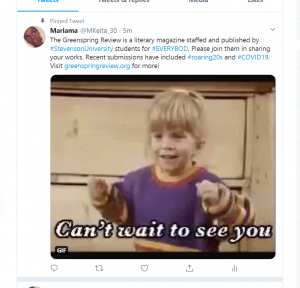
  1. Craft a pitch that fits the constraints of the platform. Consider the common conventions for that site. Will you use text as a caption or an overlay? Do you have a character or space limit? Can you manipulate the font or color of the text? Should you include emojis and punctuation?

Twitter has actually improved the conventions of its site in recent years! There used to be a character limit now there is not one so posts can be as long as you would like them. Also, if you would like to add pictures or not you can manipulate the colors and/ or fonts of your post to make it as original as you would like.

  1. Craft media for your post. Should you use an image? A video? A screenshot? A GIF? What works best for this platform?

Twitter is a platform where a lot of people use humor to get their points across. GIF’s have been very popular recently and continue their popularity because there are always new gifs being made, so I think the use of gif’s works best for this platform.

  1. Consider when and how often to post. What time of day does your audience use this platform? How can you increase likes and comments? How can you get more views?

Like I stated earlier, Twitter is used as a news outlet for many Students so we would need to post often. I know I speak for a lot of students when I say that the moment I wake up and grab my phone the first thing I do is check my social media. For a lot of students that first media outlet is Twitter, so I would start making posts either late at night or earlier in the morning before students have class so that when they do wake up and check their phones GSR is the first thing on their feed. Usually when you start the posts earlier one RT or Like can go a long way because those people that interacted with the post now make it available to their followers who might see the posts later on in the day. Either way, starting the posting early and having people interact with it keeps the post relevant throughout the day, if not longer. If for some reason the post starts to go a little dry or unnoticed Twitter also has a feature where the originator can RT their own posts which will be shown to all of their followers and also brings the posts to the top of your feed where everyone can see it if they go to your page. Another useful tool that Twitter has is a pinned tweet. A pinned tweet is a tweet that a user can use that permanently stays at the top of their feed on their page for as long as they would like. So if someone clicks on your page along with your most recent tweets the first thing users will see is your pinned tweet before they check anything else.


Style Sheet Editing


https://docs.google.com/document/d/1sw1LZkhLj3c89_21mwuuzCt7LD4ZGPQ5/edit#heading=h.gjdgxs

I have zero experience making edits from a style sheet or using Chicago style, so this exercise was very hard and overwhelming. Like I have stated before I am not tech-savvy, so it is all about introductions at this point.  Reading what the assignment was made it seem like it was not that bad, instead it felt pretty self -explanatory. All I had to do was make basic to moderate edits to a word document.  I then went through and made sure that headers and in-text citations looked correct.  I was half right and half wrong. My initial scope was looking through basic typos and grammar mistakes. Then going through again about 3 or 4 times I was making sure the headings and images were okay. Overall, the article was pretty difficult to go through also considering I had no prior knowledge about the topics being discussed, so I had to be careful before I changed certain things like certain words or sentences. I can see how the style sheet is a very useful tool to be applied when the when it comes to editing documents etc. However, this is not something that should be trusted in just anyone. Those with extreme knowledge in editing and technology should be the go to’s when making these corrections. They would need to be very Type A and particular about their work to get the best job done.


GSR Final Submission

COVID-19: Pandemic Haiku

by Mariama Keita

Eat, Sleep, and Homework –

This is now the new normal. 

How long will this last?

https://www.shutterstock.com/image-illustration/coronavirus-asian-flu-ncov-over-earth-1654083868

Outbreak

by Mariama Keita

Empty Roads,                                                                                                             

Cleared Sidewalks,                                                                                  

Silence across the horizon – Is this what our life has become?

It was all good just a week ago,

And now we are confined to our homes,

Hiding from an invisible terrorist that no one knows.


This is now a deadly game

You vs Them vs It

Manhattan, New York, USA – March 28, 2020: No crowds in Times Square after self-quarantine and social distancing was put in place
https://www.shutterstock.com/image-photo/manhattan-new-york-usa-march-28-1686009973

Unless you’re dying or hungry, 

stay put or they’re gonna get you.

Those in the Black and Blue

Even then It still might get you –

A silent killer putting the whole world on pause.

We didn’t pay attention to the beginning,

Now we don’t know if the end is near.

We can’t come out until the coast is clear – 

So, wash your hands because it’s just the first inning. 


Coding Refelection

https://docs.google.com/document/d/14TA6yV4YLkCQPLKfMRwcD4EsvsvsZWDm5Z7L_lK5ykw/edit

This assignment took me a while to do because it was very challenging. This was my first time working with coding, so I had to get the hang of it. When I first looked at the assignments I thought if I pressed the wrong button my computer would explode. It was almost like I was reading one of those extravagant foreign languages. It took me a while to get the hang of it, but as I kept doing the “try it yourself” and the exercises I was getting the hang of it. I even caught myself using a lot of the earlier codes as I was moving on to the different exercises.

As I was getting the hang of codes and HTML, I was getting through assignments much quicker and more efficiently. The majority of the lessons were pretty straight forward, especially in the beginning. They were short and very to the point. For example, the lessons on “Elements”, “Headings”, “Paragraphs”, and “Comments” were very straight forward and easier to navigate and execute. The earlier lessons on “Basics” and “Paragraphs” helped me get the feel of HTML. The elements I learned in these lessons I found myself carrying as I continued the other lessons. My favorite lessons were “Styles” and “Colors.” Even though the codes themselves weren’t that easy to remember and write down, they were definitely fun to play with and experiment with. Especially the “Colors” lesson I just found myself playing with the actual colors and seeing how many colors I could come up with. While those lessons were easy and more entertaining to experiment with the hardest lessons were definitely “CSS” and “Images” the codes were extensive and very particular just to get a small result. It got very confusing the more I continued, and I had to keep going back to the reference page just so I got the codes down the right way.

Overall, the lessons were not insanely difficult to navigate. Once I understood the process more and saw patterns, I felt more and more confident using it. Now I do not see a future for me and HTML, but now I won’t be as scared and intimidated if I were to see it again. I most likely won’t be able to help anyone decode anything serious, but I won’t be completely oblivious and that was a purpose of this assignment. At least now I can say I have some experience in coding!


Poster: Autism Spectrum Do’s & Don’ts

The audience I chose to represent are students who are on the autism spectrum. Autism is very prevalent in a lot of college students, and people are not usually aware of that. When people initially think of autism, they automatically gravitate towards the lower functioning side of the spectrum. Usually, college students that are on the spectrum are on the higher functioning side, so they tend to be forgotten about because no one thinks about their needs. I have a  little sister and friends on this campus that are on the spectrum which is why I wanted to bring this the GSR’s attention.  The list of Do’s and Don’ts are very concrete.

The Do’s and Don’ts of students of the autism spectrum are very broad in the sense that they usually take pieces of concepts from people that suffer from ADHD or anxiety to name a few. Students on the spectrum vary because the spectrum is so extensive certain parts get triggered. One aspect we need to focus on is to use plain English and not use complex words or phrases. We must also refrain from use bright and loud colors and stick to the softer and warmer colors. Color and word use used the wrong way could trigger anxiety in the students. The last few Do’s and Don’ts focus on the simplicity of the site. We must have a simple layout of the content where everything is laid out bulleted or structured because clutter can also trigger panic, uneasiness, and even anxiety. To keep on the simplicity the navigation must be kept simple as well,  nothing tricky to get you from point A to point B.

This poster is plain and simple. I used the soft and plain colors on top of a white background to create an open and inviting feeling (Vasile). The use of the boxes and circles kept the layout appeal yet simple and easy for the eye.  I did not do images for on the list because I did not want it to be overwhelming or have a sense of being trapped Id.  As far as the text goes, I chose to use whites and blacks for words on the poster because it is neutral and remained consistent with the simplicity of the poster.


Kent, Mike. “Disability, Mental Illness, and ELearning: Invisible Behind the Screen?” The Journal of Interactive Technology and Pedagogy, 17 Dec. 2015, jitp.commons.gc.cuny.edu/disability-mental-illness-and-elearning-invisible-behind-the-screen/.

Vasile, Christian. “Learning the Basic Elements and Principles of Graphic Design.” 1stWebDesigner, 4 Mar. 2019, 1stwebdesigner.com/graphic-design-basics-elements/.


Usability Summary

This article explores two concepts that we tend to hear about and experience in the education and work fields. These concepts are workshops and meetings. Usually, workshops and meetings are used in professional settings to get an established topic to a final definitive target. In the article, we learn that “meetings are for sharing information and workshops are for solving a problem or reaching an actionable goal” (Kaplan, Nielsen Norman Group, 2020). It is common that workshops are unsuccessful when the goal is not clear from the beginning and this causes problems within the workshops between the individuals because no one is on the same page. In a workshop, ideas and thoughts are brought together to ultimately create one larger idea related to their mission at hand. The purpose of a workshop is to solve problems within it through actions in the controlled environment. On the other hand,  meetings are more information-based and allow for things to be discussed amongst a group. A “you speak, I listen” environment is often used to convey information more effectively in meetings. Often meetings can be very brief, whereas a workshop is lengthier. The structure of the two is also a little bit different. A workshop often time includes the process of brainstorming, stretching, writing and overall action-based demonstrations to complete a more involved way of solving the problem. Whereas a meeting is more round-table like and discussions are had and often there is a facilitator who is giving a good portion of the information regarding the topic of the meeting.

Kaplan, Kate. “UX Workshops vs. Meetings: What’s the Difference?” Nielsen Norman Group, 16 Feb. 2020, www.nngroup.com/articles/workshops-vs-meetings/.


Access Article Summary

In this article, the author discusses how online students with disabilities could have issues of accessibility even in higher education.  Open University Australia (OUA) is an organization of the seven universities and fifteen institutions teaching higher education to students fully online across undergraduate and postgraduate programs.  Students are given the opportunity upfront to disclose any disabilities to OUA during enrollment. What makes this tricky, however, due to privacy legislation, OUA cannot relay the information on to the institution where the student is studying.  OUA conducted an online survey with students who had registered for support.  The survey examined two areas: how accessible the online platforms used for teaching were, and what motivated the students to disclose their disability or not.  The study found that a little less than half of OUA students responded as to having a mental illness. Then the article then examined the advantages of eLearning and those with a disability.  The author states that the biggest advantage is that online information could be made available in a variety of different formats that best fit the person trying to access it. The information can be formatted visually through images or text, audio as spoken words or sound, or touch through wearable technology.  The author also talks about how that design can make or break student accessibility with eLearning.

Mike, Kent. “Disability, Mental Illness, and ELearning: Invisible Behind the Screen?” The Journal of Interactive Technology and Pedagogy, 17 Dec. 2015, jitp.commons.gc.cuny.edu/disability-mental-illness-and-elearning-invisible-behind-the-screen/.


Greenspring Review Redesign

GSR Team 1: https://thegreenspringreview.art.blog/.

Positives:

  • The search bar is effective, viewable, and handy
  • The Event Countdown
    • The GSR logo with the year it was actually established
    • The link to the current magazine is the first thing you see
    • The menu options are nice and accessible

Needs Improvement:

  • The “library” of books that peak through the sides
  • The layout of the submission guidelines is very confusing
  • “About Us” group picture
  • The “Contact us at this email”
  • There is no social media presence

GSR Team 2: : https://jennaaye.wordpress.com.

Positives:

  • The attractive logo
    • Featured issues that guide you to other submissions
    • “Share” button on the submissions
    • The Submission section
    • The distinct font change that important words are written in like “submit” and “featured issues.”

Needs Improvement:

  • Although the logo is attractive it is not the whole site, so tone it down a bit
  • The navigation of scrolling and the logo disappearing
  • The way the issues were organized
  • The different quotes on the “About Us” page
  • Very bright and kind of bland

GSR Team 3: https://greenspringreview.art.blog/

Positives:

  • The Social Media presence right on the Home Page
  • The cute display for profile pictures; didn’t go for a group picture
  • It is interactive with posts, you can like posts
  • The display of the different issues with pictures
  • The accessibility of search bar

Needs Improvement:

  • The blue font of “The Greenspring Review”
  • The Typewriter image
  • Submission guidelines should be before the actual form
  • The pale colors of the website make it kind of bland
  • There are no names or information about the team members


My favorite website was definitely team 1. It automatically had a certain old school charm to it from the logo to the set up of the site. Once I found out what the oak leaf stood for, I loved that they connected that back to what Stevenson is about. Even though we have this new campus the Greenspring Review still screams “Greenspring” where everything started. Even though the books were the only thing that was throwing off the aesthetic everything else was pretty much on point. They have a few more things to tweak, but I feel moving forward as Stevenson expands our website will be a cute homage to where we came from.


UX Summary

Braga, C. (2020, January 16). Rendering intentionality. Retrieved from https://uxdesign.cc/rendering-intentionality-1a57df40b585

The article starts off with the process of how products begin. They start off tiny and concentrated and are successful with what they end up with. However, as time progresses the developers started to make the app fancier and sophisticated by adding more features. And it worked! They did this for many reasons. 1. users asked for updates and features and the developers and designers, of course, had to follow suit. With that being said, a lot of times most businesses get in touch with the designers and they begin to push for more features because they calculate their performance based on the number of features they produce and not their actual function or relevance. What some businesses don’t realize is that the increase in features comes a decline in the user’s experience on the app. Newer apps, like Tonic, have created a news app that does not even make you do a sign in, which makes it immensely simple and very user-friendly. Being aware of your designs and how it relates to your users is knowing that the job is to solve the needs and wants of the user and not to just keep the developers happy. This means that the designers need to care about the wants and needs of the users.

The information of this article was very informative, which kept on cue with the subject being discussed. In the case of this article, they kept it nice, short, and simple. The way they delivered this information was more important than them trying to be extravagant and be unnecessarily wordy.

I found the information in this article was very useful. Something that I learned from this article is that less is most definitely. The addition of features does not necessarily enhance the site, but in fact, makes the website harder to use and more complicated for users. Simplicity is key if we want to keep the user experience a good one. I will keep this in mind when we redesign the Greenspring review, because not only do we want to keep our current users happy, but add more users due to this redesign.


Guernica Rhetorical Analysis

Guernica Script 

Guernica is a literary magazine where art and politics intersect. The site is comprised of poetry, essays, photographs, and podcasts to name a few, with each continent being well represented. This literary magazine attracts a wide range of individuals from young adults to middle-aged adults who all express interests in global and multi-cultural perspectives and stories. The site’s purpose is to teach, inform, and provide insight into what is going on in the world through the artistic and creative lens. Guernica is an unconventional literary magazine website because at first glance its layout and design are one that resembles a news website. Since it throws in art, news, politics, and entertainment it stands out compared to its other literary counterparts giving it an artistic reality feel like a genre. The site’s use of colors, shapes, and fonts creates more of that rough hard news aestheticwhereas most literary magazines have more of a  softer approach to their sites 

As you see when we get to the site’s Homepage and click around, you can jump around to the different themes of the site. Like we’ll see here “Politics” is a major theme or this site. The layout of these posts is that of a major news site, but if you actually look at the thumbnails you’ll see: poetry, commentary, fiction, essays, and interviews. They are all related to politics, but politics have shown through aartistic lens.  

The next theme we’re going to explore is the “Lives” tab. Notice how the colors on this site are only black and white with a dash of red. The red is only used to highlight where you are on the site and also highlight certain tabs that the creators want you to focus on throughout your navigation. So, as you see I clicked the “Lives” tab and now it’s highlighted in red. Even looking at the font on this sitethe font is plane professional and very easy to read. What makes using this type of font in a literary magazine different from most is that for this type of site, it works. They don’t need the soft pretty font, or big bold font to make it artistic, the art lies within the posts and the whole site’s aesthetic. 

To my surprise, popular and effective literary magazine does not have to be the “pretty in pink” with cursive writing splashed everywhere to be considered a literary magazine. They can be just as great without having to actually look like one. This is the case with Guernica. That is probably why it also attracts a wide range of people because they share that same common ground of world news but make it artistic. 


Works Cited 

“Advertise.” Guernicawww.guernicamag.com/about/advertise/. 


“Lives.”Guernicawww.guernicamag.com/about/advertise/. 

“Politics.”Guernicawww.guernicamag.com/about/advertise/.