Social Media Remix

The platform that I chose to use was Instagram.  I chose Instagram because as a senior in college myself that is the social media platform I use most often.  Based off of my piece my target audience for my social media page would be young adults between the ages of 18-21 and or adults out of college.

Pitch: Not only will students be able to send in their creative pieces to the GSR email to get reviewed and submitted to the site.  Viewers will be able to use their personal Instagram accounts to post small bits and pieces of their work with the hashtag “Near or Far, Post on GSR.”  Using this hashtag will allow for the editors of GSR to see what other people are writing about, and current hot topics to keep up with the younger crowd.

Depending on the day of week depends on when GSR will be posting on their Instagram page.  According to social sauce these are the ideal times to post, which means the times when you get the most views, likes, and shares. Monday-Thursday the best times to post are 9AM-11AM and 7PM-11PM.  As for the weekends, Friday-Sunday, the best times to post are between the times of 8AM-11Am and 4PM-7PM.  Having this background knowledge allows GSR to capitalize on their posting times, to get more “traffic” on their site.

With every post GSR can share their post on their Instagram Story.  The Instagram story gives a brief look at what has been posted and if clicked on can bring Instagrammers straight to the GSR page to see what content has been posted.  Also sharing things on their Instagram stories can make it easy for the viewers to share on their stories which can allow for people to spread the word which can then gain more followers, views, likes, and comments on the GSR page.

COVID-19 took a piece of me

COVID-19 Took a Piece of Me

Confusion.  Traumatized.  Devastation.  Anger.  Depression.  Disbelief.  Lost.  All of these words are things that are constantly running through my head.

Is my family going to be okay?  Will I get to see my friends soon?  Will someone I know get COVID-19 and not survive it?  If I get COIVD-19 will I survive it?  Why my senior year?  Why did lacrosse get taken away from me?  These are all questions that I constantly ask myself.

In the beginning of March, word started to spread about the corona virus entering the United States.  There were mild precautions that people could take to avoid getting it; not sharing drinks, Chapstick, food, constantly washing your hands, keeping a distance from people.  These were all things that could be easily done to flatten the curve.  Little did I know that that wouldn’t be enough.

March 13th, what I thought would be one of the worst days of my life.  The day that I found out my senior season of lacrosse would be put on hold, but to be completely cancelled three days later.

I was sadly mistaken, March 15th is when a part of my died.  To most people that sounds dramatic, but to me something that I had dedicated my life to for 15 years has disappeared into thin air.

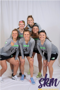
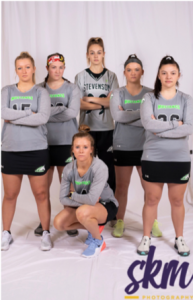
Lacrosse was my outlet in life for everything.  If I was upset, I played lacrosse, happy, played lacrosse, mad, played lacrosse, confused, played lacrosse.  Lacrosse was always the answer to my emotions.  Not only because it was a great way to let out those emotions, but because I also had a team that I could always turn to when I needed them, they were my second family.

Over the years I’ve been on several teams, all great girls, great coaches, and great memories, but nothing will compare to my college team.  This team has been through it, all the good, the bad, the happy, and the sad.  One of the toughest things that this team has been through is the abrupt separation we faced from COVID-19.

We got the news right before we were supposed to leave for spring break, for myself and fellow seniors, this would be the last college

spring break we would have.  This would be the last time that we all got to travel together and make memories that would last a life time.

This was supposed to be the best year of my college career, my senior season of lacrosse, my last year with my roommates that I have been with since freshman year, these were the times to make memories before we all walked across the stage together.  But no, that was not the case anymore.

We were all sent home, for our safety of course, but that’s not how I felt about it.

COVID-19 ruined my life, or a part of it.  For the first two weeks of being home I was constantly upset, found myself crying at random times throughout the day, and isolating myself from my family.

I never thought that this was the way my senior year was going to go, and at first, I refused to accept it, but had a “coming to Jesus” moment and realized that I was being selfish.  I realized that I was lucky to be healthy and alive.  I also realized that there are first responders working hard every day to help flatten the curve, working 12+ hour shifts, and wish they were at home lying in bed like I am doing while writing this paper.

COVID-19 has devastated me to an emotional level that I don’t think I can recover from anytime soon, but there are some people that will sadly die from COVID-19, and that is a tragedy that I hope to never experience.

Although COVID-19 has put in wrench in my senior year of college, it thankfully hasn’t put a wrench in my family or friends, it has allowed me to realize that the “little things” in life are bigger than I think, it has allowed to realize the importance of family time, it has allowed me to take a step back from social media, it has allowed me to self-reflect, it has allowed me to not be selfish.

So, although I would like to curse COVID-19, and I want to go back to my college life, and lacrosse, COIVD has actually done some good.  It has helped replenish the earth and helped bring families and friends closer together.

The feelings I have about school and lacrosse haven’t disappeared, and they won’t go away over night, but there are things in my life now that have taken priority over those things.  I am still able to complete my classes, so I can obtain my degree, I am still able to connect with my friends on FaceTime, and I have more time with my family then I did while I was in school.

As crazy as this sounds, I would like to thank COVID-19.  Thank you for giving things that I started to subconsciously take for granted.  Thank you for helping me bring light to such a dark time.  Thank you COVID-19.

Style Sheet Assignment

https://docs.google.com/document/d/1SZZwvJpYAAeNZtkMd4o79I27HKeD4eLFCDd4Ro5Qojw/edit#

While following a style guide seemed easy at first, it was honestly quite difficult.  I have never used Chicago style before, therefore me not being familiar with it made it difficult to proof read.  Also, I am not the best when it comes to proof reading others peoples papers.  Grammar is not one of my strong suits, making it hard to find errors in this paper.  With any paper it is hard to read through it when there is much interest in the topic.  It was very hard to stay focused reading this paper, which made it even harder to go through and re read it to edit throughout the whole thing.

HTML Lessons

https://drive.google.com/open?id=1F9YqdMtSt9J0IbFa6IJX5NDVEOlRdMHo

I’ve only ever done coding one other time while in college.  I believe it was either my freshman or sophomore year.  With that being said it was not this easy when I first tried it.  being able to see an example and then follow up by myself was very helpful.  I would say throughout the whole thing, the most difficult part was making sure that I had the right letters, numbers, and symbols in the correct spot.  I noticed very quickly that the littlest mistake and make the biggest difference.

Do’s and Don’ts for Greenspring Review

  • The audience
    • The audience of my poster is to the population at Stevenson University that deals with dyslexia, specifically letters. The population includes, but is not limited to, Stevenson students, faculty, staff, and the rest of the surrounding community.
  • The purpose
    • The purpose of this poster is to, not only bring awareness to dyslexia, but to bring specific key elements of the difficulties of dyslexia to the eye of The Greenspring Review. The poster that I created points out five (there are more) points that The Greenspring Review should and should not do when creating their cite, to accommodate to the needs of those with dyslexia.
    • I kept my post very simple, still keeping the Stevenson color scheme, I made sure that my text was easy to read, not using a san serif font. I also made sure use colors that did not complement each other, I did this so that words don’t get lost when reading the poster.  Another main thing that I did was to keep the text concise and straight to the point, trying to eliminate the idea of getting lost or sie tracked when reading.
  • Citations:
    • Ball, Cheryl E., et al. Writer/Designer: a Guide to Making Multimodal Projects. Bedford/St. Martins, 2018.
    • Pun, Karwai. “Dos and Don’ts on Designing for Accessibility.” Accessibility in Government, 2 Sept. 2016, accessibility.blog.gov.uk/2016/09/02/dos-and-donts-on-designing-for-accessibility/.dyslexia finaldyslexia final

dyslexia final

First Rule of Usability? Don’t Listen to Users

In this part of the article, it focuses on the first rule of usability.  It says that the first and most important is to not listen to the users.  At first thought, it seems odd, people that create websites want to have it appealing to their users, therefore their input is important.  However, instead of listening to what they say, and might do.  Focus on what they actually do on the website when navigating, this would include the idea of business intelligence.

To go along with the idea of not listening to the users, there are three sub-points to it.  The first one is watch what the people actually do.  Second, do not believe what people SAY they do, and lastly do not believe what people predict they may do in the future.  In conclusion this basically means, do not react to what the users says, react to what they actually do.

World Leaders in Research-Based User Experience. “First Rule of Usability? Don’t Listen to Users.” Nielsen Norman Group, www.nngroup.com/articles/first-rule-of-usability-dont-listen-to-users/.

Accessibility

In this article, written by Dr. Mike Kent, it discusses how online students with learning disabilities can have potential issues of accessibility in higher education.  Open Universities Australia (OUA) is a consortium of seven Australian universities and brings together 15 different institutions teaching higher education to students, online, across several different fields; graduate and postgraduate levels.  Students at OUA are given the option is disclose that they have a disability as a part of the enrollment process, however this information is not passed to the specific institutions where that student(s) is studying.

A survey was conducted in 2014 to look into the attitudes and conditions of students with disabilities.  The survey focused on two topics, the first focused on accessibility of the different online platforms used for teaching and learning.  The second topic focused on a student’s level of disclosure; how forth coming would the student be with their disability and if an accommodation was made, was it affective.

After the study was conducted, it was found that only 15 percent of students reported having a mental illness.  However, in the study conducted by Dr. Kent, 46.3 percent of students that took the survey, responded that they have a mental illness or other learning disability.

Mike, Kent. “Disability, Mental Illness, and ELearning: Invisible Behind the Screen?” The Journal of Interactive Technology and Pedagogy, 17 Dec. 2015, jitp.commons.gc.cuny.edu/disability-mental-illness-and-elearning-invisible-behind-the-screen/.

GSR Analysis

Oak Tree – https://thegreenspringreview.art.blog/

Positives:

  • Side Widgets: straight and to the point; useful
  • Good use of the gestural mode with social media tags (i.e. Facebook and Twitter)
  • Classic font for The Green Spring Review
  • Like the logo because they use an oak leaf rather than a feather to link back to Stevenson without being aggressive and pushy
  • Solid and consistent color theme throughout the website

Negatives:

  • Main background with the books was distracting
  • The Issues page was boring, could add images for each season (Fall/Spring)
  • The gray sub head color is a little too light, add something to make it more bold
  • The home page is a little boring, I think it needs to be more inviting
  • On the Submissions and Guidelines page, there isn’t a section to submit. The other two sites have an area either above or below the submission/guidelines area where the user can write their:
    • Name
    • Email
    • Subject
    • Message


Old School – https://greenspringreview.art.blog/

Positives:

  • I like how they didn’t use Stevenson colors, they went with a blue and gray theme which is new and refreshing
  • I like their side widget topics
  • The What’s New tab is something different that the other sites didn’t have
  • I like how on the Issues page the Spring and Fall 2019 each have a large image to draw in the user
  • On the Submission and Guidelines page, I like how the first thing you see is the necessary information to post and then below it follows the rules/guidelines

Negatives:

  • Although I like the simplicity, I feel like it lacks originality
  • The website header image is pixilated
  • The typewriter image has an old school feel, but the rest of the website feel more modern
  • I don’t like the About page images in the circle. It was a good idea, but the images need to more uniformed and their job titles need to be centered under their images
  • I feel like the headers and content need to be either both Serif or San Serif. They don’t need to be the exact same, but for consistency purposes


Modern Flower – https://jennaaye.wordpress.com/

Positives:

  • The first thing that stood out was how the webpage moves as the user scrolls; really like that feature
  • Very minimal feature, but I really like the Est. 2016 in the bottom left of the website header
  • I like the typewriter font they used, giving a rustic English feel
  • I like how under each topic under the Issues tab there is a topic name and then an image directly under it
  • I like how it is more image based rather than word based. It is more visually appealing than having to navigate and read a bunch of words

Negatives:

  • I don’t love the image that they chose as the logo, it has a good meaning for interpreting what you want, but I don’t see the relevance
  • Lack of side widgets
  • No search bars
  • The head image is not clear, it’s pixilated
  • The text in the header for the Green Spring Review should be the same font as the rest of the text throughout the website

7 Psychological Principles for Better UX

Kalina. “7 Psychological Principles for Better UX.” LiveSession, livesession.io/blog/7-psychological-principles-for-better-ux/.

In this article, author Kalina Tyrkiel, discusses 7 principles for better UX (user experience).  At the beginning she discusses why psychology and UX go hand in hand; the idea that understanding human behavior is essential, and a lot more promising than taking a shot in the dark.  Tyrkiel also mentions the three types of psychology, behavioral, cognitive, and gestalt.  Behavioral psychology speaks for itself, it focuses on a person’s behaviors, cognitive focuses on a personal mental process, and gestalt refers to the whole is more than the sum of its parts (Max Wertheimer).

Moving into the 7 principles, they are as follows.  Jakob’s Law, Nielsen had this idea that, if users already know how to work websites similar to yours, why change it.  Second is, the principle of least effort, and it means exactly how it sounds like, do as little work as possible to get something done.  Third is, the law of proximity, this means elements located close to each other are perceived as one group.  Fourth principle is law of figure/ground, this deal with the visual appeal of a website; the color, brightness, contrast, etc.  Fifth is the law of similarity, if two things are seen as similar they are seen as parts of the same group.  Second to last is, Hick’s law, and in simplest terms, this means less is more.  Lastly, the seventh principle is, Serial position effect, this effect describes how the user remembers the first and last items that they saw.

These seven principles will be nothing but helpful for the Greenspring Review.  Having these key elements help better understand their audience.  This can go anywhere from the content that they want to see, as well as how easy and simple they want to website to be navigated for optimal usage.

Rhetorical Analysis – The Paris Review

https://drive.google.com/file/d/1BfPmFaFU_P7IK1yitFzQD3CjGOD9f6CQ/view?usp=sharing

The Paris Review 

  • Audience 
    • After looking through the content bar at the top of the website, specifically under The Review, there are several subcategories that cover Issues, Interviews, Fiction, Poetry, Letters & Essays, and Art & Photography.  From this you can see that the main audience that they are trying to reach are people that are really into English. To be more specific, people that are able to look at a photo, a piece of art, or poem, and be able to annotate what the artist/writer was trying to convey through their work.
    • The audience would expect nothing other than a poem, either past or present, as well as a piece of art that speaks to them on a personal level.
  • Purpose 
    • After looking through the Paris Review, I would say that the main purpose is to bring back old works of art, photography, and literature back to the present.  In some cases, these things weren’t appreciated in their time, so bringing them back to life gives them the recognition they deserve. As well as inspiring other artist’s/authors to show their creativity, and for it to be shared amongst others that share similar interests and can enjoy it as much as the people composing it did.
  • Context 
    • Depending on what you choose to look at on the website determines what kind of context you will see.  For example, if you click on the poetry or fiction tab under The Review content, there is a lot of text.  There is a uniform layout to it as well, at the top of the poem is the name of the poem, directly underneath is the name of the author, and then underneath that is the preview of the poem.  If the reader wants to read the whole thing, they can click on the “…” to expand the poem and read it in its entirety.
    • When it comes to Art & Photography, once you click on that tab, there are albums of art and photos by several different artists.  Once you click on the one you would like to further browse through, you can see their portfolio with photos as well as a little back story to follow the meaning of the art or photo.
  • Genre
    • Literary magazine
    • Has now touched into podcasts to talk about art through the podcasts and videos 
    • The podcasts and or videos are going to tell you how to think/feel rather than “what do you think”
    • People who want to be in the know about art, will use this website for their references 
  • Modes
    • Visual 
      • Visually there are a lot of images on this particular website.  Since one of their main pages actually of just art and photography, there are an ample number of images to help catch the audience’s eye.  Underneath the images are explanations as to what they are, what they mean, and if it is a picture of a person, it says who they are and a little backstory on them. 
      • Example: Dave Hardy’s New and Recent Sculpture 
    • Aural
      • When it comes to the aural aspect, there are two sections on the content bar that would fit that mode.  There is a tab for podcasts and a tab for videos. So, for the people that are not so into the idea of having to read and absorb information about a poem or piece of art, there are these options where the audience can listen to a reading of a poem or a discussion about a poem, literature, or art.  There are several different types of podcasts that can be watched, with several episodes to follow up.
    • Linguistic
      • I already covered the linguistics of this whole website in the beginning of the capture, but just for a refresher, it was discussed that there is constant font throughout the whole website, it just varies in color, boldness, and if it italicized or not.  To more specifically touch on the tone of the website, I would say that it is more relaxed and subtle. There is a very calming feel to the website and the art, literature, other things on this website fall into that tone as well.
    • Spatial 
      • When it comes to the spatial aspect I noticed a lot of distracting whire space on The Daily tab.  There is content down the left side of the page, however, on the right side there is a large white space down the whole side which I find to be a little distracting.  I find that my eyes skip lines or words, and it is difficult to find my spot.
    • Gestural 
      • The main gestural content that instantly caught my eye was also in the content bar.  There are two tabs that would be considered gestural, the first being the Donate and the second being Store.  These are two tabs that make the audience react.  
      • There are also side widgets to the right of the page that say “You may also like” which means the website is using Business Intelligence based off of your past clicks to try and find other things on the website that the audience may like.  This would allow for the audience to click and journey further into the website.
    • Affordances
      • Strengths
        • I would say one of the main strengths on the website would be how easy it is to navigate through the website.  There are the main tabs that have sub-tabs to help narrow your search to see specific things on the website.
        • There is also a constant text and color to the website making it easy on the eyes, and not hard to follow.  The consistency makes it very appealing.
      • Weaknesses 
        • From an audience stand point, I would say the one weakness that this website obtains is how much content is actually on the website itself.  Although it is very organized, and everything has its own spot, it was a little overwhelming to see how much content was on one website or even one page
      • Color
        • Just from looking at the home page you can already tell the color palette the website uses is black, white, gray, and a hint of pink that really draws the eye.  Once you scroll to the very bottom of the home page you can see an illustration of the city of Paris, which gives off a very elegant feel.
      • Font 
        • You can see that the font that is used throughout the entire website is a Serif font, very similar to Times New Roman with a more rustic touch to it.  The font stays consistent however, there are times where the titles of articles or blogs are bolded and or italicized.