Social Media Remix Assignment

I choose Twitter because it is, in my opinion, the second commonly used social media platform after Instagram. Most students in college use either Instagram or Twitter as their main source of fast news or information. I think that Twitter is slightly easier to access and set up for all age groups. In particular for reading my piece, college students in general can relate the most to the theme of my poem. 

For Twitter, I will use text as a caption with a character limit of 280 characters. I can manipulate the color of the text directly in the app but would have to use a third-party to change the font. I will use both emojis and punctuation because they are commonly used amoungst my age group and will draw in the audience. Both can make a simple tweet to something students will remember and make them want to take further action. I will also sometimes  use graphics rather than constant text.

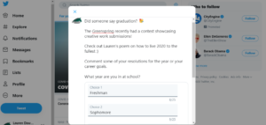
Twitter is a straight forward platform that often contains few words. This is another reason why I choose it. Therefore, each of my posts will not contain many words but will promote the Greenspring Review interactively through polls, images, and links. This is how many authors tend to promote written work through Twitter.

Since posts contain few words, users are often continuously scrolling through Twitter for more content. Therefore, I will post on Twitter often with at least 5 posts a day. My audience uses Twitter during business hours which is between 9 a.m. to 4 p.m. This also relates to business days which are Monday and Thursday, posting sometimes on Fridays. I will increase likes and comments by posting during this timeframe and these days. I will also use hashtags so that users can see my posts even if they do not follow the Greenspring Review account.  I also interact with those who like, retweet, and comment on my posts. Encouraging others to share the account as well as promoting it on other social media platforms will help build the Greenspring Review’s Twitter page.


Style Sheet Exercise

Immersive Pedagogy_Dawkins

I enjoyed this exercise and learned more about citing as a result. It’s interesting to learn more about different editing and citation styles as each one is unique. The exercise was slightly difficult at first for me but once I caught on, I was able to complete it without any problems. Learning how headings are set up and images are referenced reminded me of the previous HTML exercise. Some references in this exercise were similar to when we learned about coding a website and text. The Chicago Manual of Style was not difficult to learn in that most of it guidelines reminded me of previous citation styles I have learned. The Author-Date Style however is different particularly for the in-line and bibliography citations. Therefore, I had to go through the document and make sure that the authors and dates were cited correctly. Lastly, I learned about the procedures that go into the copyediting style guide and that articles are proofread twice. Traditional articles can usually be copyedited in Microsoft Word which is familiar to most authors but for more complex articles, it may be necessary to edit in a web browser.

Creative Work

Book of Life

Goals are short stories.

We are authors,

Choosing characters and settings – 

Careers, lifestyle, family, friends.


Life is innovative.

Walk with optimism,

Speak with certainty –  

Boundless, limitless, imaginative.


Each day is a learning experience.

Move forward and never backward,

Walk across the stage of accomplishment –

Step into your career


Our stories hold meaning.

I write a new chapter this year,

Bridging into new setting –

Eliminating conflict, choosing a rising action.


Looking ahead –

2020 will be productive and rewarding!

The theme is ever changing,

My resolution is slowly approaching.

Coding Reflection

https://docs.google.com/document/d/1m88etSEaaA142bHV8mDh4Wj74lDWJGnZnIUBo0MVVmM/edit?usp=sharing

Working on the HTML tutorials was both an interesting and insightful assignment. Each section of the tutorial had its own level of complexity with each lesson getting more difficult. Time management was especially important as I got into the lessons, as each exercise got harder and longer. This was the biggest challenge for me while completing this assignment. In order to complete the longer sections, it was essential for me to take my time and incorporate breaks in between my work. Therefore, I split up each lesson by section so that I could pay closer attention to each individual exercise. 

Learning how all elements of coding work together was one of most important takeaways from this assignment. As expected, continuing the tutorial the coding started to get more complex. It was essentially for me to remember what was taught previously. Coding is essentially one big formula that starts off with basic characters and is built up from there. Prior to starting this tutorial, I had some coding experience but not too much. Therefore, it did not take me too long to catch on and some sections were easier than others. However, with this being said, I was not as familiar with the more complex material. Knowing the basics of coding beforehand was definitely helpful in my success with this assignment. Adding coding to my list of technology skills will set me apart from others in my career field. It is especially important to have a variety of skills in any industry today. While I feel more confident in my coding skills there is still room for improvement which I would love to invest some time in. I feel that I can apply my knowledge to a real website in the future as I start to build my career. While I continue to improve my coding skills, I plan to add coding to my resume as I continue to learn because it will show employers I can adapt to different work environments.

Accessibility Poster

I designed a poster portraying concerns of an online publication environment as it relates to those with movement disorders, specifically Tourette’s Syndrome. To evaluate this, I listed both do’s and don’ts that the target audience can use to improve online publication. For this project, the target audience is both Stevenson students, faculty, staff, and alumni. This target audience was chosen in particular to refine the Stevenson literary magazine, the Greenspring Review. To relate to the target audience, I used words, images, and information that would be useful for each of these individuals. In order to improve the online publication, it is essential to think about all possible viewers. Therefore, disability accommodations are necessary for the success of the literary magazine. 

The accessibility poster includes both five do’s and don’ts to be considered when designing an online publication. Each is accompanied by an image to further explain the point that is stated. The do’s included are: use a simple background and font, have easy accessibility to articles, use organized text, consistent sizing of both text and images, and use clear heading. Proceeding are the don’ts that read don’t: use distracting colors, use links that are broken, use overwhelming information, use images of multiple sizes, and use multiple links to direct site. The Journal of Interactive Technology & Pedagogy states that eLearning has proven successful for those with disabilities (jitp.commons.gc.cuny.edu). However, in order to ensure this, the article titled “Disability, Mental Illness, and eLearning: Invisible Behind the Screen?” says that publishers need to pay close attention to specific areas of accessibility, flexibility, and disclosure (jitp.commons.gc.cuny.edu). Therefore, these three aspects are what I focused on when designing this poster. 

In terms of aesthetics, I chose to focus on one specific color scheme. It was important to do this because of the the information stated in the poster. It is particularly important to keep information displayed both simple and neat for those with Tourette’s Syndrome. Therefore, the poster does just that and is an example of how to design when considering movement disorders. This color scheme is light blue which is said to be calming and advantageous to the mind and body. The guide for this poster was an article titled “Do’s and Don’ts on designing for accessibility”. The article states that it is imperative for us to not solely design or build for our own “immediate needs” (accessibility.blog.gov.uk). Karwai Pun also mentions that when creating an accessibility poster, it should not be too much based on perspective but be a general guide (accessibility.blog.gov.uk). Therefore, as stated, I used both images and color scheme to portray this. I chose a white background for the text to further my point of organized information. Letting the images explain the point simply is one of the key tools for accessibility. 

References

Kent, Dr. Mike. “Disability, Mental Illness, And Elearning: Invisible Behind The Screen? /”. Jitp.Commons.Gc.Cuny.Edu, 2015, https://jitp.commons.gc.cuny.edu/disability-mental-illness-and-elearning-invisible-behind-the-screen/.

Pun, Karwai. “Dos And Don’ts On Designing For Accessibility – Accessibility In Government”. Accessibility.Blog.Gov.Uk, 2016, https://accessibility.blog.gov.uk/2016/09/02/dos-and-donts-on-designing-for-accessibility/.

NNG Article Summary

The article titled “5 Principles of Visual-Design” in UX identifies how to “verbalize why a layout is visually attractive”. The article states that graphics use the principles of good design to both increase usability and drive engagement. Visual-design principles tell us how design elements create meaningful visuals. These design elements include line,shape, color, grid, and shape. Specifically, the five principles that impact UX are Scale, Visual Hierarchy, Balance, Contrast, and Gestalt. The article then identifies and explains each of these principles and their contribution to user experience. Scale and contrast are the two most commonly used principles. In addition, some elements are interdependent such as both scale and visual hierarchy. Scale is said to help visual hierarchy therefore it is important to include a variety of scales for different design elements. The importance of balance in a visual design is also emphasized stating that without it, there is no equality. It is important to remember that not only the quantity of elements in a design but the area taken is equally significant.


“5 Principles Of Visual-Design In UX”. Nielsen Norman Group, 2020, https://www.nngroup.com/articles/principles-visual-design/.

JITP Article Summary

The article “Disability, Mental Illness, and eLearning: Invisible Behind the Screen?” is a report of students who registered for disability support while studying online through Open Universities Australia. The article mainly identifies which disabilities the students studying online have and how it contributes to or affects their studies. It is discovered that online students with disabilities often become “invisible” and this is particularly higher in Australian studies. In order to improve eLearning for students with disabilities in higher education, online information needs to be readily available. Specifically the article states that this information needs to be accessible and flexible for these individuals. Difficulty to lectures or tutorial rooms comes with the disclosure of each individual’s specific impairment. However the article states this avoided. The study conducted by Open Universities Australia discovered that of the 2,925 students who had a documented disability, less than have had registered for disability support with the organization.The study consisted of a survey that discovered the necessary expansion of technology specifically teaching practices. Lastly, it was discovered that those with mental illnesses have problems completing higher education. However, eLearning is said to add this accessibility that these individuals need. 


Greenspring Redesign

Team 1

UI-

  1. The drop downs used for the issues tab stood out to me. The font is big, making it easier to navigate the website with each category being displayed. This makes the website fairly easy to navigate.
  2. The way that the header is set up makes the name of the website known. The addition of year it was established along with the purpose of the magazine was to incorporate.
  3. For improvement, the arrangement of elements on the main page could be updated. There is a lot of empty space that can be used for the magazine’s publishements.
  4. The search bar as well as the submission/ contact us section should be moved up on the main page so that users don’t have to keep scrolling to find them.
  5. The issues section should have pictures rather than just words to make it more inviting.

UX-

  1. The colors used on the site stand out in particular to the viewer. Specifically, the books that border both sides of the page make it inviting and welcoming in a sense. 
  2. The green as the base color for the website is nice because it represents Stevenson’s color.
  3. The green for the banner and heading should match the green for the rest of the website in order to give an orderly look.
  4. The banner of books can be changed as users click on different sections of the website.
  5. The old fashion pen and ink picture is very creative to use as the magazines logo. However, the title could be bigger to stand out more to the viewer.

Team 2

UI-

  1. Having the header as the initial thing users see is very effective.
  2. The banner that opens and closes as you scroll up and down the homepage is a very nice addition.
  3. Drop down menus should be added to each tab not just the one titled Issues.
  4. The Greenspring Review banner should be at the top of the website as you click on every tab.
  5. Featured issues on the homepage make it more interesting. 

UX-

  1. The big header makes the website very inviting to the users. Users immediately know what the Greenspring Review does.
  2. However, the white background can be changed to make the website stand out more. 
  3. The fonts of all the subtitles as well as tabs can be made bigger to stand out more.
  4. In the about section, names of the authors should be under the picture so that users know who each individual is.
  5. The addition of quotes by each author gives the website an artsy touch. 

Team 3

UI-

  1. The banner and tabs can use a bigger font so that they don’t get lost in page.
  2. The search bar can be moved up to the upper right hand corner so that it is easier to find.
  3. The what’s new section keeps the reader up to date with the Greenspring Review.
  4. The social media tab on the side that can see recent posts is also a good addition.
  5. Having two tab sections makes the website easier to navigate.

UX-

  1. The mural incorporated in the border is a good addition however it is a little blurry.
  2. The background can be enhanced slightly to make it stand out more.
  3. Color can also be added to the tab sections.
  4. More pictures or murals should be added to the website to make it more visual.
  5. The featured posts are a nice addition to the homepage but can be incorporated more visually as well. 

Rendering Intentionality

Caio Braga’s article titled “Rendering intentionality” is about how designers can lose focus on a product’s original purpose. As a result, its attraction to users is diluted as the product becomes “more complex and less meaningful”(uxdesign.cc). According to Braga, teams who are rewarded for adding features to a product can feel like failures for removing one (uxdesign.cc). According to him, great products do less but are better, using Tonic’s new login process as an example. In this case, going a different route would have made the product more complex but in the end making the login simpler for the user is what made it successful. Overall, this is the most valuable thing I learned through the article. Once products start doing things they are not initially designed to do, their success and overall interest dies down. The most intriguing statement in the article was “being intentional about our designs means knowing that our job is to solve users needs, not to keep developers busy” (uxdesign.cc). This statement can be applied to all products and designs, especially with our redesign of the Greenspring Review. Making sure ideas and intentions do not get lost are what determines whether or not anything is successful. Purpose is the basis of prosperity as examined in the article.

“Rendering Intentionality”. Medium, 2020, https://uxdesign.cc/rendering-intentionality-1a57df40b585. Accessed 17 Feb 2020.

Lauren Dawkins Rhetorical Analysis

This rhetorical essay analyzes both the structure and purpose of American literary magazine “Tin House” and its impact on the reader as well as the overall success of the magazine. 

Audience, purpose, context, and genre

Tin House was first published in the spring of 1999 (tinhouse.com). It is said to be a cross between both journal and magazine style writing (tinhouse.com). It was created to offer a variety of reading including fiction, nonfiction, poetry, and interviews (tinhouse.com).  

Tin House is intent on not only publishing established authors but the “undiscovered” writers as well (tinhouse.com).  Publisher of Tin House Win McCormack said “I wanted to create a literary magazine for the many passionate readers who are not necessarily literary academics or publishing professionals.” (tinhouse.com). Particularly, this is what separates them from other magazines and journals. The implementation of different genres is what makes Tin House unique.

Color, font, media, information architecture, and use experience

When considering the interface of the magazine, both the modes and affordances of the magazine play a huge role in the creation of all Tin House issues. In particular, the aspect of color draws and maintains the reader’s attention. 

Each magazine has a cover with a portrait that most closely relates to the theme of the issue. This is apparent in books published by Tin House as well.

In addition, information architecture is a prominent affordance for Tin House. The Tin House website is structured in order to give viewers a better understanding of exactly what they do. 

The website is artsy with drawings and portraits on the homepage. It is very easy to navigate and includes 10 sections of interest on their menu.  

This menu includes books, workshop, podcast, tour dates, magazine, tin house online, shop, resources, search, and internship followed by their social media tags.  

These tags are Facebook, Twitter, Tumblr, and Instagram which are open links for viewers to click. With this broad range of selections, the website is easy to navigate and understand. 

The font displayed on the website also contributes to the user experience of readers. The font of the logo is neatly displayed, making it very readable and visible for all audiences. 

It is bigger than all other writing on the web page making it known that this is the title of the magazine therefore the reader does not get lost. 

In addition, the logo is all the same font in black with the “I” in Tin House having the color red in it as well. The colors of the website seem to be both black and red with the majority of the website being written in black. The logo also has a mini house above the words Tin House.  

As stated, colors are portrayed heavily on the website through their publications. 

The homepage includes their latest and upcoming publications displayed by a picture that is more than likely the cover of the books or magazines. In addition, the summer workshop they are offering is also advertised along with a podcast titled “Between the Covers” Tin House also published.

Displayed on the homepage is a letter to all viewers and readers stating that Tin House Online will no longer be publishing original work any longer. 

Tin House recently switched from print magazine to digital only. As the new year approaches, they have decided to focus on their divisions named Tin House Books and Tin House Workshop (tinhouse.com).

In the letter, Tin House’s new Workshop Residential Program is announced along with the statement that 2020 will bring a record number of issues for Tin House!

Works Cited

“Home | Tin House”. Tin House, https://tinhouse.com/. Accessed 13 Feb 2020.

https://drive.google.com/file/d/1hlwR08EaQIDO5g7JEivjawxHyGJEmmD1/view?usp=sharing