GreenSpring Review Social Media

I chose to use Instagram as my social media platform to advertise the GreenSpring Review.  I am most familiar with this platform, and I thought it would be effective in reaching other students.  I know most college students do not utilize FaceBook much, and SnapChat does not keep posts advertised for more than 24 hours.  This brought me to choose between Instagram and Twitter.  I chose Instagram, though, because I thought it was important to advertise the art that you would find in the GSR, and many college students are attracted by visually appealing posts.

Since I decided to do an actual Instagram post, I had to do a caption.  If I had done a post to my Instagram story, I could have done some text overlay, but I thought it was important to have an original post.  Other viewers could then choose to post this to their stories to which they could add overlays.  Also, font and image could be manipulated in stories, which I think increases interaction with the post.  There is a word limit for the caption, but it is relatively high, and I did not want to overwhelm an audience with an exorbitant amount of text.  In my opinion, a block of text on a social media post is a turn-off.  I chose not to use emojis in the caption because there is not an emoji that directly correlates with Stevenson or the GSR.  I did not want to add a bunch of emojis because it would make it seem rather childish to me.  Once again, though, the use of emojis can be used when interacting with the post.

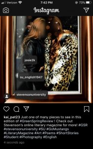
Pictures, videos, GIFs, etc. are all great to use on Instagram!  I used a picture because it is what I had access to from my own submission.  I believe any other type of media would suffice perfectly to advertise the GSR.

From my own use of Instagram and my own research, I have come to notice that there is a “prime time” to post on Instagram.  I have found that this is between 5 and 8pm.  It is a time students are getting off of work and out of class, so it is the time they check their social medias.  To increase likes, views and comments, I used hashtags.  These help bring more attention to the posts not only to SU students but everyone else in the world as well!  I also tagged Stevenson’s main Instagram page as well as the GSR account I found and the SU English Department page.  These are all important accounts associated with the literary magazine.  Another way to get more views is by sharing the post to Instagram stories and sharing your own thoughts.

Immersive Pedagogy

https://docs.google.com/document/d/15Za1e7Y_RU0PdpEUyax8TSzJOiIYfhRAAuibKwxTsqA/edit?usp=sharing

This assignment was more difficult than I was expecting.  I think my main issue was trying not to edit for stylistic purposes.  I was also not very familiar with Chicago Style citations, so I had to do a little research before making my edits.  I also had to make sure that it was following the guidelines set forth on the copyediting sheet.  It was also a little difficult for me because I was not familiar with the topic, and at first I was trying to understand the topic while reading instead of editing.  Reading for understanding and trying not to make stylistic comments were probably the hardest parts of this assignment for me.  I was taking a long time to get through paragraphs when I was doing this.  Once I got the hang of reading for editing purposes, the process was able to go a little quicker for me.  Overall, I think this just confirmed that I don’t want to go into editing!

Final GSR Creative Writing

Kailyn Pater

“Frames”

One frame doesn’t tell the whole story. 

They say a picture is worth a thousand words, but what about the other thousands of words? 

What about the things just outside the frame? 

What about all of those people?

Fighting. 

Dying.

Loving.

Caring.

Do we just completely disregard them? 

Act like the only thing that exists in that moment is what can fit into a 4”x6” frame? 


We cut, and we mold, and we manipulate

What goes in the frame.

Are we looking in,

Or are they looking out?

Will we ever know?

It’s about you.

No.

It’s about me.

Don’t get stuck.


I, for one, cannot accept this concept. 

How could you when there are wars and love,

and tragedies and discoveries,

and pain and beauty?

I, for one, don’t believe in frames.

How could you?


HTML Essay

This assignment was relatively difficult for me.  I am better at looking at things on paper and being hands-on.  I went through each HTML section individually and noted the uses for each type of coding.  Sections like formatting and citations were more difficult for me because I was not familiar with all of the terminology.  I had to spend more time practicing these sections as well as links and CSS format, which included learning what everything meant in the first place.

I think part of the reason it was difficult for me was because I never made myself aware of all the aspects that go into making websites.  I understand things like hyperlinks and margins, but I never attributed their presence on websites to coding.  Sections like images were also a little difficult for me, but I was able to understand them more quickly because it built off of some of the basics that were covered.  I tried to do the exercises in each section and look at the code I saved from each of options.  It took me longer than expected.  I definitely had to reference the basics and elements sections several times to understand the association between them and the more complex codings.  I knew what coding was, but I had never actually tried it, so it was definitely difficult to get the hang of.  I am not sure if I would be comfortable putting HTML coding on my resume–not until I practiced more, anyways.  Learning how to HTML code is definitely an important skill to possess, though.

https://docs.google.com/document/d/1qjtoMibzTdbwQEwjyZWic1piA2Ndbpe7z5giLfa4dFg/edit?usp=sharing

Poster

I chose my primary audience to be victims of sexual assault.  I did not want to specify any age, demographic or sex because it is a tragedy that anyone can be subject to.  Nearly one in six women experience sexual assault in their lifetime, and one out of every ten rape victims are male (“Victims”).  These are astounding numbers.  Because of the prevalence in society, it is paramount to be conscious of how survivors can continue to be affected in their everyday life.  I wanted to have some of the major “do’s” and “don’ts” for The Greenspring Review to be weary of.

Providing trigger warnings and disclaimers is important for survivors of sexual assault because survivors are constantly working to be able to identify their triggers to avoid anxiety and PTSD episodes (Smith).  Survivors are also advised to stay off social media for some time (Smith) because of the triggers that can come from it.  For this reason, I said a major “don’t” is the advertisement of sexualized bodies.  A part of recovering after a sexual assault is to engage in rhythmic movements because is allows the survivor to “relax and regain a sense of control” (Smith), which is why I advise a flowy layout opposed to blocks of text or an overwhelming amount of media. It is also important for survivors of sexual assault to open up at their own pace (Smith), which is why I said that information should be easily accessible and not have vague options.  They need to have clear options because their experience most likely put them in a blur of self-doubt and hatred (Smith).  Clear options also involve precise language and word choice.  It is important to consider the linguistics based on the audience (Ball 13-14).  Because it is important for survivors to feel comfortable when disclosing information, it is also important to provide opportunities to engage.  They should not feel pressured to reveal any information (Smith).  I also said that bright colors should be avoided and simple, inviting colors should be used.  Survivors are often advised to practice mindfulness and/or meditation (Smith), which are commonly associated with simple and relaxing colors.

This poster uses solid lines because of the impact and presence they have for the viewer.  However, the horizontal lines in the body of the poster have little arrows attached to them, so the solid lines do not have such an imposing force, and it allows for some fluidity (Vasile).  I did not want the viewer to be intimidated by the solid lines, so that is why I used lines with some flare, but not dotted lines because these “do’s” and “don’ts” are not interchangeable.  I also organized the poster into a type of T-chart with all “do’s” and “don’ts” are clearly distinguished.  The spatial mode is an essential aspect in allowing users and viewers to engage with the media (Ball 18).  I used a fair amount of white space to create an open and inviting feeling (Vasile).  I did provide some images to coordinate with the “do’s” and “don’ts,” but I chose not to do images for every item on the list because I did not want it to be overwhelming or have a sense of being trapped (Vasile).  I chose to use greys and blacks for all lines and words on the poster because it is neutral.  I wanted the poster to be inclusive to all because any person, no matter their race, religion, sex, etc. could be a victim of sexual assault.


Works Cited

Ball, Cheryl, Jennifer Sheppard, and Kristin Arola.  “Writer/Designer: A Guide to Making Multimodal Projects.” Massachusetts: Macmillan Learning, 2014. Print.

Smith, Melinda, and Jeanna Segal. “Recovering from Rape and Sexual Trauma.” HelpGuide.org, 17 Feb. 2020, www.helpguide.org/articles/ptsd-trauma/recovering-from-rape-and-sexual-trauma.htm.

Vasile, Christian. “Learning the Basic Elements and Principles of Graphic Design.” 1stWebDesigner, 4 Mar. 2019, 1stwebdesigner.com/graphic-design-basics-elements/.

“Victims of Sexual Violence: Statistics.” RAINN, www.rainn.org/statistics/victims-sexual-violence.


Empathy Mapping Summary

Gibbons, Sarah. “Empathy Mapping: The First Step in Design Thinking.” Nielson Norman Group. January 14, 2018. https://www.nngroup.com/articles/empathy-mapping/. Accessed 2 March 2020.


Empathy mapping is a technique that is used by designers to articulate the type of user in order to create shared understanding and have better decision-making processes.  Empathy mapping typically consists of four parts: says, thinks, does, feels.  All of these parts surround the center, the user.  The “says” quadrant is what the user says aloud and usually contains direct quotes.  The “thinks” quadrant encompasses what the user thinks about their experience.  The “does” quadrant is how the user interacts with the page.  Finally, the “feels” quadrant is expresses the user’s emotions while interacting with the site.  This map is not always clear-cut because users experience a wide range of complex emotions and reactions, so it is common to have overlap in the quadrants or even discrepancies.  Empathy maps can be created for individuals as well as an aggregation of multiple users, which represent a “user segment, rather than one particular user.”  They should be made to prioritize the users’ needs and are central for a user-based experience.  The process of making one can be broken down into six steps, but the main idea is to define the goals of it, collect evidence and analyze it, which will allow the user to have a shared experience in the end.

Disability, Mental Illness, and eLearning Summary

Kent, Mike. “Disability, Mental Illness, and eLearning: Invisible Behind the Screen?”.  The Journal of Interactive Technology and Pedagogy.  8(2015). Web. 25 February 2020.


Open Universities Australia offers the option of disclosing that they have a disability so that the specific schools can tailor the program to their needs, but admissions are finding that many students are hesitant to reveal their disability.  This has divulged that a high percentage in the country’s population reported suffering from a mental illness, but because it was not disclosed in the application process, those with disabilities were highly under-represented, which also restricted their opportunity to learn.  Students with disabilities felt their impairments were made even more invisible in an online context because of universities’ decisions to under-represent those with invisible disabilities.  Open Universities Australia decided to conduct a study by giving a survey to its students.  The questions consisted of students’ demographics, studies, accommodations, issues around disclosure, accessibility of technology and services as well as opinions of the university and free-response suggestions.
There were notes from the study that those who reported having a mental illness struggled with online accessibility, but they offered suggestions for improvement like “breathing space” during exams.  The study also revealed that the most common mental illnesses among the students were depression, anxiety and PTSD.  Many students conveyed their frustrations with the stigmas attached to these mental illnesses, as it was part of the reason they may have chosen not to disclose the information originally.  The different types of impairment must be accounted for in the design of these institutions, which can be a tricky task, but that is why the study was conducted.  Researchers wanted to know what can be changed to improve students’ experiences.  The conclusion of the study was that online learning provided an easier learning environment for students with disabilities, but there were still areas that could be improved.


GSR Redesign Websites

Team 1:

  • Effective
    •  The simplicity of the header and the image of the inkwell with an oak leaf quill struck me when I first opened the page.  I thought it had incredible aesthetics and efficacy.
    •  Tour (video) of GreenSpring campus
    •  The idea to tag authors/artists in each post to make them easy to find
    •  I like the idea of having featured events on the side bar and its interactivity
    •  Simplicity of the “About” page.  It does not have an overwhelming amount of the team’s information, which is good for the viewer.
  • Improve
    • The book background is a little busy.
    • The “Submissions” page is wordy.  I think it could be condensed and/or provide an attachment to all of the guidelines.
    • I like the other teams’ ideas of having a direct submission on the website opposed to through email.
    • The “Home” page does not contain many interactive elements.  I like the other ideas of having featured work.
    • The “Issues” tab is a little bland.  When clicking on the types of art/creative pieces, it takes you to all of the work, but they only have a title and author/artist.  There needs to be some more visual elements.

Team 2:

  • Effective
    • I like the image in the header a lot; it is very symbolic and has subtle connections to Stevenson.
    • I really like the archives tab, especially for after GSR has been around for a while.  The literary websites we looked at for the rhetorical analysis contained archives.
    • I like the idea of quotes from the editors because it shows their personal involvement in the magazine.
    • I liked having a snapshot of the creative writing/poetry pieces and the option to read further.
    • I enjoyed that they organized the content by genre and then issue.  This is how The Paris Review organized their content as well.
  • Improve
    • Besides the small image in the header, it is rather boring to look at because it is just a dulled white screen.
    • I don’t like the font chosen for the featured pieces and their titles.  It is easy to overlook even with the underlining.
    • There is a lot of scrolling involved in looking at pages like the “visual art.”
    • There is a lot of blank, white space on the “Home” page, and there is not much interaction for the viewer.
    • Though there is easy submission on the website, there is still a wall of text prior to the submissions, which could be a deterrent.

Team 3:

  • Effective
    • I like the idea of featured pieces displaying multiple types of creativity as well as submitted artwork for the issue cover
    • I liked the idea to create a collective “About” page then having a picture of each contributor.
    • The idea of a subscription to the magazine is a good way to get a better following for GSR.
    • Having submission through the website is very effective.
    • I like the way content is displayed upon clicking the type of multimedia (in squares).
  • Improve
    • There is a lot of white space on the “Home” page, and the image in the header does not seem relevant.
    • I think the headers should be in a different font.  There a little boring to look at, and I pass over them easily.
    • I think the issues should be more clearly labeled, or there should be more separation between the two issues it displays now.  They blend together.
    • The side bar seems a little redundant because of the issue links then four more links to the specific art and writings.
    • There is not much connection to Stevenson besides the small Facebook feed on the side bar, which is something the GSR staff expressed a subtle need for.

I am voting for Team 1.  I really enjoyed the easiness in navigation, but it was also interactive, which is important for user experience.  The main suggestion I would make is to mimic the other teams’ ideas to have a direct submission option through the website opposed to a separate email.

UX Summary

Boag, Paul. “Software as a Service (SaaS): How to Be Sure of Success.”        Boagworld, Boagworld – User Experience Advice, 14 Jan. 2020, boagworld.com/digital-strategy/software-as-a-service/.


This article acts as a guide for those looking to develop a software as a service.  The author of this article has experience in his failed attempt at creating such.  The first tip he suggests is to test the market before becoming too invested in the software idea.  This saves lots of time and money from being wasted on something that the public is not interested in and/or willing to pay for.  The market can be tested by creating a “fake marketing campaign.”  The first step in this campaign is the construction of a “landing page,” which should include things like pricing, videos, and what the author considers to be most important, a “call to action.”  This is what will invite users to purchase the actual product.  The next campaign step is to compile emails to the users who expressed interest in the software.  The author explains a five day email list that should draw users into the product.  The third step is to create a set of surveys to distribute to those who failed to engage with the call to action, those who signed up for the emailing list, and those who actually preordered the product.  The last step is to “drive traffic to the landing page.”  Once people reached the page, it is then most important to understand their interaction with it.


From this article, I learned the importance of advertisement prior to the actual release of a product or service.  I obviously know that marketing is a key role in any product’s success, but I thought it was an interesting idea to make a “fake” campaign for it in order to really get a feel for what the products’ receptions would be like.  I also have never come across surveys in this context.  This could be because I don’t subscribe to many things (mainly due to a lack of money), but I cannot recall being asked to complete a survey for a product I have never used.  I think this is a good idea in principle, but it heavily relies on customer response.  The likelihood of hearing back from even half of the surveys sent out is low.  Because there is a tendency to lack responses, the analysis of the product/service may not be entirely accurate.


The idea of sending out designs of The Greenspring Review to students and faculty is great because it will allow the creators and editors to hone in on what the public audiences find appealing in a literary magazine.  I also think that getting students to engage with the magazine is important because most students don’t realize the extent of creativity in it or that it even exists.  Once again, it is not likely that a large amount of responses will be received, but it can aid in the process of rebuilding, which is very important in success.

Rhetorical Analysis Assignment

https://drive.google.com/open?id=19eVbqAx5Rb28e4CYIEZd3eOEo5R0EbiE


I pledge on my honor that I have neither given nor received unauthorized assistance on this assignment/exam.”


Introduction: [Daily Page] The Paris Review is a literary magazine that promotes a wide variety of artists and writers including photography, poetry, fiction, and artwork.  It has been in publication since the 1950’s and contains decades of expression, which are released in quarterly issues.

[move mouse over the tabs where you can access such] You can subscribe to an online version of the Paris Review, which gives you access to podcasts, videos and interviews that you would not be able to view if you buy the hardcopy, which can be found in bookstores all over the world.

Though the Review is representative and diverse, its content seems to be entirely based around its accessibility and targeted audience, which limits the amount of subscribers; however, for the audience it does reach, it seems to be mostly effective in communicating an expression of art and literature without criticism.


[Daily Review] The Review’s primary audience seems to be middle-upper class women interested in art and writing.  The basic colors of black, white and pink attract a feminine audience, and [Subscription Page] it costs $49 to have a year’s subscription.

[“Yet You Turn to the Man” Fiction Story] That being said, The Paris Review is also bound to attract literary scholars. Many of the submissions contain elevated subject matter, like this one talking about drugs, sex, rape and death.

[Under Poetry Section] For those looking to delve into this expansive literary world, the online version makes navigation simple.  Under each of the “review” categories, you can search for artists and writers based on either their name or by decade.  This is an effective way in categorizing all of the pieces considering there are thousands spanning back decades.  Though the works are able to be broken down into subsections, each page still contains an overwhelming block of text, which can make it harder for the reader to appreciate the individuality of each piece.

[Daily Review] The Home Page contains an abundance of images that aid in attraction to all the art pieces and writings.  This side suggestions bar also contains only an image and a title, which is much more intriguing, at least to me, than a text wall to try and get me to navigate the website further.  However, even the titles of the suggestions, like “What Men Have Told Me” in addition the fact that all the authors are women, nearly guarantees a female audience.

Conclusion [Daily Review]:  The Paris Review contains thousands of representative literary and historical pieces.  Though the review is inclusive and diverse in its published artists and writers, its readers and viewers seem to be limited to intellectual and wealthy women.  Though it has a dynamic and ever-changing genre, the review is static in the people it reaches.  It is effective and relatively easy to navigate, but modes as simple as its color scheme and linguistics restricts the allure to other types of audiences, which in turn could be its biggest flaw.


Works Cited

“The Daily.” The Paris Review. Web. Accessed February 13, 2020.

https://www.theparisreview.org/blog/.

“Poetry.” The Paris Review. Web. Accessed February 13, 2020.

https://www.theparisreview.org/poetry

Scanlan, Kathryn. “Yet You Turn to the Man.” The Paris Review. No. 231, 2019.