Social Media Remix

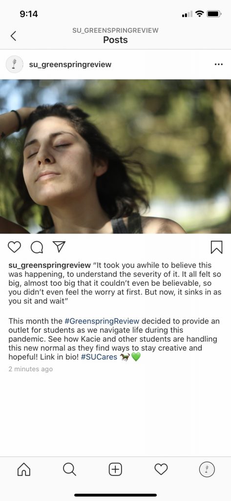
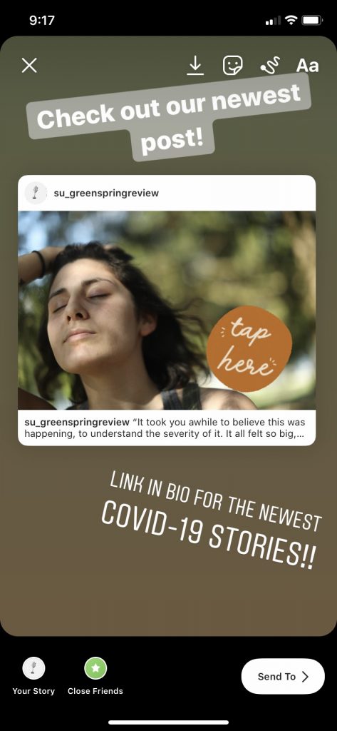
I chose Instagram because I feel like it is the most popular social media with the target audience of The Greenspring Review. With this being met for students it is important to share it on a social network that will reach the most audience members. Facebook tends to be more for the older generation, and while Twitter still has some popularity Instagram I feel is just the go to app. You can share posts, stories, and even go live and talk to people directly. Instagram is also nice because there is no character limit, and if you don’t want your caption too long you can even post creative pictures of your texts instead of a photo, and now with Instagram allowing you to most multiple photos at a time, you can do both pictures of text and photos. For my post I decided to use a photo with a caption that included part of my Greenspring Review piece, and then to help bring attention to that post not only did I use hashtags, but I also shared the post onto Greenspring Review’s stories. This will help bring attention not only to the Instagram post and our page, but also to our website as students will hopefully want to read the rest of the stories. It can be challenging to know the best time of day to make a post, I find the most successful times are in the morning or evening because people usually check the social media networks as they start and end their day, or before school/after work. I feel a page like this should post at least 2-3 times a week in hopes of the content appearing more often, or encouraging students to stay up to date on stuff. There are many hashtags they can utilize to gain attention, and even make creative posts for “motivational monday”, “throwback thursday”, or other similar days like that. Another thing to consider is finding ways to make your posts or stories interactive. Commenting their favorite book, doing contests, or doing a voting poll on their stories. Little things like this are fun ways for people to past the time on social media.


Style Sheet Exercise

https://docs.google.com/document/d/1RFRg8EBTXeoTwizBOnvGLcAPgFUflA0enz6csxVxjPo/edit?usp=sharing

This process seemed overwhelming at first, especially since I had never even heard of a style sheet before. I looked at the check list and just took it step by step and that helped me not feel as overwhelmed and just focused on one thing at a time. Doing this exercise really showed me all that goes into editing a piece, especially a lengthy one with links, articles, footnotes, etc, things that aren’t always even every piece of writing. I really had to reread it multiple times to do my best not to miss anything, and even then I am sure I missed things as it was a lot to pay attention to. I learned a lot about Chicago style during this process. I have been using APA for so long I forgot a lot of the rules with Chicago style writing and editing, so this was a good refresher. I also learned that to be an editor you have to have a lot of confidence in your skills and knowledge of editing. There were so many times during this process where I was second guessing myself, and if I needed to make a change in punctuation or not. However, by the end I did feel a little more comfortable with the process and overall had a good experience with this assignment and am glad I got some exposure to style sheets and how they work.

GSR Submission

“Sit and Wait”

Hey you,

How are you doing today? I know, I know, you’re hanging in there. What a crazy time we are living in right now. I know you never thought you would ever experience something like this – something so surreal, something so uncertain, something so big. You have faced big and uncertain before, but this, this is something so unbelievably, well, out of your control. All you can do is literally stay home and wait it out. Sit and wait – not something you’re great at.

When you first heard of COVID-19 you didn’t think much of it. “It’ll blow over soon”, you thought. You most certainly did not expect to be in lockdown. To not see your family or friends for such a long time. To see grocery stores so empty. To be doing school and work from home, on your laptop, on your couch, in your pjs. But here we are. Sitting and waiting.

It took you awhile, to believe this was happening, to understand the severity of it. It all felt so big, almost too big that it couldn’t even be believable, so you didn’t even feel the worry at first. But now, it sinks in as you sit and wait.

Week one of quarantine felt easy, too easy. It was spring break so no homework, no school, no work, no responsibilities. Just you, your couch, your dog, and the next show to binge watch on Netflix. You took advantage of getting to sleep in; eased your mind from all the troubles and stress you usually feel throughout the semester. And you didn’t feel bad if you decided to stay in your pjs all day. Life would go back to normal soon right, let’s enjoy this time off while we can…right?

But then you got that daunting email. You couldn’t go back to school. You couldn’t go back to work. This wouldn’t be over in two weeks. This wouldn’t be over in a month. The realization of that numbed you. You sat on your couch, in your pjs, in fear. Not even fear of the virus, but fear of what staying cooped up for weeks on end would do to you. The anxiety snuck up on you while your guard was down, creeping its way into your mind until it consumed you. It took charge of your thoughts and of your limbs. You sat there, immobile. Waiting to move.

You sat there for hours, but it felt like days. So many questions. So many concerns. “Why is this happening?” “When will it be over?” “How will I stay motivated?” “Can I do this?” I know that was hard for you. I know how easy it is to sit on a couch and ignore the things that still need to be done. I know it all felt so big that it wasn’t even worth trying. But look at you now, you are doing it. Three weeks later and it has not broken you. In the midst of the worry, the fear, and the uncertainty, you are doing it all. In fact, you are grateful that there is still homework to be done and that you are even capable of doing your job online when so many people don’t have that luxury. To you these responsibilities give you structure, and you need that! It’s a comfort for you. It says that life still has some normalcy to it, and that you must continue moving forward, while you sit and wait.

But structure wasn’t the only thing you gained. You gained a new perspective on life and became grateful for all the little things. Yes, being home all the time can be difficult, but how wonderful is it to see your beautiful family each day, something your busy schedule often kept you from. And that technology that often frustrated you, how grateful you are for it now, as it allows you to see those not so close to you. And you know that list of things you’ve been wanting to do? Do a puzzle, read a new book, clean the house till it shines, try those new recipes. Well you have done those too, and how freeing it has felt for your life not to be consumed by all that work and school, to make time for you again. You truly deserve that. Yes, time has been moving slowly, and what a miraculous gift that has been. Cherish it as you sit and wait.

This virus has taken many things from all of us, but it has also given us something as well. There are some words you never thought you’d say! But it’s true. You used to think the world was divided, and in many ways it still is. But in the past couple of weeks you have seen humanity unite in the face of incredible adversity. To see people from all over the world work endless hours to find a way to defeat this disease. To witness people singing and clapping from their windows to show gratitude and support to all of the first responders who put their lives on the line everyday so that we can stay safe. And to see something as simple as a colorful message written on the sidewalk just to lift your spirits as you take your afternoon walk. There is so much beauty in this world, beauty that often becomes clouded by ugliness, but somehow always finds a way to be prevalent again. This brings you so much hope, comfort, and peace and we all need that during these trying times. I know this hasn’t been easy, and that every day hasn’t been as positive as this letter makes it sound. But you are trying. You are creating beauty in the face of ugliness, and you will prevail. So, sit, and wait, and breathe.

Much love,

Yourself

HTML Reflection

https://docs.google.com/document/d/10p4gdmUrzFnyTyzBg0Gg1DCDjc7Elortrl7lSkGXaVU/edit?usp=sharing

This was my first experience working with coding so this assignment was a challenge for me from the beginning. When I first looked at the assignment and what we had to do it all looked like a foreign language to me. I wasn’t sure where to begin, what it was suppose to look like, and felt a lot of anxiety when getting started with this. I tried to go through the lessons and teach myself but the anxiety of not knowing what is correct or not correct hindered me from being successful. I looked for assistance and help with our teacher and a peer’s example. It was very helpful as I can be a visual learner and sometimes need guidance. After that I restarted the lesson and had a much more successful time the second go around. It felt easier to understand and I was able to focus on each lesson step by step instead of being overwhelmed with it in its entirety.

I continued this method the entire assignment, just focusing on each individual step of each individual lesson so that I wouldn’t overwhelm myself again. I eventually found myself on a roll and getting the hang of HTML. I did half of the lessons on one day, took a break, and then continued the other half of the lessons the next day. This helped me stay focused and remember the steps, but also give my mind some time to rest as it still was a lot of information to absorb. Most of the lessons were pretty straight forward like the lessons on “Headings”, “Paragraphs”, “Formatting”, and “Comments”. I felt like the lessons on “Basic”, “Headings”, and “Paragraphs” helped me get a good grasp of HTML. It was good for me to first understand the general layout and then to add to that, like that each code starts with “<DOCTYPE html>”, and that you need to always put “<h>” and “<p>” when starting a new heading or paragraph. I think having “Attributes” be the first lesson with the exercises made the rest feel overwhelming because I felt like I was trying to understand what attributes are and what they do when I barely even understand the fundamental basics yet. I really enjoyed the lesson on “Styles”, while it was a lot of information to take in, I really enjoyed typing in a code and then automatically seeing the color of the text change, or the font be different, like how typing =”color:blue;” will make the following words blue. I truly never understood just how much went into the simple design of just text, let alone an entire website. The most difficult lesson was probably CSS, which felt similar to the lessons on “Styles” and “Attributes” but was mostly difficult just because it took me a bit to fully understand how CSS is different from what I did earlier. While this probably was the most challenging, I could see it being one of the most helpful skills to know as it can help manage the layout of multiple web pages at once.

Overall, the lessons were fairly easy once I understood the process more. I however, don’t feel confident adding HTML to my resume. There is a lot to remember. One error, like forgetting a bracket, colon, or a greaten than sign, can make it all ineffective. I feel like it is something that takes a lot of practice and repetition, and while this lesson has made me familiar with HTML, it has not made me efficient enough to tell an employer that I know how to do HTML. While it did stress me out in the beginning, I did actually find myself enjoying creating code and am glad I got to have some experience with it.

Do’s and Don’ts Poster


The audience I chose for my poster is students with anxiety. I chose this audience because I feel like many students deal with some level of anxiety, I myself included. Another reason I chose this disability is because it is often associated with a stigma, or at risk of being ignored. Because anxiety is not a visible disability it tends to be out of sight, therefore out of mind, resulting in designers not creating a more inclusive interface for students (Kent, 2011).  For students who have anxiety and want their work on the Greenspring review, it can be very intimidating to put yourself and your work out there. The idea itself can cause students anxiety, so it is important to find more ways to create a calming and welcoming environment where they feel they can be a part of it.

When coming up with my list of do’s and don’ts I considered what I myself find overwhelming in website designs that cause me anxiety. I realized that I typically like websites that use warm and inviting colors, with a simple layout, and a mix of words and images. Whenever the information isn’t easy to find, is overwhelming, or complicated to understand I tend to become tense and frustrated. I eventually feel overwhelmed and don’t even know where to begin with processing everything, leading me to give up and leave the website. I also know that if I were to submit something to the Greenspring Review that didn’t get accepted I would not only want a response, but some positive feedback that I can use to improve for next time. If my work did get approved and was submitted I also know I would be terrified of seeing negative comments for everyone to see, or seeing any type of negative content in general. I also read what students with anxiety found encouraging about online learning and adapted it to better fit my do’s and don’ts poster. Many of them like how easy blackboard is to use and that it is a place that encourages open and accepting discussions. They also like the easy access to feedback and tutoring, and enjoyed some of the video tutorials on the website (Kent, 2015). What I gathered from this is that students felt better when they could easily navigate the page, had access to positive feedback, had a positive forum encouraging participation, and liked having visuals to look at besides just reading texts. This, along with my own experiences, helped me create my five do’s and don’ts.

The aesthetics of the poster, and the interface in general, are important to consider. Good aesthetics have been known to not only increase the attractiveness of the interface, but also the usability. When users have a positive response with the aesthetics, they are more likely to enjoy the usability more, or ignore minor discrepancies (Morgan, 2017). This can be especially important for users with anxiety as they will feel more calm and open minded while navigating the website. While aesthetics are important, the interface still needs to be usability friendly for their user. Aesthetics and usability must work together to create a cohesive and effective interface, something I kept in mind when creating my poster. Because I am doing a poster for students with anxiety, I wanted the aesthetics of my poster to resemble the do’s and don’ts of my poster. After looking at many different sources I discovered that muted, pale, or dusty shades of blues and greens are popular colors for relieving stress, therefore my background colors are muted shades of blues and green. Using muted greens is also something for the Greenspring Review to utilize in their design, that way it can relate back to Stevenson, but also provide a calming background for these users as well. To help my audience understand the information better I used a mix of words and images in each of my do’s and don’ts, and also made the information as clear and concise as possible without overcrowding each section. While the Greenspring Review already shares images students have taken, they can still utilize visuals in their homepage, or other informative page, maybe even use videos in some way. It can be helpful to provide different ways for students to absorb information. For my poster, the layout of each box is the same, and the overall poster is clean, simple, and cohesive. And finally, I utilized thin blue lines to separate each do and don’t from each other. This helps declutter the information and create clear designated sections, allowing the user to easily follow along. The Greenspring Review should keep in mind how they use their spacing. Pages should not be cluttered with information, and they can utilize white space between images and words to make it visually easier to follow. While each page will vary with content, the layout should be generally the same to avoid an overwhelming presence. By considering these aesthetics, and the do’s and don’ts, the Greenspring Review can design a more user friendly interface for users with anxiety.

Works Cited:

Kent, Mike. “Disability, Mental Illness, and ELearning: Invisible Behind the Screen?” The Journal of Interactive Technology and Pedagogy, 17 Dec. 2015, jitp.commons.gc.cuny.edu/disability-mental-illness-and-elearning-invisible-behind-the-screen/.

Morgan, Kate. “The Aesthetic-Usability Effect.” Nielson Norman Group, 29 Jan. 2017, www.nngroup.com/articles/aesthetic-usability-effect/.


Usability Summary: Empathy Mapping

In “Empathy Mapping: The First Step in Design Thinking”, Sarah Gibson discusses what empathy mapping is, why it is important, and the steps in creating one. An empathy map is a way for an UI designer to understand their user better. In the center of this map is the “user persona” which is information about who this user is. From there it stems off into four different squares, “says”, “thinks”, “feels”, and “does”. Research is conducted to help fill in information into each square. For instance, during the interview whatever the interviewee actually says while going through the interface, or afterwards, is put into the “says” square. This is the same for whatever the interviewee thinks, feels, and does in the interview. If some information is lacking in certain squares then it shows that more research needs to be conducted. By the end of the mapping exercise the designer should have a good understanding of who their user is and how they do and don’t like to interact with the interface. It is important for designers to do this process from the very beginning so that they not only understand their users better, but so that the team as a whole is on the same page about the user so that they can create a cohesive design. It also helps remove any bias from the design process, discover weaknesses in research methods, understand what drives users’ behaviors, and leads the team to design effectively and efficiently. Gibson explains that the first step in any empathy map is to define the scope and goals of the map. After that the team should gather the necessary materials, collect their research, individually generate ideas for each square, collectively condense those ideas, and finally polish the map and put the information into action with a plan. This is an effective tool all designers should take advantage of as it can really help aid in the decision making process.

Gibson, Sarah. “Empathy Mapping: The First Step in Design Thinking.” Nielson Norman Group, 14 Jan. 2018, www.nngroup.com/articles/empathy-mapping/.

Accessibility Article Summary

I chose the article “Disability, Mental Illness, and eLearning: Invisible Behind the Screen?”. In this article they talk about students with mental illnesses and how eLearning can help and hinder their learning experience. They conducted a study with eLearning students from OUA, Open Universities Australia, where 352 participated in a survey. These questions focused on what type of disability they had, how the university handled these disabilities, and how effective they were.

After the initial survey they found that the highest noted disability was mental illness. They then did personal interviews with 11 of these students to dig a little deeper in their disability and how their experience with eLearning has been. Overall, students liked that eLearning gave them the chance to avoid face to face conversation, having to travel to a physical campus, and be a little more flexible with their work and disabilities. Not only that, but they felt they had more control over the disclosure of their disability. However, this became something that hinders their accessibility to learning. Many felt invisible to the university, or felt as if the stigma associated with mental illness was too strong that majority did not feel comfortable disclosing their disability. By not disclosing their disability they were not able to get the necessary additional help they needed. Even those who did disclose it felt like the universities made them jump through too many hoops, making it too difficult of a process for them to get the help they needed.

Overall, the study showed that eLearning needs to improve in the ways that they are inclusive to all students, however there is always the problem that making it inclusive to one disability can actually make it more inaccessible to a different disability. The article explains that a big issue here is that when people with mental illnesses study online they often become invisible. Their issues are out of sight, therefore out of mind to the university. Society does not view mental illness as a disability like they do with other impairments, therefore they handle it differently, they believe that it is more about making the person better rather than making the environment more accessible. In fact, the article believes that the real disability with any impairment comes from the construction of society rather than the individual.

Kent, Mike. “Disability, Mental Illness, and ELearning: Invisible Behind the Screen?” The Journal of Interactive Technology and Pedagogy, 17 Dec. 2015, jitp.commons.gc.cuny.edu/disability-mental-illness-and-elearning-invisible-behind-the-screen/.

UI/UX Experience of Greenspring Proposals

Proposal 1:

Effective Elements:

  1. I love the look of the logo along with the font. It was very professional and clean. This also connects back to Stevenson without being over the top. I also like that the logo is present on every page.
  2. Organization of the issues’ page: very easy to find topics in each issue.
  3. Submission Guidelines’ page is very easy to read and understand.
  4. Recent issue front and center on home page
  5. I like that the event countdown is on every page

Areas of Improvement:

  1. The book background is distracting, colors clash, and only resembles one form of art.
  2. While I like the organization of the issues page the page where it says the year and issue is a little plain. If it is going to be its own page I feel there should be some imagery to go along with “Spring 2020” and “Fall 2020”.
  3. I would like more info on the “About Us” page. While I agree it shouldn’t be overwhelmed with information I feel like now it is too little. I feel like I don’t know enough and the magazine and its purpose.
  4. I do think there needs to be a submission form on the submission page.
  5. What else can be put on the front page? There feels like a lot of empty space. Can you put flyers on there to also promote events or workshops? Links to direct stories, images, etc? A feature of the day?

Proposal 2:

Effective Elements:

  1. I like the boldness of the logo as the entire opening of the home page.
  2. I like the subheading under the logo “A Literary, Art, and Media Magazine” Right away I already know what this is.
  3. I like that when I scroll the navigation bar always stays up top.
  4. I really like the submission guidelines page. It is informative with all of the rules and requirements and you can submit right there while reading the rules.
  5. I like that the editors put some of their favorite quotes down and included a contact us section to their about page.

Areas of Improvement:

  1. While I like that the navigation bar stays in place when scrolling, I don’t like that the logo disappears. It also makes the page totally white, it would be nice to see some color. In fact, throughout the magazine I felt like there was too much white space.
  2. I don’t like that on the homepage the content there is labeled “Featured Issues” as I don’t see these as issues, I see this as content that is place in issues. I like the idea of featuring content on the homepage, but maybe just word it “Featured content”.
  3. I also don’t like the organization of the Issues’ page. Again when I click on the word issue I expect to see Spring 2020 or Fall 2020 and then click on that to see all of the content. How it is now maybe it almost overwhelming to look at everything.
  4. While I really like the submission page on this website, it was very spacey. I felt like I had to scroll for such a long time and there was a lot of white space. This could be a simple fix as changing the layout, maybe putting the photos to the side instead of the top or closing the gaps between lines.
  5. While I like the quotes the editors picked I would like to know something about them personally or what exactly they do at the Greenspring Review.

Proposal 3:

Effective Elements:

  1. I like on the homepage the “What’s new?” section, along with having featured content on there as well.
  2. I also like that when you scroll on the homepage on the side there is a side navigation bar, along with videos to watch, flyers to view for upcoming events, and a link to the Stevenson English social media page. There is a lot of helpful and fun information on the homepage.
  3. I really like the organization of the Issues’ page. It is similar to the first but there are photos for the page where it lists the issues, and then photos again when you view the different categories for each issue. I also like how when you click on an issue the photos used for the categories are faded. It helps to have an image but also isn’t overpowering.
  4. I love this about us page. It is informative and fun without being a lot of information to take in. I also love the circular shape of the photos. So fun!
  5. The navigation of this website is very easy and clean. Overall, there is nice spacing. It is taking up space without being crowded and even though there is a white background it didn’t feel plain because of all the content covering the background.

Areas of Improvement:

  1. The logo is very plain.
  2. I also am not a fan of the photo chosen above the logo on the homepage.
  3. While there is a lot of great content this website could use some color.
  4. I think the title for the submission/guidelines should just be called submissions as having both words make it a very long title for a navigation bar.
  5. I would also put more the guideline information before the submission form. If I hadn’t scrolled down all the way I could have missed the information I needed to know before submitting.

My personal choice: Proposal one. Overall this was my favorite as it was very appealing to the eye, easy to navigate, had a connection to Stevenson, and just had nice foundation to build upon. The things that need improvement could easily be fixed in this proposal. I think combining things I liked from proposal one and proposal three would create a great online publication.

UX Article Summary

O’Haire, Wes. “Mental Models for Designers.” Dropbox Design, https://dropbox.design/article/mental-models-for-designers. Accessed 19 Feb. 2020.

In O’Haire’s article she discusses seven mental models that she uses to help her and other designers solve problems, make decisions, and communicate more effectively and efficiently. She has three models for problem solving which are “First principles”, “Inversion”, and “Abstraction laddering”. In first principle, you focus on creating a problem statement and then break everything down into fundamental parts so that you can analysis those parts in hopes of creating a solution. With inverse, designers should focus on coming up with not only good solutions, but bad solutions as well. This way they can understand how to avoid those bad outcomes. And with abstraction laddering the designer will start with the initial problem statement, then ask a “how” question to create concrete statement, and then a “why” question to create an abstract statement. They can get the designer to think about the problem in different ways, therefore coming up with different solutions. O’Hiare’s models for decision making are the “Hard decision” model and “Confidence decides speed vs. quality”. She uses these models to compare her possible decisions and then to decide if she needs to focus on speed or quality. And lastly, her two models for communicating are the “What, so what, now what?” model and the “Diamond” model. With “What, so what, now what?” designers communicate to their team the “what” as in what will be done, the “so what” as in the why it should be done, and the “now what” explaining the next steps of the process. The Diamond model is a way to more elaborately explain you information and creates a format of how you should communicate it. Overall, these models help designers better organize their thoughts and ideas, evaluate their solutions, pick the best one, and communicate everything more clearly.

I found the quality of this information reliable and helpful. Each model was explained in an efficient way and the importance of each model was known. Not only that, but by giving multiple models, designers can choose the model that would be most efficient in that moment. While this article gave a general overview of each model, O’Haire also provided links to other pages that went into more detail of each of the seven models. However, for me the overview was detailed enough for me to get the big picture of it and how it can be helpful.

I picked this article because I have never done a project like this, so for me I didn’t even know where to begin, or where I will begin. I saw the title and thought maybe this could help me organize my thoughts better when the time comes, and it most certainly did. This article gave me a good idea of where I should start when it comes time to redesign the Greenspring Review. I can first identify the problem with it, brain storms solutions, good and bad, and then communicate this with my teacher and classmates. Maybe once that is figured out I will feel like I have a plan in designing it, rather than just going in and doing it on a whim. I feel with any project it is always important to start with the “why” of it, the reason we are here, and the discover the problems that exist.


The Paris Review Visual Analysis

https://drive.google.com/file/d/18AuxVsGW0r_kb18a3buBjm_ExiSKRAs6/view?usp=sharing

Introduction/Thesis: Today I’m analyzing The Paris Review, an online publication that has a variety of ways to create, share, and appreciate art. Its publication holds a clean, upscale, and artistic presence that is easy to use for their specific audience who views art and creation as a lifestyle rather than a hobby.

Audience/Context/Genres: (Home Page) Its audience is upper class men and women who are art enthusiasts. You can see this by the font choice, it is professional yet stylistic, and reminds us of a classy and modern Paris. The name itself, The Paris Review, Paris is known to be extravagant whether in fashion, art, or fine dining. (Interviews Page) They mention names throughout that the general public would not know, like Rae Armentrout. She is a highly established writer they interviewed, so these aren’t really everyday people. The publication can be found online and in print. As we can see here there are genres like poetry, fiction, art, and photography. (Guernica) When you look at a publication like Guernica, you see genres like politics, bodies and nature. This publication is more about public issues or radical and daring type of information. So clearly someone who goes on The Paris Review will most likely not read Guernica.

Color: (Home Page) When we look at the colors we see here it is mostly black text on a white background. The text does highlight pink when you scan over it and is also used to highlight some headers or words that they want to bring attention too, such as the subscriber button and current issue.

Font: ( Home Page) The words of titles or headers are in a thicker font, again bringing the reader’s attention there. The font in general has a classic elegance look to it, only bring cohesion to their Paris upscale art theme.

Layout/Spatial: (Fiction Page) The layout is generally the same. There is always some side information, sometimes other articles readers might like, or in this case side navigation bar. In fact, when you scroll on every page, the main navigation bar always stays in place along with the side bar which makes navigating super easy. Between the layout and spacing, it is very clean, sophisticated, and well organized, making it an easy user experience while staying true to their theme.

Visual: (Art and Photography Page) As you can see there are a lot of visuals on this website, we will focus in on Dave Hardy. This image is of his sculpture which is incredibly modern and is so sophisticated and artistic that it is actually the cover of The Paris Review’s newest issue.

Aural: (Podcast Page) And lastly, there is aural mode present in both the podcasts and videos. This is an excellence affordance as it gives the audience a break from all the reading and gives them a different way to experience different works, gain information, and even take it on the go with them. So again, this is meant for people who really eat, sleep, and breathe art, or see it as a high status.

Conclusion : Overall, The Paris Review stands out as an art publication and has a very cohesive theme, is easy to use, and is appealing to its specific audience that is looking to immerse themselves in the world of art.

References

“Art and Photography.” The Paris Review, https://www.theparisreview.org/art-photography. Accessed 14 Feb. 2020.

Brian, Reed. “Rae Armentrout, The Art of Poetry.” The Paris Review, https://www.theparisreview.org/interviews/7507/rae-armantrout-the-art-of-poetry-no-106-rae-armantrout. Accessed 14 Feb. 2020.

Dave, Hardy, and Passarello Elena. “Dave Hardy: New and Recent Sculptures.” The Paris Review, https://www.theparisreview.org/art-photography/7508/dave-hardy-new-and-recent-sculptures-dave-hardy-elena-passarello. Accessed 14 Feb. 2020.

“Fiction.” The Paris Review, https://www.theparisreview.org/fiction. Accessed 14 Feb. 2020.

“Home Page.” Guernica, https://www.guernicamag.com. Accessed 14 Feb. 2020.

”Home Page.” The Paris Review. https://www.theparisreview.org/. Accessed 14 Feb. 2020.

“Podcast.” The Paris Review, https://www.theparisreview.org/podcast/6051/odd-planets. Accessed 14 Feb. 2020.