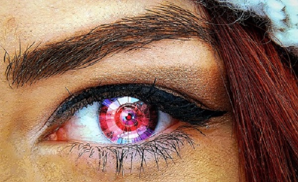
GSR submission social media remix

For my social media mockup, I chose Instagram because Stevenson University students seem to interact mostly on that platform, so for GSR, IG makes more sense. Also, Instagram is visual-based, which I think is necessary for an online literary and art magazine as it allows us to display the work more. My submission is a dystopian and sci-fi short story and I believe that my ideal audience will be on Instagram because fans of the genres like to interact with fan art and IG is one of the platforms to see that.  For the Greenspring Reveiw Instagram, I’d post at 6am, 3pm, and 8pm during the weekday to target students checking their feeds before/after school and when relaxing during dinner and before bed.  To promote my submission, I made a graphic with the story’s cover picture and used a quote. In IG, there’s a 2200 character limit, providing enough space to write a nice caption with emojis and to integrate specific/niche hashtags to attract our audience. Also, I would share the post on our IG Story and add gifs, filters, or stickers that pertain to what we’re sharing. In the case of my submission, when I share the post on the IG story, I will find a cyborg gif as my story is about a cyborg. I’d also post multiple times a week to the GSR IG page, reply to comments under the posts, and participate in soicial media trends to stay current and expand the audience.


The Deterioration (GSR final submission)

Sitting in a fort of blankets and pillows, Zuri was reading a book. During those times, it helped to escape reality to stay sane, though one couldn’t afford to escape for too long. It wasn’t safe.

Zuri’s friend, Nova, trudged over, interrupting Zuri’s flow. “Somebody came here to see you. . .” Nova pointed behind her, to the door.

“Girl, what?” Zuri strained to hear her amidst all the noise in the shipping container. She and the other bionics were on the run and in isolation, dodging scrappers.

Nova bent down, her purple hair falling onto her face, contrasting well with her brown skin. “Some dude is here to see you, Z.”

Zuri furrowed her eyebrows, sliding her bookmark in between the pages of the novel then stood up and started for the door. “Who?”

“Girl, I have no idea. Myles is standing guard and he said some dude rolled up in an old truck and asked for you.” Nova shrugged.

“That’s weird. . .” The two friends began the trek to the door, stepping over other refugees’ bags, blankets, and pillows.

“Mhmm. You want me to come witchu?”

“Nah, I’m good.” A pang of bravery struck her. Zuri was curious.

“You sure, Z?”

“Yeah, yeah . . . I’m good.”

“Okay,” Nova sounded unsure in her friend, but she branched off to a few others playing some card game in the corner.

Zuri reached the end of the container and pushed open the door. Myles—muscular and unwavering—stood outside, eying the man. Zuri followed his gaze and their eyes magnetically connected. How the fu—? she thought.

“You know dis guy?” Myles asked her, gawking at the mysterious man.
He seemed familiar—felt familiar. Déjà vu washed over Zuri, but she wasn’t sure where or how she knew him. . . Perhaps a dream. . . I’ve definitely seen him before. . . I think.

“Yeah,” Zuri said reluctantly.

Myles didn’t question her as he began patrolling their surroundings. They couldn’t be too careful in those dilapidated and barren areas. Desperation will make people do crazy things there.

Zuri sensed the man was older than her—way older. By like 20 years, she guessed. But the energy that passed between them—the unusual attraction—suggested that age wasn’t a factor. Age didn’t scare either away.

After all, he found her. Zuri didn’t know how, but he did. This man’s blind faith scared her . . . but she’d be lying if she said it didn’t intrigue her as well. She yearned to know more about him, but she knew to be cautious, for someone this ambitious was dangerous. Ambition could get you killed.

After all, he did find her and she knew—only instinctively—of his existence, but nothing more. She never knew of anyone this committed, this determined. He must’ve used all his resources to find her. This mission, one of pilgrimage proportions, was odd—unusual, but again, piqued her interest, one she didn’t know she had until now.

This scared Zuri. She needed to be careful. She needn’t fall under any trance to overlook this behavior. This was beyond weird.

He parted his mouth to speak, but no words flowed out. She stood speechless, too, the air around her was choked out by mystery man’s overwhelming presence. He didn’t appear powerful, of affluence, but his presence was strong like rich cologne. He was tall, wearing a yellow corduroy jacket, cargo pants, and boots. An everyman. A grey beanie fit snug on his head as plaits sprouted underneath. His face was square-shaped and he sported an unfinished beard, but it was his eyes that really caught her attention. His eyes were piercing—intense, seeing past her soul if that was possible.

Moments passed as they both assessed each other’s person and soon he decided to take careful steps towards her. His stride exuded certainty, something she wished she possessed in that moment.

Once in front of her, she noticed that the steady rise and fall of their breaths fell in tandem. It was unusual to be this in sync with someone she didn’t really know. Although her heart didn’t quicken, her mind zoomed with a thousand thoughts, ransacking her memory bank of any possible recollection of this man. It frightened her how comfortable she was around him.

She searched the depths of his light eyes and found nothing but confidence. He knew who she was.

“Come ‘ere,” he gently commanded. His voice was gruff yet smooth.
He brushed past her and she turned around, finding him walking towards the shipping container fashioned as a bathroom. Mystery man pushed down on the door’s rusty lever until it budged open. He gestured for her to walk through first as he held the door open.

Zuri flicked the light switch on, nearly blinded by the white interior. The container had stalls with portable toilets, a mirror, and a long counter with hand sanitizer stations. Running water was scarce during The Deterioration. It seemed like only the rich people who could afford the bionic parts had access to running water.

He pushed the door closed, the sudden sound startling her, then she swiveled around to face him. Before he could speak, she interjected, “DTV?”
He stared at Zuri then nodded. She wasn’t sure how she knew that, but she just did.

“How’d you find me?”

DTV stepped closer to her, rolling up the sleeve covering his right arm. He flexed his muscles and a holographic downward arrow appeared in the crease of his elbow. He tapped it and a keypad appeared, prompting him to enter his PIN. Most people would turn away when entering their code, but not him. A list of commands materialized, and he tapped the first entry. “My link already had your PIN in it.” He turned his arm so Zuri could see.

“But how? We’ve been running and have been in isolation for weeks. The connections aren’t stable enough to receive information out here—let alone someone else’s codes.”

He typed his PIN on his keypad, flexed his arm, and rolled his jacket sleeve down before shrugging his shoulders.

She started pacing. “What’s your full name?”

“Daven Tobias Vaughn. DTV,” he answered immediately, standing with his feet shoulder-width apart.

She nodded. “I’m guessing you already know mine, huh?” Skeptical, Zuri crossed her arms over her chest.

Daven carefully walked over to her. “Zuri Kaleela Mercer.”

He stared at her and uncrossed her arms. She stared back, offended and uncertain. Silence overtook them. Then, in a swift motion, he gripped her thighs and lifted her onto the counter. Her hands planted on his broad shoulders, breathing hitched as they held simmering eye contact. Then their lips smashed into each other, an unexplainable passion exploded—an intensity neither could explain. They gripped and groped one another, their lips and tongues intertwined as they sucked in the same hot air. Want turned into necessity. His hand slipped up her shirt, grazing the slit of her USB po—

“Aye! Unlock this muhfucka! I gotta pee!” Zuri recognized that voice as her friend, Tavian.

Zuri pushed Daven off of her and hopped off the counter. She ushered him into a stall and turned around to adjust her clothes before opening the door.

“Hey,” she chirped.

“Hey nothing. The fuck you got this door locked for?” He didn’t let her answer before he brushed past her, beelining for one of the stalls to relieve himself.

Zuri left the shipping container and waited on the side for Daven. She saw Tavian leave and enter their temporary living quarters then Daven emerged from the container moments later. He circled the corner to find her posted up on the wall. A smile spread on both of their faces as they continued where they left off: his hands on her waist and her arms cradling his face.
But abruptly, he stopped.

“What?” Zuri asked, concerned.

His head hung low. “They’re coming after you—all of you.”

“Who?”

“Those rich, fat fucks.”

Zuri let her arms fall off of his body and Daven stepped back. With several feet between them now, they searched each other’s eyes. “You’re a scrapper, aren’t you?” She asked with the conviction of an oracle.

Daven simply nodded.

Zuri’s face hardened. “So, what’s this?” She motioned between them, referencing their unusual attraction.

“I ‘on’t know.”

“Are you gonna kill me?” she asked with eyes as thin as blades.

“No,” he answered definitively. If his voice had a foot, he put his foot down.

“Originally, I was supposed to—you know, for your parts. But this,” he gestured between them, “is too strong. Honestly, it would’ve felt wrong to complete the job.”

“Sooo—,”

“So, I came to warn you all. They’re coming—others like me are coming, other scrappers.”

Zuri seized her head, pacing again. “Shit!” she hissed. “We should run, huh?”

“I ‘on’t know any other options.” He shrugged.

She side-eyed him. “Why should I trust you?”

Daven smiled. He knew she was going to ask. “Because you know me.”

“How do I know you?” He began to walk towards her, Zuri retreated until her back hit the cold metal of the shipping container.

“I ‘on’t know.” Daven brushed her hair out of her face.

“You ‘on’t know nothin’!” They both laughed. “But this is crazy.”

“I know,” a low chuckle tumbled out of his mouth, “but I rather not question the Divine.”

“There is no Divine,” she mocked him. “Only divine wealth,” she stared off at nothing in particular, the weight of their situation finally settling on her, “and from what you said, they’re trying to kill us. I mean I knew that, but damn. There’s more? It’s that bad out there, huh?”

Crestfallen, Daven nodded and said, “You have what they desperately need and they’re willin’ to do whatever it takes to survive. They’re not used to that, Zuri.” She finds another spot to stare at behind Daven. He tipped her chin up to make her look at him. “But we are. We know how to survive. We’re going to fight this thing and we’re gonna be okay.”

His words were confident like everything else about him, but Zuri couldn’t afford that level of certainty. “I ‘on’t know.” She shook her head and crossed her arms.

Daven smiled. “Trust me.”

Zuri immediately gazed up at him, finding solace and comfort in his familiar eyes. “I do.”


Style Sheet Exercise on Immersive Pedagogy

https://drive.google.com/file/d/13aRR_h-wQ7Tg2Vr5rBVveWLXmqR0zNxu/view?usp=sharing

Learning to implement a style sheet to a text was definitely a new experience. I’ve heard of style sheets, but wasn’t sure what they were. I immediately always thought of them as having strictly to do with CSS on HTML, but learned that they are used to keep the publication’s voice and aesthetic consistent. Style sheets do have instructions for CSS, but they are much more than that.

I first skimmed over the style sheet to get a general understanding of the requirements. I opened the Immersive Pedagogy document and used the split-screen feature on my laptop to see the style sheet and the text at the same time. I applied one section from the style guide to the document at a time. Then I went back and read the article to make sure punctuation and Author-Date format was correct.

W3Schools HTML Lessons Reflection Essay

https://docs.google.com/document/d/1xAkHCfta8A3rOgThEb8y2tQYlXf3VdFqaZhviwDNgfw/edit?usp=sharing

To be honest, I wasn’t thrilled to have an assignment to do over spring break, especially one of this size. But the project was one I was kind of familiar with.  In high school, I took a computer class where we learned HTML coding so I knew stuff like the simple format, the importance of the opening and closing tags, and using CSS to customize the webpage.

I started the W3Schools HTML lessons on Tuesday, March 17 and finished up to HTML Images on Thursday, March 19. I originally planned on completing three lessons a day to break them up, but on Thursday I decided to just complete the last seven sections. When I started the lessons, I decided to use the new skills I learned to build upon the same Tryit Editor web page in order to visually log how much I was learning and what all of the skills combined looked like on screen.

I liked how W3 introduced some skills like adding paragraphs in the first few sections then expounded upon that element in their own separate lessons later on. It got me at least familiar with the concept before delving into them.

The coolest thing I learned was that I could edit code in the Notepad app! I didn’t know about that function. I encountered the hardest lessons on that Thursday: HTML Comments, HTML CSS, and HTML Images. I’m not quite sure when I would use HTML Comments. The lesson made it seem like it could be used to communicate with a collaborator in the editor. HTML CSS just had a lot of confusing different aspects. I don’t understand the concept of adding a link to the heading to refer to an external CSS file, or when to even use it. The most difficult thing for me to accomplish was adding an image. W3Schools didn’t go over the steps on how to insert an image, they just listed the format. I got the format correct, but wasn’t able to insert my image. That frustrated me.

After these lessons, I don’t think I could put HTML on my resume because in order to be proficient I would have to practice those skills and to constantly develop them, not learn them a couple of times. I don’t feel confident applying those skills on a real website, either. However, I do appreciate HTML and learning the inner workings of a website. I thank all coders, programmers, and engineers everywhere for all the hard work they do to keep us connected!

“designing for users with anxiety” accessibility poster

Many students, especially college students, suffer from anxiety. “Anxiety is your body’s natural response to stress” (Holland and Legg) and college is definitely stressful. Students’ apprehensiveness and worry are triggered with project due dates and exams and balancing your social life and health and a lot more factors that can trigger your anxiety. Staying active and talking to someone can help remedy people’s anxiety (National Institute of Mental Health) . . . and the arts can help with that as it challenges your mind with insightful work and the opportunity for discourse. Product Designer at Envoy Jon Rundle said “[d]on’t allow technical limitations to get in the way of thinking outside the box” so designing the Greenspring Review website should strive to accommodate as many needs as possible, as if there is no box.

My “designing for users with anxiety” accessibility poster has a very simple design and relaxing color scheme. Dizziness, distress, irritability, and headaches are some symptoms of anxiety (Holland and Legg), so to combat that, I opted for a simple design and spacious layout. Negative space “offers light and an open feeling . . . [and] lack of white space will turn your design into an old-fashioned, cluttered one” (Vasile), so a spacious layout is necessary as to not distress users with anxiety. Anger is another symptom, so using cooler, calming colors like the seafoam-blue and soft pink relaxes the user. I initially thought pink was a warm color, but “soft pastel pink can definitely bring an element of peace and calm to a space” (Robinson). The bolded font is also more rounded and playful, instead of a hard-edged font that felt too aggressive.

GSR should definitely provide comment sections, but also remove negative comments. The National Institute of Mental Health state that some people might benefit from support groups as it provides a space for people to share “their problems and achievements with others”. This community can be cultivated in comment sections as well so providing a place for students to interact with others over art and literature could be a way to help alleviate their anxiety. GSR has an editorial staff and they often have meetings to discuss submission guidelines and plan events, but they should also offer the option to allow remote editorial work as social anxiety may prevent some people from attending meetings or events. When there is an event, don’t have such a tight and busy itinerary as anxious people may feel jittery.


Works Cited

“Anxiety Disorders.” National Institute of Mental Health, 2020, https://www.nimh.nih.gov/health/topics/anxiety-disorders/index.shtml. Accessed 4 Mar. 2020.

Holland, Kimberly and Timothy J. Legg, PhD, PsyD, “Everything You Need to Know About Anxiety.” Healthline, 19 Sep. 2018, https://www.healthline.com/health/anxiety#in-teens. Accessed 4 Mar. 2020.

Robinson, Sarah. “9 Peaceful Paint Colors to Help You Relax.” Wow 1 Day Painting, https://www.wow1day.com/blog/paint-colors/9-peaceful-paint-colors-help-you-relax/. Accessed 4 Mar. 2020.

Rundle, Jon. “Designing your digital product like a concept car.” Medium, Transform, 15 Jan. 2020, https://medium.com/snapdocs-design/designing-your-digital-product-like-a-concept-car-26e382eb56e. Accessed 17 Feb. 2020.

Vasile, Christian. “Learning the Basic Elements and Principles of Graphic Design.” 1stWebDesigner. 27 May 2018, https://1stwebdesigner.com/graphic-design-basics-elements/. Accessed 4 Mar. 2020.

NN/group article summary

Drag-and-drop is a type of “direct manipulation” used for “grouping, reordering, moving, or resizing objects”. Some advantages include that it makes the actions visible (promotes user gestural interaction) and improves usability. A disadvantage is that drag-and-drop “can be inefficient, imprecise, and physically challenging over long distances” on the user interface, thus resulting in errors like dropping an item in the wrong spot and having to start over. There are two types of visual signifiers that indicate an item’s grabbability: grab-handle icons (a target to click then drag and drop) and hover-state cursor changes (to indicate that clicking an item will allow the user to grab then drag and drop). Once an item is grabbed, feedback will either show the object was grabbed and/or preview what it will look like once the user drops it, which is to help prevent errors. Another way to minimize drag-and-drop errors is to include magnetism, which enlarges the drop zone and “snaps objects into place, even if the user hasn’t acquired the target” (Laubheimer).

Laubheimer, Page. “Drag–and–Drop: How to Design for Ease of Use.” Nielsen Norman Group, Nielson Norman Group, 23 Feb. 2020, www.nngroup.com/articles/drag-drop/.

JITP article summary

As social justice gains popularity in technical communication, teachers are trying to incorporate that in the classrooms. The researchers conducted a pedagogical study, considering disability in social justice technical communication. They achieved this through service-learning and action research, allowing students to apply what they’ve learned to benefit disabled communities. The researchers’ hoped that students developed Aristotelian virtue ethics. Students learned to communicate accessibly, considering various disabilities of potential readers when writing. This is inclusive communication so as to empower the audience for usability and diverse representation. Throughout the study, the researchers routinely checked on students’ awareness to make sure that they were engaged in the assignments. At the conclusion, students learned the importance of inclusive communication and became better technical communicators. Students also realized that it’s an attractive skill to employer when looking for a job. Some even expressed wanting to continue improving inclusive communication and some are now more aware of social justice concerns beyond disability.


Colton, Jason S., and Rebecca Walton. “Disability as Insight into Social Justice Pedagogy in Technical Communication.” The Journal of Interactive Technology & Pedagogy, 17 Dec. 2015, jitp.commons.gc.cuny.edu/disability-as-insight-into-social-justice-pedagogy-in-technical-communication/.

UX/UI of GSR redesign

https://thegreenspringreview.art.blog/
UX/UI elements
1. The logo is sophisticated and professional while the color and the oak leaf connect to Stevenson’s heritage.
2. The homepage is dynamic as the latest issue shows up on the landing page.
3. Events Countdown in the side navigation shows that the organization is active.
4. I like that under each issue are separate links to each genre instead of a lengthy drop-down menu.
5. The “About Us” page’s group picture of the staff shows that they are a team and their bios are brief. The video tour of the Greenspring campus is a nice touch, once again connecting SU’s heritage.
Elements that need to be improved
6. The background photo of the books isn’t inclusive of all the types of art that GSR accepts, so the photo should be changed.
7. Like the artwork, all of the posts need feature photos.
8. Having a submission form would be easier and more convenient for artists to submit their work from the site.
9. Add the contact to the “About Us” page instead of the side navigation bar.
10. Move the Facebook feed to side navigation for viewers to see what’s happening in the SU English department.

https://jennaaye.wordpress.com/
UX/UI elements
1. After an explanation on the logo, I like that it’s ambiguous and looks like both a paintbrush and a flower, symbolizing that the magazine accepts all artwork. I don’t like that it takes up the entire screen when you land on the page, but it does disappear when you begin scrolling down.
2. The featured work on the homepage directs the reader to what’s considered the best work from the latest issue.
3. The preview of each written work gives the reader enough to entice them to click on the piece. I like that each post has a featured photo which encourages the reader to click on the piece.
4. The various ways work is organized on the page under each genre promotes gestural interaction and keeps the pages exciting.
5. The submission form makes it easier and convenient for the artist to submit their work to the magazine.
Elements that need to be improved
6. The font size needs to be larger. It’s too hard to read at its current size.
7. When you click on a written work, there’s repeated widgets on side nav, so remove the extras. Side nav shouldn’t be cluttered.
8. While creative, the quotes under each staff member in the “About” page doesn’t provide enough info on the staff who is reviewing artists’ work. Add a short bio.
9. Add a search bar to help viewers narrow down what they’re looking for.
10. There’s too much white space on either side of the website, which makes the content seem very small.

https://greenspringreview.art.blog/about/
UX/UI elements
1. The events on the homepage shows that the organization is active.
2. The Facebook feed in the side navigation bar allows viewers to see what’s happening at SU English department.
3. The circular photo frames for each staff member on the “About” page helps capture each member’s personality with close shots from shoulders up.
4. The cover photos for each issue may help to indicate what kind of work is in each issue.
5. I like that when you click artwork, it blows up so you can see the detail.
Elements that need to be improved
6. The banner above the title is blurry and seems to emphasize written art, not all the art GSR accept.
7. Change the theme since the blue color of the title and the diamond background isn’t changeable.
8. Featured work should be before the events on the homepage since this is a literary and multimedia magazine; focus on the work.
9. The submission form should be after the guidelines, so artists know what the magazine expects first.
10. When you click the “Art” genre page, the photos are covering the elements in the side navigation.

The GSR redesign I vote for is this one: https://thegreenspringreview.art.blog/ . I would suggest that we change the background photo, add social media feeds to side nav, and insert a submission form for easier and convenient submission.

“Designing your digital product like a concept car” by Jon Rundle, Annotated Bibliography

Rundle, Jon. “Designing your digital product like a concept car.” Medium, Transform, 15 Jan. 2020, https://medium.com/snapdocs-design/designing-your-digital-product-like-a-concept-car-26e382eb56e. Accessed 17 Feb. 2020.

Rundle compared designing a concept car to your digital product. He discussed how doing concept work for your digital product may help you explore and imagine your product without limitations, to unlock ideas you probably wouldn’t even realize within normal project constraints. This gets you and your team excited to use the concept as a tool to take practical steps towards improving your product in the iterative process of design.

Rundle is a product designer so the information and insight he shared is credible and coming from experience as he used a personal example. Relating concept car design to how you improve your digital product is an interesting perspective that makes sense, making this a useful source.

I learned that brainstorming without limitations or using logic will help you realize ideas and actually get you motivated and excited to design your product. In this class, our product is The Greenspring Review. I will think of ideas as if there isn’t a box (no constraints) to improve the user interface that will, hopefully, positively affect the user.

Guernica Magazine Visual Rhetorical Analysis

https://drive.google.com/open?id=1ogy2Y89keyh-gc1Z41Kig9OKOkjQrv0U


According to the “About Guernica” page, Guernica is an online “non-profit magazine focused on the intersection of arts and politics”. This dynamic multimodal magazine publishes creative writing, journalistic pieces, art, photography, and many more— they are truly an arts magazine. A visual rhetorical analysis of Guernica shows an inviting homepage and a strong, clear identity.

Guernica has a very inviting homepage. The first thing I noticed is the tall, slender, bolded, all-capped title of the magazine followed by their tagline above the top navigation bar. The modern font suggests the forward-thinking work that they publish. Top navigation has the content categories, making it easier for the viewer to access what they want to read specifically. One thing that’s quite distracting is the advertisement banner below the top nav but above the latest post. It shouldn’t be the first image viewers see, but it makes sense in the context of this nonprofit magazine: they need funding. Although, I do think the ad should either go on the sides or at the bottom of the page.

After perusing the homepage, I estimated that Guernica’s ideal audience is educated and worldly 25 to 50-year olds who care about art and global sociopolitical issues. The magazine’s tagline, “15 years of global art & politics”, alluded to the global focus and audience. After I scrolled down to the bottom of the homepage and clicked the “ADVERTISE” button, on the page, Guernica actually provides demographic data on their readers from a 2010 survey to provide advertisers a baseline when deciding on ads to put out on the website. My estimation was pretty close! According to the data, Guernica’s readers range in age, are college educated, support indie brands, and are socially conscious.

Going back to the homepage, as I scroll down, I see all of Guernica’s most recent posts with the author, categories, and tags clearly labeled. Spatially, these posts are positioned in various ways from alternating alignments to all left-aligned. The photos accompanying these posts are abstract, encouraging viewers to click on them to see what the posts are about. This all guides the eye, keeping the homepage interesting, exciting, and inviting, promoting gestural interaction.

The bottom navigation section houses all of Guernica’s organizational information— things not necessarily interesting to the average reader (except for the “About” page) hence its placement at the bottom of the page. The two red “DONATE” buttons, one above the top navigation and one on the bottom, emphasizes that Guernica is a nonprofit and implores readers to invest in this publication.

On the “About Guernica” page, they explicitly state that they publish work that has “incisive ideas and necessary questions . . . exploring identity, conflict, culture, justice, science, and beyond.” They also list acclaimed writers that they’ve published like Chimamanda Ngozi Adichie and Alexander Chee, which adds to Guernica’s credibility and makes the reader feel secure that this is a legitimate publication. When scrolling through the work they’ve published, it’s extremely clear that they are dedicated to the purpose and values that they’ve expressed in the “About Guernica” page, demonstrating professionalism and consistency.

After clicking “What About Your Grandmother, Jeanine?” by Aya de Leon, I noticed that the categories, date, large title, premise, and author are visibly displayed with a large attributed feature photo. Scrolling, I like that the text took up the entire screen, beseeching the reader to solely focus on the text instead of them being distracted by cluttered side navigation bars and ads like in the Paris Review. Multiple hyperlinks interspersed in the text shows that Guernica isn’t selfish with views and wants to genuinely share ideas and thoughts, a value they stated in their “About Guernica” page. Like the “DONATE” buttons, the social media links are at the beginning and end of the posts, encouraging readers to share the work and the ideas. According to the “About Guernica” page, they support writers at “every stage of their career” so I love that they include a small author bio and their social media to encourage readers to support the writers and artists. Below that, there’s a “Read Next” section, showing several posts. After clicking “Alexandria Peary: Declined”, I noticed that the post was published six years ago! The title “Read Next” implies that the posts in the section is in chronological order and that’s not the case, so instead, the title of the section should be “You Might Also Like” since these posts are recommendations dealing with similar subject matter. The comment section below encourages readers to spark conversation about the above piece.

Scrolling up to click the “MORE…” button in the top navigation bar, an “Explore” page loads with links to more work based on genre (i.e. “fiction”), format (i.e. “audio”), and topic (i.e. “race”). Guernica has dedicated sections to articles with an audio component and a video. I clicked the “The Empty City”, and then started the audio where someone read the poem and I could follow along, reading the poem below. In “SIMA Docs: Marie’s Dictionary”, the video played on the website and a short description was underneath it, combining the visual, aural, and linguistic modes.

The modes complement each other and when used effectively, it engages with the reader’s senses and enhances their experience. Guernica is an amazing online arts magazine, that utilizes all five modes remarkably, displaying an inviting homepage and a strong, clear identity.

Works Cited
“About Guernica.” Guernica, https://www.guernicamag.com/about/. Accessed 13 Feb. 2020.

“Advertise.” Guernica, https://www.guernicamag.com/about/advertise/, Accessed 13 Feb. 2020.

“Audio.” Guernica, https://www.guernicamag.com/format/audio/, Accessed 13 Feb. 2020.

Bazzett, Michael. “The Empty City.” Guernica, 10 Jan. 2020, https://www.guernicamag.com/the-empty-city/. Accessed 13 Feb. 2020.

de Leon, Aya. “What About Your Grandmother, Jeanine?” Guernica, 12 Feb. 2020, https://www.guernicamag.com/what-about-your-grandmother-jeanine/. Accessed 13 Feb. 2020.

“Explore.” Guernica, https://www.guernicamag.com/explore/, Accessed 13 Feb. 2020.

Guernica. 2020, https://www.guernicamag.com/. Accessed 13 Feb. 2020.

Tattoli, Chantel. “How to Leave Your Lover with Lemons.” the Paris Review, 13 Feb. 2020, https://www.theparisreview.org/blog/2020/02/13/how-to-leave-your-lover-with-lemons/. Accessed 13 Feb. 2020.

Peary, Alexandria. “Alexandria Peary: Declined.” Guernica, 23 Jun. 2014, https://www.guernicamag.com/alexandria-peary-declined/. Accessed 13 Feb. 2020.

“Video.” Guernica, https://www.guernicamag.com/format/video/, Accessed 13 Feb. 2020.

Wang, Mary. “SIMA Docs: Marie’s Dictionary.” Guernica, 6 Sep. 2019, https://www.guernicamag.com/sima-docs-maries-dictionary/. Accessed 13 Feb. 2020.