- For my platform, I chose TikTok. I am very familiar with it, and spend a lot of time on it looking through different videos that people post. I feel like TikTok would be a good platform because the majority of the users are people between the ages of 13-30. This would be a good audience for the GSR where that age range would be able to understand the content on the GSR. A lot of people have TikTok, and spend more time on it than Instagram. Sometimes, Instagram gets filled with ads and posts can get lost in users’ content, so I feel as though TikTok would be appropriate. The app itself is new and upcoming, and this would help draw in a targeted audience for the GSR. The only thing that would be tough is getting them to then click an external link to read the post.
- This was my caption for the video “If you liked this video, go checkout my poem on the Greenspring Review! Link is in my bio 🙂 “. You can only include 150 chatacters which includes hashtags. I included the hashtags to get more views for it. You can only manipulate the color of the text in the video itself, but my video did not contain any text. I did a smiley emoji just to send happy vibes at the end.
- For a Tik Tok, it’s all videos. I can use pictures in a video itself as well as text if needed. Out of simplicity, I think that a video with actual footage works the best. You can add your own video from your camera roll, one you just took, other videos online, etc. If someone wants to insert a photo into the video, it is simply an extra step. There are different filters and effects you can apply, to enhance your video. For my TikTok personally, I used some of my own footage from my backyard. I used an audio that is popular around TikTok, for background music. It says “Wonderland”, which I think fits well because I describe how beautiful the nature is in my poem; despite everything with Covid-19.
- For TikTok, the audience tends to use it all throughout the day. Although, posting at night seems to get more attention since people tend to scroll through TikTok similarly to how they scroll on apps such as Instagram and or Facebook. TikTokers usually post on a daily basis, to keep their followers engaged and to keep providing them with new content. Keeping up with the trends is important as well, as those tend to be more popular in terms of views and likes. To increase the likes and comments, I can add hashtags in the caption of my post. Hashtags will connect my video with other people’s, and will gather more views, likes, and comments as a result. By tagging certain tags that are trending, one can get more likes and comments.
- abcb698f088b7aaea84b4a7f34edac7c
Author: ewolff
COVID-19: Final GSR Submission
Dear COVID-19
You’ve caused many people an unbearable type of pain,
When droplets fall from the sky, I see tears instead of rain.
A number of loved ones and friends are no longer here,
For that alone is a reason to create a sense of fear.
The deer still prance lifting their white tail,
While people’s lungs are slowly starting to fail.
The world is trapped: held under lock and key,
Without knowing, when it will then become once free.
The birds are singing and chirping still each day,
While people all over are being forced away.
There is a clear aura of anger and frustration,
That can be felt all across the nation.
The blades of green grass continue to grow taller,
While the limit of interaction gets smaller and smaller.
We are held in a grasp of something quite strong,
To a point of feeling as though we don’t even belong.
As we mourn, the world seems to go on,
The sun often shines from dusk to dawn.
We can’t help but wonder how much time we have left,
COVID 19 that has taken our lives: has been charged for theft.
Style Sheet
https://docs.google.com/document/d/11GilUOoOLeTPNe3TV_BbepVZdyks4Z-O–LMGRxTGYI/edit#
This was a very interesting assignment. I thought it would be easy because I like dealing with grammar and spelling, but it wasn’t whatsoever. I did not seem to find many errors with that. I have never written and or seen Chicago style before so it was really tough doing this assignment because I kept having to familiarize myself with the style and the rules. I barely knew what I was doing; and don’t feel so confident in it. I’m really hoping this is graded by effort over correctness. The article was also hard to read because I had to look up certain words to figure out what they meant, and I was lost in reading it because it was so technical. I really didn’t enjoy it.
Coding Reflection
https://docs.google.com/document/d/1xiWVgKw69eiES43KDsnAzAwbXrRme0a4fIz5dJA7bL0/edit?usp=sharing
I completed the work kinda all out of order. I first went through and did the try it now sections after reading each one, and then posted them all in the google doc. After that, I went back and summarized each section in my document. I did the exercises last because they took some time for me, and I wanted to just simply go ahead and complete the try it now sections. One fo the main obstacles I overcame (sort of) was frustration and confusion. I was confused first of all because this was basically a different language for me, so it took some time to understand it. I was frustrated for part of it because some of them were short, and some required lots of steps and if you messed up a little step or forgot a letter, the whole code would be messed up and I couldn’t find exactly where I would mess up and would have to start over. One of the problems I also overcame was time management.. I didn’t realize the coding was supposed to be done over break so it was hard jamming it all out in a session to try to get it done on time, especially when I have never done anything like this before.
Like I said before, this coding work was completely new for me. It was stressful, overwhelming, and I did not really enjoy it overall. Although, I did enjoy seeing the end result when it actually worked. I definitely do not feel confident applying these skills to a website in the future and hopefully won’t need to since I am a psychology major who wants to have a private practice and teach to kids. I definitely couldn’t put this on my resume because if you asked me to do the same thing a week later but without giving any instruction, I definitely would not have been able to do it. It was so out of my element and honestly I was really surprised we had an assignment like this at first. But when I thought about it, I understand how it is necessary. I understand we really had no control with this, but I think it would have been a lot easier and a lot more manageable if we were able to maybe do it in class so we could walk through it together and break it down to be more manageable and be there to support each other.
Do’s & Dont’s Poster
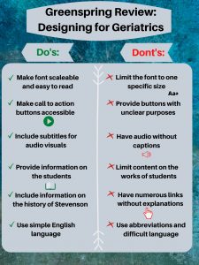
- The audience I chose for my poster is the Geriatric population. Meaning viewers over the age of 60. This is an important audience to think about because if there aren’t certain features on the website, it can make the experience for them unbearable. By adding additional features to the website, it can make their user experience positive and actually enjoyable. I thought about my grandma looking at the Greenspring Review, and let that guide my thinking and my decisions.
- My first do is one of the most important. It is crucial to make the font scalable for the Geriatric population to be able to read and review the website in the first place. That’s why my don’t is right next to it, to ensure that the font can be scalable and easily read. My second do is to ensure that the buttons are clear and easily accessible. One of the points on Accessabilityblog is to make the buttons “clear and clickable” when considering people with low vision. Referring to my second don’t, there is no need to incorporate buttons without a clear purpose or not to be easily seen. The third do on my list is vital for comprehension. It is absolutely essential to provide subtitles for audio visuals to make sure people understand the video. My third don’t goes along with it as well, where as providing a video without captions would hinder their experience with the website. My fourth and fifth do relate to the content of the Greenspring Review. It is important to keep in mind what this population would be interested in reading about to keep their interest. Leading to my fifth don’t, having a bunch of links everywhere can be confusing for anyone. From Boomertechtalk.com, they state to “underline links and change color” when you click on it so they know they have already visited that part of the site. My last do is important as well so the Geriatric population can understand the content that is in front of them. My last don’t going along with it, makes sense because the older generation may not use the same lingo as we do and not understand exactly what we are trying to say exactly.
- The majority of my decisions for this poster came from my general knowledge, and ‘The do’s and don’ts on designing for accessibility” article reviewed in class. I started off with a blue/green background because it is subtle and adds a calming mood to my poster. I put the grey over it so that way the text was easily readable. I made sure the font was an appropriate size, and picked black so it would stand out. I decided to label ‘Do’s” green and put green checks next to it because green represents good. And for the don’ts, I used red and kept it consistent throughout that side to symbolize what not to do. I put a white line down the middle to show that there is separation, and to make the reading easier.
Sherman, Linda, and Linda ShermanBoomer. “Website Design for Seniors Accessibility Guidelines.” Boomer Tech Talk, 19 Dec. 2018, boomertechtalk.com/website-design-for-seniors/.
“UI vs. UX: What’s the Difference between User Interface and User Experience?” UserTesting, www.usertesting.com/blog/ui-vs-ux.
Pun, Karwai. “Dos and Don’ts on Designing for Accessibility.” Accessibility in Government, 2 Sept. 2016, accessibility.blog.gov.uk/2016/09/02/dos-and-donts-on-designing-for-accessibility/.
Usability Summary: Test with 5 Users
This article by Jakob Nielsen talks about why he believes that one only needs to test usability with 5 users. He goes on to explain that usability tests in general, are a waste of resources and funds. He explains that the best way to test is running several small tests that you can afford on no more than 5 users, in comparison to running a single test on more than 5 users. With the test involving the 1st user, he states that the insights shoot up. With the 2nd user, things are generally the same (overlapping data) but it also adds some new insight. The 3rd user provides a small amount of new data as well. One of Nielsen’s main points is that the more users = less you learn; due to the amount of repetition.
In terms of running several tests, it seems as though doing more than one is deemed most efficient. With their being more than one, they can test different things in different ways from one another. For example, the second test can fix the problems from the first test; while introducing something new as well. As the tests continue, one can go deeper into the user experience and test that in various ways.
In conclusion, Nielsen states that testing 5 users on their experience with several tests is deemed most efficient in testing user experience. The problem with a study of one person, is the risk of being misled by them; and their number not being representative of the population of the website. The problem with fifteen people, is that there will be a lot of overlap with the information and not show much of “new” data. The only reason to test for more than five users would be if you needed that many to accurately represent the population.
World Leaders in Research-Based User Experience. “Why You Only Need to Test with 5 Users.” Nielsen Norman Group, www.nngroup.com/articles/why-you-only-need-to-test-with-5-users/.
Greenspring Review
Green spring review: layout 1
Effective:
Navigation bar towards the top: black bolded ink is easy to see
Love the logo. Something about it’s simplicity is nice and calming
Submission Guidelines are up there with the navigation bar which promotes people to submit
Search bar being in the top right is easily accessible and gets readers to reach their goal faster
Lots of whitespace: doesn’t feel overcrowded with content
Not effective:
“Welcome to The Greenspring Review” ink is so light I can barely see it
The spring 2020 issue button is so small that I completely missed it and had to look a second time
Books on either side are distracting, although I like the home-y feel. I have more interest in looking at all the books at first
Under Issues, the way “spring 2020” and “fall 2020” is displayed is rather unprofessional. It feels out of place and I feel pressured to click it
Maybe it would be helpful to have a list of authors with several published works here where someone could just click it? I don’t think outsiders know off hand of a couple authors to search up in the first place
Greenspring review: layout 2
Effective:
Having an actual place on the website to submit more work encourages people to submit. If it’s easy and accessible, there is no need for an extra step and this eliminates them.
There is an efficient use of white space. It creates for perfect balance
It’s simple; yet elegant and sophisticated.
The font is interesting and keeps me engaged. It’s different, but not too different to where it is distracting.
I like how the editors chose quotes instead of putting their own bios. It makes it more interesting and unique and maybe they could go somewhere with that; make a quote of the week would be pretty cool
Not effective:
I feel like the ___ is too much. It takes up too much space when the site is first open. Kind of confusing as to what to do / where to go next
The navigation bar is so small at the bottom and it should be placed at the top, because it is important and you want people to click there
The articles on the featured issues page are not hyperlinked. You cannot click it to read more, rather you have to go to the general topic to learn more which is definitely aggravating (for me)
Issues are the only thing with a drop down menu. It doesn’t make much sense to have a dropdown menu for issues if there is none for any of the others.
The header is cropped when click on other parts of the navigational bar. You only see “review” and letters are chopped off at the bottom
Greenspring review: layout 3
Effective:
Design is sleek, draws my attention to where it needs to be and isn’t too distracting
Creates a nice vibe. It feels current and inviting as well
The blue text here and there really makes it for me. It is appropriate and certainly a nice touch
The navigation bar is clear and easy to see, and spatially is placed perfectly. It fits so well where it is
Love the use of pictures when you look under “issues” for the spring and fall. It’s a nice touch and adds another element
Not effective:
Under issues when you have the choice of spring or fall, I wanted to click on the words themselves to go there but instead it was just the picture. This was a bit confusing: maybe link both?
Where it says “Follow my blog” and ask for an email submission, what / who’s blog is it? Should maybe be more specific
On the right side, the feature bar is at the bottom to where one sees the Facebook posts first. I had to scroll down to look for it, and by having it toward the top, it could become more effective and help people achieve their goal
On the submission page, the guidelines are below where you submit it, so you would submit it first maybe before looking for the guidelines. They aren’t organized in an easy fashion either.
Game Jam is the first thing I see on the website. It would be nice to see the featured articles or something, moreso what it actually is instead of advertising for something else
Ux article summary
UX Movement, and UX Movement. “5 Techniques to Make Mobile Call to Action Buttons Intuitive.” UX Movement, 4 June 2019, uxmovement.com/mobile/5-techniques-to-make-mobile-call-to-action-buttons-intuitive/.
This article is about how to encourage people to press call to action buttons more than they usually do. The article introduces 5 different techniques in order to make it more effective and intuitive. Technique 1 was called “Order the buttons to scanning pattern” which is pretty self explanatory. It is important to order the buttons from top to bottom because it fits the scanning pattern. The bottom button is easiest to reach, and it improves efficiency where it helps people get what they need to get done faster. The second technique deals with distinguishing buttons from text with an outline. By just having text, people might not see that it is an actual button, and just think that it is text. Also by having an outline, it shows that what you’re trying to do is high priority. The third technique dealt with adding color to the progressive actions. The ones that are high priority should be the easiest to identify, and should have more visual weight. It is important to use a variety of colors as well to show priority. It has been discovered that blue is familiar to most users both male and female, that it is a color that is viewed positively as well. The fourth technique is to vary the font weight of the present text labels. Here, it is important to vary them in terms of importance. The last technique is to put an icon on the button that has the highest priority and helps the customers achieve their goal the fastest. For people who are colorblind, they need something more than just the color to base their decisions. The picture of the action helps promote them to pick the button more so than to not pick it.
Rhetorical Analysis
Hi everyone, my name is Emily Wolff and today I will be providing a rhetorical analysis of the online website of Guernica. To start off, I will provide some background information on the site. Guernica is an online magazine that consists of various mediums that focus on different forms of art and politics. It can be said that Guernica is an arts magazine, as it incorporates different forms of art such as poetry and writing pieces; including fiction.
The targeted audience for this online publication would be for anyone interested in learning more about global politics and anyone who enjoys the arts. Because of the type of context the magazine uses, it is intended for adults to use; although open to anyone who can understand the level of writing. Tieing into the purpose, the purpose of Guernica is to provide a medium for people interested in the topics of global politics and people who have an eye for poetry and the arts in general. Guernica provides a means of entertainment and enlightenment for it’s readers and contributors as well.
Before going into the modes, I would like to make the claim that the way Guernica functions is effective and appropriate in terms of an online magazine.
Visual:
Color: The color of the website is mainly black with splashes of orange. The integretation of these colors against a white background makes them stand out. As you can see at the top here, the category you are under is highlighted orange, so it’s easy to see which one you are on; which is definitely helpful.
Font: The use of bolding and font size is absolutely perfect. Looking here, the main topic has the largest font and is bolded for accessibility. For example, looking under politics here, the titles of the various articles are in black ink and in larger font. The captions are smaller in size and provide a brief synopsis of the article.
Media: In looking at media, there is an integration of pictures, text, and sound. This is very effective in keeping an audience and bettering their experience, because they have a picture to go with what is being discussed. Looking at poety specifically, some of them provide a narration. Let’s take a look at “Milk Teeth” over here. As we click on it, there is a picture of teeth. And here we have a place where we can hear the narration of the poem, and scroll down to find a picture of said teeth.
Info architecture: In terms of information architecture, there is a navagation bar at the top with the search bar included as well. This creates easy navigation for it’s users and is displayed effectively as seen here.
User experience: Looking at user experience as previously mentioned, the experience is positive because of the modes coming together. The magazine is easy to navigate, and all the modes come together to make for a positive experience; due to the simplicity and straightforwardness of the website.
Aural
Looking at the aural mode, there is the usage of sound when it comes to the narration of poetry. The tone of the authors voice is calming and is slow enough where one can understand it. Looking here at this poem, the poem is able to be narrated.
Linguistic
The language used in this website is sophisticated, yet simple enough to understand. As we look over this article entitled Notes from a Nothing, we can see it laid out here. The author’s usage of simple words make the reader’s experience more enjoyable and captivates the reader’s attention.
Spatial
Now diving into the spacial mode, the publishers did a great job spacing everything out appropraitely. There are white columns on either side of the page, grabbing the reader’s attention to focus on what is in the middle of the page. We can see this by looking at the front page.
Gestural
Transitioning into the gestural mode, there are a couple things that viewers can do here. There is a search bar at the top right up here, where people can type what content they would like to see. There are also some additional options under the more tab, such as what we see pictured here.
Conclusion
In conclusion, Guernica combines all the modes effectively and provides a great medium for people who are interested in art and global politics. It’s purpose is direct, and the user experience is definitely effective. I feel as though there is no need for change about this online publication whatsoever.
Visual Rhetorical Analysis: Villager
Intro:
I am performing a rhetorical analysis on the Stevenson Villager. The Villager aims to keep students and readers informed about what is going on at Stevenson, through various modes with different types of articles.The Villager is a website that is updated weekly by journalism students that attend Stevenson. The website features the latest news on the school, and highlights certain occurrences on campus. Some examples of articles include Relay for Life, how the science majors prepared for the showcase, as well as highlighting the athletes of the week. Furthermore, the website contains various modes, such as pictures and videos in order to gain the attention of it’s readers and communicate individual writers point across. Diving deeper, the purpose of the website is to provide students with a medium they can access to stay in touch with what is occurring on campus. The intended audience for this website is for students, including perspective ones, parents, alumni, teachers, and anyone else who is interested in keeping up with what is happening at Stevenson.
Visual:
Looking at this website visually, it is thought out nicely and is easily accessible. Tuning into the font, it is readable and it seems to go well with the color scheme. The splash of green in the title emphasizes the name of the website effectively. By making the font white and grey, it blends in nicely but is not “bold” to readers to an extent where they feel as though it is almost “screaming” at them. In terms of the layout, the way it is designed makes it easy for its readers to navigate the website, and encourage them to explore it. The variety of categories provides readers with a range of topics they could be interested in, such as sports, reviews, and features. By including the search bar at the top, it allows the audience a sense of freedom and control as to what they want to look for and what exactly they choose to look at. Spatially, the website is thought to be well spaced out, having a bar on the right side, and various articles going down the middle, all with having different categories at the top.
Aural Mode:
Despite the inclusion of various modes, there is little to say when it comes to aural. There is only sound when it comes to the videos that are present. Having sound present in the videos is extremely important to peak the viewer’s interest and add a different element. The volume and tone in each video is at an appropriate setting.
Spatial Mode:
Referring to visual again, the way the website is spacially organized makes sense. The search bar at the top allows viewers that have a specific targed article to get there, instantly, which is not an option when it comes to non online resources. By having articles in the middle, it draws attention to them and gains viewers. It does not feel too crowded, yet it does not feel like there is a lot of empty space either. The combination of filling the page and not filling it at the same time makes for an appropriate layout.
Gestural Mode:
By looking at the people on the website, it seems evident some were camera ready, and some didn’t even know a camera was there. In videos, some of the people involved act like there isn’t a camera, and some do. There are no gestures that feel out of place, and everything is fitting for the website and its contents.
Linguistic:
The language on this website is easy, simple, and informative. By making the language easily understandable, it gives the potential to broaden the audience and have readers focused on the articles, since they can understand them.
Conclusion:
In conclusion, The Villager’s usage of various modes and affordances play a vital role in captivating it’s readers. All the modes come together to create a website that provides students and other viewers with accurate and real time information as to what is happening at Stevenson. If the website lacked any of the modes, it would be missing something that has been a key contributor for it’s success.