1. Choose your platform, and explain why you think this platform would be effective for the GSR and your submission. Consider choosing the platform that you are familiar with, but that will also address a specific audience of the Greenspring Review. Who might be interested in reading your piece, and what platforms do they interact with most?
I mostly chose Twitter as the platform for my mockup because I knew my way around the website, and it’s significantly easier to post on a desktop/laptop than websites like Instagram. Also, I know a lot of my friends and peers use Twitter and have a profile, as well as Stevenson and their library. This allows the promotion of my drafted submission, as liking and retweeting the post would share it to their followers. Students from Stevenson specifically may be interested in reading, especially ones who are involved with the Greenspring Review or the English department.
2. Craft a pitch that fits the constraints of the platform. Consider the common conventions for that site. Will you use text as a caption or an overlay? Do you have a character or space limit? Can you manipulate the font or color of the text? Should you include emojis and punctuation?
There is a rather restrictive character limit for tweets, but instead of describing what my creative work was about I was able to post an image of an excerpt from my submission, along with the first picture that is embedded into my work. There are no font options, but there are tags you can add to the post so that when someone searches for a specific word like #creative or #COVID19 they will see the post as they scroll through. Even though the character limit is small, most users aren’t very receptive to walls of text, so I incorporated spacing and two short sentences to get my point across.
3. Craft media for your post. Should you use an image? A video? A screenshot? A GIF? What works best for this platform?
Adding the pictures may prompt the user to click and scroll through them so they can read the excerpt, and posting the link to the Greenspring Review will attract more attention to the website itself if users are interested. Images are practically a staple for Twitter, especially as a workaround for the limited characters you can have, so the screenshot of my excerpt is very useful in describing what my work is about. This can also attract anyone interested in photography, as the first image in my mockup and the images in my submission are pictures I took myself.
4. Consider when and how often to post. What time of day does your audience use this platform? How can you increase likes and comments? How can you get more views?
For my audience, which is mostly anyone who is affiliated with Stevenson University and the Greenspring Review in any way, or anyone who is a photographer or author themselves, I would say that early afternoon in Eastern Standard Time would be best. That way, across United States, and other time zones across the world that are during the day at this time, would be able to see this post. It might be more beneficial to post this on other sites like Instagram or Facebook as well, since Stevenson University also has a following on their profiles as well. There’s also a possibility that Stevenson might post/repost/like/retweet my post to reach more people, because their social media accounts are very interactive with their students.
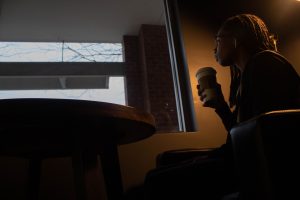
I visit this coffee shop a lot. The building never changes, but the people do. Every year or so new college-bound students come here in search of a job and a new beginning. To start fresh and meet new people.
When I first came here, I had my new beginning. But my new beginning quickly became my end. I’m stuck here, and I don’t have the energy to leave. My friends have all left after they graduated to pursue their dreams, and I’m still here.
I met him on our first day of an overseas trip. A group of twenty students, current and graduated, including me were taking a plane to Europe where we would explore Germany, Italy, and Switzerland for ten days. He walked up to me as we were waiting to board our plane, and I could barely hold a conversation with the bubble of anxiety strangling my thoughts.
I would say we hit it off immediately, but that isn’t true.
Back then, I’d say my mental health was the worst it ever was. Standing in the middle of the airport in a T-shirt and sweatpants, my backpack over my shoulders and my hands strangling my phone, fingers mindlessly scrolling to keep myself busy. Strangers bustled around me in every direction, the only thing I could focus on as I struggled to breathe through my anxiousness. This was the longest I would have been away from home at the time, and being surrounded by people I didn’t know sent my social anxiety at an all time high. And then he came.
As I was fiddling with my phone for the fiftieth time, I paid no attention to movement in my peripheral vision until he began talking, his voice deep and curious, starting off with “So…” I glanced up, hardly processing who was in front of me; looking, but not seeing as he asked if I had ever been on a plane before. I told him not since I was eight, and he asked to see my plane ticket.
Such a creative way to learn my name.
Gesturing with his hands, he described where my seat would be and I smiled in gratitude, too anxious to talk with the lump in my throat, and the shuffling of my feet that couldn’t stand still. He asked about my name, and I told him it was from a show. An unexpected laugh that was rich and smooth sounded from him, mixing in with the chatter around us, and yet very distinct. He said his name probably came from a baby book, and all I did was smile tensely. The anxiety I felt prevented me from seeing the obvious cue to ask what his name was, so it remained a mystery for days.
Now, I wring my hands together, taking deep breaths to calm the crushing feeling in my chest. The anticipation is building as I sit in the same place where we had talked many times before. It’s been three years since then, after we had failed to say goodbye as he walked out of the airport to see his mom, and as I stood by mine. We had each other’s numbers, and throughout those years we kept contact on and off, as often as my moods bounced between horribly anxious and feeling content. He was tired of my fickleness, and I was tired of being misunderstood. We haven’t spoken since then.
Until I texted him yesterday.
The sound of a bell rang through the air, a sign that the door opened. I stiffened in response, waiting to see if it was him as I stared down at the lukewarm espresso in front of me. The stool across from me moved slightly as he sat down, and I immediately felt nauseous at the thought of the conversation we had to have.
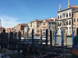
Anxiety washed over my body as I pursed my lips. His hands appeared on the table, fingers lacing together. I started to remember how his dark, rough skin glided across my tan, smooth hands. How we held them as we walked across Venice together.
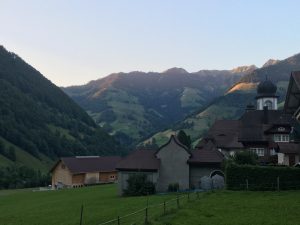
That day we had driven there from our hotel in Switzerland early in the morning, days had passed after we had first met. A little less after he sat next to me on the bus after someone sat in his seat. Even less after he first held my hand under my blanket that we shared. I had begun to look forward to our talks about nothing and everything. But that morning he wasn’t in a great mood, and after he sat next to me there was silence. I plugged my earphones in and my walls built stronger around me.
After the bus ride we went to a glass-blowing building, where we watched demonstrations and gazed at sculptures in their displays. He had tried to talk to me a few times, and I responded with a small, polite small smile and kept walking. It was then that I really felt alone, because I had turned him into my safety net over the course of the trip. Without him, I was just me. Anxious and lonely.
I didn’t really speak until we got to roam around the city after our chaperone let us go. He had grabbed my hand and pulled me with him, persistent in getting through the barrier I built around myself. I remember we went to a museum and rode in a Gondola, traveling in the blazing heat filled with crowds of tourists talking and taking pictures.
Smith, Essence. July, 2017.
I remember how I sat on a low stone wall in the shade where he stood between my legs, the same hands resting beside either of my thighs before we left the city back to our hotel. Those same hands that caressed me face at sunset, sitting in front of a bonfire before he kissed me. Dark, brown eyes lit up by the fire behind us filled with warmth and adoration.
Smith, Essence. July, 2017.
I remember how I pushed him away for years when I wanted to be alone. And now we’re here.
I slowly looked up at him, to see that he’s already looking at me. A black jacket encased his arms over a light grey shirt, full lips pulled into a tight line, nose wide and slightly flared, dark eyes staring back at me. No anger, no regret, no contempt. His eyes were filled with love and hurt, and I hated myself for causing the latter.
“Thank you for meeting me.”
He nodded.
I swallowed the lump in my throat. “I just – I just wanted to say that I’m sorry.”
“For?”
His pained, deep voice sent shudders down my spine. Tears formed in my eyes as I remembered how we stayed up on the phone at night talking, how we would steal glances at each other when we were near, how his infectious laugh made me fall in love with him.
How it was all about to end.
“Everything,” I spoke. I took a sip of my cold, black coffee to soothe my painfully dry throat before I looked back into his brown eyes. “I was terrible to you; pushing you away because I couldn’t trust you, pulling you back in when I thought I was okay. I’m sorry for never opening up to you; for never telling you how much I loved you.” I cast my gaze down toward the table, fiddling with my nails.
A moment passed before his hand reached out and held mine. “You know I hate that,” he said with the tiniest bit of amusement. I gave him a small, forced smile and he moved his hands away and asked “Why did you leave?”
I let out a sigh at the expected question. “I didn’t want to.” He waited for me as I gathered my thoughts.
“Ever since middle school, I’ve been kind of…emotionally compromised, I guess you could say. I’ve always been bullied when I was younger – by my own friends too – and when I was finally fed up with it I held everyone at a distance. Hell, I was going to, you know, in seventh grade and all my mom said was ‘You think you’d go to Heaven if you did that?’ Typical Black-Parent Syndrome. All I felt since then was pure defeat. The only person I’ve ever had as a constant in my life was me, and I learned to cope with the endless anxiety and loneliness, I guess. And I felt – feel – like I have no one. I couldn’t – I can’t trust anybody.” I drank more coffee to push down the enormous bubble floating in my chest.
Before I continued, he cut me off. “I tried so hard to get you to trust me – to trust someone after all you’ve been through-”
“You can’t fix me,” I whispered. “You can’t save everyone,” he shook his head, about to reject the idea but I continued, “you have this hero complex. You’ve been trying to fix me, you tried to fix your last girlfriend before she cheated on you – multiple times, you tried to fix the relationship with your Mom who never really bothered to give you the time of day.” The faintest outline of a tear rolled down his cheek before he wiped it away quickly. “You’re trying to fix your best friend who was assaulted months ago, even though he hasn’t talked to you since then. You can’t fix anyone unless they want to fix themselves.”
A troubled breath left his lips and I sniffed in response. “You have such a kind and generous heart, but that will be your downfall if you don’t put yourself first.”
“Is this what you brought me here for?”
I smiled ruefully. “No, that’s not why I brought you here.” I glanced around the small café, taking in the sweet and bitter smell of coffee and the sound of the silent chatter as I gathered my thoughts. “I just – I feel so alone all the time. Anything and everything makes me so anxious that sometimes I can’t even breathe and most days I don’t even want to. I stopped talking to my friends because I know it’s draining being around me, and they’ve even said it themselves. They don’t and they will never understand me, no matter how many times I explain to them how my mind works. Either that or they just don’t care. So I stopped opening up to people because no one will ever care or understand or care to understand me-”
“All I’ve ever done is care to understand you.”
I held back a sob as I responded, voice watery with emotion. “I know that now. You are, by far, the kindest, most thoughtful person I’ve ever met. And even though it was fleeting, I did – I do – trust you. I never want you to think that I didn’t. I don’t want you to think that I never loved you either, because I always will.” He reached out to hold my hand and I let him. My chest tightened unbearably and threatened to suffocate me. “I knew you loved me and I took advantage of that, and I am so sorry.”
He wiped a tear that fell from my eye. “I will always love you, too. You deserve so much more than what you got; you deserve to be happy, and I’m sorry I couldn’t give that to you.”
I shook my head. “You did, even when we weren’t together.” I breathed out. “Whenever I pushed you away, I threw myself into work to try and ignore everything and everyone, which obviously isn’t healthy. So I decided to take your advice and start going to therapy. But I think we should both try to move on. You deserve more than what I can give right now.”
The corner of his lips quirked up a little, his hand still on my cheek. “Is that a ‘one day’?”
Biting back a sad laugh, I said, “It’s maybe one day. If, somehow, we meet again in the future, and we’re both in better places, maybe we can try again.” He stands up and I follow as he immediately reaches for a hug. We stand there for a while, breathing each other in one last time before we part ways. Once he pulled back, he planted a light kiss on my cheek before he reached in his pocket, took out a five-dollar bill and placed it on the table. Knowing what I’m about to say, he sends me a look before I start talking. An easy, grateful smile stretches across my face as he starts to leave.
“See you.”
“See you,” I called back to him.
The bell rang again as he walked out the door, and I felt myself drowning.
I have never used a Style Sheet before, so there was definitely a lot of confusion when I first started. I’m still not entirely sure if I followed the guidelines the correct way, because I wasn’t sure whether to add or change specific elements in the article. I mostly had some minor punctuation changes and spacing. In the pages I edited there were only a few headings and there weren’t any references except the footnotes that I looked over. The article wasn’t too difficult to read to fix a few punctuation issues, and from what I found most of the first eight pages were fine. This was slightly overwhelming to start because of the list of rules the Style Sheet provided combined with the rather cluttered article that we had to edit. Overall. the Style Sheet seems like a useful tool to use in the editing process for more structured, journal-style writing. For a creative piece I think some of the guidelines wouldn’t be as helpful, because normally they don’t include footnotes or lists.
When I had first visited the w3schools website, I was a little overwhelmed at the amount of lessons that were available, and the amount we had to do, so it took while for me to actually start the process of completing them. I decided that once I started, I would split the lessons over two days to give me a break, as even the first half of them took a few hours to read through and make my own code, do the exercises and write a brief reflection for each one. Some sections took a little longer to complete because they had more tags to learn and more examples listed, and I tried to implement most of them while I was experimenting with creating my own code from the examples shown. Even though it took quite a while to finish this assignment, it was kind of fun to experiment with different fonts and colors, textboxes and formatting with tags like <i> and <strong>. I took a class in freshman high school where we had to create a website providing information about a topic of our choice, and we could use different colors, images and links to different pages of our website. So walking into this I was kind of familiar with coding, but I certainly didn’t remember most of what I had previously learned.
I think the Attributes section was the most difficult for me, because there were so many new tags to learn and make a code for. Once I got to the exercises I had to refer back to the information on the page because it was hard to remember specific ones for different things. CSS and Images were also pretty difficult as well, since there were many different tags for some of the same style and object that I would try to code. Overall, the lessons weren’t hard to understand, there was just a lot of information to digest at one time. Coding has very structured rules to it, like how open tags (<em>) should always have a closed tag (</em>), and once I understood those staple rules that always applied it was easier to implement the tags and create a webpage. I definitely wouldn’t add this to my resume because there is so much more information to learn in regards to tags and how and where to use them, and I’m not experienced enough to be able to code things without looking at reference information to code specific things.
As my audience for creating this poster, I knew I had wanted an anxiety-based disorder because I struggle with social anxiety myself, and after researching different disorders I decided on post-traumatic stress disorder (PTSD). This is not limited to people who have served in any of the military branches, as the definition of trauma is any shocking event that one sees or has happen to them. Traumatic situations include robberies, assault, sexual assault, witness of death, etc. PTSD is also not limited to a specific age or gender, as 60% of men and 50% of women have at least one traumatic experience in their lives that could lead to the development of this disorder. More specifically, 10% of women and 4% of men will experience PTSD in their lives (U.S. Department of Veterans Affairs, 2018). Since this is so common among the general public, I decided to create a poster geared towards people with PTSD because of the students and faculty that may have/will experience this at some point in their lives.
Accommodating for this anxiety disorder proves difficult as it varies for each person, since different things such as sounds and visuals are triggering for different individuals. Providing trigger warnings for sensitive content included in videos or very graphic images would be beneficial. In a study conducted in a university located in Australia, it was found that the prevalence of mental illnesses such as depression, anxiety, and PTSD were the most prominent (Kent, 2015). Since trauma is variable with each individual, I decided to use more general Do’s and Don’ts catered to the content that the Greenspring Review would inhabit. In specific pieces such as videos, images, or written work inspired by PTSD, offering contact information or resources would be beneficial to this audience as this would encourage users to seek help if they need it, rather than promoting content that inadvertently discourages them. Also, to reduce anxiety from using the site, implementing an easy to use navigation system and eliminating ambiguity by utilizing clear language would render the website more useful.
For the visual aspect of my poster, I tried to create a simple design that would not be too overwhelming to users with anxiety disorders, specifically PTSD. To serve the idea to be clear and concise, I used bold lines to separate parts of the poster for the Do’s and Don’ts, as well as using a white background to make the text and pictures stand out more and to create contrast. I included the picture at the top of the poster as a way of expressing that PTSD is not limited to certain ages or genders. I also kept the colors relative to this picture so that they would coordinate well with the “color scheme.” To not overwhelm the reader with walls of text. I spaced the words out at much as possible so that the space would not be too cluttered. Overall, I tried to balance the pictures and the text as much as possible so that and off-centered pictures or text would not be noticeable. (Vasile, 2018)
Kent, Mike. “Disability, Mental Illness, and ELearning: Invisible Behind the Screen?” The Journal of Interactive Technology and Pedagogy, Cuny Academic Commons, 17 Dec. 2015, jitp.commons.gc.cuny.edu/disability-mental-illness-and-elearning-invisible-behind-the-screen/.
U.S. Department of Veterans Affairs. “How Common Is PTSD in Adults?” National Center for PTSD, 13 Sept. 2018, www.ptsd.va.gov/understand/common/common_adults.asp.
Vasile, Christian. “Learning the Basic Elements and Principles of Graphic Design.” 1stWebDesigner, 27 May. 2018, 1stwebdesigner.com/graphic-design-basics-elements/.
In this article, Sarah Gibbons describes the process of creating a Journey Map and the parts it comprises. First, she defines it as a UX tool that gives the user a visual guideline or process that has an overall goal. To start the creation of this map, designers begin by congregating actions that the user takes into a specific order. Then, this timeline will include the customer’s thoughts and emotions about the product that make a narrative. This diagram states the user, scenario and goal at the top, three phases composed of the user’s thoughts and emotions, and overall insight at the bottom. The first important component of a journey map is the actor, or user, that is going through their “journey,” where each map is dedicated to one client. The next component is the scenario, where the map describes the certain situation intertwined with the user’s goal for using the product. Then, there are the journey or high-level phases specific to the organization that give structure to the user’s thoughts and feelings. These actions, steps taken by the user, emotions, up and down experiences, and mindsets, which are the user’s thoughts and questions, are also incorporated into the journey map. Lastly, the opportunities are what information the organization has gained from the UX from the journey map. A variation of this tool is an experience map, where the components are for a more general UX to understand normal human behavior. Another would be the service blueprint, which focuses more on the business instead of the user. The last one mentioned was the user story map, which is a more visual and is typically summarized in a single sentence. Journey maps in any form are useful to UI designers because they offer a visual guideline and place to gather all customer insight in one place so that the whole design to can make decisions.
Source
Gibbons, Sarah. “Journey Mapping 101.” Nielsen Norman Group, Nielson Norman Group, 9 Jan. 2012, https://www.nngroup.com/articles/journey-mapping-101/.
Sarah Gibbons, in her article Empathy Mapping: The First Step in Design Thinking, describes the empathy map as a tool many UI designers use to create a successful and useful product. An empathy map, she explains, is a display used to combine knowledge about different kinds of users. It usually has four squares labeled Says, Thinks, Does and Fells, with an associated type of user in the middle. Says incorporates what the customer verbally wants, Thinks is what their thoughts are while using the product, Does describes the actions the user makes while exploring the product, and Feels is their emotional state while using different features of the UI. There are two types of empathy maps, One User and Multiple-User maps. One User is usually centered on people have provided insight on their preferred style of product. Multiple-User maps are broader and include multiple user comments that expressed similar thoughts and actions. Empathy maps provide a lot of beneficial uses to designers, as they give insight to how the user-base companies have feels about their products and how to design and create a better UX. Gibbons wrote steps in this process which includes choosing a specific goal and gathering materials to create the map, then actually collecting information from users to put all of the notes together so that a map is created. Then, using this information the designers can begin planning. This tool is designed to enhance UX experience by giving direct feedback to companies based on customers’ feelings about their product.
This article describes how schools and educational institutions can accommodate those students who had requested disability support for mental illness, so that studying online can be better suited for them. Kent explains that students who identifies with a disability are often invisible when there is consideration for online schooling. The Open Universities Australia (OUA) consisting of several Australian universities requests that upon registration students can include information about any disabilities they might have, and possible distribution of their medical information causes them to be reluctant to disclose their disability. Students in these institutions received a survey containing a variety of questions, including some about the accessibility of online learning and their effectiveness. Students who accepted the option of an interview about their impairments and the impact they had on the students’ learning ability, and some also accepted to participate in any further research. Kent noted that trying to accommodate for one impairment could hinder the other, so it is difficult to find a good balance of accessibility. From the interviews, it was found that many students suffered from depression, anxiety, post-traumatic stress disorder and OCD, and some identifying with both; the interviewees described how the stigma around these mental illnesses had made them reluctant in disclosing their disabilities. This results in them feeling invisible and helpless, as they do not feel that their disabilities are being taken into consideration even when their information is disclosed. The stigma of mental illness as being something they just have to “push through” makes it even more difficult for the students to find the motivation and will to continue their education and their work. eLearning as an online system to accommodate those with disabilities has been developed by many different institutions to give access to more people. Although the invisible feeling still remains in some, this online study still has some way to go in regard to being accessible to all students with many different disabilities, and with the help of the students will make this eLearning system more effective.
Edit:
Kent, Mike. “Disability, Mental Illness, and ELearning: Invisible Behind the Screen?” The Journal of Interactive Technology and Pedagogy, Cuny Academic Commons, 17 Dec. 2015, jitp.commons.gc.cuny.edu/disability-mental-illness-and-elearning-invisible-behind-the-screen/.
This article describes how user experience (UX) designers’ role is to create a user-friendly interface that caters to all of the customers’ needs. Listed are three branches of psychology that can be utilized by UX designers and seven different psychological principles that may be used when designing an interface to give customers the best experience when using a service or product. Starting off, the writer talks about behavioral psychology as a branch.
Behavioral psychology assumes that behaviors are actions to certain stimuli, or their origin is from past punishments or praise. A UX example of this concept is that users assume one website works exactly the same as another website they have visited before. The next branch mentioned is cognitive psychology, which focuses on the user’s mental processes. This researches how the customer thinks; attention, perception and problem solving. A UX example for this principle would be “least effort,” to get something done or to go to a specific page in a user interface, the user will find the easiest path to do so. Another branch of psychology that was mentioned is gestalt psychology, which is primarily how users perceive and simplify objects and complex images, specifically those in an interface.
The second half of the article began to talk about the seven psychological principles UX designers can apply. The first is Jakob’s Law, which says that users will expect to find certain features in certain places, implementing the desire path, or the easiest way to get there. To determine these paths, you can record their sessions to see how they navigate through the interface. The aforementioned principle of least effort is mentioned again as the second principle, where users will find the fastest way to get something done with the least amount of effort. Then, the Law of Proximity states that elements near each other are perceived to the user as a single group. Next, the Law of figure/ground says that an element can be perceived to the customer as a figure or a background, which can be applied through the color and brightness of the background and buttons in the interface. The Law of Similarity, like the previous principles, is the concept that if two elements are similar then they are perceived in the same group. Number seven, which is Hick’s Law, states that when there’s an overwhelming amount of features that the user has, they feel frustrated. So essentially, less is more. Lastly, Serial position effect combines primacy and recency effect, where users remember the first and last items in a series respectively. In context of the user interface, it’s better to repeat a feature at the beginning and end of the webpage.
From this article I learned about different psychological principles and how they can be applied when designing, or in our case redesigning, a user interface to enhance user experience. Using elements such as series, primacy and recency, and grouping similar objects together to provide an easier navigation. Utilizing these principles may aid in the construction of our redesign and serves as a guide for how to organize them.