GSR Social media

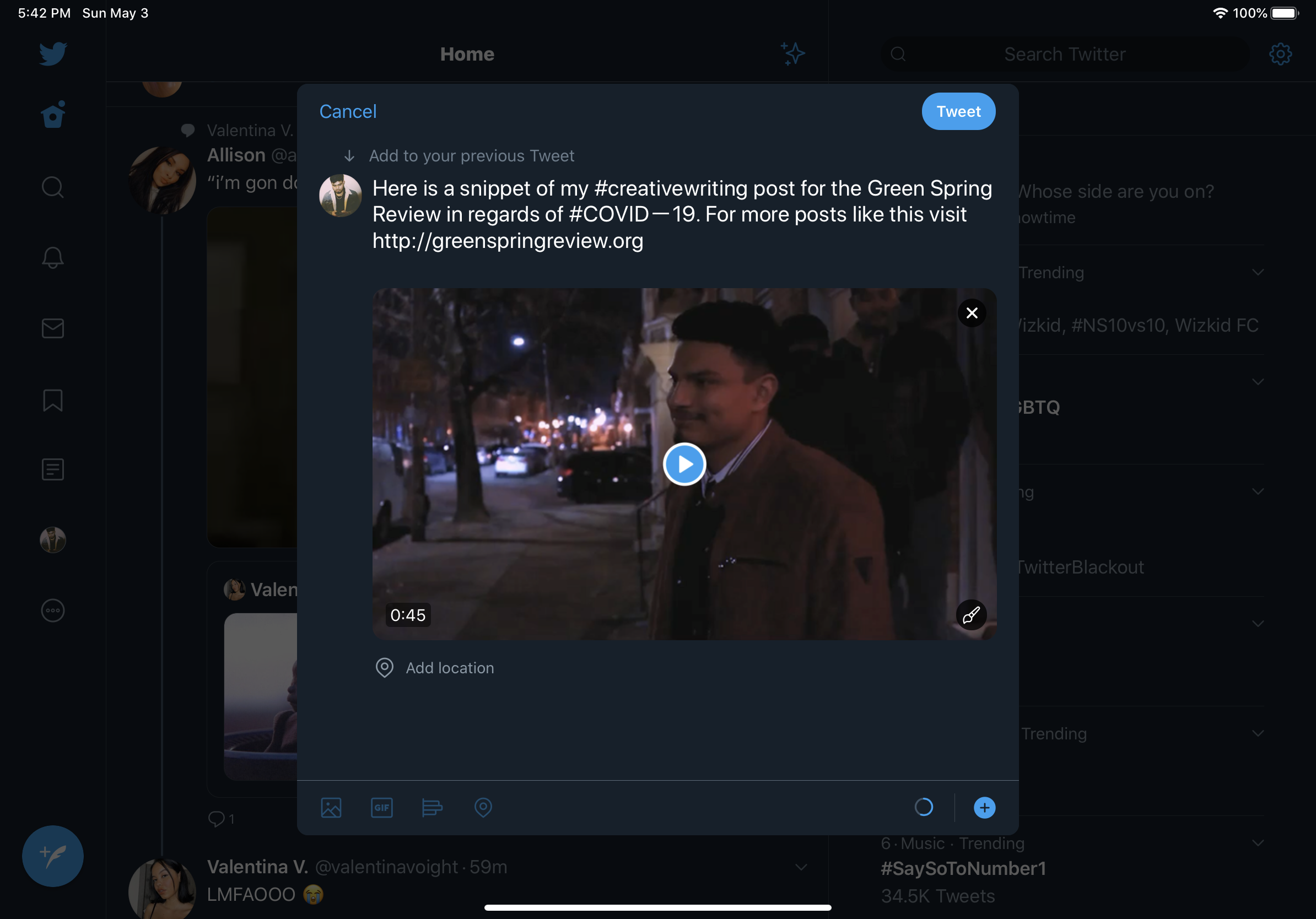
The platform I choose to promote my creative work for The Green spring review is Twitter. Reason for that is because that is the main source of social media that people are using these days. It is perfect for something that involves video or writing.

My idea for my post is to create a short video that revolves the idea of a my poem. Which is a couple that is stuck in quarantine and cannot see each other. Using the hashtags Covid-19 is a good idea because that is one of the major topic in today’s world. So when they go to see everything under covid-19 they will see my post that will grab their attention. Plus this way I am not restricted by characters and can get my point across in a way that catches attention. Peoples attention span is lowering so the video will not be long enough for someone to click off but just enough to keep them engaged.

I think posting around the afternoon would be a good idea because that is when people are getting off work and want to just sit down and relax. That is when they will scroll through social media and come across my post. Some ways to help increase comments and likes are having friends share your posts for you or even take it to another media platform. You can promote your post on Instagram if needed.  I could also mention Stevenson university in my post by tagging them in it and they might even share it.

GSR

So Close, but So Far


I can see you in front of me,

But it does not feel the same.

Waiting for the day they set us free –

The desire to be with you cannot be tamed.


We know this is not a goodbye,

rather a see you later.

The day we do sparks will fly,

The bond we have will become greater.


But is all this suffering pointless?

Everyone tells us to hide,

But how do we expect this situation to digress?

When everyone else refuses to stay inside.


Going out for their selfish reasons,

Not a care in the world when ours is ending.

This is an act of treason,

While the date we see each other is still pending.


If we do our part, we can kill this quick

Go back to our normal lives

But they want to act like toddlers not listen and throw a fit

Seeing them outside while I still have to say goodbyes


But it’s not goodbye right?

It’s see you soon.

When it’s all over we can take our flight,

Finally escape, maybe to the moon?


To finally go out again with you,

Grab some dinner. I’m in the mood for caviar.

At this point it seems too good to be true,

That day seems so close but so far.

Style Reflection Sheet

https://docs.google.com/document/d/1C7F3oblQC_j19LDF7ljIq13xZRyHtvd4SI6ldIJa9hc/edit?usp=sharing

At First glance, seeing what we had to convert into a style sheet was overwhelming.  But that was only because I assumed that we had to do all 19 pages. I am experienced in coding so it is not that I was so much worried that I did not know what I was doing. It was more so that I worried I would accidentally skip over something. If there is one thing that I will always remember about coding, is that if one little key is off, then the whole program will not work.

I am experienced but I am no means an expert at this. I did have to go back and review from the website we were previously doing practice on. I even used the “Try it yourself” tabs and entered my code to make sure it comes out the way I wanted.

HTML Reflection

https://docs.google.com/document/d/11yAvZUZzWFkBlVUZuasVoIzSD9fKS1C4w0NK1ZzG-2U/edit?usp=sharing

Being a CIS major I am required to take at least one programing class. So majority of this is all review to me. I have taken a html class at Stevenson as well. Some of this reminds me how time consuming programming is and how frustrating it can be. But if you have a passion for it, it becomes really fun. The end results can be satisfying as well.

I do wish I had the patience to be able to sit down and knock out programming and practice it everyday because it can be a very promising career. Re-learning programing makes me nervous about redesigning the Greenspring Review because I do not want to mess anything up.


NNGroup summary

In the article “5 Principles of Visual-Design in UX”, they discuss 5 principles on what creates a beautiful design and increases usability. These principles are known as Visual design principles, they are scale, visual hierarchy, balance, contract, and gestalt. When all five of these principles come together, they make one beautiful design. Scale must deal with using relative size to signal importance (Gordon). Visual Hierarchy must deal with guiding the eye on the page so that it attends to different design elements in order of their importance (Gordon). Balance refers to satisfying arrangement or proportion of design elements (Gordon). Contrast provides the eye with noticeable difference between objects in order to emphasize that they are distinct (Gordon). Gestalt Principles captures our tendency to perceive the whole as opposed to the individual elements (Gordon). The end result of using these five principles will produce, an increase in usability for the user, provoke emotion and delight to the user and strengthen brand perception (Gordon).

Gordon, Kelley. “5 Principles of Visual-Design in UX.” Nielsen Norman Group, 1 Mar. 2020, www.nngroup.com/articles/principles-visual-design/.

JITP summary

There is a fear of online students with disabilities being invisible and not being attended to properly, which is the problem in Australian higher education (universities). At OUA, a university in Australia, a survey was emailed to students who have registered for disability support; regarding how accessible online platforms used for teaching by different institutions were, and what motivated the students to disclose their disability or not. The study found that 46.3 percent of students responded as having a mental illness. The article talks about how eLearning can help those who have a disability and are studying in a higher education. One advantage that comes with online courses is that the information can be accessible anywhere in any format. The articles states that the students are attracted to eLearning because of three attributes accessibility, flexibility, and disclosure. Students do not have to face the problems they would if they were in a physical classroom and can change their environment if needed. The article claims that students have their own ideas on eLearning and institutions should find a way to make it easy for them to share these ideas. The students want their voices heard it is just the matter of doing it properly without discouraging them. The article claims that change needs to happen, students with disabilities should not be left out or disappear behind the screen. When the numbers of the surveys are released and acknowledged hopefully that is enough to shed some light into this topic.

Kent , Mike. “Disability, Mental Illness, and ELearning: Invisible Behind the Screen?” The Journal of Interactive Technology and Pedagogy, jitp.commons.gc.cuny.edu/disability-mental-illness-and-elearning-invisible-behind-the-screen/.


UX/UI review

Team 1: https://thegreenspringreview.art.blog/

5 elements that are effective:

  1. Home page of the website is done well by giving The Greenspring Review a very professional aesthetic. The home page reminds me of a university database page; database websites are meant to look for professional pieces of writing. With the Green Spring Review, you are looking for writings in general, thus there is a similarity in the two.
  2. The side widget is also a nice touch. It states the next event that is going on at Stevenson. This makes the users want to keep exploring to find out more about this event. The widget is also hard to miss which makes it easy for the user to notice it while on the website.
  3. The menu on the top of the home screen makes it easy to navigate through the website. The cursor turns from a regular arrow into a finger icon to allow the user to know you can click on the item, making for easy navigation.
  4. On the main menu it allows you to see the latest work from the latest issue. This is a nice addition because if a user wants to see what the issue is then they can easily do it. And if this is updated daily it will make the user come back everyday to see what the latest work is.
  5. They do a good job making it a Stevenson Website without branding stevenson’s name all over it. They kept it clean and simple. Being a Stevenson student, you can recognize the classic Stevenson colors. And if you were not from Stevenson but had an interest in Stevenson you can still tell by the color schemes.

5 elements that are not effective:

  1. The issues Tab is not a good design. When on the issues menu 2 items are in your face in large letters. And when hovering over them a drop down appears in big letters as well. To me this makes me feel like they do not have much to offer so they thought they could hide that with bigger letters and fill space.
  2. The search box placement on the issues tab feels awkward as well. Users are used to seeing search tabs on the top of the screen, to have it dead in the middle does not make sense.
  3. It would be easier for the user if the issues tab had a drop down menu at the top of the page and not having to constantly click on the issues to see other works.
  4. The Greenspring Review is supposed to target all types of art works, but with the side panels being pictures of a bookshelf it makes you think that there is only literature on this website.
  5. In the art page there is only a picture of the artwork, if there is maybe a story behind the artwork or maybe some description of some sort, it would make it more interesting.


Team 2: https://jennaaye.wordpress.com/

Effective:

  1. The header on the home page does a good job at grabbing the users attention and gives them a brief description on what the website is about “A Literary, Art, and Media Magazine”
  2. When scrolling down on the website the menu stays attached to the top of the screen. So no matter how far you scroll down, the top menu is still available to user. They would not have to waste time scrolling all the way back to the top
  3. The issues tab on the top menu have a drop-down menu. This way the user does not have to leave the page they are on just yet. It is also not big and in the way of anything else.
  4. On the art page, when scrolling down the art pieces are in a staggered form. This keeps the user’s eyes moving and more attentive to what is going on, rather than just moving their eyes up and down.
  5. They also give the user the option to submit a piece of work themselves for review to have a chance to get published as well.


Needs Improvement

  1. This website is more designed for a mobile device. When you look at the website on a computer there is too much blank space on the side, and everything feels compacted in the middle. When you look at it on a mobile phone then all that white space is gone, and the content fills up the screen appropriately on the phone.
  2. The banner is made so huge, but it all disappears when you scroll down. Should’ve found another to incorporate the banner design throughout the website.
  3. Under the creative writings the options are still in the middle but more towards the left leaving even more blank space.
  4. More color should be added to the website because, as now it does not and without color it feels like a word document.
  5. When looking at the archives I thought it would be more so of old work that is on the page, but it takes you to a different website. It would be best to have the works on the website so that way users are not clicking off yours.


Team 3: https://greenspringreview.art.blog/

Effective:

  1. The Facebook widget on the side menu is a nice touch. It lets the user know that this website is not the only platform for brand. The Widget allows users to interact with recent posts on the Facebook page.
  2. They do nice a job at keeping the blank white space to a minimum. This keeps the user active throughout the site.
  3. Adding a submission tab for those who wants their reading reviews and published bring a sense of community.
  4. The menu is sectioned off, letting the user know that it is in fact a menu
  5. Having the email subscription signup at the bottom of the page is a nice touch. It is what every website does. Giving the user a sense of recognition. It is also smart to put it at the bottom of the website because after reviewing the content users can decide if they want to keep seeing more

Needs Improvement:

  1. There is no color scheme, Users are more attracted to a website when there is a theme happening and the random light blue if offsetting
  2. In the issues tab it would be nice to see what the options are other than “Spring 2019” and “Fall 2019”. You want the user to know what they are getting themselves into.
  3. It would be nice to have a drop-down menu coming from the issues tab on the top menu as well. That way we can know the full contents of the tabs.
  4. When you click on the artwork it expands the image and it allows you to view the next image, but only the image that is displayed next to it. They should have it so you can continue to see all the images and not just one, keep I continuous.
  5. There is no context in neither the short stories nor the interviews sections.

UX Summary

Tyrkiel, Kalina. “7 Psychological Principles for Better UX.” LiveSession, livesession.io/blog/7-psychological-principles-for-better-ux/.

The information in the article helps those create websites by first helping those understand how a user thinks and expects from a website

UX and psychology go hand in hand (Tyrkiel). There are 3 areas of psychology that are related to user experience. First one is Behavioral Psychology, meaning that an individual’s reaction depends on their previous interactions with the environment (Tyrkiel). In other words, users will expect your website to function like others (Tyrkiel). The second one is Cognitive psychology, dealing with how people behave and how they think (Tyrkiel). The way this relates to UX is users will choose the easiest path to get something done. The next one is Gestalt psychology, meaning how people perceive objects, as well as how they simplify complex images (Tyrkiel). They are also seven psychological principles that can be applied in design. They are Jakob’s law, The principle of least effort, Law of proximity, Law of figure/ground, Law of Similarity, Hick’s law, and Serial position effect (Tyrkiel).

These laws can be applied when designing a website, in our case “The Villager”, to ensure that our website acts like one and is appealing to those who use it. A good way to use these laws is to see how they are incorporated in “The villager”, then see how much it is incorporated in another website, such as Towson University’s website. See which of the two does a better job and what is the room for improvement in Stevenson’s website.

Rhetorical Analysis

https://drive.google.com/file/d/1SIjbAv5v6hJ3_s_YaSNUw1FsgccR4zuf/view?usp=sharing

Introduction:

This is The Paris review, and this is the website I will be performing my rhetorical analysis on. The Paris review is an online subscription-based magazine that provides reviews about all categories of art. Such as paintings, readings, poetry, etc.

Thesis:

The Paris review provides efficient navigation for the large amount of information that was recorded from decades ago. It does it so by providing an interface that is appealing to its targeted audience and that is those are involved in that high-class art scene.

Body

At First glance of the front page you will notice the large amount of white space that is in the background. The font style that is being used appears to have that similar of times new roman. Because of using times new roman throughout my whole college career, I see it as one of the more professional fonts, which automatically makes me think this website leans towards the professional side. The color scheme of the website is a black, white, a grayish blue, with hot pink accents.

The Paris review provides daily content about readings and some criticism on that piece. For example this reading called “How to Leave your Lover with Lemons” by Chantel Tattoli is one of the daily pieces. The review breaks down everything in the reading in a way to where an ordinary joe would not have thought of.

The Paris review provides more than just reading, they also provide podcasts of reading, such as this one called “before the light” In the podcast they have guest readers read poems or pieces that they created themselves. This way the listener can hear the work the way the author intended it to be heard.

Another form of media is video, the Paris review provides video footage of interviews they have with authors of the reading. Such as this one titled “j.Robert Lennon’s First time” where the author discusses his ideas that went into making his book.

If you noticed that throughout the website, you could see the spatial pattern being followed. There is a three-column pattern that contain a thumbnail of what the link will be. Along with a side column that helps the reader organize the links in whichever order is provided. When you scroll all the way down to the bottom of the page you will see an image drawn that is consistent throughout the website and links to sign up to their newsletter, upcoming events and to their store.

The store provides printed out copies of these reviews and some unique pieces of authors that only those who are very much involved in the art scene would know.

Conclusions

In conclusion, The Paris Review provides those who are in the high-class art scene an user-friendly web interface, so that they are able to receive the information they please.


References

“J.Robert Lennons First Time.” The Paris Review, www.theparisreview.org/video.


Tattoli, Chantel. “How to Leave Your Lover with Lemons.” The Paris Review, 13 Feb. 2020, www.theparisreview.org/blog/2020/02/13/how-to-leave-your-lover-with-lemons/.


Saunders, Rae ArmantroutEmma ClineGeorge. “Before the Light ” The Paris Review, www.theparisreview.org/podcast/6047/before-the-light.
Visual Rhetorical Analysis

A Rhetorical analysis can be performed on The Villager. The villager is an online newspaper that is operated by students who attend Stevenson University. It is used to post articles that are related to Stevenson university, regarding sports, events, or anything that is going around in the Stevenson community. These articles are meant to be read by current Stevenson university students, parents, faulty members, and those who live around the Stevenson community.

Modes & Affordances

Visual- Logging on The villager you will notice the clean white negative spaces in between every image. The first text that pops out is the Title, written in big bold letters with that recognizable Stevenson green. The front page has a menu going across the top of the page in a horizontal matter. Below it there is previews of some of the articles that are found in the menu items, for easy access. When you navigate to one of the menu items such as “Sports” or “Reviews”, you will notice the articles are going in a staggered form.

Aural- When clicking on any link or title on the website, there is no feedback. When browsing through mobile, there is no vibration neither.

Spatial- The menu is too repetitive. The sections are first seen on the top menu. Then when scrolling down you will see the menu on the right side of the screen. As it shows again with two previewed articles from each section. Under the side menu on the right side, there is another menu that provides a list of the 10 most recent articles. Which is a nice touch but should be placed higher than it is.

Gestural- The website lacks in gestures. The only thing that the reader can see that is interactive is on the main page. There is a slideshow of four articles.

Linguistic- The goal throughout the articles is to keep a professional writing style due to it still being a “newspaper”. Nothing but facts about the school and community is written in these articles. The only time you see change in writing styles is in the OP/ED section, as students give their stories and opinions.

Conclusion- The Villager does a good job at providing articles for the reader. But it does not do it in a way where it seems interesting enough to keep a ready on the website, the website is kept very monotone. There are very little aural elements. It would be nice to see videos on news going around the campus or even highlights of some of the games rather just reading about them. However, if a student wants to focus on reading articles, The Villager makes it easy for them to navigate to their article of choice.