Contagious
Over it
Respiratory
Online learning
Nuisance
At home order
Ventilator
Intrusive
Restrictions
Unsettling
Scary
Author: dbaker6
Social Media Post-Dorothy Baker
I chose Facebook as the platform that I would promote my piece on. I think this would be effective for the GSR and my submission because the Stevenson University audience has a heavy presence on Facebook. I also think this would be an easy way to share the page and invite new audiences and people to like the page and look at new pieces. Some people that may be interested in viewing my piece would be activists and people invested in the covid-19 cause. From what I have seen so far it is important for an activist to have an equal presence on all social media platforms that are being used that day so I think that in choosing to promote my work on Facebook I would reach a good number of people. They tend to interact with people that promote the same causes they do and so it would most likely invite viewers that are passionate about helping people who are suffering from covid-19 and/or who are interested in community response to the virus.
I chose to create a post with a caption that was simplistic yet heartfelt. Rather than using imagery such as emojis or other features such as the feeling bar I wanted to let the image speak for itself. For the page itself I chose to have an image of hands gripping a heart and the cover photo is a quote about helping people. I chose these images so that people would be able to interpret the main purpose of the page quickly. When they first visit the page, they will see that the entire thing is highly invested in positivity and helping. I used my GSR submission as the media for the post and so it was accompanied by a caption in the style of Facebook. If I were to keep monitoring this page I would post at least once a day and would keep that post to the morning time. I would want to update each morning so that people would have all day to look at the post and visit the page. I can get more views by asking people to share the page, asking questions on posts that encourage people to respond, and finding issues to explore and endorse that people are interested in at that point in time. 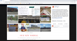
Copy Edits DB
Personally, I found the editing process to be a bit cumbersome and difficult. I think that it was difficult to edit such a large piece of text and would have been a bit easier and more accessible if pieces of the text could have been reviewed one piece at a time. I learned a lot about a new citation style that I had never used before. Since I had never used this citation style before things were even more difficult because it was unfamiliar scholarly text that I had to evaluate to ensure an unknown citation style was accurately applied. Although, this was a challenge I can say that I learned how to cite things in Chicago citation format and this was a positive result from the assignment. I also learned that certain areas of text can be rife with grammatical errors if one does not slow down long enough to evaluate their work. I enjoyed the assignment overall. I learned that there are ways to evaluate the proper citation of a multimedia presentation. I also learned that I may benefit from some more practice with the Chicago method of citation.
URL: https://docs.google.com/document/d/1hll0-55k6JM3Gsjh9TuhBb9XoaZ7G9h8XuVFPscWybg/edit?usp=sharing
A Community Fighting Coronavirus

HTML Reflection Dorothy Baker
Over break I completed the self-guided lesson on HTML. I was not as good at structuring my time to complete it as I had thought I would be. I would complete large chunks over periods of time, leave it for a couple days, and then come back to it later. I found this to be an inappropriate use of my time and it did not benefit me in completing this assignment. It is something that I am not proud of and that I have decided to fix going forward. I completed this assignment in three big chunks which included: home to styles, formatting to comments, and colors to images.
When completing this tutorial, I did learn some specific skills that I believe will prove useful to me when using HTML coding. I learned that it important to format ones HTML code properly. If the code is not properly formatted, then things will not work right and may have to be revisited. I also learned that there is a way that the author of the HTML code can leave notes inside of the coed for other people looking at the code. The notes will not show up on the published site if the person does not want them to, but it provides a good guide for those who are also working on the code.
I also learned that pictures and colors can be edited and included in the html code. This was the most important part to me because I am always more attracted to a website that includes nice pictures, attractive fonts, and vibrant colors. Therefore, I took note on how to do my favorite things. Linking sites to images, buttons, and words was also something that I learned. I did not know how to do these things; however, I always knew that they were done in the code portion of the website. I now know that they are done through HTML coding and that I can do them if I should choose to design a site of my own.
All the skills listed above were skills that I personally found to be easy to learn. I believe this is since I was interested in learning them. When it came to learn about CSS and attributes, I found it more difficult to get through these sections. I found the wording of the prompts and the examples long and difficult to get through. I also found myself more unsure as to how to approach the exercises and get through the sections of work. I think this is partially because I was not interested in these attributes of HTML.
In general, this coding work was very new to me. I did not know anything about HTML before this tutorial. Now I feel confident in adding stylistic features to html code and observing the results. I think that I would like some more practice with coding before adding the skill of HTML to my resume because I want to be affluent in skills that I peddle to potential employers. My worst fear would be that a potential employer asked me to complete a project based off my resume and I not be able to complete it because I lied about my proficiencies on my resume.
Depression Poster- Dorothy Baker
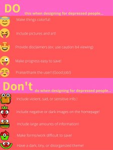
The audience for the poster is people suffering from depression. The idea of the poster is to provide a pleasing, easy, readable site and set of guidelines for developers hoping to appeal to those suffering with depression. As someone who suffers daily with depression, I chose the suggestions both from research and from my own personal experience. When someone suffers from depression, they can experience symptoms such as “persistent sad, anxious, or empty mood; difficulty concentrating, remembering, or making decisions, and feeling restless or having trouble staying still” among many others. With these symptoms in mind the design had to include features that someone with depression could utilize and find that they made using the site easier when their condition was flaring up and not simply when they were feeling okay and happy.
My do’s and don’ts include making things on the poster and the site colorful. I chose this because the idea was to create a positive user experience (User Testing ) for those with depression and if the site were to feature colors that were associated with happiness and joy then this would be a great thing for someone with depression to interact with when feeling low. I also encourage choosing positive images for the site. This means that rather than choosing images that are dark and foreboding, a suggestion that made it on the don’ts side of the list, the designer should choose images with happy and encouraging connotations to them to dissuade negative thoughts or feelings of hopelessness. For if one has too much exposure to negative material when feeling low this may cause the feelings to stay longer or increase. If dark, negative, or sensitive items must be included on the site, which I strongly suggest avoiding, then a disclaimer should be provided so that if the depressed individual is viewing the site then they can prepare to view said images. This may include waiting and coming back to the images when they are in a better state of mind. I also encourage the designer to avoid displaying large chunks of information on the site. A person suffering from depression may experience an inability to focus (Lyness) and if this is the case then the large portions of information may be overwhelming to them and cause them to shy away from the site. If the site requires portions of information to come in large quantities then I suggest that the User Interface be such that the user can save their progress on the site and come back to it without difficulty (Zaraysky). I also chose to discourage from a tiny, dark, or disorganized them. If the depressed person is taking the time to visit the site when they are not feeling their best then the hope is that the information searched for will be clean, precise, and direct. Lastly, I suggest that the site be encouraging for the user. After all, out of millions of other websites that could have been visited to search the information the user chose this one. That is cause for praise but then to have a depressed individual visit, operate, and get something of the site when they are not feeling well is truly cause for kindness and graciousness.
For my poster I chose a salmon and pink background. These colors were chosen because I found that bright red can cause a person to feel alert and energized while colors such as salmon can cause a person to feel happy (Gremillion). I chose font colors of yellow and white because they were not the norm. Yellow was also found to be a happy color, and since black is seen as a depressing color, I went with white which is considered a calming color. These are all feelings that a depressed person lacks when they are in the middle of an episode/bout of feelings and so if they were to visit the website at that time the hope is that the color choice would soothe them. The decision to put the information in different blocks was to break up the information in hopes that it does not overwhelm the user. The emoji stickers were placed to create some joy, positivity and/or happiness for the user. Instead of using regular mundane bullet points to share my points the emojis do the job while including a design element. Examples were given on the poster when possible, however if I were to include examples of all bullet points it would go against my don’ts list which is something I wanted to avoid. Therefore, on an actual website the design would include these features and the other stylistic elements featured on the poster.
References
Gremillion, Allison. “Colors and emotions: how colors make you feel.” n.d. 99 Designs . Document . 9 March 2020.
Lyness, D’arcy. “Depression .” August 2016. Kids Health from Nemours . Document . 9 March 2020.
User Testing . “UI vs. UX: What’s the difference between user interface and user experience?” 15 October 2018. User Testing. Document. 9 March 2020.
Zaraysky, Sara. “The Obvious UI is Sometimes the Best UI.” 2 October 2019. Google Design . Document . 9 March 2020.
Usability summary 2
The article gave the definition of service blue printing. A service blueprint is “a diagram that visualizes the relationship between different service components that are directly tied to touch points in a specific customer journey.” The article refers to the service blueprint as being a tool that is typically used to help the employee have a positive experience when completing the tasks required of them. The article then goes into discussing weaknesses the blueprint can help find. For example, it states that the blueprint can help one finds weaknesses in the operation of the site. It can also help improve the employee production and effort in creating a plan for said employee to use to create the optimum experience. The article then begins to discuss primary and secondary actions that are part of the blueprint. These actions include customer interactions, frontstage actions, backstage actions, processes, arrows, time, regulations of policy, emotion, and metrics.
References
Gibbons, Sarah. Service Blueprints: Definition . 27 August 2017. Document . 2 March 2020.
Usability Article Summary
The introduction on the assigned page talked about the phenom that people are more likely to forgive a negative user interface if the site is more aesthetically pleasing. People like things that look nice and are more likely to use them. Therefore, the aesthetics of a site can be just as important if not more important than the functionality of the site when it comes to maintain and drawing in users. The article I read for the assignment was about usability testing on minors. When testing a product/app on minors it is important for one to understand that they are dealing with children who have different needs than adults. Children may take longer to settle into a comfortable position or may fidget more often than adults do. They may require more bathroom or water breaks and may get bored more easily than an adult would. Therefore, it is important to keep this in mind when testing on minors. One may want to give incentives with the kids in mind such as gift cards or toys. They may also want to prepare more participants in case something may come up with one the other can be used as a backup. Most importantly the testing coordinator wants to keep in mind that these are minors, there tech skills will increase each year they are exposed to the tech, and the children will be receptive only if the study is understandable and tailored to incorporate their needs as well as the coordinators.
References
Joyce, A. (2019, April 28). Usability Testing with Minors: 16 Tips. Retrieved from Nielsen Norman Group: https://www.nngroup.com/articles/usability-testing-minors/?lm=aesthetic-usability-effect&pt=article
2-24-2020
The introduction for the issue began discussing disability’s and technology. It maintained that technology is important in the lives of those with disability’s because these people use it to help them in their daily lives. It urged people to explore the bond between technology use and those with special needs. However, before unleashing the reader on the articles in the issue it cautioned the reader that an important consideration is that one must focus on the user of the technology more than the technology itself.
I chose to read the article entitled “Disability, Mental Illness, and eLearning: Invisible Behind the Screen” by Mike Kent. This article discussed a study in which he focused on those individuals with mental illness. He found a large portion of college students that he interviewed self-identified as mental illness and from those he interviewed each individual. He then continues to assert that the problem with mental illness and why there is not more treatment and help is since there is still a stigma around it. There is a negative reaction when people say they have a mental illness rather than a willingness to help.
Critique of Winter 2019 Redesigns of Greenspring Review
Team 1
Effective Elements:
1. The image of the oak leaf and ink pot on the homepage was effective because it created a positive experience because it helped frame the viewers mindset that they were entering a creative atmosphere.
2. The search bar was effective because I was able to quickly find article types that I was searching for.
3. The hyperlinked headings such as “issues” and “submissions” navigated the user to the appropriate page and were easy to read.
4. The “take a tour button” on the “about page” is effective because it gives the user some background information on Greenspring Campus that the user may not have if they have never been to the campus.
5. The Facebook window at the bottom of each page was effective because it updates the viewer with goings on that are specific to the organization and the day. The user can receive information about the living organization and their day to day programs while exploring the work that the organization has already completed.
Needs to be improved:
1. The book border on the side needs to be improved because it makes the pages look cluttered and distracts the eye from the other material on the page.
2. The event countdown on the front page could be improved so that the user can easily see it. As it is right now, it is a dark color which does not draw attention to the box and users may skip past it when they are scrolling.
3. The submissions guidelines page could be improved by formatting the information on the page a different way. The site could offer a pdf file which contains submission guidelines that the user could download, save on their personal device, print out and/or refer to multiple times on their own without having to bring up the site each time.
4. The about page could feature the picture of the editors in more business casual clothing rather than the relaxed wear they are currently in.
5. The Greenspring picture on the homepage is unable to be enlarged. User experience could be improved by allowing the picture to be enlarge so that those with bad eyesight could more easily see the photo close.
Team 2
Effective Elements
1. The logo and title on the Home page are large and vibrant. Provides for positive User Experience because the user knows exactly where they are visiting the minute they are on the site.
2. Positive user experience is created through the display of featured works on the home page. It gives the user a sense of what the site is all about.
3. The submission page offers a place in which users can visit and submit their work on that page. It makes it so that the user does not have to worry about an email or other link they must visit.
4. The about page includes quotes from the editors. This shows the user that the editors have an artistic and diverse side to them that speaks to the nature of the magazine.
5. The Archives link takes the user right to the page and when clicking on the link for the older magazine the user is transported to the 2016 “old” issue.
Needs to be improved:
1. The featured works on the home page only allow the user to click on the link for the type of work that the featured work is to be led to the page with that work. It does not allow for the user to click on the work and have it enlarged or click on the work and get taken to a page that includes more works of the same nature. This is poor user interface- the user wants to click on the work but cannot.
2. The issues are not in chronological order. Instead they are in order based on type of work and then according to year. This makes it difficult to see all the items from each year as they are published.
3. The “contact us” section includes too many words. With all the words the email address gets lost. The lack of a phone number is also noticeable.
4. Only providing one drop down menu tends to be a bit confusing. Only having the one menu causes the subtitles to look uneven.
5. The “share this” box needs to incorporate links to other social media sites such as Instagram and Snapchat.
Team 3
Effective Elements
1. The cream background is a relaxing element for the user’s eyes. It does not detract from ay of the information on the page.
2. The issues page uses plain text that does not detract from the pictures representing the information that will be contained in the issues they represent.
3. The submissions/guidelines page gives a form that users may fill out to submit their work on the site. This is a great feature because it eliminates the fear of user error and lost emails when having to email submissions.
4. The Facebook sidebar is an effective element because it gives the user an update as to what is going on with the editors of the magazine, the magazine itself, and events that the club may be throwing.
5. The about page provides professional looking photos of the editors. The format of the pictures allows for the user to see who the editors are without taking too much attention away from the body and purpose of the page.
Needs to be improved:
1. The color of the font does not fit in with the color of the school, organization, or magazine. It is its own theme.
2. The theme of the site does not show that it is affiliated with Greenspring or Stevenson University. This makes it difficult for the user to remember who the review is representing.
3. The submissions/guidelines page gives very little instruction on how to make a submission and what the guidelines of the site are. This can prove troublesome because someone may not have enough information on the medium, they want to submit.
4. The picture of the typewrite on the homepage causes the user to think that the review is mainly focused on writing. While writing is part of the review it is not the whole purpose and should not be given such a large feature on the homepage.
5. The video on the site detracts from the focus of the user. Although it is nice to have a video it does not have an explanation as to why it is on the side and may confuse users.