Social Media Remix

Disney/Pixars Onward
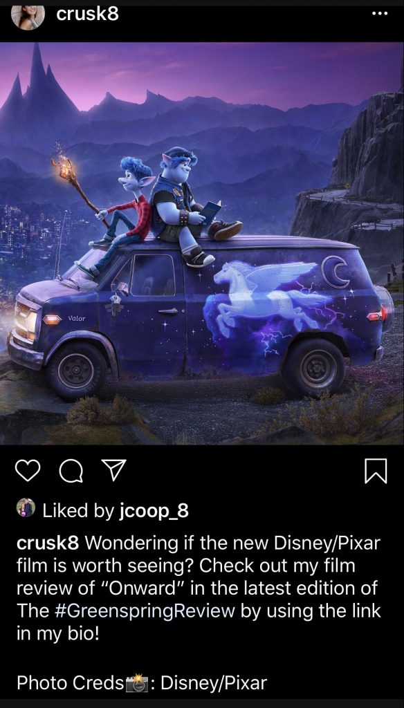
Main post on Instagram
Disney/Pixars Onward
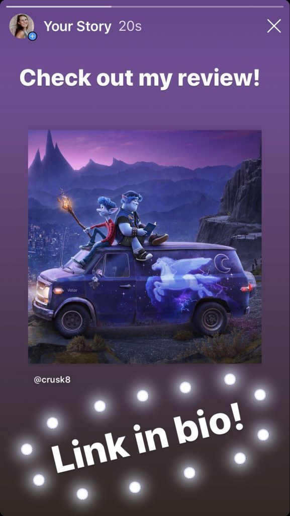
Instagram story post

I chose Instagram as my platform because I believe it is one of the more popular social media sites for college-aged students. Also, the Stevenson accounts on Instagram are very active and it makes it easier to potentially share my posts to their pages. I wanted to create both a post and an Instagram story becuase more people tend to look at their Instagram stories than scrolling through their feed. If a person comes across my story, they can easily click on it and be taken directly to the original post. I wanted to keep my caption short and simple. Personally, I never read super long posts on Instagram because it should mainly be about the visual. Hashtags are extremely popular on Instagram, so I made sure to include one for The Greenspring Review. I also included a camera emoji when crediting Disney/Pixar with the photo. I chose a photo for the media because that is the main medium of Instagram. I tend to not watch videos posted on Instagram unless the caption draws me in, so I stuck with a photo from the movie. I already touched upon this, but posting to my story as well will get the original post more likes and views, as more people tend to view their stories. I would post this mid-afternoon to early evening because this tends to be the time students are out of school and find themselves relaxing. I would also have my friends an family members share my post to their own stories so that I can reach more viewers.

GSR Submission

Pixar continues “Onward” with its latest installment 

By: Cari Rusk

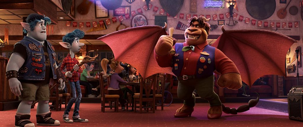
Barley and Ian with the Manticore from Onward
Disney/Pixar

Fantasy and reality collide in Disney/Pixar’s latest installment, Onward. Directed by Dan Scanlon, the film is set in a fantasy suburb where magic has faded due to advancements of technology. Pixies are unable to fly, unicorns dig through trash, and the once fearless Manticore is now the owner of a family-friendly restaurant. Two elf brothers named Ian and Barley Lightfoot discover that there is still a little magic left in the world, so they embark on a quest to bring back their deceased Dad for one last day together. Scanlon’s second go at directing a Disney/Pixar film was an epic success, as he addressed tough themes while keeping a light-hearted and humorous narrative.   

Superstars Tom Holland and Chris Pratt lend their voices to bring to life Ian and Barley. Holland creates a believable character in the wimpy, self-conscious Ian and transforms him into a confident and likeable hero, while Pratt conveys Barley as the comic relief and screw-up throughout the majority of the movie. Perhaps most importantly, the characters’ voices do not reflect any of Holland’s or Pratt’s previous roles. They create separate identities from their extremely popular Marvel characters.

With comedy and adventure in the forefront, it’s amazing to analyze how dark and upsetting the themes of this film are. A once magical world full of magical creatures has now become a world exactly like our own. The creatures have adapted to the advancements of technology and have evolved around these crutches. Instead of flying around, pixies use motorcycles for transportation, as their wings are seemingly useless. This evolution is a call-out to humanity’s own reliance on technology. Perhaps our world was once filled with magic, but we have since long forgotten it because of our own advancements.

Another theme of the film is loss and death. The plot of the movie is upsetting, as they are attempting to bring back their deceased father, who died of cancer before Ian was born. As they go on this adventure to bring back the rest of their Dad (their first attempt at the spell only brought back his legs) there is frustration from Ian, as he thinks Barley is screwing up his chances to meet the father he has longed for. In the end, Ian gives up his chances to meet his father, and lets Barley say goodbye to him one last time. 

These are heavy themes for an animated movie with children as a target audience, but that is what makes Disney/Pixar movies stand out from the rest. The similar topic of loss was heavily addressed in the 2017 Disney-Pixar film CoCo, which won several awards including an academy award and a golden globe. The combination of real-world themes, stunning animation, and lovable characters are the recipe for a Disney-Pixar success. Onward and Scanlon continue this legacy as a lovable and teachable film for all.

Photo Source:

Disney/Pixar. Onward. 2019. IMDb, www.imdb.com/title/tt7146812/mediaviewer/rm797149953.


Style Sheet Assignment

https://drive.google.com/file/d/1OKYj7ObtCnWYBZ8OQ1my90YsHXyJw7RF/view?usp=sharing

This is the second time I have used a style sheet to edit, and it was still just as overwhelming as the first time. When you first open the style sheet, it is overwhelming to see the amount of steps and rules that you have to follow and check. What I did to help myself was to break up the tasks day by day. I would do one section one day, like checking the headings, and then the next section another day, like the images. Then, I went through and tried to correct grammatical errors and the citations. Breaking it down and coming back to it with fresh eyes was a lot easier than trying to edit it all in one sitting. The article itself was difficult to read, but you don’t really have to understand the content in order to edit the document. While it can be a bit overwhelming at times, learning how to use style sheets is a great skill for future careers in digital publishing.

HTML Reflection

https://docs.google.com/document/d/1mRUiIIF4q3kkvJroCAKTkZPPXOCNIjrcG-btCuPxF2Y/edit?usp=sharing

I had confidence in myself going into this project. I am currently taking a Python programming course and I thought that my previous experience with coding would help me. I was semi-right. It was definitley easier in the sense that I understood the language of HTML and it was not overwhelming. In fact, coding with html, for me, is much easier than Python from what I have experienced so far. There were some lessons I struggled with, but the site was very easy to follow and understand.

Each lesson was easy to follow becuase of the way it’s content is laid out. My programming textbook has information by the paragraph, which makes it easy to get lost in all of the technical terminology. This site was broken down pretty much line-by-line so that each term was explained with an example. This made it much easier for me to learn and understand the content. After reading each lesson, I would complete the exercises on my own. I did not use the “check answer” button until after I came up with one on my own. The “try-it” buttons were very helpful because they showed what the code did instead of just using words to try and describe the outcome.

The lesson I struggled with the most was the CSS lesson. I think I struggled with it because of the amount of information that was contained within the lesson. There were so many new elements that they introduced that I had to keep referring back to the lesson in order to complete the exercises. All of the other lessons I felt comfortable with. I wouldn’t say I am completely comfortable with applying these skills to a real website yet, but I am also not totally uncomfortable. Coding is something that takes a lot of practice to feel completely comfortable with it, just because there is a lot of elements and terminology that I have to remember. That being said, I think with a little more practice, I would be comfortable.

Do’s and Dont’s Poster

Website Do's and Don't for people with social anxiety

The audience that I focused on for my poster was people who have social anxiety. Anxiety is a common mental health disorder that “comprise[s] a range of mental illnesses that are characterised by excessive feelings of fear, apprehension, and dread” (Swallow). Social anxiety is “an intense fear of being embarrassed, humiliated, or judged negatively by others in a social or work setting” (Swallow). Personally, I have some degree of social anxiety, especially when sharing my creative work or presenting. Just from talking with other people, most students, and people in general, tend to have a form of social anxiety in some degree. This is why it is important for The Greenspring Review to follow some accessibility guidelines so that those with social anxiety can interact with the site and participate in events the organization holds.

The first Do and Don’t I have listed is all about creating a comfortable, positive enviornment. In the definition of social anxiety provided by David Swallow, one of the intense fears stems from being judged negatively. The comments on the site must be moderated to eliminate the possibility of somebody’s work being judged negatively. To reassure the user, there could be a disclaimer or warning message stating that negative comments will not be tolerated. The second item I list deals with unpredictability of the site. All buttons need to be clearly labeled so that users know exactly what will happen if they click on the button. For someone with social anxiety, unpredictability can increase levels of anxiety (Cambron). The next item deals with the submission of works and contacting others. Contact with others, even if it is just over email, can be very difficult for those with social anxiety. Users should be able to submit directly to the site as opposed to having to email someone. People with anxiety should not be rushed, which brings me to my fourth item. Deadlines needs to be established far out in advance so the user has an adequate amount of time to prepare. Deadlines should be flexible as well, so that the user does not feel uncomfortable submitting a piece of work a little late. My last item deals more with the events The Greenspring Review holds. They are wonderful events, but for people with social anxiety, it can be hard to participate and enjoy themselves. For example, the open mic event is very anxiety provoking for those who have to read their own work in front of others. The GSR needs to have more relaxed events that don’t require any sort of forced participation.

While I did not have many aesthtic-related items listed on my poster, I tried to create the poster so that it would not provoke any anxiety. According to Writer/Designer, “Cool colors are usually read as calming” (Ball et al. 46). I went with blue as my primary color choice becuase it is a cooler color and evokes a sense of calming for those who may be feeling anxious. The font I chose was so that the poster was as welcoming as it could be to try and eliminate any fears related to anxiety. According to Jakob Nielsen’s “10 Usability Heuristics for User Interface Design,” “Dialogues should not contain information which is irrelevant or rarely needed. Every extra unit of information in a dialogue competes with the relevant units of information and diminishes their relative visibility” (Nielsen). With this in mind, I tried to keep the wording on my poster to a minimum. I kept a neat, simple layout that was simple and easy to follow so that those with anxiety did not feel overwhelmed.

Ball, Cheryl, et al. Writer/Designer: A Guide to Making Multimodal Projects, 2nd ed., Bedford/St. Martin’s, Boston, 2018, pp. 46.

Cambron, Thaddeus. “Designing Better Experiences for People Facing Anxiety.” Model View Culture, no. 37, Feminist Technology Collective, Inc., 24 May 2016, modelviewculture.com/pieces/designing-better-experiences-for-people-facing-anxiety. Accessed 4 March 2020.

Nielsen, Jakob. “10 Usability Heuristics for User Interface Design.” Nielsen Norman Group, 24 April 1994, www.nngroup.com/articles/ten-usability-heuristics/. Accessed 4 March 2020.

Swallow, David. “A web of anxiety: accessibility for people with anxiety and panic disorders [Part 1].” The Paciello Group, Vispero, 14 Aug. 2018, developer.paciellogroup.com/blog/2018/08/a-web-of-anxiety-accessibility-for-people-with-anxiety-and-panic-disorders-part-1/. Accessed 4 March 2020.
 

Usability Article Summary

Nielsen, Jakob. “Usability 101: Introduction to Usability.” Nielsen Norman Group, 3 Jan. 2012, https://www.nngroup.com/articles/usability-101-introduction-to-usability/. Accessed 27 Feb. 2020.

Jakob Nielsen’s article is an introduction to the term usability and the process in making a website with the users first in mind. The term usability means how easy an interface is to use and is determined by five main components: learnability, efficiency, memorability, errors, and satisfactions. Another key component is the term utility, which refers to how well a design function. By making sure a design has both usability and utility, that design is useful and easy to navigate for the user. Usability is important because if a user encounters a difficulty on the website, then they will leave. The best way to improve usability is by testing the design. This is called user testing and it is made up of three steps. The first step is to get representative users. The next step would be to ask the users to perform tasks on the design. The final step is to observe what the user is doing, if they are able to succeed, and how the user is reacting to using the design. Testing five users will often point out the biggest usability flaws or strengths. There are several steps that go into creating a usable design. The first step is to examine any old designs and determine what should be kept and what should be changed. The next step is to take a look at other competitors’ designs and then conduct a field study to see how users act in their own homes. Making paper prototypes of the design is an inexpensive way to plan. Then, the design can be created several times on the computer to find out what works best. Make sure the design follows the established usability guidelines, then test the final design. Test the design in a quiet space so that the users reactions can be heard and there are no other distractions.

Accessibility Article Summary

Hunter, Leeanne. “The Embodied Classroom: Deaf Gain in Multimodal Composition and Digital Studies.” The Journal of Interactive Technology and Pedagogy, 17 Dec. 2015, https://jitp.commons.gc.cuny.edu/the-embodied-classroom-deaf-gain-in-multimodal-composition-and-digital-studies/.

In her essay, Leeanne Hunter discusses how drawing from Deaf culture and the concept Deaf Gain and implementing this into the classroom can have a positive affect on the learning environment for all students. Hunter begins by explaining that she has two deaf parents and she has already been immersed in the Deaf culture because of this. Hunter wanted to explore how sign language – and all the gestures involved with it – can be used for educational purposes in diverse classrooms. She talks about her personal experience from when her parents came to one of her classes and were not impressed by her students’ presentations in “deaf-friendly” formats. She learned from her parents that nonverbal communication is the art of storytelling through the human body, which her dad demonstrated when he performed a humorous skit involving a teacher and a student. Through practicing this nonverbal communication by using a skit of her own, Hunter realized that all of her students were totally engaged with her, as opposed to looking at their phone or laptop screens. Hunter took this concept and ran with it, including several multimodal assignments into her courses and found that students were able to both articulate through the written word, but also with visual and spatial metaphors shown through nonverbal modes. She goes on to talk about her own course and how she combines literature and digital technology, showing how the exposure to different modes and affordances allows her students to think and feel more deeply than before. By drawing from Deaf Gain, students are able to engage with the works and professor more than if they did not have these multimodal assignments and coursework. They are also learning about valuing all types of people, regardless of any disability or differences.

Proposal Reccomendations

Cari Rusk & Renato Santos

1.) We suggest changing the background of the website to something less distracting. The bookshelves draw the user’s eyes away from the content of the page.

2.) The drop-down menus under the “Issues” page is too big and goes below the fold. The links should be smaller as well as the menu.

3.) The social media link should not be at the bottom of the page. It should be moved to the sidebar. Also, there should be previews for the short stories and poetry entries.

4.) There are too many search bars. It should be limited to just the one on the one on the sidebar.

5.) The submissions page should be updated to allow you to submit directly to the site.

GSR Redesign

Team 1: https://thegreenspringreview.art.blog/

Effective

  1. I really like the color scheme. It still feels like its own website, but the green reminds the user that the site is affiliated with Stevenson.
  2. The logo for this site is awesome. It is creative, well-polished, simple, and memorable for the user.
  3. I like how the home page has the big section to take you to the most current issue. It makes it easier for the user to access the new issue right from the home page.
  4. I like how the categories of the submissions have backgrounds of the submitted photographs. It showcases the artists work even more so that the user can appreciate them even if they are not specifically trying to find the photograph pieces.
  5. I like how the users are able to go to the Stevenson website from the site. It can attract future students.

Needs Improvement

  1. I’m not the biggest fan of the books as the background. I understand why they did it, but it is a little distracting for me. Maybe if it was in black in white it would be a little less distracting.
  2. When you click the issues button, the links and drop-down menu attached to the links are huge. The links I don’t have a problem with, but the menu goes out of view and forces the reader to scroll down to see the options.
  3. I think that the social media link to Stevenson’s English department should be on the sidebar and not in the footer. I think more users would see it if it weren’t at the bottom of the page.
  4. The submissions page does not allow you to directly submit like the other websites. This would make it much easier for the user if they could submit right on the site.
  5. The picture on the “About” page should be smaller so that the user does not have to scroll far down. There is a ton of white space at the top of the photo that could be cut off to decrease the size.

Team 2: https://jennaaye.wordpress.com/

Effective

  1. The about page is really clean, concise, and to the point. I enjoy the quotes from the editors of the websites and it gives it a personal feel.
  2. I really enjoy the layout of the Visual art page. All of the photos from the issue are together, but are big enough to appreciate them as their own work. The name of the creator and the title to the side of each piece makes it really easy to know who did what.
  3. The submissions guideline page is detailed and even gives the copyright statement. Makes it easier for the user to know what they can submit.
  4. The home page highlights featured artists from multiple categories. When you click on the category header, it takes you right to the submissions for that category by issue. This makes it easier for the user to find submissions.
  5. I like the archives page with the link directly to the old site. It is easy to get to and not hard to miss.

Needs Improvement

  1. The giant header does not allow the user to see the actual content of the page without scrolling.
  2. Since the header is not a sticky header, it goes away when you go to a different page other than the home page and only is partially showing.
  3. The font and logo on the header appear blurry and it appears the same on a mobile device.
  4. The scrolling header does not work very well on the mobile phone. As you are scrolling, it widens so that the words get cut off on the sides.
  5. The website itself is very plain. A nicer background would give it some more pop and make it more interesting for the user to view.

Team 3: https://greenspringreview.art.blog/

Effective

  1. The sidebar with the link to the Facebook page allows the user to interact more with the The Greenspring Review by allowing them to follow what’s happening with the Stevenson’s English Department.
  2. The way the issues are broken down is easy for the user to navigate through the different categories. Having pictures as the cover of the issues also allows the artists to be featured.
  3. I like the smaller header. It doesn’t distract the reader from the content and they are able to see a lot more without scrolling.
  4. The design within the header itself is effective. Even though it is not a custom-made logo, it fits the purpose of the magazine.
  5. I like the simple pattern that makes up the background of the website. It isn’t distracting for the user, but it is something more than just a plain color.

Needs Improvement

  1. I think that the “What’s new?” Section should be smaller and not the entire page. This distracts the user from the purpose of the magazine, which are the submissions.
  2. The featured artists section on the home page makes the user question why these artists are featured.
  3. There is no email on the about page or submissions page for users to ask their questions. This limits the user to only communicating through the site, whereas an email would be more effective.
  4. The about page is not exactly professional. I think the smiley faces should be removed so that it gives off more of a professional literary magazine tone.
  5. The video at the bottom of the sidebar is confusing. Is it a submission? I can’t find it in the actual submissions link and there is no explanation for it. If it is a submission, it shouldn’t be tucked away at the bottom of the page.

Summary of “What Newspapers Can Teach Us About Web Design.”

O’Brien, Frederick. “What Newspapers Can Teach Us About Web Design.” Smashing Magazine, 8 Nov. 2019, https://www.smashingmagazine.com/2019/11/newspapers-teach-web-design/.

Frederick O’Brien’s article, “What Newspapers Can Teach Us About Web Designs,” focuses on taking a minute to look back on newspapers and learning from their designs to provide insight on how websites should look. Newspapers have been around for centuries and have been highly successful. Many of the web designs seen today have ties to newspaper designs. The big elements that carry over have to do with form and how readers process information.

The first big element that translates from newspaper to web design is the term “above the fold.” This term defines itself, as with newspapers, the first thing the reader sees is what is above the fold line. In reference to websites, it is what the user sees on the home page without scrolling. By having compelling “above the fold” content, users will know what the designer wants them to know and will be interested to find out more.

Another common element in newspapers is what is known as “The Guttenberg Principle,” which is the reading gravity of readers from the top left-hand corner to the right bottom corner and how important content should be laid out both in print and on the web. Grid systems and content blocks follow this same principle. It organizes the information and makes it easier for the users to follow and read. Nameplates are another element that web designers have taken from newspapers. This allows the name of the website to be seen from every page the user goes to without changing, just like the titles of newspapers do not change from day to day.

By taking a look back at newspapers, web designers are gaining insight into good design elements that have been so successful for centuries and continue to be successful today. These elements can be applied to The Greenspring Review, as the original format was print, but has now gone to the digital format.