Social Media Remix

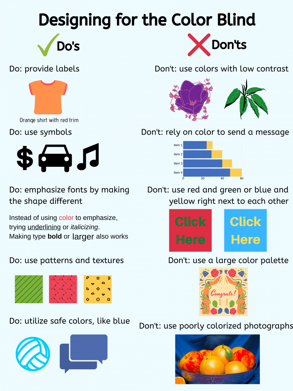
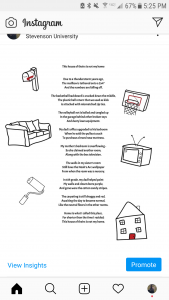
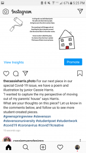
For posting and promoting the Greenspring Review, I recommend using Instagram. Most college-aged people and college organizations have Instagram accounts, so choosing this platform will make the content more accessible. Instagram is photo-based, so digital media and artwork would thrive on the platform. Poetry and other short written works can be screenshotted and uploaded as pictures. Another advantage of Instagram is that posts can have super long captions, as opposed to Twitter which has a 280 character limit. Instagram does have a ratio limit of posts  to maintain continuity and sleekness, so posts would be edited to be either square, a 4:5 rectangle, or a 1.91:1 rectangle. The only downside is for longer pieces of written work because it would have to be chopped up into multiple slides. Instagram has a limit to 10 slides per post, so problems would arise if the written work is longer than that.

For my post specifically, it can be sized to fit as a single slide on a post. Instagram has filters and in-app editing, but I wouldn’t utilize either. My post has text and images floating around it, so it could be converted into a picture to post. Since captions can be long, I would mention a small blurb from my thought process, a mini biography about myself, and a few sentences about the Greenspring Review. Unfortunately, the caption text cannot be manipulated, but emojis can be included. The Instagram account would be public, so hashtags will be used to increase the traffic to the account and posts.

In terms of running the account, we should post, at minimum every other day. Ideally, I would try to post every day Monday-Friday. From analyzing my personal account, most of my followers are active in the early afternoon, and late night around 9pm. Since this account is school-related, the best option is to post in the afternoon anytime from noon-4pm. The best way to increase engagement is to post consistently and include hashtags and locations so others can easily find it. We can ask other Stevenson accounts, including the English Department, Student Activities, and Stevenson’s main account,  to share our posts to increase our engagement.

Immersive Pedagogy Style Sheet Exercise

This was my first time working with this type if style guide. I have seen styles guides used in graphic design settings. I was very confused with this assignment, and felt very overwhelmed when reading the directions and looking at the style guide itself. Once I looked at peers’ examples, I realized I was simply proofreading the “Immersive Pedagogy” text. It wasn’t difficult to proofread, although the text itself was not interesting to me; there was a lot of foreign vocabulary. Frankly, even after editing it, I still have no idea what immersive pedagogy is. This assignment was helpful; I did learn what a style guide is and how to use it. I think this assignment would have been better with a text that was a little easier to understand.

I also had issues linking the Google Doc to this post. The link would show the text unedited, without the suggestions I made. After trying several things, I decided to make the suggestions into official changes to the text, so the changes would be visible (instead of simply seeing the unedited document).

Immersive Pedagogy_Harris

GSR Final Submission

GSR drafts- Cassie Harris

For the Greenspring Review, I decided to write a poem, which is something I haven’t done in a while. I didn’t want to write about how I felt the quarantine  or how the quarantine affects me because those felt too overdone. Instead, I decided to write about my parent’s house that I grew up in. Because of the quarantine, I have permanently moved out, so I wanted to share my perspective of how I feel about the house now, but in a way that is almost reminiscent. To incorporate a multimedia element, I decided to add some illustrations.

Understanding and Applying HTML

https://docs.google.com/document/d/16gWdDGofd-hReMRagHGj-QTbz-Kb5hOZ71XWPA8SNF4/edit?usp=sharing

The last time I coded was my freshman year at Stevenson in my Introduction to Digital Media course. I didn’t retain a lot of the information that we learned. I haven’t had a particular interest in coding, which is why I haven’t made any strides to learn or practice coding. When I went through this exercise, I knew I wasn’t going to find it entertaining or enjoyable. Coding is very specific and particular; there are a bunch of rules and specifications.

Overall, the work wasn’t incredibly difficult, but because there was a lot of guidance, it was relatively easy to follow. Once I apply these rules to an actual project, I know I will be constantly referencing sources. Coding is not something that I can retain easily. mostly due to my disinterest in the activity. Coding is very extensive, and after this coursework understanding a few basic rules, I feel like I have a better idea of coding and HTML.


Designing for the Color Blind

This poster contains the basic Do’s and Don’ts for designing with a color blind audience in mind. The most important Don’t is to never use colors to tell a message. Using other elements like symbols, patterns, or manipulating text are easy ways to emphasize and highlight specific areas. Choosing the correct images is also important. Do not choose an image with poor saturation or colorization, which could make it difficult to understand. Try to find graphics with simple color schemes without green and red or blue and yellow taking the majority of the picture. Providing labels and captions is also important, so the audience can tell what the graphic depicts. Utilizing safe colors is also a good idea. Blue often appears in color blind-friendly color palettes. The reason why Facebook is blue is because its founder, Mark Zuckerberg, is red-green color blind (Widrich, 2016).

I chose to spotlight colorblindness because it is often forgotten about when talking about disabilities. Color Blindness is a condition where a person’s eyes cannot read colors as they present. The types of color blindness include red-green, blue-yellow, and complete color blindness. Color blindness occurs when specific rods in a person’s eye are either absent or not working properly. The result is having trouble distinguishing red and green or blue and yellow. On rare occasions, most or all of the rods are absent or defected, and the person cannot differentiate red, green, yellow, and blue (Tubert, 2019).

I chose color blindness because it is often forgotten about. Color blindness has always intrigued me, and it makes me think about animals with multiple rods in their eyes who can see more colors than humans can. As somebody who isn’t color blind, I know that there are colors I cannot distinguish because humans only have 3 sets of rods in their retinas.


Turbert, David. What Is Color Blindness? American Academy of Ophthalmology, 6 Sept. 2019, www.aao.org/eye-health/diseases/what-is-color-blindness.
Widrich, Leo. “Why Facebook Is Blue: The Science of Colors in Marketing.” Resources, Buffer, 18 Sept. 2017, buffer.com/resources/the-science-of-colors-in-marketing-why-is-facebook-blue.


The Aesthetic-Usability Effect

The Nielsen Norman Group published an article about the Aesthetic-Usability Effect, which is when users will disregard minor usability issues because the site they are visiting is aesthetically pleasing and visually interesting. The article also touched on how to interpret vague positive comments from research.

Neilsen Norman Group also discusses usability specifically in a separate article.  Usability, according to the article, is defined by 5 key characteristics: learnability, efficiency, memorability, errors, and satisfaction. All of these pieces work together cohesively; without one piece, the site doesn’t have ideal usability. Usability also works hand-in-hand with utility, if it provides necessary aspects. If a site has good usability and utility, the site is considered to be useful.

Usability is an important aspect of a website/webpage because if it isn’t easy to use, visitors will not stay long, nor will they want to come back. Marketing and other strategies worked their part in getting visitors there, and usability helps to keep the visitors returning. Usability should be regularly tested, so problems can be fixed quickly and efficiently.

Disabilities and Access Summary

The article “Disability, Mental Illness, and eLearning: Invisible Behind the Screen?” covers a study done through an online college program at an Australian university. It notes the relationship between online college students and disabilities; those who stated they had a mental disability went through an interview stage. Online education programs offer a lot of advantages such as flexibility and independence. In some eyes, they have limited access to resources for those with disabilities. Students noted that they felt “unimportant” within their higher education community. Technology is also not adaptive or inclusive enough. The article mentioned examples of videos materials that do not supply captions or subtitles and instances when screen-readers do not function correctly. The article’s overarching message is that the online classroom experience is fairly new and hasn’t been fully developed enough to be accommodating for students with disabilities. The article also stated that more research is needed to create more accurate results.

Based on my experiences, these downsides in online education are nothing compared the challenges faced in in-person classes. I have a severe hearing impairment and mental illnesses, and I have been faced with obstacles that wouldn’t have happened if the class was online. During lectures, if I miss what a professor says, I’ll have to ask to repeat it. The professor with either repeat it or blame me saying that “I should have been paying attention” or another variation of that. Online classes often have videos that can be replayed over  with volume that can be adjusted. During a time when my mental health drastically impacted my day-to-day life, I found it a struggle to leave my bed, leave my room, and attend class. Several professors have refused to accept “mental health” as an excused absence. If the class was online, I can get my work done without leaving my room; I can even work on my phone for certain assignments, so I don’t even have to leave my bed. FOr my personal experiences, online classes have been more beneficial, however I recognize that certain disabilities are less flexible than others.

Design Proposal Comments

Team 1 (https://greenspringreview.art.blog/) Ineffective UI/UX Elements:

  1. The top navigation doesn’t have any drop-down options. It could be more difficult to find things.
  2. The color scheme doesn’t work well together, nor does it represent Stevenson.
  3. The overall design doesn’t scream “online multimedia magazine.” It reads very generic.
  4. Cannot access back issues. Only Spring 2019 and Fall 2019 issues are available.
  5. Featured Artist and Featured Poet articles at bottom of page have thin widths; it appears squished and hard to read.

Team 1 Effective UI/UX Elements:

  1. There is a search bar.
  2. Facebook highlights are on right side navigation bar.
  3. Within each issue, submissions are categorized by type (short story, photography, etc.)
  4. Several buttons change subtly when the mouse hovers over it
  5. “Meet Our Team” on “About Us” tab has pictures, which is really helpful.

Team 1 Overall:

The website has the basic, required elements for an online magazine, however it lacks overall attention to design and user interaction. It seems unfinished and it doesn’t look like an online multimedia magazine.

Team 2 (https://jennaaye.wordpress.com/) Ineffective Elements:

  1. Overall lacks color and interest. The only color is from photographs. The background and text are black and white.
  2. The ‘typewriter’ typeface doesn’t mesh well with the other typeface.
  3. The Greenspring Review logo at top doesn’t match the Greenspring Review brand.
  4. Content isn’t grouped by issue- it’s grouped by category (Creative Writing, Journalistic).
  5. The content categories aren’t specific and easy to understand. I would rather see them grouped by short story, poem, journalism, photography, etc.

Team 2 Effective Elements:

  1. Some buttons change subtly when the mouse hovers over it.
  2. The photos are crisp and bright.
  3. Archives are easy to access.
  4. Website isn’t overwhelming.
  5. Quotes from the Editors is a unique addition.

Team 2 Overall:

The website was extremely underwhelming, and it was difficult to find effective elements. The overall design and organization was lacking.

Team 3 (https://thegreenspringreview.art.blog/) Ineffective Elements:

  1. The books background isn’t inclusive for a magazine that isn’t exclusively books/ written work.
  2. The “Grab a Poem,…” section on the homepage doesn’t have a good hierarchical structure, and there are too many elements.
  3. The search bar and Event Countdown, as well as several other elements make the website feel too blocky and less organic.
  4. The “Issues” page should be more interactive than 2 text buttons with drop down menus. I want colorful visual elements like photographs or art from each issues.
  5. Content previews in each category are only text. visual element included in the preview would make the page less text-heavy

Team 3 Effective Elements:

  1. The oak leaf fountain pen logo is really cute and unique.
  2. The search bar is easy to locate
  3. Overall, there is a good amount of color that makes the website interesting.
  4. Each category in each issue (Poetry, Short Stories, etc.) has large, crisp photographs.
  5. Although the books background isn’t inclusive, having a colorful, yet simple, photograph as the background adds a pop of color that isn’t distracting.

Team 3 Overall: This website has all of the required elements, plus extras that make the website feel special and connected the Stevenson University. The colors and visual elements make the website feel organic and easy-to-use.

Final Decision: Team 3. The website feels the most complete, and only has small adjustments to fix.

Practical Tips to Combat Digital Exhaustion

Li, Jacky. “3 Practical Tips for Product Builders When Designing in an Era of Digital Exhaustion.” Medium, 11 Jan. 2020. Retrieved from https://uxdesign.cc/3-practical-tips-for-product-builders-when-designing-in-an-era-of-digital-exhaustion-47131d933baa.

In this article, Jacky Li discusses ways to create a successful online presence in the midst of consumers feeling less and less excited about the digital sphere. He opens when an anecdote about the excitement he felt with his first interaction with the internet. He then says how that excitement in consumers is slowly dwindling. This generation is more reliant on digital platforms than any other, so how can we keep the digital realm interesting and excitable?

Li suggests three points to follow when creating a digital space. First, we must get inside the head of our site visitors and potential customers to understand their headspace. We must understand the behaviors and routines of our customers. Do they mindlessly scroll through Twitter every 2 hours? Do they have a designated time of day where they check their social accounts then stay off for the entire day? Understanding the relationship between the consumer and digital platforms is important.

Next, we must understand what behaviors we want our digital platforms to encourage or cause. Everything has an effect, and we want to understand what the effect is. We can control what the effect will be by understanding what the effects are.

Finally, we establish an emotional piggy bank so we can create a more personal relationship with consumers. We must empathize with our consumers, so they can feel acknowledged and heard. This is a simple marketing tool to create quality relationships and therefor increase customer retention.

Visual Rhetorical Analysis of The Villager Website

Affordances:

The website overall isn’t very interactive. It features mostly buttons that redirect the visitor to a new page. The only interactive features are the search bar and the article gallery on the homepage. There are some buttons that are distinctly designed as buttons including “Read More” and “View Category.” The author’s name in articles kin underlined and in a different font, so the visitor can tell the name can redirect to a page about the author.

Color:

The Stevenson Villager is easy to read because of the colors selected. Most of the site has black type on a white background, which is an optimal combination for reading lengthy text on a digital platform. On the top left on every page is the green Stevenson Villager logo. The only other forms of color come from photographs. Overall, the color choices, while easy to read, are very boring and plain, leaving the site visitor disinterested.

Font Choice:

The font and typeface choices for the Stevenson Villager work well for an online student-run newspaper. Almost all text on the homepage is in upper case font, except for the body of the articles, which is in sentence case. The “Recent Posts” on the side navigation bar should be in title case. Article titles, authors, article categories, publish dates, and more are in upper case. Too many elements are in uppercase, and a few elements do not have good tracking. The choices of typeface work well together. There is never more than 3 typefaces on the same webpage.

Layout:

The layout is very easy to follow. There is a top navigation bar and a side navigation bar that allow visitors to explore the website easily. The layout follows a simple grid design. Most sections are separated with space or with solid black lines. Some of the lines create too boxy of a feeling. The side navigation bar includes too many grey lines in between items, which makes the section too busy. Overall, the layout makes the website easy to navigate, but the extra elements make the website appear too busy and boxy.