GSR Social Media Remix

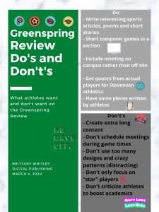
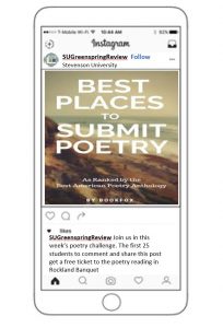
In my mockup of a social media post, I chose Instagram as the main form of social media for the Greenspring Review. Instagram is a social network filled with over 120 million users and most of those being young people. Instagram caters to the youth and college-age students who look to social media for information. The Greenspring Review wants and needs to reach its students at Stevenson and looking to enroll in Stevenson; this is the platform that the audience looks first for the latest information and things about school. I think another important audience is parents. Parents of Greenspring Review writers want to see their child’s published work and probably show it off to their co-workers. This can be done through the Facebook platform. The post on this platform would be more formal and straight to the point of promoting new talent and student work. While the Instagram Post would be more causal as a way to get students interested and aware of programs being put on and how to enter their own work onto the Greenspring Review.

On Instagram, there are many factors that make it the best choice for the Greenspring Review. Once a page is on public, any person can have the ability to direct message (DM) the Greenspring view for questions or comments within minutes to stay in contact with the magazine. On Instagram, there can also be private and public stories that give an interesting aspect of exclusivity for the site to relate messages to certain people, for example, possibly a secret poetry reading late at night and only the people who like this post get to be in the private story for the location. Another good thing about this platform is that the comments amount is pretty much unlimited versus a platform like Twitter that only allows a certain number of characters per post. Emojis are always a good way to capture a follower and keep them interested in the caption attached to the picture. And speaking of photographs, these can be anything from a picture to a flyer to a video or a gif to make the post whatever we want it to be. All forms of mixed media work and mixing up the different media per post is a creative way to keep followers on their toes. Posting frequently, once a day of 3-4 times a week is good for any organization or club because this means they appear on someone’s timeline more often and that is the best way to get your page out there. Ultimately, I believe Instagram is the best platform to promote and use social media for the Greenspring Review.

GSR Submission

The Not So Quiet Virus

By Brittany Whitley

The sirens sound as the silence in the city

brushes quietly against the tall buildings. 

“Nobody move!”


Law enforcement posted at every light, 

waiting for an anxious walker to emerge. 

“I’m on my way home, officer!”


Anxiety creeps up the apartment ceilings; 

the walls are closing in all at once. 

“Please mom, let me ride to work with you.”


Stores are closed, so stock up on bread, water, can foods, toilet paper. 

A literal war zone, fighting for scraps and receiving even less. 

“Lockdown!”


The freedom we took for granted is gone,

with no way of knowing if it will return.

“Do not leave your homes!”


A new way of living that no one asked for, 

no one can bear the heartache of the new life we were thrown into.

“I can’t do this anymore.”


A system that leaves us hopeless.

But the new hopelessness is becoming too regular,

Getting used to a system of life that seems never-ending.

“Wear gloves and spray the mail before you come in the house, sweetie.”


A virus busts through the door, loud and uninvited.

Like a burglar, it sneaks in and steals more than material things,

It steals the souls of families one-by-one.

When can we wake up from the not so quiet virus?


A Pandemic for the history books.

Global, with collateral damage and mental hardship. 

A war that is both civil and international.

“ I can tell my kids, I have lived through 9/11 and Coronavirus.”


Style Sheet Assignment

https://docs.google.com/document/d/1hofRQJWJwY4O3o982SoAGsNIxCTMsJQC0IYYt8OXh4E/edit?usp=sharing

This style sheet editing was a lot more difficult to understand and comprehend because there were so many different rules that had to be followed. Having to read and reread over and over was a lot to handle at some points and sometimes I felt like I wasn’t finding anything. I think the practice definitely helped me better understand Chicago-Style. But overall it was very difficult and I still don’t think I fully understand what I did, to be honest. But the experience was good practice and I think with more practice, maybe I would become more fluent with known the mistakes to edit right away. The footnote citations were a bit hard and made it a struggle to flow through the editing process. Overall, unfortunately, I don’t think this is an editing style I will try to keep using in my career unless I have to and if I do have to, I am glad I had a little practice.

HTML Exercise Summary

https://docs.google.com/document/d/1vKgTYbuBUuZuNUfUbM7w9tLYOXEjpDUeQcv3y3H0H80/edit?usp=sharing

In the HTML Exercises, I was able to learn more than I ever thought possible. I have never coded or used coding before doing these exercises and therefore, I found a lot of the exercises difficult to understand and comprehend. I found myself second-guessing a lot of the material and because of this, I felt like I also learned a lot from this.

Understanding the headings and paragraph HTML codes were easiest for me and I was able to click more with that material because I could see where these skills come in handy for a website. For the Greenspring Review, I think coding is more than important to create a consistent balance for the viewers to see students’ artwork. Using links and hyperlinks was one of the topics talked about in the exercise and I think we can benefit from the Greenspring Review to give readers multiple options on the site.

When it comes to coding, after going through the exercises I do feel a little more knowledgable about coding, but I do not feel confident about it entire process, unfortunately. But not that I have a little foundation from these exercises, I can build on that and possibly learn more about coding in the future.

Do’s and Don’t’s Posters

For the Greenspring Review, I have come up with do’s and don’t’s for the athletes as the target audience. Athletes are a large portion of the university’s population and ultimately they have connections that may reach outside of a literary level. I believe athletes would be a good audience to expand the magazine and help spread the content throughout.

When talking bout the don’t’s, I came up with five to capture the essence of what shouldn’t be done or added if this was their target audience. The first don’t is to not create and publish extra long content; athletes unfortunately do not have tons of time in between lifts, games, practices, classes, film and homework and reading a shorter piece would capture more of their attention because they would have time to read in its entirety. My next two don’t’s are to not schedule meetings during games and not to only focus on “star” players. Games are important for athletes and ultimately are their purpose for playing the sport they play, making athletes have to make a decision on which event to attend; a game will mostly likely come over a meeting. When it comes to sport’s features in the magazine, focusing on the same “star” player every week is a factor in the external collaboration of the team. Gonzalez writes “The author cites coaches that ‘focused on favorites instead of the good of the entire team,'” is bad for team chemistry and causes athletes to lose passion for sport. Although the Greenspring review is focused on content of great literary work from student, I believe this is something for them to consider if the opportunity comes along. In Writer Designer, we also learn about the balance of modes. Visual modes are a huge factor in a design and can turn audiences to or against the site. By not using too many designs

With don’t’s, there are also do’s and some of those include, writing and publishing interesting sports poems and short stories. This will make athletes feel as though they are included and that someone was thinking of them during this process. In addition to this, the Greenspring Review could feature more published work from athletes. Sending out interest for “poetry needed” around the gym and the stadium for athletes to see because that is where you will find most of them outside of class. Again, this goes to the idea of inclusion for all student and not making athlete feel like literary art and sports don’t mix because they can mix. Another do would be to include short computer game onto the site. This give the site a competitive and fun edge that will attach not just athletes but other students. Creating that sense of interaction is good for the overall culture and feel for the site. The games can be minimal and art related with a competitive component. A smaller and less invasive change would be to continue to make all meeting be on campus.

These do’s and don’t’s allow for more participation from student athletes on campus and ultimately expands the audience base amongst the school. The modes used to create the Greenspring review can always be changed to attract and expand to new audience members and I feel as though these do’d and don’t’s will help with that based on my research.


Work Cited:

Ball, Cheryl E.; Sheppard, Jennifer; & Arola, Kristin L. (2017). Writer/designer: A guide to making multimodal projects, 2nd ed. Boston, MA: Bedford/St. Martin’s Press.

Gonzalez, Peter. “A Response to ‘The Coach That Killed My Passion.’” Athletes in Action, athletesinaction.org/underreview/a-response-to-the-coach-that-killed-my-passion?gclid=Cj0KCQiAwP3yBRCkARIsAABGiPpYYSY_Wo9zGnUhBXGeeRmjrJPpzBUoG7N7pydZXMwjR-2muYOE5jkaAl2fEALw_wcB#?cid=da-adwords-cru-mktgfol-us-aiasearch2-456789061.

UX Workshops vs. Meetings: What’s the difference?

In this article, we are able to explore two words we hear often in the school and work fields. Workshops and meetings are often used in a professional setting to get an established topic to a final conclusive destination. In the article, we learn that “meetings are for sharing information and workshops are for solving a problem or reaching an actionable goal” (Kaplan, Nielsen Norman Group, 2020).

Often times workshops are unsuccessful when the goal is unclear from the beginning and this causes everyone to have different thought processes for achieving what they believe is the goal. In a workshop, ideas and thoughts are brought together to ultimately create one larger idea related to their mission at hand. Solving the problem through action is done within the workshop in a controlled environment. Meetings are more information based an allow for things to be discussed amongst a group. A speak and listen environment is often used to convey information more effectively. Often times meetings can last from 30 mins to a few hours, whereas a workshop can take from half-days to several days. The structure is also a bit different amongst the two; a workshop often time includes the process of brainstorming, stretching, writing and overall action-based demonstrations to complete a more involved way of solving the problem. In a meeting, more round-table like discussions are had and often there is a facilitator who is giving a good portion of the information regarding the topic of the meeting. Notes are most likely being taken and the environment is more passive.

Kaplan, Kate. “UX Workshops vs. Meetings: What’s the Difference?” Nielsen Norman Group, 16 Feb. 2020, www.nngroup.com/articles/workshops-vs-meetings/.

Accessibility Summary

In the article, The Embodied Classroom: Deaf Gain in Multimodal Composition and Digital Studies, the writer gives readers an insight into the challenges and benefits associated with a classroom of deaf and hearing students caused by the access of their learning environment.

They begin by discussing the difference between access to student feedback and actual student feedback. And how in general, this generation of students is more likely to give feedback using technology tools rather than being voluntarily sharing on their own. This is where the struggles become an issue for the combination of all students.

The article gives readers a look into the non-verbal meaning of communication. This is very important in a class with deaf culture and picked up on more than people may realize because students are not able to hear. Accessibility has moved far beyond American Sign Language (ASL) to accommodate the deaf culture in a classroom; technology and human interaction play a more prevalent role to ensure the successful learning of all students in the classroom. Making students feel different is when they turn their back to learning because they may feel that the materials are not reaching them. ASl changes that norm because it is a way of communicating that speaking to and for both the deaf community as well as the hearing community. “Nonverbal communication is the story we tell with our bodies.” (Hunter, 2015). Body language is a huge part of the ASL process; by slightly changing the position or direction of a symbol, the meaning can change as well and this is important because the relationship within a classroom is different. From teacher to student, from student to student, from teacher to parent and parent to student.

When asking students to stage a series of experiments in connection to dissecting their consumer identity. Students were able to come up with course materials including a “mixture of digital, literary, and critical texts, including Rachel Botsman’s TED talk on “Collaborative Consumption” (2010), Lars Eighner’s essay “Dumpster Diving” (1993), Denis Diderot’s “Regrets for My Old Dressing Gown” (1769), Reviewer Rosenbloom’s New York Times essay “But Will It Make You Happy?” (2010), and selections from Lisa Ede’s The Academic Writer (2010).” (Hunter, Washington State University, 2015). His findings were conclusive with how he thought multimodal helped students. With several examples above, students were able to see an example of the learning they wanted to encounter.

Overall, this research was well established and gave readers a more than deep insight into the deaf community learning experience through digital technology.

Hunter, Leeann. “The Embodied Classroom: Deaf Gain in Multimodal Composition and Digital Studies.” The Journal of Interactive Technology and Pedagogy, Washington State University, 17 Dec. 2015, jitp.commons.gc.cuny.edu/the-embodied-classroom-deaf-gain-in-multimodal-composition-and-digital-studies/.

Greenspring Post Proposal Recommendations

Group Members: Brittany Whitley, Liam Walsh, Aaron Murray

We liked Greenspring Review Redesign #1, but we would suggest the changes of a few things:

  • The font color on the home page header is a light grey and we feel the color should be darker and/or more defined of a color to stand out.
  • With the new logo/title images, there is a lot of grey space in the box and would like to see the image logo/title larger to fill up that space more.
  • Expanding the top navigation bar to spread across the entire page rather than just half the page by either adding more options or making the font larger.
  • We really liked the books in the background, but we wanted to fade the books out or create a more transparent effect to take some of the attention off of the books and to the work in the main middle.
  • Adding a LinkedIn and Instagram link at the bottom with the Twitter and Facebook links because these are two social sites relevant to literary work.

UX Article Summary

The article I chose to explore is written by Rameez Kakodker and it is entitled “10 Rules for User Sign-up Journeys”. I found this article interesting because of much of the impact it has on every person who uses the internet. For every website, it seems like a user can sign-up for something related to that site or company. I doubt some people can keep up with all the sites they have signed-up for and given their personal information.

In the article, Kakodker gives us 8 rules for the “sign-up” attachments to a site. under each rule, he allows the readers to understand why based on research to apply this rule. The first rule he gives us is to ask for basic information only to create an account. Some of the research behind this is that sign-up with more 2-pages cause users to drop off the site. Only asking for name, email and password are far more reasonable than asking for 3 pages worth of personal information.

After we learn the first rule of sign-ups, Kakodker then gives us steps 2, 3, and 4; Mark what is required and group them together, indicate password policy, and implement inline field validation & indicate errors onFocusOut. These three rules allow a site to minimize the steps necessary for a user to enjoy the site fully beyond the extent of signing-up. Grouping items together makes the process shorter and eliminates the repetition of information. Indicating a password policy will put a stop to common passwords by help the user create a unique one.

Rule 5 and 6 are next and they discuss the efforts and energy in not blocking access to an account with an unverified email and an just indicating the account exists with the email. These two rules speak to the safety of an account made by a user. Setting these email extensions up with the sign-up allow the confirmation of the correct person logging on and off of the site. “If a user enters an email that already exists in your database, don’t just tell the user that the email exists.” (Kakodker, 2019) By providing the user with a reason attached to their failed login, it becomes easier for a person to figure out the correct login and avoid creating a whole new one.

The last two rules (7 and 8) are social login should be the norm, and a tab keypress should go to the next field. From a user’s point of view, pressing the tab button is second nature when wanting to go from one field to another. But sites must put these features in place in order to create a smoother experience for the users. In terms of rule 7, creating normalcy of logins is great for all sites because it gives the user a personal connection to whatever site they are using.

With these rules, sites are able to change and evolve for their users based on the UX preference. Decision and mistakes are made based on the use of the user and their ability to control their own journey successfully through a login process.

Kakodker, Rameez. “10 Rules for User Sign-up Journeys.” Medium, 28 Sept. 2019, https://uxdesign.cc/10-rules-for-user-sign-up-journeys-7f9b19079a72.

Literary Magazine Tin House

https://drive.google.com/file/d/1tExkfnc2cQo-xsOd8DIHWykD54_uZABw/view

The Tin House literary magazine is a website that allows readers to view and reader original stories and poems by unknown talent freelance writers. Although they do publish a ton of original work, the site does not explore all types of poetry and view may find too much of the same kinds of poems. From reading poems on their site, such as Above the Tunnels by Sandy Fontana and Practical Joke by Brian Barker. Both of these moments speak on a hidden issue and looking deeper than the surface. I believe, Tin House selects these writers and these poems to appeal to their professional audience full of creatives who have more to share.

Modes:

Through the Tin House literary magazine website, there are several different modes that allow the reader to better understand the site. When looking at the linguistics modes on the site, what stands out the most is title heading. The title is a very simple yet elegant font and allows the animation of a two-story house to become a focal point for the audience. The font remains the same kind of simple yet elegant font throughout the site.

In addition to linguistics, the Tin House site also uses very visual modes to catch the audience’s attention. When a viewer enters the site, you immediately see a larger front page changing slide with six different colorful titles of original poems and stories. The colors of the title slides range from turquoise, blues, yellows, whites, browns, and oranges. The rotating colors and images in the slide contrast very well with all the negative white space around the margins. This brings me to the examples of spacial modes on the Tin House site. The layout of the site continues straight down as you scroll to see different samples of work from authors such as Patricia Smith, Brian Barker, and Sandy Fontana. But all around these reading, one will notice the side margins are very wide on both sides and cause the site to have a ton of white, unused space throughout. The Tin House layout starts with the revolving slides on the front page and simply list three smaller boxes underneath to highlight three different literary pieces. Below that, Tin House leaves its own message for the readers as a “Thank you” for their support and to inform them of a new policy they are implementing. The layout and structure of the site are organized in a way that allows viewers to continue seeing new poems just by scrolling down; making the site very easy to navigate.

The last type of mode seen throughout the site is the gestural modes. Throughout the site, viewers have the ability to scroll up and down through the featured poetry.  Through the different gestural modes, a viewer will find three lines in the top left corner of the screen that brings them to a menu that gives new options, additional information and resources to purchase books, workshops, magazines, and even internships. Allowing people to buy and have a chance to purchase the poetry they are reading is an upgrade to the literary experience.

Affordances

The Tin House gives readers a variety of poems to engage in without interruption. Tin House affords readers with a chance to purchase books of the authors they may have really enjoyed from their site. I feel like this is a great way to promote different authors and not only allow readers to get a glimpse of their work but to get more of what they are interested in. One way in which Tin House does not afford the audience is through a top navigation bar. Most sites have the navigation bar right under the title, along the top of the site so that the information tabs are easy to find. The three-line menu bar (mentioned before) is not in an eye-catching spot to locate.

Conclusion

When analyzing the Tin House literary magazine, I was able to find and go through a very modern and sleek website design while reading new poems. Through the different modes and affordances, Tin House was not able to offer all genres of poetry by they are very successful in giving audiences a chance to explore original pieces of work from various poets.