Social Media Post

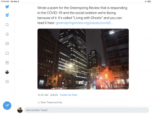
I decided to use Twitter to promote my poem. In getting this done later, I was able to actually post the link to what I got published. I decided to use a photo that was kind of related to the content of the poem. It’s hard to capture the more abstract feelings, so I chose a photo I took in Montreal last year that evokes similar feelings. As for when I posted, with friends in other timezones, putting it out between midnight and one in the morning might help it get more visibility. Most of my friends are people I’ve met through creative outlets, so just mentioning something I wrote along with a picture to capture attention (especially a photo with the color of lights in a nighttime city during the rain) that isn’t too boring, but isn’t too interesting to cause people to ignore what I’m saying.

Style Sheet

https://www.dropbox.com/scl/fi/866witbwt8oo2sr7h8rfc/Immersive-Pedagogy_Bott.docx?dl=0&rlkey=snp0deln3l3astl2a1hlz5sd5

The process has little difference that I went through at my job. In addition to content generation, I helped copy edit various writings from around the company. So, to look at this, while a bit more in-depth with a style manual than my previous employment, it was very similar. I also had similar experiences being an English major for three years and proofing papers and other projects. So, the process was easy, though the volume of text in an unfamiliar subject matter made for a bit of a difficult process at times.

Coding Reflection

https://drive.google.com/file/d/1mD2boAVmz0VqbpeXQOplQr4WzwfsiQ1x/view?usp=sharing

The assignment was fairly easy. Took me a short while to familiarize myself with the patterns of HTML, but it is a basic system that offers flexibility. Recognizing how to use that system, even with just one morning of practice to run through what we were assigned, I was able to get the hang of what to do, even if I didn’t have all the codes memorized.

I kept using the same “Try it Yourself” document, and added to it as I followed more lessons, so it represents the solid end result of everything I learned. I had only had limited experience with coding beforehand, mostly command line commands to salve an issue with my computer.

The biggest issue I was faced with was the lack of memorization of the codes for certain things. I’d add to the document after taking that particular lesson, so I had a fresh reference, but it would take me a similar amount of time to put something together on my own, as I would have to reference a fair amount of information to put something together.

In summary, HTML is something I could learn if I dedicated more time to, but at this point, it’s not a skill I could utilize effectively, or put on my resume. I simply do not have enough practice with it, but a few weeks of practice and a continual effort would get me there.

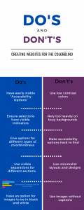
The audience I wanted to work for is the colorblind audiences. Since being colorblind is more common than people think, then websites can be made more accessible by taking some simple affordances into account while retaining stylistic independence. Video games often have colorblind options to make things easier for players, and they’re treated as standard features now. If websites adopted simple colorblind options as standard, then a commonly missed audience would be accounted for in web design, and present a more universally user-friendly experience.


In “Disability, Mental Illness, and eLearning: Invisible Behind the Screen?” By Dr. Mike Kent, he says that “Online information can be made available in a variety of formats to best suit the person accessing it” (Kent). The do’s and don’ts on the list were crafted to reflect some basics of web design. The use of colors, when used, was chosen to highlight the contrast between different sections while having visible text on it, while the idea of Accessibility Options including colorblindness were taken directly from video games because they are simple features designed to make things accessible. Without color, busy backgrounds tend to be difficult to read, so eliminating them makes sense for accessibility options.


According to “The Aesthetic-Usability Effect” by Kate Moran, “a positive emotional response to your visual design, and that makes them more tolerant of minor usability issues…users are strongly influence by the aesthetics of any given interface, even when they try to evaluate the underlying functionality” (Moran). However, in this instance, the aesthetics are directly related to the usability. Every aesthetic choice is directly tied to accommodating the colorblind, and therefore is directly related to the user experience.


Kent, Dr. Mike. “Disability, Mental Illness, and eLearning: Invisible Behind the Screen?” The Journal of Interactive Technology & Pedagogy. 17 December 2015. Web. Accessed 13 March 2020.


Moran, Kate. “The Aesthetic-Usability Effect.” Nielsen Norman Group. 29 January 2017. Web. Accessed 13 March 2020.

Greenspring Review Template Pros and Cons

Team 1


Pros

  • Clean and simple layout that’s easy on the eyes
  • Easily navigable, with unobtrusive drop downs within the issues
  • Consistent search bar and upcoming events keeps them within visibility and use
  • The about page connecting to the Greenspring campus of the University, feels official
  • Easily readable on mobile


Cons

  • No built-in direct submission function when many sites have it
  • Not optimized for mobile, drop downs for issues end up off screen
  • Mobile formatted poorly, site scrollable to the side to see background image, no real reason to do so, happens by accident
  • Submission guidelines feel very spaced out, feels a little awkward to read
  • Background image isn’t necessary on tablets, very little of it is visible


Team 2


Pros


  • Easily navigable on mobile
  • Eliminates previews of content on mobile, making it easier to read
  • Baked in submission box on the website
  • Separation of content by genre
  • Archives of previous content


Cons

  • Header feels too huge, feels gimmicky
  • Vertical focus leaves unused space on the sides
  • To navigate to a different section, the reader needs to scroll to the top
  • Minimalist about page with no delineation takes the reader a moment to recognize the difference with
  • The genre headings on the front page aren’t visually distinct enough, feels too close to the content titles


Team 3


Pros

  • Event focus promotes things that are often under-attended
  • The content being organized by issues and then genres makes finding something a bit easier, but also requires more pages to be viewed
  • Baked in submission tool makes submitting easier
  • About page very team focused
  • Text easily readable on mobile


Cons

  • Lack of drop downs in the ‘Issues’ section makes navigation slightly more time consuming
  • Should be an entire page to focus on events, with a calendar or list of dates
  • Aside from the header, there is a lack of color which feels less visually distinct
  • Lack of mobile optimization, content previews are still same size as full site
  • Menu at the top on mobile requires scrolling to the very top to navigate to new section


Summary of “3 practical tips…”

Li, Jacky. “3 practical tips for product builders when designing in an era of digital exhaustion.” UXDesign.cc. 7 January 2020. Accessed 17 February 2020. WEb. https://uxdesign.cc/3-practical-tips-for-product-builders-when-designing-in-an-era-of-digital-exhaustion-47131d933baa


The article mentions several phenomena that affect how people use digital devices, and that the designers of applications should account for them. The idea of smart phone users only using roughly nine applications a day, and that new ones end up disrupting an established routine is the first thing mentioned. It then mentions how applications either add or lessen functions to their daily lives, or replace them. So, fitness trackers add something, while mobile wallets lessen then, and substituting one streaming service for another is a replacement. The second main point is about how building a product that has an impact should be about the process. It should be something usable, something worthwhile, not something to have an event for. The example given was a company that changed how the electric bill was presented to encourage people to use less energy, which was fairly successful. The third aspect is the use of the “emotional piggy bank” which is a way of describing the emotional relationship built between user and builder over the long term. Any users who feel like the builder has a personal investment in the users’ use of a product will feel more inclined to continue using that product, and have a better experience while doing so. The best pieces of advice from this article, especially in regards to the Greenspring Review redesign, are that it needs to be clear to use and understand, but give the readers something to be invested in, and a site that they will want to continue to visit.

Rhetorical Analysis of The Paris Review

https://drive.google.com/file/d/188Hx4XX1-KodINpAd4y6gy67UtKo5UTa/view?usp=drivesdk

Hello ladies, gentlemen, and anything in between or beyond. I’d like to take some time today to do a quick rhetorical analysis of The Paris Review’s website. To summarize my thoughts on the site, I’d say that the site has a simple, easy to navigate design and aesthetic, but it does feel a bit cramped.


The observant eye can tell a lot about a website from a cursory overview. For example, the Paris Review primarily is marketed towards people with ‘refined’ taste. These are upper-middle or upper class individuals who have a healthy appreciation for the arts. Their website is designed to showcase text-based pieces like short stories, interviews, or poems, but also has pages for articles and photographs, as well as full sections for podcasts and videos. There is also the page designed to sell print issues of the magazine, which are put out seasonally.


The page for text content, we’ll use the poetry one for this, is pretty straightforward. The entire site’s colors are simple and clean, white background with black text, and pink for some boxes that serve as buttons or for indicators. It provides a nice contrast to the white, and lets us see that we’re looking at poetry from the 2010s, for example. The font is simple, dignified, and harkens back to the Review’s appreciation of the classics. However, the drawback is that the screen feels too cluttered, because the sidebar which stays at the top of the screen is right next to the scrolling list of content. The shifting element appears, sometimes, in other places of the screen before snapping back to where it should be, and feels hectic to navigate and a tad sloppy. Plus, there is an excess of white space on the right side of the screen, which accentuates the problem.


Looking at a piece of content, we see the same principles: simple, classic, easy to read, but it makes better use of the space. The layout has shifted, placing the content on the left side of the page, while putting an advertisement for the print edition of the magazine on the right. The bright pink of the “Subscribe to Keep Reading” advertisement in the middle of the page signals the appropriate shift to the audience.


Navigation is pretty easy and self explanatory, with drop down menus in the ‘review’ section to take to the different pages within said section. The ‘Video’ and ‘Podcast’ sections are even simpler to navigate, having only one page within them.


Both pages look mostly the same, the layout keeping the sub-categories on the left, and the main content on the right. The biggest issue with this is that on both the podcast and video pages, there exists very little negative space, the thumbnails have tiny gaps in between them, and are placed across most of the page. Sometimes when navigating these pages, the sidebar that’s just a placeholder for the videos will disappear and the video tiles will settle to four across before correcting back to three across when the logo moves down.

Overall, the main content portions of this website are pretty easy to read and navigate. Sometimes, the use of space could be optimized better, and having a sidebar that stays static while the rest of the website scrolls would be a somewhat useful tool, but a smooth navigational experience should come first.

Works Cited:

Ball, Cheryl E., et al. Writer/Designer: A Guide to Making Multimodal Projects. “Chapter 1: What Are Multimodal Projects?” Second Edition. Bedford/St. Martin’s, 2018. Print.
 

Villager Rhetorical Analysis

The Stevenson Villager online newspaper utilizes several different stylistic choices to ensure it is an easy to read and navigate site. Using a combination of clean and simple text, enough photo and video to make the point without over-saturation, and a layout that makes sense and is easily navigable, the website is effective at being easy to read, although it does not make itself stand out particularly well.


The front page shares a color and layout with the rest of the website. The logo of the newspaper is at the top, simple, in green letters to represent the school. Underneath it are the subcategories of different areas listed in plain black, and separated by very pale slashes. The use of the simple black and white contrast overall not only calls to mind print newspapers, but continues the format of text on a plain background that is a staple of internet news sources. On the right side of the page is a box which offers links to other articles. On the front page and the head page of the different sections, this sidebar has pictures as links to the articles, however those photos are removed in an article itself, and instead category information about the article, along with links to similar articles, appears in its place. This keeps the relevant text and images primarily on the left side of the screen, and allows the reader to focus just on the article as opposed to the details about it.


However, this style does not come without drawbacks. The first is that the logo, color and font choices are not particularly daring or bold. The article text is fine in simple font, but the logo and headings are only slightly stylized, making it seem like an effort in crafting a conservative design, but ends up resulting in something that is not particularly memorable. Having such a prominent information box taking up the right side of the screen is a tad distracting, as it pushes the main contents of the article to the left. There’s little white space around, leaving little to focus the reader on the text of the article. Once the mental separation is established, then reading the article is fairly easy, but the large info box taking up almost half of the page at a vertical perspective is somewhat distracting.


Overall, the site is effective at making its point. The pictures add flair and context to articles, and the site is easy to navigate. It’s simple and clean, but without much risk taking, thus, leaving an unmemorable experience. The large info box, which changes based on the page, is a bit distracting, but not cripplingly so.

College Meme

Sourced: https://www.reddit.com/r/PrequelMemes/comments/engpou/the_ability_to_speak_does_not_make_you_intelligent/?utm_source=share&utm_medium=ios_app&utm_name=iossmf

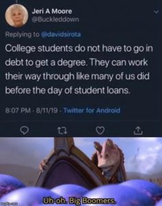
I chose this one as I am about to graduate. Paying attention to the current political landscape, and the idea of college debt is sure to come up. My brother is also set to begin college in the fall. The fact that my debt is about to seriously kick in, and he will be starting to accrue it is troublesome, as wages have not risen as much as the cost of college, and my choice of school was made, in part, due to financial reasons. The idea that the situation is the same as it was even back in the eighties is short-sighted and damaging to the perception of the issue, and to the financial futures of many university students over the next several years.