Social Media Remix


I think Twitter would be the most effective platform for my submission for the GSR. Twitter is my favorite social media platform and it is used by many college students. Although my primary audience is college students at Stevenson University, my secondary audience could be frequent beachgoers since my story takes place at the Outer Banks in North Carolina. When I was creating my social media post, I was debating between Twitter and Instagram. I decided to choose Twitter because of the type of content on the two platforms. When college students are scrolling through Instagram, they only want to see pictures. Usually, people go through Instagram much faster than other social media sites since they do not read much. Meanwhile, Twitter is full of all types of media, so people are more likely to read posts or click on a link that opens a new window with your writing. Another good feature of Twitter is that other users can retweet your post, which increases the number of people that will interact with my tweet.

There is no character or space limit for Twitter. However, no one wants to read a super lengthy tweet, so I think it is best to keep it short. Twitter allows you to include a picture or GIF along with a text caption. I think I should use an attention catching picture with a two sentence caption. The image will catch their attention, and then I will really draw them in with a personal question as a hook. Although you are not able to manipulate the font or color, I do not think it is necessary because I want to keep it simple. Furthermore, I think emojis may decrease my credibility, so I want to keep everything short, simple, and professional.

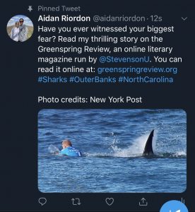
I think an image with a caption will work best. If I only used text, then I think it would get overlooked since there are so many tweets with just text on Twitter. If I used a video, then that would give away the plot of my story, which I do not want to do because I want people to read my story and be surprised. I think a professional photograph of a man next to a shark is the perfect image because it captures the viewer’s attention without spoiling the story. If I were to use a GIF, then I do not think that would capture their attention as much as a photograph.

I would post around 9 am on a Saturday morning. Many college students wake up and scroll through Twitter like it is the morning newspaper. I think I would get the most likes and comments by posting it on a Saturday morning since that is when many college students are active on Twitter. I do not want to post it on a weekday since most people still have online classes, which leads to a wide range of possible viewing times. I feel like Saturday morning is a safe time since everyone should be home to read their Twitter feed. With Twitter, you are also able to retweet your own post. Therefore, I could retweet it the following week around noon, which would be the second best posting time. This is because people usually have a lunch break around noon, so they are able to check their social media platforms. The last thing I would do is “pin” the tweet to my profile. This means that if someone views my profile, the tweet will always appear at the top. By doing this, I will increase my views even more.

Style Sheet Exercise

https://docs.google.com/document/d/1cdHh3HYcDJE3WkIM6ogC91LIaB285xu_dg063aagd5c/edit?usp=sharing

This assignment was honestly a little difficult because of the content in the article. I did not understand the article, so it was really hard for me to stay focused. If it was something I had prior knowledge about or was interested in, then it may have been easier. Also, I am not the best with grammar or spelling since we never spent too much time learning about it in grade school, so I always struggle to proofread other people’s writing. Furthermore, it was also hard to not correct things that were not on the checklist. For example, there were tons of run on sentences and repeated information that could have been cut out, but it was not something we were supposed to edit, so I left it alone. Additionally, I have never used Chicago style, so I had to teach myself another formatting style. Then, it was even harder to apply this new formatting style since it was my first time using Chicago style.

GSR Final Submission

When Fears Become Reality

It was Saturday, June 20, 2015. I frantically packed my bags for the beautiful sandy shores of the Outer Banks in North Carolina. I ran through the house as I looked for pool toys and other games to play during our two-week vacation. For beach vacations, we usually got a house with a pool because I have a huge fear of sharks. However, I do not let that fear keep me from enjoying the ocean. I have always told my parents, “I am going to die in a shark attack.” They always called me crazy since I have a better chance of dying from a cow. Despite the low probability of being attacked by a shark, I always took the necessary precautions to decrease my chance of being a victim of a shark attack. For example, never swimming early or late in the day, wearing plain bathing suits, swimming away from piers and people fishing, and avoiding unnecessary splashing.

It was finally Sunday morning and we hopped in the overpacked car to head to the beach. The moon and stars were still out, but it was super humid. I was so excited to get in the ocean in a few hours. My cousin’s obnoxiously loud snoring kept me awake most of the ride, so I went on my phone and listened to music. I opened my shark tracker app to see if any sharks had pinged recently off the coast of North Carolina.

“Mom, Dad! A tiger shark pinged off the coast of Nags Head yesterday!” I shouted over my cousin’s snoring.

“But, how far off the coast was it?” my dad asked.

“10 miles,” I replied.

“You do realize how far that is, right?” my mom said.

After what seemed like days, we finally arrived at our beach house. Before the car was even in park, my cousins and I piled out of the car like customers flooding Target on Black Friday. We sprinted like marathon runners to the water as the scorching sand burned our feet with every step. As soon as I dove into the monstrous waves, I knew it was going to be a great week. It seemed like all the worries from girls, sports, work, and life were gone.

About ten minutes later, I felt something like sandpaper brush up against my leg. I looked down nervously into the murky water to see what it was. I did not see anything, so I continued to ride the waves. A few seconds later, I felt it again.

“Did you guys feel that?” I asked.

“Feel what?” my cousin, Nathan, asked.

“I don’t know. I thought I felt something brush up against my leg,” I replied.

“I think you are just paranoid about sharks,” my cousin, Ganon, chuckled.

“You’re probably right,” I said.

I continued to swim until I heard a panicked woman’s voice from the shore. At first, I could not make out what she was saying, but then I saw everyone running to the shore with horror in their eyes. She was still screaming, and this time I could make out what she was saying.

“Shark! Shark!” I heard her yell as she pointed her finger to the water less than 50 yards from us.

My heart was beating faster than ever before, including when I asked out my first girlfriend in middle school. I heard the lifeguard blow his whistle so fast it sounded like a machine gun. He screamed at us to hurry up, but I knew I had to go slow to not disturb the water too much or else the shark might mistake us for fish. I felt I was being chased by Michael Myers from the Halloween series. I never felt so scared in my life.

Thankfully, we all made it to the shore safely. Everyone gathered on the shore like a football team in a huddle as the cool water trickled beneath our feet. We looked frantically out into the water as we searched for the shark’s fin. Every few seconds, we saw the knife-like shark fin pop up out of the water as it effortlessly moved from east to west.

The next two days were normal. The weather was hot and gorgeous as the beaches were packed with people and excitement. Children boogie boarded in the water, adults drank and talked, and teenage girls tanned. It seemed forgotten that a shark attack had happened on this busy beach just a day or two ago. For me, the attack was far from forgotten.

It was now Wednesday, June 24th. As I drank my delicious french vanilla Dunkin’ iced coffee on the screened in porch, I turned on the news to check the weather for the day. Immediately, my heart stopped, and my coffee hit the floor and exploded all over my new white shoes. “An eight-year old boy was attacked by a shark in Surf City,” the reporter stated. Although this was not the Outer Banks, I was concerned since the reporter also mentioned this was the fourth shark attack in North Carolina this month. There was one on June 11 in Ocean Isle, North Carolina, two on June 14 in Oak Island, North Carolina, and the most recent on June 24 in Surf City, North Carolina. He then showed a map that indicated that the shark attacks seemed to be moving northward up the coast of North Carolina. I was paranoid.

The next morning, we walked onto the beach as the sun beat down on my tomato colored sunburnt face. “Should we go to the right or left?” my dad asked as we stared out over the dunes onto the sandy shores.

“Let’s go to the left,” I replied. Little did I know at the time, such a simple decision may have changed my life forever.

It was around noon when I was body surfing wave after wave with no fears in my mind. Then, I heard panic erupt like a volcano about a football field’s length away to my right. “Shark!” I heard coming from the shores. Who would have thought I would have gotten out of the water twice in one week because of a shark? I vacationed in Avon, North Carolina for years and never saw a fin of a shark. I rushed out of the water and followed the crowd to the scene. “Somebody call 911!” a mom yelled as she rushed out of the water while the waves hammered her like she was in a boxing ring. We waited anxiously as a man hobbled out of the water with a trail of red blood flushing out to sea. Everyone was in shock. Not too long later, ambulances echoed along the shores as they arrived at the scene. The stretcher was rolled along the sand at a snail’s pace, but they loaded the man on and drove off.

“That could’ve been me,” I thought to myself.

“Good thing we have a pool,” my dad joked.

During our stay, two more shark attacks occurred in North Carolina. It was then concluded that choosing a new family vacation location would be a wise decision.

Coding Reflection

https://docs.google.com/document/d/1zcv-F7ZAjRTbl7zxIMGe69NTmr52h5w0gzEp_SotTl0/edit?usp=sharing

I learned a lot of HTML skills from this online lesson. First, I learned the importance of start and end tags, since the text between them is what is displayed on the website. Furthermore, you specify the type of text in the tags, such as a h for heading, p for paragraph, or b for bold text. Also, I learned how to change the background color, text color, font, font size, and text alignment. Lastly, you can add comments to your code, which are not displayed in the browser. These can be used to place reminders within the code and even if you forget, it is not a big deal since it is not displayed anyway.

This was my first time doing any type of coding work, but I found this lesson really easy. I decided to crank it all out in one sitting since I was super busy during spring break that I really only had that one day to do school work. For each lesson, I completed the “Try it Yourself” tutorials and practiced coding the different things in the lesson. Then, when I came across an “Exercise,” I completed that too. I started to get annoyed with the lesson because a lot of it was repetitive. For example, it talked about specific things within multiple sections, such as images. Images was discussed in a few lessons, such as basic, attributes, and a separate images section. I got annoyed when I had to keep repeating things I already learned how to do in a previous lesson. Besides that, I thought it was cool learning how to code a website. Everything was pretty easy since I had the examples to reference. Without the examples, I feel like I may struggle with remembering the exact codes I needed to enter to do a certain thing. For instance, to code for an image, you have to type img, src, alt, width, and height. I could definitely apply these to creating my own website in the future, but I think it would take me a while since I would probably keep looking at examples for formatting. For this reason, I do not think I am confident enough to put HTML on my resume.

Designing for Users with Anxiety Poster

For this assignment, I chose to focus on the dos and don’ts for designing for users with anxiety. I chose the audience of college students with anxiety because anxiety is very common in college students. According to the American Psychological Association, 41.6% of college students have anxiety (American Psychological Association). Therefore, it is important to design your website accordingly because it is likely that people with anxiety will be visiting your website.

When designing for users with anxiety, it is important to keep the website easy to navigate. In Dr. Kent’s study of college students with disabilities in Australia, he found many students enjoyed sites that were easy to navigate (Kent). For example, “Blackboard has been great. It’s generally easy to understand and use (Kent). Like any website, the user wants it to be easy to use. You do not want to clutter the pages because this will discourage the user, which will cause them to leave the website. When there is a simple layout, the users will be able to find information easily, which will make them feel good. One of the pieces of the “usability honeycomb” is that information is easily found (UserTesting). In addition to using a simple layout, bold text is a good way to make information easily to find. Writers are able to use bold text to make the important information stand out, so readers do not have to read the entire article. People with anxiety do not want to read long paragraphs of text because that will make them stress out, so writers can make articles less intimidating by using bold text and shorter paragraphs. Furthermore, the use of visuals, like pictures or videos, can also be used effectively to provide alternatives to reading lengthy articles. However, you should never have pop-ups or videos that play automatically because that will cause people with anxiety to panic, which will turn them away from using your website in the future. Lastly, people with anxiety can sometimes require more support than others. Therefore, it is a good idea to make a live chat option or at least make it easy to contact someone to get help when needed.

I used the dos and don’ts strategies listed in my poster and applied them to creating the poster. I made the poster very simple with two clear sides that distinguished the do’s and the don’ts to make it easy to follow. The text is also simple, which makes it easy to read. Additionally, I left a lot of blank space, so I did not overwhelm the viewer with a lot of text. To supplement each box of text, I used an image to display what the text says in a visual way. Therefore, people do not have to read the text to understand the poster. Although this is not mentioned in my poster, I felt like it was important to use a blue color scheme because the color blue is usually associated with tranquility. It is important to make people with anxiety feel calm, so the color scheme you choose is very important.

“College Students’ Mental Health Is a Growing Concern, Survey Finds.” Https://Www.Apa.Org, https://www.apa.org/monitor/2013/06/college-students. Accessed 3 Mar. 2020.
Kane, Laura. “Disability, Mental Illness, and ELearning: Invisible Behind the Screen?” The Journal of Interactive Technology and Pedagogy, 17 Dec. 2015, https://jitp.commons.gc.cuny.edu/disability-mental-illness-and-elearning-invisible-behind-the-screen/.
“UI vs. UX: What’s the Difference between User Interface and User Experience?” UserTesting, https://www.usertesting.com/blog/ui-vs-ux. Accessed 3 Mar. 2020.


Usability Article Summary

This article discusses why you only need to test your website with five users. Many people belief that testing is extensive and costly, but it turns out the best thing to do is run as many small tests as possible with fewer users. The researchers used the equation N (1-(1- L ) n ) to prove their statement. When you test with only one user, this user will give you some insight, but they will not hit everything. Then, the second user will give some of the same insight as the first user, but they will offer some additional insight. Next, the third user will offer many similar thoughts, but they will still have some new things to share. This pattern of overlap will continue as you increase the amount of users. You will start learning less and less, so there is really no point in continuing past five users because it will mostly be the same information. Although the graph indicates that you must test with at least 15 users to hit all the problems, it will save you money by running three small tests of five users each.

Experience, World Leaders in Research-Based User. “Why You Only Need to Test with 5 Users.” Nielsen Norman Group, https://www.nngroup.com/articles/why-you-only-need-to-test-with-5-users/. Accessed 27 Feb. 2020.

Accessibility Article Summary

The article discusses the findings of a study about college students with disabilities who attend college online in Australia. Students with disabilities might choose online schooling because it allows them to avoid issues that they would face in a physical class. They are also able to have more flexibility to complete assignments because their mental illness might affect their ability to complete things at certain times. Also, they can withhold from disclosing their disability to anyone by taking an online class. Researchers conducted a study to determine the accessibility of specific online platforms, and the students’ level of disclosure of their disability. Students had to classify their disability as one of the following: hearing, learning, mobility, vision, medical, intellectual disability, acquired brain impairment, or mental illness. Then, they were asked demographic questions and questions about their disability. For example, the accommodations the students received and how accessible the technology was for students. Researchers found that many people with a mental illness also had one or more other impairments. With the data, they found students with disabilities had the most difficulty accessing Echo 360, Blackboard, Lectopia, University Websites, and Blogger. However, the students spoke highly of Blackboard because of its discussion feature, ease of navigation, communication options. They also found online learning is good at allowing students to use different accessibility features without disclosing their disability. Based on the results, they found eLearning needs to be made more accessible for all students. Schools could do a better job assessing students and making group work more accessible. Students with disabilities want their voices to be heard, so universities should listen to comments and suggestions from their students to help accommodate them.

Kane, Laura. “Disability, Mental Illness, and ELearning: Invisible Behind the Screen?” The Journal of Interactive Technology and Pedagogy, 17 Dec. 2015, https://jitp.commons.gc.cuny.edu/disability-mental-illness-and-elearning-invisible-behind-the-screen/.

Evaluating Redesign Sites

Team 1: https://thegreenspringreview.art.blog/

Effective:

  • The color scheme goes well because it matches Stevenson’s school colors, which I feel is important for a university’s literary magazine.
  • The search bar makes it easy to find posts and navigate their website.
  • The menu is very easy to navigate with clear headings and subheadings.
  • The header and logo are clean and simple, which makes it visually appealing.
  • I like how they have a subscribe option in the side nav to receive emails when there are new posts because it keeps the readers up-to-date.

Needs Improvement:

  • I am not a fan of the bookshelves because I feel like it distracts me from the main section of the website.
  • The reader must scroll back to the top of the page to view the header or side bar. It would be nice if it remained at the top as you scrolled, so you could easily access the header or search bar at any time.
  • You cannot upload pieces of work directly in the website, which adds more steps for the viewer.
  • The “email us” link brings you to Google Maps, which does not make any sense. It would be convenient if the “email us” link opened up your mail app with their email automatically typed.
  • It tells you that there are only 3 followers. They might want to hide this information because it shows a new reader that the site is not very popular.


Team 2: https://jennaaye.wordpress.com

Effective:

  • The header sticks at the top, which makes it easy to access at all times.
  • You can submit your work directly to the website, which makes it easy and convenient.
  • I like the “About” page because it is original, creative, and it does not state basic facts about the editors.
  • I like the “Read More” option because then the reader does not have to scroll a lot to see all the posts.
  • I like how the “Issues” header has a drop down menu that organizes the different genres of posts to make it easy to find what you are looking for.

Needs Improvement:

  • The header is huge, bright, and overwhelming.
  • I would rather have the home page include recent posts in chronological order rather than the featured posts.
  • There is no search bar, which is an important feature to include to make the website easy to navigate.
  • You cannot click on the pictures on the “Visual Art” page, which is surprising and might deter a viewer.
  • They could have a side nav since there is a lot of wasted space that could be used to add categories to make it easier for the reader to navigate the website.


Team 3: https://greenspringreview.art.blog/

Effective:

  • The website has a side nav with plenty of options to make the website easy to navigate.
  • The website offers a subscribe option on the home page to keep the regular viewers in the loop with new posts.
  • You can click “The Greenspring Review” and it brings you back to the home page, which is important for accessibility.
  • The search bar makes it easy to find what you are looking for within the website.
  • You can submit your posts to the website, so it makes it convenient.

Needs Improvement:

  • The color scheme has no relation to Stevenson, so I think it would be better if they included some green colors within their website.
  • There is no sticky header, which makes the website harder to navigate.
  • They could have subheadings within the “Issues” heading to make it easy to get to your desired page. Instead, you have to do a lot of clicking to go to your issue and genre. They could put all of these in the menu, so you can just hover over the “Issues” tab to see all the options.
  • They could post their email address for people to contact them. They have the submission page, but there is no way to contact them for individual questions.
  • I don’t really like the picture at the top of the page since it feels unrelated and unimportant.

Designing Your Settings Page

Karthikeyan, Vivek. “Designing a Better ‘Settings’ Page for Your App.” Medium, 13 Dec. 2019, https://uxdesign.cc/designing-a-better-settings-page-for-your-app-fcc32fe8c724.

One thing that often gets overlooked when designing an app is the settings page. This article discusses how to design an effective settings page to boost the user experience. The settings page should be well organized with clear and generic categories. However, there should not be too many categories because that will make it hard for the user to find their desired setting. The categories should always be prioritized with the most important at the top (like account settings) and the least important at the bottom (like about settings). Furthermore, destructive settings like “logout” or “delete account” should be at the bottom, so it is less likely it gets accidentally clicked. In addition, the top of the page should include any action items, such as reviewing new privacy terms, subscription offers, or current deals. It is also a good idea to include a search bar at the top, so users can save time by searching for settings rather than guessing and checking all the categories.

Before reading this article, I honestly would not have put too much thought into creating a settings page for my app. I probably would have thrown something together real quick just so I could say I had a settings page, but it would not have been very user-friendly. Now, I have many tips for creating a settings page that can be easily navigated by anyone who uses my app. When I redesign The Villager, I will need to add a settings page, since it currently lacks one. I could add an account feature that allows an individual to create an account and subscribe to their favorite writers or topics. Then, in the settings app, they could allow notifications for specific postings. I would also limit the amount of categories I had in the settings page, while keeping everything easy to locate.

Rhetorical Analysis of The Paris Review

https://drive.google.com/open?id=1bVLDF05DScwHxKipK-VRl5NKM4T63S7q

[Start at home page of The Paris Review]

A rhetorical analysis can be performed on The Paris Review. The Paris Review is a professional literary magazine that features original writing and various types of art. They also discuss opinions on art and literature through interviews and podcasts. The Paris Review is an effective literary magazine because it is very neat, professional, and easy to navigate.

When you open the website, you are taken to the home page. The first thing that catches my eye is the huge title at the top of the page that is written in all capital letters in a fancy font. This makes it clear that their audience consists of high class, rich, and elegant art lovers who love to read and discuss art.

The header is located below the title and is clearly organized to separate the different categories of information they have on their website. For example, when you hover over “The Review” tab, you can see some of the genres of text you can read, such as fiction, poetry, or essays. This makes it easy to navigate to the page you are looking for.

However, if the headings and subheadings do not narrow down your search enough, then there is a search bar in the heading that makes it simple to find anything. A search bar is essential for an online magazine because there are tons of material within the website, so a search feature makes everything easy to find.

[Search soccer]

Right away, you have all the results from The Paris Review with the word soccer in it. Then, you can even filter it further by genre. This is a quick, easy way to get filtered results.

[Go back to home page of The Paris Review]

The next thing I notice is the color scheme. The color scheme for the online magazine is composed of neutral colors like black, white, and gray. This makes it look very clean, neat, and professional. Although they use these colors to look professional, the main purpose is to make the material in pink stand out. For example, the subscription box is highlighted in pink to capture the reader’s attention. The writers do this to hopefully get the readers to click the subscribe box to enter their email. Additionally, they have the current issue highlighted in pink to get the readers to purchase the hard copy issues. Also, if you place your cursor over anything, it will turn pink. Clearly, the pink color scheme is used symbolically to make things stand out from the rest of the neutral colored page.

[Go to Ploughshares]

On Ploughshares, almost everything is the same color. Therefore, nothing really stands out to the reader. I think the idea of a bright color among a bunch of neutral colors is a great idea to focus the reader’s attention on specific aspects of the website.

[Go back to home page of The Paris Review]

If you haven’t noticed already, the header remains at the top when I scroll. This is an underrated feature because there is nothing more annoying than scrolling all the way back to the top to view the menu or search box in the header. By pinning the header to the top, it makes it very easy for the reader to navigate the website.

[Go to Guernica]

Here you can see how the header does not remain at the top, which makes it time consuming to scroll your way back up to the top just to access the header.

[Go to “The Daily” page of The Paris Review]

The content is organized chronologically with the newer information at the top and older information towards the bottom. By organizing from newest to oldest, it saves the reader time and provides them with the most up-to-date information. For the reader, the less scrolling, the better.

[Go to “Arts & Photography” page of The Paris Review]

Since the audience is prestigious art lovers, they expect to see high quality artwork. The Paris Review delivers in this aspect. It is exceptional work and the reader can view a lot of pictures at once. The reader is also scrolling, which is much easier to do than click through a slideshow of pictures. Then, once they find an artist they like, they can view their art in one place.

There are also side bars on some of the pages with filters to limit your search. These filters are alphabetically by author last name and decades. Once again, this makes it easy to find information that is relevant to what you are looking for and it also remains on the side when you scroll.

The page looks organized since all the pictures are the same size and shape, and the text is lined up. It makes it very easy on the eyes to view. There is also plenty of white space between everything, so the viewer does not feel overwhelmed by all the content.

[Go to “Podcast” page of The Paris Review]

Podcasts are becoming super popular today. Many people will listen to them on their commutes to work. They are also good for people who prefer to listen to articles rather than read them. The podcasts give viewers an auditory option, which cannot be found many other places on the website.

Like the rest of the website, the podcast feature is easy to use. They provide a short description of the podcast episode, while also embedding the episode within the website. This means there are no annoying pop ups or new browsers opening with the podcast. You can also subscribe on Apple or Google, which makes it easy for cell phone users to listen on their phones.

As you can see, The Paris Review is very well organized. Everything is consistent throughout which makes it look very professional. They also include many user-friendly options like sticky headers, filters, and search bars to make the website easy to navigate.

Works Cited

Guernica. https://www.guernicamag.com/. Accessed 13 Feb. 2020.

“Morrison, Toni, et al. Before the Light. 13, https://www.theparisreview.org/podcast/6047/before-the-light. Accessed 13 Feb. 2020.

Ploughshares. https://www.pshares.org/. Accessed 13 Feb. 2020.

The Paris Review. https://www.theparisreview.org/. Accessed 13 Feb. 2020.