The audience for this poster would be students, faculty, and staff members at Stevenson with ADHD. The dos and don’ts are meant to be utilized by the Greenspring Review website in order to accommodate viewers with ADHD. I chose to address this audience because I believe that there is a vast amount of people who have ADHD within Stevenson, and I wanted to make it easier for them to view the literary magazine.
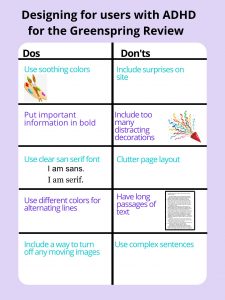
For my poster, I had included 5 dos and 5 don’ts. My first do addresses the need for soothing colors. Soothing colors helps create a calm environment for people with ADHD (Harris). My second do is to put important information in bold. For people with ADHD, this helps them distinguish that the information presented before them is actually important (Harris). My third do is putting the text in sans serif font. This makes it easier for people with ADHD to read the text, since it will be clearer for them (Harris). My fourth do is to use different colors for alternating lines, since it helps people with ADHD follow the text (Harris). My fifth do is to include a way to turn off any moving images on the website (“Diverse Abilities and Barriers”). This is important because people with ADHD have a hard time concentrating, and moving images may be a hindrance to their experience as a viewer of the website. My first don’t is to avoid surprises. People with ADHD have a harder time focusing on the content of the website, especially if the website displays a sudden surprise, which may be a displeasing experience for the viewer. My second don’t is to avoid too many distracting decorations, since this will make it difficult to view the literary magazine (Harris). This reason is also applicable to my third don’t, which refers to avoiding clutter on the page. My fourth don’t is to avoid having long passages and my fifth don’t is to avoid complex sentences. Reading the website should be enjoyable. My fourth and fifth don’ts are to ensure that people with ADHD have an easier time reading the text and taking the time to actually enjoy the reading instead of struggling with the text.
In his article, Nielson mentions that it is important to pay attention to what users do. I know that users focus on pictures and colors, but for my poster, I had made sure to accommodate users with ADHD. For my poster, I had used a light purple, since it is a soothing color. I only used a few pictures, since I didn’t want it to be distracting for someone with ADHD. I had also used different colors for alternating lines to make it easier for people with ADHD to follow the text. I tried to keep the text simplistic, so people with ADHD would have an easier time reading the content of the poster. According to one of the articles we read in class, it is important to take the time to learn about different disabilities and how we can address these disabilities (“Disability as Insight”). This is something I hoped to establish in my poster.
Works Cited