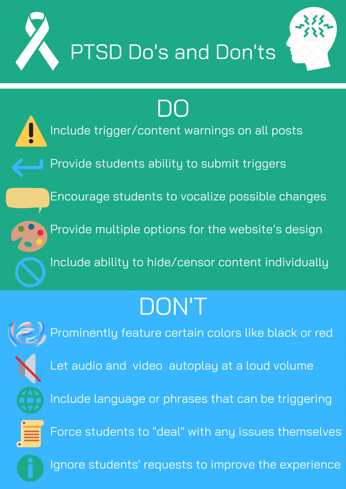
For my poster, I decided to target students who are affected by PTSD or PTSD-like symptoms. These students may have had traumatic experiences in their past, and likely still have pain associated with those events. Students with triggers and sensitivities to certain stimuli will also benefit from this website design. In addition, regardless of mental health status, many people have fears and phobias that may cause a negative reaction upon experiencing. According to Lisbeth Thorlacius’s article on web design, “there is always visual communication on a Web site, whether the use of visual effects is deliberate or not” (2007, p. 63). As such, this website design will give students a variety of options to make their experience as comfortable as possible.
For my do’s, I decided to focus on the ability to make the user’s experience customizable. I want the students to be able to encourage change, as well as provide multiple design options. The ability to hide content will also be very beneficial. Allowing students to submit triggers, that will then be featured as content warnings before posts, will prevent students from reliving any possible trauma. For my don’ts, I outline key mistakes that many website designers make. Certain colors, such as black or red, are common triggers for folks with PTSD. They should be avoided, as such videos that play at a loud volume. Certain language and phrases can be triggering, so posts should be reviewed before they are greenlit. The designers should not force students to accept the negative consequences of their posts, as that directly alienates this group of students. Ignoring these same students’ requests would also cause unnecessary tension. According to Karwai Pun’s post on gov.uk, “it’s always worth testing your designs with users to find the right balance, making compromises that best suit the users’ needs” (2016). While all students cannot have their needs met, our goal should be to reach the most students possible.
The visual design of my poster is quite simple, and this is purposeful. The top header is the color of the PTSD awareness ribbon, with a white ribbon to represent it. The symbol on the right is another PTSD awareness symbol. The line below it is meant to separate the header from the first title. Including “bullet” points could be triggering, so I decided to use symbols to represent each statement instead. The green and blue are meant to be calming colors. The colors of the information, enter, censor and world symbols were originally black, but I decided to switch the colors to fit the design motif (and prevent any possible triggers). The unique and simple design of the poster should not invoke any past trauma, but if it did such I would edit it accordingly.
Sources: