- The audience I chose for my poster is the Geriatric population. Meaning viewers over the age of 60. This is an important audience to think about because if there aren’t certain features on the website, it can make the experience for them unbearable. By adding additional features to the website, it can make their user experience positive and actually enjoyable. I thought about my grandma looking at the Greenspring Review, and let that guide my thinking and my decisions.
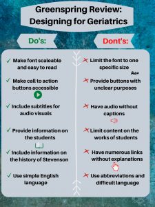
- My first do is one of the most important. It is crucial to make the font scalable for the Geriatric population to be able to read and review the website in the first place. That’s why my don’t is right next to it, to ensure that the font can be scalable and easily read. My second do is to ensure that the buttons are clear and easily accessible. One of the points on Accessabilityblog is to make the buttons “clear and clickable” when considering people with low vision. Referring to my second don’t, there is no need to incorporate buttons without a clear purpose or not to be easily seen. The third do on my list is vital for comprehension. It is absolutely essential to provide subtitles for audio visuals to make sure people understand the video. My third don’t goes along with it as well, where as providing a video without captions would hinder their experience with the website. My fourth and fifth do relate to the content of the Greenspring Review. It is important to keep in mind what this population would be interested in reading about to keep their interest. Leading to my fifth don’t, having a bunch of links everywhere can be confusing for anyone. From Boomertechtalk.com, they state to “underline links and change color” when you click on it so they know they have already visited that part of the site. My last do is important as well so the Geriatric population can understand the content that is in front of them. My last don’t going along with it, makes sense because the older generation may not use the same lingo as we do and not understand exactly what we are trying to say exactly.
- The majority of my decisions for this poster came from my general knowledge, and ‘The do’s and don’ts on designing for accessibility” article reviewed in class. I started off with a blue/green background because it is subtle and adds a calming mood to my poster. I put the grey over it so that way the text was easily readable. I made sure the font was an appropriate size, and picked black so it would stand out. I decided to label ‘Do’s” green and put green checks next to it because green represents good. And for the don’ts, I used red and kept it consistent throughout that side to symbolize what not to do. I put a white line down the middle to show that there is separation, and to make the reading easier.
Sherman, Linda, and Linda ShermanBoomer. “Website Design for Seniors Accessibility Guidelines.” Boomer Tech Talk, 19 Dec. 2018, boomertechtalk.com/website-design-for-seniors/.
“UI vs. UX: What’s the Difference between User Interface and User Experience?” UserTesting, www.usertesting.com/blog/ui-vs-ux.
Pun, Karwai. “Dos and Don’ts on Designing for Accessibility.” Accessibility in Government, 2 Sept. 2016, accessibility.blog.gov.uk/2016/09/02/dos-and-donts-on-designing-for-accessibility/.