Senior citizens use the internet almost as much as everyone else. In our case, we will find that past alumni, or relatives of current students who publish in our literary magazine may want to access and read the Greenspring review. With that in mind, it is important that these people find it easy to navigate the website and will not have difficulties reading the publications. Moreover, it is important every age group feel included in our community and not left out due to slang or other forms of communication that aren’t common across all age groups or audiences. For this poster, I focused specifically on the geriatric audience, or those over 65 years of age.
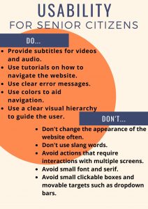
When considering a UX design for older people, it is important to maintain a streamlined, easy to read, easy to navigate environment. The main challenges this age group face in most websites are readability issues, and small targets such as clickable boxes or dropdown bars. (Kane) Fonts are usually too small, on a computer or mobile device, and often the color choice also impacts readability. Using jargon or wordplay can pose a challenge for this age group and “sabotage the experience [the website is] trying to generate.” (Adiseshiah) Senior may also face issues with sound. Those who are hard of hearing or suffer from any degree of blindness or eye impairment may find websites without subtitles or text-to-speech features too hard to enjoy and simply give up. Finally, it is important that websites don’t change their appearance too often because with age, “short-term, episodic memory tends to suffer” (Adiseshiah). Having to relearn how to navigate a website may prove to taxing for a senior citizen and they may just give up or not enjoy their experience as much.
Aesthetically, I chose a relatively standard poster. Do’s on one side, Don’ts on the other. I used a pastel background and very little color. I used orange to give some color to the poster but tried to keep the poster neutral without bright colors to not impact readability or create eyestrain. For the body text, I used a large sanserif font. I also used bold for the body text so that users find it easier to read. I created a visual hierarchy and separated elements, the Do’s are not too close to the Don’ts and are not parallel so that the user intuitively knows they either reading the Do’s or the Don’ts reducing the chances of mixing them up. Overall, the aim of the poster was to be very simple and straightforward, without too many elements as too not create a confusing or difficult experience.
Kane, Lexis. “Usability for Seniors: Challenges and Changes.” Nielsen Norman Group, https://www.nngroup.com/articles/usability-for-senior-citizens/. Accessed 4 Mar. 2020.
Adiseshiah, Emily. “UX Design Thinking From A Senior Citizen’s Perspective.” UsabilityGeek, https://usabilitygeek.com/ux-design-thinking-senior-citizen-user/. Accessed 4 Mar. 2020.